How long do users stay on your website?
That’s the average time spent on a website. And that’s how long you have to capture someone’s attention on your website.
I’ve dubbed this “the 15 Second Rule.”
If you haven’t generated interest in 15 seconds, then you probably aren’t going to.
How do you do that? Let’s take a look at some major reasons why people leave a website and, of course, how you can capture their attention instead.
It all comes down to your bounce rate.
Why you should care about your bounce rate
Bounce rate is one of those deceiving marketing terms that kind of sounds fun.
It’s not.
Jon Lister from Elite SEM recently shared this advice at an ecommerce conference when asked about the importance of bounce rate:
Focus on “dwell time” (how long site visitors spend with your content), rather than vanity metrics like pageviews. Creating quality content is extremely important because Google cares about how deep people navigate into your site, whether they hit the back button, and worst of all, whether they return to the search results page because they didn’t find the information they were looking for.
A high bounce rate indicates a poorly constructed site.
And low bounce rate suggests things are running smoothly.
So you see why it’s important to know this when we’re discussing the why of visitors leaving your site.
To find it, you’ll need to open up your Google Analytics Dashboard.
On the left-hand toolbar, you’ll see an option that says “Audience Overview.” Go ahead and click it.
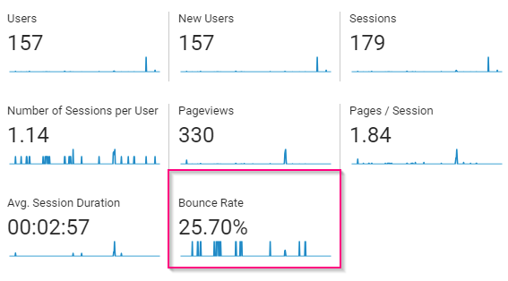
You’ll be greeted by a display of analytics about your site’s performance, including the overall site bounce rate:
The thing is, a site-wide bounce rate doesn’t tell you very much.
You need to find out where your visitors are actually going before you can have insightful data.
Thankfully, Google Analytics also lets you check the individual bounce rates by going to the Behaviors section of your dashboard.
Once you select “Behaviors,” select the “Site Content” drop-down.
Then, select “All Pages.”
You’ll find a breakdown that looks like this:
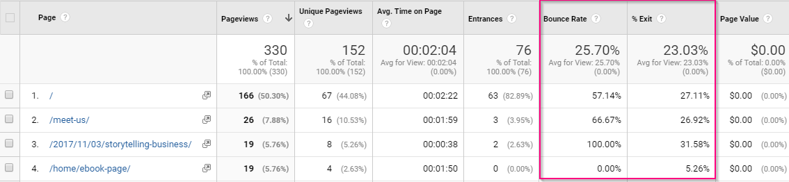
Now, we have a bounce rate that’s broken down by page.
Here you can get more information about how each page is performing. This is especially helpful when you’re determining whether or not your visitors are getting what they want out of your site.
Your bounce rate compared to your exit rate shows you the overall effectiveness of your page—all in one convenient place.
But how do you interpret this information? To be honest, there’s a bit of ambiguity in a bounce rate metric.
A slightly high bounce rate isn’t always a bad thing.
According to Yoast, bounce rate has three different interpretations:
1. The quality of the page is low. There’s nothing inviting to engage with.
2. Your audience doesn’t match the purpose of the page since they won’t engage with your page.
3. Visitors have found the information that they were looking for.
For example, it could mean that your audience got what they wanted and then left.
As a writer, I get helpful information from other sites all the time, even if I don’t buy from that brand.
Does that mean that my activity on those sites is making their bounce rates misleading? Yes and no.
Keep in mind that it varies by industry.
That’s why you should know what you’re aiming for. It’ll help keep you sane and focused on your goals.
Here’s an example of a few industry standards from Kissmetrics:
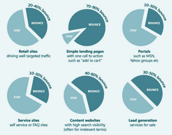
Your entrepreneur friends in different niches will all have different bounce rates, and that’s okay. What’s an acceptable bounce rate for one industry may be pretty high for another.
And keep in mind that the average time on site depends on the type of site, too. According to a survey conducted by Brafton, the average session duration was 2 minutes, 17 seconds, but that varied depending on whether the site was B2B, B2C or a hybrid.
It also depended on the industry. For instance, the survey found the average time spent on healthcare websites was over three minutes.
Activity on your website is also dependant on your goals. But it’s always a good idea to decrease your bounce rates when and where you can.
Though a high bounce rate isn’t always bad, it’s usually a sign that something is broken or not working.
Therefore, this post is about keeping those rates low and session duration high.
How do you do that?
You have to know why visitors leave your website.
That’s where my five reasons come in.
Let’s start by addressing your audience’s needs like I hope you are already aiming to do.
5 Reasons Why Visitors Leave Your Website
1. Visitors Leave Your Site When They Don’t Get What They Expect
Have you ever been to Nissan.com?
Go ahead and click on that link.
Seriously, give it a click. It won’t blow up your computer or anything.
Now, tell me: Was it what you were expecting? Most people expect to find the homepage of Nissan Motors (the car company). Instead, you were taken to a website about computers, right?
So, if you were interested in purchasing a Nissan car, would you stick around to look at computer parts?
The answer is almost definitely no, and I have web statistics from Alexa to back it up.
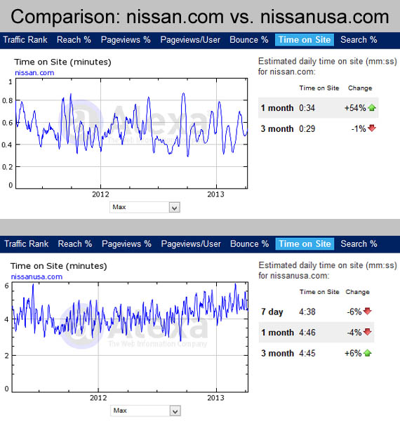
According to Alexa, the average visitor hangs out at nissan.com for about 30 seconds and nissanusa.com for over 4 minutes.
Here’s the sad truth: Most of the people who visit nissan.com aren’t interested in what the website is actually about. They’re probably looking for a new car.
In this particular case, Nissan is a family name. Naturally, the owner wants to keep it, and he has a right to do so since he got there first. But from a business standpoint, the confusion generated by the domain name is likely doing him more harm than good.
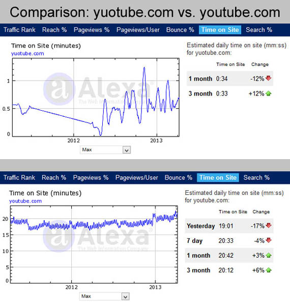
The following graphics compare two massively popular websites, YouTube and Facebook, with intentionally misspelled domain names. For those of you who are not familiar with this little “trick,” it involves anticipating popular misspellings of high-traffic websites to steal a small portion of their traffic.
Basically, users sometimes misspell the names of the websites they are looking for. Some people use this to their advantage, registering a domain name like “yuotube.com,” or “faecbook.com” in order to siphon a small percentage of web traffic from the actual sites.
Personally, I’m not fond of this type of website. At best, it is misleading. At worst, it can be downright dangerous—even illegal (some sites have used misspelled domain names to gather login credentials from users intending to visit the real website).
Notice how long users stay on these bogus sites — about 30 seconds or less. So, why play those games?

But there’s more to keeping a website visitor than not being misleading. You also want to make sure that your user experience provides the opposite of what we’ve already been discussing.
That is, you need to give your visitor a pleasant experience.
One way to start is by addressing web design.
Why? Poor web design drives visitors away.
Consider a site that has too many options.
Social Triggers shared a fascinating study of what happens when potential buyers are given too many options.
Here’s what they found:
On two consecutive Saturdays, a free tasting booth was set up in an upscale supermarket.
On the first Saturday, 24 flavors of jam were set out for customers to taste and buy.
On the second Saturday, only six of those same jams were made available.
What do you think the results were?
One would think that more jam options would mean more sales, but the study found that the opposite was true.
When 24 jams were available, 60 percent of the customers stopped for a taste test. But, only 3 percent of the shoppers who stopped also bought some.
When only six jams were available, fewer customers stopped. Only 40 percent tried the jams.
But of those who stopped, 30 percent took home some jam.
So what does this mean for your website?
It means that a poor design that gives too many options will significantly lower your sales and increase your bounce rate.
Even something simple like the layout can make a huge difference.
Even if they aren’t aware of it, people want your site to look a certain way.
But that’s not the only problem. A bad design has some other negative effects, as well.
Take loading time, for example.
Neil Patel found that poor design leading to bad load times equals abandonment.

That means that a poorly designed site with unoptimized load times will drive up your bounce rate.
That’s before the visitor ever sees your content or offer.
That’s powerful, right?
So how do you create a design that loads quickly, is appealing, and doesn’t raise your bounce rates?
Hubspot shared these guidelines for good web design:
- Simplicity: Eliminate unnecessary design elements and make your site easy to understand.
- Hierarchy: Arrange your site so visitors naturally gravitate to the most important elements.
- Navigability: Make your site’s navigation simple and obvious.
- Consistency: The look and feel of your site should be uniform throughout.
- Accessibility: Your site should be compatible with all devices (mobile, tablet, etc.).
- Conventionality: Don’t reinvent the wheel. Use elements and design that people are familiar with.
- Credibility: Be upfront about your intent and your pricing.
- User-centricity: Gather user responses to all site elements to get the best UX.
What does this look like when it all comes together?
Let’s look at an example from the website of the famous YouTubers Rhett and Link:

As you can see, they’ve created a simple layout that draws the eye to the main imagery.
The coloring is neat, and the navigation is clean and easy to browse.
They also immediately provide a link to their YouTube content with information on when you can expect new content.
And when you scroll down, the good design trends scroll with you.

You see another call to action for their content, and then they give you the opportunity to get a sneak peek of their Good Mythical Morning show.
They also take the chance to tell you a little bit about their show.
Do you see how all of that flows together to keep you engaged and interested?
You can see the opposite effect in a poorly-designed site too.
If you don’t know where to go or the color scheme confuses your eyes, you’ll just leave.
That’s why design is so important to your bounce rate.
Even something as simple as the font or script you use makes a difference.
Every font has a personality and purpose. The right script will make your site easier to read and reduce bounce.
Consider the example of the old but gold Kill Comic Sans campaign from a few years ago.
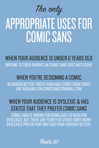
They give examples of doctors and government officials using a rather silly-looking font to convey an important message.
It kind of undermines what they were going for, right?
So remember that the seemingly simple aspect of proper design has an immediate impact on your interest in a site.
But what about the other elements of what your audience is expecting?
For example, think about the content.
If you’re still featuring your old posts on your site, then visitors might just take one look at the date and opt out.
Even if the data is still relevant, your audience craves newer content. If all you need to do is update a few statistics, find a new example, and provide some additional insight, then just do it.
Your modernized content will serve you much better.
If you’re lacking in content right now, you should know that your audience expects you to at least be competent, if not an outright expert, in your niche in order for them to truly listen. So, make sure your content conveys your expertise.
And please, don’t just greet your user with a huge wall of text.
Nothing is more intimidating or off-putting than having to wade through a wall of information, meaningless text to find what you came for.
Instead, I recommend creating “chunks” of content.
They’re easier to digest and much easier to skim and understand without boring your audience.
Then you can start adding graphs, imagery, or other helpful interruptions.
You can use them like this:

These charts are meaningless. I’m just using them to illustrate how you can keep attention and spread your message with a simple image.
And keep in mind that even if you think you’re a poor writer, you can write good content.
As the article linked above suggests, it’s okay to break the “content writing” rules as long as you go back and learn the rules you’re breaking. The key is that you communicate effectively. If you communicate well, your content is doing its job.
You should also keep in mind that you don’t have to write long, complex sentences to connect with your audience.
In fact, those longer sentences are often why you lose your audience.
And research from the Nielsen Norman Group back from the 1990s confirms that most people never fully read web content anyway.
We all scan what we read most of the time, which sometimes means your words aren’t even the most important element.
In a way, formatting your content is the most important part, and anyone can do that effectively.
One way you can change up the format is by making a nice visual.

That’s not to say that you shouldn’t have good content though.
So how do you tell if your content is what’s driving up your bounce rate?
Neil Patel shared a few content mistakes you should avoid. Here are some of my favorites:
- Don’t plagiarize other people’s content.
- Don’t push the boundaries too far.
- Don’t mock your audience.
- Never stray off-brand.
Always remember that the effort you put in determines the results you get out. Bad content will turn visitors away just like bad design will.
And as I already mentioned with content, another element you should consider is how visual your site is.
You might have noticed that there’s been an image every so often in this post. I do that for a reason.
According to The Aberdeen Group, businesses that utilize visual engagement tactics see an 83% increase in annual revenue compared to their competitors. Websites that relied on visual engagement in addition to copy saw their conversion rates more than double.

What does that look like on a website?
Let’s go back to the Rhett and Link example for a moment.
Here’s another screenshot from their site:

At this point on their site, they’re inviting you to check out their online store where they sell apparel and other accessories.
You can see that they’re drawing you in with more than just their funny faces. They’re also wearing their apparel (looks neat, right?) and showing you a couple of cool mugs.
You now want to see what else they’re offering, so you click through to the store.
That’s how powerful some simple imagery can be.
It draws the eye, engages, and converts.
So we’ve looked at how honest URLs, good design, appropriate content, and powerful images all play a role in giving your visitor what they expect so they don’t bounce from your website.
But there are two final things that you also need to consider when trying to fulfill your visitors’ high expectations.
One aspect that you might not expect is how frequently you update your website.
If you haven’t updated your site in years, or months, it can affect your bounce rate.
Why?
It lowers load time.
It also reduces the risk of a hack or attack.
And, new updates can help extend the value of your visual appeal.
Most importantly, you especially want to update your content frequently.
According to the Kissmetrics Science of Social Timing infographic, your chance of getting more unique views and backlinks increases as you increase the frequency that you share content.
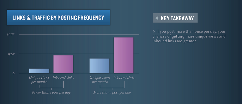
So you see how vital content updates can be when trying to drive traffic to your site.
If you’re struggling to find ways to generate and share content, here are a few you could do today.
1. You could add a blog.
2. You can interact with your own site by commenting on or updating old posts.
3. Try adding images and videos when appropriate.
4. Update your design to stay trendy.
5. Freshen up your other content like social media, FAQs, and testimonials.
It doesn’t take an army to generate frequent content updates, and the results speak for themselves.
But there’s one last thing that your customers expect:
A good offer.
If your offer isn’t appealing, then your visitor won’t stick around on your site.
Your offer is what you’re giving your customers in exchange for them giving you something you want.
It could be a more traditional coupon or discount, or it could be a free trial, whitepaper, or gift.
The best offers push your visitors further into your sales funnel.
I always recommend offering a clear statement of value in addition to a way for people to contact you.
Like this example from Bills.com:

They immediately give you what you came for. They don’t make you hunt for the offer. They simply start by giving you the tools you need to manage your bills and debt.
On the other hand, I don’t recommend forcing your user to input information too soon.
While getting information from your visitors is helpful to you, it could turn away a user who is simply trying to browse or learn more.
Finding the right offers and timing them appropriately goes a long way in meeting the expectations of your visitor.
Even one misstep can turn a visitor away, so take the time to do this well.
Pro Tip: Keep It Real!
Never intentionally mislead your visitors to believe you are something that you aren’t. Give users what they expect. Make sure that your domain name, website header, and every last drop of content is relevant to the focus of your website.
Users aren’t stupid, and they don’t like being tricked or brought to your site by way of misleading gimmicks. So, keep it real. Let your site be what it is and advertise it as such.
2. Visitors Leave Your Site When It Isn’t Usable
Overall, what your customers expect is a site that’s usable.
In the last decade, we’ve simply become used to websites that look and feel a certain way.
Users want websites that make a lasting impression,. They don’t want a site to simply act as an online billboard.
That’s why I put all of this emphasis on user expectation. People need to be able to use your website, not just experience it.
That’s a little less tangible, right?
Not quite, actually.
There are actually five different elements you can look for to establish and assess usability on a site that your visitors will enjoy.
I’ll share them with you so you can incorporate them into your next website design.
The first element of a good user design is access and availability.
What does that mean?
It means that if your site isn’t working for any reason, it will negatively affect the expectations of your visitors.
So that penny you pinched on a cheap server that’s down all the time is actually affecting your bounce rates.
It also means that elements like broken links or lack of mobile responsiveness are playing a part in how someone experiences your website.
A dead link on your site can be a momentum killer when you’re trying to convert a visitor into a lead.
And if that one landing page is always loading wrong, you simply shouldn’t use it.
A good example of a site that is always available and accessible is Facebook.

Think about it. When was the last time you can remember Facebook going down?
Without consulting Google, I honestly can’t remember.
And it’s accessible across so many platforms as well.
There’s the mobile version we all remember from our pre-smartphone days. The screen is flexible and adjusts when you minimize or maximize the window.
But there’s also an eye-pleasing mobile version that gives us the same updates and the same experience when we’re on the go. It’s even less cluttered than the desktop version so that usability is still the highest priority.
There’s even an app.
And this makes sense. You would expect a site like this from a social media platform that has exploded to a user base of more than 2 billion.

None of this has come by accident. Facebook has constantly been concerned with ease of access and constant availability as a part of its brand.
No one ever says “I hope Facebook is up.”
It just is.
And your website needs to have the same type of regularity, or else you’ll see more people leaving and fewer people coming.
But beyond accessibility and availability, you should also be able to provide a clear experience of your brand.

You don’t want to overload your site visitors with too much information, as the example above from Mineral.io founder Matt Sanocki illustrates (more on this in our post about clear email design).

You should be able to create a website that has a single focus. It should have a clear and unwavering design and purpose that your audience can jive with.
How do you achieve clarity on a website?
There’s actually more ways than one to do this, and which you choose depends on your audience’s needs.
One way to achieve this is to keep things simple. Take Samsung as an example.

Their site immediately focuses on the important aspects they want you to see. In this case, it’s the Note9.
Do you see any distractions? I don’t.
There are no frills, no bells, and no whistles. It’s just a straight-to-the-point homepage.
To take it a step further, they also try to make you feel like their site is familiar when you scroll down and see this:

If you’re already a user of their home appliances, then this will bring back your thoughts on their products. It’s a subtle yet simple nudge that helps you feel more at home on their site.
One thing you’ll also notice between those two images is that they’re consistent. The font is the same. The colors match. There’s no drastic variation that could potentially startle your visitors.
What’s more, they also provide guidance:

If you’re interested in their new phone, they provide three quick resources for you to check out that show you what’s new.
You’re not left to wonder about this information. They put it right in front of you.
They’ve structured their site this way on purpose. It provides a clear user experience that minimizes distractions and bounces.
Beyond clarity, the site also helps you learn about the product. This is largely due to the fact that it follows some pretty classic design patterns that many major websites and brands use.
Let’s say you do want to learn about trade-ins for the Samsung phone, but you don’t see the callout image at first.
You would likely scroll upward until you saw the navigation toolbar.

Notice I’ve highlighted a few options and the search tool. As frequent Internet users, we look for these things when we can’t immediately find what we want.
It’s part of what helps us learn a new website and not get lost.
You’ll also notice another common feature: the logo. And this isn’t taking into account the huge image we saw on the page in one of the previous examples or the calls to action we’d most likely be using in this case.
Once you find the page you’re looking for about trade-ins, you don’t have to dig for answers

You simply find your current phone and determine its trade-in value.
All of this is possible because this site is easy to learn. It’s not a complicated, twisting maze that requires a map. It’s intuitive and easy.
So we’ve made our site accessible, clear, and learnable. What else can we do to help meet our users’ expectations?
Let’s build some credibility.
I add this element because it plays into the overall trust equation we’ve been working with when trying to keep visitors for longer than 15 seconds.
Credibility is one of the cornerstones of any website.
Even if someone finds what they’re looking for, if they don’t trust you, then your content is pretty much worthless to them.
It’s like when someone gets fooled by The Onion, a satirical news site. But in this case, we’re talking about winning or losing a customer.
If someone leaves as a skeptic of your brand, they may never come back.
You have to establish your reliability and “realness” in one short visit.
One way you can accomplish this is with an “About Us” page. Another powerful option is social proof — putting customer reviews right on your homepage.
The content you share also plays a part in how much people trust you, and for good reason.
Take the Pebble smartwatch brand, for example. Before they sold their company to Fitbit, they had to compete against Apple in the emerging smartwatch market.
As a Kickstarter turned company, you’d be right in imagining they were in over their heads.

But, by being proactive about displaying the versatility, battery life, and durability of their product, they were able to develop a loyal customer base and even break some Kickstarter records.
The key here is to go all out with your expertise. Don’t be modest or self depreciating.
The more facts, figures, and successes you can share, the better your site will be.
Convey that visitors can trust you, and customers will use your site as a reliable source of information.
But beyond credibility, you should also strive to stay relevant.
If you don’t know who your users are or why they should use your product, you won’t be around very long.
Again, Pebble is a great example, as they were a leading brand at a time when smartwatches were still a risky concept.
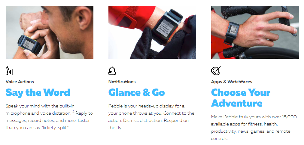
By innovating and creating useful features like speech to text, always-on watch faces, and third-party apps, they were able to cater to the crowd of individuals disillusioned by the Apple Watch.
They listened to what their users wanted and poured all of their resources into creating an innovative and user-friendly product.
In other words, they were relevant.
Before we end this discussion on usability, I want to switch gears to a more technical topic.
How responsive or mobile-friendly is your site?
If your site isn’t working on a mobile device, you’re missing out.
Mobify found that 30% of mobile shoppers have abandoned buying from a site because it wasn’t optimized for mobile.
A responsive site will change based on the needs of your audience.
For example, if you’re using a site on your browser while multitasking, you usually want to be able to fit your browser window into a smaller space.
A responsive site responds to that by shrinking with your browser.
Content will change as necessary, navigation will condense, and images and spacing will adjust, but the usability of the site is preserved.
So by design, a responsive site is also going to work on mobile.
And with mobile conversion rates only lagging 0.5% behind desktop rates in 2016, this feature is very important.

If you don’t have a responsive site, at least make sure you have a mobile-friendly version.
It will work exactly the same across all devices, and it will even accommodate for lacking elements like Flash on some tablets.
Navigation will be simpler, images will appear smaller, and your static content will remain the same.
Otherwise, it’s pretty much the same website as your mobile browser. But the key difference is that it will look good on a tablet or smartphone.
The point is that transitioning to a responsive design will help build trust, increase usability, and lower bounce.
All of the other elements rely on a clean format, which you can achieve with a responsive or mobile site.
Pro Tip: Keep It User-Friendly!
If your website is a versatile, user-friendly platform, your visitors will want to stick around to see what you have to say.
Boost your usability by keeping runtime high, site design clear, and learnability to a maximum. As long as you stay clear and relevant, your bounce rate will be low and your brand trust will be high.
And remember to keep your site either responsive, mobile-friendly, or both. Losing mobile users will mean you’re missing out on a fantastic source of conversions for your business.
3. Visitors Leave Your Site When They Don’t Know What to Do
A common mistake is to give people too much information.
It sounds weird, right? We naturally want to give people all the information so they can make an informed decision. But in reality, this hardly ever works.
Less really is more.
So, don’t give your users too many options once they land on your page. “A confused mind never buys,” says John Childers, business trainer and success coach.
For example, have a look at the following homepage:
This site is just way too busy, and look at the number of hyperlinks!
I counted 297.
And that doesn’t include the option to search (which has three radio button options also).
That’s more than 300 options. Ridiculous!
Too much information, in this instance, is a symptom of an even bigger issue though.
I’m talking about bad navigation.
Having a website that’s hard to navigate creates a frustrating experience for your users.
Sending your visitor through a maze to get to the information they want is not helpful.
And it’s also bad for your SEO.
Instead of creating a navigation nightmare, take a look at this helpful excerpt from Neil Patel’s infographic, “What Makes Someone Leave A Website:”
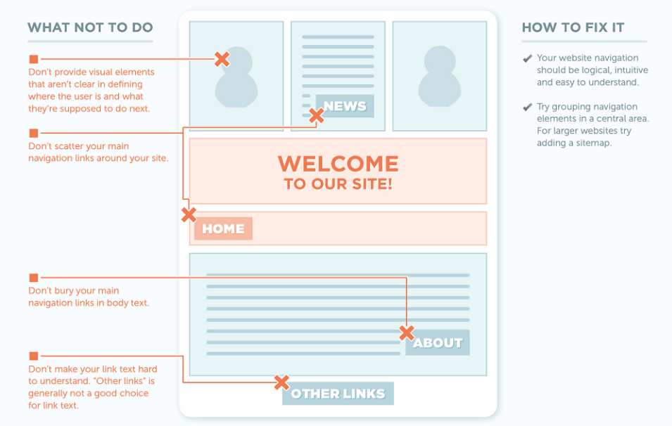
There are two big takeaways here.
Number one: Don’t bury your main navigation.
Keep it right at the top and don’t use dropdown menus. Again, Rhett and Link’s site is a good example:

Number two: Be specific, logical, and intuitive.
Think through your site’s setup like you’re a customer who is totally new to the website.
How do you think information should be organized? How can you reduce friction from start to finish?
Trying to look at your site with fresh, unbiased eyes will help you streamline navigation and reduce the headache a new user might experience.
You’ll also minimize annoyances, which is good all around.
You can also help a visitor navigate your site by directing them with internal links in your content.
If a user is reading a helpful post and you mention a topic they’re unfamiliar with that has a link, they can click on it to learn more.
And what’s more, internal links also help your SEO.
According to Yoast, internal linking helps Google understand your site.
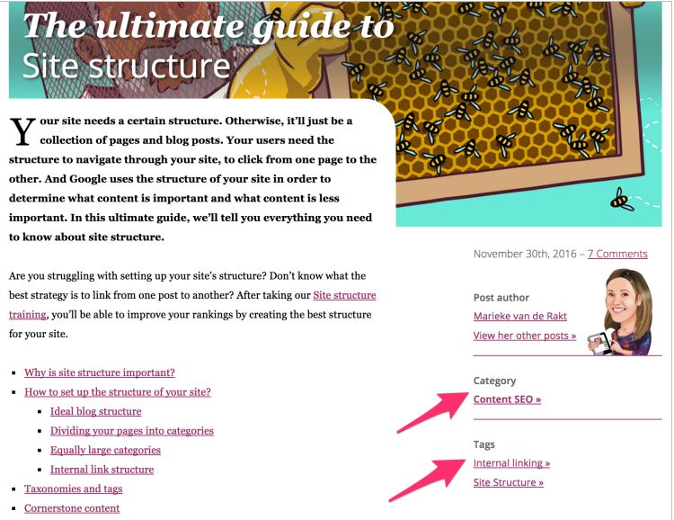
So you’re not just directing visitors. You’re also directing Google.
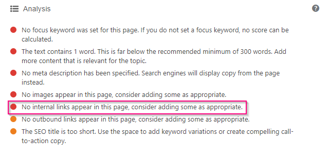
And as you can see in their WordPress plugin, they provide a red flag for a lack of internal links:
So how do you build these internal links?
First of all, you need to source your material and have a good content strategy.
Then, as you create content, use links that push viewers to check out your additional content.
It’s an awesome way to provide curation that helps build targeted content.
Just ensure that, per Google’s instructions, you keep internal links to “a reasonable number.”
In other words, don’t spam your internal links. Use them smoothly and naturally like you’re seeing me illustrate in this post.
Once you’ve cleaned up navigation and started inserting internal links, you also want to consider your calls to action.
If they’re bad or missing, then your site visitor isn’t going to know where to go if they want your help.
And that means that they’ll likely bounce.
Your objective is to instruct users about what to do, explain what they’ll be getting, and remove doubt or perceived risk when taking action.
In the example below, replacing the run-of-the-mill CTA on the left with the value proposition on the right improved conversions by 201%.
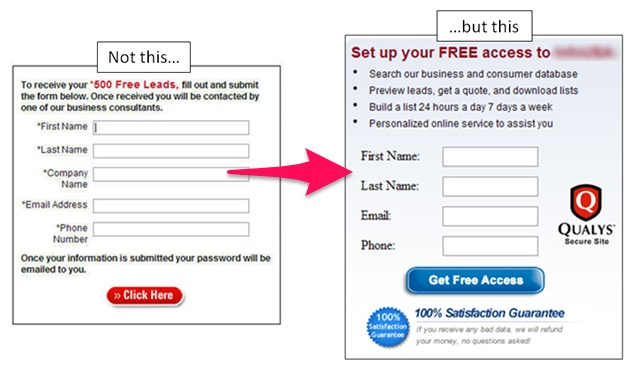
You can see how they changed a rather boring call to action into an eye-catching offer.
I know I would rather interact with that second one, and I’m sure you would, too.
You can expect that your competition has refined and optimized their CTAs. If you want to stack up to them, you have to include well-researched value propositions that appeal to your audience.
But there’s something even worse than a boring CTA: no CTA at all.
That’s just a missed opportunity. Businesses with no CTAs are letting leads slip right through their fingers. Just imagine those bounce rates.
In addition to calls to action, internal linking, and proper navigation, you should also consider how easy it is to accomplish something on your site.
Specifically, you should look at how you’re trying to close a sale with a customer.
If it’s difficult for a visitor to do what you want them to, they’ll find somewhere else to go. They’ll just buy from your competitor instead.
This is another area where bad page design can hurt conversions if you let it.
A good example of making actions easy is Amazon’s “Buy now with 1-Click” button.

When you’re browsing Amazon and find the item you want, you don’t always want to input and verify all of your information.
That’s why they conceptualized this button. It makes it so that you can purchase something immediately.
It’s the online equivalent of putting candy bars next to the store register.
Impulse buys need to be just that: impulses.
If you want to provide easy navigation and lower your bounce rate, then make it easy for visitors to accomplish the tasks they came to do.
And to compliment that idea, you need to make sure that you’re conveying benefits correctly on your site, products, or services.
The key here is perfecting your presentation. And the sad truth is that it’s an element of website design that many businesses overlook.
We’re so focused on getting our product out there that we fail to adequately guide our visitors in the right way.
We’ll take our product or service, add a good margin, and then slap it on our websites.
But how often do we consider the presentation?
You don’t expect your steak at a fine restaurant to come out on a paper plate. So why do you serve your products on a metaphorical paper plate?
Consider this example:

This example uses a few powerful presentation aspects that you can start implementing in your own designs to help show visitors what they can do.
Better yet, don’t just show them what they can do. Show them what you want them to do.
The first element at play here is a cognitive bias known as the Anchoring Effect. It’s a subtle way of presenting your most expensive option first, then making everything else seem like a deal.
You’ll also notice that all the figures are smooth. There are no decimals or added fluff.
The middle option also stands out, almost like a “pop.” They’re using color to show their visitor where they want them to look and click.
The next element you want to consider is how you can use presentation to gain trust and push your visitor a little further into the sales funnel.
Take this example from one of Crazy Egg’s own pricing pages:

Instead of waiting until we’re on the phone with you, we do everything we can with our presentation to help build trust.
The idea is that if all of these other big name brands trust the service, you can too.
You can also look for other elements like trust badges, certifications, social media buttons, testimonials, and even clear and concise descriptions.
It doesn’t matter if you incorporate one or all of these ideas so long as you are gaining trust.
Once you’ve gained trust, you have an open door toward showing your visitor how to further their involvement with you.
A great example of this comes from Hootsuite.

As you can see, their plans page doesn’t give you carte blanche when you visit their site.
Instead, they give you limited options.
This makes sense for a lot of reasons. One reason is that a crowded pricing package could simply cause confusion. You’re not showing people the way if you’re clouding the picture.
Like we saw earlier from the jam experiment, too many choices often means that your customer won’t make any choices at all.
By breaking up the selection, you can reduce your bounce rate and drive up conversions.
Another great way to lead your customer is by drawing their attention with a badge that says “best deal” or “most popular” like this example from InMotion.
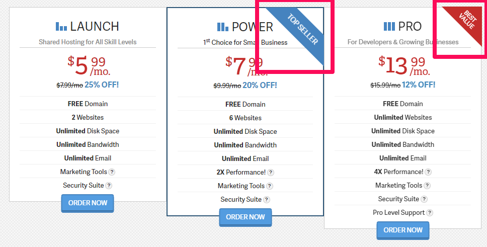
This reassures your visitor and encourages them to take a longer look at your services. It’s a form of social proof that helps push their decision.
One final thing to consider when you’re trying to direct you customers is that it is possible to create a sense of urgency.
I’m talking about the “Limited Time Offer.”
Using elements like strikethrough pricing, temporary bundles, or even a countdown timer are good ways to put a little added pressure on a visitor.
It can be the last step you need to take a customer that’s on the fence and close the sale.
It’s basic human psychology. People don’t like feeling like they’re missing out.
It’s like when a stock suddenly rises and people rush to buy it. Traders call it FOMO, or “fear of missing out.”
No one want to miss out on a great deal, so they act now when they’re told to act now.
A good example of this is Amazon’s annual holiday sale:

By using the strikethrough pricing, they give off the idea that these prices will be going up soon.
They’re also helping you count down how many days until you can’t have your purchase by Christmas.
While you might think you can get this type of deal another time, the point is that you don’t actually know when you might get another deal like this. You feel like it may never come again.
That’s why creating urgency is so powerful. It prompts immediate action without having to ask.
As long as you use urgency without looking spammy, you’ll be able to guide your visitors to wherever you need them. They’ll be around for much longer than 59 seconds, and they’ll keep coming back to you.
As you guide your visitors in their purchasing decisions, you always want to clearly explain the benefits that they’ll receive if they buy your product or service.
A lack of clear benefits about your product and its features early on will mean you’ll have a hard time moving people through your sales funnel.
HelpScout shared a powerful example that showed how Apple could have gone about marketing their iPod both effectively and poorly.

If you were in the market to consider an iPod, which description would you rather see?
I know I’d be more interested in having 1,000 songs in my pocket because 1GB is a meaningless statistic to me.
You’d have to know how many songs is equal to 1GB in order for the first ad to be effective.
Take some time to consider how clearly you display value. Even one slip could be bumping your bounce rate a little higher and sending customers to the competition.
Pro Tip: Keep It Simple!
Remember that “a confused mind never buys.” So, keep it simple and guide users through your website.
Your call to action should be blatant and easy for the user to achieve. For example, if you want users to subscribe to your mailing list, then make that your call to action and the central focus of your page. Capture their name and email quickly.
Also take time to clean up your sites navigation, internal links. Make your site easy to use. Even small improvements can go a long way in improving bounce rates.
Make it easy for the user to get what he or she wants, and you’ll be sure to get what you want. Simplicity causes your website to stand out in a very good way.
4. Visitors Leave Your Site if They Suspect You Aren’t Being Genuine
Trust is critical online. Almost anyone can create a website, including criminals. Because of this, users are going to critically analyze your website the first time they visit—even if they don’t know that’s what they’re doing. They’ll be looking for two things:
1. Proof that your website is legitimate and trustworthy.
2. Proof that it isn’t.
Now, I am assuming that your website is legitimate and your intentions are benevolent. But the question is whether or not you are clearly communicating this fact to your target audience and helping them know you better.
If you don’t have major brand recognition (i.e., Walmart, Home Depot, Bass Pro Shop, etc.) then you are going to have to establish trust with the user in other ways.
Have a look at SEOTOOL’s old homepage:

This is a legitimate site that you may have never heard of before. According to Alexa, the average user stays on this website for 15 minutes when this screenshot was taken. Users obviously trusted this site or they wouldn’t have spent that much time using it.
So, how do websites like this, without national or international name recognition, generate real trust?
Third-party validation tells users that your website is secure. The SEOTOOL website (pictured above) demonstrated this by including a badge that said their website was “Verified & Secure” according to GoDaddy.com.
It doesn’t really matter whether or not users had ever heard of GoDaddy. What matters is that a user sees third party validation—validation from an outside source.
Furthermore, the website was connected to social media. The sidebar was linked to Facebook, Google, and Twitter. These names are recognizable and demonstrate that the website has nothing to hide. This is a public website that’s active in social media, and that smells trustworthy!
Also, notice that there were several ways in which a user could get help from the website:
- Once in the footer section
- Again on the side
- Also on the top menu bar
As a result, it was clear that the user could contact someone and get the help they need. It also implied that the website (or, those who were behind it) wanted to help the user.
You’ll also want to make sure you get an SSL (secure socket layer) for your site. An SSL is a security protocol that establishes encrypted links on your site. Your customers (and Google) will know you have this set up because your http address should change to https.
Finally, notice that visitors could log in or sign up for a membership account in the nav bar. This communicates that the website has a following or community associated with it.
It feels secure, validated by community members, although no contact with fellow community members has actually occurred for the new visitor.
Customer reviews are also a great way to build trust fast, particularly in ecommerce.

Beyond these little trust-building touches, you should also be aware that your audience is looking for a certain type of personality to be on display when deciding whether or not to trust your brand.
Millward Brown found in a world-wide examination that desirability and trustworthiness were the overall characteristics that people looked for in an online presence.
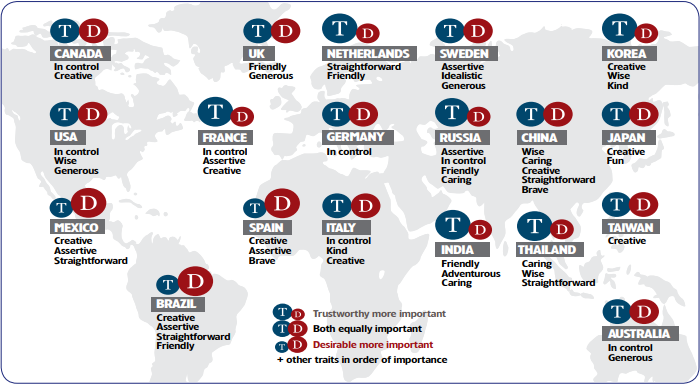
What’s more, the country you’re looking to appeal to makes a difference in what type of persona you adopt.
A company based in the U.S. with a homegrown audience needs to appear to be in control, wise, and generous.
That same company in the U.K. would need to appear to be friendly as opposed to in control.
It’s a small shift in tone that creates a difference in how people perceive you. You don’t want your site visitors to see you as lacking a genuine personality simply because you give off a different personality than your audience wants.
Look at a brand like Beats by Dre.
When you visit their site, it’s clear that their brand focuses on creating stories around successful athletes and young, trendy, rugged types.

They speak to an athlete and in-motion crowd. They display control over their image and provide a “wise” persona that empowers their audience to just be better.
Whether that’s running faster or just working harder, they have a genuine and on-tone voice.
It’s a perfect example of a brand that knows its audience and genuinely strives to speak to them on their level.
As you can imagine, they’re doing just fine with their sales.
But you need to take genuineness a step further in some instances because there are a lot of websites that undermine their voice with one little addition to their site.
I’m talking about ads.
Overwhelming visitors with ads drives them away and hurts their perception of your brand.
It makes you appear coercive and needy instead of generous and in control.
Depending on your site, even one batch of ads could drive away a visitor and raise your bounce rate.
And this is important because across the board, 82 percent of U.S. respondents to a Rakuten survey found digital ads interruptive.

That means more than half of the users on the Internet don’t want to see ads on a site.
If they do see ads on your site, you’ll be negatively impacting their trust in you.
And when everything online is exchanged through trust, I can’t imagine a worse way for you to start a relationship.
I do realize that some sites are based on an ad-driven model, and that’s fine.
Those sites may be unable to get rid of ads altogether, especially if they act as a sort of financial flotation device for the company.
If you have a site like this, I would caution that you don’t have to have ads everywhere on your site. A little judicious placement can still go a long way in building trust.
But for most sites, you shouldn’t even have ads.
In fact, I’d go so far as to say you shouldn’t even consider placing ads on your site.
Why do I say that?
For one, it doesn’t actually make you that much money.
Many advertising platforms will try to convince you that you can indeed make money, but it’s simply not true when you’re trying to use traditional inbound marketing methods.
These ads pay out based on clicks, not impressions. That means that only clicks will net you any money.
Do you want to know the average click-through rate for display ads? It’s about 0.05%.

That’s not much at all. About one click per 2,000 visitors, in fact.
If you’re wondering how that stacks up against other advertising platforms, the average Facebook click-through rate is about 0.9%.

That’s still under one percent, so it doesn’t sound like much.
But it’s a 1700% increase in the click-through rate.
These stats are even more insightful when you consider just how many visitors and clicks you would need in order to actually make money off of the ads on your website.
One blogger calculated that you’d need to get 100,000 visitors per day to make around $100,000 a year in an ideal situation.
That’s a monstrous goal, especially when you consider that you’ll be undermining the trust of more than 50% of your visitors.
And that’s just an ideal situation. The chances of you actually succeeding with less than adequate resources and with no true way of generating consistent pageviews and clicks makes the situation even more dire.
I hope you can see just how ineffective these ads are for anything.
These website ads will just undermine your ultimate goals and prevent you from making true conversions via your website.
Smart Blogger gave a fantastic reminder that banner ads can kill conversion, distract your visitors, and just make you look sleazy.
When your audience’s attention is everything, why gamble with it?
Stay away from putting advertising on your site. It’s simply a bad idea.
But enough about ads. Let’s talk about another way many sites unwittingly undermine their genuineness online.
Have you ever gone to a website in a really quiet place only to have a video start blasting at full volume?
It’s the most embarrassing moment of your life. And it’s probably also one of the most frustrating.
People hate this type of stunt. And yes, it is a stunt.
To help illustrate my point, I want to point out that one of the most upvoted posts of all time on Reddit’s r/ProgrammerHumor was a rail against this very thing:
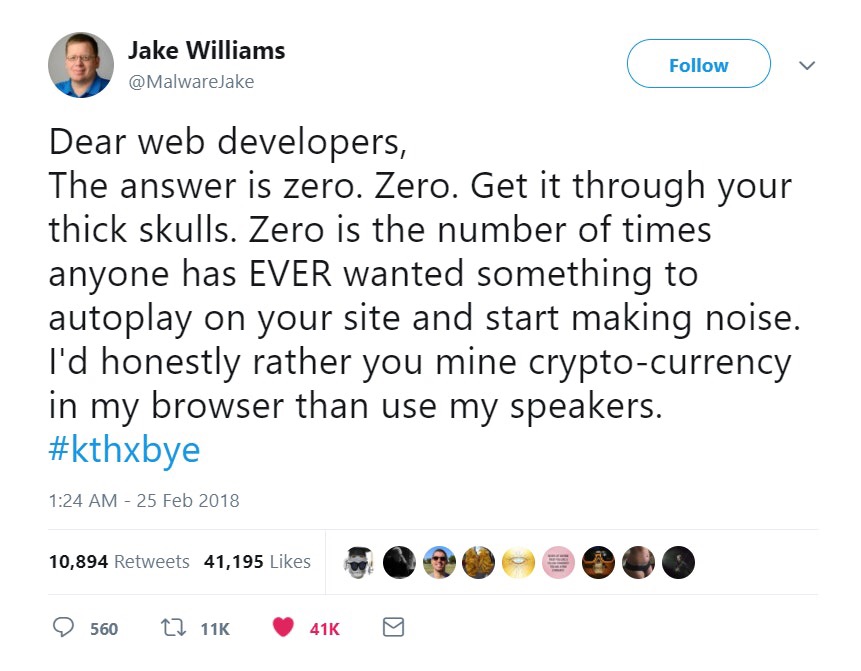
He would rather have crypto mining than an autoplay video? That’s pretty desperate.
But his point is spot on. No one wants to click onto a site and immediately start being sold to. It’s one of the most trust-breaking acts I could imagine.
Jokes aside, here’s another section of that helpful Kissmetrics infographic we pulled from earlier:

They discovered that visitors find it obnoxious when you force them to consume your content.
It’s loud, brash, and too much of a desperate plea for attention.
That’s a far cry from “in control” and “wise.”
Instead of forcing a video to play, give visitors the option to view or listen.
Or, try to convey the same info in written copy or powerful imagery.
You’ll find that fewer people will leave your site in that 59-second window.
And your customers and your bounce rate will thank you for it.
The last thing you should keep an eye out for is something you may not consider very much:
Hacking.
That’s right. If your site has been hacked, it can severely damage trust and permanently cause a disruption in your visitors’ perception of you.
You may think that it’s crazy that your site could be hacked. But think again:
Statista reported a spike in data breaches between 2015 and 2017.

And almost two-thirds of hacked sites could be compromised for an extensive period of time before anyone even notices.
And when people do notice, it’s likely too little to late.
That’s why a hacked website is notorious for damaging trust.
And for a branded website that’s looking to make a conversion, there is a direct correlation between a visitor’s action and trust.

That’s why even a single hack could be devastating. When your visitors don’t trust the security of your site, they won’t be leaving any of their information behind.
They might not even visit at all!
The crazy part is that it doesn’t even have to be a serious breach.
Take the 2013 hack on the U.K. Vogue website as an example:
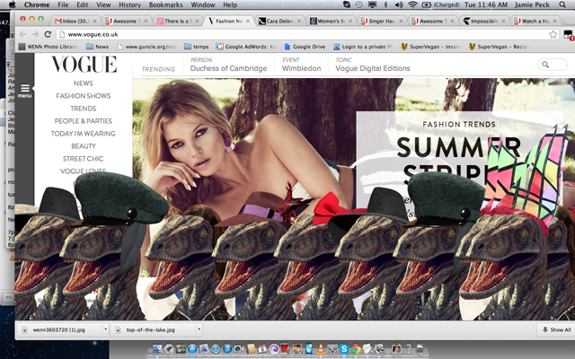
Dinosaurs wearing hats? This hack is objectively funny.
Think about what it meant for Vogue though. They had to clean it up, secure the site, and then continue on like it had never happened.
But it did happen. It was live, and people even recorded it. It’s made top-ten lists for the “best hacks” for the last few years, and I imagine it still will.
What a blow to a brand.
And this doesn’t even touch on more serious breaches like the Equifax hack in 2017 that affected the financial information of 143 million Americans.
The mad scramble to clean that up plus the missteps that Equifax made in the aftermath created an enormous controversy and more than a few class-action lawsuits.
And that all came from a single compromised password.
That’s not funny at all.
It’s a trust-destroying nightmare, and it will cause years of damage to the affected individuals and the brand.
Pro Tip: Keep It Secure!
Put recognized validation symbols on your site, and by all means, be accessible to users through social media and your website.
Additionally, keep your online personality in check with the expectations of your customers. Your brand relies on finding the right words to say at the right time.
Boost trust and keep attention by staying away from intrusive online advertising or autoplay videos. And keep your site updated and hack-free.
You’ll find that your bounce rates will dip and the general perception of your brand will be genuine and powerful.
5. Visitors Leave Your Site When You Fail to Impress or Inspire
No matter who your website visitors are, they all have one question: “What’s in it for me?”
If they don’t get that in the first 15 seconds, they’ll bounce.
You should orchestrate everything you do to impress, inspire, and motivate your audience to a sale.
In other words, it’s all about the first impression.
Your first impression is everything.
From the homepage below, you want to know why Kala is saying they’re the world’s most popular ukulele.

The crazy part of this is that not so long ago, the crazy colors, logos, layout, and popups we all thought were helpful were actually sinking our first impressions and driving visitors away.
Now, we know that the first 15 seconds is everything.
Simple imperfections add up, and our window to win attention and leads is shrinking.
Even worse, a bad first impression can drive away a visitor for good and leave your bounce rate startlingly high.
So how do we impress? How do we inspire people to not only not leave, but to choose to stay?
Not surprisingly, it all starts with audience analysis.
You can have the perfect site, good navigation, and all the bells and whistles. But if you don’t actually speak to a need, then they’ll leave.
You need to address your basic demographics, like:
- Age
- Location
- Education
- Gender
- Income
- Marital status
- # of children
- Ethnicity
- Occupation
Once you know these facts, you can dig a little deeper and try to speak to the mindset of your audience.
These are called the psychographics. They are the elements that tell you why your customer is buying, not just how old they are.
They include:
- Interests/hobbies
- Personality
- Lifestyle
- Behavior
- Attitudes
- Values
Finally, you have to decide on a voice.
I touched on this earlier while talking about the types of personalities that people trust in different countries, but let’s take it a step further.
Millward Brown shared a really illuminating diagram of how brands can have different archetypes.

This gives us a deeper look at some of the personality traits a brand can have.
The “Wise” archetype is one of the elements we saw earlier that is fairly universal. But it doesn’t always mean that a successful brand has to be wise.
A good example of this comes from the world of teen magazines.

Instead of taking on a wise persona, they approach their audience from a more rebellious point of view.
They capture the attention of their audience with alluring imagery and snarky headlines.
You wouldn’t expect the same thing from the Washington Post, and that’s just fine because they’re two vastly different brand archetypes.
And this approach is good because it forces us go beyond merely looking at how unique a brand is. It prompts us to find ways we can make it more unique.
Is your personality consistent across the board? Why or why not?
Your brand will be much more compelling and inspiring if you find and stick to your unique voice.
A customer will bounce if they stumble onto a page that sounds vastly different than your normal tone. They may not even think it’s actually you.
But besides your brand’s tone, you also want to go one step deeper. You want to look into the audience around your audience.
This advice comes straight to you from your high school English class.
That’s right. Anyone writing to an audience needs to actually consider three audiences:
1. The Primary Audience
These are the decision makers, points of contact, and the other people at the top of your list.
2. The Secondary Audience
This is the expert in your industry who will scrutinize every word you write.
3. The Tertiary, or “Shadow”, Audience
These are the people who might stumble onto your brand when you’re used as a reference on a site they regularly visit.
By stepping back and considering the entire scope of your audience, you can determine whether you should focus on a specific area or move away from it entirely.
I’m not recommending you drop everything for a tertiary audience. But keep them in mind as a potential lead one day.
Once you’ve determined your audience, it’s time to take some steps to inspire them.
A good way to start is with a “wow factor.”
If you want to take this literally, that’s quite alright. Finding a way to make someone say “wow” to your website or product is a powerful method of magnetizing your brand.
Some brands even turn this into a customer service initiative, which is also a good approach. By providing added touches that aren’t expected, you can make a lasting impression on a customer’s mind.
However, I think a more apt description of a good wow factor comes from the business magnate Warren Buffet:
“Any business with delighted customers has a sales force they won’t have to pay; You don’t see them, but they are talking to people all the time.”
An unpaid sales force? We all want that.
The wow factor we’re talking about here is simply providing a product or service that’s so good or so useful that they can’t help but share it.
Digitally, Hubspot’s Inbound Methodology coined a more succinct term for this concept:
Delight.
And it’s the final step of that same methodology: attract, convert, close, delight.

Rallying your business around delighting your customers will turn them into something greater than faithful buyers. They’ll become loyal brand advocates, too.
And this isn’t just focused on the after-sale glow that comes from a new relationship.
You can take steps to create a presale sense of delight in your brand that creates happy customers and longtime proponents.
Sounds great, right?
But how do you accomplish delight? How do you build an unpaid sales force that shares your brand with their network?
One way is simply by proactively answering questions. Create a thorough FAQ page that guides and anticipates their needs.
Or, you can present yourself as the solution to a tricky problem. This is another way in which the Pebble succeeded where others failed.
You can also try to help your audience reach a goal. It can either be a personal goal or a professional one.
As long as you approach your audience and present solutions with enthusiasm, you’ll find your brand is creating delight in its sales funnel.
One final element to consider when you’re trying to impress your audience is that you need to move with the tides and seasons.
One good example of this comes from the Portland coffee giant Stumptown Roasters.
In the middle of winter, they changed their homepage to this giant banner:

When it’s 11 degrees outside with 90% humidity, you better believe their audience wants to be warm and cozy.
This style of change is subtle, but it can’t be understated. Changing your message to meet the season can help endear your brand and inspire a quick purchase.
Another example of this comes from the laundry giant Tide. They leveraged their popular Super Bowl commercial by putting it on their homepage and turning it into an Internet meme:

After their commercials aired, the Internet exploded with every variation you can imagine of “this is a Tide ad.”
And I suppose that makes this a Tide ad?
Either way, my point is clear. Changing your approach can have a greater effect than just inspiring your audience. It can also captivate them.
When you have a captivated audience, delighting them is easy.
So go discover what your audience likes, create more of it, and share it.
Pro Tip: Keep It Appealing!
When a visitor comes to your site, they want to know just one thing: What’s in it for them?
If you want to keep them on your site, you need to appeal to them. And you need to do it quickly.
In order to do this, you have to know your audience. Appeal to the different needs or desires of your specific audience from the country you’re trying to reach.
And consider all of your audiences: primary, secondary, and shadow.
Start with your home page, and then make sure that you optimize all of your pages to appeal to your audience.
How to Improve Your Bounce Rate
I’ve given you a bunch of reasons why people are leaving your site, but how do you figure out which one is at the root of your high bounce rate?
After you’ve assessed your site for technical problems like broken links and a lack of SSL, you’re left with more subjective issues like UX.
Crazy Egg’s website optimization tools can help you analyze user behavior and improve your website introduction, if necessary.
To determine where you’re losing people, you can use site assessment tools like heat maps, scrollmaps, and recordings. Here’s a breakdown of how they work.
Heatmap
To get a high-level idea of where people are clicking and what they’re interacting with on your high-bounce pages, look at your heatmap. Here’s an example of a heatmap from Wall Monkeys.
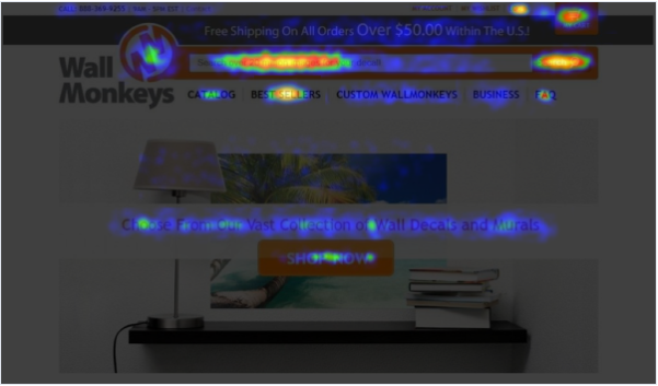
As you’ll notice, the most popular parts of these hotspots are bright yellow or orange. If the nav bar links or search field are blue (a much cooler, more subdued color), then there’s something about your site people are not finding useful, or they don’t trust. If embedded links in content are blue, that means visitor aren’t clicked. Why? It could be that visitors are getting the information they want right away and then leaving.
Scroll Map
A scroll map will tell you how far people are scrolling down on any given page before they leave.
To use this tool effectively, go into your Google Analytics and find the pages with the highest bounce and exit rates. Then, use the scroll map to see how far down the page they’re getting.
Compare this map to your heatmap to see how far people are getting down a page and whether you have hotspots that are below the fold. That could mean you have popular content that should be moved up higher on the page.
If your links aren’t glowing, your users could be getting confused, or it could be they don’t realize they have to scroll down. Individual session recordings will come in handy to determine what’s happening.
Overlay Report and List Reports
An overlay report will isolate your clickable elements and tell you which ones are doing best. So, if you have several links going to the same place, you can see which of those links is actually getting the clicks.
If you want to go even deeper, a list report provides you with rankings of your most clicked element in a table format. It includes visible and non visible elements (like the subcategories of a drop down menu, or a pop up modal).
Recordings
To see where people are bouncing from your site, recordings are going to be your most helpful tool. You can watch actual users interact with your high-bounce pages and understand the behavior of those with the least average time on page.
See where they pause, where they click, and how far they scroll in real time. Compare that to the results from your maps to better understand where your UX and design mistakes might be tripping up your visitors.
A/B Testing
Now you’ve gathered your data and analyzed it thoroughly. You’re pretty sure you know why your visitors are leaving and you’ve come up with a few fixes that you think will help.
If you’re ready to track whether those proposed design updates make a positive impact on your bounce rate and time on site, you’re at Stage 3 of the Web Optimization Lifecycle: A/B testing.
Remember WallMonkeys? They gathered the data from their heatmaps and scroll maps and created new, tweaked versions of their homepage.
They tested versions with a more fun image and one with the search bar moved to the center of the screen. In the end, they ended up increasing their conversion rate by 550%.
Not bad.

Once you’ve analyzed your heatmaps and watched your recordings, it’s time to test your hypotheses through A/B testing.
When you A/B test, you publish two versions of the same page (option A and option B) and see which one has a lower bounce rate and better average time on page.
Most likely, you’ll start out testing your old high-bounce page against a revised one you’ve put together based on lessons learned from your analysis.
Conclusion
15 seconds is all you have.
And 15 seconds is a really short amount of time.
But if you keep it real, user-friendly, simple, secure, and appealing, you’ll see results and improve your bounce rate.
Misleading your customers and failing to give them what they want is going to be damaging to the reputation of your company.
Run a tight ship on your website and make sure you deliver relevant, fast-loading content that exceeds expectations. The right design is key, here.
Remember that people don’t want to use a site that they can’t trust, that they can’t learn from, or that isn’t available. Down time will hurt you, and a lack of mobile compatibility will kill you.
Providing guidance in the midst of a sale is the number-one goal of pretty much every website. Don’t let your audience get lost or distracted. Provide clean navigation, clear calls to action, and a short path to success.
Create trust by doing away with spammy ads and videos. Instead, focus on creating a voice for your brand that resonates with your target audience. The right words at the right time will go a long way.
Finally, find ways to inspire your audience when they arrive. Know your audience and your voice, then speak boldly with the changing seasons.
In everything you do, build trust. You’ll see longer site visits, lower bounce rates, and more happy customers.