Did you know specific colors cause people to feel and respond in different ways?
Do you find yourself overwhelmed by the number of potential website color palettes? Not knowing which one to choose?
Everyone has favorite colors.
But a skilled designer understands the importance of evaluating a color scheme based on the brand. The meanings of the colors. And the products or services being promoted.
Colors actually cause emotional responses based on the palette you use.
Good color choices take careful planning.
They can influence how a visitor interprets what they see as much as a site’s layout and typography — and, when done well, they can have a positive impact on each visitor’s evaluation of the brand as a whole.
In this article, we’ll take a look at why selecting the right colors for your site matters, as well as 23 different color palettes from real sites that are effective in grabbing visitors’ attention.
Why Is Your Color Scheme So Important?
Before we jump into the process of selecting a color scheme for your site, it’s important to understand exactly why your website color scheme matters so much.
After all, you might be thinking that it’s the content that really matters. And that’s true, but it’s not everything.
People love content. They’re drawn to fresh voices and enticing information, but you have to capture their attention first. That’s where website color palettes come into play.
If you choose the right website color scheme, you get the opportunity to drastically improve your visitors’ experience with your content.
Here’s how:
1. Create brand recognition
Your site is essentially your company’s home online.
That means it needs to be an accurate representation of your brand. And beyond that, it needs to be memorable enough that users will return after their first visit.
After all, many of your visitors won’t be ready to make a purchase or other major conversion during their first visit — and they need to remember your company in order to come back and take those actions.
Fortunately, color increases brand recognition by 80%.
So, if your company already has an established color scheme, it’s essential to include this in your site’s design. This will make it much easier for visitors to immediately connect it with other places they’ve seen your brand.
Plus, if your color scheme is consistent across your entire site, they’ll know they’ve come to the right place when they return, regardless of the exact page they land on.
Beyond telling users who your company is, your web design also plays a major role in users’ snap judgments about your brand.
According to one survey, 94 percent of respondents named web design among the primary drivers of website first impressions.
Of course, web design involves much more than just color.
But given that color is one of the most obvious elements on your site, and one of the only ones a user can discern within those initial 50 milliseconds, your palette can make or break a user’s assessment of your company.
2. Shape how visitors feel about your site
To a certain extent, the reason for this is clear.
After all, color is one of the easiest aspects of a page to “understand.” It can be assessed almost instantaneously and doesn’t require visitors to evaluate copy or other messaging.
But it’s also important to consider the role that the psychology of color plays in these snap judgments.
Many companies take advantage of these connections, as illustrated by the logos in the following chart.

For example, brands that want to create a sense of creativity and imagination tend to incorporate purple into their imagery, while brands that want to establish a sense of balance and calm lean toward black and white.
This ties directly into the “personality” you want your brand to have.
In one study on brand personality, psychologist and Stanford professor Jennifer Aaker concluded that five core dimensions play a role in a brand’s personality:

Brands can sometimes mix traits, but for the most part, their “personality” is centered primarily on one. A company that sells camping gear, for example, would identify with “ruggedness,” while a fashion brand might aim for “sophistication.”
And as you can see in the logo chart above, color can play a major role in showing consumers what your brand’s personality is like.
Although most may not consciously realize that a company’s red logo is designed to create a feeling of excitement, it can still do exactly that.
And while each color can serve to create a specific feeling or reaction, certain colors are better choices than others for the majority of brands and websites.
For example, blue is often considered the safest choice. This is, in part, because it’s the most common “favorite” color among the majority of the population.
In fact, 57% of men and 35% of women say it’s their favorite color.

So, if you want to appeal to a wide audience, this could be a great choice for your site. In fact, this might be why some of the most-visited sites today, like Facebook and Twitter, use it for their logos and branding.
It’s also worth noting that blue is also commonly associated with feelings of trust, authority, and reliability.
But that doesn’t mean it’s the best choice for every site. It all depends on the feeling you want to convey to your visitors.
For example, if your brand centers on health and wellness, green could be a better option for creating that association. And if you want to get your visitors excited and drive them to take action quickly, red could be more effective for helping you accomplish that goal.
So, as you select colors for your site, consider the emotional reactions they might drive in your visitors.
For example, if you’re trying to create a sense of tranquility for your yoga studio’s website, red might not be the best choice — and it’s best to know that before you invest serious money into your design.
3. Develop a sense of order
Aside from the emotional responses the individual colors you choose might evoke, it’s also necessary to consider the way the colors on your site interact with one another.
The best way to do that is by looking at a few basic principles of color theory.

If you’ve ever taken an art class or looked at any design-related resources, you’ve probably seen something similar to the color wheel in the graphic above.
The most common concept illustrated within this wheel is the relationship between primary colors (red, yellow, and blue), and the secondary and tertiary colors that are formed by mixing them together.
But beyond that, this wheel can help you create color harmony or a visually pleasing arrangement of colors. A harmonious web design palette can help you establish a sense of balance and order.
There are three widely-accepted types of color schemes you can use to establish this type of harmony: analogous, monochromatic, and complementary.
An analogous color scheme is made up of colors that fall side-by-side on the color wheel. This is one of the most difficult palettes to do well since the colors can easily overpower one another.
That being said, analogous color schemes are also some of the most vibrant.
So, if you want to create a colorful, visually interesting site, you might do well with a palette similar to the following three examples:

A monochromatic color scheme falls on the opposite end of the spectrum from the previous type. As the name implies, it’s made up of one main color, but the intensity and lightness of the shades vary.
These palettes are some of the easiest to create and the “safest” to implement because varying shades of the same color rarely ever clash or feel too busy.
So if you’re going for a relatively simple look on your site, a monochromatic color scheme like these three could work well for your brand:

Finally, a complementary palette falls somewhere between analogous and monochromatic schemes in terms of variety.
It’s composed of colors that lie directly opposite of each other on the color wheel. So while it involves more colors, those colors naturally complement each other and won’t overwhelm visitors.
If you want to include some variety in your color scheme without making your site appear too busy, a complementary color scheme like one of these could be the perfect choice:

Of course, these three aren’t the only types of color schemes you can create. In fact, the best palette types vary based on who you ask.
A triadic color scheme is one of the main options.
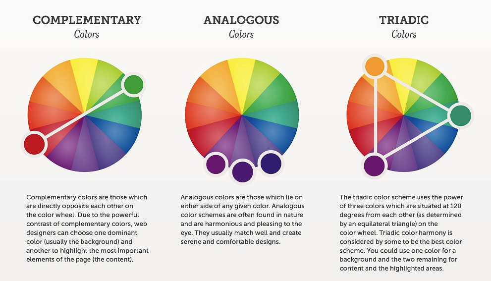
This color scheme involves using three colors that are situated 120 degrees from one another on the color wheel. In the graphic above, those colors are orange, green, and purple.
As you select your colors, remember that the types listed above aren’t definitive rules. They can give you a general idea of the overall feel you want your site to have, but they’re by no means the only ways to create a palette that works for your brand.
Regardless of the type of palette you go with, you can use it to create a hierarchy of the most important content on each of your pages.
4. Make certain elements stand out
As I mentioned in the previous section, a defined color website palette can be helpful for signifying that certain elements are important.
You can maximize this impact by keeping the Isolation Effect in mind as you determine how to use your color scheme on your pages.
The general idea behind this psychological principle is that the more an item stands out, the more likely it is to be noticed and remembered.
Make sure that the colors you choose give you the ability to make certain calls to action stand out on your pages without clashing with the rest of your design.

This approach is in line with most consumers’ preferences, too.
In two studies, Aesthetic Response to Color Combinations and Consumer Preferences for Color Combinations, researchers found that while consumers prefer color combinations with similar shades, they also favor palettes with a highly contrasting accent color.
The first study showed that “pair preference and harmony both increase as hue similarity increases.” But, “although pairs with highly contrastive hues are generally judged to be neither preferable nor harmonious, figural color preference ratings increase as hue contrast with the background increases.”
In the second study, researchers found that, “people generally like to combine colors that are relatively close or exactly match, with the exception that some people highlight one signature product component by using contrastive color.”
So although your accent color should have a strong contrast, it’s okay — and even preferable — if the rest of your palette is made up of relatively similar shades.
This means that creating web design palettes that include one strong, attention-grabbing accent color is not only effective for isolating certain elements but is also a great way to create a combination that many of your visitors will like.
5. Simplify design-related decisions
When it comes to running a website or a business (or both!), it’s always a good idea to look for ways to simplify basic processes.
After all, the less time you spend on basic tasks, the more time you’ll have to spend on processes and decisions that have a bigger impact on your success.
And establishing web design palettes is a great way to cut down on the time it takes to create new pages. When you have an established color scheme, you make basic design choices much easier, both for yourself and for your designers and developers.
This is especially true if you take the time to document your palette in an easy-to-use way like this business did:
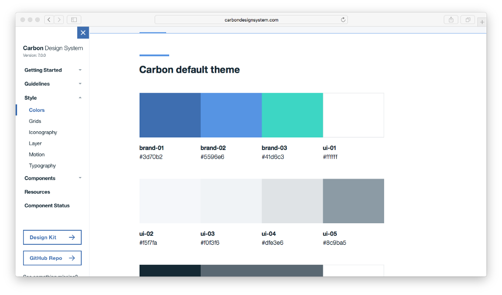
When you create a user-friendly document of your palette, you manufacture an at-a-glance resource with all of the possible options for each element.
This way, if you (or your designers) are having trouble determining which color to use for a CTA button, you can simply reference the document for a complete list of your options.
So instead of racking your brain for all of the various possibilities, you can choose from a pre-set list of colors. And once you select a few to use or test, all of the HEX and RGB codes are already right in front of you.
How many colors should you incorporate?
It all depends on the complexity of your design and the types of color combinations. For instance, if you’re using a monochromatic web design palette, you might need seven or even more shades of that color to capture enough variety on the screen.
You’ll want to specify colors for specific parts of your site, such as text, backgrounds, links, link hover colors, CTA buttons, and headings.
How to Choose a Website Color Scheme
If you’re not sure how to select the best web design color palettes, check out this video I created. It walks you through practical tips for choosing a website color scheme.
Ideally, website color palettes reflect a business’s values, beliefs, and purpose. Loud colors can indicate a less formal atmosphere and more excitement, while subdued colors lend a more sophisticated or formal note to the business.
But that’s not always easy to translate when you’re staring at thousands of potential color combinations. Let’s look at 23 great website color palettes that can help you increase engagement.
16 Great Website Color Palettes To Increase Engagement (2020)
The following sites use various website color palettes to great effect. They’re carefully chosen for the emotions they evoke and the feelings they convey.
1. Mea Cuppa

The Mea Cuppa website uses an eye-pleasing color palette that incorporates a couple of jewel tones (ruby and emerald) for maximum vivacity, but otherwise relies on a neutral, monochromatic palette of browns and greys.

The web design palette evokes a coffee shop feel and is reflected in the site’s hero image, which creates cohesion.
2. The Big Top

BigTop is a community that specializes in helping startups network. The site uses an unusual but extremely attention-grabbing combination of jewel tones that range from purple and blue to bright orange and yellow.

The primary colors are all cool colors, which makes the warmer colors pop. You’ll notice in the homepage screenshot that the orange and yellow CTA grabs your attention before anything else.
3. Tori’s Eye

Our third example comes from Twitter visualization tool Tori’s Eye. This is a great example of a mostly monochromatic color scheme. Here, we see the effects of a simple yet powerful color palette centered around shades of green.

This color scheme is often easy to pull off, as one shade of a color will almost always work with another shade of the same color.
4. BarkBox

The dominant pink color on the BarkBox homepage is repeated throughout the site in different shades. It contrasts beautifully with the blue color that’s used in the logos and CTAs throughout the site.

Using complementary colors to draw visitors’ attention where you want it can help improve any website color palette.
5. Cheese Survival Kit

Red is an extremely popular color for a website color palette. It can convey a rich mix of emotions, which makes it very versatile. It’s particularly powerful when used in small doses, as you see on the Cheese Survival Kit website.

The red is tempered with more neutral colors, and the blue helps pack a punch for CTAs and other areas where the business wants to draw the visitor’s eye.
6. Nordic Ruby

Nordic Ruby, a conference in Stockholm, has a beautiful website designed in rich jewel tones. The colors chosen for this website color palette lend it sophistication and set it apart from less impactful designs.

7. Lake Nona

Lake Nona is a website for a specific place — specifically one near the water. Consequently, it’s not surprising to see a blue color represented here. The other neutral colors let the blue stand out nicely.

8. LemonStand

Again, there’s no surprise that a company named Lemon Stand would have yellow in its website color palette. The blues and grays pair nicely with the yellow and help temper its brightness.

9. Mint
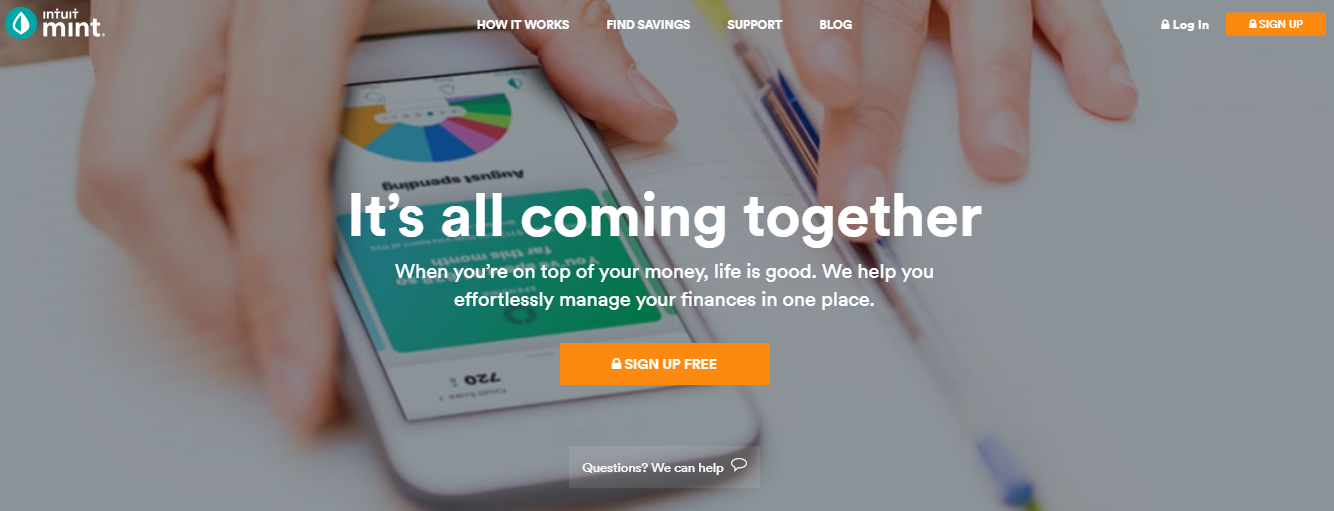
Mint is a website dedicated to finance, so the use of greens and blues are good choices. They help convey calmness, peacefulness, and trust. Neutral shades in the brown family make it an overall earthy color palette that soothes the senses.

10. Odopod

Odopod goes with the monotone color palette, but helps avoid looking boring with a gradient on its homepage. The large typography offers excellent contrast, and it’s obvious where they want you to click.

11. Fiverr

You might notice that many companies reserve a specific color — in the case of Fiverr, green — exclusively for CTAs. It doesn’t appear elsewhere on the site. In fact, it wasn’t even picked up by ColorFav because it’s dominated by the more neutral colors.

12. Digital Photography School

You would expect a business centered on the graphic arts to have a commanding website color palette, and Digital Photography School doesn’t disappoint. The vibrant colors help draw the viewer in. And, just like Fiverr, the orange used in the CTA doesn’t even appear on the site’s palette because it’s used sparingly for impact.

13. Ahrefs


Ahrefs is an example of a website that uses its color palette liberally. A darker blue serves as the dominant color, but variations of it exist throughout the site. The same goes for the orange, pink, and teal colors.
14. Millo.co

Millo.co uses a very simple website color palette, and it’s better off for it. We know exactly where to look when we visit a site like this.

15. Brian Gardner

Some companies and individuals take the monochromatic color palette to the extreme. Brian Gardner, web designer, uses a black and white color scheme that works perfectly. It’s based on his brand of minimalism, so it reflects his values and beliefs.

16. Loom

Soft colors can work well when you want to put the visitor at ease. Loom employs liberal doses of salmon and baby blue. It works well, especially with the darker blue color available for CTAs and other important elements on the page.

A Handy List of Resources for Picking the Perfect Website Color Palette
Here are 18 color palette resources to set you up with the perfect palette for your website.
First, do you need inspiration?
1: BrandColors

BrandColors shows you how leading brands use color to differentiate their businesses, tell their brand stories and let their customers know what they stand for. You can scroll alphabetically through a list of corporations, nonprofits and startups, or search by brand name.
Looking for a readymade palette?
2: ColourLovers

ColourLovers is a forum site for palette design, with almost 2 million palettes submitted by its users. You can hunt up ‘palettes that include this color,’ browse, or follow designers. Often, you’ll find variants of the same palette, giving you hue and saturation options ready made.
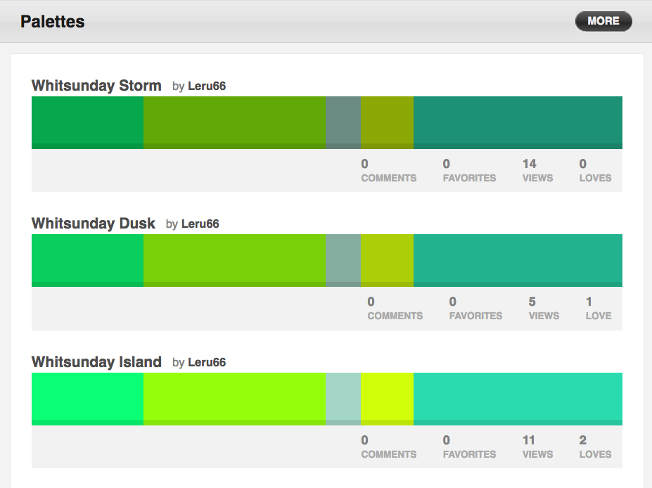
(Complete with whimsical names.)
3: ColoRotate

ColoRotate comes with a library of color schemes you can browse, select from and modify. If you want to build your own from scratch, you can, with a 3D color tool. And you can use the scheme you created straight in PhotoShop or Fireworks, with the ColorRotate plugin and iPad app.
Match Your Branding
But what if you already have images, logos or branding that your website colors have to match?
4: Color Hunter

Color Hunter isn’t a tool with a massive range of functionality, like some of the all-in-one powerhouses on this list. Instead, it’s a solid solution for one thing: tracking down a particular color. Go to the site, then drop an image in and the tool will create a palette for you from the image. This is a solid way to create color palettes around images you need your site to harmonize with, and you can also use it to reverse-engineer the palettes of sites you like the look of.
5: Pictaculous

Pictaculous generates color palettes from photos – upload a photo, and Pictaculous will suggest colors to match it. As well as offering you a palette based on the photo you upload, Pictaculous will offer ready-made color schemes that match.
These tools will generate entire color palettes.
6: Adobe Color CC Color Wheel

This tool used to be known as Adobe Kuler, and it started out as a basic color comparison site. Now, it’s a full-power color palette construction system. It lets you try out, compare and save color combinations based on a color sphere. You can choose types of palette and generate five-color palettes with various levels of input from the tool including fully custom and near-automatic.
7: Paletton

Paletton lets you build a color palette fast. Select the scheme you’d like: mono, complementary, triadic, tetradic, analogous or accented analogous. Then, when you change one color in the scheme, the others change to match it.
8: Color Spire

Color Spire builds you a color palette from a single color. You select a starting color, and Color Spire suggests a palette of colors to use in combination with it. It also provides a preview, letting you see how the colors it recommends would look in a sample website.
9: MudCube Color Sphere

(Source: https://htmlcolorcodes.com/resources/best-color-palette-generators/)
MudCube’s Color Sphere is a Chrome plugin that helps you harmonize colors, control for colorblindness and identify hex codes. You can also export color schemes directly into Illustrator, PhotoShop and CoIRD.com.
10: Cohesive Colors

Cohesive Colors takes your current palette and lets you manipulate it, adding an overlay tint in the color of your choice and generating a new palette from an existing one quickly and easily.
11: Hex Color Scheme Generator

This tool lets you generate colors that work in combination with a color you already have. It’s a little more basic than some of the color sphere tools in this list. You paste a Hex number into the tool or click on the color wheel, and it returns with a set of 3 additional colors that match, complete with Hex codes.
Building Your Colors
Some of these tools need you to have a color in mind to begin with. If you don’t have branding you need to match, and BrandColors didn’t show you anything that caught your eye, you can start from scratch.
12: The Color App

This iOS tool lets you make fine decisions between similar colors, by laying them out clearly with some space between them rather than in gradients, as in color wheels and spheres. Big color grids let you use your whole screen (iPad Pro users, rejoice!) and it also lets you sample colors, find RGB, Hex and HSLA values and create color palettes from scratch.
13: Color

Color, by HailPixel, lets you really nail down exactly which color you want, and then gives you the Hex code for it.

Hover over the screen and the color changes very slightly as you move – it’s like a color sphere that constantly feeds back in Hex codes. Move across the screen for color, up and down for saturation.
Get the Codes for a Color
If you’ve seen a color somewhere and you don’t know exactly what to call it, these are the tools for you.
14: SpyColor

SpyColor gives you information about any color, including the Hex, RGB, CMYK and other codes. The tool shows you range of scheme types like complementary, split-complementary, triadic, clash and analogous, on each color page.
15: HTML Color Codes

HTML Color Codes finds hex codes for image colors in your browser. You select a picture from your desktop and click ‘view image,’ then mouse over it to get Hex codes for the different parts of the image.
Test Your Palette
Once you have a color palette in place, you need to know if it’s going to work for a variety of visitors.
16: Check my Colours

Check my Colours lets you check your colour palette’s foreground and background colors, making sure that they provide sufficient contrast for someone having color deficits. If you want to colorblindness-proof your site, or just get the most effective and intuitive color combinations from a UX perspective, this tool is invaluable. Drop a URL in and it spits out a report:
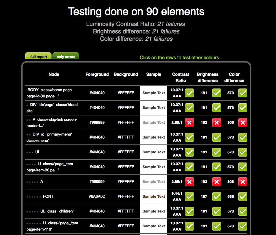
…that basically goes through all the code for your site and grades all the visual elements in it on visibility.
Matching Images
Now your color palette is in place and you know it’s super visible, you’ll need some images to match.
17: TinEye

TinEye is better known as an alternative to Google Image Search. But it also works as a way to explore color combinations, using a database of over 10 million Creative Commons license photographs harvested from Flickr. If you’re looking for images in the perfect color combination, this is a great, easy-to-use way to hunt them up.
18: Designspiration

Designspiration lets you select up to five hues from a full-page palette, which gives you the opportunity to see the colors clearly. Then, the site displays all the images in its database with that color combination. It shows you Hex numbers clearly, and lets you click on individual Hex numbers. You can save images to collections on the site as well as downloading them.
How to Use a Website Behavior Tool to Analyze the Best Color Palettes
You might think that all you have to do is choose a website color palette and move forward full steam ahead. That’s not the best way to go about business.
Think about it. You test your CTAs, headlines, and other website elements. Why should color be any different?
A website behavior analysis tool like Crazy Egg offers the perfect opportunity to figure out how your audience responds to your current color palette.

User behavior reports like heatmaps will tell you whether your colors are catching the eyes of the people who matter most — your current and potential customers.
When you have raw data in your hands, you can make informed decisions about your website color palette.
Imagine that you’ve created a website for an audience of sports lovers and have chosen the colors blue and pink as well as a couple neutral grays. Your audience doesn’t like it.
Maybe it doesn’t convey your image well enough. Sports lovers might like bolder, darker colors and earthy tones.
You won’t know until you test.
Start Using Crazy Egg
Create a free Crazy Egg account to begin your free trial or log in to set up your user behavior reports.
You can run multiple tests at the same time so you don’t waste hours, days, or weeks. Instead, you can capture data in real time and refocus your efforts on finding the best color palette possible.
Conclusion
Your website color palette should not only reflect your brand, but also appeal to your audience. Otherwise, people might be turned off by your site without even realizing it.
Start with what you like. Consider choosing a palette that’s different from others in your niche so you stand out. Then begin testing.
It’s easy to change the colors on your site. If you know HTML, you can alter the HEX codes in your theme files manually. Many WordPress themes also come with customizers that allow you to change colors without knowing any code.
Give yourself the opportunity to make your site as visually appealing and memorable as possible.