A heatmap gives you a visual breakdown of where users spend the most time, where they are engaging, clicking, losing interest, getting stuck, or abandoning a cart. This makes it easier to identify what’s working, flag problem areas, and make data-backed decisions to improve your site.
Getting started is simple. Most tools require minimal setup and begin collecting data right away.
What is a Website Heatmap?
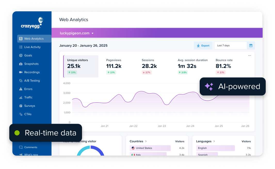
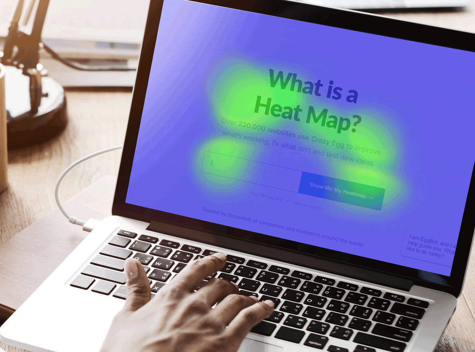
A website heatmap is visualization that aggregates engagement data and shows how users interact with a web page by highlighting where they click, scroll, or hover.
Heatmaps use color gradients to represent engagement — hot colors (red, orange, yellow) indicate high activity, while cooler colors (blue, green) show less interaction. Areas with no color indicate no engagement.
This visualization makes it easy to identify patterns, such as whether users are clicking on important buttons, ignoring key sections, or getting distracted by non-clickable elements.
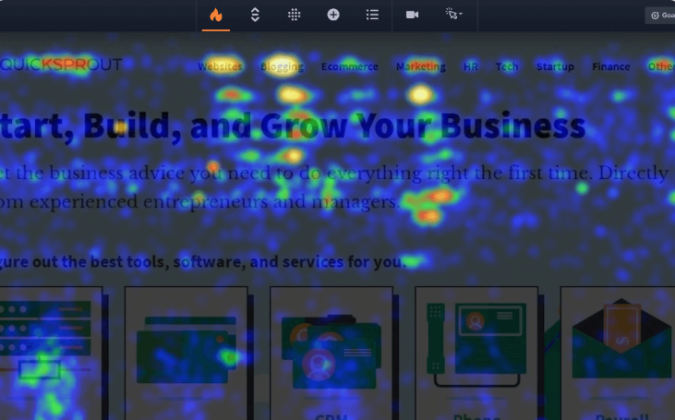
In the above heatmap, you can see “hot spots” where clicks and user activity are highly concentrated. There are also areas with scattered clicks, as well as those with zero signs of engagement.
At a glance, heatmaps show you where users are really engaging with your page. If visitors aren’t interacting with critical areas — like a checkout button or lead magnet — a heatmap lets you know where those lost conversions are going.
What You Can Learn from a Heat Map
Heatmaps turn raw engagement data into a clear picture of how visitors interact with your site, revealing both engagement patterns and problem areas that may be hurting conversions.
Heatmap data can help you to quickly see:
- Which headlines draw visitors in and make them click
- Which images and elements attract attention
- Where visitors are clicking, or trying to click
- What distracts visitors from your core content
- Whether visitors see key offers, forms, and email opt-in boxes
- Which areas of the page receive the least engagement
- If people can locate search options easily
- Whether users engage with secondary content
Getting insight on any of these points is valuable. Who wouldn’t want to know what the top performing CTAs are, or whether people are engaging with content you spent good money on. Heatmaps allow you to understand and address these areas directly. This can help you create a better user experience, decrease the bounce rate, and ultimately drive conversions.
With heatmaps, a lot of the guesswork is gone. You can learn exactly what users are doing and where they stop short of taking the next step with your brand. This helps you make sure you’re getting the most out of every visitor, guiding them through an experience that’s designed to convert.
How Does a Website Heatmap Work?
Once you add a small snippet of code (provided by the heatmap vendor) to the head section of your website, the tool automatically collects user interaction data — clicking buttons, scrolling through content, or moving their mouse. The data is then processed and presented as a visual representation, so you can easily see where users focus their attention.
There is a lot going on behind the scenes to make sure that the heatmap tool collects data correctly, but you certainly don’t have to understand the mechanics to be able to use it.
Since heatmaps rely on aggregated data, they become more reliable with larger sample sizes. A heatmap generated from just a handful of visitors may not be representative, so it’s best to let data accumulate for at least a week.
A common rule of thumb is to collect data for two complete business cycles, preferably without a holiday or unusual event that could skew behavior.
With enough traffic, a heatmap provides a clear snapshot of how users interact with your site, making it easier to fix problem areas and optimize for conversions. If you don’t have a lot of traffic on your site, you might want to use session recordings, which let you see exactly what users saw when they converted, dropped off, rage-clicked, and so on.
12 Tips for Reading Website Heatmaps Like a Pro
While website heatmaps are intuitive, coming up with useful interpretations of the data requires a bit of finesse. It’s not enough to just see where users are clicking — it’s about knowing which behaviors to focus on and how to act on those insights.
The more heatmap data you read, the better you will get at acting on it. It sounds trite, but you just have to do a lot of reps, see a lot of pages, make changes, and analyze results. Over time, you’ll get better at empathizing with user struggles, sensing what they need, and recognizing friction in their experience.
There is no one way to analyze a heatmap, but there are definitely some best practices to keep in mind and some classic mistakes to avoid. Use this quick list of tips for reading heatmaps to get started on your own analysis.
- Prioritize high-value pages: Focus on pages that directly impact conversions, like the home page, landing pages, product pages, pricing pages, and checkout flows.
- Watch for dead clicks: If users are clicking on non-clickable elements, like images or text, it indicates they expect interaction. This signals an opportunity to make those elements clickable and clarify their function, or to de-emphasize them and drive clicks towards desired elements.
- Segment heatmaps by traffic source: Users from paid ads, organic search, and social media behave differently. Segmenting can reveal unique behavior patterns and opportunities to increase conversions for different groups
- Look for differences across devices: Desktop users click, mobile users tap, and they interact with the same pages very differently. Reviewing heatmaps by device type helps ensure that all users are getting a quality experience, and you’re not losing conversions due to tiny buttons, menus that are impossible to tap, or other common issues.
- Don’t overreact to isolated behavior: A single hotspot or scroll pattern may not indicate a widespread issue. Always validate findings with additional data from click maps, scroll maps, and other analytics tools.
- Identify unnoticed CTAs: If users aren’t clicking on important buttons or links, consider adjusting size, color, placement, or copy to improve visibility. If that doesn’t help, perhaps you need to write a better call to action.
- Use heatmaps to optimize forms: Using heatmaps on forms can reveal where users hesitate or abandon input fields, helping you streamline the experience and increase the percentage of conversions.
- Filter by time and day: User behavior may vary between daytime hours, evenings, weekends, and so on. Filtering heatmap data by this way can help you ensure that you are putting your best foot forward with each of these different audiences.
- Track behavior after major changes: Compare heatmaps before and after promotions, redesigns, or seasonal traffic spikes to see how user behavior shifts.
- Don’t ignore low-engagement areas: Everyone looks at hot spots, but colder zones can be just as informative. If users ignore a key section, it might require revision, or be beneficial to replace the section with something new.
- Combine heatmaps with other tools: Heatmaps show where users interact but don’t tell the whole story. Pair them with session recordings, conversion tracking, or A/B testing for deeper insights.
- Check heatmaps routinely: User behavior evolves, so revisit heatmaps periodically to ensure past optimizations are still effective.
More Types of Website Heatmaps
Most popular website analytics tools include several different ways to heatmap the click data, along with other reports to give you a more nuanced idea of what users are actually doing on each page.
Brands use their own terminology for these reports and tools. For example, what I call a click map below is called heatmap on some platforms, and Crazy Egg calls it the Confetti Report.
The specific terminology is less important than understanding what each heatmap can show you about user behavior.
Scroll maps
Scroll maps show where users move around a web page, how far they scroll, and where they start to drop off. The warm areas show more engagement than the cool areas, letting you see how far down the average user scrolls.
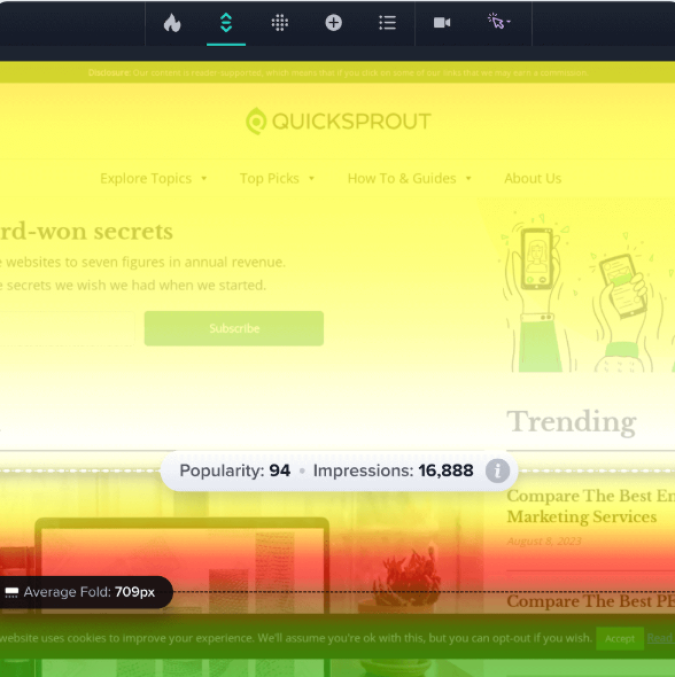
If visitors consistently stop scrolling before reaching an important offer or call to action (CTA), that is a giant red flag. When the typical user doesn’t even see the offer you want them to click, it’s definitely costing conversions.
Scroll maps supplement the click data you get from heatmaps by telling you whether critical sections are even seen. If a crucial CTA has low engagement, scroll maps can tell you if it is a visibility issue. I’d check that first before spending time trying to refine the offer, make it more interesting to users, etc.
Click Maps
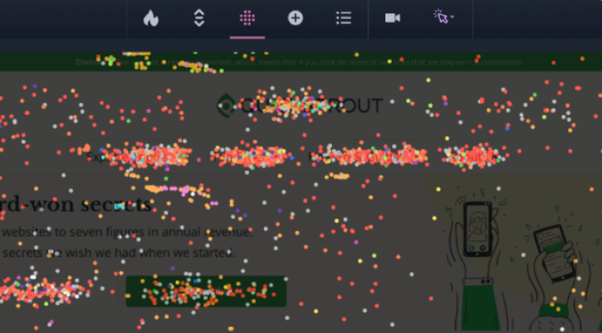
Click maps show the location of individual clicks on a page. It’s very straightforward.
Typically, you can segment the click map data by factors such as traffic source, time of day, referrer, device type, and so on. Comparing the specific click patterns between mobile and desktop users, for example, is a great way to diagnose usability issues that are hurting conversions.
Click maps add precision to website heatmap analysis by showing exactly where interactions occur. A heatmap can highlight a busy area on your site, but a click map clarifies whether users are engaging with intended elements or getting distracted.
Identifying “dead clicks” where users are interacting with non-clickable elements is critical. It’s frustrating for users — clearly they expect something to happen when they click — and signals that you could be offering a link, resources, or help.
Users want to click through, they just can’t figure out how. It’s a clear opportunity to increase your site’s usability and increase conversions.
Hover Maps
A hover map tracks where users move and rest their cursor, which suggests areas of your site where users are showing interest or hesitation. The output looks very similar to a typical website heatmap.
Hover maps are not as clear an indicator of attention as heatmaps or click maps, but they can reveal which sections users linger over before converting or exiting the page. If visitors hover over key content but don’t engage, that’s a sign that people could be confused, uncertain, or unconvinced by your messaging.
When To Use A Website Heatmap
If you are serious about driving the conversion rate on your website, I would use the full set of website heatmaps once a week on the pages you really care about.
It’s a really quick way to validate the efficacy of website changes you’ve made — are you actually improving conversions and UX? And it’s also just a really great way to get ideas for future improvements and tests you want to run.
Here are a few scenarios where having heatmap data handy can help you quickly make better marketing decisions.
Website redesign
Redesigning a website can be an expensive, time-consuming undertaking. The last thing you want is a redesign that doesn’t work better than the original.
Graphic designers and UX professionals can use heat mapping tools to understand how user behavior is impacted by important typography elements like color, whitespace, contrast, and hierarchy, ultimately helping a website convert users more effectively.
Obviously, graphic designers already know all this stuff in principle. But no two audiences behave the same way. Wouldn’t it be nice to give the designers some readily-accessible visuals that show them exactly what your target audience is engaging with (and what they neglect?)
Running heat maps before designing and launching a website redesign could save you from missing the mark and winding up with a site that doesn’t convert, or that your particular audience finds tough to navigate.
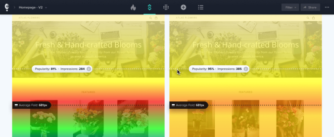
A/B testing
Using heatmaps to gather insights from A/B testing results is a great idea. The basic idea of A/B testing is to split traffic between different versions of the same web page and see which one performs better. It’s good for testing small changes and seeing what really resonates with your customers.
Heat maps can give you instant, usable insights into exactly what your visitors do differently on different website versions you’re testing. Most A/B testing tools report basic metrics like clicks, click-through rates — you can see which version “won” based on the goals you set — but heatmaps can be instrumental for figuring out “why” a specific test did so well.
In the example below, a Crazy A/B test has incorporated a scrollmap, which allows us to see that users start to lose interest much earlier on one page than another.
Content marketing
Are visitors engaging with your content in a way that leads to conversions? Heatmaps offer direct feedback on how well your content marketing strategy speaks to users.
If users frequently engage with a product feature breakdown, pricing table, or case study link, it signals strong interest. You are giving people what they need in order to take the next step.
If a core benefit statement is in a super visible area, but it has sparse engagement, the messaging may need refinement. It’s probably a good idea to use a different persuasion technique to reach users on this page.
By analyzing heatmaps, content marketers can fine-tune how they present value propositions, redesign content that isn’t attracting attention, and steer users toward page elements that drive conversions.
Usability Testing
Heatmaps can help you find issues that work against users and make it harder for them to use your site. By investigating where users engage, hesitate, or drop off, heatmaps provide a data-driven approach to improving usability, reducing friction, and recovering lost conversions.
Let’s say you’re an online retailer, and you’ve found that plenty of people are adding items to their shopping cart, but then they’re abandoning their cart at the last minute.
A heatmap can reveal whether critical elements — like the checkout button — are going unnoticed or competing with distractions. For example, if a checkout button gets little engagement, it may be too small, too low on the page, or blending into the design.