A click map is one of the fastest ways to see what’s working on your site, what’s not, and where you might be missing opportunities.
Once you know how to interpret clickmap data, it’s easy to find user experience (UX) issues, sections with poor engagement, and dozens of potential actions to improve conversions — all in about 20-30 minutes a week.
You can get really quick at this, and use click maps to provide clear, readily-understandable visuals that get everyone on the same page. A click map can be shared with a design team, freelancer, or anyone who wants clarity on your rationale for making website changes.
Click Map Basics
What is a click map?
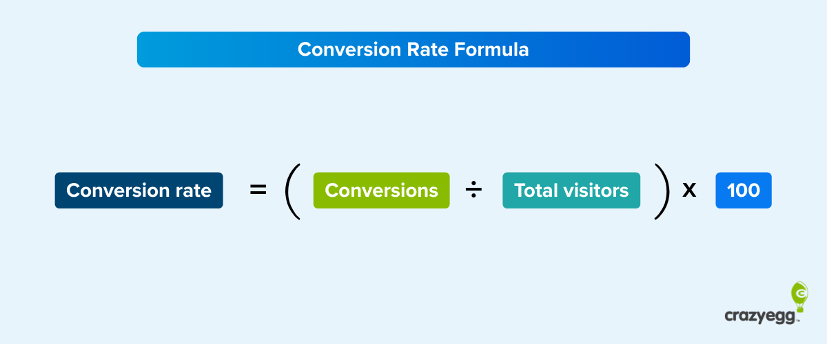
A click map is a visual representation of where users click (on desktop) or tap (on mobile) across your website. It focuses solely on clicks and taps — not scrolling, hovering, or movement.
Click maps log each user click during a given time period (a few days, a week) and then map it to the exact coordinates on the page. This data is then aggregated and visualized in a clickmap report.
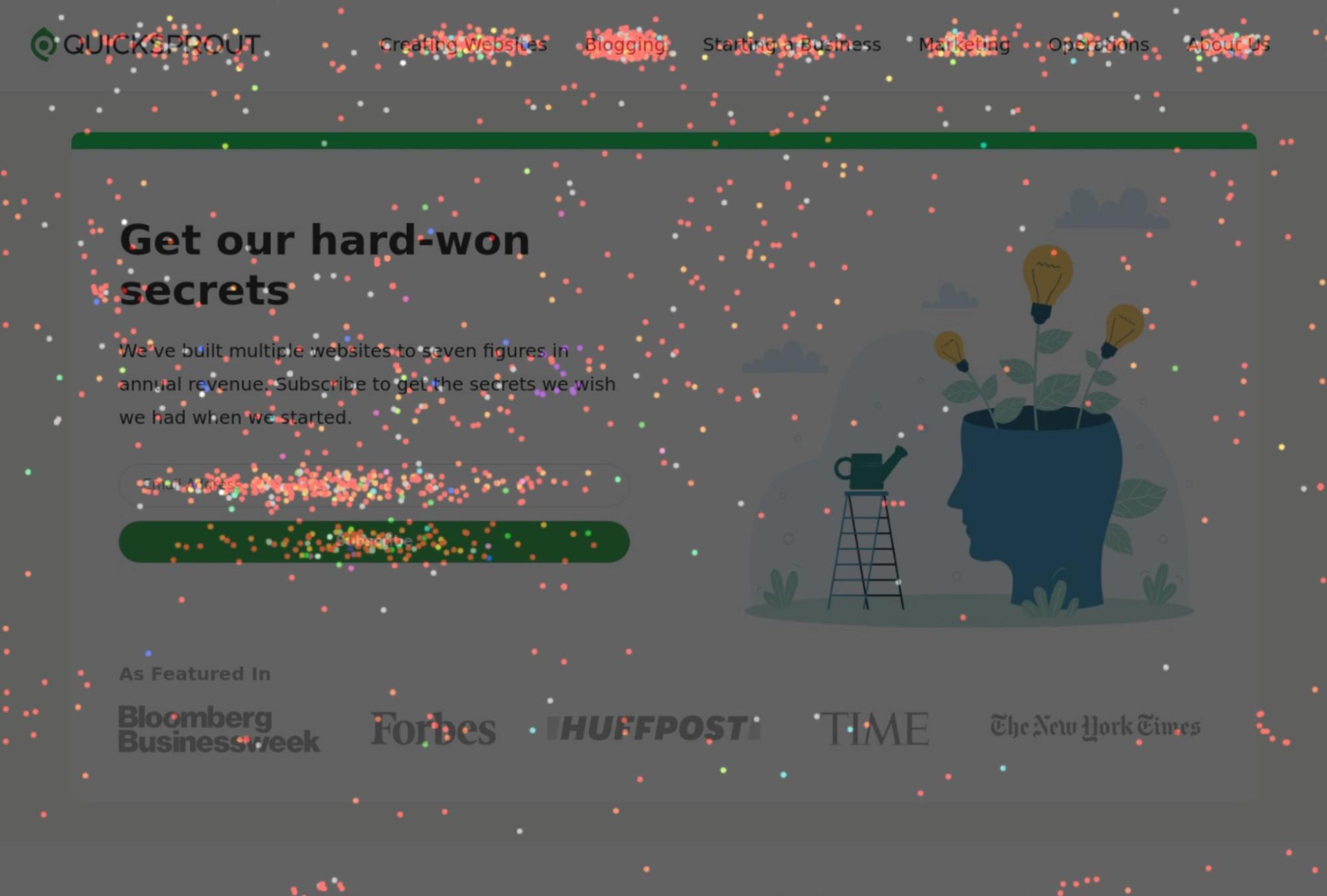
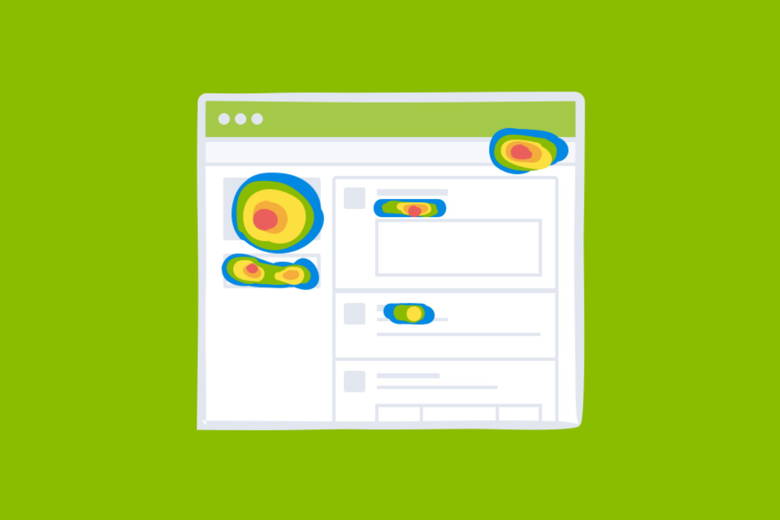
In the confetti-style click map above, each dot is an individual click. You can immediately spot patterns in the clicks, such as:
- Ignored elements: Important buttons or links that users overlook entirely.
- Rage clicks: Repeated clicks on an unresponsive element.
- Dead clicks: Clicks on non-interactive elements.
- High/low click density: Areas with lots of clicks, areas with sparse clicks.
If an important button goes untouched, if an area you didn’t expect sees tons of engagement, or users are clicking on dead spots — a click map reveals it instantly.
Filtering click map data
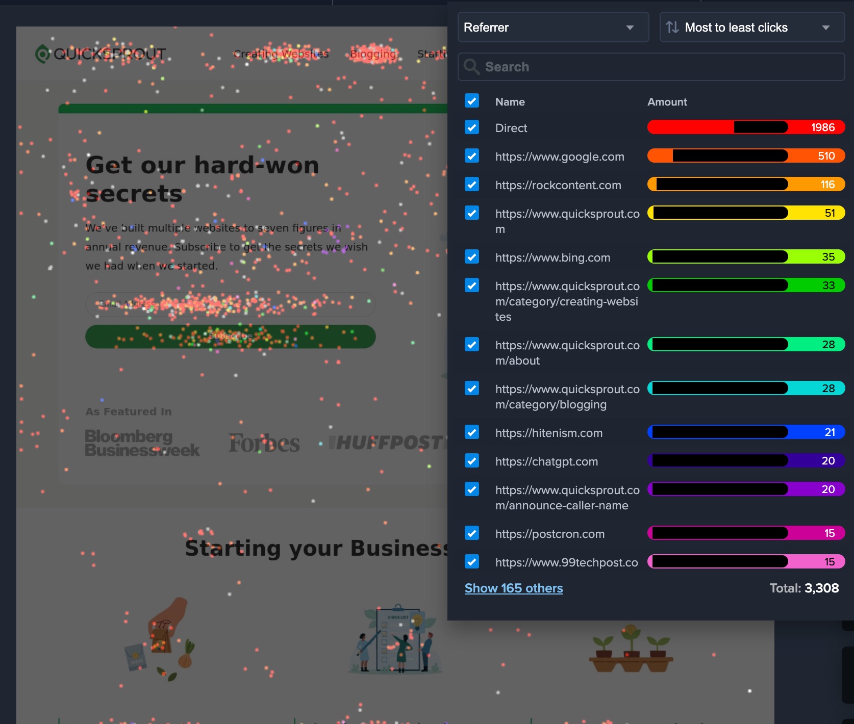
Along with showing you the precise location of every click, you can also filter click data by different factors to get a deeper look at who is actually doing all that clicking. Most tools allow you to filter click data based on factors like:
- Device Type
- New vs. returning visitors
- Country
- Time of day
- Traffic source
- Campaign
Filtering for any of these factors can reveal trends or problems that are worth fixing. You might find that late-night shoppers engage more with different content than the working hours visitors. There could be an opportunity to optimize the conversion rate for this segment.
The ability to compare performance between device sizes can also be really helpful. For example, a button that performs well overall might be significantly underperforming for Android users. If you are just looking at overall click-through rates, you’d miss it.
By filtering the data, click maps let you zoom in on these potentially valuable differences between individual segments. We’ll say more about the power of this feature in the section on interpreting click map data.
What’s the difference between click maps and heatmaps?
I noticed that people often use click map and heatmap interchangeably, treating them as the same thing. Not exactly. Strictly speaking:
- Click Maps: Track and display actual click interactions, showing exactly where users have clicked on a webpage.
- Website Heatmaps: Use color gradients to visualize aggregated user behavior, such as clicks, mouse movements, or scrolling depth.
It seems pretty straightforward — these are two distinct tools.
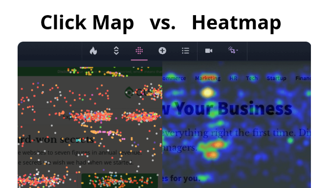
But in casual, everyday usage, people refer to click maps as heatmaps. A lot of the top ranking content for searches about “click maps” spend most of the page talking about heatmaps, which only reinforces the confusion.
Web analytics tools, like Crazy Egg (pictured above) offer click maps as a subset of their website heatmap features. Crazy Egg calls the click map the Confetti Report, so there is no mistaking it.
Many people use both tools as part of analyzing performance and user experience. Click maps, heatmaps, and other reports offer multiple perspectives and additional context to guide your decision making.
Setting Up Click Map Tracking on Your Site
The process is very easy. You won’t need a developer to enable click maps. Here are the essential steps:
- Select a click map tool: Go with one that you feel confident using, offers the depth of reporting you need, and integrates easily with your site.
- Install the tracking script: Most tools require adding a small code snippet to your site’s header (copy paste, not hard).
- Test to make sure it works: Open your site and interact with it to confirm clicks are being logged.
That’s it.
Now you wait for the data to roll in. Once you have a few days or a week’s worth of click data, it’s time to start pulling reports and searching for insights.
Tips For Reading and Interpreting Click Map Data
Getting the most out of click map data requires both analytical thinking and creative problem-solving. The data itself is objective — users clicked, in a particular location, or they didn’t — but your assessment of that data is always going to be subjective.
What does the data suggest about user behavior? How can you use that insight to drive conversions, decrease confusion, and delight your users?
People who are talented at reading click maps are usually drawing on knowledge from a range of disciplines — UX design, web development, copywriting, data analysis, and lots of psychology.
Now, you don’t need to be a UX designer or expert in everything. Putting yourself in the users’ shoes plus a little bit of common sense will go a long way. Bring what you know to the table, stay curious, test ideas, and refine your approach over time.
Here are a few simple tips to help you get started.
Learn from wasted clicks
Ask yourself why people are clicking on elements that don’t do anything. What are they trying to accomplish? What do they expect will happen?
If you have a lot of dead clicks clustered on a single element, it can signal that people expect a link, help, more information — and you aren’t currently giving it to them. Maybe this element is too pronounced, and it’s siphoning clicks from more desirable locations. Maybe you add a link and now the element aligns with user expectations.
Scattered clicks can indicate hesitation, uncertainty about where to go next, what they should be doing. Again, this is another opportunity to clear things up, sharpen your message, or rework your design to steer more clicks on meaningful elements on your site.
If rage clicks cluster around a slow-loading button, it could definitely be a performance issue. Making your website fast rarely disappoints users.
Compare click distribution across devices
User behavior varies between desktop and mobile — so it makes sense to analyze click maps separately for each in order to spot any meaningful differences.
On desktop, users rely on precise cursor movements, while on mobile, they navigate by tapping and scrolling. This means elements like buttons, menus, and links should be large enough to tap easily on mobile but not so oversized that they overwhelm desktop users.
So if you notice an important button gets far fewer clicks on mobile than desktop, it may be too small, too low on the page, or too close to other tappable areas. Any one of these factors makes it harder for users to engage on mobile.
Also be aware that some taps on mobile devices don’t indicate real engagement. Users may tap just to stop scrolling, which can create misleading click clusters in non-interactive areas.
For example, if a background section gets a lot of taps, but only from mobile users, it might be users trying to pause their scroll. If you see the same lost clicks in the same area for desktop users, then it might be a genuine sign that people are confused.
Consider the intent of different traffic sources
A visitor from organic search may arrive with a clear goal. Someone coming from social media might just be curious. Their behavior on the site differs because of intent. Are you serving both users who are clicking through your site purposefully? What about those who are browsing casually?
The goal is to be able to optimize the experience for each audience by matching the content with their intent. Does the paid search segment drop off at any particular point? Are they less engaged than other segments in particular areas? It might be a sign that there is a mismatch between the ad bringing in the search traffic, and the messaging on your site.
Turning Click Map Data into Real Wins
These are the things I am trying to do every time I analyze a click map:
- Pinpoint user struggles: Identify dead clicks, rage clicks, and other problematic patterns to spot navigation issues, broken links, and unclear design elements.
- Find winning elements: Find which CTAs, images, and navigation elements attract the most interaction in order to double down on what’s already working.
- Fix underperforming elements: Identify which areas and elements users ignore, whether it’s a buried link, an unclicked button, or content that fails to engage.
- Improve conversion rates: Find where clicks are leaking to non-essential areas instead of key CTAs, and adjust the placement, design, or messaging.
- Inform content strategy: Discover where richer content (like videos, images, or in-depth text) helps engage users, and where it might be unnecessary or overlooked.
If I can follow through on any one of these goals, that is a measurable win for the site.
Say I find out that no one engages with our particular feature on our site. Amazing. We can axe it and put time into the features of our site that users are spending time with.
The net result of all this work is making a site that is smoother for users and more closely aligns with their expectations.
Complement click map analysis with other tools
Click maps are strongest when paired with additional visualizations and reports. On their own, they show interaction patterns, but they leave gaps you can fill in with other tools.
Website heatmaps, for example, can help you get a better sense of where people are spending time on the page. Where is the intensity the highest? Your callshould be right there.
Using click maps with session recordings lets you see how visitors navigate before and after they click, which can help you identify hesitation or frustration points. Web analytics tools add context by showing bounce rates, exit pages, and time spent on site, helping you understand whether users find what they need or leave too soon.
Looking at click maps is a great way to supplement A/B testing. Comparing the click distributions can provide rich insight into the test performance. Why did a new variation win? Where did it gain clicks that the control did not?
The more you use click maps, the faster you will be able to understand what’s happening on a site, and what you can do to make it better.