At great risk to my sanity, I went to find call to action examples (CTAs) that were fresh, original, unique, and compelling.
My discovery: Almost everyone is using generic CTAs. Safe, boring, and forgettable.
The 7 innovative call to action examples I found made those brands stand out immediately.
Your opportunity: By changing 2-3 words of a call to action, brands can stand out in a small way from the hopelessly ordinary competition.
Less than 0.00001% of CTAs Are Unique
This is not a scientific number. I came up with it out of spite after an exhausting search.
Refresh the examples in a listicle about calls to action, my editor said.
I thought this was going to be easy.
It was a nightmare.
Websites for brands large and small were universally boring in terms of calls to action. The most tantalizing offer I could find was usually “Free Trial”, which brought me to a page with miles of fine print.
I thought maybe the aggressive pay-per-click advertisers would put together some compelling calls to action. Nope. The name of the game there is using every conversion hack at once.
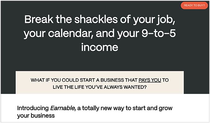
Here’s a typically boring call to action example that most people are using:

I think this offer hits every cliche tactic: the ticking clock, a warning emoji about sell-out risk, money-back guarantee, a steep discount, etc.
Then I tried social media, which was even worse. Facebook gave me nothing in the way of an inventive CTA. Absolutely nothing.
I checked Reddit–as always, a wonderful place, just not for buying things.
On X (fka: Twitter), I was hoping to find some good scammy infoproducts, maybe some clever hardsells. But I was disappointed. I could have made a full quilt that spelled out “unoriginal” with all the thread emojis inviting me to click and read a tweet-storm. Here’s why that trend is played out: 🧵/23
My wife told me that TikTok has been ruined by advertisers and influencers–so I was really excited about that. This is where the real ingenuity must be.
Nope. It’s a simple SHOP button that overlays influencer videos. That’s it.
But in the end, I prevailed. I found 7 examples of brands actually trying something new with their call to action. They used this small detail to support their brand image or speak to their audience.
7 Truly Unique Call to Action Examples
1. Cloudflare

“Under attack?”
That is a viable button you can click on Cloudflare’s site.
I love it.
Cloudflare has positioned themselves as a cybersecurity version of calling 911 when there’s an intruder in your house. And they did it using two words, a question mark, and a construction-zone orange button in the navbar.
I assume the majority of people who click that button are like me: not currently under attack, but curious about what the next steps would be if they were.
I wanted to learn more because of the clever call to action. If the button had said Learn More, I never would have clicked it.
2. Backcountry

The online outdoor retailer Backcountry hires the people who stay up around the fire fighting about which hiking stove weighs less. You know the type: Gearheads.
This is a huge selling point for Backcountry. When people buy kayaks, avalanche beacons, and so on, they really want to know that this gear works.
Call a Gearhead. Text a Gearhead. These are creative, on-brand calls to action nested in a familiar dropdown menu.
You have a question about climbing rope? Now you are talking with a woman who climbs 3 times a week.
3. LINGs CARS.com

This is actually a fairly tame example of the calls to action on LINGsCARS.com, one of the most successful car leasing services in the UK.
Ling broke every rule of web design to bring us this masterpiece. I know neons are in right now, but most people aren’t using all of the neons, at once, with a paisley background.
CrazyEgg will lock me out of WordPress if I actually recommend a call to action that includes three Order Now buttons that blink at random intervals. So I am not going to do that.
I will say with 100% certainty, however, that I have never seen call to action examples quite like this ever before.
4. Niki Whittle

Niki Whittle is an online personal stylist who has helped thousands of clients find joy instead of anxiety at the prospect of getting dressed and going out into the world.
The text of her CTA button speaks directly to that goal: Help me enjoy getting dressed!
If you swapped out Niki’s personalized text for a basic “Find Out More” button, I think the call to action would suffer.
Her choice of text is intimate. No adult is going to ask for help getting dressed unless they fully trust the other party to understand where they are coming from. The way that Niki has framed the call to action shows that she understands.
5. Ceria

Due to California regulations, the beverage brand Ceria couldn’t exactly say what their new product was. With the help of the marketing agency Mother, Ceria found a clever way to get their audience to connect.
The call to action they used was a Spotify playlist people could download by scanning a barcode styled like the familiar Spotify audio waveform.
There’s a cool story behind this ad campaign, which appeared online and in-print in California.
I’m not going to rehash it here because you should go visit the site of the people who did the work, not hear about it third-hand, looking at screenshots I took while I was way behind schedule writing this post.

6. AllTrails

Have you ever seen a limited time offer that isn’t pushy?
AllTrails nails it with this email they sent me. If I go outside, this weekend only, they’ll plant a tree on my behalf.
It’s a positive push, encouraging me to do something for my health, and it won’t cost me a dime. Until AllTrails called me to action, I just had weekend plans. Now I am saving the forest.
The invitation to “Join In” isn’t super original, I know, even with those cute little tree icons.
But the call to action is social. It’s not “Register” or “Find out more”, it’s about connecting with other people. AllTrails has 50 million users. This is a real community, and AllTrails is smart to frame it that way.
7. Avocado Green Mattress

Avocado Green Mattress has upcycled bedroom furniture people can buy to complement their organic mattresses.
The call to action is “Shop Zero Waste” is a clear call to the type of buyer who is willing to pay a premium to minimize their impact on the environment. “Shop” would work, but it doesn’t highlight the key selling point of their furniture.
It’s a small detail, but most people buying online have 5-7 tabs open. I know I do. With buyers scanning all these different sites, I think it makes sense to foreground your unique features in the button text.
More Call To Action Examples
Here are some twists on classic calls to action. I can’t say I’d never seen these types of tactics before, but the following examples are well done.
The call to action text speaks to the audience, aligns with the brand image, or is simply more inviting than a generic “Try Now” button.
Kati Curtis Design

Kati Curtis Design opted for a slight variation on the Get In Touch call to action by including her name.
I’m not going to belabor the point about what’s going on here, but this slight personalization will absolutely stand out.
I think this is a good idea if you are the face of your business as opposed to a brand. “Get In Touch With The Owner” could work, too.
Havenly

Havenly is an online interior design service company. I liked the invitation for customers to “Find Their Style.”
They could have stuck with “Learn More” or “Book a Consultation,” but those aren’t personal at all. Those are also fairly passive calls to action, versus “Find Your Style,” which is much more active.
Birchbox

Birchbox, the popular cosmetics subscription box opted to use an invitation style call to action:
“Build Your Box”
It’s intuitive, on-brand, and crisp.
One issue people have with subscription services is that they get products they don’t want. With this short call to action, Birchbox is countering that objection by offering their customers an active role in building their own box.
Art & Logic

Art & Logic is a software development company with an approachable call to action.
Wait what?
Yes, they decided to go with “Let’s talk about your project” instead of something sterile or gimmicky.
Building custom business software is insanely complex, but Art & Logic makes the next steps as easy as possible.