To get a customer to trust your brand, your website has to do a lot of things right.
And if you do anything wrong? They’re gone in an instant.
Let’s go through all the web design mistakes that cost brands money so you can find every problem and fix it fast.
Yes, Web Design Mistakes Cost You Money
People are judging your brand the moment they arrive on your site.
Your average user has visited thousands of sites before. They know what a good one feels like, even if they can’t explain what’s wrong.
Within a few seconds, their first impression has solidified. If you win them over, your website just has to hit the basic notes and you are well on your way to getting a new customer.
But if that first impression is bad, your site has to do a ton of work to regain their trust, if they haven’t left already.
How to spot mistakes on your site
Throughout the post, I’ll reference different ways to identify issues that make sites less enjoyable for users and less profitable for businesses. Most mistakes are easy to catch using common sense and simply checking your site.
Put yourself in the shoes of a visitor who has never visited before and try to use your site on desktop and mobile. You’ll catch 80% of errors that way. You can catch 95% with a quick CRO audit.
But you can’t monitor hundreds or thousands of pages by hand. Here’s a short rundown of the most important tools for finding and fixing mistakes at scale:
- Web analytics tools report how much traffic you have, how long people stayed, whether they clicked links, or filled out forms. These tools are essential for understanding website performance.
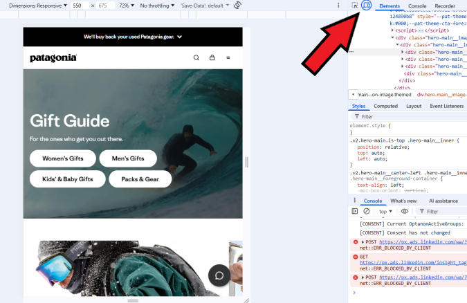
- Browser inspect tools allow you to view the code on your site and troubleshoot basic performance issues. In Chrome, right click and select “Inspect” to view page performance data.
- SEO tools and web crawlers go through your site page by page, link by link, and report on potential issues.
There are free versions of most of these tools and premium versions that provide a lot more information.
Crazy Egg gives you free web analytics, surveys, and goal tracking. It’s like a user-friendly version of Google Analytics. If you upgrade, you get access to heatmaps, A/B testing, and session recording, which allow for much deeper analysis and improvement.
Screaming Frog and SEMRush are two popular SEO tools that have limited free versions that are fine to use for small sites. PageSpeed Insights is a free tool from Google that highlights a lot of the technical problems that hurt site performance.
Between the free tools and free trials, you should be able to address many of the biggest mistakes on your site for $0.
Critical Web Design Mistakes – Fix These First
These are the biggest revenue leaks and trust killers
People arrive on your page, but the design is so bad that they leave within seconds. This section covers mistakes that stop people in their tracks and make them bounce, often with a bad taste in their mouth about your brand and what you stand for.
1. Overreliance on AI tools
What this means: The site has a generic design, lifeless copywriting, “AI slop” images, or is missing critical conversion elements. Using an AI website builder or vibe coding platform (like Wix AI, Jimdo, or Base44), you got a site that looks fine at first glance, but it’s actually hurting your conversion rate.
Why it’s costing you money: Research shows that AI builders consistently score poorly on actual UX best practices. Our testing found that AI tools acted like a lazy designer, omitted critical trust signals, produced bare-minimum content, and generated layouts that don’t match their intended use case.
Other studies have shown that website visitors devalue content they believe is AI-generated, even when the quality is identical to human work. AI aversion is real, and you want to make sure people don’t feel it when they are on your site.
How to check if you have this problem:
- Look for the hallmarks of LLM-generated writing, such as too many em dashes — a clear give away, 😉. Other signs include repetitive usage of LLM-favorite words (like delve and leverage), phrases (elevate your experience, and [brand] gets it right), and figures of speech (like antithesis: our product isn’t just X, it’s Y…)
- In images, look for strange lighting, garbled letters, unnatural textures, and of course, that air-brushed perfection that screams fake.
- Audit your site for missing elements, like customer testimonials, trust badges, and other brand-specific content that AI tools cannot supply.
- Use an AI detection tool, like GPTZero to see if your site passes the test.
How to fix it:
- Revise AI copywriting to sound like your brand, not everyone else’s. Be specific and personal, as opposed to vague and aspirational. If it sounds like the text could work for any of your competitors, rewrite it with stronger copywriting.
- Replace AI images with real ones: your team, your product, and your customers. It’s easy to create real video walk-throughs that look professional as opposed to AI-perfected.
- Check your work. AI tools are a good start, but they consistently fail to execute on basic conversion rate optimization tactics that will increase your sales and profit margins.
AI tools are amazing. The takeaway here is not to avoid them, but to use them responsibly. They don’t replace good taste, common sense, and thoughtful design.
2. Site is not friendly for mobile users
What this means: Your website doesn’t work as well on a phone as it does on a desktop display. Often, mobile users encounter text that’s too small to read without zooming in, buttons that are hard to tap, or a layout that makes them scroll horizontally.
Why it’s costing you money: It feels shoddy and looks unprofessional. If your site frustrates mobile users (likely 60% or more of your traffic), they won’t buy, call, or engage further. And, since Google ranks and indexes mobile versions first, a bad mobile experience makes it harder to increase traffic from search engines, too.
How to check if you have this problem:
- Open your site on your phone and make sure everything works as intended. Click links, scroll, and just manually check the site.
- Use a free web analytics tool like Crazy Egg or Google Analytics 4 to compare the bounce rate for mobile vs desktop users. If mobile bounce rate is high (or engagement rate is low), then there could be an issue.
- In Chrome, right click on the page, select “Inspect.” Once the developer tools panel opens, click the “Toggle Device Toolbar” button or press “Control + Shift +M” to view the page on mobile. You can test various device sizes this way, though it is not perfect.
How to fix it:
- Switch to a responsive theme or template, if you are not using one already.
- Make text and buttons bigger, and put more space between buttons.
- Redesign your site with mobile users in mind, and then scale up to tablet and desktop.
You need your website to look good on mobile. Whenever you make changes to the site, be sure to double check that you haven’t caused issues for users on smaller displays.
3. Hidden Calls to Action (CTAs)
What this means: A CTA is the button or link that you want people to click so they can learn more, download a whitepaper, make a purchase, reach out to sales, and so on. Most often the CTA is too far down the page or is not differentiated enough from other page elements.
Why it’s costing you money: If the CTA is hard to find, it means that less of your traffic is going to convert. That means fewer signups and sales because the CTA did not turn people’s interest into action.
How to check if you have this problem:
- Visit your page and confirm that you are following best practices for CTA design.
- Use heatmaps to see if users engage with the CTA and scrollmaps to determine what percentage of users see it.
- Compare page views to conversions using your web analytics tool. Is the conversion rate similar to other pages like this one, or is it weaker?
How to fix it:
- Place the CTA in a more visible location and repeat it at least once somewhere else on the page.
- Make CTA buttons bigger and distinct from other page elements by using different colors, bolded fonts, and surrounding it with more whitespace.
- Use A/B testing to experiment with different button styles, placements, and page layouts to see which design converts the best
You are not being pushy when you make the CTA obvious. It’s good for business and helpful for the users on your site who want what you have to offer.
4. No SSL certificate
What this means: An SSL certificate encrypts the connection between users and your site. If you don’t have an SSL certificate or it has expired, then web browsers like Chrome and Safari will display a message that says “Site not secure.”
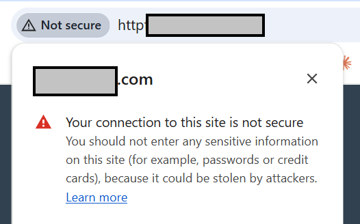
Why it’s costing you money: Because most people leave a site as soon as Google tells them it’s not secure. They are certainly not going to enter their credit card info (and they shouldn’t). Also, Google downranks sites that don’t have an SSL certificate.
How to check if you have this problem:
- Visit your site and look at the address bar. If you see a red lock icon, a warning sign ⚠️, or the URL begins with “http://” instead of “https://”, then your site is not secure.
- Use the free SSL test from SSL labs or a similar tool to ensure that SSL is working properly on your site.
- Log into your web hosting dashboard (e.g cPanel, Plesk) and ensure that all of your sites have a valid SSL certificate.
How to fix it:
- Install an SSL certificate from Let’s Encrypt or through your hosting provider. Your web host should include this for free.
- Ensure that any “http” pages on your site redirect to an “https” page with 301 redirects.
- Ensure that SSL certificates are set up for auto renewal.
Not having an SSL certificate is an absolute killer mistake. Again this is something that good web hosting providers will handle for you without an extra charge. If they are making you pay for a basic SSL certificate or set up auto renewal on your own, I would look for a new host.
5. Pages take too long to load
What this means: People click through to your site, and then they have to wait. They want to engage, but they can’t.
Why it’s costing you money: There are dozens of studies that show how every extra second of load time causes more people to leave (this analysis from Cloudflare drives the point home). If your page is slow loading, half of your traffic is going to leave before they ever see your offer.
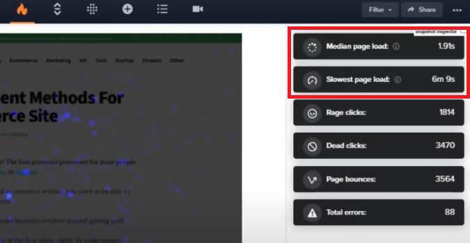
How fast should your page load? Here’s the benchmarks:
- 0-2 seconds: Good. Page load times are probably not a problem.
- 2-3 seconds: OK. You could be losing visitors, and should try to get load time down.
- 4+ seconds: Bad. I would work on decreasing load time immediately.
How to check if you have this problem:
- Test the page speed by entering the URL into PageSpeed Insights (a free tool from Google) or a similar website speed test tool.
- Consult your web analytics. Average load time should be low, but also look at slowest load times to see if particular browsers or devices have longer load times. See the example page load speeds captured by Crazy Egg web analytics below:
How to fix it:
- Compress and resize images. This is a common culprit of slow load times and one of the easiest ways to speed up your site.
- Remove any unnecessary plugins, third-party scripts, or non-critical page elements that are slowing your site down. PageSpeed insights can help you identify which ones are increasing load times the most.
- Enable a content delivery network (CDN), like Cloudflare.
You should design a fun and engaging website, but not at the expense of site speed. Today’s users don’t like to wait.
6. Broken links
What this means: It means that someone clicked a link on your site and it: A) didn’t do anything, or B) went to a 404 page (page not found). Both of these are not good, even if you have an awesome 404 page.
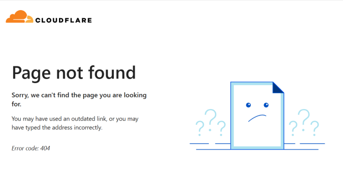
Why it’s costing you money: The people who are trying to click links on your site want to know more or potentially even buy from you. And now they can’t because the link is broken. A dead link causes someone to exit your website funnel instead of moving to the next stage.
How to check if you have this problem:
- Manually check links and make sure they work and go where they are supposed to.
- Use a tool like Screaming Frog or SEMRush to crawl your site and find broken links.
How to fix it:
- Replace or remove broken links.
- Add 301 redirects for deleted URLs so that users and search engines go to a live page instead of a dead one.
- Schedule link audits regularly and run them after major site changes.
Links break because pages get moved, renamed, or deleted. It’s completely normal, BUT to users and search engines, it looks like you don’t care about your site. Both of them will penalize you for the breakdown.
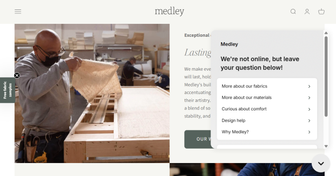
7. Popup overload
What this means: Users arrive at your site, but before they can decide what to do, they are overwhelmed by popups, chatbots, special offers, banner ads, and privacy disclosures. The content they came for is blocked by a distracting array of offers.

Why it’s costing you money: Too many popups distracts visitors from whatever you want them to do. In the above example, I would have to close 4 windows simply to view the website. Maybe there is a user out there who craves this experience, but I doubt it.
How to check if you have this problem:
- Ask a friend to visit your site for 20 seconds and hear what they have to say.
- Check the bounce rate on your site after adding new popups. Does the conversion rate for popups justify their use?
- Use session recordings to see how users respond to popups in real time.
How to fix it:
- Use popups wisely. Delay their appearance so users have a chance to explore your site and build trust in your brand before making a popup offer.
- Try using more discrete popups, like slide-ins or banners instead of lightbox or full-screen popups that block content.
- Test your site with and without popups, or experiment with different behavioral triggers to find the sweet spot for frequency, timing, and popup types.
Popups are great for lead generation and highlighting special offers. Every single high-growth brand uses them. BUT they do not use every type of popup at the same time. Too many aggressive, overlapping, instantaneous popups kill trust in your brand.
Design Choices That Make Your Site Harder To Use
These mistakes confuse visitors and cause them to leave frustrated
We’ve covered the critical problems that cause people to leave immediately. Now let’s get into the second level issues that impact users as they try to explore. These web design mistakes get in the way and convince people to go somewhere else.
8. Broken or confusing navigation
What this means: People can’t find what they are looking for. Your navigation menu might be straight up broken (like it won’t expand or is unclickable) or maybe it doesn’t feature the pages people really want to visit. Either way, it’s not good.
Why it’s costing you money: People on your site are trying to find out more information about your product, like pricing and product details, but they don’t know where to go. It’s frustrating and unhelpful. Many studies have shown how a malfunctioning or poorly-designed navigation menu costs conversions.
How to check if you have this problem:
- Visit your site on desktop and mobile and make sure that you can click/tap to all your key pages within 3 actions or less.
- Ask someone who has never used your site to visit and find a key page. If they have trouble, it’s no good.
- On desktop, hover over every dropdown. If menus disappear before you can click, you need to improve the user experience.
How to fix it:
- Simplify top-level navigation. 5-7 items is ideal. Keep the labels concise and use plain language (bear in mind the way you think about your product may differ from customers).
- Add key links (like Contact or Pricing) to both the header and footer.
- Consider redesigning your site structure around the user experience, grouping pages according to what is most helpful for visitors who don’t know your brand.
Setting up proper website navigation is one of the biggest responsibilities of a brand. It impacts how search engines make sense of your site and helps your users find out what they need to know.
9. No clear visual hierarchy
What this means: Everything on your page looks equally important (or equally unimportant), so headlines, body text, buttons, and images all blend together. There’s no clear order of what to look at first.
Why it’s costing you money: Your visitors’ eyes don’t know where to go, so they scan aimlessly instead of engaging with your content. Eye-tracking studies consistently show how people scan web pages in predictable patterns (like F-patterns and Z-patterns).
If your design fights against these natural tendencies, or doesn’t communicate a clear hierarchy of importance, it’s harder for people to take action.
How to check if you have this problem:
- Show your page to someone for 5 seconds, then hide it. Ask what they remember. If they can’t recall the main point or primary action, your hierarchy is unclear.
- Look at your CTAs: Do your buttons visually compete with each other, or is one clearly primary?
- If your scroll map shows a sharp drop halfway down the page, that could be a hierarchy problem.
How to fix it:
- Make your headlines dramatically bigger: Your main headline should be at least 2-3x the size of body text.
- Follow best practices for typography elements to enhance your design and make the hierarchy obvious.
- Use directional cues (like arrows or lines) to literally point visitors toward your CTA.
Generally speaking, you can follow best practices for hierarchy and your site will be fine. This is not an area where you should feel like you need to get creative and unique. Sticking with what people know is good. Going against the grain is risky.
10. Sticky elements interfere with content
What this means: Sticky elements are those that stay fixed to the screen as users scroll, like your header, footer, chat widget, cookie banner, or promotional bar. By design, they cover up the actual content people came to see.
Why it’s costing you money: Website visitors will have trouble interacting with your content. They read your value proposition, can’t see your product images, or can’t click your CTA buttons. They get frustrated by the obstructions and leave, especially when the sticky elements stack up, like a slide-in pop up plus a chat widget.
On mobile, these sticky elements can easily eat up 30-50% of the screen, making it nearly impossible to read or interact with your page.
How to check if you have this problem:
- Do a quick manual check on desktop and mobile. Does it feel claustrophobic? Do sticky elements cover CTAs and make the content harder to read?
- Try to complete forms. Do sticky elements get in the way?
- Use a scrollmap to see how far people explore. If people aren’t scrolling far on pages with lots of content, sticky elements might be making scrolling frustrating.
How to fix it:
- Decrease the height of your sticky header and simplify it. Your logo + a hamburger menu is probably all you need on mobile.
- Try disabling some sticky elements for mobile users, especially if you notice that engagement metrics are worse for people on smaller screens.
- Make it easier to close sticky elements with a clear X button. Where closing simply reduces the element’s size (like a persistent chat widget), make it as unobtrusive as possible.
With mandatory website disclosures about cookies and tracking, users are going to have to click through some windows to get to your content. Chat bots, popups, and sticky mega menus need to be used with care.
11. Inconsistent branding and visual tone
What this means: Your website feels like it was designed by multiple people who never talked to each other. The homepage design is corporate, but the pricing page is playful. There’s no unifying use of color, font, or tone.
This can also happen off-page, when a user finds your site via social media or a paid ad. They see one thing in their feed and arrive on a web page that cuts against their expectations.
Why it’s costing you money: For one thing, slapdash design doesn’t communicate a sense of trust or do much to build a credible brand identity. It’s going to be harder for people to remember your product when they have a hard time understanding who you are and what you stand for.
It can also just make it more confusing for people to use your site if button styles aren’t consistent, for example, or the visual hierarchy varies from page to page.
How to check if you have this problem:
- Open 5-7 pages from across your site. Does it immediately feel like they belong to the same brand?
- Read a few headlines from across your site and sample the copywriting. Does it feel like the same person wrote them?
- Count how many different colors you use on your site (excluding variations). Do you have multiple versions of similar colors? Do the same thing for fonts. Are you using more than 3 different fonts? That’s probably not great.
- Compare your site to your social media accounts. Does it feel like a unified brand?
- Look at the CTA buttons and ensure that they are all the same. It’s good for primary and secondary buttons to be differentiated from one another, but generally bad if the styles themselves vary.
How to fix it:
- Enforce a brand style guide. Choose 1-2 fonts, decide on 3-5 colors, and stick to them ruthlessly. Document these with hex codes and font names.
- Define your brand voice and rewrite sections that sound off.
- Create templates for repeated elements like CTA buttons, testimonials, feature boxes, blog post layouts.
- Stick to a single image style, like all photos or all illustrations. Use filters to make photos feel unified.
It’s really hard for brands to gain momentum when different elements on their site are working against each other. Every successful business and personal brand has some sort of style guide that they enforce across their site.
Conversion Killers that Stop Signups and Sales
These are common errors that deter people from taking the next step
Your site looks good, it works fine for users, but these seemingly minor design choices wind up creating a negative impression. They make it harder for people to trust your brand or understand exactly what you offer.
You got the click, earned the visit, and then lost the customer because the design made it feel too risky or unclear to take action.
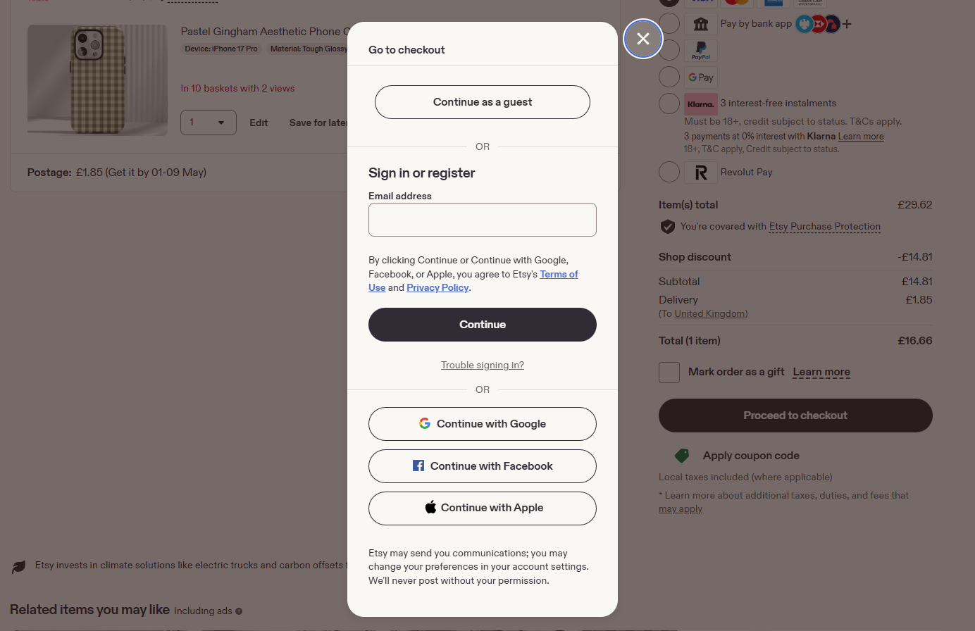
12. Clunky or complex forms
What this means: The signup forms or checkout process is annoying users to the point where they don’t complete it. Forms might ask for too much information, have confusing fields, show unclear error messages, or just feels like a chore to complete.
Why it’s costing you money: Because users stop completing the form and you don’t get a signup or sale. These are high-intent users who want to connect with your brand, but the form is too convoluted or confusing.
How to check if you have this problem:
- Count your form fields. More than 3 fields for lead capture is usually too many. You can get more information later. More than 7 for checkout is going to push the conversion rate down.
- Check your form analytics: Where do people drop off?
- Look for any confusing form field names or unclear error messages
How to fix it:
- Cut down form fields to the bare essentials. Consolidate multiple fields if possible.
- Show inline validation. For example, tell people immediately if their email is formatted wrong instead of waiting until they hit submit.
- Allow guest checkout instead of making people create an account.
- Make things easy and efficient for users by using dropdowns instead of text fields, enabling autofill for addresses, and so on.
- Survey users that exit the form and get feedback.
There’s nothing worse than losing a conversion at this point. You did so much right, only to lose the lead or sale in the final mile.
13. Generic CTAs
What this means: The text of your CTA buttons say things like, “Click Here” or “Learn More,” which are bland and forgettable. They don’t tell visitors what they’ll actually get or why they should click.
Why it’s costing you money: Because you aren’t giving people an enticing reason to click. People are more likely to act when they understand the value they can get.
How to check if you have this problem:
- If your CTA text and buttons have default, lifeless phrases like “Submit,” then you can probably punch them up a little to good effect.
- Ask someone unfamiliar with your business to look at your page for 10 seconds. Can they tell you what they’d get if they clicked your CTA?
- Ignore the rest of the page content and just focus on the button. Would you know where the click leads without the other content?
How to fix it:
- Use specific, personal, benefit-driven language in your CTAs. “Yes, I want the first chapter FREE” is way better than “Download the e-book”. “Start my free trial” will work better instead of “Sign Up”.
- Look at your competitors and pages from high-performing brands to see what they do. Draw inspiration from compelling CTA examples, and then put your own spin on it.
- A/B test your changes. Try 2-3 variations of your new CTA and measure which performs best.

In the above example from Abstrakt, a B2B marketing firm, they use the CTA “Let’s Build My Pipeline,” which speaks to exactly what most people want. It’s concise, personal, and aspirational.
The text of a CTA seems like such a small thing, and most brands just settle for the defaults. Putting a bit of effort into your CTA is a low-effort and memorable way to stand out from the crowd.
14. Too many choices
What this means: There are so many options on your site that people don’t know what to do. There might be multiple competing CTAs, dozens of product variations, and very little guidance about how users should proceed.
Why it’s costing you money: This is a well-documented phenomenon known as “the paradox of choice,” and often the result is that people don’t pick anything at all.
How to check if you have this problem:
- Count the CTAs on your page. If more than 2-3 are visible at once, that’s probably bad, especially if the buttons are identical.
- Analyze heatmap data. If there is a lot of engagement with CTAs, but few conversions, that is a sign of potential choice paralysis.
How to fix it:
- Pick ONE primary offer and make it bigger, bolder, and more prominent than anything else. Secondary and tertiary offers are fine, but dial down their design so as not to compete with the primary offer.
- Add guidance, recommendations, and ways to filter down options. On a SaaS pricing page for example, most brands highlight a “recommended” or “most popular” option.
- Reduce the visible product variations, and give people easy ways to find more options if they want.
15. Lack of trust signals
What this means: There’s nothing on your site that tells people unfamiliar with your brand that you are legitimate and credible. Maybe you say nice things about yourself, but there are no clear signals from independent, third-party sources that you should be trusted. No press mentions, security badges, or certifications.
Why it’s costing you money: People are skeptical, and rightly so. There are a lot of bad actors on the internet, and if someone doesn’t know your brand, they’re less likely to click through or get out their credit card. Adding in trust signals reduces this skepticism and buyer hesitation.
How to check if you have this problem:
- Check key pages (home page, pricing page, checkout flows) to make sure that there are trust signals prominently displayed.
- Is your About Us page easy to find? And when people arrive, do they find real pictures of real people with unique writing that explains who you are?
How to fix it:
- Add trust badges to all the key pages, especially near signup and checkout.
- Showcase industry memberships and credentials.
- Add client logos so people know you have worked for real businesses in the past.
- Add small trust statements like “Used by 250 brands” or “Cancel anytime”.
Here’s a screenshot from Crazy Egg’s homepage where you can see the new user signup is literally surrounded by trust signals.
16. Zero social proof
What this means: Your website has no testimonials, reviews, case studies, user counts, or evidence that real people use your product.
Why it’s costing you money: It’s hard for people who don’t know your brand to just accept your marketing claims at face value. Without any examples of social proof visible on your site, you are asking strangers to take a risk that (as far as they can tell) no one else has taken yet.
How to check if you have this problem:
- You should confirm that there are multiple types of social proof on your homepage, pricing page, signup page, and product pages. It should be easy to find at a glance.
- Check a competitors page. Do they have a lot more social proof than you?
How to fix it:
- Move reviews or testimonials higher on the page. Ideally, place them above the fold or right next to your CTAs. Don’t hide them on a separate tab or subpage.
- If you don’t have reviews, use what you do have: client logos, press mentions, star ratings, or user counts. You can also use short quotes from emails or chats (I’d get permission first, though).
- Get new testimonials by reaching out to recent happy customers within 48 hours of purchase. Keep it short and explain how you plan to use the info.
You’ve probably noticed that every successful brand has many types of social proof placed in key locations on their website. You should, too. I get that it can feel weird asking for testimonials, but you might be surprised how people respond. If you do good work, people want to help you.
Mistakes that Hinder Website Visibility
These omissions harm SEO and limit your website traffic.
This section doesn’t exactly cover aspects of web design, but these technical mistakes will cripple your website’s ability to rank high in search results. If you make enough of these errors, you won’t show up at all in Google or AI overviews, and your website traffic will suffer.
So, if you are the one who is in charge of making sure your website is profitable, you need to get this stuff right.
Most of it is really straight forward, so a simple SEO mistakes checklist is good enough:
- Failing Core Web Vitals. This means your site is slow, the layout shifts, and it signals a poor experience to Google. You can check your CWV on PageSpeed Insights and get a list of what needs to be fixed.
- Missing meta data and schema markup: Page titles, meta descriptions, and structured data tell search engines what your page is about. If this is sloppy, it will be harder to appear in rich results. Visit Schema.org to find out how to use schemas. Use an SEO tool to find missing meta data and Google’s Rich Results Test to make sure markup is properly formatted.
- Inconsistent site structure. Use a consistent pattern to name and or organize pages on your site. If you have some blog posts in /blog and others in /blog-posts, it’s going to confuse Google.
- No sitemap or robots.txt. These files tell crawlers what to index and what to skip. Without a good sitemap, you’re leaving it up to Google to guess. You can check both at yourdomain.com/sitemap.xml and yourdomain.com/robots.txt.
- Missing alt text. This is the text you include for images so that people using screen readers understand the page element they can’t see. SEO tools can help you find images with missing alt text.
- Poor internal linking. This means there are pages on your site that are not crawlable by Google or accessible to humans. You can find pages that are orphaned or unindexed in Google Search Console.
- Faulty redirects. Redirects send visitors and search engines from one page to another, and when they are set up wrong, it causes all sorts of problems. Use an SEO tool to find and cure these.
There is a lot more you can do, but these are the big issues that most SEO tools will flag during an audit. There are lots of free tools out there like Yoast, which help website owners stay on top of keywords and metadata.
Neglect: The Main Source of Web Design Mistakes
A website is never done. I wish you could just create a simple, functional website that didn’t require maintenance. But that’s just not how the internet works.
Things are constantly changing. Plugins and browsers are updated constantly, which changes the way end-users interact with your site.
Even a few years ago, website owners didn’t really have to think about how AI understood their site. Now you have to consider semantic search and potentially including an llms.txt file in addition to a robots.txt file.
But is this new? Not really.
The tasks are different, but the responsibility is the same as it’s always been. Websites require consistent attention. A “set it and forget it” attitude has never worked for website owners. The biggest mistake you can make is thinking that your website will age well on its own.