Good CTA button design is not a mystery. Millions of dollars have been spent discovering what gets people to click.
We’re going to look at examples of successful CTA buttons and talk through why they work. Then you can use similar tactics on your site to increase signups and sales.
What is a CTA button?
A call-to-action (CTA) button is what people click (or tap,on their phone) in order to shop, buy, register, download, learn more, and so on.
The most common places you will see CTA buttons are:
- Websites
- Social media
- YouTube
- Mobile apps
- Display ads
On a website, brands have a lot of freedom to design CTA buttons, controlling the size, shape, color, placement, text, and more. If they are using a simple website builder, there may be some design limitations, but there is still a good deal of freedom.
Because you don’t have as much control over CTA buttons on other channels, I’m going to focus the post on designing amazing CTAs for websites.
That said, a CTA button can only do so much on its own. Much of its success hinges on other factors surrounding the button, like your page design, copywriting, and visual content.
You have control over a lot of those elements when you design emails, ads, or creatives for social media. So, even if you can’t always change the CTA text or styling on those channels, a lot of the tactics we cover here are still useful to know.
What a CTA button looks like, and what it does
Here’s an example of a CTA button from the homepage of HeyGen, an AI video generation platform that is growing like wildfire.
There’s nothing crazy or innovative happening here, but it’s doing a lot of things right.
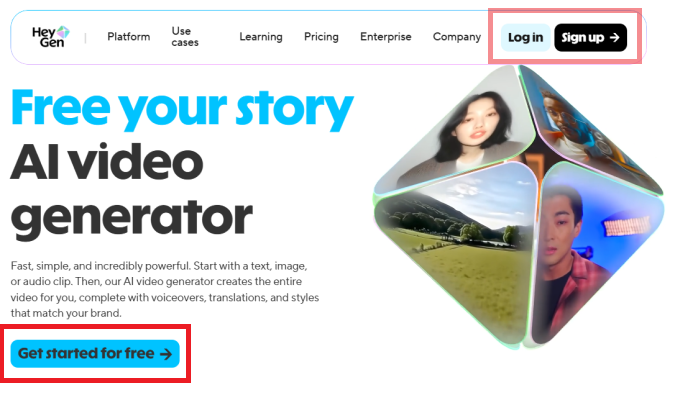
The CTA button is an electric blue color with bold black text that reads, “Get started for free 🠊”. This is the primary CTA button, which means it’s the main action they want people to take.
There are also two secondary CTA buttons in the navbar for users to Log in or Sign Up 🠊. These buttons are smaller in size and less brightly colored than the primary CTA.
Clicking on the Get started or Sign up buttons brings you to a simple signup page.
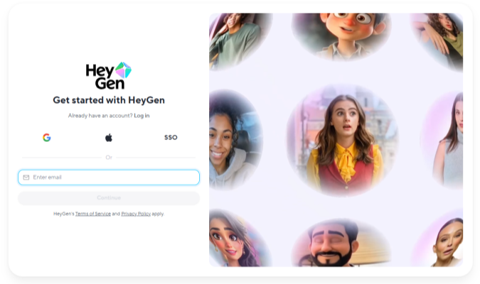
Enter your email, or sign on with a third-party (like Apple or Google), and you will be all set up to start using HeyGen to make your next video.
This is a simple, low-risk, low-effort signup process. Let’s talk about why this is smart.
What Makes People Click CTA Buttons (And What Doesn’t)
People click CTA buttons when the offer feels clear, safe, and genuinely worth their time.
That means that a strong CTA starts with knowing your target audience. If you understand their fears, hopes, dreams, and goals, you can frame the offer so it resonates with them.
From there, CTA buttons that get clicked nearly always have the following characteristics:
- The button stands out on the page
- The text tells people exactly what happens when they click
- The button placement meets them where they naturally pause
- The message gives them a real reason to act now
Color, shape, and styling will help you make the button stand out and reinforce your message. But they only matter when the offer is attractive to potential customers.
As you get into the tactics, remember that your audience is the guide. Ultimately, they determine what’s going to work best.
What works
Here are some of the key design tactics for increasing the clickability of your CTA buttons:
- Use high-contrast color: Make buttons clearly stand out from the background and everything else on the page. You can do this with loud colors (orange button on a blue page), using a heavy color like black on a generally light page (or vis versa), or by using a color that appears nowhere else on the site. Contrast is one of the most important typography elements you can use to make your button obvious and appealing.
- Provide ample white space: Give buttons breathing room. This attracts more attention than buttons in the middle of a cluttered area. It also makes it easier for mobile users to tap them (and not something else).
- Show that it’s interactive: Use hover states so that people know they can click the button. Changing the border color or making the button light up help people know where to click.
- Make it large: The bigger the button the easier it is to see and tap. I see a lot of high-performing ecommerce sites where the “Buy” button spans almost the entire width of the page on mobile.
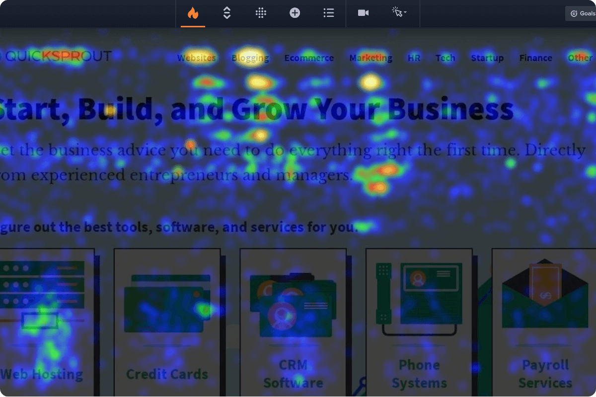
- Make it prominent: Ensure that users can see a CTA button as soon as they arrive on the page, without having to scroll. Use additional CTA buttons wherever users naturally pause as they explore your site. A scrollmap will show you where website visitors linger on a page.
- Make the primary CTA obvious: You can have additional CTA buttons, but don’t make them as big or as pronounced. Style them in a way that won’t compete for attention with the main button you want people to click.
Here are some copywriting tips that make people feel more confident about clicking:
- Use action verbs: Clear, descriptive commands like “Sign up for free” tend to outperform vague labels like “Submit.” Power words work really well.
- Focus on benefits: Tell users what they get, not just what to do, such as “Get 30% Off.”
- Use first-person language: Variants like “Start My Free Trial” often earn more clicks.
- Include urgency cues: In microcopy near the CTA button, phrases like “Ends Tonight” or “Limited Spots” encourage immediate action. You might be able to include urgency cues within the button text, like “Claim today’s discount” or “Hold my size now.”
- Decrease perceived risk: Add reassurance near the CTA, such as “Cancel Anytime” or “No Credit Card Required.”
- Place social proof and trust signals nearby: Include relevant types of social proof close to CTA buttons, like customer testimonials and star ratings. Include trust signals, like client logos or microcopy (e.g. “30-day money-back guarantee”) in close proximity to buttons, as well.
All of these persuasion techniques make it easier for people to understand your CTA, recognize the button, know where it leads, and feel confident about clicking it.
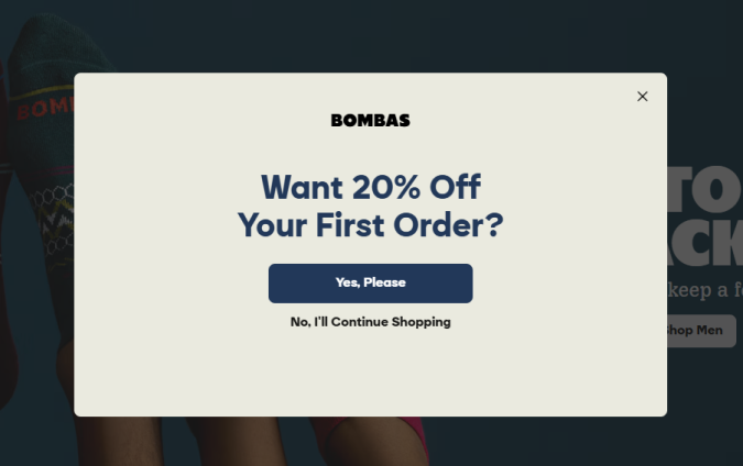
The best advice I can give? Don’t overthink it. Just be clear and obvious, like this opt-in popup from Bombas.
What doesn’t work
These design choices tend to work against the goal of getting people to click a CTA button:
- Low contrast: Buttons that blend into the design get ignored, even if they look on-brand.
- Competing CTAs: Multiple buttons with equal weight distract and confuse people.
- Vague text: Phrases like “Discover solutions” say nothing about the benefit.
- Buried placement: CTAs placed where most visitors never scroll will not earn clicks.
- Overcrowded layouts: Buttons surrounded by clutter lose visibility and intent.
- Cute or clever copy: While this can work, a lot of the time you end up confusing users.
- Inconsistent design: Changing CTA text or styling across the page creates hesitation.
All of these mistakes make the CTA button less obvious, appealing, or easy to understand. You want to make it as simple as possible for people to recognize what clicking the button will do. Anything that gets in the way will not help you increase conversions.
For example, I don’t think this image and CTA button are doing the brand AYR (All Year Round) any favors.
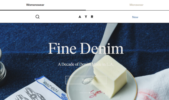
The CTA button is hard to see and the text says “Enjoy,” which doesn’t indicate anything concrete about where the click will take me.
Far be it from me to critique the design of a womenswear landing page, but I feel confident that this low-contrast design is unhelpful. If I struggle to read the CTA, people who are color blind or have moderately low vision are going to have a really hard time engaging.
I highly recommend following accessibility guidelines, which make your site easier to use for everyone. That’s a good thing. And, if you don’t, it opens the door to accessibility lawsuits, which you definitely want to avoid.
When should you break the rules?
Rarely, and only with a really good reason.
I don’t have magical instincts about which CTA will win. The tactics I’m sharing come from years of experience in conversion rate optimization (CRO), as well as studying the design decisions of high-performance brands. They have collectively spent thousands of hours and millions of dollars optimizing their sites based on what actually works.
The truth is that most CRO case studies I’ve read end up finding big wins by coming back to the fundamentals.
Clear beats clever. Obvious beats hidden. A button that looks like a button almost always outperforms whatever avant-garde idea someone sketches on a whiteboard.
Plus, CTA button best practices give you tons of room to experiment and be creative. What’s the best high-contrast design? What’s the most prominent placement? What microcopy is going to convince users to click?
There’s still a huge amount of room to play. Break the rules, if you must, but I’d rather mess around within them.
Whatever you do, watch your website key performance indicators, and let data overrule instinct.
If you have the traffic, A/B testing is the most reliable way to know which CTA buttons perform the best. If you don’t, keep a close eye on your metrics so you can swap out designs that hurt your conversion rate.
9 Effective CTA Button Examples
Here are nine examples of CTA buttons I pulled from high-growth brands and respected organizations. I included a mix of buttons from excellent landing pages, homepages, and popups.
Let’s go through each one and what it’s doing to earn more clicks.
1. Mercury
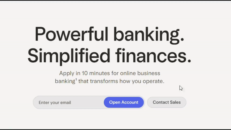
Mercury is a digital-first banking platform aimed at startups who want a fast, no-frills way to pay employees. They want to position themselves as the new way to do business, not your stodgy old local branch.
CTA: “Open Account”
Location: Homepage
Why it works:
- Unique button animation: It’s sort of a lava lamp hover effect that follows your cursor within the button. I’d never seen that. For a startup that’s trying to position itself as something new, this works.
- Clear next steps: To get started just enter your email in the field indicated by the placeholder text and click the button. This is quick and easy, which appeals to an audience that wants to move fast.
- No distractions: The only moving part of the above-fold-experience is the button animation. The text uses a simple, sans-serif font, written in plain English. The secondary CTA button to “Contact Sales” pulls minimal attention away from the primary CTA.
2. Wishi
Wishi is an online styling app that matches users with trained personal stylists. It’s a premium brand, aimed at people who want to look fashionable, elite, and confident.
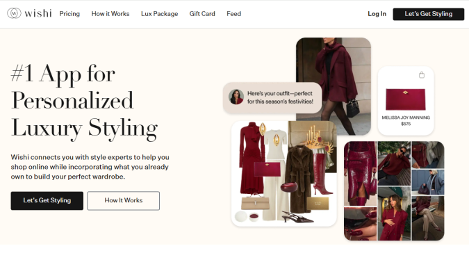
CTA: “Let’s Get Styling”
Location: Landing page
Why it works:
- Inviting copy: The button text signals partnership, saying “Let’s get styling.” It’s upbeat and frames the next step as an experience, not a task. Including the user with “Let’s” aligns with the promise of “personalized” styling.
- High contrast, but polished: It’s easy to see the dark button against the light background. They don’t use a loud or bright color, which would work against the brand’s premium, luxury aesthetic.
- Clear hierarchy: The primary CTA uses a filled button, and the secondary CTA uses an outlined button. People know where to click, whether they are ready or want more information. The landing page offers options without competing signals.
3. Doctors Without Borders (Médecins Sans Frontières)
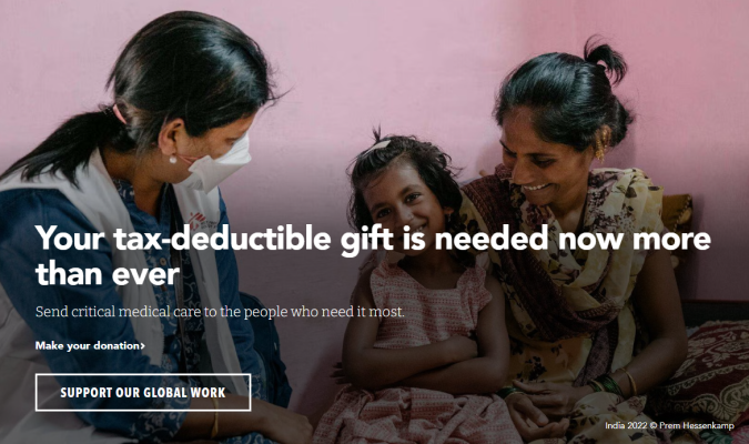
Doctors Without Borders is a nonprofit that sends medical professionals into areas suffering from wars, disease outbreaks, and natural disasters. They need funding to deliver life-saving healthcare services to parts of the world most organizations can’t access.
CTA: “Support our global work”
Location: Homepage
Why it works:
- Powerful CTA text: The word “global” underscores the offer to contribute to something so much bigger than yourself. It’s a fitting counterweight to the headline’s focus on “tax-deductable,” which foregrounds the personal benefits of giving.
- Instructive microcopy: A small bit of text just above the button “Make your donation >” allows the CTA text to be a bit more ambitious, reassuring users about the purpose of the CTA button.
- Helpful hover effects: The button border turns red when you hover over it, confirming for users that it is clickable and their cursor is over it. The microcopy is also clickable, and turns red when you hover over it.
4. 99 Designs
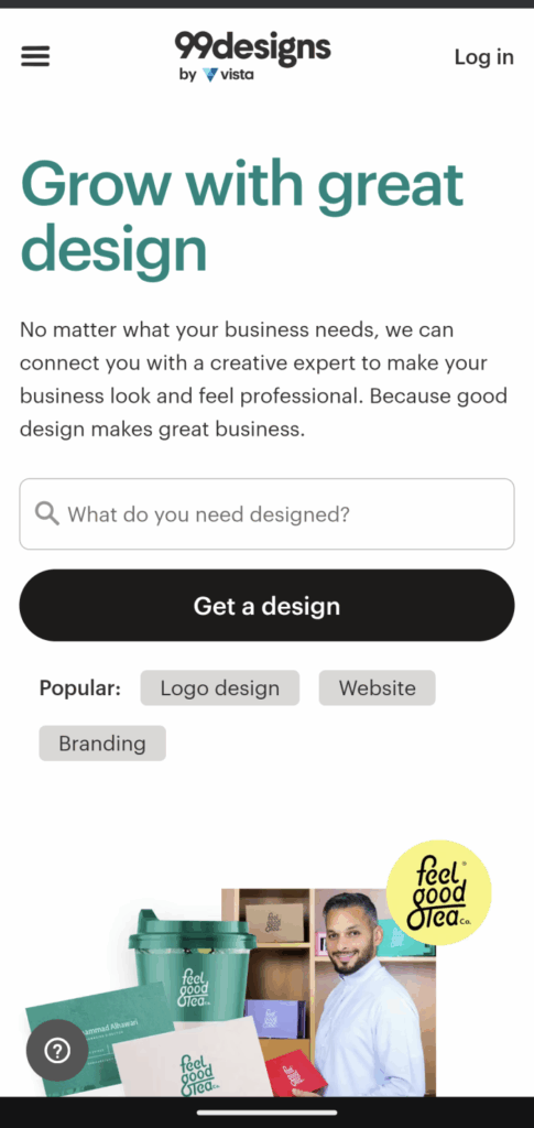
99 Designs is a wonderful service that allows graphic designers to compete for your business by supplying logos, websites, and full brand kits. They want to reach brands who don’t have in-house design resources, and make using their service as intuitive as possible.
CTA: “Get a design”
Location: Homepage
Why it works:
- A huge black button: You cannot miss the action they want you to take. A large, full screen-width button. The CTA text explains exactly what’s offered.
- Aligned with intent. Most users arrive with an idea of what they want, but are unsure about next steps. This smart homepage design makes it easy. Just enter your idea into the text field, which is marked with a magnifying glass and explanatory placeholder text, “What do you need designed?”
- Helpful secondary CTAs: You can tap the “Popular” tags for Logo designs, Website, and Branding, which brings you to another page explaining each service in more depth. The size and color of these secondary actions doesn’t take away from the main CTA, yet offers a simple alternative action for people who want to learn more.
5. Campfire
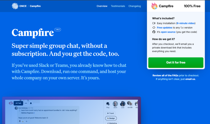
Campfire is a free, lightweight group chat software from 37signals aimed at small teams. It serves as a freemium on-ramp to the company’s other tools, offering a low-commitment way to get familiar with 37signals’s focused approach to platform design.
CTA: “Get it for free”
Location: Homepage, in the sticky navigation menu
Why it works:
- Prominence: You cannot miss the large, bright green CTA button that’s in a giant light gray box, hanging from the navigation menu. On mobile, the box is not sticky, but it’s still hard to miss it when you land on the page.
- Contrasting colors: The green of the CTA button is not used anywhere else on the page. It’s set on a light gray box, against a rich blue background.
- Trust-building microcopy: Free doesn’t always mean free, but they include a link to the GitHub repo. There’s nothing to hide. They also link to FAQs and ask you to email them (with a link) if anything isn’t clear.
6. Allbirds
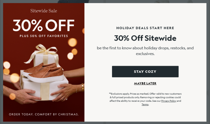
Allbirds is a sustainable footwear and apparel company that built a billion dollar brand using a minimalist, no-nonsense aesthetic. They tend to avoid the heavy-handed messaging of other eco-friendly brands, instead taking a more casual, friendly angle.
CTA: “Stay Cozy”
Location: Opt-in popup
Why it works:
- Unique CTA text: Since every ecommerce brand uses opt-in popups and they are annoying on some level, I thought the cute copy made sense. It’s slightly less tiresome than the usual “Join!” button and an easy way to stand out from the competition.
- Timing: This is a seasonal offer that made sense for me, a buyer in the US in December, when the invitation to “Stay cozy” was welcome. The opt-in popup also appeared after about 20 seconds, so I’d had a chance to explore the site before they sweetened the pot with this offer.
- Brevity: Excluding the fine print, the entire ad is 35 words, including the text in the image. Short and sweet is good if I want the offer, and creates minimal friction if I don’t.
7. Avocado Green Mattress
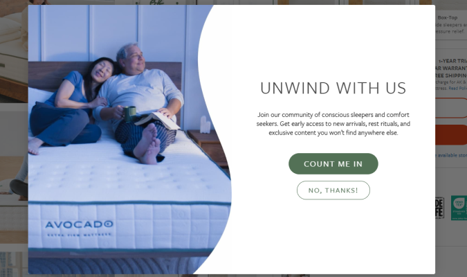
Avocado Green Mattress is an eco-friendly mattress brand that caters to shoppers who find value in organic, sustainable products.
CTA: “Count Me In”
Location: Opt-in popup
Why it works:
- First-person focus: The headline invites users to “Unwind with us,” using the inclusive first-person plural. The CTA text follows naturally with a first person singular, “Count me in.” This feels more personal than using second or third-person pronouns.
- Audience aware: All of the content is angled to appeal to types of buyers who care about sustainability, community, and the larger impact of their purchases. The button offers a way to be a part of something, not just a new item or discount.
- Low risk: Opting in is positioned as an easy action, like raising your hand, and opting out is a polite, “No, thanks!”. There’s nothing pushy or risky about choosing either button.
8. Steep & Cheap
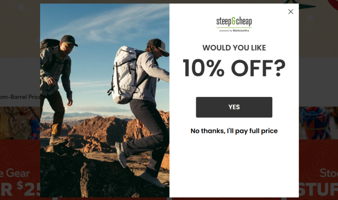
Steep & Cheap is an online outdoor retailer that attracts deal hunters and budget-minded consumers. They want to keep urgency high, and low prices in focus.
CTA: “Yes”
Location: Exit popup
Why it works:
- Simplicity: There are 12 words in the whole ad, which could not be easier to understand. The button text is just answering Yes to the question.
- FOMO Framing: The opt out, “No thanks, I’ll pay full price,” is more than twice the length of any other text in the ad, putting a focus on the fear of missing out (FOMO). This plays into loss aversion, which is the common human behavior to focus more on potential losses than potential gains.
- Timing: I got this popup when I tried to leave the site. Using an exit popup to offer a discount makes sense for Steep & Cheap’s audience: we’re looking for a bargain, and the extra savings might be enough to get us to pull the trigger.
9. Stereofox
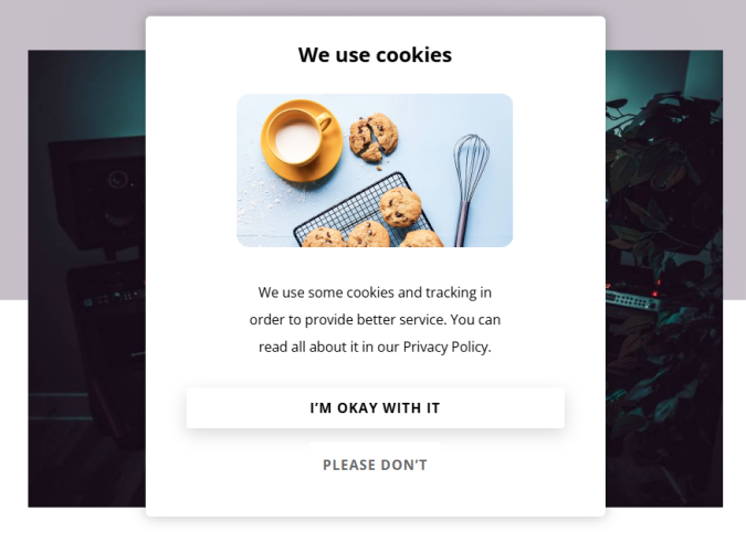
Stereofox is a music blog and record label that helps people discover emerging artists. Because they’re based in Europe, they have to be extra careful and transparent about how they collect user data.
CTA: “I’m okay with it”
Location: Privacy disclaimer popup
Why it works:
- Humor: Who says you can’t have a little bit of fun with privacy regulations, which require all sites to disclose tracking “cookies”. Whereas every other site uses the same annoying cookie banner design, Stereo gets user consent in a grounded, humorous way.
- Natural text: Your options are “I’m okay with it” or “Please don’t,” both of which sound like humans actually talk. Most disclaimers use sanitized, overly-formal language, forcing you to click a button that says something like, “Confirm consent choices.” Stereofox appears more friendly by comparison.
- Transparency: Whereas some brands use “dark patterns” to try and get your consent for hundreds of advertising cookies, Stereofox makes it easy for people to read the linked privacy policy, which builds trust without slowing users down.
What Metrics Matter for CTA Button Performance?
Is your CTA button performing well? For most brands, it comes down to three questions:
- Did people click the CTA button?
- Did you convert the people who clicked?
- And, if you paid for traffic, was it worth the cost?
Answering these questions means taking a closer look at three important metrics.
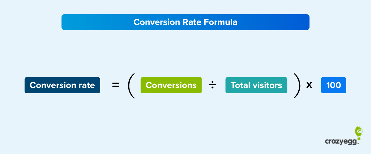
Click-through rate (CTR) tells you if your button is working at all. It’s a percentage that compares the number of people who saw your CTA to the number of people who clicked it.
Just looking at the total number of clicks doesn’t tell you how well the CTA button is doing. On a landing page, for example, getting 10 clicks when you have 10,000 visitors is a CTR of 0.1%, which is pretty bad. If you got 10 clicks with only 100 visitors, that’s a CTR of 10%, which makes that same 10 clicks look pretty darn good.
This post goes into much more detail on CTR and how to boost it, if you are unfamiliar.
The conversion rate compares the number of people who saw the CTA button to the number of people who converted. It shows what happens after the click. Someone clicked your “Start Free Trial” button, but did they actually sign up? Did they actually complete the purchase?
At the end of the day, conversions are what pay the bills, so you can’t just look at how many people clicked the CTA button.
You’ll have to look at your own data to figure out what’s a good conversion rate for your brand. There’s too much variance, even for brands within the same industry.
The other big metric is cost per action (CPA) matters when you’re paying for website traffic. This looks compares your total ad spend to the number of conversions. For example, if you spend $500 on Meta ads and get 25 sign-ups, you’re paying $20 per conversion.
This tells you whether your CTA (and everything that follows it) justifies the cost of getting people to see it.
Those three metrics are crucial for determining the profitability of a website funnel. Getting the click is step one. Converting that click is step two. Making the economics work is step three.
CTA Button FAQs
Working in marketing and conversion rate optimization, both in-house and for agencies, I’ve fielded a ton of questions about CTA buttons. Here are answers to some of the common questions I get from colleagues and clients.
What is the best CTA button color?
There’s not one best color. It depends on your website color palette. From there, you need to make sure that the color of your CTA button stands out.
So if you have an orange website, a blue button is going to stand out. And the same is true in the opposite case, like Ahrefs, with a blue site and orange button:

The contrast is important. But beyond that? I wouldn’t over think it.
I’m not 100% sold that color psychology matters. Sure, different hues can impact people’s emotions, but I think it starts to get into the land of marketing mysticism when I hear people claim that certain button colors are going to affect user behavior in a predictable way.
The color palette should look good and it should make sense for your target market. The luxury brand probably doesn’t want to use fire-sale colors, for example.
Then, make sure the CTA button contrasts from the rest of your site. Done.
Can I use symbols and emojis in CTA Buttons?
On the technical side, sure. These days, as long as you stick to standard symbols and widely-supported emojis, you aren’t likely to have your button display incorrectly.
On the CRO side, I’d say it depends. Navigation cues (like: ›, →, or ») can be helpful, especially if your CTA is directing users to a different page (like, “Shop our record collection”) or signalling a step forward in a multi-page flow.
Including symbols like ↓ or ⇩ to signify a download can be helpful. Same with platform logos to differentiate mac and PC.
With emojis, I’d stick to ones that help clarify what the CTA button does or strengthen the emotion you want to convey. You can include them to clarify what’s offered, to amp up excitement, or to make the CTA seem friendlier.
Just make sure you understand your audience, and track your usage to see if it’s really helping users navigate your site and increasing performance.
Can I have more than one CTA button on the screen?
Of course, but you want to have only one primary CTA button visible at once. I’ve shown a bunch of examples in this post where brands have a primary, secondary, and even tertiary CTAs in the same viewport (visible area of a user’s screen).
The key is making the primary CTA the focus and ensuring that any other CTAs are clearly secondary.
Do I need to use unique CTA text?
Of course not, but it can help differentiate your brand. Above all else, your button text should be:
- Clear
- Concise
- Intuitive
- Explanatory
From there, you can potentially improve it by using copywriting to:
- Lower the perceived risk
- Increase the perceived gain
- Add urgency
- Appeal to target audience
The more sure you are that you have a good sense of your buyer persona and what they want, the more freedom you should feel confident to take in using more unconventional copy in your CTA button text. Here are some examples of unique CTA button text that do a great job speaking to their audience.
The less sure you are, the safer I would play it. Plenty of brands with amazing sites and bottomless resources opt for basic, functional, CTA buttons. They have probably tested other options and found that simple text works best.
How do I test CTA button performance?
The gold standard is A/B testing, where you come up with a new button and split traffic between your existing site (A) and a variation (B) where only the button has been changed.
A/B testing tools make this really easy, provided you have enough traffic for your test to reach statistical significance (i.e. your results aren’t just random chance), which is about 2,000 sessions per week.
If you don’t have that kind of traffic, you can still test CTA button performance by looking at your web analytics, especially metrics like clickthrough rates and conversions.
You can also use heatmaps to look at where users are spending their time and scrollmaps to see how far down they go. Session recording can offer you really deep insight into how users interact with different buttons.