Ease of use is a common expectation for a site to be considered well designed.
Over the past few years, we have been used to certain standards in web design.
In order to make a lasting impression on your visitors, you need to build experiences that go beyond those of a plain, usable website.
This does not mean usability has become any less important.
It just takes on a different role in web design, now forming the basis for a great user experience.
Usability means user-centered design.
Both the design and development process are focused around the prospective user, to make sure their goals, mental models, and requirements are met. And to build products that are efficient and easy to use.
Here are 5 key principles of good website usability. Make sure to consider these in your next project.
1. Availability and Accessibility
If people try to access your website and it doesn’t work — for whatever reason –your website becomes worthless.
Not only will users become frustrated, but you’ll also lose out on new customers and revenue every time your site is unavailable.
Here are a few of the basics of availability and accessibility,
- Server uptime – It’s important to ensure your visitors don’t get an error trying to load your site. Invest in good hosting. Invest in good hosting. We never cut corners here, get a good web host that you can depend on.
- Broken links – Double check that there are no dead links on your site. SEO tools like Ahrefs and Screaming Frog will crawl your site for you and find all the broken links.
- Mobile responsiveness – Make sure your site can handle different screen sizes and slow connections. Google has also moved to a “mobile-first” index which means they index the mobile versions of sites. So a great mobile site will help you get better search results.
Amazon.com

Amazon.com is a perfect example of an accessible website for several reasons.
First, the desktop version of the site is optimized for both tablets and desktop screens. The layout is flexible and adjusts automatically as the screen size is reduced. For mobile, there is an explicit version of the site with a clean interface, less clutter, and a clear hierarchy of the content. This stripped down mobile version works like a charm — even with a slow mobile internet connection.
Second, Amazon.com has almost no downtime. Obviously, this is what you expect from a company that size. Still, the history of constant availability makes Amazon a reliable and trustworthy service platform.
Last but not least, Amazon is actively concerned with it’s accessibility. On their website, they state: “We’re always looking for ways to improve usability of the site for our customers, including those with disabilities.” For screen readers, they specifically recommend their mobile site with a cleaner presentation of the content.
2. Clarity
You could say the core of usability is clarity.
If you distract or confuse your visitors, they will either need more time to find what they came for, or they might forget their initial goal all together. Either way, they will not experience your website as user-friendly and chances are that they leave dissatisfied and with no intention of coming back.
Visitors come to your site with certain goals in mind. It is your job to help them reach these goals as quickly as possible. If you can manage to do that, your visitors will be pleased and you have laid the groundwork for a positive experience.
A clear and usable design can be achieved through:
- Simplicity – Focus on what’s important. If you don’t distract your vistors they will be more likely to do what you want them to do.
- Familiarity – Stick to what people already know. There is nothing wrong with looking at other sites for inspiration.
- Consistency – Don’t get cute. Create a consistent experience across your entire website to keep your visitors mind at ease.
- Guidance – Take your visitors by the hand. Don’t expect your visitors to explore your site all on their own. Instead, guide them through your site and show them what you have to offer.
- Direct feedback – Feedback is essential to any interaction. The moment people interact with your site, make sure to offer an indication of success or failure of their actions.
- Good information architecture – Understand your visitors’ mental models and how they would expect you to structure the content on your site.
Apple

Apple is known for its lean and user-friendly products.
The extreme simplicity of the brand and the focus on what really matters can also be found on their website.
The overall appearance is very elegant and minimalist. There is a lot of white space and only relevant content is presented in a clean and straightforward way. The classical top navigation menu holds the logo and home button, the store, different product categories, a link to the support page, and a search function. The footer of the site holds classical secondary links, such as the Terms of Use and Privacy Policy.
There is no distraction, making it very easy to pursue your goals on the site.
For example, when choosing the category “Mac” in the top navigation, you get a visual overview of the different Mac products available. Besides, you get a sub navigation listing all related products relevant for this category. The clear design makes the website just as intuitive to use as all other Apple products.
3. Learnability
Learnability is another important aspect of usability.
It should be your goal to design intuitive interfaces — interfaces that don’t require instructions, or even a long process of trial and error to figure them out. Key to intuitive design is to make use of what people already know, or create something new that is easy to learn.
By now, people are familiar with a lot of design concepts used on the web. By using these concepts consistently, you meet your visitors’ expectations. This way, you help them reach their goals more quickly. As human beings, we like patterns and recognition, which is why we are better at handling familiar situations rather than unfamiliar ones.
If you use new concepts in your design, make sure to use them consistently and give people a hand during the initial learning phase. For example, you can offer additional information, or instructions the first time they use your site or product. Keep it simple and visual to help people remember new concepts.
Microsoft

Microsoft redesigned their website last year.
While the design is very fresh and modern, the layout of the site is classical and in line with what most of us know about websites. At the top left, there is the logo telling us where we are. On the top right, there is a search field, allowing us to search the site for any random term. Below, there is the top navigation menu featuring the central content categories of the site. When clicking on the links, we get a dropdown menu with all the content available within that category.
Then, there is a big visual header element which alternates between four different images. The header is followed by what we know as content area with a vertical sub navigation menu featuring different topics that can be “discovered” and some highlighted content. Below that, there is a social media section and a comprehensive footer area which features Other Microsoft Sites and a lot more secondary links.
The site is very clean and easy to navigate. The familiar layout helps people to quickly find what they are looking for.
4. Credibility
Credibility is a crucial aspect of any website.
Even if people find the content they are looking for, if they don’t trust you, that content is worthless. Your website could cause site visitors to be skeptical about your business in any number of ways including whether or not you really exist, your reputation, or the quality of your content.
It is important that people know you are a real company with real people. Offer a clear “About Us” page together with your contact details and if possible a physical address.
Of course your content also plays an important role for the perceived trustworthiness of your site. Make sure you are honest and precise about your content. Avoid mistakes, such as incorrect grammar or misspellings. Don’t be modest about your expertise. If you are an expert in your field, make sure people know it. For example, you can show third-party testimonials, work references, or the number of your social media followers to win your visitors over.
L’ORÉAL

The brand L’ORÉAL does a great job when it comes to building web credibility.
Besides the professional design, which matches the exquisite reputation of the brand, they offer a lot of high quality content to demonstrate their expertise.
For example, an entire content section covers information about Research and Innovation. This shows the engagement of the brand in professional research and reflects the high quality of its products. Another content section addresses Commitments, demonstrating that the brand takes its social responsibilities seriously.
Besides the actual research, the brand also makes use of expert testimonials and photographs of celebrities, such as Julia Roberts, to convince people of the quality and popularity of their products. Another trust indicator is that it is very easy to get in contact with L’ORÉAL. The brand is not only available via social media, but also a physical address and phone number is easy to find.
5. Relevancy
Last but not least, relevancy contributes to good website usability.
It is not enough that your website is clear, your content must also be relevant. Again, it is essential that you know your users and why they visit your site.
Start with defining who your users are. Second, talk to them to find out what their goals are when visiting your site. Third, define user scenarios that demonstrate in which situation people visit your site to find what kind of content. Any design decision that you make should result in a more user-friendly website for your users.
Nike
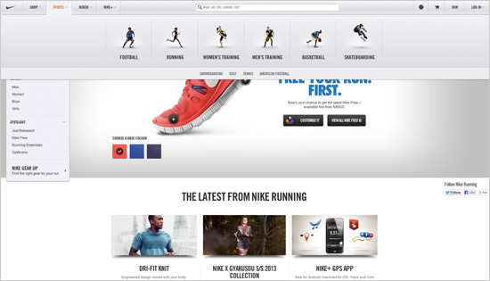
Nike has done an exemplary job in prioritizing their content with focus on their users.
The brand offers sportswear and equipment for different sports. When coming to their website, you can either choose to browse their store by Men, Women, or Kids, or you can browse by sports. Instead of only grouping people by their age or gender, Nike recognizes their visitors as sportspeople within a certain discipline.
For example, if you are looking for new running shoes, you don’t even care about all the tennis or indoor sports shoes they also have. Nike allows you to browse their store according to your very specific goal.
Usability means test, test, and test again
Good usability is not attained overnight.
It requires thorough user research and an iterative approach of constant testing and refining.
Good usability depends on whether your website is available, clear, credible, learnable, and relevant to the people who actually use it.