Google Analytics doesn’t have a heatmap feature. It never had.
Google used to have a Chrome extension that allowed you to create a simple click map. That’s what most people — and ranking articles — mean when they mention “Google Analytics heat map.”
In this article, I will show you how the extension worked — what it could and couldn’t do.
I will also show you how Crazy Egg heatmaps fill the gap and how to use them together with Google Analytics 4 and other qualitative and quantitative data sources to inform website optimizations.
What happened to the Google Analytics heatmap
Google has never built a native Google Analytics heatmap feature.
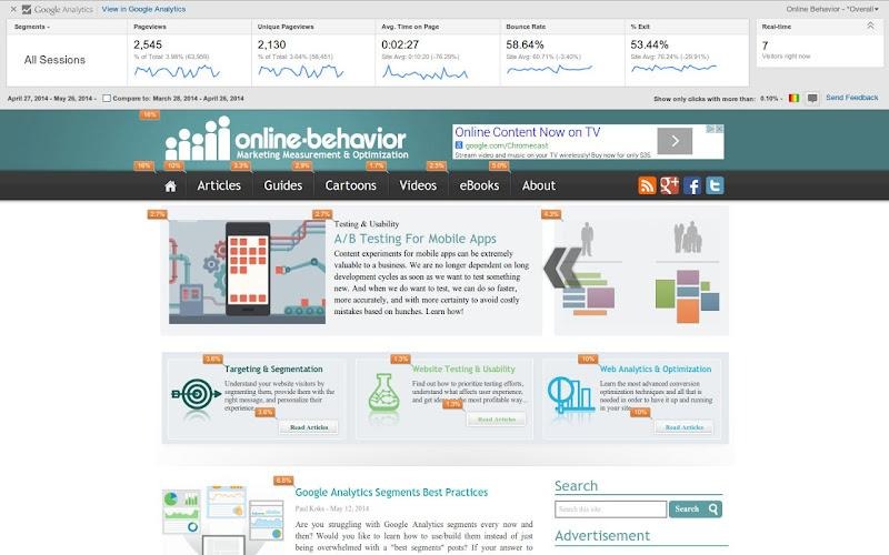
The closest it got was a dashboard report called In-Page Analytics — a view inside Universal Analytics that showed click percentages directly on your site.
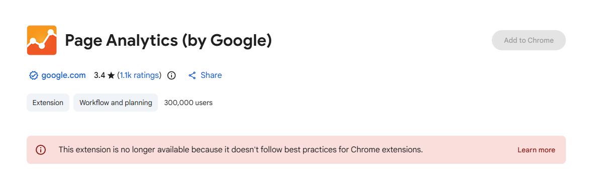
Google later moved this functionality out of GA and into a standalone Chrome extension called Page Analytics.
The extension added a reporting bar at the top of your site while you browsed it.
You could configure up to four audience segments, change the date range, switch between all visitors and real-time traffic, and choose which metrics to display: page views, unique page views, average time on page, bounce rate, or exit percentage.
It also offered an overlay with bubbles showing percentages of clicks on links, and that’s what many refer to when they talk about “Google Analytics heat map.”
The bolded “on links” bit is vital. The extension measured only user engagement with the clickable page elements.
But it offered no dead- or rage-click data or scroll-depth analysis, so the use cases were limited.
For example, you could see which links they clicked instead of the CTA button, but couldn’t see which other page elements distracted them or which page sections they saw.
Google deprecated the In-Page Analytics report in early 2017 and stopped updating the extension shortly after. The last Chrome Web Store update was in 2019, and it was never compatible with GA4.
At the moment of writing in March 2026, you can’t add it to Chrome anymore.
How to get similar link click data from GA4
The Page Analytics extension is dead, but you can replicate its functionality with a custom GA4 Exploration.
First, set up a custom event in Google Tag Manager with a trigger that fires on all link clicks and captures the link URL as a parameter. This allows GA4 to capture clicks on internal links, and not just external links.
Once the data is flowing, build a Free-form Exploration:
- Go to Explore in GA4 and create a new Free-form exploration.
- Add dimensions: Page path and screen class, and Link URL (or Link text).
- Add metric: Event count.
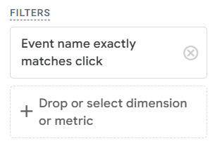
- Add a filter: Event name equals your click event.
5. Set Page path and screen class as rows and Link URL as columns (or both as rows for a flat list).
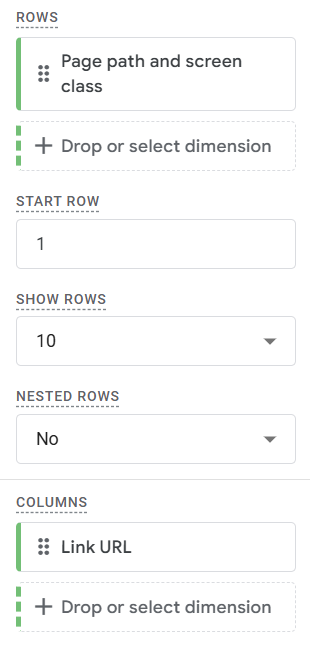
6. Set the Cell Type to Heat map
This gives you a color-coded table showing which links get clicked on which pages — the same core data the extension provided.
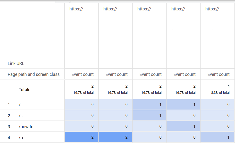
The table view is more convenient than the Page Analytics extension overlay because you see the data for all pages in one place.
But you still get nothing for scroll depth, dead clicks, rage clicks, or non-link elements.
The other kind of “Google Analytics heat map”
“Google Analytics heat map” is also used to describe data visualization heatmaps. That’s the color-coded tables, grids, or maps, where color intensity represents volume. The darker, the higher the count.
GA4 uses them in various reports, for example, cohort analysis.
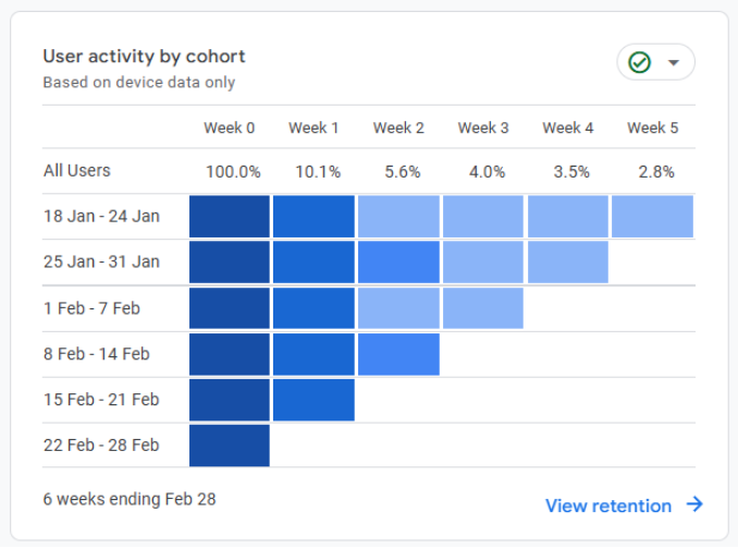
Such heatmaps make it easier to digest quantitative web analytics data but offer no qualitative insights into user behavior.
The what, not the why.
To get the latter, you need heatmaps of user interactions with page elements (like those in Crazy Egg).
The day-and-time heatmap that GA4 dropped
Universal Analytics had a traffic heatmap that showed sessions by day of week and hour of day — a color-coded grid that made it obvious when your site was busiest. Useful for scheduling content, timing ad spend, and staffing live chat.
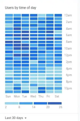
GA4 doesn’t have the report. Many users miss it, so there are plenty of workarounds:
1. Spreadsheet: Export the data from GA4 via the API or as a .csv file, create a pivot table, and use conditional cell formatting to achieve the heatmap effect.
2. Looker Studio: Connect your GA4 account and build the pivot table.
Again, this heatmap doesn’t tell you how users interact with your page, but only when.
What Crazy Egg heatmaps show and GA4 can’t
Crazy Egg offers five heatmap types that help marketers understand what website visitors do and why: click maps, confetti maps, scroll maps. overlay maps and list maps.
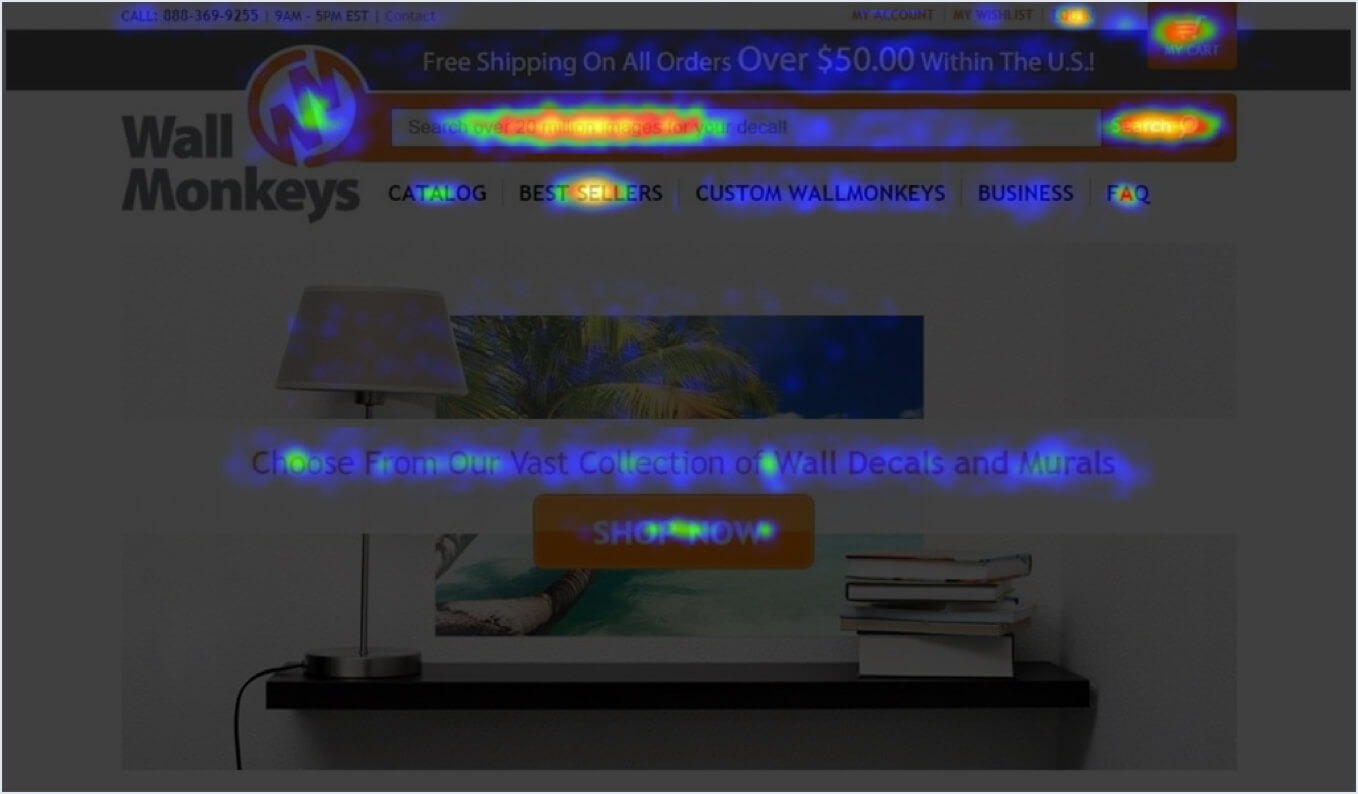
Click maps: where users click and where they don’t
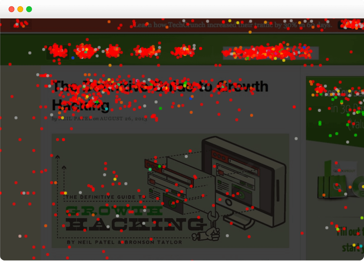
A click map is an overlay that illustrates every click on the page.
That’s clicks on clickable page elements, but also everywhere else. For example, dead clicks on UX elements that the users expect to be clickable. Or rage clicks.
Click maps, like all the other map types below, are color-coded. The warmer the color, the more clicks on the spot. Hence, the term heatmap.
Such click maps help you understand where on the page visitors focus and which parts they ignore.
That’s how Wall Monkeys, one of our customers, discovered that visitors weren’t clicking the CTA in the homepage hero slider and went straight to the search bar.
Confetti maps: the same page, different audiences
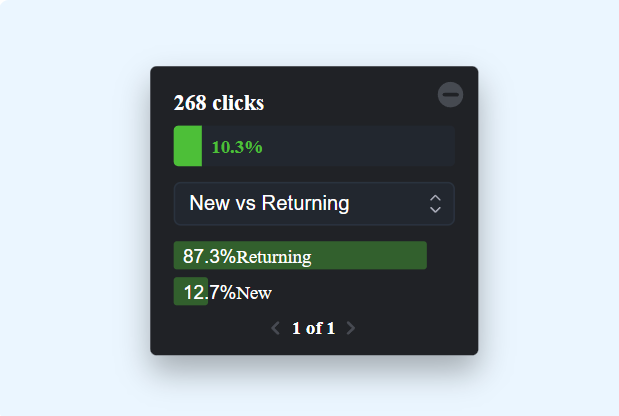
Confetti maps are a kind of click map. They also display individual clicks — as color-coded dots, which resemble confetti scattered around the page.
The main strength of confetti maps is that you can visualize click data for different audience segments using 17 metrics. For instance, traffic source, device, OS, campaign name or medium, browser, new vs. returning.
Say you choose to segment the clicks by Referrer. Crazy Egg will populate the map with click dots whose colors represent different referral sources.
Red for google.com, orange for google.co.in, and so on.
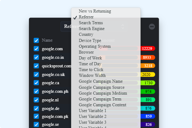
Thanks to this, you can identify issues that affect specific user groups.
For example, Sendible, a social media management platform, used confetti maps filtered by browser to catch a serious Firefox readability issue on their pricing page. It affected 5% of visitors, so not insignificant, but completely invisible in aggregated click data.
Scroll maps: how far users get before leaving
A scroll map is a gradient overlay showing the percentage of visitors reaching each section of the page.
Again, the hotter the color, the more users see the section.
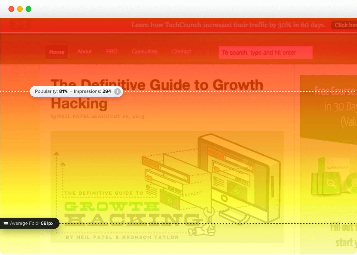
Scroll map insights let you improve your page design so key elements that drive engagement and conversions, like CTA buttons or testimonials, appear where visitors are most likely to see them.
Radio Free Europe, a Crazy Egg customer, uses scroll maps to study user engagement with their content — where and why they stop reading. This helps the team optimize article length and deliver value in the sections that attract the most attention.
Overlay maps: how users engage with clickable elements
Overlay maps show you how many users engage with the clickable elements on your page.
Each link, button, or search bar is marked with a plus.
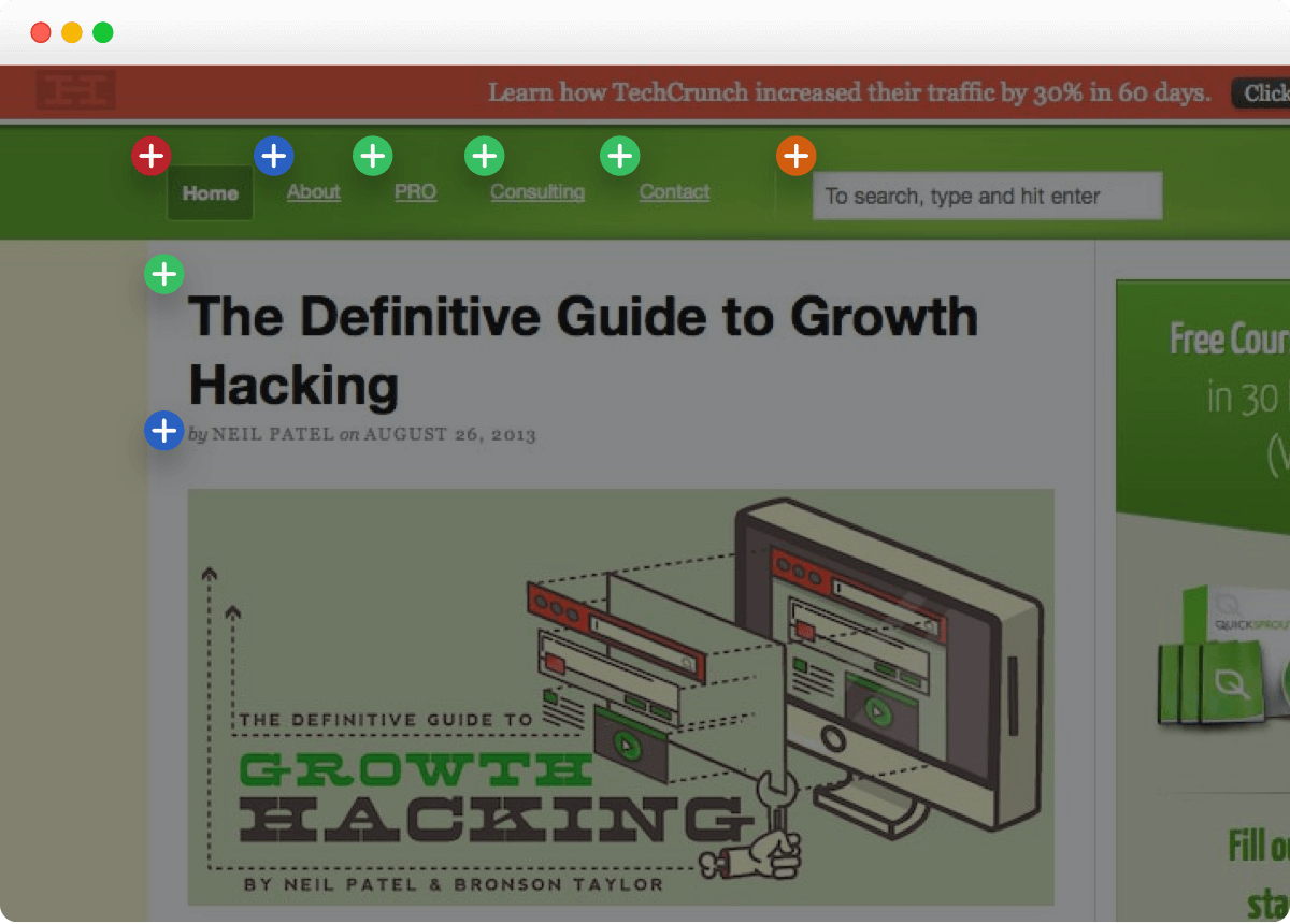
Click on it, and a box with the total click count and percentage pops up. This is what the Page Analytics extension showed.
In the overlay, you can segment the data for more granular insights, just like in confetti maps. (This wasn’t possible in the extension.)
Overlay maps can help you find elements that distract users from clicking where you want them. For example, instead of clicking the ‘book the demo’ button, they might click other links and navigate away from the page.
Softmedia used the overlay map to learn which form fields users left blank. This allowed them to simplify the form and increase the conversion rate.
List maps: what users like to click on
The list map report is a table with all click details on the page: what gets clicks, what kind of UX element it is (link, button, search box, etc.), and how many times people click it (total count and percentage).
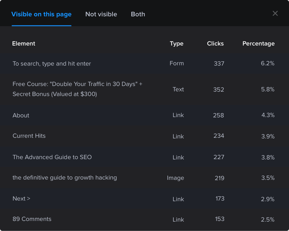
Presenting click data like this gives you instant insights into user preferences. Do they prefer to engage with videos or images? Links or buttons?
Lists are also better for tracking user engagement with moving elements like pop-ups or sticky buttons, which are difficult to analyze with regular heatmaps.
View GA4 data in Crazy Egg to get a full picture
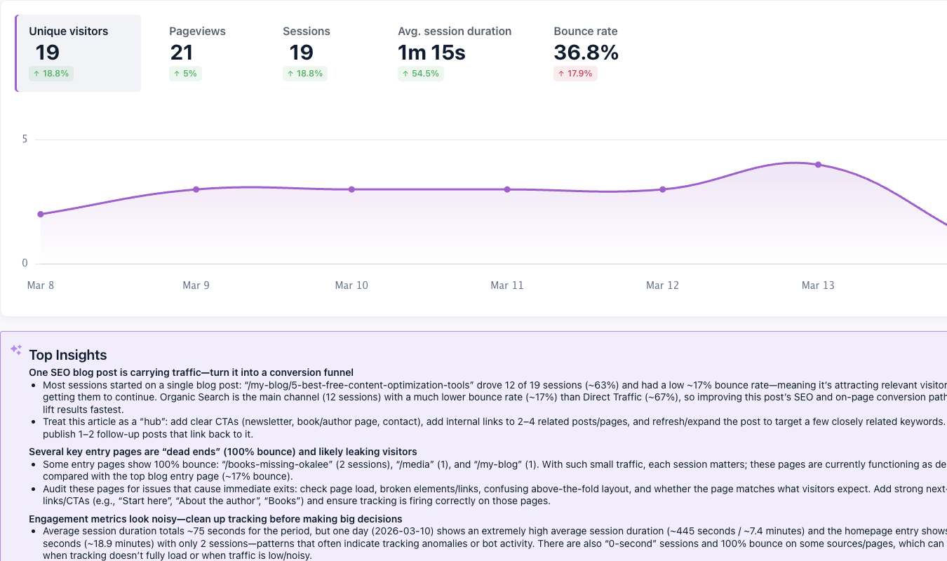
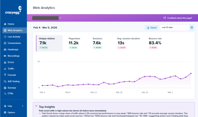
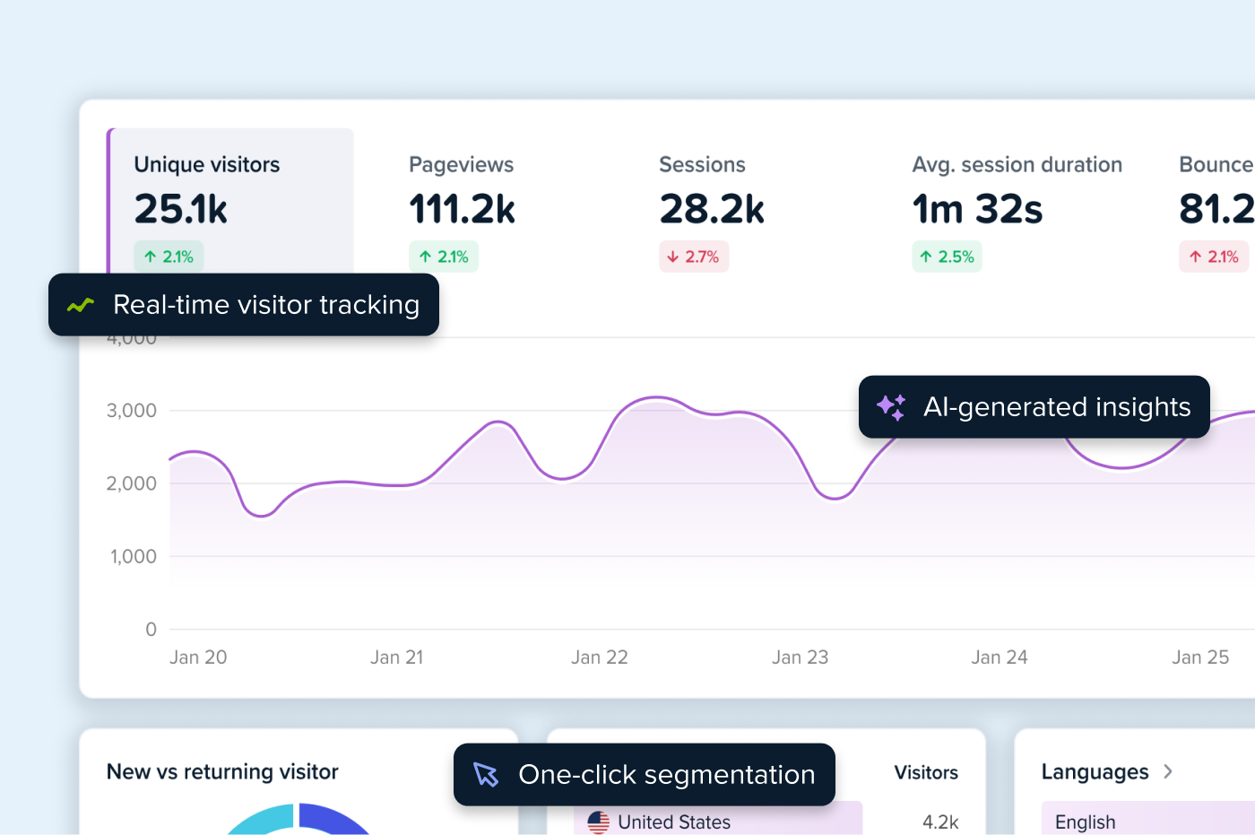
Google Analytics doesn’t offer heatmaps, but it doesn’t mean you have to toggle between tools to get a complete view, because Crazy Egg offers web traffic analytics.
And you can connect your Google Analytics account to sync traffic data to view and analyze it from your Crazy Egg Dashboard. Sessions, pageviews, session durations, bounce rates, and more.
This means you can flag underperforming pages with GA4 data, drill into the root causes with heatmaps (and other tools), and track performance once you implement changes directly in Crazy Egg.
Here’s a hypothetical scenario of what it could look like:
- Locate the issue. Web traffic from GA4 and conversion analytics show the page is attracting traffic but not converting.
- See the pattern. A click map shows users are ignoring the primary CTA.
- Understand the context. Session recordings show users pausing, then scrolling past it.
- Ask the user. A survey asks: “What stopped you from signing up?” Top response: “I wanted to see pricing first.”
- Tweak the design. A new variant, designed with the visual builder without developer help, moves pricing above the CTA.
- Test the fix. An A/B test validates the solution.
- Deploy and measure performance. Website traffic data and conversion analytics show improved performance and show other areas to optimize.
A full optimization loop. Everything you need to improve conversions and enhance the user experience under one roof.
Google Analytics has no heatmaps, so choose another tool
Google Analytics doesn’t support heatmaps, so you can’t analyze user on-page behavior. To do this, you need a dedicated UX analytics tool.
This means switching between tools to get a complete understanding.
Unless you use a tool that integrates with Google Analytics.
Crazy Egg supports multiple heatmap types — as well as session recordings, surveys, and A/B testing. And thanks to the GA4 integration, you can also analyze the web performance.
You can try out all the features for free. Start your 30-day trial today.
FAQs
Does adding a heatmap tool slow down my site?
Crazy Egg’s script is lightweight and loads asynchronously, so it won’t block page rendering.
Most other tools work in the same way, but always run a page speed audit before and after installation to be on the safe side.
Do heatmaps work on mobile, or do I need separate reports?
Crazy Egg heatmaps capture user interactions on mobile and desktop. However, tap patterns on a phone are fundamentally different from click patterns on a desktop, so view and analyze them separately.
The confetti maps are particularly useful for this. You can segment by device and compare exactly how each audience interacts with the page.
How long should I collect heatmap data before acting on it?
In general, let the heatmap collect data for 2-3 weeks. Even on smaller sites, a few dozen clicks can reveal a lot. The important part is to run the heatmap for long enough to avoid having the data skewed from one-off events. Like a marketing campaign.
Do heatmaps collect personal data? What about GDPR and CCPA?
Crazy Egg is GDPR, CCPA, and HIPAA compliant. It masks sensitive data — passwords, payment fields, form inputs — at the DOM level before anything is transmitted. It stores IP addresses anonymously, uses first-party cookies only, and doesn’t use cross-site tracking.
However, if you serve EU visitors, pair it with a consent management platform.
Is there a heatmap in Google Tag Manager?
No, Google Tag Manager has no heatmaps. As a tag deployment tool, it manages scripts, not analytics.
But GTM is an easy way to install a heatmap tool like Crazy Egg. You create a Custom HTML tag, paste the tracking script, set the trigger to All Pages, and publish.