Conversion rate optimization offers one of the fastest, most effective methodologies for turning your existing web traffic into paying customers.
Also known as CRO, conversion rate optimization can involve numerous tools and strategies, but they’re all geared toward the same thing:
Converting visitors into leads and leads into customers.
There is a lot of conflicting and illuminating information out there about CRO. For instance, one study found that using long-form landing pages increased conversions by 220 percent.
However, some companies find that short-form landing pages work better for their audiences.
Similarly, about 75 percent of businesses who responded to another study stated that they struggled to find experts to help them optimize their landing pages.
Furthermore, 84 percent of landing pages have navigation bars, while studies show that removing navigation can boost conversions by up to 100 percent.
These numbers all illustrate why we need to focus on CRO if we want our businesses to succeed.
Let’s look at some of the most important things you need to know about CRO. I’ll walk you through the definition of CRO, the options you have for testing and iterating, and the strategies I’ve used to grow my own websites.
Run your CRO strategy using Crazy Egg tools
What Is Conversion Rate Optimization (CRO)?
Conversion rate optimization is the process of increasing the percentage of website visitors that convert on your site.
For instance, if you have a 25 percent conversion rate, that means 25 percent of people who visit your website actually convert.
It’s kind of like running a retail store. Lots of people might enter and browse, but some leave without actually spending money.
The conversion optimization process focuses on two things:
- Reducing friction in your funnel
- Enhancing the value of your offer
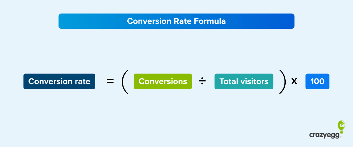
What Is Conversion Rate (CRO) and How Do You Calculate It?
Conversion rate is a ratio. It tells you what percentage of visitors to your website actually convert.
The equation is pretty simple:

Let’s say 100,000 people visited your website last month. Of those visitors, 3,000 bought a product.
Your conversion rate would be 3 percent (3,000/100,000*100).
If 10,000 people converted, your conversion rate would jump to 10 percent.
Depending on your site, you’ll usually have one of these conversion actions as your primary goal:
- Purchase
- Demo request
- Trial or free account signup
- Filling out a lead form
- Clicking an ad
- Becoming an email subscriber
This primary conversion goals are also called macro conversions. They’re the main goal of your entire site.
Your site might also have micro conversions, these are small steps that a visitor takes towards the larger conversion goal. They include things like social media shares, viewing specific pages, adding products to a shopping cart, downloading PDFs, watching videos, and that sort of thing.
We focus on the primary goal (the macro conversion) of the site when talking about the overall conversions rate.
The Biggest Benefit of Conversion Rate Optimization
Let’s look at the impact from having a better conversion rate.
For our fictional business, we’ll say that the company is selling just one product worth $300.
In our first calculation, we came up with a conversion rate of just 3 percent. Three thousand people bought the product, which produced gross revenue of $900,000.
That sounds great. But what if we boosted that conversion rate to our second equation, which quantified conversions at 10 percent?
In this case, revenue jumps to $3 million (10,000 people bought a product worth $300). Big difference, right?
Conversion rate optimization really comes down to one major benefit.
You’ll get more customers from the same amount of traffic.
This has a huge impact on most businesses.
You probably have a monthly marketing budget that you use to maintain your traffic volume. Maybe it’s in paid marketing, maybe it’s in content or social. Either way, traffic costs money.
Conversion optimization, after it’s live, gives you more customers from the same amount of money.
In turn, you’ll see several great changes in your business:
- The acquisition cost per customer will come down. When your marketing budget stays the same and you get more customers, each customer costs less to acquire.
- Your profit per customer goes up.
- With more profit every month, you can invest more to grow your business faster or take more profit out of your business.
Spending a few weeks or months on conversion optimization can unlock the next step in your business.
Understanding the Parts of Conversion Optimization
Conversion rate optimization has a lot of moving parts. Here’s what they all mean:
- Call to action (CTA): Tell your visitors exactly what to do next.
- Conversion funnel: This is the series of steps that someone has to take in your site in order to complete the primary goal of your site.
- A/B testing: A common practice to verify conversion improvements. Two (or more) versions of your site are shown to visitors. Conversion rates are measured on each version to see which one is most effective.
- Multivariate testing (MVT): A version of A/B testing that tests multiple variables at a time.
- Usability: A set of best practices and processes for making your site more user-friendly. Often, this increases conversions by removing friction in your site.
- Customer development: Tools and processes for understanding your customers better. When you deeply understand your customers, it’s a lot easier to design websites that convert a larger percentage of your visitors.
- User recordings: A tool that records users as they move through your site. Gives lot of feedback on where people get stuck and where they really want to go. It’s a great source of ideas for increasing conversions.
- Analytics: tools for measuring visitors and users. Measurement is a key piece of improving conversion rates.
- Heatmaps: A type of report that shows where people click on a page using “hot” and “cold” colors. It’s a great tool for coming up with ideas to improve conversions.
Tell your customers exactly what you want them to do with a large, attention-grabbing CTA.
Building an Effective Conversion Optimization Strategy
Are you searching for conversion rate optimization tips?
Let’s look at the list of metrics above. You need to know your starting metrics — a baseline, if you will — so you’ll know whether your CRO methods actually work.
You can get lots of information for free via Google Analytics.

For instance, let’s say you want to start by focusing on bounce rate and time on page. Other metrics that might influence those numbers could include page load time and UX.
Start with a strategy that looks something like this:
- Condense all images to the smallest size possible
- Improve top-level navigation and add breadcrumbs
- Sprinkle internal links through every page to encourage click-throughs
- Use big subheads on pages with lots of content to keep people reading
- Add unique CTAs to every page
This is a good starting strategy. Test every one of them using both A/B testing and multivariate testing to see how you come out, then repeat the process.
Ecommerce Conversion Optimization
In the ecommerce world, conversions often happen at prodigious paces. That’s especially true if you sell inexpensive products.

You have to make the purchase as simple and easy as possible. Shorten the checkout process, offer more forms of payment, and allow customers to buy products as “guests” rather than having to create an account.
Step-by-Step Process to Double Your Conversion Rate
Conversion rate optimization best practices can help you improve your results from the very beginning. In other words, you won’t have to start from scratch.
Following are some of the tried-and-true best practices I’ve used to accelerate my websites’ growth. You’ll learn how to do conversion rate optimization:
1. Identify your potential customer
Who belongs in your target market. And, sometimes more importantly, who doesn’t?
You want every marketing message to find its target. It must be so specific and compelling that your ideal customer can’t refuse it.
2. Survey users
Ask your users to complete surveys or polls. Keep the questions brief and few so you get more responses.
Avoid repetitive or boring questions. You’re looking for insights into your target customers’ specific wants and needs.
3. Collect and analyze data
Remember those metrics I mentioned earlier? Start tracking them. You can use conversion rate optimization tools like Crazy Egg, Hello Bar, and Google Analytics to make sure you cover all your bases.
As you gather more data, look for patterns. Maybe most of your customers find you via Twitter, for instance, or read your about page before looking at your products. You can use that information to boost conversion rates.
4. Run A/B tests
I can’t stress enough how important it is to run A/B tests. I’m always testing every aspect of my offers because I don’t want to leave money on the table.

Tools like Crazy Egg have built-in A/B testing functionality. This means you don’t have to comb through the data yourself and develop a pounding headache. Instead, you know the “winner” and the winning variant gets the majority of the traffic even before the test concludes.
5. Discover the exact journey visitors take through your site
Mapping your buyers’ journey can yield lots of tasty nuggets of data. Do they read lots of your blog posts? Do they follow you on social media? How far do they scroll down each page?
6. Focus on the content that matters using heatmap analysis
The most important pages on your website, such as your landing pages and product pages, deserve special attention. Run heatmap analysis on those pages to see where people click and how they use the page. You can then optimize it for maximum conversions.
7. Create the perfect page with A/B testing
A/B testing doesn’t stop after just one test. In fact, you might need dozens of tests before you craft the perfect page.
Test your headline, body copy, hero image, CTA, CTA button color, font size, font color, and anything else that might impact conversions.
8. Don’t “guess”
Everyone starts out with a guess, but that’s where the guesswork should stop. Once you’re actively collecting data, make decisions based on what the numbers tell you.
9. Guide your customers
CTAs and directional indicators can help you guide your customers where you want them to go. Be strategic about where you place CTAs, arrows, navigational panels, and other elements.
10. Reduce friction
Remove any elements that give the user pause or promote objections. For instance, if you don’t need a paragraph of copy on your sales page, delete it. Or, if you want to make the information more digestible, turn it into bullet points.
Conversion Optimization Rate Mistakes
Unfortunately, even with lots of information circulating the Internet, business owners still make mistakes when it comes to conversion rate optimization. I’d like to help you avoid the three most common pitfalls:
1. Not adding positive emotional response
In your copywriting, include positive storytelling to help convey benefits. Help your reader envision himself benefiting from your product or service.
2. Not adopting a mobile-first strategy
More than half of consumers use their mobile devices to surf the Internet. If your store isn’t mobile-ready, you’ll turn off prospects.
3. Not caring about the site speed
Your pages need to load fast. Consumers expect a page to fully load in fewer than 2 seconds.
Multivariate, or A/B Testing? Find out How to Test and Optimize Conversions
We’ve already touched on multivariate and A/B testing. They’re both highly useful conversion rate optimization tools.
A/B testing (also called split testing) is useful when you want to take a granular approach. You want to know how a CTA button’s color impacts conversions, but you don’t want anything else to contribute to the test.
Multivariate testing, on the other hand, works great when you have two very different versions of the same page or asset. Which one appeals most to your target audience?
Choose a testing platform
You can run A/B and multivariate testing manually, but I don’t recommend it. Use a tool to automate the process and get your results faster.
Crazy Egg, for instance, allows you to set up a split test and run it automatically. Crazy Egg will divide traffic evenly between the two versions, then hand you a “winner” once the test has reached statistical significance.
Analyze A/B test results
Once you have your results, record and analyze them. Why did your target audience prefer Version B, for instance? What aspect of the color red or the font Georgia or the wording of the CTA appealed to them?
You can use this information for later without running an identical A/B test.
Top Conversion Rate Optimization Tool
Once you’ve chosen a tool, such as Crazy Egg, you can run lots of different experiments. Each tells you something unique about your website and its visitors.

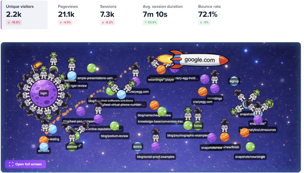
- Heatmap: Discover where mouses travel and users click or tap when viewing a web page.
- Scroll map: Find out the point at which most users stop scrolling on a given page.
- Recordings: Record individual sessions of a user’s experience on a specific web page.
- Snapshots: Look at different versions of reports Crazy Egg generates, from confetti to lists and overlays.
- A/B tests: Conduct A/B tests on any variation of a web page.
- Forms: Get detailed information about prospects and turn them into leads.
Advanced CRO Techniques
Once you’ve nailed the basics, you can drill down on more specific aspects of your website’s design, format, and copy to take conversion rate optimization to the next level. I recommend testing all of these facets of your website.
- Test big ideas, not small ones. To get big lifts on your conversions, you generally need to try bigger tests. Changing little things like button colors won’t impact many visitors.
- Focus on headlines. People use the headline to make a snap judgement on whether or not they should continue. A better headline could easily increase conversion rates by 30%. It’s on the few “small” elements that have a major impact.
- Remove fields in your signup form. The fewer steps in your form, the higher your conversion rate will be, usually.
- Interview customers. Use customer research to find the primary benefit that your market wants. Also look for the top three objections. Then make changes to your site that focus on the main benefit while addressing the main objections.
- Always run an A/B test. Results are often counter-intuitive, we’re still surprised by results. Hard data is the only way to ensure that your idea truly works.
SEO vs. Conversion Rate Optimization: Should You Focus on Increasing Traffic or Converting your Existing Traffic?
SEO and conversion rate optimization might seem like two sides of a coin. One is designed to attract more traffic (SEO), while the other optimizes content for existing traffic (conversion rate optimization).
So which matters more?
In my opinion, they’re equally important. Without SEO, you can’t get traffic in the first place. Without CRO, your traffic will produce fewer sales.
Let’s say you have a pretty good baseline for SEO, but it could use some improvement. First, though, you focus on conversion rate optimization. After a few months of hard work, your conversion rate jumps from 10 percent to 25 percent.
Great work! But it’s not over yet.
Now that you have a good CRO baseline, how do you grow your sales even further? You drive more traffic to your site and get even more conversions.
Conclusion
I’m a big fan of CRO and growth hacking.
Through conversion rate optimization, I’ve vastly improved my businesses’ conversion rates, and I’ve helped my clients do the same.
Sure, it takes work. But once you have the data, you can generate more sales and dominate your industry.
Start by understanding the definition of CRO and how it works. Focus on following the CRO best practices and avoiding the most common mistakes.
Use the best conversion rate optimization tools in the business. Crazy Egg offers an ideal tool. Then keep testing. The more data you have, the better your chances of converting visitors.
See how our tools work and start improving your conversion rate!