
Creating an effective site requires more that an attractive design.
You can have the perfect branding, eye-catching photos, and impeccable aesthetics. But your visitors aren’t becoming customers, your site isn’t help your business at all.
Your site needs to be designed to generate conversions. And that requires a strong understanding of your target audience.
Your need to know what they’re looking for and which elements will drive them to make major conversions, like buying a product or submitting a contact form.
But those actions start with smaller details, like the elements that attract their attention as soon as they land on a page, what they click on, and how they interact with your content.
That’s where user testing becomes essential.
Many site owners make the mistake of implementing standard “best practices” to increase conversions and sales. And while those recommendations can give you solid options to consider, it’s important to remember that they haven’t been tested on your audience.
In fact, your audience may react negatively to the changes that increased conversions on another site.
With user testing, you can learn more about how your site’s visitors respond to certain elements. Then, you can make data-backed decisions about your site with a focus on matching their needs.
This will help you drive engagement on your site, as well as develop a design that’s intuitive for your users. It can also help you create streamlined user flows throughout your pages to increase your conversions and ROI.
But… collecting all of this information sounds complicated, right?
It doesn’t have to be.
With Crazy Egg, you can start collecting data and running user tests with zero technical experience.
The following seven features make it simple to access actionable information about your visitors, then use that insight to optimize your site for conversions.
Crazy Egg Snapshots
As you optimize your site for conversions, it’s important to monitor each page’s performance, as well as the changes you make and the results you see with each change.
After all, the entire point of conversion rate optimization is to improve your site — so being able to determine whether you’ve done that is essential.
That’s exactly what Snapshots help you do.
What are Snapshots?
Snapshots are reports focused a single page on your site for a specific period of time. If you’re new to user testing, your first snapshots can serve as benchmarks.
They’ll show how your users are engaging with the current version of your site. Later, you can create new snapshots for the same pages to see how that engagement changes.
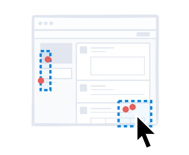
Within each snapshot, you’ll see several different reports on the page’s performance, including a heatmap, a scrollmap, a confetti report, an overlay report, and a list report.
We’ll get to those in a minute.
But before you can access any of that data, you need to set up snapshots to start collecting it.
How can Crazy Egg Snapshots help your site?
Snapshots help you track how users interact with a specific version of a page.
As you optimize your site, your snapshots will show the evolution of each page, as well as the results each one generated. This can give you a before-and-after look at how users respond to your changes.
You can see how users respond to each variation, and use your results to guide future changes and tests.
Snapshots can also be used to monitor both desktop and mobile visitors.
By default, snapshots solely include data from desktop, tablet, and smartphone users, but that data is all displayed on a screenshot as a desktop visitors sees your site.
If you want to focus on a particular segment of users, however, you can select which devices you want to track traffic from, and how you want to see it displayed in your reports.
How to create a Snapshot
Before you can start collecting user data, you’ll need to install the Crazy Egg script on your site.
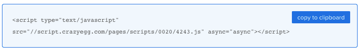
All you need to do to complete this process is copy and paste a few lines of code into your header file. You can grab this code and copy it to your clipboard here.
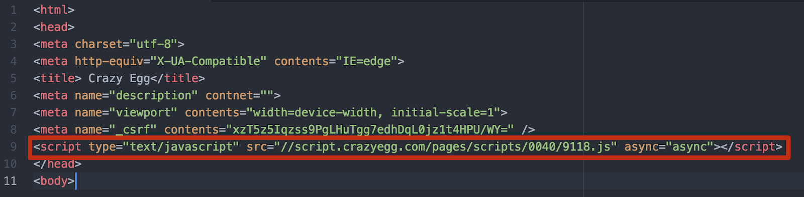
Then, open the file that contains your header, and paste that line of code just before the closing </head> tag, like this:
Save the file and re-upload it to your site. You’re ready to start collecting data!
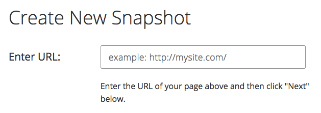
Return to your Crazy Egg dashboard and select “Add” to create your first snapshot.

Then, enter the URL of the page you want to monitor.
On the next screen, you can determine which visitors you want to track, and how you want their visits to appear.
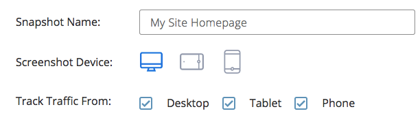
If you want to track and view all of your visits in the same snapshot, you can stick with the default settings.
But if you want to focus on optimizing a page for mobile visitors, on the other hand, you can exclude desktop and tablet traffic and opt to have your results displayed on a screenshot of your site as it appears on a smartphone.
From here, it’s up to you whether you want to customize your snapshot with any of the advanced options available on the page.
For most users, the default settings are a solid starting point. But if you want to customize your URL tracking rules, determine how your snapshot treats pop-up elements, change your sampling ratio, or create a delay timer, these are all options.
Then, click “Next” to determine your snapshot’s duration.
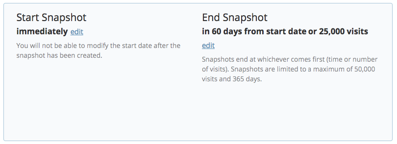
You can set your duration in terms of either days or visits, and your snapshot will end at whichever comes first. Snapshot durations are limited to 50,000 visits and 365 days.
Click “Next” to finalize your snapshot. If everything worked correctly, you’ll see a page confirming your new creation.
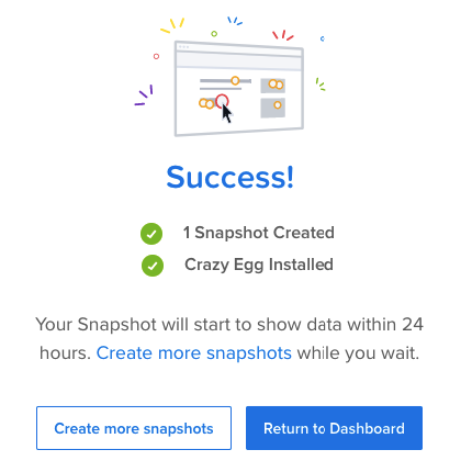
When you return to your dashboard, though, your new snapshot will be listed as “Pending.”
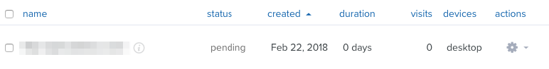
This status will remain until Crazy Egg’s server captures and processes a screenshot of your page. Then, it will switch to “Running” and your snapshot will start collecting data.
If you’re planning to optimize multiple pages on your site for conversions, you can go ahead and create snapshots for each of the pages you want to work on.
These can serve as performance benchmarks, and can give you helpful insight to use as you start your optimization process.
Crazy Egg Heatmaps
If you’re familiar with one Crazy Egg tool, it’s most likely heatmaps. This is our signature tool, and a great starting point for any conversion rate optimization process.
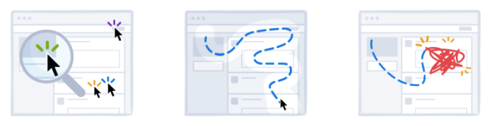
What is a heatmap?
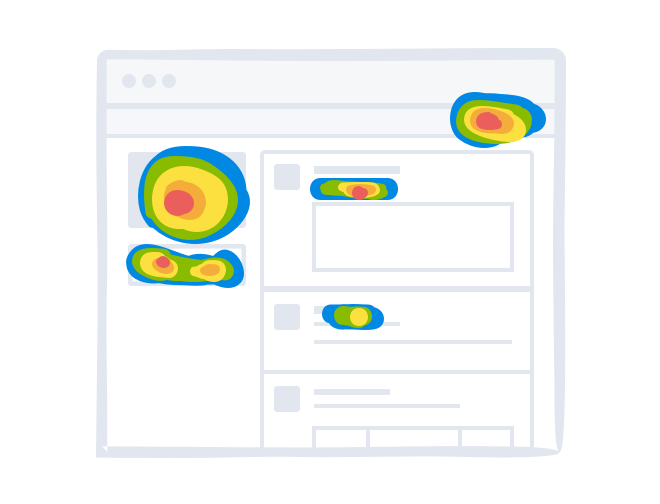
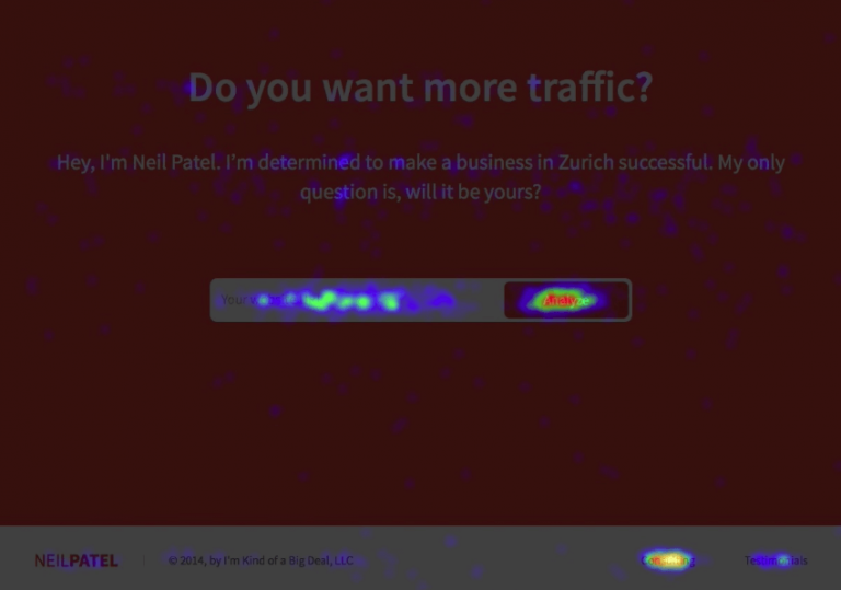
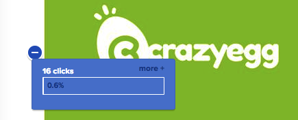
A heatmap is a visual representation of where users click on your site.
It pulls in data from actual user visits to show which elements on your page get the most attention, and which are being ignored.
Areas that get lots of clicks “glow,” so the more clicks an area gets, the brighter it will appear in the heatmap.
This makes for an extremely easy way to see how users engage with your content at a glance. Instead of analyzing hundreds of data points from a report, you can simply look at a page and see where visitors focus their attention.
Why are heatmaps important?
Heatmaps essentially show you what people care about on your pages.
They show you which elements attract attention and get clicks and which elements are being ignored. The underlying information, then, is what your visitors want.
If you see that certain types of elements like photos or case studies attract more clicks than the rest of the content on the page, you can deduce that your visitors want to see photos.
Then, you can use that information to guide the way that you design and improve that page, as well as others on your site.
This is particularly important for conversion-focused elements, like call to action buttons and signup forms.
If there’s anything you test on your site, these should be it. Optimizing the pieces on each page that play a direct role in driving action is the best way to make an impact on the metrics that matter most to your business.
Run heatmap tests on your conversion-focused pages, and see which are most effective at generating clicks.
When you know which buttons and elements get the most clicks, you can replicate those elements to increase your conversions site-wide.
On the flip side, it’s also important determine which pages aren’t driving conversions, and why that’s the case.
Sometimes, it’s not as simple as an element not attracting users’ attention. Some of your pages may have usability issues that prevent your visitors from taking the action you want.
Those issues could be anything from broken elements to confusing buttons to unclear calls to action. With heatmaps, you can determine exactly what they are.
Your reports can show you where your visitors are struggling, and what’s preventing them from becoming customers.
In many cases, you’ll find that unimportant elements are distracting users from taking more important actions.
For example, Conversion Rate Experts set a goal of increasing their opt-in rate for this resource page on their site:
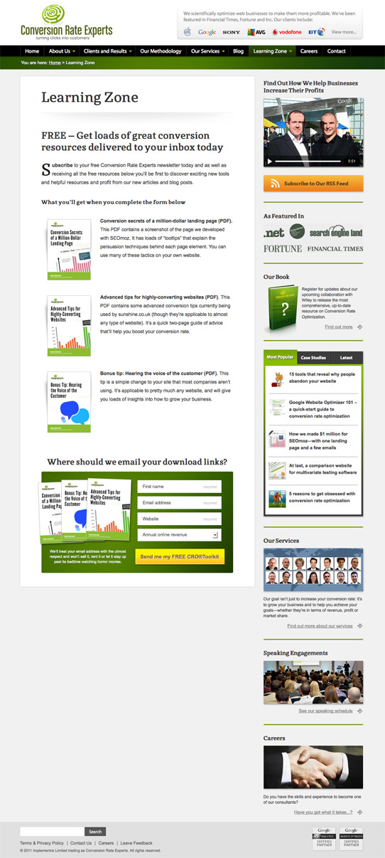
The page was performing well in terms of other metrics, and there weren’t any obvious issues preventing users from signing up.
But after running a heatmap test with Crazy Egg, they found that many of their users were being distracted by their sidebar.
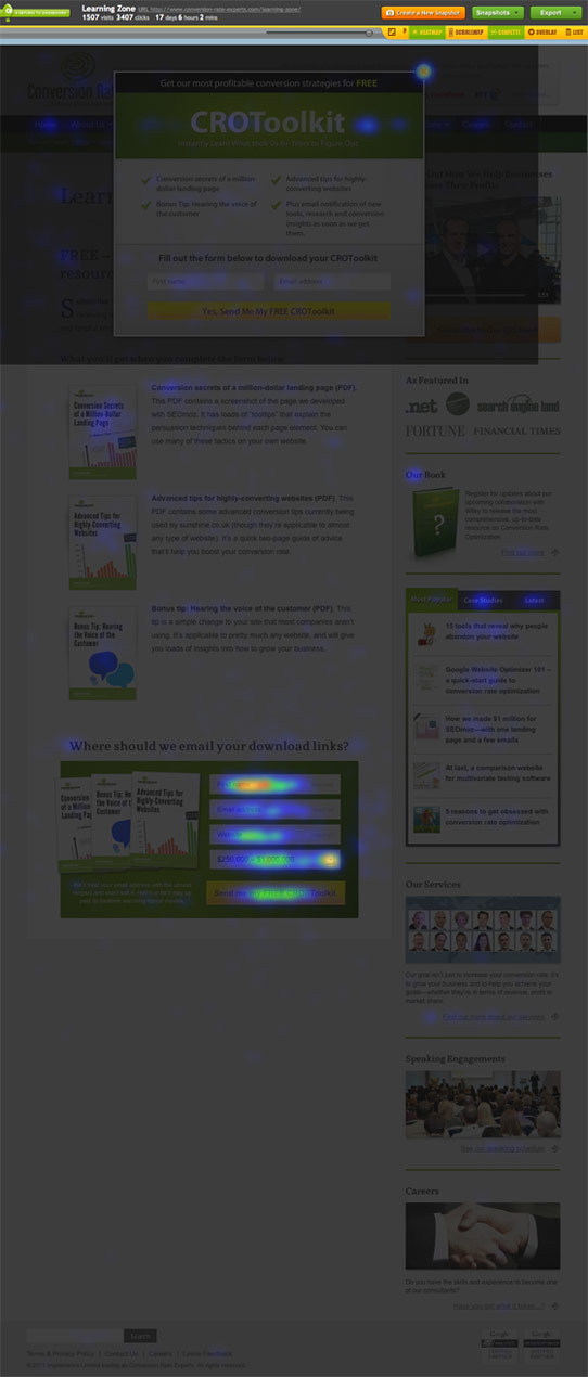
While a useful navigation setup is important, this page simply gave users too many options. And the sidebar on the right was distracting them from completing the goal conversion.
They used this insight to develop a variant of the page that was virtually identical, except that it didn’t have any navigation options on the right side of the page.
Then, they used Visual Website Optimizer to test that variant against the original page.
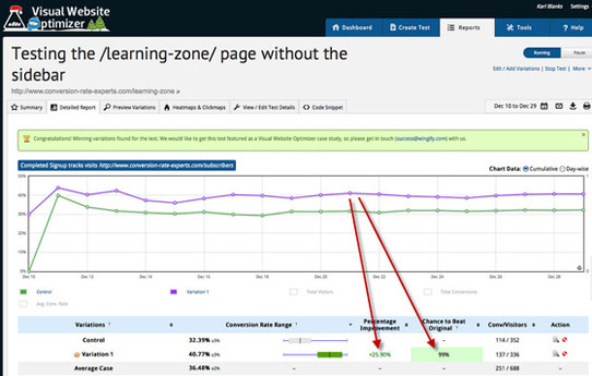
The variant without the sidebar generated 25.9% more signups, with a 99% chance of statistical significance.
By basing their variant on user click data, they were able to easily create an effective version of the page that eliminated distractions and pushed users to focus on the most important element.
Couple (formerly Pair) saw similar results when they set a goal to increase app downloads.
The landing page they’d designed to help them reach this goal was already relatively simple.

But after running a heatmap test, they noticed that a large chunk of the page’s visitors were leaving the page by clicking the small navigation buttons in the upper left. Some users were also being distracted by social sharing icons.

They ran a series of tests with different placements for these distracting elements, and ended up with a version that contained a simple navigation bar in the footer, instead of the header.
As a result, they saw a 25% increase in downloads.
This type of test is especially important if you have multiple calls to action on a page.
Although Couple’s goal was to encourage all of their visitors to take the same action, that isn’t always the case.
You might provide a variety of options to suit visitors in different stages of the buying process — but it’s important that your less important calls to action don’t distract from the ones that drive sales and leads.
For example, when North Face realized that many of their users were adding items to their carts and visiting their cart page, but not completing a purchase, they ran a heatmap test on their checkout page.
They determined that a large number of clicks were going to a promotional banner and taking away from the checkout button.
Although clicking that banner could help users who were unsure of their purchase learn more about a program that could eventually drive them to convert, it distracted users who were ready to buy from taking action.
They addressed this issue by moving the checkout button above the banner and making it more prominent on the page.
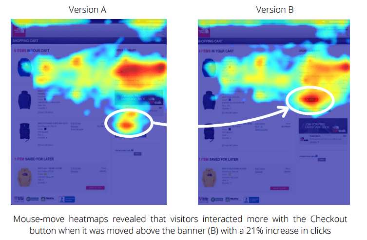
As a result, that button saw a 21% increase in clicks — a jump that could have a huge impact on overall revenue given that it directly drives sales. In some cases, though, distraction isn’t the problem.
Sometimes, visitors will want to convert, but struggle to figure out how. This is arguably an even worse scenario, because it means that your site is preventing your business from earning qualified leads.
In another example, Pronto wanted to improve their site’s sales funnel and figure out why more visitors weren’t converting into leads.
They ran a heatmap test, with a focus on seeing how users were interacting with elements like videos, drop-down menus, and accordions.
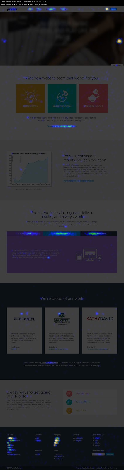
After analyzing the heatmap, Pronto noticed that their educational and industry-specific elements were effective in attracting clicks and attention. This affirmed that they were on the right track with their site content.
They also noticed that many of their visitors were scrolling all the way down to the bottom of the page to click the tiny “Contact Us” link in the footer.
While this indicated that their users were interested enough to spend time searching for that link, it also meant that they were likely missing out on qualified leads that weren’t willing to put in that much effort.
Based on that information, they placed a contact page call to action at the top of their homepage and added a Contact Us button to their main navigation bar.
These calls to action are both significantly easier to find than a footer link, and they stand out with contrasting colors.
As a result, Pronto saw 17% more clickthroughs to their contact page, and a 24% increase in site-generated leads.
The takeaway here is that the easier you make it for your visitors to do what you want, the more likely they’ll be to do it.
On the flip side, you can also use heatmaps to adjust your site to match the actions your visitors are already taking.
One of the most common issues site owners see when they run heatmap tests is that users are clicking on elements that aren’t actually clickable.
Think about this from the user’s perspective: You find a company you really like and you’re ready to contact them to become a customer. You click a button expecting to be taken to a page where you can make your next step…
And nothing happens.
That’s extremely frustrating.
Fortunately, if you notice this issue on your site, it’s an easy enough one to fix.
Determine which page a user would logically expect to visit after clicking an element, then link it to that page.
Problem solved!
You also might run into the exact opposite problem, and notice that your visitors can’t tell that certain elements are links.
If this is the case, you can either adjust your link placement to match where users are already clicking, or redesign your links to be more eye-catching.
Or better yet — try both strategies and see which works best.
Heatmaps are most effective when you use them continuously to gain insight on user behavior, make data-backed changes, then monitor the impact your changes make.
Running a test isn’t a once-and-done process, but a valuable tool for improving your site over time.
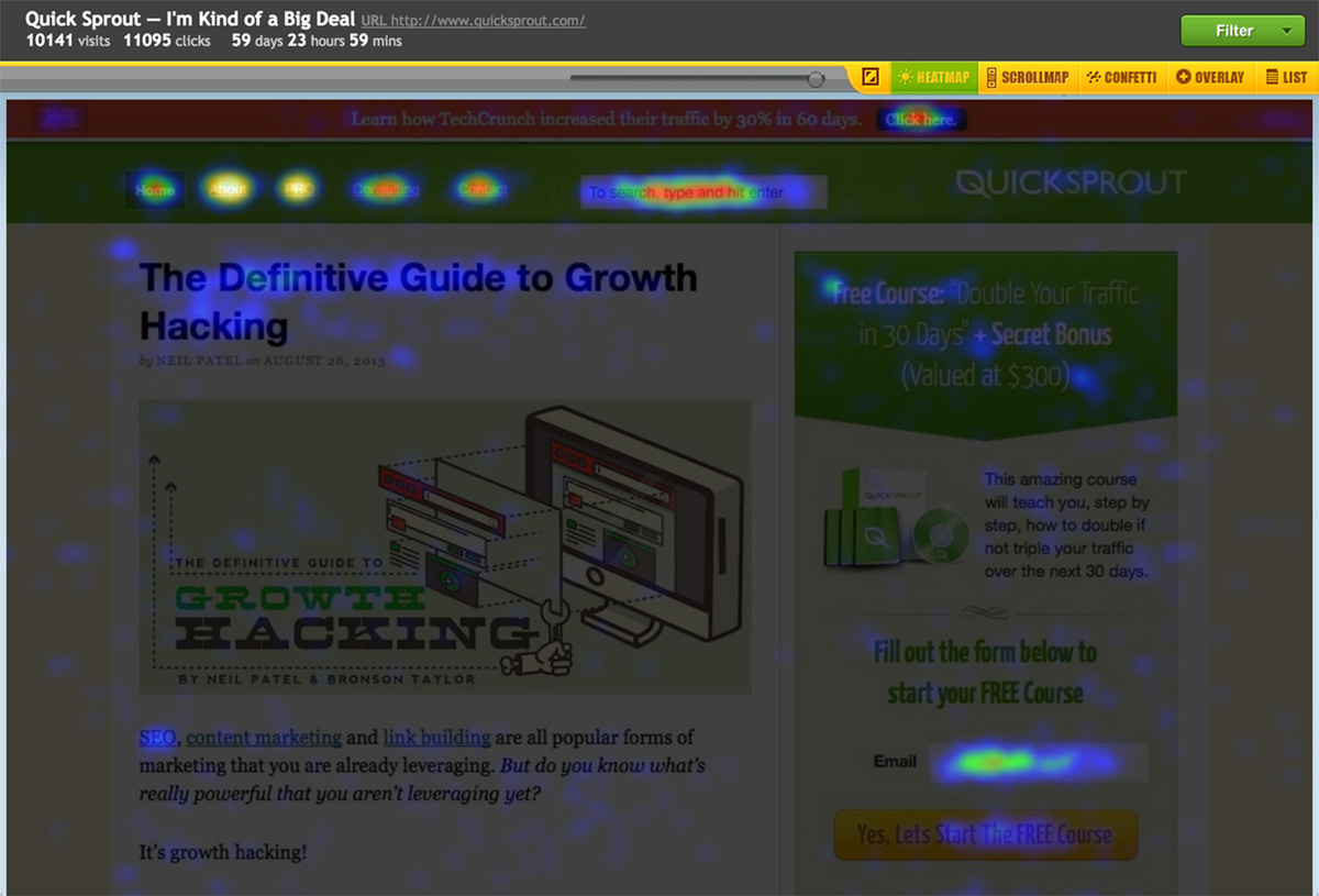
How to access heatmap data
Once a snapshot has had time to accumulate sufficient data, you can access a heatmap of the page by selecting that snapshot from your main dashboard.
Then, select “Heatmap” from the menu at the top of the page
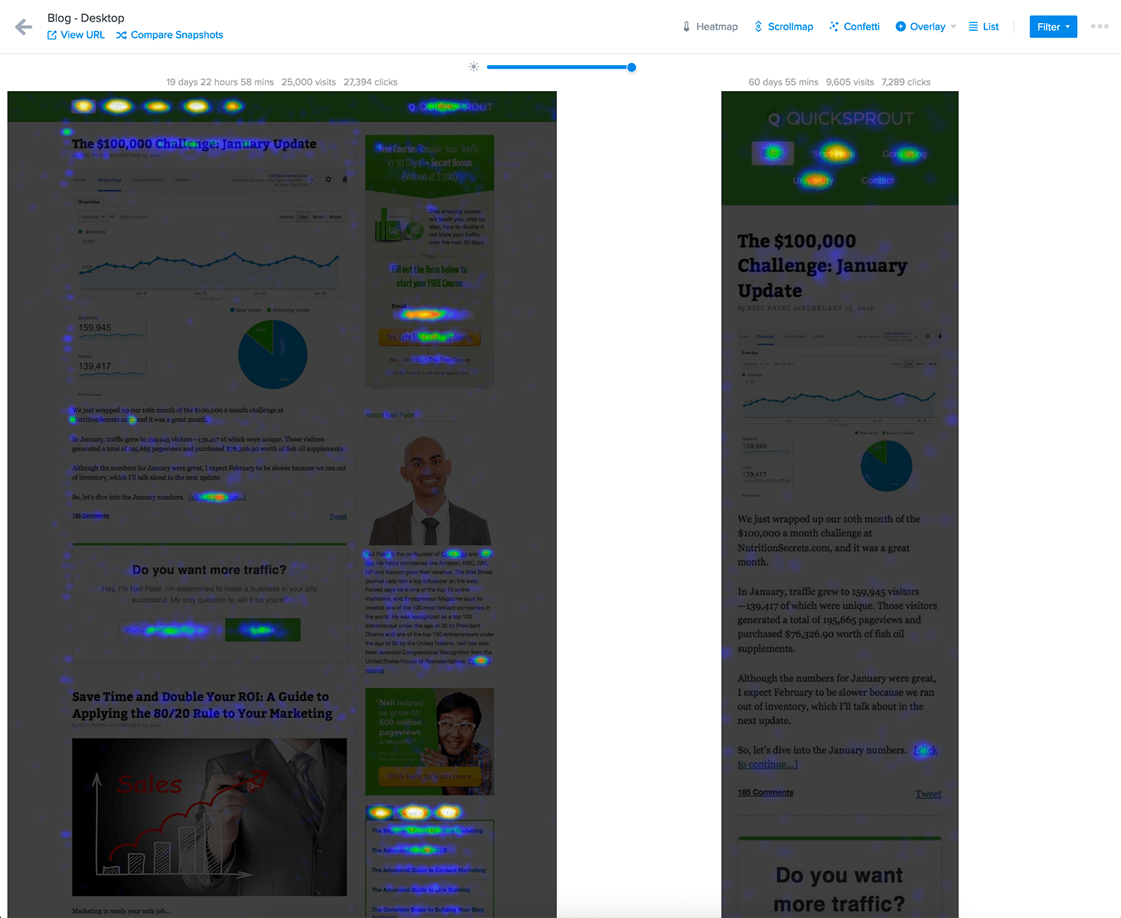
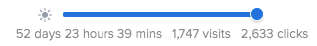
At the top of the page, you’ll see a summary with the amount of time your snapshot has had to accumulate data, the total number of visits, and the total number of clicks.
Below that, you can see a heatmap with all of those clicks mapped on a screenshot of your page.
From here, analyzing your data is a fairly simply process. Areas that got lots of clicks will “glow,” and the warmer the color, the more clicks they attracted.
Areas that didn’t get as much attention will appear dark.
As you analyze these reports, focus on the most important elements on each page, as well the areas that received the most attention from users.
Ideally, those two things should be the same.
And if they’re not — you’re in the right place. You can start by using the information in your heatmap to identify opportunities for improvement and potential changes for boosting your conversion rate.
Case study: Nurse.com
If you’re new to heatmaps, making sense of your first report can be a bit confusing.
So let’s take a look at how it works in practice.
For example, when Nurse.com wanted to improve their conversion rate for course sign ups, they started by running a heatmap test on the page about their courses.
After looking at the results, they found that many of the clicks were going to elements other than the signup call to action.
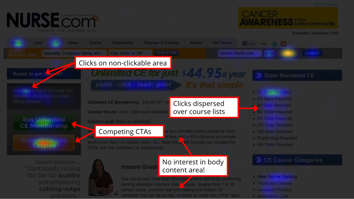
The less important links on the page were attracting more attention than the calls to action, and many users were ignoring the page’s body copy. They also noticed a heavy concentration of clicks on non-clickable elements.
Based on these results, they created a new version of the page that removed the distracting links, consolidated the calls to action, and moved the most important details to the top left, where users were already focusing their attention.
After running a heatmap test on this variant, it was clear that users were now focusing their attention on the most important element: The call to action.
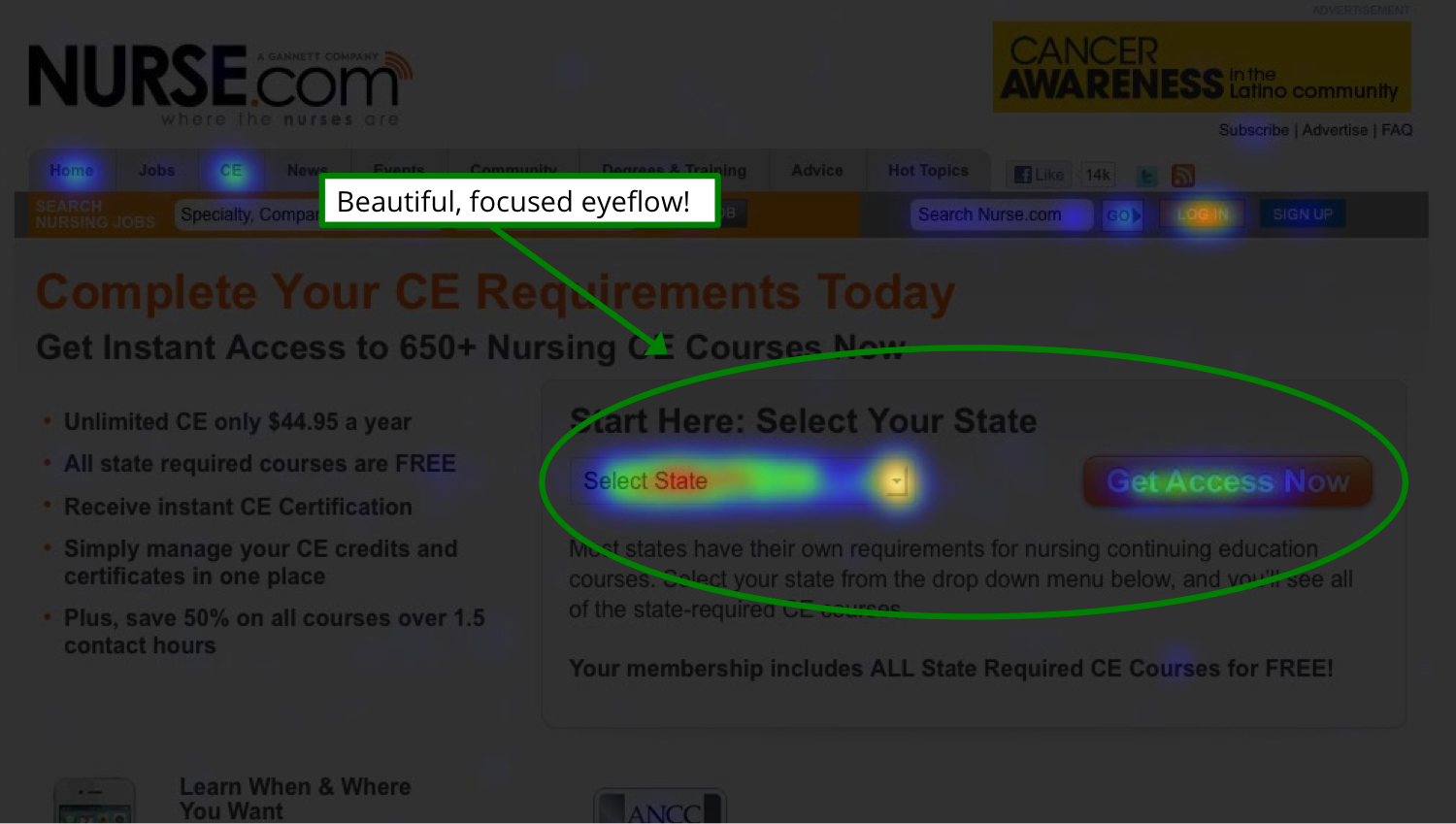
This variation resulted in a 15.7% increase in sales.
So as you look at your heatmap results, focus on determining whether your visitors’ behavior is in line with what the page is designed to encourage them to do.
And if not, you’ve found a perfect starting point for conversion rate optimization.
Crazy Egg Confetti
Much like heatmaps, the Confetti tool shows you where people are clicking on your pages. But beyond that, it takes things a step further by showing individual clicks.
These clicks can be color-coded based on a variety of metrics, but by default, they indicate the referral source or where the visitor arrived on your site from.
In the screenshot below, for example, red dots indicate clicks from users that arrived on the page from another page on the same site.
The orange dots represent clicks from users that arrived on the page from google.com, while the green and white clicks represent users from google.co.uk and google.es, respectively.
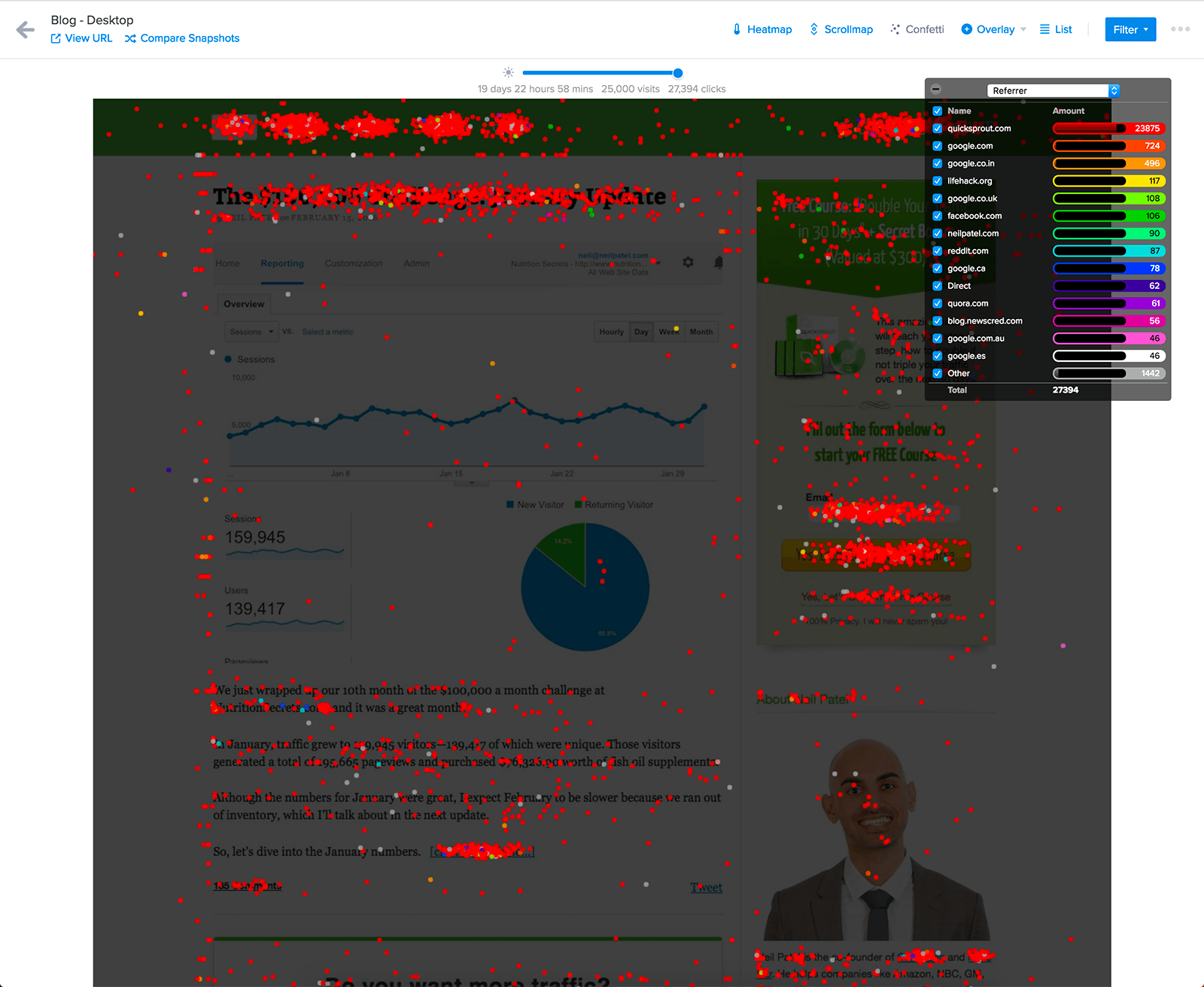
This can help you learn more about where your visitors come from, and how user behavior varies by referral source.
If you see that the majority of the clicks on your main call to action are all the same color, for example, this indicates that the channel that color represents is a source of highly qualified leads.
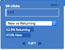
And referral sources are just the start. Using the drop-down list in the upper left corner, you can select from a variety of options for color-coding your reports.
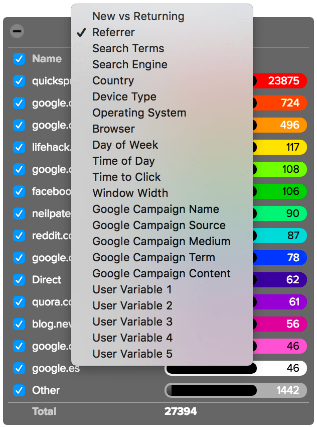
Here, you can choose to view clicks by:
- New vs. Returning
- Referrer
- Search Terms
- Search Engine
- Country
- Device Type
- Operating System
- Browser
- Day of Week
- Time of Day
- Time to Click
- Window Width
These metrics are standard within Confetti reports and available to all users.
But if you use UTM parameters to track custom campaigns, you can also opt to view your report with those metrics. This will show you clicks based on campaign name, source, medium, term, and content.
Any visits from URLs that have been manually tagged with campaign information will automatically be processed in your Confetti report. So if you’re already using UTM parameters, all you have to do is select the parameter you want to view from the drop-down list.
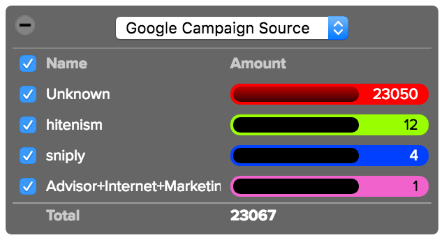
Then, you can gain valuable insight into the quality of traffic your campaigns are attracting, and how visitors behave on your site after clicking on a specific campaign.
If you’re not yet using UTM tracking, this isn’t an option. But getting started is simple.
Most businesses run marketing campaigns on a variety of channels that drive traffic back to their site. If you don’t yet use UTM tracking, visitors who arrive on your site after clicking on an ad are virtually indistinguishable in Google Analytics.
Some might show up as referrals, while others will simply get lumped in with your direct traffic.
This makes it extremely difficult to measure your results and see which campaigns are working. UTM parameters are designed to solve this issue.
These parameters are extra pieces of data you can add to your links to tell Analytics where your traffic is coming from. Then, other tools (like Crazy Egg) can use this data as well.
When you tag your campaign URLs, there are five pieces of data you can include: Medium, source, campaign, content, and term. These are the standard parameters that Google uses to categorize campaign clicks.
The medium parameter indicates the channel a user comes from, whether a social site, PPC campaign, or email.
The source is the individual site within that channel. If you’re running multiple social media campaigns, for example, this parameter lets you separate traffic from Facebook from traffic from Twitter.
The campaign parameter is a little more unique. If you’re running different campaigns on a single site, you can tag them with unique names that indicate the promotion, sale, or feature that you’re advertising.
Then, if you have multiple links within the same campaign, like two links in the same email, you can tag them with separate content parameters. This is only necessary if you want to get really detailed with your tracking.
Finally, the term parameter is the least commonly used of the five. It was originally designed to help marketers track keywords within ad campaigns — but since AdWords provides this information and integrates with Google Analytics, it’s almost never necessary.
Whenever you launch a new campaign, you can use Google’s Campaign URL builder to create tagged URLs.
For example, let’s say you wanted to track clicks on your email signature in a new product promo campaign. You’d enter the following details into the URL builder.
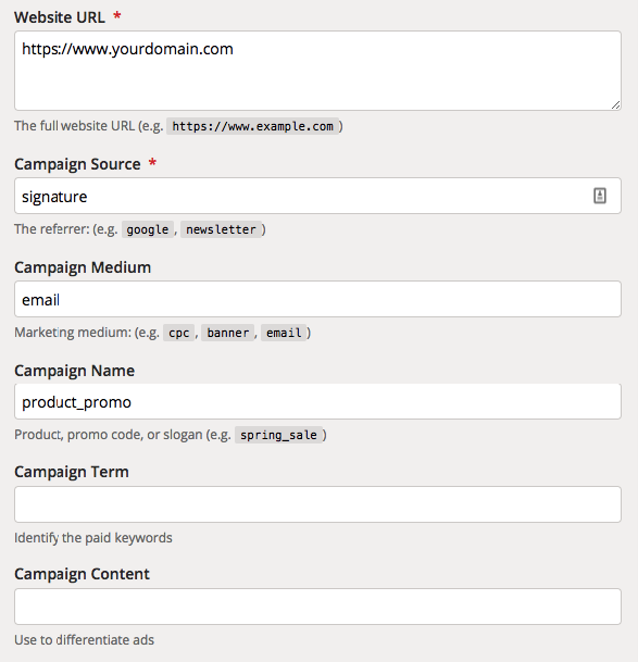
Then, you’d get a custom URL with those parameters.
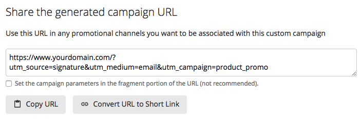
When you launched the campaign, you’d use that URL to link to your site. Then, when a user clicked it, their visit would register as being from that campaign in your Analytics account.
You can create custom tracking URLs for each new campaign you launch, and use them to get a better understanding of how successful each one is.
This is also true within the Confetti report.
When you view your reports by campaign parameters, you can see which channels and ads drive the most qualified traffic to your site.
So, for example, if you notice that visitors who arrive after clicking a link in a specific email often click your most important conversion buttons, this is an indicator that the email was effective in making users want to take action.
Then, you can use this insight to spend some time figuring out what was different about that email, and use a similar approach in future campaigns.
Finally, the last few options in the Confetti report are User Variables. By default, these options don’t pull in any data. This is so that you can sort your visitors by custom variables that are unique to your site.
For example, if you let users create accounts on your site, you could create a user variable to show clicks from logged-in vs unregistered visitors.
Setting this up requires a bit of Javascript knowledge. You’ll need to use the CE2.set Javascript function to set the value of each variable.
So, for example, if you used all five possible user variables, your code would look like this:
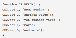
Then, when you accessed your Confetti report, you’d be able to view data from each of those variables.
In total, this means you have 18 possible ways to sort and analyze your data in the Confetti report.
How can you improve your site with Confetti?
Each metric in the Confetti report can help you get a better understanding of your audience, and you can switch between them to gain insight into how different users interact with your site.
For example, you can use the days of the week view to see if there’s any difference in how users interact with your site on weekdays and weekends.
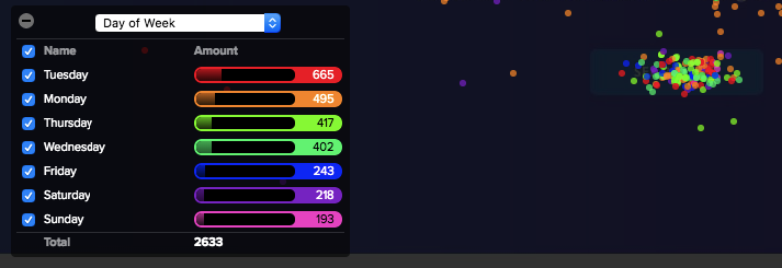
Many B2B companies will see more clicks overall during the week, since that’s when their target audience is most likely to be researching work-related services.
You can use this insight to come up with new conversion rate optimization ideas.
If you notice, for example, that your email opt-in form gets the most clicks on Mondays, you might consider adding a line of copy above the form that promises “Helpful tips in your inbox every Monday!”
For users that are on the fence about signing up, the idea of getting valuable information that quickly could be the push they need.
Then, once you created that variant, you could create an additional snapshot to see whether your idea are worked.
And this is just one example from one report.
When you consider all of the metrics available in the Confetti report, it can be a goldmine for optimization ideas.
The information from your Confetti report can also help you improve other parts of your marketing strategy.
Keeping with the same example, let’s say you notice that your visitors are most interested in your email signup form on Tuesdays and Thursdays, right around 3 p.m.
If you’re looking to increase your email open rates, you could alter your schedule to send emails on those days at 5 p.m. This way, the bulk of your new subscribers will see helpful information in their inboxes soon after signing up for your list.
How to access the Confetti report
Accessing the Confetti report is simple: Open the snapshot you want to analyze, and select “Confetti” from the top menu bar.

Then, you’ll see a screenshot of your page, covered in colorful dots that represent clicks by referral source. From there, select the attribute you want to view your clicks by, and you’ll have access to all of the click data you need.
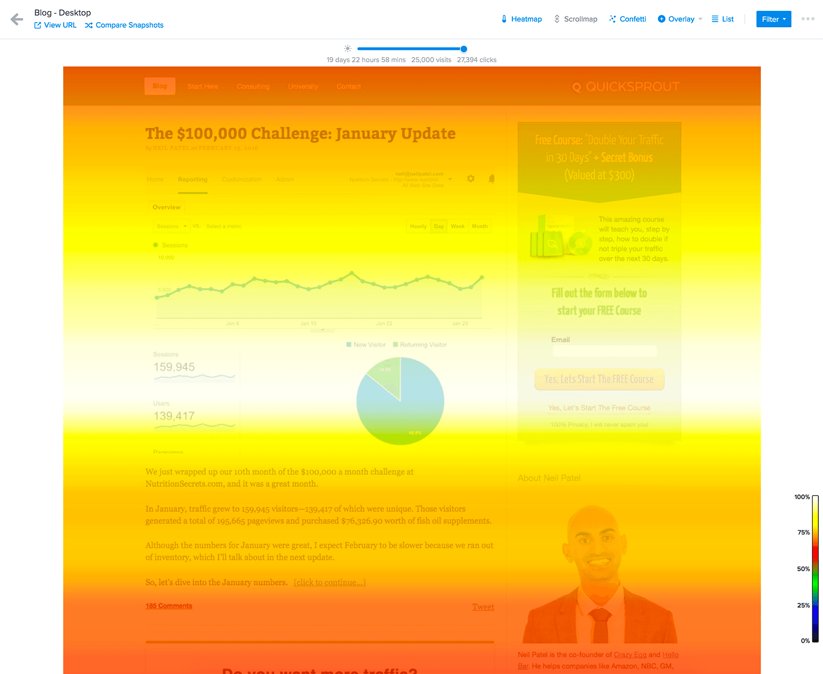
Case study: Neil Patel
Given the amount of possible metrics, there’s a ton of potential insight to gain from this report. So there are many different ways to use it to identify and address issues.
For example, when Neil Patel wanted to increase conversions on his site, he started with his homepage.
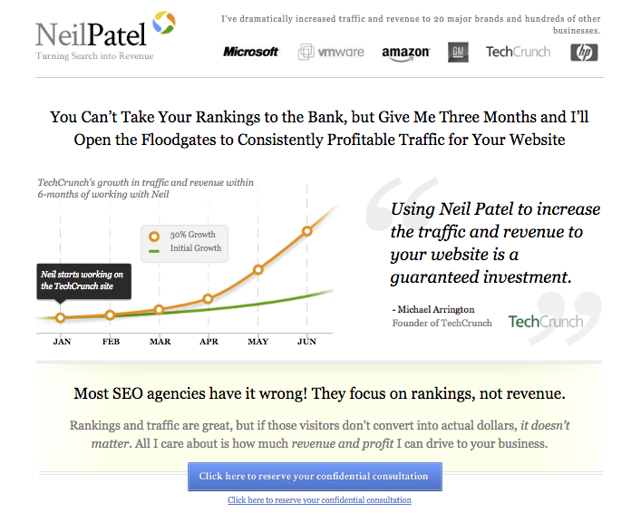
The heatmap report showed that many visitors were clicking on Neil’s name or client logos farther down the page instead of CTAs.

Some were also clicking case studies, and others were even clicking on non-clickable elements.

All of these actions were taking away from the main conversion goal. Then, the Confetti tool showed that 49% of traffic on the page was coming from Neil Patel’s personal blog, Quicksprout.

This meant that almost half of visitors probably knew who he was before visiting the site. So the page likely didn’t need to contain as much information about Neil — those visitors were already familiar.
Based on this data, the Neil Patel team decided to test a much simpler variant.
This version contained only three total lines of text, plus a single-field form.
Then, users who entered their URL into this form were taken to another page with a form that asked for additional information.
So, how did it work?
The original page saw a 2.1% conversion rate.
After launching the new variant, 26% of visitors filled out the first form, and 9.1% filled out the second.
Even when only accounting for users who filled out both, that’s a 433% increase in conversion rate.
Crazy Egg Scrollmap
A scrollmap is another type of visual representation of user data that shows how far down a page visitors typically go before leaving.
After all, if you’re spending time creating site content, you want to be sure that your visitors are actually seeing it. And if your page requires users to scroll, that may not be the case.
In fact, at one point, the Neilsen Norman Group reported that 80% of visitors’ attention was spent “above the fold.”
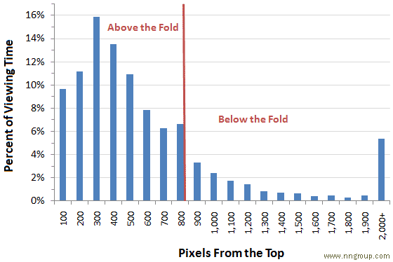
This meant that content “below the fold” was only seen by one out of five site visitors.
But this doesn’t mean that your content users need to scroll to find is doomed.
In fact, lengthier pages can even outperform their more concise counterparts.
Not convinced?
Take a look at these two landing pages we tested here at Crazy Egg:
That screenshot isn’t distorted, either — the variant was almost 20 times longer than the original page.
And it outperformed that original by 30%.
So, does this mean that you should redesign all of your landing pages with more copy and information?
Nope.
It just means that it’s a good idea to keep an eye on how much of your content your visitors are reading — and that’s exactly what scrollmaps help you do.
Like heatmaps, the scrollmap feature in Crazy Egg provides a color-coded report to give you an at-a-glance look at where your visitors focus their attention.
But unlike heatmaps, which only show action, scrollmaps show what your visitors they look at — whether they take action or not. This means you can see where users are spending time on a page, even if they don’t click.
The idea here is that scroll depth is a good indicator of page consumption.
This information is especially valuable for content-heavy pages.
If you have a content marketing strategy, you likely post a decent amount of pages that aren’t designed to drive conversions immediately. Instead, you create them with the goal of building trust in your brand and developing more qualified leads.
So you might not be worried if those pages don’t generate a ton of conversions.
But you do want to know that visitors are reading your content — and this information doesn’t show up in a standard Google Analytics report.
That’s where a scrollmap report can help.
These reports use a color-coded gradient to show where users spend the most time. The “warmer” an area appears, the more attention it gets from your visitors.
“Colder” areas, or sections of your site that appear blue, get very little attention from visitors. This can indicate that users are scrolling right past these elements without stopping to read.

It’s also worth noting that these impressions are based on where a user stops — not just how far they make it on the page.
So if you see a blue section halfway down your page, but a red section below it, that means that users skipped over that middle section. Even though they technically “viewed” it as they scrolled past, this isn’t counted as attracting their attention.
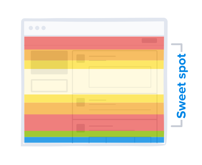
Most pages will have a white band near the top, because this is what a user sees as soon as they land. They don’t need to take action to see this content.
But beyond that, your scrollmap reports will show you which areas of a page users find most interesting.
Then, you can use this information to adjust your pages so that more of your visitors see your most important content.
How can scrollmaps help your site?
The simplest way to use a scrollmap is to look at how much of your content your visitors see before leaving.
While standard metrics like bounce rate and time on page can give you a general idea of how engaged your visitors are, they can’t show you how your visitors engage with your content. It’s also not particularly easy to sort through these metrics and gain actionable insight.
And that’s where scrollmaps come into play. They can show you exactly how visitors view your pages, and which sections are the most effective in attracting their attention.
On the contrary, they can also show you where users lose interest.
You can use this information to determine the appropriate length for each of your pages.
If you find that your visitors aren’t making it to the bottom of a large chunk of your pages, this indicates that your audience prefers shorter pages.
But in most cases, the results won’t be so simple.
The ideal length often varies from page to page, and can even differ based on traffic source.
For example, users who visit your site after clicking a link in an email campaign are already familiar with your brand. They’re interested enough in what you offer that they opted into hearing from you.
So when they click through to a landing page, it likely won’t take much persuasion to get them to convert. A simple headline and a few lines of copy could be all you need.
Visitors who arrive on that same landing page after clicking a PPC ad, though, will likely need a bit more information.
If they’ve never heard of your brand, and aren’t completely sure about what your services are, they’re unlikely to convert based on a few lines of text.
For these visitors, you’d probably see higher conversion rates with a longer, more informative page.
So which is the better choice?
A scrollmap report can help you figure that out.
Try creating landing pages of varying lengths and see how your visitors engage with them. Then, you can use this insight to create better landing pages sitewide.
Beyond the length of content you should be creating, scrollmaps can also help you determine what kind of content works best for your audience.
The simplest way to determine this is by analyzing scrollmaps for a few different pages and looking for trends.
For example, if you notice that sections with bulleted lists tend to “glow” more than large chunks of text, this indicates that users prefer that formatting.
And if you notice that certain elements tend to fall within dark blue zones on a lot of your pages, this tells you that users don’t find those elements very interesting.
This can also give you insight into why users abandon your pages.
If many of them are leaving at a certain section, this tells you that you should revise that section to include more of the elements they like.
Alternatively, if the lower section of a page is entirely blue, you might even consider eliminating it altogether and moving the content to a different page.
As you analyze your scrollmaps, you should also pay special attention to where the most important elements on each page fall.
You want your visitors to engage with certain elements like forms and calls to action.
But they can’t do that if they never even see those elements — so you should aim to place them in the spots where users spend the most time.
For example, when Khan Academy wanted to figure out why one of its most important calls to action wasn’t generating many clicks, they quickly found an answer after looking at a scrollmap of their homepage.
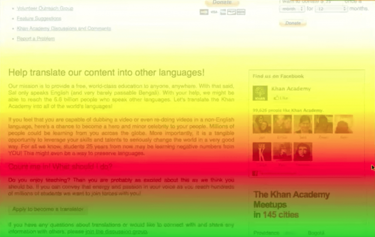
Can you see the “Apply to become a translator” call to action?
It’s near the bottom of this screenshot, almost entirely in the green section. This means that only about half of their visitors scrolled down that far and saw the button. This essentially cut their potential conversion rate in half.
So when you analyze your scrollmaps, look for calls to action that are hidden within these darker sections on your pages.
Moving them to sections that already see lots of attention could be a quick win for the page.
On your reports, these ideal sections will “glow” in a bright white or yellow.
Placing your calls to action in the areas your visitors are already spending time is a much easier solution than redesigning a low-converting page from scratch.
And because you’re making this change based on data-backed reasoning, you can also be much more confident in its effectiveness.
But before you make any changes based on your scrollmap reports, it’s important to make sure that you have an accurate idea of how all of your visitors engage with your site.
This includes users who access it on devices other than desktop computers.
You can also create separate snapshots for desktop and mobile users, then compare your reports’ results.

Considering how many people browse the internet on smartphones and other devices, it’s essential that your site provides a great user experience on all of them.
If you already utilize responsive design, you may not think that you have anything to worry about.
But scrollmaps often tell a different story.
Given that smartphone screens are much narrower than desktop screens, users have to scroll much more to access content.
A 6,000-word blog post might be manageable for your desktop visitors — but users who access that same post on a smartphone might only make it halfway through before they decide to stop scrolling.
This means that even if the majority of your desktop visitors scroll far enough to reach a key call to action, your mobile visitors may not.
Fortunately, you don’t need to rely on guesswork to figure out whether that’s the case.
Take a look at your page’s mobile-focused scrollmap, and see whether those visitors are scrolling to the most important elements.
If they’re making it all the way to the bottom of the page, you can be confident in your decision to stick with lengthier content.
But if not, you could be missing out on conversions from mobile users, simply because your pages are too long.
How to access your scrollmap report
You can view any snapshot’s scrollmap by selecting this report from the top navigation bar.
This will show you a screenshot of your page with a color-coded gradient. Then, if you mouse over your report and click the magnifying glass icon, you can zoom out for an overview of the page.
Then, as you move your mouse over your scrollmap report, you’ll see a “Movable Marker” that indicates the number of impressions for an exact spot on the page.
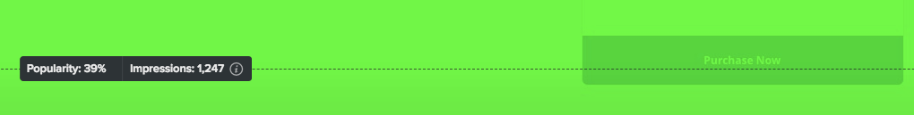
This essentially gives you more granular insight, beyond the color-coded gradient.
It’s also an easy way to see the percentage of your visitors that are seeing important elements.
So, for example, if you mouse over a call to action and see that only half of your visitors are viewing that section, this indicates that many users never even see it.
If this is the main call to action on the page, this is an issue — but moving it to an area with a higher percentage could be an easy win.
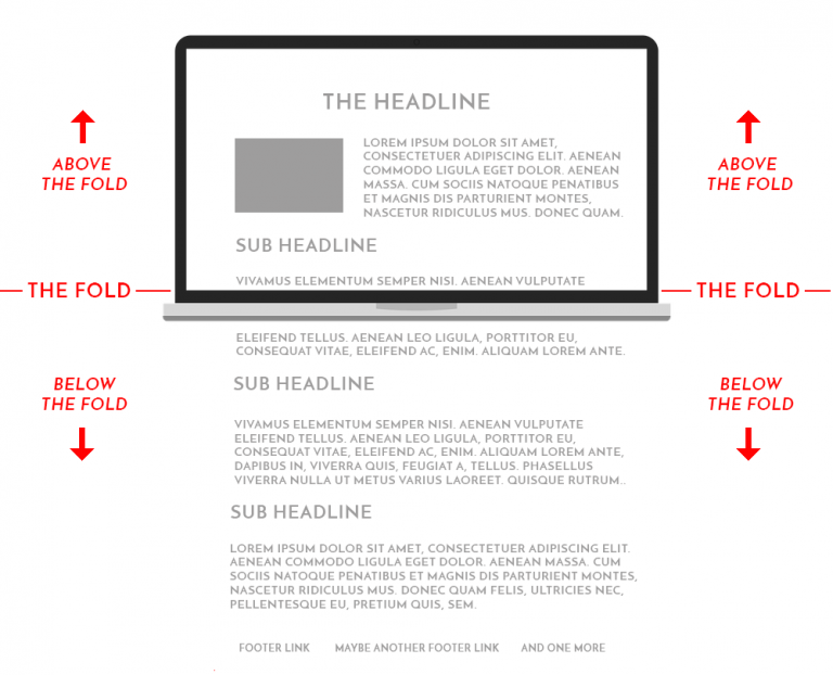
You’ll also notice an “Average fold” line running across your report relatively close to the top.
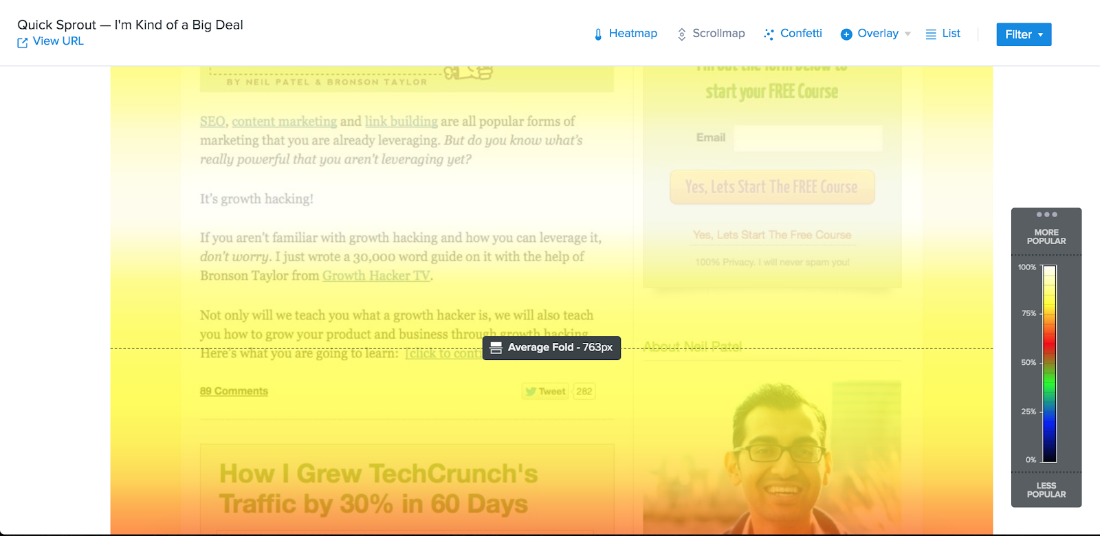
This shows shows what the average visitor sees when they land on your page, based on their screen size.
This might be different from what you see when you visit the page on your computer, especially if you have a larger screen.
You can use this information to make sure that your most important calls to action are above the fold for most of your visitors — and not just the ones using the same size monitor as you.
Overlay
If you prefer clear data over visual representations, you’ll likely be a fan of the Overlay report.
What is the Overlay report?
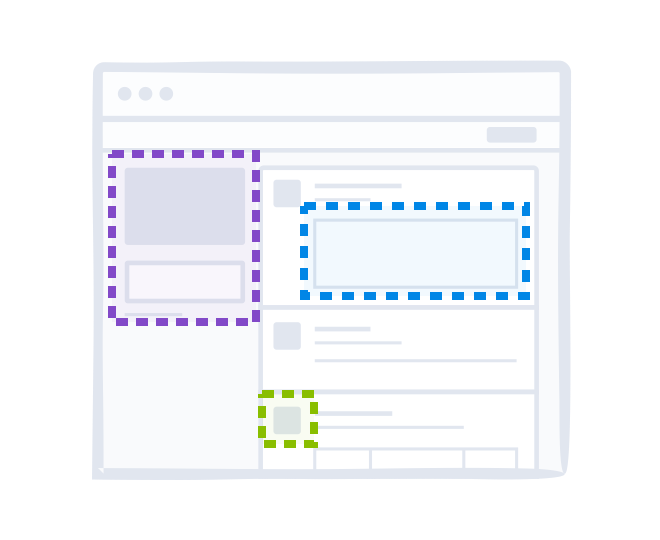
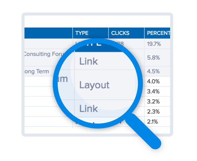
While heatmaps and scrollmaps show data for different sections of a page, the Overlay report focuses on specific elements.
While heatmaps sometimes have overlap between elements, the Overlay report isolates each clickable element on a page. This lets you get a better understanding of specific links and buttons, beyond the general area they fall into.
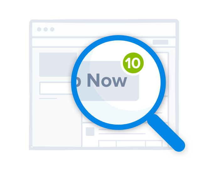
In this report, each clickable element has a (+) marker that’s color-coded by the number of clicks it received.
This color scheme is similar to the one used in other reports. A blue (+) marker indicates that an element received few clicks, while a red marker indicates that it received a lot.
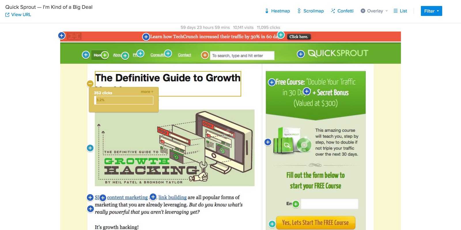
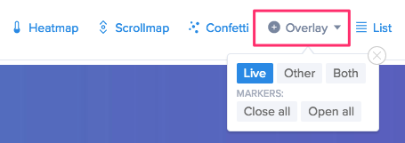
By default, the Overlay report launches in the “Live” view, meaning that it only displays clickable elements.
You can opt to switch to the “Other” view to see non-clickable elements like paragraphs and divs. These markers for these elements are gray.
And if you want to see all of the elements on your page, you can switch to the “Both” view. In this view, it’s easy to tell clickable and non-clickable elements apart, because clickable elements will have red or blue markers, while the markers for non-clickable elements will remain gray.
In any view you choose, you can hover over each marker to see the total amount of clicks each element received, as well as the percentage of total clicks.
This gives you clear, quantified look at which elements on your page get the most engagement from your visitors.
These markers can also show element data like new vs. returning visitors, operating system, browser, country, referrer, search engine, day of week, time of day, time to click, and custom UTM variables.
Digging into these metrics can show you which of your visitors engage with certain elements, and help you get a better idea of the channels and strategies that bring your site qualified leads.
How Crazy Egg Overlay can help your site
While heatmaps and scrollmaps provide simple, at-a-glance overviews of areas that attract the most attention on a page, the Overlay report allows for more in-depth analysis.
For example, if you have multiple conversion buttons on a page, they may appear to “glow” a similar amount on your heatmap.
You can use the Overlay report to get a definitive answer as to which generates the most clicks.
And on the flip side, you can also determine exactly which elements are distracting users from accomplishing the intended goal for a page.
You can see the exact percentage of clicks each element is getting. So if a less-important button or link is getting a larger percentage than your goal conversion, moving (or removing) it could boost your conversion rate.
When you include non-clickable elements in your report’s view, you can also gain insight into potential usability issues.
If you notice that many of your visitors are clicking on non-clickable elements, it’s safe to assume that many users are confused by your design. This can easily become a point of frustration.
Even if you think your site is straightforward and easy to navigate, your visitors may not feel the same — and the Overlay report is an effective way to determine whether that’s the case.
This type of report is often more helpful than even more advanced reports like video recordings, because it includes off-element clicks that are easy to miss in a video.
This helps you get a more accurate picture of how users interact with your pages.
How to access your Overlay report
You can access this report by clicking the “Overlay” button in a snapshot’s main navigation bar, then selecting which view you want to see.
If there are a lot of elements on your page, starting with the live view is a simpler starting point. You may also want to opt to have all markers closed to start, so that you can go through them one-by-one.
For simpler pages, on the other hand, you might want to see all of the elements at once, along with click data for each.
In this case, select the “Both” view and “Open all.”
This is also the fastest way to get a general overview of how elements on a page are performing if you don’t want to spend too much time digging through data points.
List Report
The List report is even more information-focused than the Overlay report.
It’s essentially the raw-data counterpart to many of Crazy Egg’s visual reports, and shows user preferences numerically.
Much like the Overlay feature, it presents information in terms of clear numbers instead of colors and gradients.
But instead of presenting data over a pages’s screenshot, it displays it in a straightforward, sortable list.
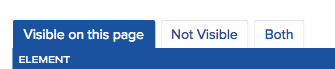
List reports are divided into three tabs: Visible, Not Visible, and Both.
The elements listed in the Visible tab are visible in your page’s screenshot. These are typically fixed elements.
Not Visible elements, then, don’t appear in your screenshot. This includes items in drop-down menus that only appear after a user places their mouse over a Visible element.
And as you may have guessed, the “Both” tab includes both visible and non-visible elements.
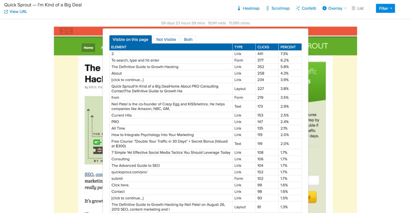
Once you select a view, you’ll see a list of each element in that view. This list includes each element’s type, the total number of clicks it received, and the percentage of clicks on the page.
This gives you an exact breakdown of every element your users are clicking.
How can the List Report help your site?
You can use the list report to get more concrete answers about what your users like. The simplest way to do this is to sort your elements by percentage of clicks.
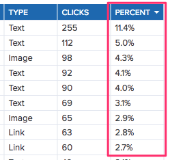
The “Type” column to the left can give you a general idea of whether users are engaging most with text, images, or links.
Beyond that, you can dig into the exact elements that attract the largest percentage of clicks on each page to see what they are.
Maybe you notice that your visitors prefer buttons to text-only links, or maybe you notice that a specific call to action phrasing generates more clicks than other variations.
These might seem like minor design concerns. But the more you tailor your site to your visitors’ preferences, the more your conversion rate will increase.
You can also use this report to analyze moving elements like pop-ups.
These “Not Visible” elements often don’t appear in screenshots, so it’s difficult to analyze them with heatmaps and scrollmaps.
The List report shows all of the clicks on these elements, regardless of whether they show up in your other reports.
Including this data gives you a more accurate understanding of how users interact with all of your elements. And if you utilize pop-ups and other moving elements on a lot of your pages, it an also have a major impact on how you perceive your site’s effectiveness in generating conversions.
And even if you don’t utilize complex elements that are difficult to analyze with other reports, you may still like the List report just for its simplicity.
Sometimes, all you might want is a straightforward report on how many times a user clicked a button — and the List report will give you that.
This is also an easy way to get concrete answers to questions you might have after viewing a heatmap or scrollmap test.
For example, if you see two areas that appear to see similar engagement on a page based on how much they “glow,” you can use the List report to determine how they compare. This will give you a definitive answer as to which one really gets more engagement.
Finally, you can export this data as a .CSV file to easily share and archive your snapshot.
How to access a List Report
You can access your List report by selecting it from the main navigation for any of your snapshots.
Then, you can select whether you want to see Visible, Not Visible, or Both types of elements by clicking the appropriate tab at the top of the report.
From there, you can sort your elements by name, type, total number of clicks, and percentage of clicks. And if you want to learn more about any of your elements, you can click on the element name to jump straight to its marketer on your Overlay report.
Crazy Egg Recordings
In the past, if you wanted to see how users interacted with your website, you had to bring them into your office and watch them browse your pages in person.
This was not only an uncomfortable way to test, but also didn’t always produce accurate results.
Fortunately, you no longer have to resort to this tactic. Instead, you can use tools like recordings to learn more about how users interact with your site from the privacy of their own computers.
What are recordings?
The recordings tool lets you watch recordings of real users interacting with your website, including mouse movements and clicks.
You can see how they interact with your navigation and content, and exactly how they move through your pages.
It’s essentially like standing right next to a customer as they use your site — but far less awkward.
And unlike heatmaps, which show a compilation of user data, recordings let you see how individual users navigate a page.
This is especially helpful for identifying usability issues.
If you watch a recording and see a user struggling to find information they want, or scrolling right past important elements, this gives you a clear idea of what kinds of improvements you should make.
You can also watch where their mouse goes, see which sections visitors avoid, and identify where they’re getting stuck.
Although other reports can show you whether or not visitors are taking action, recordings can help you get a better idea of why or why not that’s the case.
How can recordings help your site?
Most user data reports focus on a specific page on your site.
But with recordings, you can see how users move through different pages. This can give you clear picture of how your sales funnel is performing.
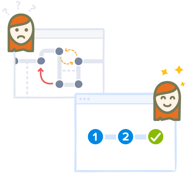
When many site owners imagine their sales funnel, they picture something relatively simple. And in theory, a funnel could look something like this:
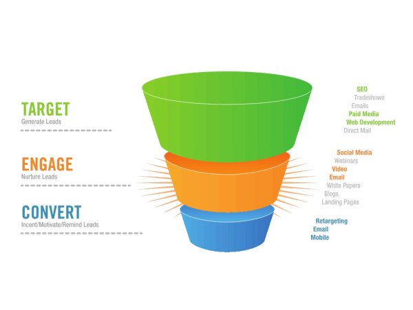
In this scenario, a user might only need three touch points before they become a paying customer.
Unfortunately, this is rarely ever the case — even for companies who sell inexpensive products directly to consumers. And for B2B companies, the process is typically much more complex.
So instead of a standard sales funnel, it’s a better idea to focus on the individual steps you need to take in order to drive conversions. This means your goal funnel should look more like this:
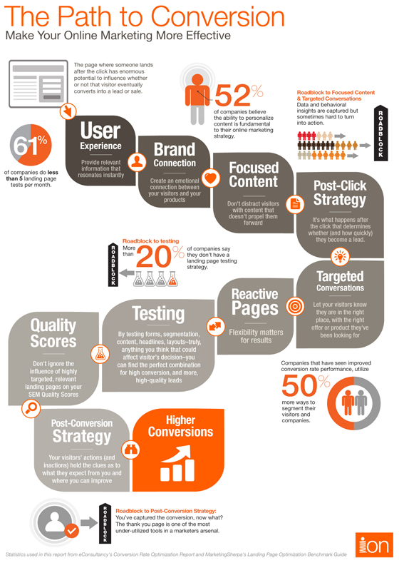
This funnel takes more of the decision-making process into account, as well as the importance of brand connection, targeted conversations, and focused content.
With this approach, you’ll likely be more more effective in moving visitors through your site in a way that gets them progressively closer to converting.
But with most traditional reports, it’s tough to know if your strategy actually works.
That’s where video recordings excel.
You can watch a user’s exact movement throughout your pages and see whether their actions are in line with your funnel
You can determine whether your informational content is effective in making them want to learn more about your company, and whether your company-specific content is effective in encouraging them to convert.
And if your funnel isn’t working the way you want it to, you can use these recordings to figure out what users are doing instead of taking the actions you want them to.
Then, you can use this insight to either alter your pages to more effectively guide users through your funnel, or alter your funnel to be more in line with your target audience’s needs.
How to start creating recordings
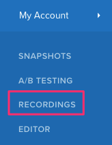
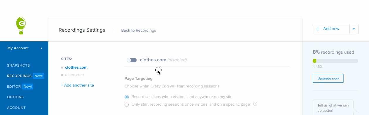
You can start using the Recordings feature by clicking the Recordings option in your account’s main sidebar.
Then, click “Start Recording.” Select the site you want to record, and switch the toggle next to that site’s name to green.
By default, this will create recordings for every visit to your site. But if you want to learn more about a specific page, you can also set your recordings to only begin on certain URLs.
Under “Page Targeting,” select, “Only start recording sessions once visitors land on a specific page.” Then, enter the URL on which you want your recordings to begin.
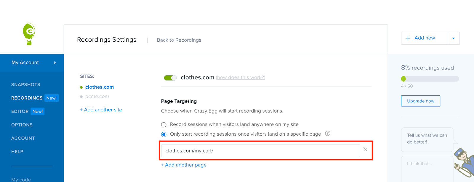
And if you want to start your recordings on multiple pages, that’s also an option. Click “+Add another page” directly below the URL form field, and enter that page’s URL, too.
When users visit any of these URLs, Crazy Egg will start a recording and run it until the end of their session.
Then, you should start to see recordings in your account within half an hour enabling them on your site.
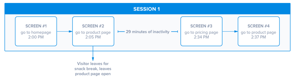
These recordings will appear as “sessions,” which begin with the first page they visit and end after a period of inactivity lasting 30 minutes.
For example, if a user visits your site and clicks through a few pages, then takes an hour break, a new session will begin when they return. But if they only take a ten minute break, their subsequent activity will be included in the same session.
As you watch your recordings, you’ll notice a color-coded timeline at the bottom of each video that indicates user activity.
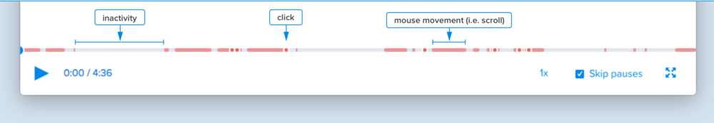
Light gray areas represent periods of time where a user is inactive. Red dots indicate times when a user clicked on your site. And red boxes show any kind of movement, including when a visitor scrolls through a page or moves their mouse.
If you’re looking for a quick overview of how a user moved through your site, jumping to red segments and dots will help you skip right to the times they took action.
A/B Testing
Most of the features we’ve covered so far are helpful for determining how users interact with the existing content on your pages.
With A/B testing, you can take things a step further and start making improvements based on that data.
What are A/B tests?
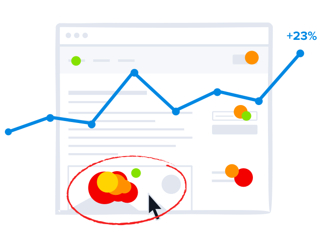
A/B tests are one of the most common ways to determine the impact a specific change will have on your site.
The basic idea is that you create a variant of the page you want to improve, with changes you think will make the page more effective in reaching a target goal.
For example, if you wanted to increase clicks on the main call to action button on a page, you might hypothesize that changing that button from orange to green will generate more clicks.
You’d create a variant of that page with a green button, then divide your traffic between both versions.
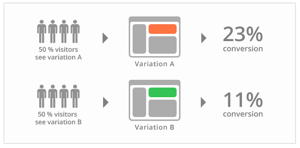
Then, you’d determine which one achieved a higher conversion rate. If one version saw significantly better results, you could opt to make it permanent on your site.
Of course, this is a simplified explanation — and in most cases, we recommend making more impactful changes than new button colors.
But regardless of what you want to test, you can use the A/B testing feature in Crazy Egg to see exactly how your changes impact a page.
You can also access real-time results while your test is running, so you always have an idea of how each variant is performing.
If you notice that one version is performing significantly worse, or even harming your conversion rate, this makes it easy to remedy the problem before you miss out qualified leads.
Plus, while other A/B testing platforms can require coding knowledge, Crazy Egg’s visual editor makes it easy to change what you want. Just click the element you want to edit, make your change, and save it.
Setting conversion goals is equally simple. Choose whether you want to record goal completions based on button or link clicks, form submissions, or URL visits, then follow step-by-step instructions to make sure your goal is set up correctly.
Finally, if the platform detects a winning variant, it will send a larger chunk of your traffic to that version automatically. So even if you don’t have time to constantly monitor your tests, you can be confident that they aren’t wrecking your conversion rates.
How can Crazy Egg A/B testing help your site?
As you look for ways to boost your conversion rates, you’ll likely come across tons of “best practices” that tell you exactly how to alter your site.
Some of these are extremely helpful!
But not all of them will hold true for your audience.
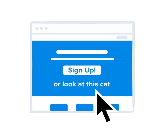
For example, one common piece of advice for increasing form submissions is including social proof. This “proof” can be your number of email subscribers, number of social media followers, or even a brief testimonial from a satisfied customer.
The idea here is that when a user sees that other users like them trust your company, they’ll be more likely to trust you, too.
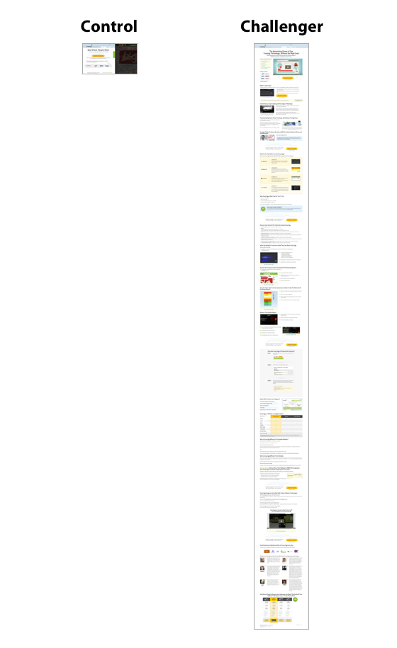
So when shown the following two options for an email opt-in form, which do you think generated more signups?
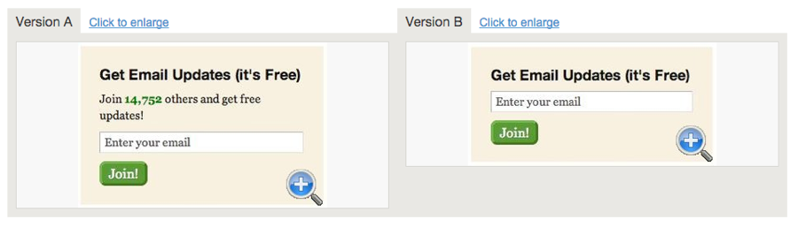
Most marketers would likely guess Version A. But Version B generated a 122% increase in signups. So, does this mean that you should avoid including social proof on your site?
Nope.
It just means that you shouldn’t assume that the optimizations that work for other site owners will also work for you.
Your audience is made up of a unique group of people, and you need to prioritize the types of changes that they like.
After all, it’s completely irrelevant if 99% of internet users prefer a specific design element if your audience is part of the 1% that doesn’t. They’re the users that are likely to become leads and customers, so tailoring your site to their needs should be your primary goal.
And with A/B tests, you don’t need to rely on anyone else’s results. You can see exactly what your particular audience responds to, then use that insight to make data-backed changes you can be confident will help you reach your goals.
How to launch an A/B test
Some site owners think of running A/B test as a complex and difficult process. That’s because in the past, it almost always was. But with Crazy Egg’s A/B testing tool, you can get a test up and running in a few minutes.
Click on “A/B Testing” in your account’s main navigation menu, then click, “Add a new test.” Then, select the page you want to test and use the Crazy Egg Visual Editor to create variants.
Click the “Add Variant” button in the editor’s sidebar to create your first variant, and you’ll be able to alter the way it appears directly in this editor.
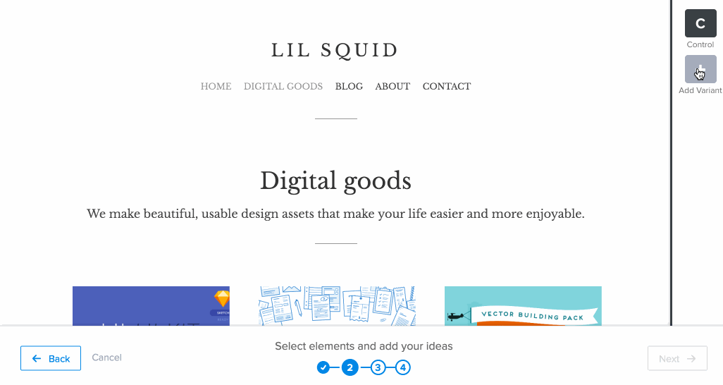
For example, if you want to alter the copy on a call to action button, select that element and click “Edit Text & Style.”
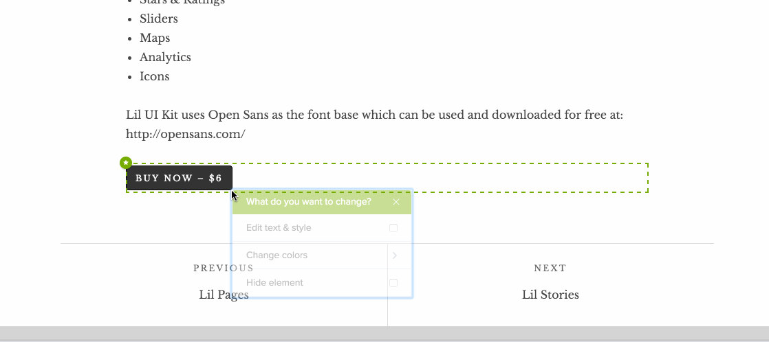
Then, add your new text and save your changes. And if you want to add more variants, repeat this process until you’ve created all of the variants you want to test.
Then, click “Next.” Before you launch a test, you’ll also need to determine the goal you want to accomplish with your page, whether that’s generating sales, registrations, leads, or pageviews.
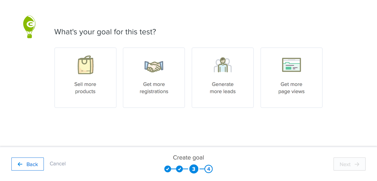
Click on the option you want to test for, then determine how you want to measure success.
For example, if you want to generate more leads, you could count a goal conversion every time someone clicks the “Submit” button on a form. And if you want to increase sales, you could count a conversion every time a user reaches your order confirmation page.
Once you’ve determined your goal, click “Next.” Your final step is to give your test a name.
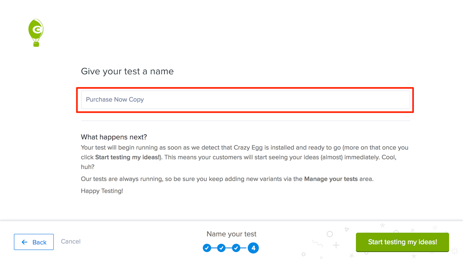
Then, click “Start testing my ideas!” to launch your test. Once you’ve done this, your variants will start appearing on your site and collecting data in about 24 hours.
After your variants go live, you can’t edit them. But you can eliminate certain variants, add new ones, and alter your goal.
Click the gear icon on the test you want to edit, then select “Add new variant” or “Change goal.”
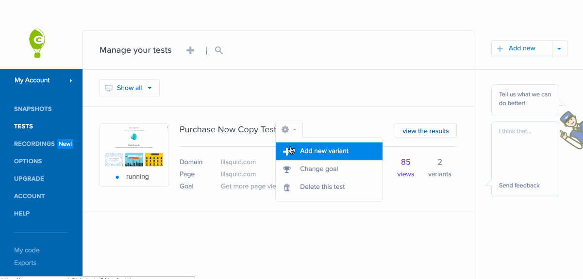
So as your results start rolling in, you can get rid of the versions that aren’t effective in reaching your target goal.
You can also use the insight you gain from your initial results to come up with new ideas to test.
This allows for continuous optimization, without pausing or ending your A/B test.
You can keep adding, testing, and removing variants until you create one that consistently outperforms the others and provides the results you want.