If you’re not A/B testing your site, you’re leaving money on the table.
The only way to truly evaluate your conversion funnel and marketing campaign is to get data directly from your customers behavior.
A/B testing lets you do just that.
What is A/B Testing?
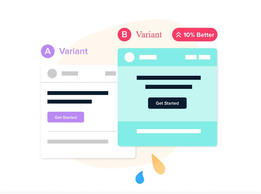
A/B testing (also known as split testing) is the process of comparing two versions of a web page, email, or other marketing asset and measuring the difference in performance.
You do this giving one version to one group and the other version to another group. Then you can see how each variation performs. Think of it like a competition. You’re pitting two versions of your asset against one another to see which comes out on top.
The core steps of an A/B test are fairly straight forward:
- Split users randomly into two groups.
- Show one group version A, the control, which is the original website, email, etc.
- Show the other group version B, the variation.
- Compare the performance of the variation to the control.
Common target elements for A/B testing include:
- CTA buttons: Text, color, placement, shape, font
- Typography elements: Typeface, hierarchy, whitespace, color contrast
- Text Elements: Copywriting, tone, emotion, angle, trust signals
- Design elements: Layout, images, padding, feature boxes, badges
The key here is testing an element that is going to have a payoff. If you can write a better call to action that dramatically increases conversions, that’s more sales, subscribers, or customers. If you can increase the number of people who opt-in to SMS messaging by putting it in a feature box, that’s more contacts for campaigns.
A Simple A/B Test Example
We think we can increase the number of sales by changing the size and color of the discount text, “Save 20% today!”
Version A uses the existing text. Version B makes the discount text larger, bolded, and electric pink. Other than that small change, the pricing pages are identical.
During the A/B test, half of users would be shown A, the other half B.
Once the test runs its course, we analyze the results and know the likelihood of the electric pink discount text increasing sales.
A/B Testing Goals: Performance or Utility?
I break A/B tests into two categories, performance and utility, based on their ultimate business goal. The category plays an important role in determining whether or not a variant can be considered a winner when compared to the control.
Performance tests are focused on creating desirable change in user behavior, like increasing conversions, purchase completion rate, social media engagement, and other trackable metrics.
In order to call a performance test a winner, the variation needs to outperform the control and the results need to show a high confidence level in the result.
Utility tests are focused on making sure that desirable changes can be made safely, such as making a website more accessible, faster to load, or cheaper to maintain.
In order to call a utility test a winner, the variation simply needs to perform on par with the control. If the payoff of implementing a utility change is high enough, even slight decreases to performance compared to the control might be tolerable.
The A/B Testing Hypothesis
Every test begins with a hypothesis, which is a testable guess of how you can achieve your business goal by implementing a single change. Some examples:
- We think using product photos instead of lifestyle images in paid ads will increase CTR by 10%.
- We think moving the “Shop” button to the top of the page will increase the conversion rate by 5%.
- We think that a guest checkout option will increase the total number of completed purchases compared to requiring users create an account.
- We think this feature box that better satisfies WCAG success criteria for color contrast can be deployed without decreasing click through rate or conversions.
These are simplified examples, but they illustrate the main point of a hypothesis which is to frame exactly what you are going to test and the standards for success.
They also use specific numbers, like a 10% increase in conversions. This is critical at the outset, because the magnitude of the change you are trying to observe will play a role in how long the test takes, how many users must go through it, and how confident you should be in the results.
Statistical Significance in A/B Testing
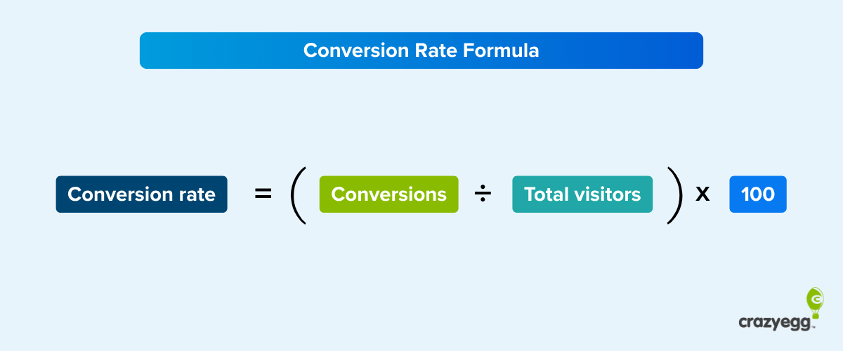
A/B tests also report the statistical significance, which tells you how confident you can be in the result.
Statistical significance helps us understand how likely it is that the difference we’re seeing is just due to random chance, rather than a real effect. It’s measured by a number (p-value) that tells us if what we’re observing is likely to happen by chance when there’s actually no difference.
For the purposes of understanding and acting on results from A/B testing, you just need to understand that the smaller the p-value is, the more confident you are that what you’re seeing isn’t due to random chance.
The rule of thumb for A/B testing is a target p-value of less than 0.05, which is saying there is a 5% chance or less that the result you observe is due to random chance. Another way to say this is that your confidence level is 95% that the results are reliable.
A high p-value (above 0.05) tells you that the results could easily be random. This will give you a lower confidence level that you would see the same result again.
Statistical significance is often displayed as a percentage, like 92%. This is just the p-value turned into a percentage. Statistical significance of 95% is equivalent to a p-value of 0.05. Then mean the same thing.
Which Are the Best Elements to A/B Test?
Some elements of a marketing asset contribute to conversions more than others. Changing one word in the body copy of an email, for instance, probably won’t make much of a difference in conversion or click-through rates. Consider looking at A/B testing examples from other websites. Many companies publish their findings on marketing blogs like this one so others can benefit from them.
Since you have limited time, devote your energy to the most impactful elements on your web page or other marketing asset. To give you an overview of what to focus on first, let’s look at ten of the most effective A/B testing elements.
1. Headlines and copywriting
Your headline is the first thing people see when they arrive on a web page. If it doesn’t grab your visitors’ attention, they won’t stick around.
Other aspects of copywriting can also impact conversions. For instance, what text do you use on your CTA button, or as anchor text for your CTA link?
Test different paragraph lengths and different levels of persuasion. Does your audience prefer the hard sell or a softer approach? Will you win over prospects with statistics or anecdotal copy?
2. CTAs
Your call to action tells readers what you want them to do now. It should entice the reader to act on your offer because it offers too much value to resist.
Changing even one word in your CTA can influence conversion rates. Other characteristics — such as button color, text color, contrast, size, and shape — can also have an impact on its performance.
Don’t change multiple qualities during one A/B test. If you want to test background color, don’t change the font or link color, too. Otherwise, you won’t know which quality made the difference in your A/B testing data.
3. Images, audio, and video
I strongly believe in omnichannel marketing. Since we know we can’t reach every single member of our target audience through SEO-optimized text, we also create podcasts, videos, and infographics.
If you have a library of videos at your disposal, one good idea is to A/B test video testimonials against written ones, or short infographics against longer versions.
If you don’t have a video channel or resource page yet, even stock images can impact your A/B testing. For instance, if you have a photo of someone pointing at your headline or CTA, the image will naturally draw viewers’ eyes toward that element.

All of these A/B testing experiments can help you figure out what your audience responds to.
4. Subject lines
Email subject lines directly impact open rates. If a subscriber doesn’t see anything he or she likes, the email will likely wind up in the trash bin.
According to recent research, average open rates across more than a dozen industries range from 25 to 47 percent. Even if you’re above average, only about half of your subscribers might open your emails.
A/B testing subject lines can increase your chances of getting people to click. Try questions versus statements, test power words against one another, and consider using subject lines with and without emojis.
5. Content depth
Some consumers prefer high-level information that provides a basic overview of a topic, while others want a deep dive that explores every nook and cranny of the topic. In which category do your target customers reside?
Test content depth by creating two pieces of content. One will be significantly longer than the other and provide deeper insight.
Content depth impacts SEO as well as metrics like conversion rate and time on page. A/B testing allows you to find the ideal balance between the two.
This doesn’t just apply to informational content, such as blog pages. It can also have an impact on landing pages.
At Crazy Egg, we ran an A/B test on our landing page to see whether a long- or short-form page would work better.
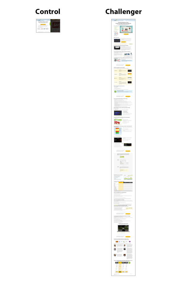
The longer page on the right — our challenger — performed 30 percent better. Why? Because people needed more information about Crazy Egg’s tools to make an informed decision.
6. Product descriptions
The opposite can be said of product descriptions.
In ecommerce, short product descriptions tend to work best. Consumers want simple, easy-to-digest content that gives them the highlights about a product.
You see brief product descriptions on major sites like Amazon all the time.

If you ask me, this product description could benefit from more white space, but it’s short and easy to read.
However, if you have a more complicated product than, say, a blouse, you might need to get into more detail. Test longer descriptions against shorter ones to see which converts better.
Additionally, you can test product description design. Try testing paragraph copy against bullet points, for instance. At the top of the page referenced below, we see the highlights in bullet format.
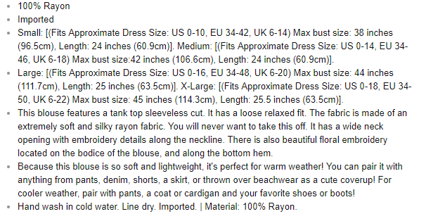
Even something as simple as bullet points can affect conversion rates.
7. Social proof
Displaying social proof on your landing pages, product pages, and other marketing assets can increase conversions, but only if you present it in an appealing way.
A/B test star ratings against testimonials, for instance. You could also test videos vs. static images with quotes.
8. Email marketing
It’s easy to A/B test your marketing emails. You just send version A to 50 percent of your subscribers and version B to the rest.
As we mentioned earlier, even the simplest changes to your email signup form, landing page, or other marketing asset can impact conversions by extraordinary numbers. Let’s say you run an A/B test for 20 days and 8,000 people see each variation. If Version A outperforms Version B by 72 percent, you know you’ve found an element that impacts conversions.
The conclusion is based on three facts:
- You changed just one element on the page or form.
- Equal numbers of people saw each variation.
- The test ran long enough to reach statistical significance.
You won’t know unless you test. Presenting different versions of copy or imagery to your audience at the same time produces scientifically viable results.
9. Media mentions
It’s a great feeling when your business, product, or service appears in a major publication, whether online or off. You want people to know about it, but you also have to present the information clearly and effectively.
Try A/B testing different pull quote designs. You could also test mentioning the publication’s name versus using its logo.
10. Landing pages
Your landing pages need to convert users on whatever offer you present them with. If they don’t, you lose a potential sale.
A heat map can show you where people are clicking on your landing pages. Collecting this data before you run an A/B test will make your hypothesis more accurate and tell you which elements are the most important to test.
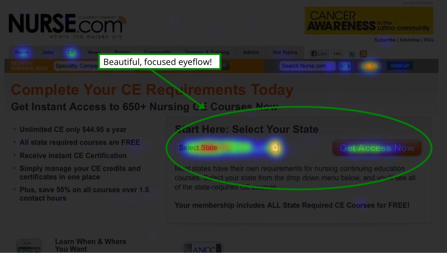
You’ll see where peoples’ eyes focus on the page so you can put your most important element, such as the CTA, there.
How to Do A/B Testing
A/B testing isn’t complicated, but you need a strategy before you begin. Start with a hypothesis. Which version of your web page or other marketing asset do you believe will work better? And why?
You could also start with a question, such as, “Why isn’t my landing page converting?” You might have significant traffic, but no click-throughs on the CTA. In that case, making changes can help you collect more data about your visitors’ experience on the page.
Then follow these steps to run your A/B test.
1. Choose what you want to test
Start with a single element you want to test. Make sure it’s relevant to whatever metric you want to improve.
For instance, if you’re trying to generate more organic traffic, focus on an element that impacts SEO, like blog post length. For conversion rate optimization, you might begin with the headline, a video, or a CTA.
2. Set goals
What do you want to achieve with your A/B test? Are you interested in improving conversion rates? Sales? Time on page?
Focus on a single metric at first. You can always run A/B tests later that deal with other metrics. If you concentrate on one thing at a time, you’ll get cleaner data.
3. Analyze data
Look at your existing data, using a free tool like Google Analytics. What does it tell you about your current state based on the metric you want to improve?
This is your starting point or base line. You’re looking for a change that will move the needle, even if only by a small margin.
4. Select the page that you’ll test
Start with your most important page. It could be your homepage or a highly trafficked landing page. Whatever the case, it should have a significant impact on your business’s bottom line.
5. Set the elements to A/B test
Choose which elements you’ll A/B test on your control. Start with the elements you think are most likely to influence the target metric.
6. Create a variant
Next, create a variant of your control. Change only the element you decided on in the previous step and make only one change to it.
If you’re testing the CTA, change the background color, font color, or button size. Leave everything else identical to the champion.
8. Run your test
Once the test is ready, start the test and then confirm that it’s actually running. The best method is try use a few different browsers until you see both variants yourself.
9. Accumulate data
This is the wait-and-see period. With A/B testing software like Crazy Egg, data gets collected automatically. You can view the progress of your test at any time, and when the test concludes, you’ll get data about how many people visited each variation, which devices they used, and more.
10. Analyze the A/B testing statistics
Draw conclusions based on which variation won: the champion or the challenger. Once you better understand which version your audience liked better — and by what margin — you can start this 10-step process over again with a new variant.
Questions to Ask Before A/B Testing
These are the things I would think about prior to committing to an A/B testing program.
Do we have enough users for A/B testing?
To give you a basic idea of the minimum sample size you need, I don’t think it’s worth A/B testing until you hit these benchmarks:
- Websites and landing pages: more than 10,000 visits per month
- Email: at least 5,000 subscribers
- Apps: at least 5,000 monthly active users
- Paid ads and paid social: at least 1,000 ad clicks per variant
- Organic social media posts: at least 500–1,000 impressions per variant.
- Text campaigns: at least 3,000 recipients per variant
These aren’t scientific numbers, but they are the bare minimums in my opinion. For example, if we assume a 20 percent open rate, 5,000 email subscribers leads to roughly 1,000 opens per variant. That’s the table stakes for being able to detect any meaningful signal from the noise. 10,000 subscribers would be a lot better.
The truth is, there are most likely more valuable things you can be doing with a user base below these thresholds. On a lower traffic website, for example, heatmaps and traffic analysis will still provide rich insights, highlight glaring issues, and surface new opportunities.
Are we committed to a few months?
Along with a large sample size, it takes time to get meaningful results with A/B testing.
Even if you deploy lightning quick with a team of A/B testing experts, it’ll be a few weeks before you have enough data to start making judgments about what to improve, then a few more weeks to get the next results, and off you go.
Let’s just say the quarter goes by fast testing in 2-week, 4-week sprints. You have to let the tests run their course. Even if you hit the target sample size during the test, pulling it before it’s run its full duration is asking for trouble.
Day of the week, seasonality, holidays, the weather — all of this could impact the results of your test depending on your industry. Running tests over a longer period of time gives you a better chance of reducing all this noise that’s not connected to the variable you are testing.
The more users you have, the faster you can get to a critical mass of test data, but you should expect that both the performance data and statistical significance will evolve over time.
Yes, you can run lots of tests at once, you can use multi-armed bandit testing to pick winners quicker — there are legitimate and useful ways to incrementally decrease the time to impact with A/B testing.
But there is no escaping the fact that time increases certainty. Baking in the expectation that A/B testing is going to take a few months is healthy for managers with budgets, as well as creatives who might not hit it out of the park with their first test idea.
Do we have the right people on board?
A/B testing is collaborative because it has to be. There’s not usually one person who can walk in and do everything that’s required to set up, run, and execute meaningful A/B tests.
I see five discrete roles to play:
- Strategist: Defines the goal, scope, and hypotheses.
- Designer: Crafts visuals for each variant, ensuring brand consistency.
- Copywriter: Creates compelling and testable messaging.
- Developer: Implements tests, especially for custom-coded elements.
- Data Analyst: Interprets results and determines statistical significance.
I’m not saying you need five people. It’s fine if there is some overlap and people wearing multiple hats, but all these skills need to be accounted for.
For small scale A/B testing, you can get by with a skeleton crew. Do you need a data analyst for testing A/B testing email subject lines? Probably not.
If you are trying to use A/B testing as a way to really optimize your site or product, you really want all those skill sets in play. You’ll create and deploy better tests faster.
I recommend getting the people you need together before you even select an AB testing tool. Because of the varied skill sets, you’ll be asking questions from all the important angles.
Which A/B testing tool makes sense?
There is a range that goes from free A/B testing tools to those that cost thousands of dollars per month. Here’s my thoughts about what to look for:
- You and your team should feel comfortable using it.
- It has a credible history of working well with the software or channels you are testing.
- It is capable of running the complexity of tests you want to run.
- It can run as many tests simultaneously as you need.
- Purchasing the tool for a year is within your budget.
- The reporting exports easily to a format that outsiders can digest.
Check out this post for a detailed review of popular A/B testing tools and how to decide.
How Long Should Your A/B Tests Run?
Most A/B tests should run for a few weeks. And every test should run for at least one week.
If one of your tests isn’t increasing in statistical significance over time, don’t be afraid of abandoning the test and trying something else. Most tests don’t impact conversions. Cycling through a bunch of dud ideas to find that rare winner is how top tier teams improve their conversion funnels.
Split Testing vs AB Testing: Whats the difference?
The terms “split testing” and “A/B testing” mean the same thing.
People often use them interchangeably and there isn’t a technical difference between them. They both mean to “split” an audience into different versions “A/B” to see the impact on a metric that you care about.