Shopping cart abandonment is an opportunity to win customers who came as close as possible to buying without actually making the purchase.
Let’s cover exactly what you need to know to decrease your shopping cart abandonment rate, increase sales, and retarget the shoppers who left before buying.
What Is Shopping Cart Abandonment?
Shopping cart abandonment is when a customer adds a product to an online cart but does not complete the purchase. It is also called cart abandonment or abandoned cart—these terms all refer to the same scenario.
For businesses, shopping cart abandonment represents failure in the final step of the sales funnel. The customer is on your site, interested in your products enough to create a cart, and then leaves before completing the purchase.

Sometimes brands can “recover” abandoned carts by getting these customers to buy with a second effort. We’ll cover strategies for abandoned cart recovery later in this post.
For now, you should know that shoppers abandon carts all the time. It’s completely normal. But if the rate at which shoppers abandon carts spikes suddenly, it’s the sign of a problem you should address quickly.
How To Calculate Shopping Cart Abandonment Rate
The shopping cart abandonment rate tells you the ratio of abandoned carts compared to the total number of carts initiated by users. It’s most often expressed as a percentage and used to look at data over a particular period of time, such as weekly, monthly, or during a holiday rush.
To calculate the shopping cart abandonment rate, use the following equation:
Shopping cart abandonment rate = (# abandoned carts / total # of carts) ✕ 100
For example, if an online store had 500 carts initiated, and 300 were abandoned, the store would have a shopping cart abandonment rate of 60%. Here’s the calculation
(300 abandoned carts / 500 total carts) ✕ 100 = 60%
All of the leading ecommerce platforms like Shopify, WooCommerce, or Adobe Commerce (formerly Magento) offer features and plugins that automatically calculate the shopping cart abandonment rate for you.
Web analytics tools like Google Analytics (GA4), Crazy Egg, and Microsoft Clarity can also track the shopping cart abandonment rate.
What’s a Good Shopping Cart Abandonment Rate?
It depends on your industry, but a general rule of thumb is that a healthy rate is less than 60% for desktop users, and less than 70% for mobile users.
More than looking at a specific percentage, I’d recommend figuring out what your baseline is and trying to improve it incrementally from there. If you have a stable shopping cart abandonment rate at which your business is profitable, I’d call that good. Improving the rate is even better.
I’d also be alert to any sudden spikes in the rate, as that suggests that buyers are experiencing a new point of friction, confusion, or dissatisfaction that ultimately blocks their purchase.
Shopping cart abandonment statistics
Here’s recent data on shopping cart abandonment from authoritative sources across the web.
- 70.19% is the average documented rate of shopping cart abandonment. (Baymard Institute)
- 26% of consumers reported abandoning their cart because a site asked them to create an account. (Paypal)
- 41% of global online shoppers said they abandoned carts due to high delivery fees. (Statista)
- Approximately $18 billion per year is lost by online stores due to shopping cart abandonment. (Yaguara)
- There was a 2.12% increase in shopping cart abandonment rates from 2014-2024. (Analyzify)
Again, I wouldn’t base your strategy off the blended market averages for shopping cart abandonment — there are simply too many unique factors impacting your business to use general stats as guidance — but these figures do drive home how costly this problem is.
Now that you know what it is and how to track it, let’s dive into the reasons shoppers give up before they buy.
The Main Causes of Shopping Cart Abandonment
Each year, many different companies survey the field to find out the most common reasons behind shopping cart abandonment. There are slight differences here and there, but generally speaking, the same reasons top the charts consistently.
Surprise fees at checkout
Shoppers abandon carts when unexpected shipping, taxes, or handling fees appear late in the process. At the very least, you are messing with buyer expectations by failing to be transparent about the total cost they ought to be considering.
Even when shoppers aren’t price-sensitive, these surprises can make buyers feel misled and lower trust in your brand.
Forcing shoppers to create an account
Requiring people to make a new account adds significant friction to the buying process for first-time buyers. Anyone who prefers to shop anonymously may leave and see if they can do so with another vendor. Others may abandon their cart simply because creating a new account gets in the way of their desire to check out quickly.
New accounts are good for your business metrics, email marketing campaigns, and getting data on customers — but if it’s preventing a good conversion rate and driving shopping cart abandonment, is it still the best move for your business?
Complicated checkout flows
If the checkout feels like a hassle, people back out. Every extra click gives them a reason to leave. Long forms, unclear steps, and poorly labeled fields will slow customers down, potentially causing them to abandon their cart altogether.
Slow page load speed
Even a few seconds of delay frustrate shoppers and make it harder for them to explore your store. They may add an item for purchase and give up because it’s taking forever to browse.
Slow loading pages also erode customer confidence, especially when they are trying to make it through the checkout process. Do they want to share their credit card info with a company with a clunky site?
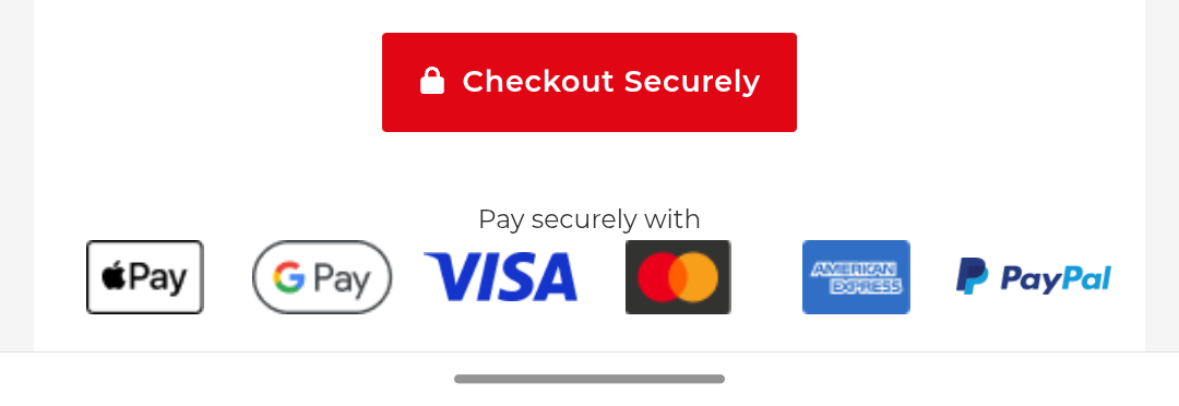
Lack of preferred payment option
Most shoppers will abandon their cart if they don’t have an easy way to pay for their purchase. In general, they won’t download a new service just to buy a product.
I would worry about this if you have a limited number of unconventional payment methods. If you already have the typical and expected payment platforms available (based on what you see close competitors offering), there may not be as much benefit to adding more payment options.
Unclear if it’s safe to buy
If your site doesn’t feel trustworthy, users are far more likely to abandon their cart. For new and lesser-known brands, this can be a real problem. It usually happens when there are not enough trust signals, like security badges, or social proof, like customer reviews, to convince people that it’s safe to buy.
An outdated design, old content, typos, or displaying the wrong currency can also undermine confidence during checkout. If buyers aren’t sure your site is secure or legitimate, they won’t risk entering payment info.
Delivery options are slow or unattractive
Shoppers often abandon carts when the delivery timeline feels vague or unreasonably long. Without fast or flexible shipping options, that initial buying energy fades. This is especially true for gifts, urgent needs, and everyday items people could find elsewhere easily.
Long delivery times introduce a gap between decision and gratification, which gives buyers time to second-guess or shop elsewhere.
Losing on price comparison
Shoppers often use the cart to bookmark or compare prices. If your price isn’t competitive, you are likely to see a lot of people adding items to carts without making a purchase.
This behavior can look similar to casual browsing, but there are clues if you have visibility into customer engagement metrics. For example, if you see high cart abandonment paired with short session duration or referral traffic from marketplaces, it may signal that users are jumping between competitors.
Delivering a poor mobile experience
If mobile users have trouble checking out, it’s going to cause a lot of abandoned carts. Some of the most common culprits of a bad mobile experience are non-responsive mobile layouts, clunky forms, and buttons that are too tiny to tap..
If you see a clear difference between mobile/desktop cart completion rates, I would dig into this.
Catching shoppers before they’re ready
Many users add items to cart while browsing, researching, or just dreaming about something they want. These people have no intent to buy, and there’s probably not much you can do to convince them to buy during the session.
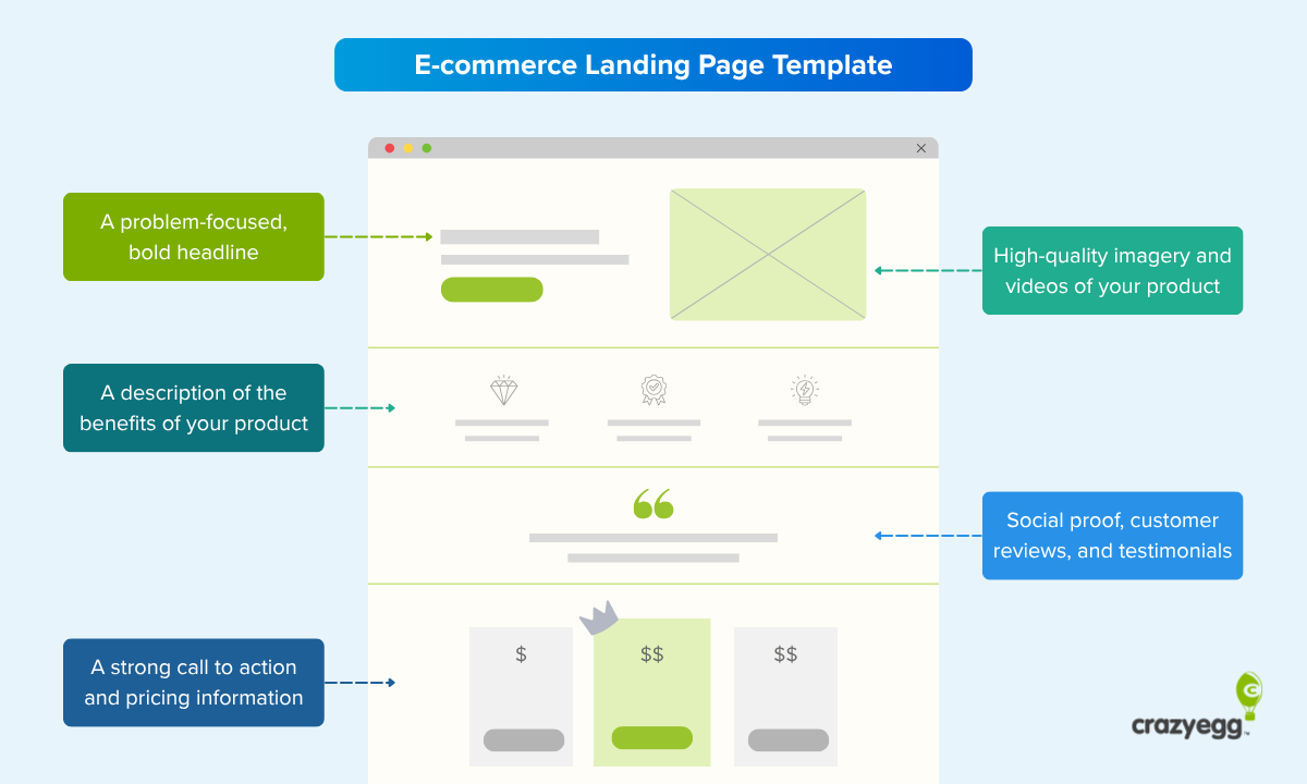
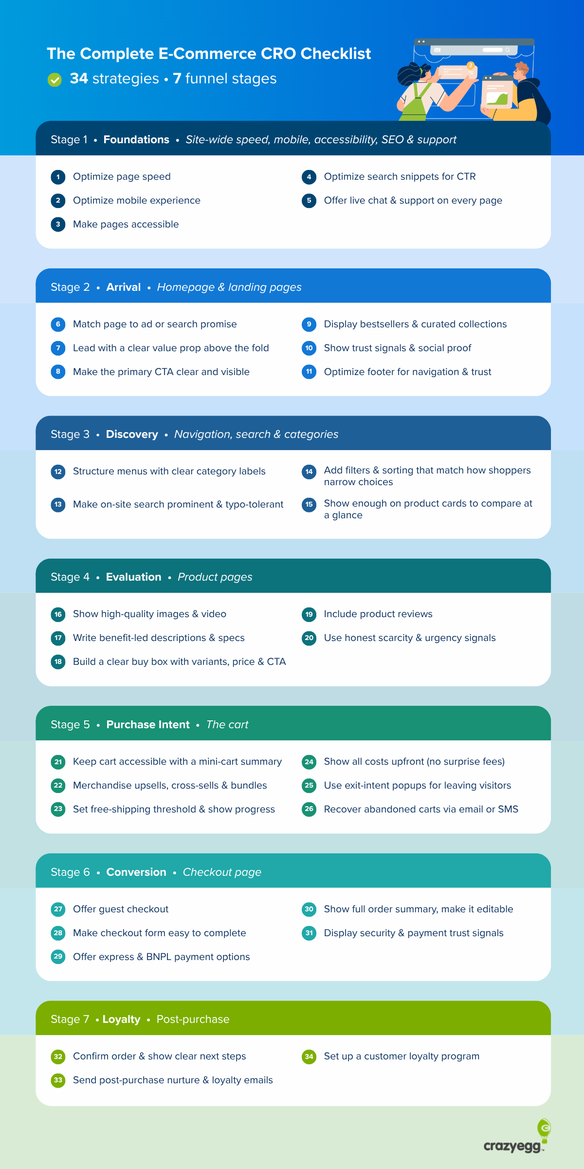
15 Strategies To Reduce Shopping Cart Abandonment
These are proven methods to decrease the number of people who start a cart and fail to make a purchase. Start with the quick wins first and then move on to the bigger changes on your site.
1. Display total costs early in checkout
Showing taxes, shipping, and other charges upfront builds trust and prevents nasty surprises at the end. Surveys consistently show that hidden fees are one of the top reasons shoppers abandon their carts.
- Show shipping options and costs immediately after zip code entry.
- Add a cost estimator on product or cart pages that updates in real-time.
- Use a progress bar to preview upcoming cost details before users advance.
2. Use inline validation

Nothing kills a shopper’s momentum like submitting a complex form only to be told they did it wrong. Inline validation catches issues as users type and keeps them moving through the checkout flow.
- Flag errors in real-time beside the field, not after form submission.
- Use green checkmarks or gentle animations for correct entries.
- Give clear instructions to fix errors, like “Please enter a valid ZIP code,” instead of just signalling that there’s an error.
3. Offer guest checkout
Adding a guest checkout option where users can purchase or order without creating an account eliminates a key point of friction for many first-time buyers. It keeps the path to purchase simple and commitment-free, which should increase the conversion rate.
- Make “Checkout as Guest” the default or most prominent option.
- Only ask for essential info to complete the order.
- Invite users to create an account after purchase with one-click signup.
4. Improve page load speed
A fast site makes it easier for users to shop more, speeds up the checkout process, and leaves less room for hesitation or second-guessing. This is an easy way to reduce shopping cart abandonment, improve user experience, and likely boost your visibility in search results — all good things.
- Compress images, remove unused JavaScript, and follow other best practices to speed up your website.
- Use a content delivery network (CDN) like Cloudflare to serve assets faster based on user location.
- Run speed audits with tools like Google PageSpeed Insights or GTmetrix.
5. Optimize the checkout process
Getting rid of every source of friction and streamlining the purchase experience makes people more likely to follow through. Put some thought into your checkout page design and streamline it as much as possible.
- Reduce the number of required fields and form steps.
- Eliminate all distractions, such as navigation menus or unrelated upsells.
- Let users edit cart contents without restarting the process.
6. Enhance the copywriting
Clear, confidence-boosting language makes buying feel easier and safer. There are many places throughout your site and during checkout where you can follow well-known copywriting tips to overcome the doubts of shoppers that cause them to second guess the value of the items in their cart.
- Use persuasion techniques like clarifying the next steps to reduce uncertainty.
- Handle common objections with microcopy near the relevant fields.
- Use direct and powerful CTAs like “Secure Checkout in 2 Minutes”
7. Use exit intent popups
When users move to close the tab, exit intent popups give you one last chance to offer value, address concerns, and convert the user.
- Trigger a discount code, limited time offer, or free shipping when the cursor moves off-screen.
- Ask a simple question to re-engage the shopper, like “Still thinking it over?”
- Offer to save the cart or email the contents for later.
He’s an example of an exit intent pop-up I encountered while shopping on Nextiva’s website. It’s one last chance to make a connection.

8. Add live chat assistance
Some users leave because they have questions they can’t get answered. Live chat software isn’t a silver bullet, but it can keep users engaged and address concerns before they click away.
- Place a chat widget on product and checkout pages, not just the homepage.
- Use proactive chat triggers when users hesitate or idle on checkout steps.
- If possible, set up chat routing so that users part-way through a checkout flow can connect with trained human agents.
9. Send abandoned cart emails
A well-timed reminder brings shoppers back after they walk away. These emails work best when personalized, timely, and persuasive. Any good email marketing tool or ecommerce website builder will help you automate this process.
- Send the first email within an hour, ideally including a photo of the item.
- Follow up with a second message that adds urgency or a small incentive.
- Test adding reviews or testimonials in the email for social proof.
10. Offer money-back guarantees
A clear, simple guarantee signals to first-time shoppers that the brand is confident in their product — if it wasn’t good, the brand couldn’t make this offer. Guarantees reduce the perceived risk of purchase, which can be especially important for big-ticket items.
- Highlight the guarantee near your call to action or pricing information.
- Describe the offer using power words and specific details, like “30-day no-questions-asked refund”.
- Clearly explain the refund policy, and foreground how easy it is to claim.
11. Run A/B testing
With A/B testing, you can test small variations of your website or checkout flows to see which version performs better. Done right, A/B testing takes the randomness out of the equation and gives you confidence that the improvements you discover will actually reduce shopping cart abandonment moving forward.
- Limit A/B tests one change at a time, or use multivariate testing to assess elements in combination.
- Focus on related factors, like shipping costs, form fields, and trust signals.
- Use tools like Crazy Egg for easy implementation and accurate reporting.
12. Ask the audience

Customer feedback reveals friction points you might miss. By including surveys in the checkout experience or after abandonment, you collect data that helps refine your funnel while signaling that you care about the user’s experience.
- Add a one-question poll on the cart or exit page to capture real-time objections.
- Include a quick survey link in abandoned cart emails to ask why they didn’t complete the purchase.
- Use post-purchase surveys to understand what nearly stopped a completed buyer.
13. Analyze behavioral data
With analytics tools, you can see what users are actually doing on your site, and spot some of the hidden hurdles and frustrations that get in the way of a successful purchase.
- Heatmaps and click maps can show you dead spots, rage clicks, and confusing design elements.
- Session recordings are helpful for troubleshooting UX issues without needing a lot of traffic.
- Segment user behavior to see if shopping cart abandonment is high with particular types of users, traffic sources, countries, and so on.
14. Enrich FAQ content
A clear, helpful Frequently Asked Questions page is great, but you should be including FAQ content throughout the checkout process. By consistently addressing real concerns about return policies and shipping times, you will reduce hesitation and build people’s confidence in making a purchase.
- Review support tickets and chat logs to identify common pre-purchase questions.
- Add expandable answers directly on product and checkout pages for quick access.
- Update FAQs regularly, and be sure to highlight recent changes.
15. Add high-visibility trust signals
Display clear indicators that your brand is legitimate, your site is secure, and that past buyers have been really happy with their purchase. All of these little trust signals reassure shoppers they’re making a safe, smart choice.
- Show secure checkout badges and SSL icons near the payment form.
- Feature reviews, star ratings, or customer photos close to the checkout buttons.
- Highlight years in business, customers served, associations with reputable brands throughout your site and include an likable About Us page.
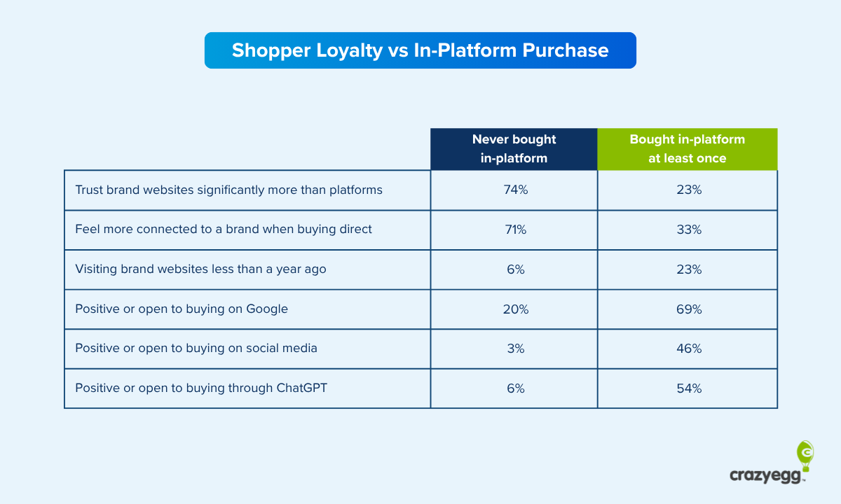
Tips for Abandoned Cart Recovery
Here are some simple pointers to give you a second chance to win back shoppers who left items in their cart. These users have already shown interest, so the goal isn’t to reintroduce your brand — it’s to close the loop and complete the sale.
First, you have to identify this group, which won’t be too difficult with today’s tools. See, for example, how to set up a cart abandoners audience in GA4. From there you can reach this specific group using several channels.
An easy and very effective tactic is to run dynamic display ads that show the exact product shoppers left in the cart. Consider adding incentives like limited-time discounts or free shipping.
Email is another powerful channel for reaching these users, especially when used thoughtfully. Instead of a generic reminder, personalize abandoned cart emails with product photos, reviews, and support options. You could also experiment with adding a sense of urgency, such as “Your cart will expire in 24 hours.”
Most email marketing services, such as MailChimp, include built-in abandoned cart email features, as do most ecommerce platforms.
The goal of retargeting this audience is to offer an appealing, low-friction path back for users that have shown interest in your products. Using a mix of channels to accomplish this will help you from crossing into spammy territory.