Brands worth $100 million or more have hundreds or thousands of new customers on their site every hour. That means they can test every single element on their site to see which CTA designs convert the highest percentage of visitors into customers.
If you are looking for what works in CTA design, why not analyze what those brands do? That’s what we’ll do in this post.
First a brief overview of the rules and strategy.
What is CTA Design?
Call to Action (CTA) design refers to how you present an offer on your site. It’s about how you use placement, color, size, wording, and the surrounding website elements to guide people towards action.
On a simple website, CTA design might be little more than selecting a template, changing a few lines of text, and uploading an image.
Don’t let the simplicity of those actions fool you.
Read any CRO blog and you will find dozens of stories about small text changes and better images leading to massive revenue spikes.
For a simple landing page, you do not need fancy tools or developer skills to enhance your CTA design and get more people to convert.
On a high traffic website, CTA design is usually overseen by a team of specialists including copywriters, UX designers, data analysts, graphic designers, web developers, and marketers with experience in conversion rate optimization (CRO).
There may be one person who owns it, but CTA design draws on all of these disciplines.
How do you know a CTA design is good?
We know a CTA is well designed when it encourages a higher percentage of website visitors to take action.
On websites, key actions are tracked as conversions. If a new CTA design improves the conversion rate, that’s good news 99% of the time.
Done well, CTA design reinforces all of the positive feelings a website user already has about a brand: What they saw in ads, what they read on the site, what they found out in reviews.
It gives users confidence in their decision to move forward, making the next steps easy and obvious.
Here are some examples of wonderful calls to action I found in the wild.
How do you know a CTA design is bad?
We know a CTA is poorly-designed when people overlook it, aren’t interested, and don’t convert into new signups, purchases, inquiries, etc.
You might not know the root cause, but you will start to see that conversion rates drop. Maybe average order value decreases or the revenue per session ticks down.
Whatever the warning sign is, you will have to dig into the problem by running a CRO audit, which will let you know if it’s a quick fix or a larger issue.
But CTA design isn’t always to blame, right?
No, of course not. There are lots of reasons that customers fail to sign up, many of which have zero to do with your CTA design.
That said, your CTA design is what every potential customer is looking at during the moments they actually have to act. It has to get people past the final hesitation before they pull out their credit card and feel comfortable making a purchase.
And when poor CTA design really is the problem, it’s tragic.
All the hard work the brand has done thus far to raise awareness, build interest, sharpen desire, and get potential customers through your website funnel, only to fail in the final mile.
At the very least, a decent CTA design gets out of the way and allows as many users to convert as possible. Truly great CTAs can actually encourage more people to sign up, subscribe, or buy.
7 Rules for CTA Design
This is a well-studied world. Unlike other corners of the marketing universe, there are few mysteries left about what makes a call to action effective. Here is my take on the key rules for CTA design:
- Place the primary CTA prominently and differentiate it
- Secondary offers shouldn’t compete with the primary offer
- Use buttons for action, links for navigation
- Use a small amount of specific language
- White space should draw attention to the the CTA
- Place primary CTA’s in multiple sections
- Place trust signals and social proof near the CTA
The very best designers and CROs know when to break these rules, which can be an incredible way to stand out from the competition.
But if you are simply trying to create a new offer or upgrade an existing one, there is probably a lot of headway you can make simply by adhering to the well-known best practices.
1. Place the primary CTA prominently and differentiate it
Whatever action you want people to take should be impossible to miss. It ought to be visible as soon as they arrive on your site, and it should really stand out from everything else on the page. This is a classic conversion rate optimization checklist item because it ensures that anyone who visits your site will see your offer.
This offer from the screen recording software company, Loom, is exemplary. It is a simple headline and subhead that sells the value of Loom, followed by a button that offers Loom for free.
Using CTA’s like this is not a pushy tactic, it’s just common sense. Many visitors will not scroll, so if your CTA is buried, they are not going to see your offer.
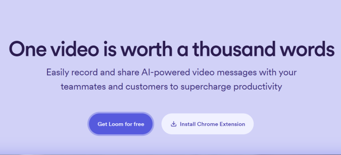
Plus, some visitors come ready to act, and you want to give them that option as soon as they arrive. They could have researched your product category heavily and are now actively looking for deals. Make it as easy as possible for people to take action with a clear and obvious CTA.
Tips:
- Put the CTA above the fold, which refers to the portion of your site that’s visible as soon as the page loads. It’s roughly 600 pixels in tall, which is not a ton of space when you factor in navigation menus, privacy notices, and ad banners.
- Use contrast to make the button pop. Make the button color distinct from the rest of your website color palette. Opposite colors work really well (e.g. orange button with a predominantly blue palette), but as long as it is markedly different, it’s probably fine.
- Dial down competing elements. Visuals should support the CTA, not steal too much attention. For example, many brands use grayscale client logos near the CTA to reinforce their own credibility without introducing dozens of extra colors to their site.
2. Secondary offers shouldn’t compete with the primary offer
If you have multiple CTAs, and users can’t tell which one is important, it splits their attention. This usually makes people confused, hesitant, and less likely to commit to anything.
You can (and in most cases should) have secondary offers on your page. Invitations to sign up for a newsletter or links to related resources are two examples of secondary offers that virtually every business uses on their site.
In the example from Loom, you can see how the secondary offer “Install Chrome Extension” is less prominent.

The button color is less heavy and there is no shadow. Even though the secondary offer button is wider than the primary offer, those design choices ensure the secondary offer does not rival the primary for attention.
Tips:
- Lock down the primary goal of the page by answering the question: What is the most important outcome on this page? This has to be universally agreed on before working on the page.
- Every design element should support the primary CTA. Ensure that hierarchy, contrast, navigation cues, and other typography elements contribute to its visual prominence.
- Secondary offers should be less noticeable or appealing compared to the primary offer. For example, using a neon button for the primary offer and neutral colors for secondary offers increases the chance that user attention gravitates toward your target action.
3. Use buttons for action, links for navigation
On your socials, you may be stuck using “link in bio” to get people to click through. But on your website, use buttons for direct action CTAs.
People expect buttons to do things. They expect links to take them places.
So if you want someone to do something, you can align with their expectations by making that action a button.
Tips:
- Button text should describe the action that people are about to take, like, “Save and Continue” or “Leave a review”. You can be creative with button text, but do what you can to help people understand what happens after they click.
- Communicate button states, like hover, loading, or success. Simple animations and color changes in the button can reassure people that their click was received, for example, and keep them from getting confused or clicking twice.
- Link text should describe the new page people are navigating to. For example, “Read the full report,” clarifies next steps better than “Learn more”. This practice helps your website users, but also helps search engines better understand your site, which is great for increasing SEO traffic.
- If you have navigation links near the CTA button, setting those links to open in a new tab (rel=”noopener”) will keep the current page open if they follow the link elsewhere.
4. Use a small amount of specific language
At the point where someone is going to take action, they want certainty. They want to know exactly what happens when they sign up. They want to know what they are signing up for.
Almost nobody likes vague, general language. They never have. And when they are at the moment of pulling out their credit card or surrendering their email, they really hate it.
Here’s an opt-in popup from the brand Quince, an online retailer that does over $100M in sales.
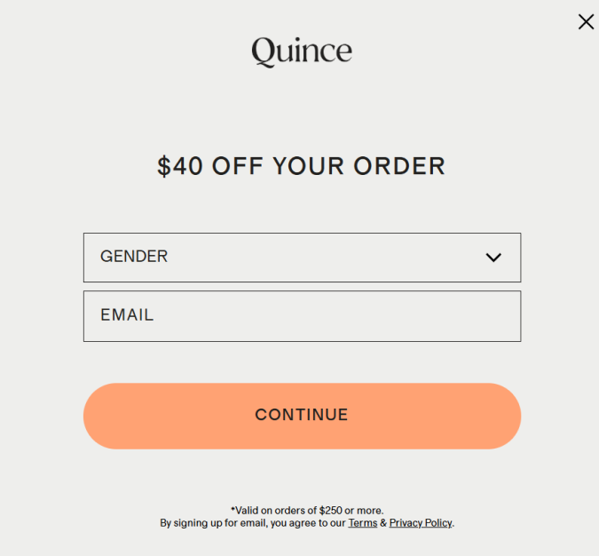
Nothing flashy there, by any means, but it’s easy to complete, easy to click out of, and unlikely to bother anyone who just wants to shop.
The rule of thumb is to use as little writing as possible to communicate only the most important ideas. People can argue over the best copywriting tips, but everyone agrees shorter is better.
With AI-slop content filling up websites and newsfeeds, it means you have a powerful opportunity to write something short, direct, and concrete that will resonate instantly with human users who are fed up with regurgitated content.
Tips:
- Don’t introduce new ideas in the CTA. Build on what’s come before.
- Avoid buzzwords and forgettable language. There are plenty of power words out there which draw people’s attention and evoke emotional responses.
- Use specific details. A new HR software that “saves 16 hours per month on payroll” is more enticing than one that “helps teams find new efficiencies.”
5. White space should draw attention to the the CTA
If users arrive on a page that’s crowded with tons of content, it can be overwhelming. You don’t want to make people work to find your CTA.
White space (that is the parts of your page with no content) is not wasted space. Good UX designers know how to use white space to guide users toward what matters.
Tips:
- Give your CTA some breathing room. A little bit of white space will make the primary button stand out naturally, which is a good thing.
- More white space around a button makes it easier to interact with. On a desktop, where users have a cursor, this isn’t such a big deal, but on mobile, trying to tap a small button that’s crowded by other elements is really annoying.
- Use website heatmaps to determine which parts of your site are engaging users and what really is “dead space” from an engagement perspective.
6. Place primary CTA in multiple sections
It’s okay to take more than one shot with your primary CTA. You almost certainly want to have a CTA visible when users first arrive on your site, but that doesn’t have to be the only one.
Most brands will include multiple CTA buttons for their primary call to action because they know that users explore the site in unique ways. Some may scroll right past your first offer to dig into the details, whereas others will give no more than a quick scan to the full page, looking for a specific bit of information.
You can’t predict what everyone will do, but you can take steps to make sure that a larger percentage of your website users have a greater chance of seeing your offer.
Tips:
- Showing more than one primary CTA at a time is aggressive (not counting the CTA in your nav bar, if you have one). It makes your brand look thirsty, in my opinion. On the other hand, if users can scroll 5-10 times without seeing a primary CTA, that’s usually too few. These aren’t hard rules, but I don’t see too many brands with large swathes of their site where it’s not possible to take action.
- Find places users are likely to linger for additional CTA placements. Using scrollmaps can help you identify these areas with precision.
- It’s good to keep the button text the same for all primary CTA buttons. I would only mix it up if you have a really compelling reason to do so.
7. Place trust signals and social proof near the CTA
One of the best ways to boost the confidence of potential customers is by giving them objective reasons to believe your brand and showing that other people have happily bought from you before.
Some examples of trust signals used near CTA’s include things like a G2 star rating or Better Business Bureau badge. These third-party endorsements show that your brand has been vetted by credible organizations. This gives potential buyers confidence in your brand, even if they have never heard of you before.
Some examples of social proof used near CTAs include customer reviews and testimonials. These reassure potential buyers by showing people like them who are happy customers already.
Tips:
- Star-ratings are one of the easiest and most recognizable ways to show customers that you have a lot of happy customers already. Use an email marketing service to automatically ask customers for reviews after they buy or use your service.
- Trust badges are crucial to place near CTAs where people are going to pull out a credit card (purchases, free trials, etc.), and you should include them in prominent places throughout the shopping cart flow.
Why Use Example CTA Designs from $100M+ Brands?
You want to learn from the best, which is subjective, but only to a point.
There are designs that convert better, and help brands grow. There are also designs that fail to convert, and drag brands down.
I picked 9-figure brands to use as examples because, at least for now, they are all clear winners.
No one says the first $10M is easy, but the path to $100M and beyond is a new kind of journey. Brands have to be doing a lot of things right, over a long period of time, in order to hit 9-figures.
They have to be making good choices about how to adapt their design and messaging as the market evolves. They are not doing what they were doing 2 years ago. They are constantly testing to see what actually works.
These brands have the resources to run in-person usability testing, conduct eye tracking studies, and significantly improve the UX on their website and/or mobile app.
They have tons of traffic, which means they can relentlessly A/B test and MVT test any page or user flow.
And the examples I picked? There is nothing high-tech going on here. It’s good writing, smart design, and thoughtfully chosen images.
Most of these tactics are well within striking distance for someone working on a basic website builder.
CTA Design in B2B | Glean
In less than three years, Glean hit $100 ARR by helping companies connect and access their data. It’s one of many players in the AI enterprise search category, but one of the few that successfully provided its customers with noticeable productivity gains.
Employees use Glean, more and more, to find answers, create content, and automate workflows. They built a tool people enjoy using, and I think the same could be said of their site, which had several compelling CTAs.

The above-the-fold offer on their homepage when you arrive directly tackles the most pressing question for most people new to the brand: What does Glean do?
The headline reads: “Work AI for all,” and it’s followed by the subhead “Give every employee an AI Assistant and Agents that put your company’s knowledge to work.”
If I put myself in the shoes of a potential good fit buyer, I find this offer pretty interesting. It’s aimed at every employee, not just managers or developers. This is something that could help my frontline workers, field techs, and customer service reps.
I might click the primary CTA, which reads “Get a demo,” and sits in a blue button surrounded by plenty of white space. Or I might be interested enough to click the secondary offer, “Watch video,” which sits as plain text on the white background, drawing very little attention away from the demo offer.
Notice that that primary offer sits beneath two small but significant trust signals. One is from Gartner, the other from G2, and these are both very trusted names in the world of enterprise B2B software. A few hundred honest reviews from real folks at big name companies will go a long way towards assuring me that this brand is, at the very least, safe to start thinking about.
Now it’s possible that you would have missed the primary CTA on the page, but there is zero chance you will miss the CTA in the navigation bar, which is encircled by a flashing neon border that sort of dances around it.

This is bold, especially because the navigation bar is sticky, so the animation follows you as you read the rest of the page. It’s not something that will work for everyone, but it does illustrate what high-growth brands are willing to do in order to stand out from the competition.
Throughout the rest of the page, Glean really leans into the idea that potential buyers need to hear from existing Glean customers in order to feel good about moving forward.
Consider this informational CTA about ⅓ of the way down the page:
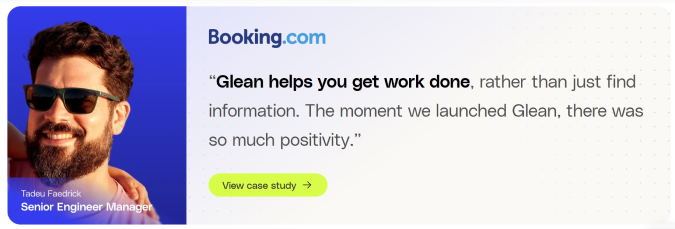
The call to action here is to read more about Booking[dot]com, featuring a headshot/quote from a senior engineering manager. The quote builds on the idea that Glean helps you get more done and that people like using it, cutting into the objection that these tools are too complex or obscure for people to really benefit from.
Notice the button color here is a neon we haven’t seen yet. It’s very noticeable during the first scroll. This type of social proof is crucial to show B2B buyers, and Glean makes sure it’s not overlooked.
CTA Design in B2C | Quince
Quince is a direct-to-consumer brand that offers high-end fashion and home goods at a fraction of retail prices. Launched in 2018, Quince hit the $100M mark in 2021 and continued to grow.
In addition to the attractive price point, their wide appeal is attributed to a generous 365-day return policy, which makes people feel a lot more confident when it comes to big ticket items. Their focus on sustainability has also propelled their growth, especially on social media.
Still, the Quince website itself is doing a lot of work to ultimately get people to say yes to a purchase and spend more than they otherwise might.
Exploring the home page on mobile (as most online retail shoppers do) I encountered a fairly minimalist CTA paired with an image headline combination that strikes at the core of the brand’s message.
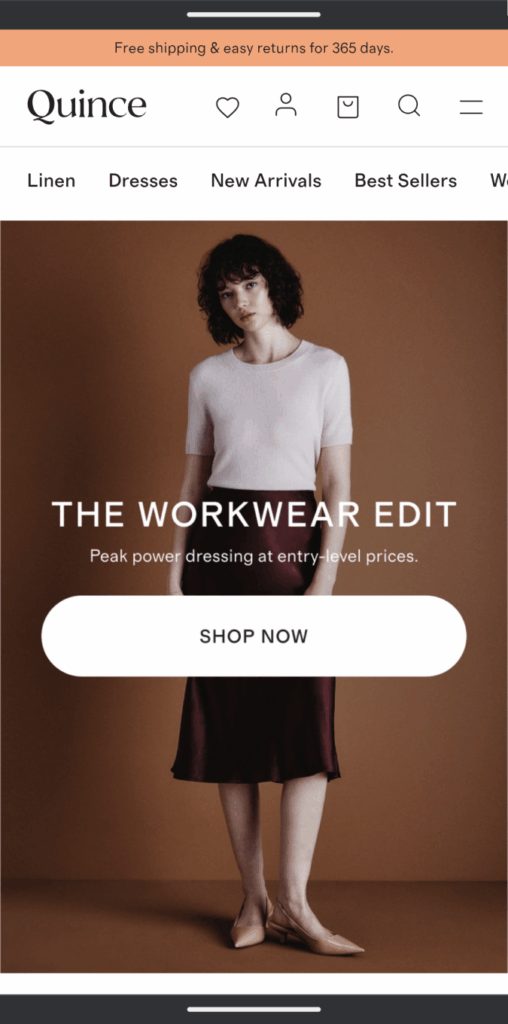
I can’t speak to the fashion choices (nor would any one want me to), but “Peak power dressing at entry-level prices” is text that evokes plenty of strong emotions.
The phrase “entry-level” evokes the idea of job and status. But it’s within the context of pricing, so it could convey “affordable for me” to an entry-level worker, or “okay for an impulse buy” to someone further up the chain of command.
The “Shop now” button is nothing special, but I guarantee they have tested many different versions. Sometimes the simplest way is the best way.
I found some really great CTA design work in the product detail pages (PDPs) on Quince site. Optimizing PDPs for conversion is where many ecommerce brands live and die. Quince is doing a lot of things right.
Here is the bedding set they promoted heavily from the homepage when I visited.
Let’s look at the key elements here:
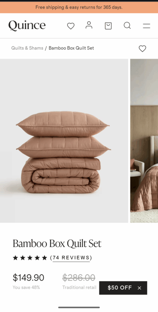
- The banner offer carries over from the homepage, reinforcing the lower-risk of the purchase because of the return policy and lack of shipping costs.
- Breadcrumb navigation lets users know where they are.
- There is a swipeable carousel of high-quality images that lets users see and judge for themselves.
- The product title is simple, easy to read, and sits directly above star reviews, with a clear underlined link to visit the “REVIEWS.” It’s quick and easy to see what the crowd has said about this product.
- The price is surrounded by value signals, like “You save 48%” and the much more expensive “Traditional retail” price, which uses a lighter gray font and strikethrough text.
- The floating $50-off popup is black with white text. It’s small, but grabs a lot of attention, encroaching on the space of the pricing section.
This PDP hits all the standard elements well and does a good job building momentum from the home page. There’s a constant focus on the savings and the value of this offer. It’s perfectly aligned with what we saw already.
For those at home doing the math, first time shoppers would be able to access that $50 and bring the sticker pricing of this bedding down to $99.99. That’s 60% off the traditional retail price, and the buyer would be getting $250 sheets for under a hundred bucks.
Scrolling just a little down and closing the $50-off, we see similar framing used around the button. More reasons to trust the brand, more reasons to feel safe about making a purchase with this company.
Note the buy button is huge, taking up almost the full width of the mobile display.
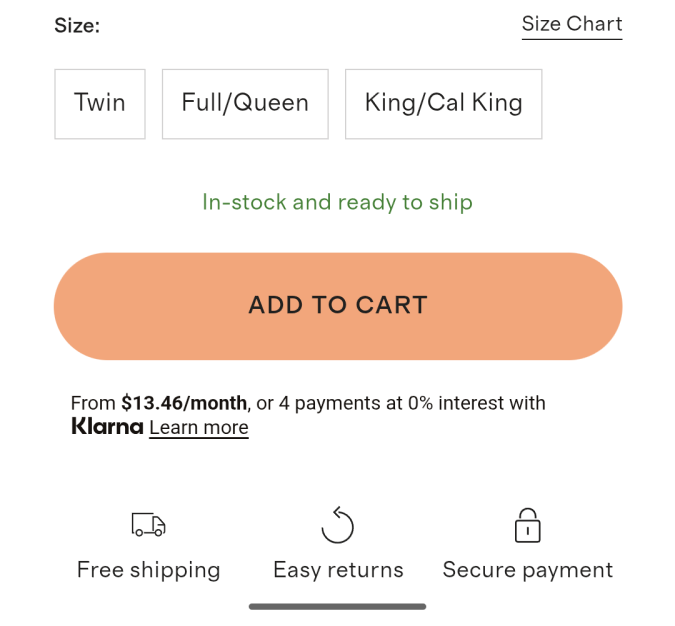
I don’t know who needs to hear this, but big buttons are easy to tap. Online retail shoppers might be holding a coffee in their other hand, standing on the train, or at the beach with terrible glare.
Surrounding the button are more reasons to feel good about making a purchase. Above the button is green text that reads “In-stock and ready to ship,” and below are three icons denoting free shipping, easy returns, and secure payment.
All of this conveys no waiting, no surprises, no risk, and makes people feel confident.
Now you might look at this and say, these are all fairly common tactics that people use to boost the conversion rate in ecommerce. They are building urgency and showing value the same way lots of other sites do.
Of course. These tactics are hardly revolutionary, but there is an important thing to keep in mind.
Quince is not using dozens of similar CRO tactics that “everyone knows”. No ticking clocks. No neon. Everything is understated. There’s tons of white space.
My guess is that a ton of CRO testing went into making this site effortless to navigate. The final product is simple, but it’s the result of testing hundreds of “good” ideas to find the dozen that actually improved the site.
They found out what works with their particular audience. You can, too.