When visiting your site, a user decides whether to hit the “back button” within milliseconds.
That’s right, milliseconds.
Your homepage is your only chance to get them to stay on your site and become a customer.
And since a company’s homepage accounts for up to 50 percent of the site’s total pageviews, it’ll make or break your business.
You need to design a homepage introduction that’s “sticky” enough that they won’t leave.
How to Create the Perfect Homepage Introduction
Your homepage’s copy is a huge factor in how successful your homepage will be.
It’s the first thing your visitors will see, and it can serve as a short “elevator pitch” letting the visitor know what your site is about.
So your website introduction content absolutely needs to be compelling.
Fortunately, writing effective homepage copy doesn’t need to be complicated. That’s why on this page, I’ll cover 11 tips you can use to design a page that’s interesting enough to make visitors want to learn more, and successful in driving them to take action.
1. Be Concise
Your homepage has a few main jobs: Show visitors what they’re looking for, show them where to start, and establish your company’s credibility.
Accomplishing this doesn’t need to involve a lot of copy.
Of course, some products and services require more of an explanation than others. If your company’s core offerings are different from anything else on the market, you’ll need to do a bit more work to tell visitors what they are.
But if you’re offering a product or service that your target audience is already familiar with, this doesn’t need to be the case.
They’ll be able to get the basic idea within a few seconds. And from there, your goal should be to convince them that your business is the right choice for their needs and drive them to take action.
If visitors immediately understand the site’s overarching goal, direct text is the best way to get them to take the next step.
In fact, you should be able to accomplish everything you need in one to three sentences, as a general rule.
Did you know that editing copy to be more scannable and concise can increase usability by 124 percent?
When you think about it, that makes perfect sense.
If the majority of your site’s visitors are scanning your content, some of them are bound to miss important information. They might read and remember the less-important details, but skip right over the copy that’s most effective in driving them to take action.
When you keep your copy concise, you remove everything but the copy you want your readers to focus on.
This way, you don’t have to worry about them getting distracted — because all they’ll see is your most important copy.
For example, take a look at Spotify’s homepage:
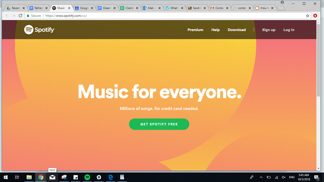
The page’s headline illustrates the brand’s goal of making music accessible to everyone. Then, it gives visitors the option to try the product’s free version. At the top, visitors have the option to sign up for a premium membership, get help, or log in, as well.
It would be almost impossible for a visitor to get distracted on this page.
If you’re torn between creating a long, informative homepage or a brief one like Spotify’s, consider that short homepages regularly outperform longer ones.
In one test, Pipedrive wanted to see whether their lengthy homepage was really the most effective way to drive conversions.
They created a variant that was significantly shorter than the original and tested them against one another.

So, was this shorter page more effective?
“Yes” is an understatement.
The shorter variant achieved a 300 percent increase in conversions.
So you don’t need to include every last detail on your homepage to drive conversions. And as this study illustrates, leaving them out could help your visitors focus on the page’s main goal.

2. Provoke Action
One of the most common reasons users leave a site is that they simply don’t know what to do.
It’s not that they don’t want to become a customer — it’s that they don’t know how.
This means that in addition to explaining what you’re offering, your homepage’s copy should also include a call to action.
And it shouldn’t be an afterthought, either. Your call to action is the most important element on the page.
After all, no matter how beautiful your design or compelling your copy, your homepage is useless if it doesn’t help you reach your business goals.
Your site isn’t just meant to inspire a positive reaction — it’s supposed to help you drive sales and generate leads.
And the best way to make this happen is to tell your visitors exactly what you want them to do.
Take a look at how Southwest accomplishes this on their homepage:

As soon as a visitor lands on this page, they’re instructed to book a flight — and to do so within the timeframe of their current sale; in this case, by Monday. The entire page is designed around this action, and the clear directive leaves no room for confusion.
Plus, the yellow “Book by Monday” button is a clear contrast with the page’s red background, making it immediately obvious where a user is supposed to click.
Now, let’s a take a look at another great website introduction example from Memrise:

In this case, the call to action isn’t a button.
This is a bit unusual and goes against what many marketers consider best practice for high-converting calls to action.
But for Memrise, it works.
That’s because the site offers courses in 20+ languages — so it wouldn’t make sense for their homepage to direct all of their visitors to only one of them.
And while they could direct users to simply create an account, then select their desired language during the registration process, this would require visitors to browse a list of languages before signing up.
Assuming that most people start using a language-learning tool because they want to study a specific language, they’d want to be sure that a platform offers the one they’re interested in before registering.
Memrise integrates this process directly into their call to action, speeding up the process and likely increasing the number of visitors who sign up as soon as they see their desired language on the list.
3. Place Your Headline Prominently
Beyond the copy you use in your main headline, it’s also important to consider placement.
Your homepage has a limited amount of real estate for content, and your headline should take up a significant portion of that.
Although you can include other elements, like photos and graphics, you want to make sure that visitors don’t miss your copy.
So as you divide up your page, give your headline plenty of space.
For example, check out how Slack balances their copy with a custom graphic:

The graphic brings color and adds some visual interest to the page, but it doesn’t overpower the main headline.
The 50-50 split layout, combined with the bold font used for “Where Work Happens,” ensures that visitors’ attention will still be drawn to the copy.
Plus, the text has ample spacing around it to make it more distinct.
Next, let’s take a look at Google Drive’s homepage:

Although the image background doesn’t leave “white space” in the same way that Slack’s homepage does, the minimalistic approach creates a similar effect.
The main headline immediately attracts attention, and the bright blue button is clearly where visitors are supposed to click.
4. Stay Above the Fold
As you place your headline, you should also ensure that it’s above the fold, regardless of the browser or device a visitor uses.
If you’re unfamiliar with the term, “above the fold” simply refers to the portion of a page a user can view without scrolling. It’s what appears as soon as they land on the page, and is the first content they’ll see.
This means that the content you place above the fold on your site is what will make the first impression on each visitor.
If visitors like what they see, they’ll either continue scrolling and learning, or they’ll take action.
But if the content within that first view isn’t enough to convince them that your business is worth their time, they may not bother to scroll and learn more.
This means that it’s essential to place your most attention-grabbing, compelling copy within the top, above-the-fold portion of your page.
If your page is simple, this is a relatively easy goal to accomplish.
For example, Duolingo’s homepage includes two simple, compelling sentences, and a high-contrast call to action.

This is all the site really needs to drive their main goal of encouraging visitors to try one of their courses — and it’s relatively easy to fit within the space offered by standard desktop, laptop, and smartphone screens.
For sites that offer a more complex product, this is a slightly more challenging task.
For example, Palantir is a full-service web agency offering strategy and consultation, brand development, web design, content strategy, training programs, and more.
That would be a lot to explain in the limited amount of space available above the fold on most browsers and devices.
So instead of cramming their homepage full of complicated details and directives, the company keeps things user-friendly with a simple headline, explanation, and call to action.

And while this brief copy likely won’t be enough to drive readers to contact the company immediately, that’s simply the nature of the industry.
Web design and digital marketing typically require large investments of both time and money, so choosing a service provider isn’t a decision to take lightly. This means it would be unreasonable to expect this homepage to generate immediate conversions.
But it isn’t unreasonable to aim to grab visitors’ attention and make them want to learn more.
And that’s exactly what this straightforward, above-the-fold headline is designed to do.
The first impression that each visitor gets is simple and easy to understand. It won’t overwhelm them or prevent them from spending more time on the page.
From here, users can scroll to find case studies, testimonials, blog posts, and more information about each individual service.
And because this headline gives them a basic overview of what Palantir has to offer, they’ll be much more likely to do that than they would if the company attempted to squeeze all of those details into that top space.
5. Use Short, Unique Copy
Your headline is the first piece of copy a user will read on your page.
But your goal shouldn’t just be to get your visitors to engage with that first sentence or two. The true purpose of a headline is to compel them to keep reading and moving through your page.
Essentially, it needs to make them want to learn more.
But considering that, on average, five times as many people read a page’s headline than read the body copy, many sites aren’t successful in reaching this simple goal.
So as you create your best homepage, make sure that your headline copy is effective at grabbing readers’ attention.
Simplicity is one part of the equation, but your copy should also be unique.
Most consumers are used to hearing the same basic taglines and marketing claims, so the best way to grab their attention is to write something that stands out.
This will help your brand create a refreshing change of pace for readers and make a much more memorable impression.
For example, take a look at the headline on Audible’s homepage:

Instead of using this space for a simple explanation of their service, the company features a bold, unique claim prominently on the page.
This is much more interesting than telling readers that they’re an audiobook service — especially since most of them probably already know that.
Of course, this method is easiest for well-established brands.
After all, companies like Google, Apple, and Amazon don’t need to spend too much time telling consumers who they are. The vast majority of us already know — so these brands have the most room for creativity when it comes to headlines.
But any company can use a unique headline, as long as they also include a more informative subheading or explanation.
For example, Lyft encourages users to sign up to become drivers with the headline, “Turn Miles into Money.”

While the subheading (“Sign up to drive with Lyft”) provides a more concrete explanation of what the page is telling visitors to do, that copy isn’t nearly as unique.
By featuring that first directive more prominently, Lyft is able to grab users’ attention, then give them more details once they’re already paying attention.
And while they’re certainly an established brand, this approach would work for virtually any company, regardless of how familiar consumers are with their products.
Use our tools to see how your copy is perfoming
6. Communicate Value Immediately
As soon as a visitor arrives on your site, you need to show them the value of what you’re offering.
And while that may seem obvious to you (and the rest of your marketing team), you’ll be most effective in converting visitors into customers if you spell that value out as clearly as possible.
If your business focuses on providing the most cost-effective solution in your industry, say that.
Regardless of how you deliver value to your customers, you should aim to highlight that clearly on your homepage.
This way, visitors don’t need to spend time digging through your pages to figure out how you can help them. They’ll know within seconds of arriving on your site.
For example, take a look at how ClickTime explains its product to users.

Right in the headline, they explain that they’re offering “Timesheets That Drive Performance.”
This alone could be a compelling explanation for visitors looking to improve their timekeeping process for employees.
But the page continues by explaining that customers can “reduce costs, increase project visibility, and stay on budget” using their product.
These are clear, concrete benefits, and ones that are likely compelling for just about any business owner — especially those looking for new time-tracking software.
The copy on this page is only a total of four lines long, but right away, visitors get a clear sense of value.
And if they’re looking for an efficient timekeeping solution, it’s immediately obvious that ClickTime could be a great option to consider.
PNC Bank takes a similar approach to explaining the benefits of their various credit cards.

In this case, the page shows four different credit cards, each with a different way of providing value.
On this main page, PNC needs to convey the core benefit of each to help users determine which one is best-suited to their needs. From there, each card has its own dedicated page, where visitors can find more information — but first, those visitors need to know which to click.
The company addresses this need by summarizing each card in one or two words: “Cash Back. Low Interest. Rewards. Travel.”
Of course, these are very simplistic ways of explaining the benefits of each. But each conveys a specific type of value, letting visitors decide for themselves which is most important.
7. Place Your Call to Action Logically
As I mentioned above, a call to action is an essential element of your site’s introduction.
A clear, direct call to action is the best way to encourage visitors to convert and generate the results that matter most for your business.
But much like your headline, it isn’t just the copy that matters for an effective call to action. The placement is also extremely important.
After all, it doesn’t matter how compelling your button text is if none of your visitors ever see it. This means that it should be a core part of your page’s design, right from the start.
And of course, you’ll want to make sure that it’s above the fold, along with your headline.
But beyond that, ensure that your call to action is placed logically in relation to the rest of the content on your page — and that it isn’t overshadowed by any of the other elements.
In fact, as you design your page, your call to action should be one of the only elements that visitors can engage with.
If your homepage offers your visitors too many options, you harm the chances that they’ll take any of them. This is the basic principle of Hick’s Law.
In its most basic form, this is the principle that the more choices someone has, the more difficult it will be for them to make a decision.

In web design, it means that the fewer inessential elements a page has, the faster users will get to conversions.
So when it comes to designing your homepage, aim to arrange your elements in such a way that clicking your main call to action isn’t just a logical choice — it’s the only logical choice.
For example, take a look at the logical flow of elements on Aspiration’s homepage.

The page only contains three simple elements: A headline, a subheading, and a call to action button.
Each is straightforward, and they work well together to encourage visitors to sign up.
That’s because there’s a clear flow from the top of the page from the bottom.
It would be nearly impossible for a user to be confused about what they’re supposed to do or be distracted from the main action they’re supposed to take.
The page doesn’t do anything wildly inventive or unique, but its simplicity is a major part of its effectiveness.
Care/Of takes a similar approach with its homepage layout.

Its main headline is attention-grabbing.
Its subheading is informative and straightforward.
And its call to action is simple and impossible to miss.
Again, this isn’t exactly groundbreaking. But it gives users a clear path to conversion.
This arrangement prevents visitors from missing important details, and from leaving the page out of confusion or frustration.
And when it comes to driving conversions, that’s much more important than innovative design.
8. Include Attention-Grabbing Graphics
Up until now, all of the tips I’ve mentioned relate to copy and calls to action. That’s because these are the two most important elements on your homepage.
And a homepage can be done well without too much in the way of graphics or photos. It’s possible to engage visitors and make them want to learn more with well-written, artfully-arranged copy.
Just take a look at this example from NeverBland:

In their case, simple works.
But that doesn’t mean that visual components aren’t important, or that they can’t make a positive impact.
In fact, when done well, they can be just as effective as a great headline at attracting a visitor’s attention and making them want to learn more.
They can make all the difference in how a user perceives your brand, and whether they decide to convert.
For businesses selling tangible products, they can also give visitors a more concrete idea of what those items are.
Just take a look at how Starbucks promotes their blonde roast espresso on their homepage:

The copy here is well-written. It promises a smooth flavor that “packs a punch” and “waits under a velvety layer of thick foam.”
Sounds delicious!
But for most coffee drinkers, that photo is much more compelling.
Visuals are much more effective for attracting attention than copy alone, and they’re also more memorable. In fact, while most people will remember 65% of the visual content that they see three days later, they’ll only remember 10% of the written content for that same amount of time.
So with the right visuals, you can not only grab users’ attention but be much more confident that they’ll remember your brand after leaving your site.
And even if you aren’t offering a specific product that’s particularly visually interesting or photographs well, this strategy still works.
For example, just take a look at AllTrails’ homepage:

If you’re unfamiliar with the brand, they offer an app with maps of parks and trails.
While it’s unclear where this particular photo was taken, it’s reasonable to assume that by using the app, hikers could encounter a similar view — or at least that’s the idea behind this approach to image use.
Instead of showing a product or even a specific place, this image highlights the type of place its target audience is interested in finding: Pristine trails in beautiful environments.
So while this is a bit more abstract than, say, screenshots of the app’s interface, it’s more effective in conveying the experience they aim to provide.
But as you select images for your site, make sure that they don’t distract users from taking action.
And whatever you do, do not use image carousels.
Headers with an automated slider of various images used to be an extremely popular design choice for businesses in just about every industry.
After all, these headers let you showcase multiple high-quality images instead of just one. That’s got to be a good thing, right?
Not so much.
These carousels are bad for both SEO and user experience.
The alternating headings that come with each slide make it difficult for search engines to determine the page’s main idea. Carousels also often lead to slow page load times, which search engines like Google see as an indicator of poor quality.
Plus, these sliders are typically created with Flash, which is now universally accepted as bad for SEO.
In terms of usability, carousels tend to push important content below the fold. As I mentioned above, this is the exact opposite of what you should be aiming to achieve with your page’s layout.
Finally, a carousel of images can give visitors conflicting ideas as to what the main point of the page is, and which action they should take.
The bottom line here is that when it comes to visuals, it’s possible to incorporate them in a way that will help you attract attention and encourage visitors to take action.
But when done poorly, they can damage your SEO and harm your site’s user experience.
So as you decide which photos and graphics to include and where to include them, keep in mind that they move visitors closer to your page’s main goal — not distract them from taking action.
9. Use Plenty of Whitespace
As you may have gathered from the tips I’ve shared so far, simpler is often better when it comes to homepage design.
But even if you take a minimalistic approach to the elements you include on your page, you should still be conscious of incorporating white space.
White space is useful for clearly separating text, graphics, and other elements, and prevents pages from feeling too crowded.
It can also enhance the importance and distinctiveness of the type and draw the eye to specific pieces of copy.
For example, take a look at how Sellfy organizes their homepage.

Like a lot of the examples we’ve looked at so far, this one uses a logical flow of elements. Users are highly unlikely to have even the slightest amount of confusion as to what they’re supposed to do here.
This is partly due to the large amount of white space on the page.
The bright green button easily stands out against the white background, making it impossible to miss.
And although it immediately follows the page’s copy, it has plenty of space to “breathe” so it doesn’t feel crowded.
Apple takes a similar approach to the white space on their homepage.

True to the brand’s minimalistic aesthetic, the page focuses on a single product: The iPhone X.
As soon as a visitor lands on this page, they know exactly where they’re supposed to focus their attention.
That’s because Apple resisted the temptation to cram details about any other products, services, or promotions onto the page.
By limiting the content, they’re able to give each element ample space. This creates a user-friendly browsing experience and ensures that visitors will focus their attention on the particular product the page is designed to generate interest in.
10. Pique Visitors’ Interest
You probably can’t tell a user everything they need to know right on your homepage.
You might be able to convey the majority of the information they need if your product is simple. But even then, you’ll need additional pages to provide background about your company, go into detail about product features, and highlight customer testimonials and case studies.
And that just scratches the surface of the content you might use to drive your visitors to become customers.
Fortunately, you don’t need to include all of that information right from the start.
In fact, I don’t recommend that you try.
Instead, focus on writing a headline that will pique each visitor’s interest and make them want to spend more time browsing your site to find the information they need.
The way you accomplish this goal depends on your brand’s identity and goals, so there’s plenty of room for creativity.
But just to give you an idea of what it might look like, take a look at this homepage from Wix.

The company helps business owners and other users create websites without any technical experience.
This means that their audience is relatively broad.
Some of their users might be local store owners looking to expand their retail sales to an online audience, while others might be aspiring musicians or actors looking to house a digital portfolio.
These are just two possible uses. The options are virtually limitless.
And while this means that Wix has a huge audience to help, it also means that their homepage needs to cater to a wide demographic.
So instead of attempting to fit all of their potential customers into a narrow category, they simply tell all of them that, “It all starts with your stunning website.”
What, exactly, it “all” is, is left up to interpretation. And that’s perfectly fine — because as long as this headline grabs a visitor’s attention, they can easily browse Wix’s site to learn more about how the company can help with their specific goals.
For brands that cater to a relatively large audience, this is often a more realistic approach than attempting to write a headline that’s compelling to all of their potential customers.
First, focus on grabbing users’ attention — then provide the nitty-gritty details later.
This approach can work for businesses in any industry, too.
And if you think that your brand is too “boring” for it to be a valid tactic, just consider Dyson’s homepage.

Vacuums aren’t exactly the most exciting product to shop for.
But this quote makes me want to learn why Dyson stopped developing corded vacuums — and it probably does the same for a lot of the site’s visitors.
Then, once they’ve generated that level of interest, they can keep users on the site long enough to convert.
11. Show Some Personality
So far, I’ve given you a lot of things to consider as you create your homepage.
And I stand by each of these tips.
But as you write your copy and select your images, don’t let a checklist of elements prevent you from letting some personality shine through.
While the value you provide might be your main selling point, your brand’s “identity” also plays a role in how your target audience perceives your company, and whether they ultimately become customers.
For example, take a look at how newsletter Lorem Ipsum encourages visitors to sign up on their homepage:

The copy itself is extremely simple. “Be cool. Get the newsletter.”
This is very in line with the writing style found in the newsletter, so it makes sense that the site would use that same tone to tell visitors to sign up.
It shows off the brand’s personality right from the start so that visitors can make an informed decision as to whether they’d enjoy consuming additional content from Lorem Ipsum.
Plus, the image with their name written on a sticky note is another way to embody the brand in a memorable way.
Next, Mr. Holmes Bakehouse is known for its amusing tagline of, “I got baked in San Francisco.”

For this type of brand, it wouldn’t make sense to take a stuffy or overly-professional approach to website copy.
And it’s immediately clear from their homepage that they don’t take themselves too seriously.
The images here are attention-grabbing, and the color palette is visually appealing, but even the call to action of “Browse the Goods” is casual and in line with the brand’s voice.
This approach ensures that visitors know they’ve come to the right place, and can get a similar experience from the brand as they do in one of their bakery locations.
The Importance of Writing a Good Website Homepage Introduction
I’ve talked about the importance of a simple, uncomplicated design and a clear CTA on your homepage. That’s because you shouldn’t think of your homepage as a landing page. It’s really a transitional page that gets users closer to your content or product. If website vistors get stuck reading a whole bunch of introduction text, they may never take that essential next step that takes them into the real meat of your website.
Even if someone enters your site from a page other than your homepage, it doesn’t mean they won’t end up there somehow. According to KoMarketing, 36 percent of users who come from referral sites will click on the company logo to get to the homepage.
Your homepage becomes an important portal for users to find contact and “about us” information, so don’t leave those off your homepage, either.
Ideal Blog Introduction Format: What Should Be Included?
So, we’ve talked about website introductions in general, but if you run a blog, your introduction text is going to be a little different. While you still want to be concise, you don’t want to be quite as concise as Spotify or Duolingo.
Your blog introduction text should grab your reader by relating to them somehow. It should explain the existence of the blog to give it context, and it should invite the reader to read on.
Let’s look at some great examples of blog introduction examples.
Blog Introduction Paragraph Examples
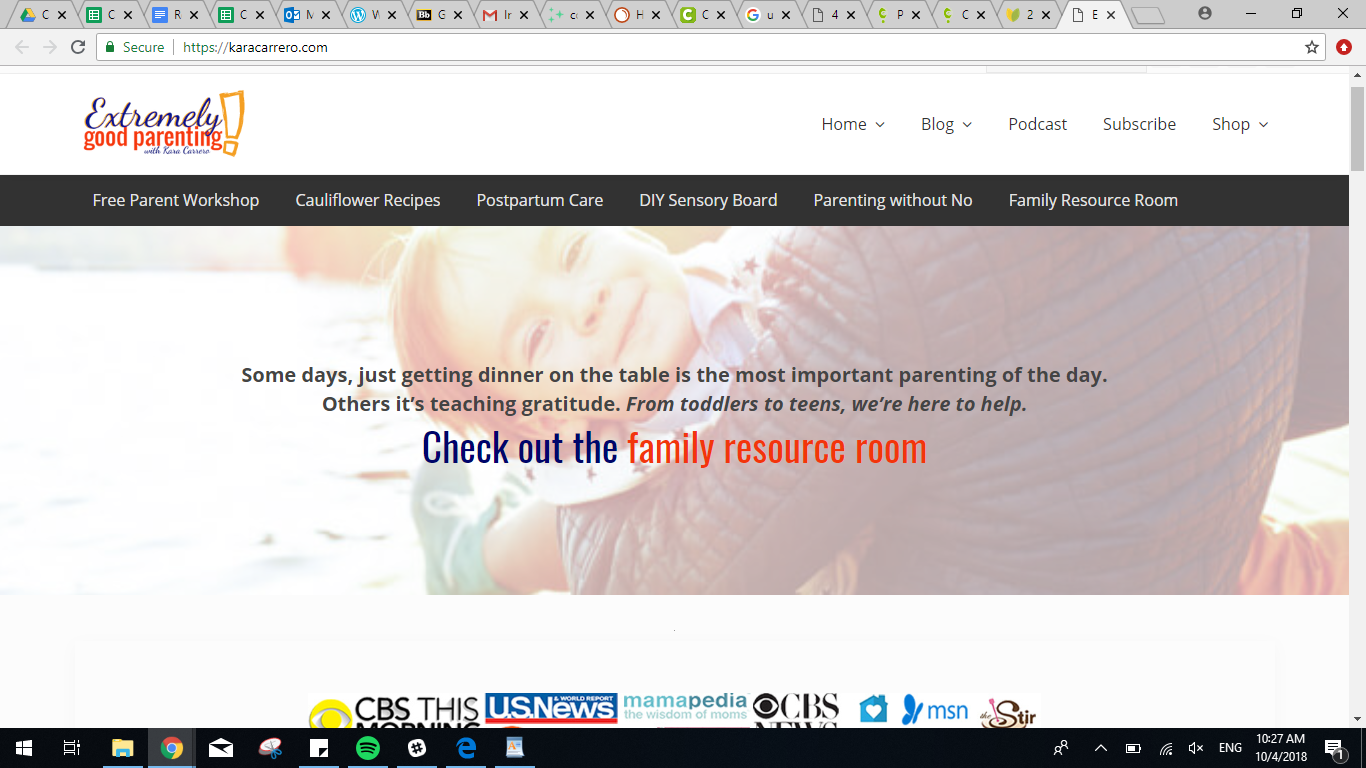
Mom blogs do blog introductions really well. Check out this example from Extremely Good Parenting. The text speaks directly to the user, relating to them as parents. Then there’s a CTA inviting users to click through to the Family Resource Room.
Here’s a bit longer blog introduction. Dan Flying Solo includes two brief paragraphs describing his blog and introducing himself. The hero image at the top is actually a video. That and the fun picture of the goat make this introduction interesting, quirky, and dynamic.

How Do You Know What’s Working and What Isn’t on Your Homepage?
Once you have your website intro page set up, start monitoring its performance to determine what’s working and what’s not.
You can use tools like heatmaps and session recordings to see if that CTA really is getting people to click, or if the welcome statement for your website is too long.
Once you have a good sense of your strengths and weaknesses, do some A/B testing to figure out the best combination of homepage elements.
The point is, keep tweaking and keep analyzing. Don’t let your homepage sit idle while you focus on the rest of your site.
Discover User Engagement at a Glance With Heatmaps
Heatmaps are a graphical representation of where people are clicking on your site. The “warmer” the color, the more clicks a particular link, call to action or image is getting.
This heatmap example from WallMonkeys, a wall decal producer, shows the areas with the most user activity in red. The areas with the least amount of activity are in blue.

WallMonkeys used heatmapping to see where their customers were engaging with their homepage and where they needed to improve usability.
Use heatmapping to see if users are clicking where you want them to — on your CTA, most likely. If they aren’t, the next two steps may just tell you why.
Evaluate Recordings to Better Understand User Behavior
Recordings let you watch how real visitors interact with your homepage.
You get to see where they’re moving their mouse, where they’re clicking, where they’re getting stuck, and when they’re leaving. Watching a recording can gives you insight into user behavior and helps you adjust accordingly.
If your website visitor isn’t getting anywhere near your CTA, which you’ve placed just above the fold, but they’re spending a lot of time near your nav bar, maybe you need to move your CTA, or maybe you need to make it stand out more.
The Importance of Testing Usability for Your Website
You might be analyzing and testing your content or your product information like crazy, but are you testing your site usability, particularly your homepage? It’s more important than you might think.
Look at it this way, imagine walking into grocery store where the tomatoes are on one side of the store and the cucumbers are kept on the other side, next to the milk. Meanwhile, the peanut butter is in a different aisle than the jelly.
You would be confused and frustrated, searching for what you needed, and you’d probably leave. The store should be testing their product placement to make it clear and easy for customers.
The same principle applies to your website homepage. You need to test the elements of your introduction page for usability.
Let’s go through testing step by step.
A Step-by-Step Guide to Crazy Egg User Behavior Tools
Crazy Egg’s website optimization tools can help you analyze user behavior and improve your website introduction, if necessary. Here’s how:
Heatmap
To get a high-level idea of where people are landing on your homepage, look at your heatmap. You’ll see where people are clicking and what they’re interacting with on your page.
If your CTA or the links to other parts of your site are blue, you’re in trouble. That means people aren’t taking the next step to move through your homepage and onto your content or product pages.
Scroll Map
If your homepage extends below the fold, a scroll map will tell you how far people are scrolling down before they leave. There are two scenarios that could be playing out, here.
First, your users could be scrolling to a certain point and then clicking through to another part of your page. Or, they could be scrolling down to a certain point and leaving your site entirely.
Compare this map to your heatmap to see which of these two is the case. If your links are glowing right about where your scroll map drops off, you’re all set. You may even want to consider moving those links up, so people don’t have to go digging for them.
If your links aren’t glowing, your users could be getting confused, or it could be they don’t realize they have to scroll down. Individual session Recordings will come in handy to determine what’s happening.
Overlay Report
An overlay report will isolate your clickable elements and tell you which ones, specifically, are doing best, using color coding on top of the page itself. So, if you have several links going to the same place, you can see which of those links is actually getting the clicks.
List Report
If you want to go even deeper, a list report provides you with rankings of your most clicked element in a table format. It includes visible and non visible elements (like the subcategories of a drop down menu, or a pop up modal). .
Recordings
Now you have all these numbers and colors to look at, but you’re probably wondering why your users did what they did. That’s where Recordings come in. Watch actual users interact with your homepage introduction. See where they pause, where they click, and how far they scroll in real time. Compare that to the results from your maps to better understand where to place links and CTAs. See if any elements seem to be hindering their experience.
A/B Testing
Now you’ve gathered your data and analyzed it thoroughly. You’re pretty sure you know what your strengths and weaknesses are, and you’ve come up with a few website elements to optimize.
If you’re ready to track whether those proposed design updates make a positive impact on your website navigation experience, you’re at Stage 3 of the Web Optimization Lifecycle: A/B testing.
Remember WallMonkeys? They gathered the data from their heatmaps and scroll maps and created new, tweaked versions of their homepage.
They tested versions with a more fun image and one with the search bar moved to the center of the screen. In the end, they ended up increasing their conversion rate by 550 percent.

Not bad.
Once you’ve analyzed your heatmaps and watched your recordings, it’s time to test your hypotheses. Determining which homepage elements are going to work is accomplished through A/B testing.
When you A/B test, you publish two versions of the homepage (option A and option B) and see which one performs better against predetermined metrics.
Most likely, you’ll start out testing your old homepage introduction against a revised one you’ve put together based on lessons learned from your analysis.
Your predetermined metrics could be anything from time on page to click-through rate, but most likely you’ll want to see how many users are click on your CTA.
Conclusion
Crafting a powerful website introduction page or great website introduction content can be the difference between visitors sticking around or bouncing via the back button.
You have a limited amount of time and space in which to convince them that your site is worth your time.
So as you design your homepage, make sure that each element is designed to grab visitors’ attention and drive them to take action.
Fortunately, this doesn’t need to be a difficult process.
Write and place each element carefully, limit the number of total elements, and arrange your page in a way that logically drives visitors to take a specific action.
Then, you can be confident that your site is designed to generate conversions right from the start.