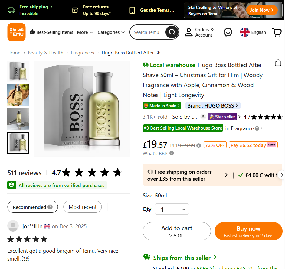
Ahh, the product page. Often a combination of a little customization and a lot of programming, many of them don’t differ much from whatever options were available out-of-the-box with their chosen shopping cart system.
And that’s unfortunate, since it’s often where crucial decisions are made on whether to check out or abandon the cart.
So what can you do to optimize conversion rates on these vital pages? Let’s take a look at a few proven tactics, including some that resulted in triple-digit improvements!
Show Your Product from Multiple Angles, but Don’t Forget THIS…
You probably already know how important it is to show your product using high quality imagery. You may have even gone so far as to showcase it from multiple angles as well. These are all great strategies, but many products can be enhanced even further with a little bit of context.
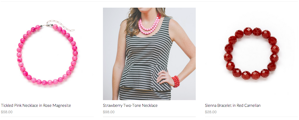
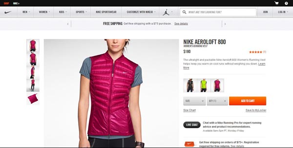
What do I mean by that? Here’s a great example:
Not only does the product page show the item in question being worn, but it also shows it with the individual accessories that make up the photo. Here’s another example:
Although the item in question here is highlighting the central item, there are also similar accessories on either side to achieve this same type of look. Many women can attest to flipping through a clothing catalog, only to have an item catch their eye that is not part of the offer. It seems trivial, but it’s a distraction nonetheless—and an area of friction on your product pages.
Adding these items on the page increased conversions for one online jewelry store owner by a whopping 271%!
Understanding Trust Signals
When I say “trust signals” what do you think of? Those little symbols at the bottom of each page announcing that your site is secure and virus free? That you’re rated 5-stars on a merchant directory? While those may help, they’re not at the core of the shopper’s trust foundation.
Elto.com showcases an excellent example of real trust signals—the kind that address the customer’s concerns before they even hit the checkout page:
Notice how they’ve incorporated a small area right by the call to action that instantly answers any questions the customer might have in mind that would prevent them from moving forward:
- How much is shipping?
- How soon will it ship?
- How soon will it arrive?
- What if I don’t want to buy now, but want to save it for later? (Wishlists are a GREAT retargeting option!)
- What are other people’s experiences with this product?
These are all valid questions that could cause the visitor to second-guess their choice—not just for that particular product, but shopping on your site, or whether they really need the item itself. As a conversion expert, you want to remove every possible obstacle that would make them hesitate.
And on that note…
Little Things Make a Big Difference
Sometimes, what you think of as “nice touches” on your product page may very well be the deciding factor for your shopper. Things like:
Knowing I Can Chat with Someone If I Have a Question
There’s nothing more conversion-breaking than having a question about a product and no way to contact support. Sure, I could call, but I really don’t have a billing question and, no, I don’t want to sign up for an Acme Store Credit Card and why am I suddenly receiving catalogs in the mail?
You can imagine a customer’s trepidation with making that call. Email or contact forms aren’t the best solution either, since it could be 24–48 hours before he gets a response, and he can see you’ve only got 4 more in stock…
We’ve reviewed several live chat solutions here if you’re looking for a high quality provider. But having this option is a great convenience for the user and provides them with comfort and privacy.
Nipping Anxiety in the Bud
What kinds of checkout anxieties do customers really face? And what would make the defining difference to help them overcome it? Marketing Experiments did a great series of tests for a large e-book retailer in which they wanted to see which points would ultimately help close the sale:
- Would security seals work? (Version A)
- What about device compatibility? (Version B)
- Would a synopsis of the product help? (Version C)
- What if we showed them how quickly they could download it? (Version D)
Which option would you choose?
Each one had a measurable impact on conversion, but the product synopsis generated a whopping 78% change, taking the conversion rate from 1.92 to 3.42. For the ultra-competitive ebook market, that’s a big deal!
You can do the same thing by providing enough information to help customer feel they know what they’re getting. Don’t stop with just a description. Anticipate questions, and answer them in your product synopsis.
Make Pages Printer Friendly
This should go without saying, but make your product pages printer friendly. Often, customers are on the go and want to show an item to their friend or family member. Maybe they have a spotty connection or don’t want to be constrained by the small screens on their mobile phone. Whatever the case, they’d rather just print the page and take it with them.
Except many site product pages don’t offer a print-friendly option.
Source: Search Engine Land
Look at all of the unnecessary clutter that fills this page (and drives your ink usage into the stratosphere!) If you’re hesitant about mucking around in the CSS coding to achieve your print-friendly look, there’s an online service that will do it for you.
Write $300 Product Descriptions
Sometimes, the best products sell themselves—like this example of a duffel bag:
Source: Lemon Stand
Reading that description, you can almost picture a kid playing in the attic and coming across his dad’s old military bag. You might envision adventures in the woods with friends on hazy summer days. The product has a story behind it, which lets you immediately attach some intrinsic value to it.
Compare that to a similar leather bag from Amazon.com
Leather. Imported. Brass hardware. *Yawn*
There probably isn’t much difference in the making of these two bags, but one can charge $100 more because it has aligned itself with quality and durability, as well as memories and imagination.
My advice? Put more energy into your product description.
How Are Your Product Pages Performing?
If you’re getting lackluster conversion rates from your product pages, it may be time to take a serious look at your shopping cart system and its functionality and degree of customization. By adding in these features, you’ll not only boost conversion rates, but you’ll also create a well-rounded shopping experience that your customers and visitors can’t help but rave about!
Read other Crazy Egg articles by Sherice Jacob.


