If you’re running a pay-per-click (PPC) traffic campaign, there’s a big chance that you’re sending that traffic to a landing page.
Though when using PPC traffic, you can’t just throw up a landing page and expect everything to work out for the best.
Rather, you need to ensure that you’re optimizing your landing page for conversions. If you don’t do this, your landing page will never reach its highest potential.
In this post, we’re going to cover how you can optimize a PPC landing page.
We’ll take a look at the different elements that you need to focus on and how you get the optimization process right.
Let’s Go!
Optimizing PPC ads
‘I thought we were going to focus on the landing pages?’
That’s probably what you’re saying right now — and if you are, it’s understandable.
However, your PPC ads can massively influence your landing page conversions.
And if a majority of your traffic is coming from PPC ads, you can see the importance of focusing on ads.
It makes sense, therefore, that we make an effort to optimize these ads, before we work on the landing page.
So what do we need to do?
1. Create one ad per landing page
One thing you need to focus on is creating one ad per landing page.
The benefit of doing this is that you’ll be able to clearly understand how each ad is affecting your landing page conversions.
If you have multiple ads per landing page, you won’t be able to identify which ad is causing landing page conversions to rise.
This image from Optimizely explains the concept perfectly.
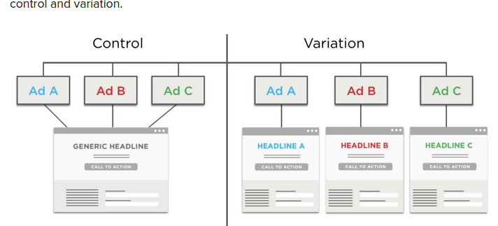
How you should test PPC ads and landing pages.
As you can see in the variation section, each ad has a unique landing page. On top of that, each ad is linked to its own headline — something we’ll discuss later.
The great thing about this approach is that it will allow for you to collect data in a way that is easy to interpret.
Each ad and its landing page will have their own unique set of metrics which can then be compared with other ad and landing page pairings. There will be no crossover that muddy’s the data.
If you’re using Adwords, you might want to do this by creating a separate ‘Ad group’ for each ad.
When using Facebook Ads, you might just want to create a separate ‘Ad Set’ for each ad instead.
2. Ensure that the messaging on your PPC ad matches the messaging on your landing page
As mentioned, PPC ads can influence your landing page conversions.
There’s one main reason for this.
If your PPC ad conveys a different message to what can be found on your landing page, visitors will feel as though they’re on the wrong page.
They may then click the back button and not take an action on your landing page.
This will of course, reduce conversions.
Therefore, you need to maintain some congruence between your PPC ads and your landing pages.
Optimizely’s most successful A/B test involved changing 3 words to make their PPC ads more symmetric with their landing page.
How can you do this for your own campaigns?
The first way you can do this is by keeping the ad headline the same as the landing page headline.
For example, if your PPC headline said — ‘Learn how you can use Facebook Ads,’ you landing page would need to say that too.
Here is an example.
Below is the PPC Ad.
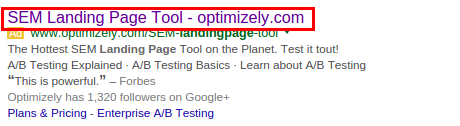
An example of a congruent PPC ad.
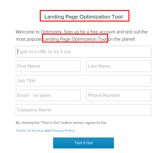
When you click on the Ad, you’ll find that you’re taken to a landing page, which has some continuity.

Congruent landing page.
Note how they do this for their other ads too.

Another congruent PPC ad.
Which goes too…
Another example of a congruent landing page
You should follow this rule for your ad copy too.
Now, your landing page copy is obviously going to be much more extensive than what can be found in your PPC ad.
However, you need to make sure that anything you promise in your PPC ad can easily be backed up by the copy on your landing page.
Here’s an example.

Take note of the copy and how it will match the landing page.
Notice how the ad, refers to a free trial.
As soon as you hit the landing page, the words free and the phrase free trial can easily be seen.

See how the copy on this landing page matches the ad?
Therefore, if you talk about a 50% discount on your PPC ads, for example, make sure your landing page clearly displays that there is a 50% discount on offer.
When you take these steps, you improve conversions on your landing page because you’re improving trust.
Those who click on your ad, won’t feel as though you used ‘clickbait’ just to get them to visit your page.
It’ll also make you more money too.
If you’re using a more visual form of PPC ads, like Facebook Ads, then you might need to take this principle up a notch.
If there is a picture of someone in your ads, you might want to ensure that the same person can be seen on your landing page too.
On top of that, you’ll also want to keep the color schemes the same too.
All of these steps will help to boost congruence.
Optimizing your landing pages in line with your PPC ads
When you’re optimizing landing pages that are primarily receiving PPC traffic, there are a few things that you need to take into account.
Landing Page Headlines
Firstly, as discussed before, you need to ensure that your ad is matching the headline of the landing page.
So if you’re going to change your landing page, you’ll need to adjust your ad too.
Of course, you’re free to experiment with differing ad headlines and landing page headlines, though it often works out for the better when the two have the same headline.
In any case, how can you go about doing this?
First, create a new ad group/ad set.
Then create a new PPC ad in that new ad group/ad set, and direct that ad to a fresh landing page.
And then test either a change in the landing page headline or the ad headline.
Note: Ensure that no other ads are running to this landing page, or else you’ll get skewed results.
Let the ad run and then compare the results.
It is important that when you are running these tests you change nothing else.
If you do, it will be hard to see what actually contributed to a change in conversion numbers.
This applies to both your landing page elements and factors that can affect ad performance. An example being the amount that you’re bidding for an ad.
Don’t let the tests run for a set amount of time but rather a set of amount of visitors, for example, 2,000 visits.
This will help provide data that is a little bit more accurate as your ads might vary in terms of the amount of traffic that they deliver in a set amount of time.
This can be a slow process.
Though It’s important that your practice some patience, because if you rush things you may end up with data that is skewed.
And that will just leave you running around in circles.
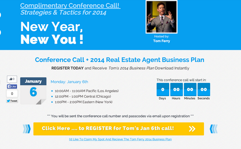
Going through the trouble of testing landing page headlines is worth it.
If you focus on changing the landing page headline, you might just experience a 30% rise in conversions, as seen below.

This landing page could do with a little bit of work
This original landing page was changed, so that it looked like this one instead…
See how the second headline addresses the reader?
As you can see, the only thing that has been changed is the headline.
Though what exactly has been changed — and why does it work?
Well, if you take a look at the second variation, you’ll notice that it explains the benefits of engaging with the landing page in a clearer fashion.
Rather than providing a vague explanation as to why this page is relevant, the new headline addresses concerns that the visitor might have.
It also explains how these concerns can be solved, by taking action on the landing page.
All in all, it piques curiosity about how a problem can be solved, and explains that the problem can be solved by taking action.
If you’re struggling to come up with some headlines, just take screenshots of headlines that appeal to you, or ones that get you to take action.
Then try and workout why these headlines work and see if you can adapt them for your own needs.
Landing page copy
There’s not much to say here.
If you’re going to change any of the copy on your landing page, you’ll need to ensure that your PPC ad has been adjusted to reflect these changes.
Remember, it’s all about congruency.
Just take a look at the examples above, to get a sense of how to do this.
Landing page optimizations that don’t always involve having to adjust your ads
Taking everything into account, are there any changes that you can make to your landing page, without having to change your PPC ads simultaneously?
You bet there is!
A landing page is much more than just the headlines and the body copy. You can also experiment with the following elements:
- Layout
- Color schemes
- Quantities, locations and styles of ‘call-to-action’ buttons (CTA’s)
- Quantity and location of copy
- Images
- Form fields
- Trust signals
- Social proof elements
If you want to run these tests, it might be a good idea to use something like Optimizely or VWO. That’ll keep the testing process quick and easy.
Let’s take a look at how you could optimize each of these elements.
Layout
Layout can massively affect the conversion rate of your landing page.
One way you can change the layout is by making your landing page long form instead of short form.
A great example of this can be seen when CrazyEgg made a similar change.
Layout can massively impact conversions.
The change resulted in a 30% rise in conversions. Though more copy and images had to be developed for the new landing page, it was worth it, as the change resulted in a rise in business.
When it comes to layout changes, radical adjustments might scare you. They may even go against best practices.
However, it is important that you’re willing to make big changes to any of the landing pages you’re running, as otherwise you won’t be able to discover unique ways to boost conversions.
Color Schemes
Color schemes can also impact the conversion levels on your site.
Now, you don’t want to make color schemes the first thing you focus on — though a change in color schemes can improve conversions if you’re out of ideas.
Leadpages found that the color ‘light blue,’ boosted response on one landing page by 141%.
Changing landing page color could influence conversions too – it’s not a priority though!
Note: This change won’t apply to all landing pages. Each landing page is going to be, in general, targeting a different demographic.
Different demographics respond to things differently. So what works for one, might not work for another.
You, therefore, need to test widely, if you want to find a color that improves your landing page conversions.
Remember though — it’s not first priority.
Changing the number and locations of CTA’s
Another way you can optimize your landing page, is by moving around the CTA’s you have on your page.
You can also experiment with changing the quantity of CTA’s you have on your page.
If you have a long form landing page, it might be a good idea to have some CTA’s throughout the whole page.
On top of what has already been mentioned, you might also want to test the color and the copy, that your CTA’s use.
Changing button sizes can also be an interesting way of split testing your CTA’s.
Quantity & Location of Copy
You can in some ways, change the copy on your landing page, without having to adjust the copy that can be found in your ad.
For instance, if you have a lot of copy on your landing page, it may be the case that a great deal of it is unnecessary. It might be clouding the message that you’re trying to get across.
As a result, see if you can be more succinct with the copy that you’re displaying.
Try and get your point across in as few words as possible. A page filled with copy can sometimes be overwhelming and people might not want to read a whole page of text.
If your page is short on copy, try adding more. It worked for CrazyEgg remember?
You might also want to try adjusting the location of your copy.
If the essential parts of your copy are below the fold, you might experience a rise in conversions if you move them above the fold.
You can use a tool like Crazy Egg to see how people are scrolling on your landing page.
If people are not scrolling down your page, then as mentioned, it might be a good idea to keep critical pieces of copy above the fold.
Images
Note: If you were using Facebook ads, or even YouTube ads, you’ll want to ensure that there is some level of congruence between the ad and your landing page, as discussed.
However, you are free to experiment, as in some cases, congruence with themes and images doesn’t always work out for the better.
If you don’t already have some images on your landing page, you might want to consider using some.
The images used on your landing page will depend on what you’re trying to giveaway on the landing page (assuming you are giving something away).
For instance, if your landing page offers people a 30-day trial of your Saas platform, then you could try showing an image of your product.
It is important that the image you show, correlates with the copy that can be seen on the page.
If you’re looking to provide an eBook or a video course, in exchange for an email, then you might want to use some images of these items in particular.
An example might include showing a great screenshot of a video in your video course, or a shot of a page within your book — maybe even the contents.
There’s no one set rule for images, as each landing page will be different. Though you shouldn’t be afraid to test a wide variety of images as you’ll never know what works.
If you have an optin in form it can also help to have an image of someone looking at your optin form fields.
We’ll also discuss later how the use of images is important when you’re showing social proof on your landing page.
Form fields
Form fields are yet another, potentially controversial, method of optimizing your page for conversions.
Some landing pages experience a rise in conversions when they use less form fields.
This brilliant chart from Hubspot, visualizes how conversions vary when form field numbers change.

Form fields can influence landing page conversions.
For pages that use more than one form field, there is, in essence, an increased amount of trust.
However, when there are so few form fields, a landing page has the potential to not look trustworthy.
Therefore, the addition of a form field, even if it is unnecessary, has the potential to boost conversion.
This was experienced in part by Gumroad. Though this test refers to a change they made on checkout pages, it is still of relevance to us — because it’s the psychology of why the change worked that matters.
Gumroad asked for more information on their checkout pages — they now also requested email addresses. Before they would just ask for essential credit card details.

Sometimes, you need to ask for more information.
However, when they asked people for an e-mail address as well, conversion rates rose by 30%.
If you’re looking to split test your form fields, remember to test at both ends of the spectrum.
See what happens when you introduce more and see what happens when you introduce less.
On top of changing the form fields, you might also want to test the size of them too.
If you make them more obvious, they may draw the eye even more. This may, therefore, lead to a rise in conversions.
You could also consider placing a ‘No-Spam’ mention under any form fields you have, where an email address is asked for. In doing so, you’ll be able to reassure people that you’re not going to sell their email on for a profit.
In an indirect way, it also lets people know that you’ll only be sending them information that is of value to them. After all, you’re not going to send them spam.
Trust badges
Trust badges can impact your conversions.
Another way you can optimize a PPC landing page, is by using some trust badges. You’ve probably seen these before.
In some cases, these trust symbols can boost landing page conversion rates by 20-40%.
When using these trust badges, the location in which you place them in is important. Ideally, it helps to place them next to any form fields that people will need to fill in — especially when they have to enter sensitive information.
This reinforces the feeling that all data provided, is being dealt with securely.
There is no one set trust badge that you should use.
Different trust badges tend to produce different results, in terms of their impact on conversions.
It’s your job, therefore, to test which ones work best.
Social proof
Social proof can also be a great way to optimize a landing page.
Social proof can come in many forms, though often its most potent form, is in the form of testimonials.
If you obtain some testimonials from your past clients and place them on your landing page, there is a great chance that conversion rates could rise.
This is in part, because testimonials increase the trust that people will have in you when they’re on your landing page.
When you go about using testimonials, consider placing a picture of the person who supplied the testimonial, next to the testimonial text.
This will help reinforce the point that the testimonial is coming from someone who is real.
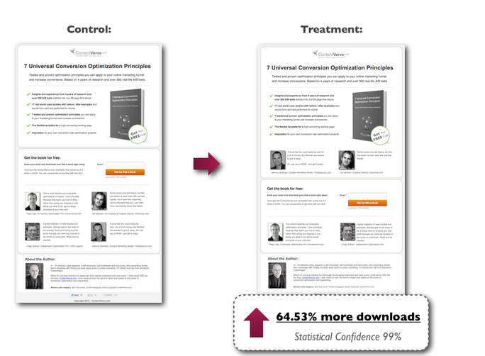
When you’re using social proof, the location of it can also have a big impact.
ContentVerve experienced a 64.53% increase in conversions, by placing testimonials nearer the signup form fields.
Are testimonials something that your landing page needs?
In any case, you don’t have to display social proof in only the form of testimonials.
You could also mention how many other people have entered their details into the landing page, i.e. — ‘Join 10,000 other marketers who downloaded our eBook.’
You might also want to experiment with using some grayscale logos too, if you’ve worked with some big name companies.
A straightforward process?
Optimizing a landing page that is primarily receiving PPC traffic can seem confusing at first.
You’ve got to keep the headlines the same or at least very similar on both the ads and the landing pages.
You’ve also got to maintain the same messaging in the copy.
And you’ve got to create unique ads for each of the landing page headline variations that you are going to test.
It’s more than enough to wear you down.
However, it need not be that way.
After having read this article, you should have a clear sense of the process that you need to follow when optimizing a landing page for PPC traffic.
Though it might seem a little bit all over the place at first, you’ll soon come to find that it is actually a very straightforward process.


