Font psychology matters for web design because the style of text you choose has an immediate impact on website visitors.
Do they trust your brand? Is the text easy to read? Do they like the vibe?
Understanding how to use font psychology to your advantage is critical, and it will take less than 10 minutes of your time to learn 95% of what you need to know.
Note: All of the specialized terms in bold are defined in the glossary at the end of this post.
What is Font Psychology?
Font psychology is the study of how different types of letterforms influence a person’s perception of a text.
There are millions of dollars at stake for large brands who need their logo and text to stand out in a crowded market. Because of this, there are decades of research in font psychology that marketers and UX designers can use to make smart decisions about which styles of text will work best with their target market.
Your choice of fonts on a website will directly impact:
- Whether visitors perceive your site as credible and trustworthy
- How easily people can understand and process your message
- Which content on your site draws the most attention
- How well your site aligns with why they visited in the first place
- Whether your site feels easy or demanding to engage with
Most of these feelings are instantaneous and subconscious. By that I mean that users are not necessarily thinking consciously about whether or not they trust your brand.
In the first moment, before they have even read the text, visitors have already judged your site based on your font choice and other visual elements on the page.
As people spend more time on your site, your choice of font will have an even greater impact on how they feel about your brand
Now, if you play it safe, and stay within the conventional best practices for typography elements like fonts, then your website visitors aren’t going to be drastically impacted one way or the other.
Of course, using a standard system font isn’t going to be memorable or stand out from the crowd. That’s OK, especially when you are starting out. Choosing a wild font is a classic website mistake that makes it harder for visitors to engage with your site.
I think there is a smart, low-risk case for choosing fonts that users are familiar with. Going with the defaults provided by popular website builders is unlikely to cause a good deal of harm.
The danger of missing the mark
Consider the disastrous $40 million rebrand by Jaguar, the storied carmaker, which resulted in a stunning 97% sales plunge. Many aspects of the campaign failed, including an update to their once iconic logo:

The new logo was relentlessly criticized on social media, both by branding experts and the general public.
While they used different language to describe their dissatisfaction, it seemed like everyone was united in the belief that the new logo’s font was a step in the wrong direction. It didn’t speak to the brand’s history or character. The poor sales numbers soon followed.
Of course the logo font alone didn’t cause all of the brand damage, but it was exemplary of the misalignment between Jaguar’s new strategy and their target audience.
The takeaway here is that font choices have a real psychological impact on the market. Even if people can’t explain in technical terms why they love/hate a font, they have a strong opinion.
So if you plan on getting more adventurous with your use of fonts for your logo or a website, then it’s probably a good idea to familiarize yourself with the fundamental associations between different fonts and the feelings they evoke.
The Basics of Font Psychology
In the next several sections, we’re going to look at the main categories of typefaces, the common properties of fonts, and most importantly, their common psychological associations.
But before we do that, we’re going to cover a bit of background on these terms.
Typeface, font, and font families
Typeface refers to the unique design of a set of letters, numbers and symbols.
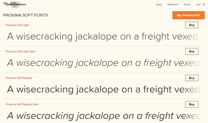
The typeface of the text you are reading in this line is Proxima Soft.
Font refers to the specific style, size, and weight of a particular type face.
The font you are reading in this line is Proxima Soft Regular.Shown below are three Proxima Soft fonts (Light, Light Italic, and Regular), which are available for purchase on the website of Mark Simonson, the type designer who invented this typeface:
These days, most people don’t make the distinction between fonts and typefaces. And most of the time, it’s not that important.
For example, Google Docs uses the term “Fonts” to describe the different typefaces available.
So why do some people still use the term typeface?
Back in the day when people were printing physical documents, the difference between font and typeface was crucial. You needed to know the point size of the typeface you put in the letter press to crank out the right sized letters on a printed document.
Today the vast majority of publishing is digital, so most people just use the term font family to describe a particular typeface that can be displayed at any size.
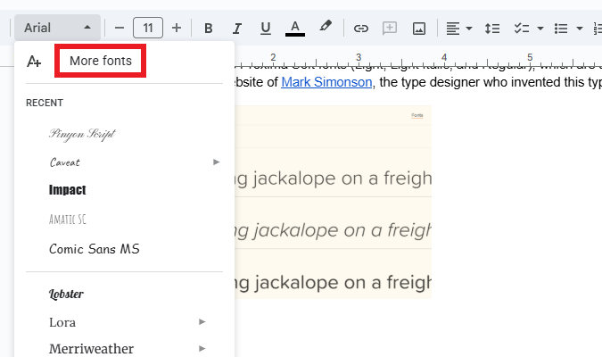
For example, Simonson sells Proxima Soft in three font families, which can each be purchased in a variety of styles (like: Thin, Regular, Bold, or Extra Bold Italic). Pictured below are samples of the different Proxima Soft families and styles.

Typeface Categories and Their Psychological Associations
Generally speaking, typefaces fall into six categories:
- Serif
- Sans serif
- Slab serif
- Monospace
- Display (Decorative)
- Script
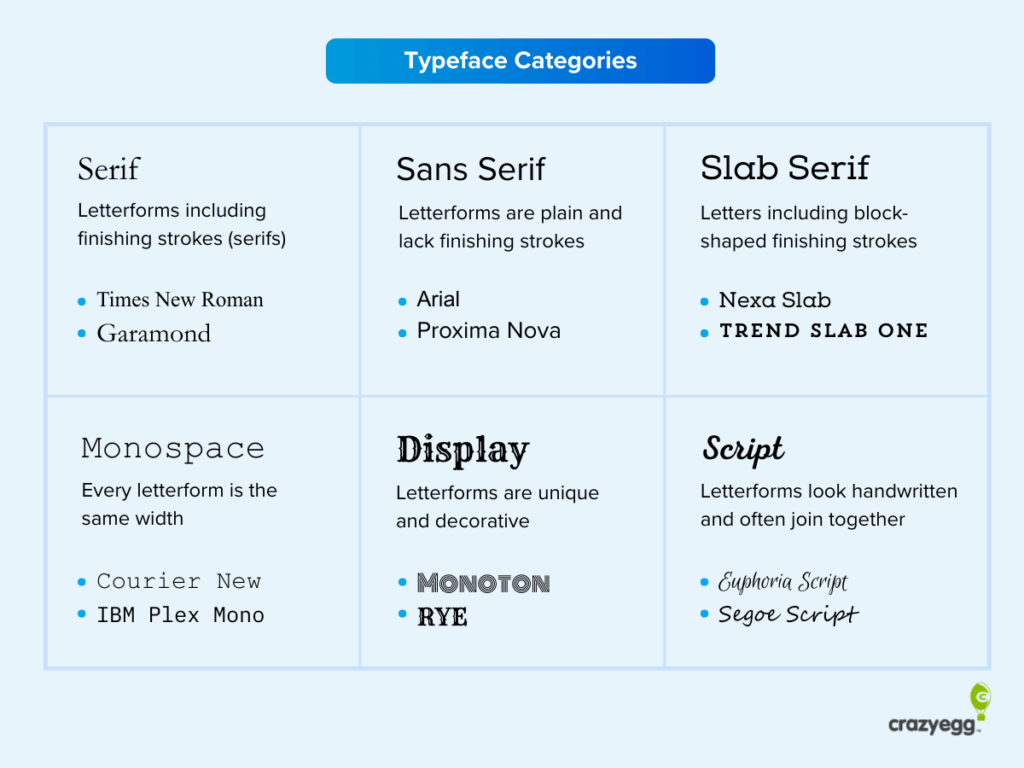
While there is a good deal of variation within these typeface categories, the font families they contain tend to have similar psychological associations and use cases.
For each typeface category, we’ll cover its main characteristics, where it is often used, and why.
Where possible, I’ll also include several examples of fonts from the category that are generally considered web-safe, which means they display without problems on most devices.
Some fonts I’ve listed are available via Google Fonts, which is generally web-safe, though you should designate a font fallback if you use these options.
Serif
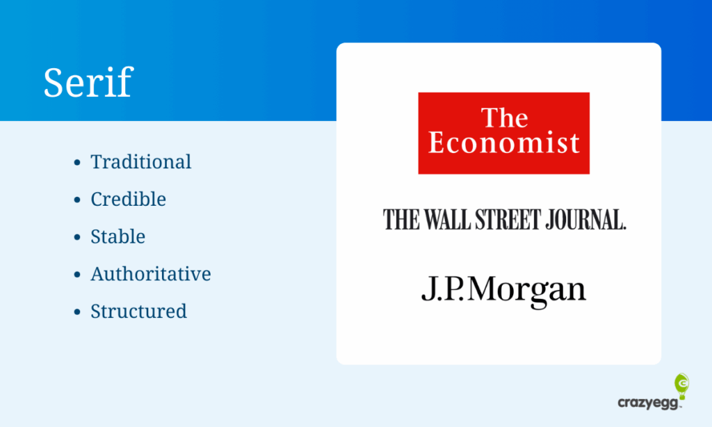
Serif typefaces use small finishing strokes or lines attached to the ends of the main stroke of the letterforms. These finishing strokes are known as serifs. From a font psychology perspective, these finishing strokes help create visual continuity between the letters and encourage the eye to move smoothly across the line.
Serif fonts are commonly used in books, journalism, academia and long-form content because they:
- Signal structure and intention
- Are associated with seriousness, credibility, and authority
- Help brands appear trustworthy
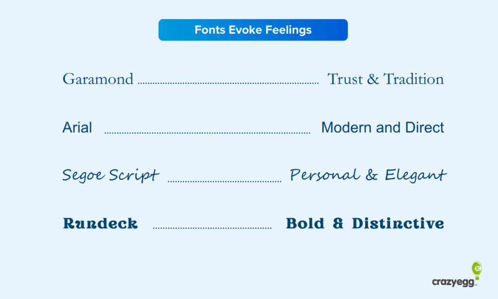
Web-safe, widely supported serif fonts include:
- Garamond
- Georgia
- Palantino Linotype
- Times New Roman
Sans Serif
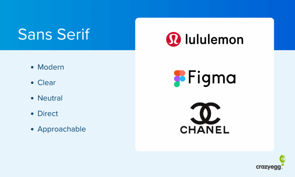
Sans serif typefaces lack the finishing strokes found on serif letters, which results in cleaner, simpler letterforms. The minimal styling feels more modern, efficient, and approachable.
Sans serif fonts are commonly used on websites, apps, and social media because they:
- Emphasize clarity and readability on screens
- Are associated with progressive, contemporary professionalism
- Make it easy for readers to scan content
Web-safe, widely supported sans serif fonts include:
- Arial
- Helvitica
- Tahoma
- Verdana
Slab Serif
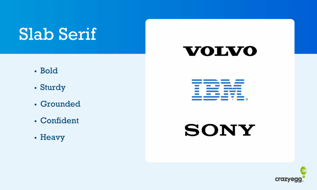
Slab serif typefaces use thick, block-like serifs that are similar in weight to the main strokes of the letterforms. Psychologically, this added weight gives the text a sturdy, grounded appearance that draws a lot of attention without feeling decorative or flashy.
Slab serif fonts are most often used in headlines because they:
- Have a strong visual presence
- Communicate confidence and stability
- Look good at large sizes
Web-safe, widely supported slab serif fonts include:
- Arvo
- Courier New
- Roboto Slab
- Rockwell
Note that with the exception of Courier New, the other slab serif fonts are supported by Google Fonts. Rockwell is a system font for Windows, but not Mac.
Monospace

Monospace typefaces give every letter the same horizontal width, regardless of its shape. This uniform spacing creates a rigid, mechanical feel to the text. Despite this, monospace typeface associations with typewriters and the early computer era can also evoke nostalgia.
Monospace fonts are commonly used in technical content, screenwriting, and computer code because they:
- Signal precision, accuracy, and technical rigor
- Communicate a sense of order through uniform spacing
- Convey objectivity by removing all visual flourishes
Web-safe, widely supported monospace fonts include:
- Courier New
- Lucida Console
- Consolas
- Monaco
Note that with the exception of Courier New, the other monospace fonts are supported by either Mac or Windows.
Display (Decorative)
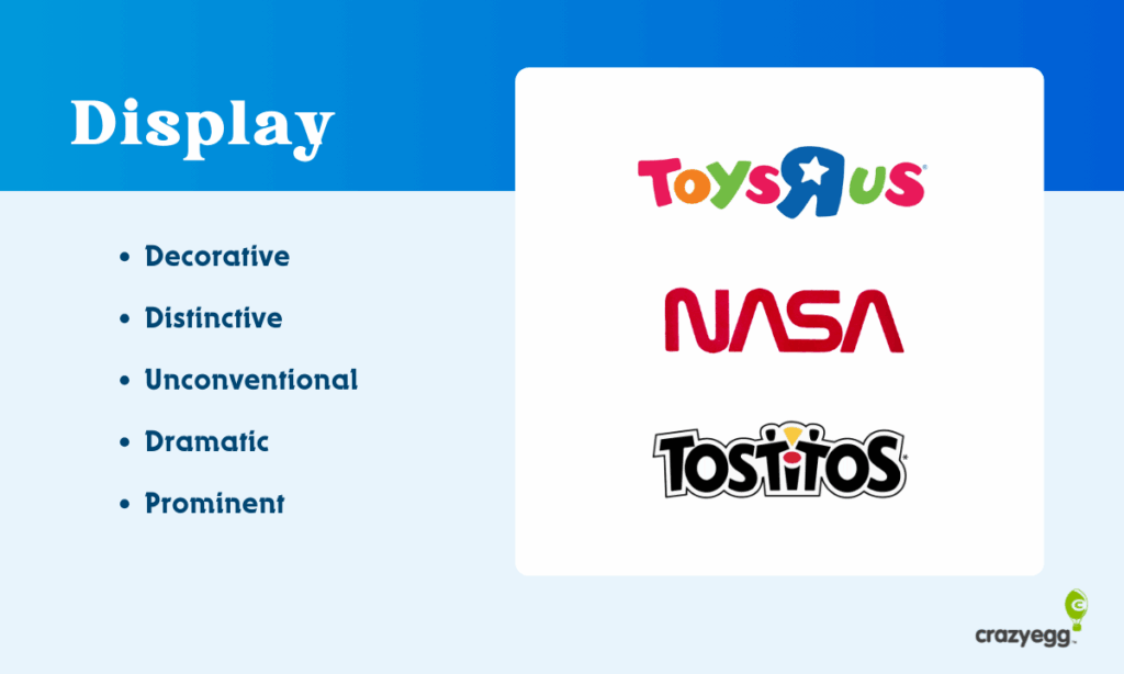
Display typefaces (also known as decorative) use highly stylized or unconventional lettershapes that prioritize visual impact over readability. They really stand out, signalling to readers that this text is meant to be noticed immediately.
Display fonts are typically used for short text elements, like logos or section headers because they:
- Attract immediate attention
- Convey your brand’s personality or vibe immediately
- Stand apart from the surrounding content
There are a number of display fonts supported by Google Fonts, but most often these are custom or web-loaded, rather than system fonts. Display fonts should be used sparingly.
Script
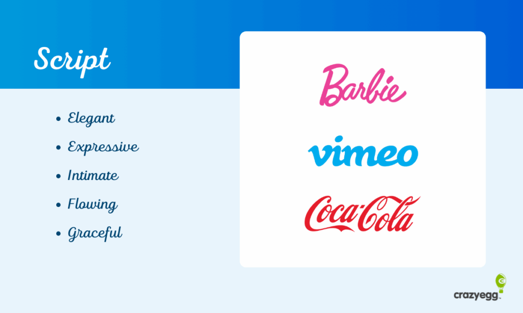
Script typefaces look like handwritten text, cursive, or calligraphy. They often have ligatures that connect letters and create a flowing, natural look. Because script fonts resemble handwriting, it introduces a much more human feel to the text.
Script fonts are used by luxury and beauty brands, as well as in formal documents, like wedding invitations and diplomas because they:
- Convey elegance and sophistication
- Create a personal, human, expressive connection
- Evoke nostalgia and tradition
Although many devices come with script fonts pre-installed, I hesitate to vouch for any as truly web-safe because they are notoriously difficult to read, especially at small sizes. I think they work best in logos and potentially headlines, though I would stay away from them where you assume readers are going to scan or need to quickly understand the text.
Font Properties
In addition to selecting a typeface, you will have control over various properties of the font which can have an impact on how it is perceived by readers. The most important font properties are:
- Size
- Weight
- Style
- Variant
- Stretch
- Letter spacing
- Line height
Here’s a simple infographic that visually explains how these changes in these properties alter the text that is displayed.
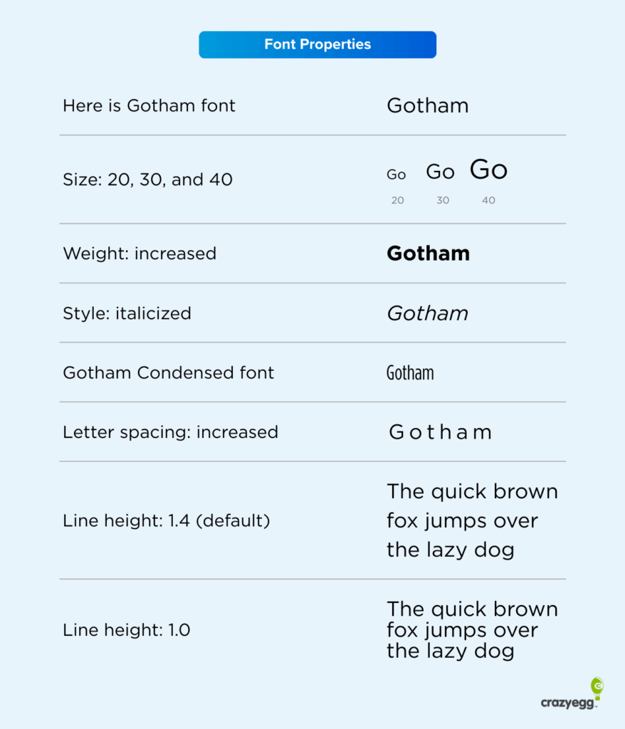
Let’s go through these properties one by one and explain the psychological implications of each.
Font size controls how large the text appears on the screen. Larger text feels easier to read. It’s more inviting. Smaller text packs more information into less space, but it takes more effort and concentration for readers to comprehend.
Font weight controls to how thick or heavy the letters appear. Increasing the weight makes the text more prominent visually. Bolder fonts with more weight signal importance, whereas lighter fonts can signal elegance.
Font style controls whether a text is upright, slanted, or italicized. Italic styles can be used for emphasis because they reduce a reader’s ability to scan, forcing them to slow down and consider the word differently than if it had no style. In logos, italicized text often indicates speed.
Font stretch controls how wide or condensed the letterforms appear. Condensed fonts pack more text into less space, but they increase reading effort. Wider text feels calmer.
Letter spacing controls the space between all letters equally across a word or block of text. Tighter spacing increases the information density, whereas wider spacing can make a text feel calmer, potentially more premium.
Line height controls the vertical spacing between lines of text. Increasing line height improves readability, though only to a point. Decreasing line height saves space, but decreases readability and feels cramped when it’s too low.
Font color and contrast
You can also change the colors of your fonts, which can have a major impact on how people perceive your site and where their attention goes.
Now you will often see claims about colors having specific meanings, like green signifies money, red equals urgency, or that blue evokes trust.
I don’t buy into that, even if there are some loose cultural patterns that support such claims.
What I think is more important, especially when you are designing a website, is the contrast of the different colors that you select. Blue text feels really loud on a predominantly orange site, whereas if the site is a neutral gray, blue would feel fairly understated.
I would focus more on the contrast between your font colors and the rest of your site more than what any color supposedly signifies on its own.
Here are three ways you can check to make sure you are using colored fonts effectively on your site, even if you didn’t go to art school:
- Use a tool like WebAIM Contrast Checker to ensure that your text is easy to read against the background color.
- Find colors that work well together with tools like the color wheel on Adobe Color.
- Focus on using colored text to highlight elements of your site you want people to notice, like sales, promotions, and CTA buttons.
Testing Your Typography Decisions Instead of Debating Them
Font psychology is useful, but it’s easy to overthink what you are doing and waste time that could be better spent improving the actual content on your site.
Is changing the text from Garamond to Baskerville really going to have a measurable impact on the website metrics you care about? Probably not.
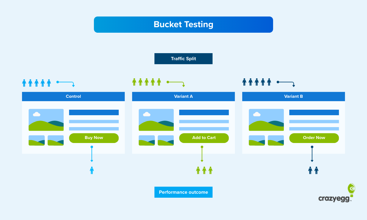
That said, if you have enough traffic on your site to run A/B testing, you can start to experiment to see which typographical decisions work best for your audience. Some ideas:
- Typeface: Serif vs sans serif fonts in the body copy.
- Font size: Larger vs smaller sizes in the body copy or headlines.
- Font weight: Lighter and heavier fonts in your CTA button text.
- Line height: Increased and decreased space in long-form content.
In terms of measuring results, I would look at the conversion rate regardless of what you test. Conversions like purchases and form completions are usually the most important metric, so you want to make sure those are increasing.
Potentially, you might see no change in the conversion rate after you change the font, but you could still call it a win if you feel like the new version is more accessible or better captures your brand.
I’d also watch out for a high bounce rate, which is a sure sign that your new font choice isn’t appealing to visitors.
When you are experimenting with line height and font families, you might also want to look at key website metrics like time on page and scroll depth, which can tell you if your new font strategy is doing a better job of engaging your audience.
Just bear in mind that most font changes are not likely to result in huge differences between the A and B versions. That means you are going to need a lot of traffic in order to detect statistical significance in your test.
If you do not have enough traffic on your site for A/B testing different font choices, there are several ways you can still investigate website visitor behavior.
- Web analytics: Look at customer engagement metrics like session duration, pages per session, and other metrics that tell you whether people are engaging more.
- Heatmaps: Analyze whether your new font choices are getting people to pay more attention to the parts of the page you care about most.
- Session recordings: Watch how users interact with your site and determine whether or not they are responding well to the new font choice.
All of these testing methods require much less traffic, but can still give you insight into whether or not you are moving in the right direction.
Resources for Understanding and Using Font Psychology
Here are some of the best resources that I have found over the years for understanding how to use fonts effectively.
- Butterick’s Practical Typography: This is an absolute goldmine of information about fonts and typography in general. It’s a free, web-based book maintained by Matthew Butterick, who has some really strong opinions about what works and what doesn’t.
- Typewolf: A popular typography website run by Jeremiah Shoaf that highlights trending fonts and provides helpful guides for web designers.
- I Love Typography: Part blog, part font store, this site has tons of useful articles and resources. It’s run by Dr. Nadine Chahine, a type designer, and author, John Boardley.
- Google Fonts: This is a free, comprehensive font library maintained by Google. It’s got some excellent documentation for website owners looking to increase accessibility, optimize font loading times, and more than 1,900 font families to choose from.
Glossary of Important Font Psychology Terms
In this section are definitions for all of the terms I covered in this post in alphabetical order.
- Display fonts: A typeface that uses unique or decorative letterforms.
- Font: A specific instance of a typeface, defined by size, weight and style.
- Font fallback: An alternative font used by the browser if the preferred font cannot be displayed.
- Font family: A group of related fonts that share the same basic letter design.
- Font pairing: The practice of using two or more typefaces to create hierarchy, contrast, or for aesthetic value.
- Font size: How large the text appears.
- Font weight: How thick or bold the letters appear, ranging from light to extra heavy
- Kerning: Adjustments made between specific pairs of letters.
- Letterform: The shape and structure of an individual letter.
- Ligature: A single letterform created by joining two or more characters together.
- Line height: The vertical space between lines of text .
- Letter spacing (Tracking): Adjustments made to the space between all letters in a word or block of text.
- Monospace: A typeface where every letterform has the same width.
- Point size: The measurement used to describe how big text is (print media only).
- Sans serif: A typeface that does not use serifs.
- Script: A typeface that mimics handwriting, often using connected letterforms.
- Serif: A small finishing stroke attached to the ends of letterforms
- Slab serif: A typeface with block-like serifs that are similar in weight to the stroke of the letterforms.
- Stroke: A single line or mark used to form a letter.
- System font: A font that comes preinstalled on an operating system and does not require downloading
- Typeface: The overall design of a set of letters, numbers, and symbols.
- Web-safe fonts: A font that reliably displays on most devices and browsers