This CRO audit guide is written for people who are going to sit down and do the work. There’s no sales pitch, no free CRO audit gimmick.
Just practical, step-by-step guidance.
If you have never run a CRO audit before, there should be a few easy, high-value fixes.
What Is a CRO Audit?
A conversion rate optimization (CRO) audit is an inspection of a website with the single goal: getting more website visitors to convert into subscribers, buyers, followers, paid users, etc.
There are two objectives:
- Verify the website is performing as it should be
- Confirm that CRO best practices are in place
The first objective has hard metrics like engagement rates and page load times, which make it easy to know whether the page meets the audit standards or not.
A page that takes five seconds to load, for example, is probably bleeding conversions.
If there are lots of typos, a broken button, or faulty redirect, then the issue is 100% negative. A fix is needed, and should be done right away.
Performance fixes will improve user experience (UX), make your company look more professional, and convert a higher percentage of users.
When it comes to enforcing CRO best practices during an audit, there is less of a universal playbook.
People do not always agree on what counts as an issue and what’s really worth fixing.
That said, there are some general rules of thumb for optimizing conversion rates that have worked, most of the time, on many types of websites, for the last 15+ years.
Things like: making sure that you have a unique call to action (CTA) featured prominently, that the product photos are sharp, and that your site looks great on every screen size.
The really tried-and-true CRO tactics should be considered true until proven otherwise.
If you continue to run CRO audits, within a few months, you and your team will have uncovered some truly unique opportunities to boost conversions. You may discover some of the CRO rules don’t apply.
What Do I Need To Run a CRO Audit?
You need to have conversion tracking in place, to make sure that your data is accurate. You can use Google Analytics 4 (GA4) or another tool, but this is non-negotiable.
Other than that, all you need to run a CRO audit is a website that’s not performing as well as you want, a little bit of ambition, and user empathy.
You can go through all of the audit steps I outline below without special tools or data, and you will probably find some places where your site could be made faster, a little easier to navigate, and a little more helpful.
When you hire a professional to run a CRO audit, they are going to do some or all of the following:
- Use heatmaps, clickmaps, scrollmaps and other visualizations to understand user behavior
- Interview, survey, or poll customers to find out their motivations and desires.
- Research your market and competitors, often auditing several direct competitor sites
- Conduct traffic analysis to discover your highest converting segments.
If you have the ability to do any of these things in conjunction with your CRO audit, I highly recommend it. Coming into a CRO audit with a better understanding of your target market is not a bad idea.
How To Run A 10-Point CRO Audit
1. Start with a valuable page
Ignore pages that are informational or top-of-funnel targeted pages. You want to work on the ones with the ability to most drastically increase conversions.
Since you won’t break anything by running a CRO audit, I would go straight to the pages with:
- Lots of traffic. Pages with 10,000 visitors or more per month provide a useful amount of data.
- High purchase intent. The reason people visit the page should be transactional or commercial, rather than educational or informational.
- Conversions. The page should be converting already or at least have an opportunity to convert.
Wait. What if this is your home page?
That’s fine, so long as it is converting users. And you’ll probably want to CRO audit it eventually, so no big deal.
But, if there are other pages with less varied traffic (like a pricing page, landing page, or collections page), I would use that. There’s going to be tons of people on a homepage seeking answers and information who will never convert.
One quick way to find really good CRO opportunities is to rank your pages by traffic, and then look for outliers.
Pages that load a lot slower than the average speed on your site are probably in need of a little CRO tune up. Pages with a high bounce rate or other problematic customer engagement metrics are another good place to start.
The higher the traffic, the better data you are going to get. 10,000 sessions per month is a good base, especially if you plan on A/B testing the page after the audit.
On low traffic sites, CRO audits can still be really valuable. Don’t stress about hitting 10k sessions, just pick one of your pages with the most traffic relative to others on your site.
2. Test website speed and performance
Use Google PageSpeed Insights (or a similar tool) to view your website performance.
The big red flag you are looking for is slow page load times.
Four seconds or higher is definitely bad.
Two seconds or less is usually good enough. If your site is this fast already, speed probably isn’t negatively impacting conversions.
There are lots of easy ways to speed up your website. Use PageSpeed insights to find the biggest issues to tackle first, such as uncompressed images, unused scripts, or a high cumulative layout shift (CLS) score.
Your conversion rate plummets when people feel like your site is slow.
3. Open your site like a cold visitor
On the technical side, this means clearing your cache, cookies, logging out, or just using a new device. This will help ensure you experience the site as a truly first-time user will.
Open the site on desktop and mobile, and appraise the site like you know nothing about the brand. Log your first impressions:
- Is the headline easy to understand?
- Is the value proposition obvious?
- Is the offer communicated clearly?
- Is it clear what to do next?
- Is there anything that distracts you from the offer?
You want to answer Yes to the first four questions and No to the last one.
If you are on the fence about any of your answers, then new users are probably confused or dealing with a little friction as they decide whether or not to engage with your site.
Here’s a low-tech example from TOPdesk, an IT services company.
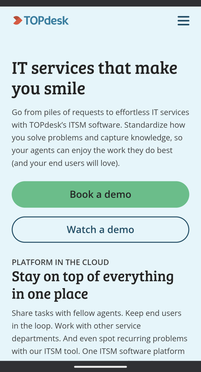
Nothing flashy going on here, just emotional, value-driven copywriting and a clear call to action.
I can’t be sure, but my guess is that they have tested this design and tone of voice. I found this landing page as a sponsored ad for a keyword (customer service software) that has a cost per click of more than $25.
You can certainly use more razzle and dazzle than this landing page, but it’s a good minimalist example that gets the job done.
For the purposes of a CRO audit, you are just assessing whether or not this page experience is going to make sense to a first-time visitor, or whether the first-impression is having a negative impact on conversions.
4. Assess the website navigation
Start exploring the site with the intent of assessing how easy it is to find your way around and locate what you need.
The big website navigation red flags you are looking for during a CRO audit include:
- Unnecessary steps or clicks
- Unclear/missing conversion paths
- Overwhelming menu
- Hidden CTAs
- Non-clickable elements
- Poor mobile design
- Distracting content
All of these are bad and you should remedy them as soon as possible. In terms of fixing your site, follow the basic website navigation best practices unless you have a good reason not to.
Mobile navigation is especially important. This is the majority of traffic for many websites. If you make buttons that are too small to tap, or product images that don’t look good on a small display, it’s going to kill conversions.
Here’s a really clean example of highly-optimized website navigation from Warby Parker, the wildly successful glasses brand.

There is nothing distracting people from the main offer, glasses for men and women. Those Shop buttons are simple, obvious, and the solid blue color stands out from the multi-colored images.
I like the simple navigation menu, which saves space by using small icons instead of text for tappable elements like the Cart and User Login.
Both the menu and the banner ad are very thin, which allows for more area above the fold to show products and highlight the “Free shipping and 30-day returns”. There is even space left for two separate CTAs to use their interactive style guide, which is perfect for users that aren’t ready to shop just yet.
5. Test all the links
As you are exploring the site, click through every link to make sure it works, and that it goes where it is supposed to go. This includes links for navigation, breadcrumbs, clickable images that expand, and so on.
Broken links are horrible for your conversion rate and even worse for SEO. If you find any links that go to 404 pages or outdated content, I would fix those immediately.
If you must have links to external sites (they will not help conversions), I would make sure that they are set to open in a new tab.
This step is very straightforward, but could not be more important in terms of finding really bad CRO issues.
6. Complete all conversion paths
Test every conversion path on desktop and mobile. Sign up, register, or make a purchase. See for yourself how smooth the process is.
All the checkout flows and registration forms need to be as simple and intuitive to complete as possible.
You are looking for any point of friction or confusion that gets in the way of converting.
Is it obvious what to do? Are CTA buttons easy to click (or tap on mobile), and do users know where the button link is taking them?
Be alert for unnecessary steps.
Are there options no one selects? Are there form fields that could be consolidated or removed? Are there dead ends that users hit trying to accomplish something?
Here’s a big one: If people want to go back a step, do they have to start over with an empty form, or is their progress saved? This is one of those small elements that will frustrate people and increase shopping cart abandonment.
If you don’t think that you can shorten the process or save users any extra steps, look for places to help users along the way.
There are many inline validation elements you can add to help users complete forms and alert them to errors.
This could be as simple as a progress bar to show how close users are to completing the purchase, or using little visual cues and error messages to help them when they get stuck.
The Baymard Institute shared this helpful example of inline validation from Lego, which alerts users that there is an error before they submit the form.

Personally, I like the live validation that lets users know there is an error right away. This way they can make corrections and move on.
There are more opportunities for mistakes when users have to submit first, and then comb back through a form to see where they messed up.
7. Check trust signals and social proof
During a CRO audit, you want to make sure that people visiting the site are given multiple reasons to trust your brand that go beyond your own claims.
I like to see a healthy mix of both:
- Trust signals, like security badges, industry credentials, money-back guarantees.
- Social proof, like customer testimonials, press mentions, and star-ratings.
At a basic level, you want to just confirm that you have a few different trust signals and different types of social proof placed strategically on your site.
Both trust signals and social proof should be close if not adjacent to your most important CTAs.
Checkout this signup box Crazy Egg uses on their homepage. It’s loaded with social proof and objective reasons to use it.

Even if you have never heard of Crazy Egg and only kind of understand what optimizing a website entails, this signup box is loaded with reasons to trust that it works.
Big name logos, FREE trial, cancel any time, and almost half a million people are using it already? It feels like a safe play.
It’s easier to convert customers that have never bought from you before by showing them that other people have said good things about your brand.
For example, your headline might claim that you make “the most comfortable sandal you have ever worn,” but a potential buyer is more likely to be swayed by a customer review posted by Jodi, (4 days ago), who says “this is the most comfortable sandal I have ever worn” and includes a picture of her smiling like she hit the lottery.
Experiment with different trust signals. This is something that I have seen move the needle on conversions personally, and heard other people in CRO talk about almost universally.
8. Assess menus
An optimized menu is one that helps users find what they need faster, which improves conversion rates.
This is especially important on mobile, with its limited display size. You can get away with a larger menu on desktop, but there is a lot to be said for keeping it as simple as possible.
Here are some common CRO standards for menus:
- The navigation menu is at the top of the page.
- There are no more than 7 topline menu items.
- At least one menu item is a CTA like Shop, Contact, or Demo.
- The CTA menu item is differentiated with unique colors or an emoji.
- The menu doesn’t take up too much space on mobile (height: 50-70px)
- The menu language is customer-centric vs. company jargon
Just hitting all of these basics should help the conversion rate.
When it comes to diving up your product offerings into intuitive categories, consider testing to find out what users respond to best.
On Crazy Egg, for example, which is heavily tested, Product breaks down into three subcategories: Analytics, Optimization, and Capabilities.

Trying to fit all of these different tools into a single Products category would have been a little overwhelming (8 items), and this breakdown better matches the customer experience of actually using the tool.
Menus are an area where you can learn a lot from your competitors. How do they see the market? How they segment the different services they offer into a clean set of menu categories.
I see every online store offering top level options to get to Sales, Bestsellers, Trending, and and other collections pages. These categories probably do well (8-9 figure brands are not just doing this for fun) and they offer marketers a lot more range to mix up offers.
9. Inspect the search experience
There are some fairly standard best practices for helping users make the most of the search function on your website.
- Enable autocomplete suggestions
- Show suggestions instead of “no results”
- Allow users to add search results directly to cart
- Personalize search experience with user data
- Allow users to filter and sort results
- Enable search on-page (vs. sending user a separate search page)
Some brands try to boost conversions using searchandising, which is the practice of showing high-margin items in search results, even if they aren’t the best textual match.
In terms of auditing the page for CRO, you want to make sure that any of the search experience features you have enabled are working as intended.
If you notice the product discovery rate or average order value is going down, you might dig into the search experience a little more to see how it could be improved.
10. Align the copy with the customer journey
The writing on your site needs to:
- Align with what your target audience has heard from your brand already
- Speak to their concerns, desires, and hesitations
- Persuade them using intentional methods
If you hit these three objectives with your copywriting, it’s good.
Sure, copywriting can be improved and maybe that’s worthwhile, but for the purposes of a fast-moving CRO audit, you really just need to ensure that the text is hitting those three objectives.
On an ecommerce site, for example, you want to make sure that the product page copy and product descriptions are consistent with the ads you run on social, search, TV, display networks, and so on.
Is the offer consistent throughout your marketing communications? Are you speaking the same way to the same audience? Are you framing problems and solutions in the same way?
Consistency is good, but it has to be an on-target message, so I would check that the copy aligns with the values, motivations, and hesitations of the target audience.
You can find these out with quick polls and surveys, in-depth interviews, and by mining product reviews in your category.
Is your copy speaking to the issues and capabilities that are truly top of mind for customers?
The final check is whether or not the writing is persuasive. This is subjective, to some degree, but there are also plenty of well-known persuasion techniques that increase the chance of making the message stick with a customer.
You do not have to be a creative author in order to write outstanding, high-conversion text for a website. As long as you hit these fundamental objectives, the writing will help convert users.


