There are limitless fonts to choose from when you’re designing a website, but they’re not all suited for website use. Pay attention to these five core characteristics of an excellent website font:
- Legibility: Easy to read at various sizes, styles, and weights, as well as on different types of screens.
- Web-Safe/Compatible: Renders (loads and appears) consistently across all major web browsers, meaning it’s widely supported and won’t trigger fallback fonts to kick in.
- Clean and Simple Design: Avoids overly fancy flourishes that make the content distracting or hard to read.
- Good Scalability: Looks good at small sizes (for body text) and large sizes (for headings).
- Consistent Style: Matches your website’s tone and branding, and isn’t likely to go out of style quickly.
No time to search through the tens of thousands of fonts available in the ether? Here are the 6 best website fonts to pick for your web design.
1. Arial

Arial is a sans-serif font, and it’s absolutely everywhere. It’s one of the core system fonts on Windows, macOS, and Linux distributions.
This means no matter what device your user is on, Arial is probably installed.
In other words, Arial is a web-safe font. You can depend on it to show up the way it’s supposed to without forcing the user’s browser to load it from an external source like Google Fonts.
It’s also plain, clear, and easy to read. That’s why it’s my pick for drafting articles as a freelance writer.
As I draft this piece for Crazy Egg, I am writing it in Arial.
Arial doesn’t get in the way of my thoughts and writing process. It’s a beautiful, blank canvas that allows the words and their meaning to get all the attention.
This plain, canvas-like nature has earned Arial a spot as a common fallback font in CSS stacks—the code that tells the browser which fonts to use if the primary font doesn’t work.
Arial looks great when it’s used in body text and header text. It’s been around since Robin Nicholas and Patricia Saunders created it in 1982.
It’s been in style ever since, and that won’t change anytime soon.
Use Arial for:
- Corporate or professional websites, like city websites, public service portals, and legal or financial firms.
- Email newsletters (not exactly a website, but related).
- Inline/body text.
- Older websites.
- Legacy/older intranet sites (internal company pages, databases, dashboards, and ticketing systems).
How to get Arial:
- Arial is easy to use because it’s already pre-installed on just about every desktop and mobile OS, including Windows, macOS, iOS, and Android. You don’t need any special license to use it on your website as long as you’re referencing it as a system font, not embedding it. You can’t embed the actual font file unless you buy a valid license from Monotype. But since it’s so ubiquitous, Arial embedding isn’t something most folks need.
2. Inter

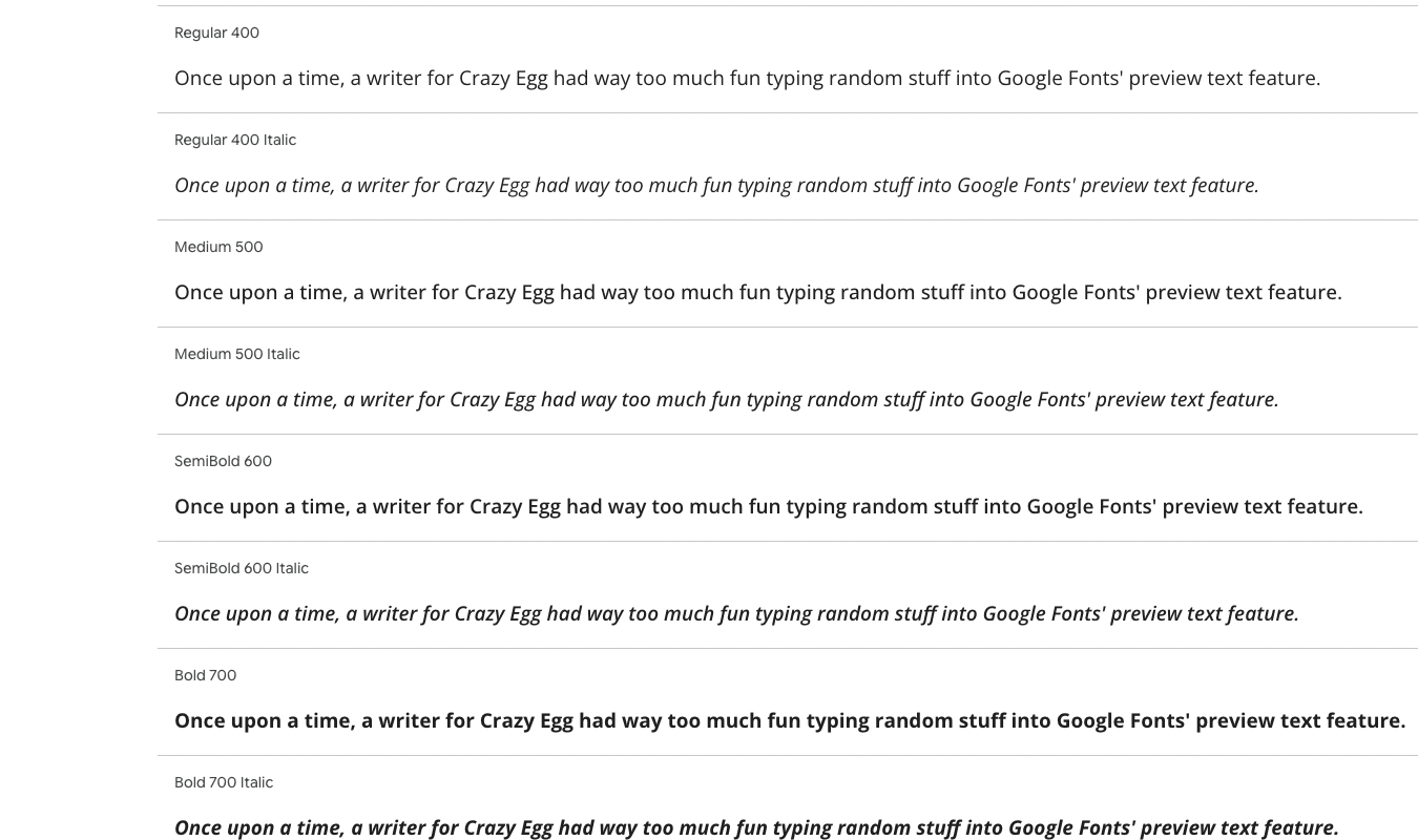
Designed in 2017 by software designer Rasmus Andersson, Inter is a computer-friendly font family with 18 styles, some of which you can see in the screenshot above.
Andersson specifically designed this sans-serif font for reading on a screen. The font design is incredibly legible across all types, weights, and sizes, which makes it an easy choice for websites.
It also scales well, offers a nuanced range of looks within its 18 styles, and fits a variety of use cases. Use it for headers, body text, and everything in between.
Whether your readers are viewing your site on a low- or high-resolution display, they’ll be able to quickly absorb the content of text rendered in Inter.
Because of this, Inter is particularly useful for content-heavy or colorfully designed sites.
Use Inter for:
- Blogs, since they have lots of text for readers to absorb.
- Online journals or newspapers.
- Educational platforms that offer courses, wikis, or tutorials.
- Knowledge bases and help centers.
How to get Inter:
- Inter is open-source and licensed under the SIL Open Font License. This means anyone can use, modify, and embed it in both commercial and personal projects without paying any fees. Download the font from Google Fonts or GitHub.
3. Playfair Display

Playfair Display is a font for those moments when you’re feeling a little bit fancy. I’d use it in headers or buttons as a nice contrast to a more buttoned-up sans-serif font like Inter or Arial.
Because it’s more of an elegant, flourishy font, I don’t recommend using it in small body text. Especially not on content-heavy websites or webpages.
As timelessly fashionable as it is, Playfair Display can be hard to read at smaller sizes.
Created by designer Claus Eggers Sørensen in 2011, Playfair Display dances at the intersection of old-style and modern serif fonts. It’s warm and fancy, like older serif fonts, but still legible—with little of the cold formality found in modern serif fonts like Bodoni Moda.
With 12 styles, Playfair Display is fully supported on all modern browsers and operating systems. This means it’s unlikely to unexpectedly trigger fallback fonts.
Use Playfair Display for:
- Blog or magazine sites, especially for headers or “fancy” content.
- Personal websites or portfolios, where the font adds a professional feel to names, hero text, and page titles.
- Luxury brands or shops, to describe things like elegant new handbags, perfumes, or clothing. Feel free to use it in product descriptions as long as those descriptions are short.
How to get Playfair Display:
- Playfair Display is an open-source font licensed for both personal and commercial use under the SIL Open Font License. Download it from GitHub or Google Fonts.
4. Open Sans
Open Sans is the type of sans serif font that’s so classy it makes you think it does have serifs at first glance. Or at least, that’s how it reads for me.
Designed for screens by typeface designer Steve Matteson and released in 2011, the font has 6 weights and 6 corresponding italics for a total of 12 styles.
If you want a font that almost looks like it has serifs but is super easy to read at all sizes, Open Sans is your typeface. It offers your webpage a clean user interface (UI) that doesn’t distract from the content.
You can pair it with serif fonts or sans-serif fonts, making it even more flexible. Since it feels elegant yet modern, you can rest assured that Open Sans is here to stay and won’t go out of style in a flash (looking at you, Comic Sans).
Open Sans is fully supported across all modern operating systems and web browsers, so it’s not likely to trigger fallback fonts.
Use Open Sans for:
- Corporate or business websites that need a look that’s clean, professional, and easy to read.
- Tech or SaaS platforms, where it’s ideal for dashboards, UIs, and app content.
- Educational or nonprofit sites, because it’s friendly and personable without being too flashy.
- Blogs and long-form content, thanks to its strong legibility in body text.
How to get Open Sans:
- Open Sans is an open-source font licensed under the SIL Open Font License (post 2021) for both commercial and personal use. Download it from GitHub or Google Fonts.
5. Merriweather

Merriweather is perfect for anyone who wants a serif font that isn’t too frilly and fancy. It’s a little more toned down than its fellow serif friend, Playfair Display, but still more decorative than a sans-serif font.
Like Playfair Display, Merriweather was designed for screens. But unlike Playfair Display, Merriweather is reader-friendly at all sizes. So if you want a pretty serif font for body text on your website, Merriweather is an excellent choice.
Plus, the typography here is slightly condensed but with strong typographic contrasts that make it easy to absorb. If you want to fit a lot of information into a page, Merriweather can help you do just that—all without making the webpage look cluttered.
Merriweather comes with 14 total styles as of this writing—on Google Fonts, that is. Designed by type engineer Eben Sorkin, it’s both traditional and timeless.
This is exactly what Sorkin was going for. In a 2011 blog post, Sorkin writes, “I wanted to make something as legible and pleasant to read as possible which meant adapting the design to screens and to as many web browsers and operating sytems as possible.”
(Side note: Merriweather is, indeed, available on most operating systems and web browsers.)
Sorkin adds, “I was also keen to add something genuinely new to the styles we read everyday [sic] on screens…I decided to evoke the familiar feeling of old book type.”
And that’s exactly what he did. If you want to dig into how Sorkin created Merriweather, read the whole blog post. I’m not a typography nerd. Or at least, I wasn’t—until I read the whole post.

It’s fascinating to see the level of detail and amount of work that goes into creating a font family.
Use Merriweather for:
- News and editorial sites—there’s a readable yet beautiful feel in this font that’s perfect for blog posts and articles.
- Educational platforms and university websites, since Merriweather gives off a professional yet trustworthy vibe.
- Nonprofits, where Merriweather’s warmth and readability help get important messages across to the right people.
- Literary sites, because while Merriweather was designed exclusively for digital use, it has a print-book feel.
How to get Merriweather:
- Merriweather is free for both commercial and personal use under an SIL Open Font License. You can download it from Google Fonts or Font Squirrel.
6. Poppins

Poppins is a clean, sans-serif font that renders beautifully in lots of different languages. It’s a modern internationalist font—as long as you’re working with Latin-based languages, anyway.
While Poppins supports all sorts of Latin-based languages with extended character sets, it doesn’t support non-Latin scripts like Cyrillic, Greek, Mandarin, or Arabic.
But it does support languages like Polish, Vietnamese, Turkish, and Romanian. Not only that, but Poppins makes these languages look good on a screen.
If your target audience reads in a non-English, Latin-based language, Poppins is your go-to for easy-to-read text in any of them.
(And of course, it’s also easy to read in English.)
Jonny Pinhorn and Ninad Kale developed Poppins, and it was released in 2015. On Google Fonts, Poppins comes in 18 styles and works on all major web browsers and operating systems.
Poppins is modern and stylish without being too cold. Because of that, I’m betting it’ll stay popular in website design for decades to come.
Use Poppins for:
- Tech and startup websites, thanks to its clean and modern look.
- Dashboards and UIs, as its geometric structure is easy to read at small and large sizes alike.
- Marketing/creative agencies, since it’s stylish but not stuffy.
- E-commerce brand websites, where Poppins will make your product names, prices, and descriptions pop without overwhelming the reader.
How to get Poppins:
- Poppins is licensed under the SIL Open Font License, so it’s free to use for whatever you want. Download it from Google Fonts or GitHub.