Pack your bags. We’re going on vacation!
That’s exactly what an effective travel website should make you feel. It should activate the travel bug with vibrant imagery and vivid copy.
And while photos can do a lot of the work in inspiring visitors, a travel site can’t accomplish its purpose without great web design.
Web design plays a major role in visitors’ first impressions of a business. In fact, in one study, when participants were asked why they distrusted a website, 94% of the comments were about design.
For a travel site, this means that design can be the determining factor in whether a visitor trusts recommendations and information.
And considering the significant investments that go into planning a trip, trust is essential.
It can make or break a traveler’s decision to take a certain tour, stay at a certain hotel, or even visit a city or country altogether.
Plus, beyond serving as a trustworthy source of inspiration, a travel site also needs to give would-be travelers all the information they need to arrange their travel plans.
Once a visitor is convinced that they need to see the sights in the photos for themselves, it should be easy for them to plan their trip.
This means that the site needs to have straightforward travel information, helpful logistical details, and tips that will help visitors simplify the travel process.
Not all travel sites tick all of these boxes, but the ones that do stand out from all the rest.
So whether you’re considering launching a new travel site, or you’re ready to improve an existing one, you want to make sure you leave no stone unturned.
That’s why in this post, I’ll cover the essential elements your site needs to include, then go over 20 examples of travel sites you can use to inspire your own design.
What should a travel website include?
There are tons of different types of sites that fall under the travel site umbrella.
The design elements you need depend on the type of site you’re running.
An official tourism site for a city will have different goals from those of a travel blogger or tour company.
So as you read through this post, keep in mind that not all of the recommendations will apply to your site.
But in general, the ideal travel website should include a mix of the following:
- High-quality photography
- A brief summary of the area, with highlights of important places
- Hotel recommendations with web links to hotel and booking sites
- Information about recreation and outdoor activities
- Guides to arts and culture, including museums, theaters, and other attractions
- Packing tips
- Maps and guides
- Public transport information
- Airport information
- Relevant tips on language and local dialect
Of course, your site likely won’t need to include all of the elements on this list. Tailor it to your needs.
And there’s tons of example travel sites that we can use for inspiration. Let’s get started.
1. Telluride, Colorado
The first site on our list is the official tourism guide to the city of Telluride, Colorado.
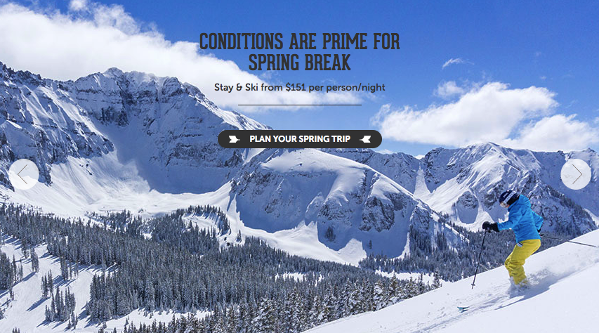
Right from the start, a prominent image gallery does a lot of the selling on the website for Telluride.
By making the images so large, the site makes sure the first thing you see is a beautiful landscape.
This is an example of a site that relies less on copy. Instead of a detail-heavy approach, the design focuses more on the picturesque views and various activities in action.
Once a visitor is drawn in by the photos, they can opt to click on the main call to action, “Plan Your Spring Trip” for more information.
From there, visitors can read about the various activities they can do in the city, then purchase any necessary tickets, passes, or equipment rentals.
This approach works, because it combines attention-grabbing imagery with a clear call to action.
Many Internet users have short attention spans, so it’s important to give them the opportunity to take action as soon as possible. Don’t make them think, wait, or read too much copy before giving them the opportunity to convert.
2. Visit Brasil
Visit Brasil is the country’s official tourism site.

On the surface, you might think that arranging this site would be a simple process.
After all, how difficult could it be to persuade visitors to check out beautiful beaches and hikes through the Amazon?
But considering that Brazil is a huge country, making up almost half of the continent of South America, the site has a lot of information to cover.
It does this by dividing the various regions into different “Experiences.”
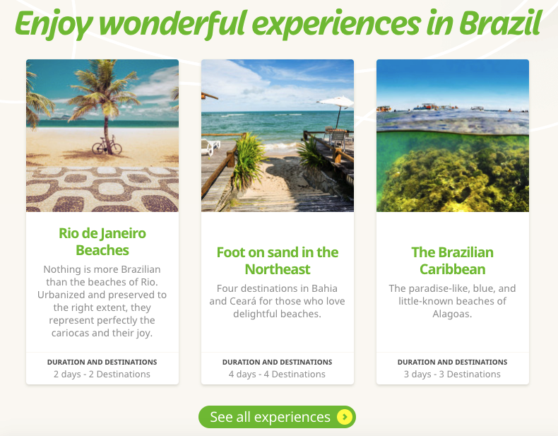
By breaking the country into smaller, more manageable areas, the site aims to create a virtual travel experience that allows the user to explore the sights of Brazil right from their computer.
This can help visitors decide where they want to go within this massive country. If they’re looking for a relaxed beach trip, for example, they’ll have very different options from travelers looking for hiking trips or adventure tours.
Then, once a visitor has selected a destination, the breakdowns on the site will give them an accurate idea of what they can hope to see within the span of their trip.
3. On the Grid
Unlike the previous two examples, which centered on one city and one country, On the Grid is a travel blog spanning many countries and continents.
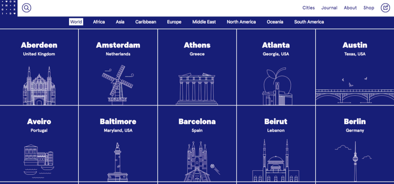
As a result, the site requires a very different type of organization.
Instead of letting visitors jump right into information about hotels and activities, the main navigation bar is organized by region.
Then, the homepage features an alphabetical list of city guides, from Aberdeen to Zurich.
[tweet_box design=”default”]This level of organization makes it easy for users to access information, whether they’re looking for a guide to a specific city or simply browsing for trip inspiration.[/tweet_box]
4. Cookiesound
Cookiesound is another travel blog that focuses on sharing personal stories from a mother-daughter photographer team.

The pair has made a name for themselves taking photos around the world, and they’ve created a nice compilation of their journeys.
And while the photos are likely what initially draw readers in, what sets this site apart from others is the personal perspective. You can tell that this site was made out of a passion for traveling.
So if you’re running a travel blog, it’s important to remember that photos can’t do all the work for you in building an audience and establishing a loyal reader base.
Make sure to spend just as much time creating interesting, well-written content for your site, and you’ll be much more effective in reaching your site’s goals.
5. Toucan Cafe & Tours
Toucan Cafe is a Medellin coffee shop that also runs tours and language exchanges.
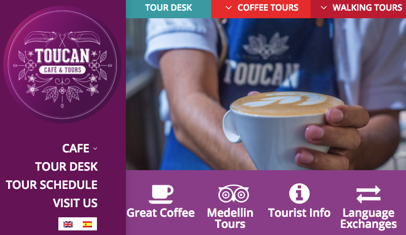
Their site is exceptionally comprehensive. It features different types of tours and details about the cafe, as well as general tourist information for visitors to the city.
Best of all, everything is easily accessible from the big menu bar. Given that the site is designed to provide information about very distinct categories, it’s essential that visitors can immediately find what they’re looking for.
After all, if a user were to arrive looking for details on a walking tour, but think they’d mistakenly come to the website of a random coffee shop, Toucan would quickly lose a potential customer.
But this straightforward navigation setup eliminates that issue and makes it easy for users to access the information they need.
Plus, it’s worth noting that all of the content on the site is available in Spanish and English.
While some of the company’s customers might be traveling within Colombia, they’ve clearly determined that many of their tour attendees come from English-speaking countries.
By making all of their information available in English, Toucan expands their audience and makes sure they don’t miss out on potential customers because of a language barrier.
6. Wheeling, West Virginia
As you may have guessed, this is the official tourism site for the city of Wheeling, West Virginia.

The site features a series of high-quality images on its homepage that highlight the various activities available to visitors within the city.
From there, the page is divided into sections that cover hotels, restaurants, recreation, and other activities.
If this doesn’t sound like a novel approach, that’s because it isn’t.
But the site makes it easy for visitors to see why they should visit the city, as well as access all of the information they need to plan their trip.
In this case, simplicity works.
[tweet_box design=”default”]As you plan your site, remember not to get caught up in flashy design elements.[/tweet_box]
While a unique site can help you stand out, your priority should be to create a user-friendly experience that enables visitors to plan their next trip.
7. Utah, Life Elevated
Life Elevated is the tourism site for the state of Utah.

Much like many of the sites on this list, the homepage features large, compelling images of scenic destinations.
Then, users can click the featured call to action to learn more about the location in the photo.
This combination is extremely effective. The image elicits an emotional response, and the action-oriented text encourages visitors to put that excitement towards their own adventure.
But if you choose to take a similar approach, then pay attention to the size and quality of your images.
First, make sure that if you feature an image on your homepage, it’s high in quality. Grainy, low-quality photos won’t do you any favors in conveying the beauty of a location.
Then, always optimize your file sizes. Many site owners make the mistake of including massive image files on their homepages.
While these might look great, they can drastically slow down page load times.
And considering the impact that page speed has on page views, customer satisfaction, and conversion rates, it’s not something you can afford to damage.
So as you incorporate photos into your site, and especially onto your homepage, pay attention to file size. Your files should be large enough to produce high-quality detail, but not so big that they slow down your site.
As a general rule of thumb, your images should be 100KB or less.
After all, beautiful photos won’t do you any favors if no one sticks around long enough for them to load.
Crop your images to the necessary size and compress them before uploading, and they’ll be much more helpful in moving you towards your site’s goals.
8. Travel Oregon
One of the most creative sites on this list is Travel Oregon.

Like many of the other examples on this page, it’s designed to attract visitors to the state.
But unlike any of the others, it presents the various regions and attractions with a video game-inspired design.
The homepage begins by explaining that “Oregon is magic,” then encourages visitors to learn more about the state with choose-your-own-adventure style calls to action like, “Wander into the forest,” “Visit the Rose City,” and “See the magic Coast.”

From there, each of these calls to action directs users to more information (and real photos) of their selected region.
This kind of spin on website design isn’t for everyone. But for the fun, laid-back feeling Oregon is aiming to convey on their site, it’s perfect.
It’s also a fantastic reminder that travel sites can be as unique as the destinations they promote.
While there are a few basic elements you’ll need to include, feel free to get creative with the way you arrange them and present information.
9. Visit Australia
Although Australia’s official website includes plenty of eye-catching photos for visitors to check out, it also takes things a step further by heavily incorporating video into the mix.
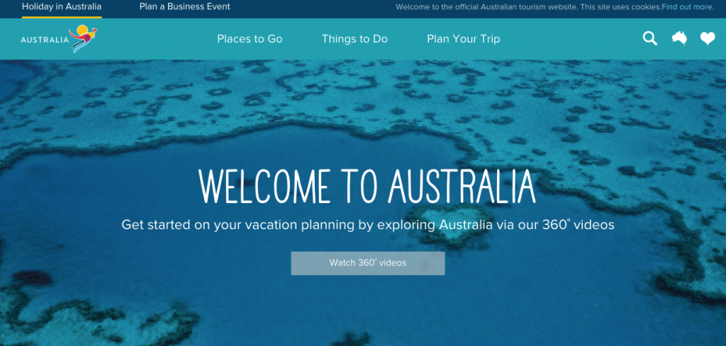
Like many travel sites, it’s designed to encourage visitors to learn more about specific regions of the country, so they can determine which is best-suited to what they’re looking for in a trip.
And in addition to high-quality photos and compelling descriptions of each, the site also offers 360º videos. These give a more in-depth look than even the most high-quality photos could, so visitors can choose a vacation spot and explore it from the comfort of their home.
Interactive elements are becoming increasingly popular in web design for many industries. But in many cases, it feels like they only exist for the sake of checking “interactive” off on an arbitrary list of design elements.
So if you choose to include interactives, it’s important that they serve a clear purpose and don’t come off as gimmicky.
In this case, Visit Australia’s 360º videos are a fun, engaging addition to the site. They’re a special way to highlight different locations throughout the country, and add value to the overall site experience.
10. Live Africa
As a tourism site for an entire continent, Live Africa has an extremely large job.

But their site’s design does an excellent job of showing the exact feeling and experience they want to convey.
Live Africa encapsulates the essence of the African safari that the site heavily promotes, down to the textures and colors used throughout each page.
Plus, the striking videos of majestic animals roaming in the wild show the reader what they can witness when they plan their trip to Africa using the resources on the site.

11. African Budget Safaris
African Budget Safaris has a similar goal to the previous example on this list but takes a slightly different approach with their design.

Right from the start, the site keeps things direct and to the point.
There are no frills here — just all the information a visitor needs to plan their African safari adventure.
But the most important detail here is that visitors can instantly tell that this site will help them find inexpensive trips.
Of course, the name itself implies that the company’s goal is to provide affordable safari trips.
But by highlighting details on budget-friendly, quality tours, and including information about discounts right in their header, the site makes it clear that providing value is a priority.
This is an important piece of information to convey, and the site does it extremely well.
After all, effectively communicating content is one of the most important functions of any website. You can have the most beautiful photos and visually appealing design in the world, but if readers have trouble finding key information, they won’t become customers.
Make your site’s value crystal clear. Your homepage should be optimized for not only conversions but also user-friendliness — and that means making sure that visitors can tell exactly what to expect from you.
12. Mount Kilimanjaro Guide
Unlike many of examples listed in this post, Mount Kilimanjaro Guide takes an information-based approach on their homepage.
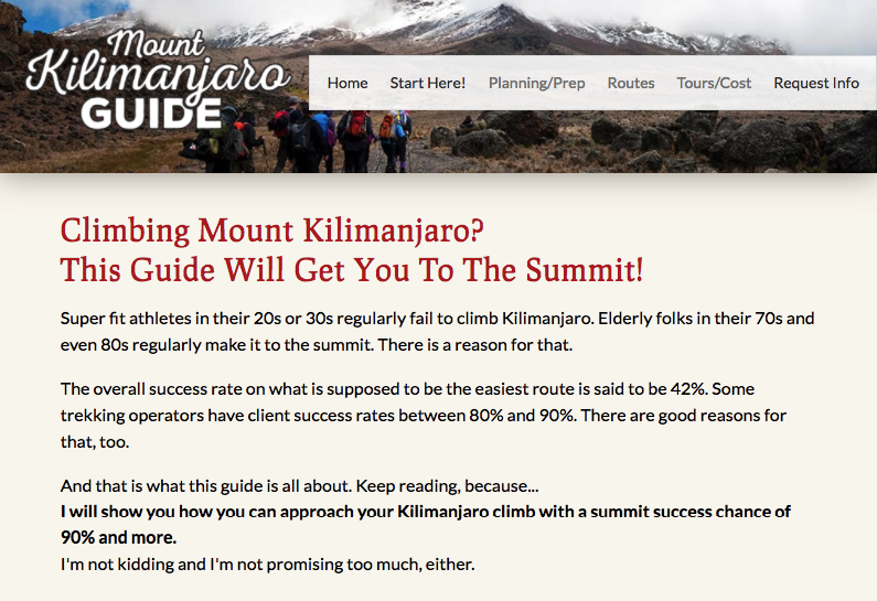
This is a great way for the site to make a memorable impression on visitors.
There are a ton of sites out there with information on Mount Kilimanjaro. It’s an extremely popular tourist destination, so there are dozens of guide companies competing for potential hikers’ attention online.
But as you’ve likely gathered from the examples in this list so far, most travel sites feature one large, compelling image on their homepage.
That’s great for sites focused on promoting a unique location!
In this case, however, the site isn’t trying to convince visitors that they should visit Mount Kilimanjaro. Their target audience is made up of people who are already interested in climbing the mountain and are looking for more detailed information on how to accomplish this goal.
As a result, they created a copy-heavy homepage that jumps right into the value of their guide.
This might not seem like an especially compelling approach but think of it from the perspective of a traveler who’s looking for information about climbing the mountain.
If you visit a dozen sites with homepages featuring similar images of Mount Kilimanjaro, and one site that gives you detailed information from the second you arrive, which do you think you’ll remember?
Probably the one that promises an approach with a summit success chance of 90%.
If your travel site operates within a competitive niche, look at what your competitors are doing to figure out how you can set your company apart.
And even if you don’t operate within a competitive niche, this site also serves as a great example of how to write effective copy.
Many site owners make the mistake of letting their images do all of the “talking.” But while stunning photos are great for grabbing visitors’ attention, they’re ultimately not what will drive most of them to take action.
When done well, your copy can be your pitch, presentation, and close all on its own. So as you create your site, don’t let this essential element become a last-minute consideration.
13. The Hawaiian Islands
The Hawaiian Islands’ website offers a no-fuss user experience.
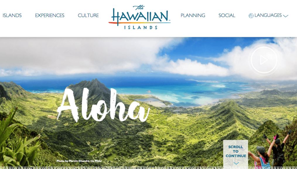
At first, The Hawaiian Islands seems to be an average travel site.
And in many ways, it is. It features a scenic landscape image with tourists enjoying a hike, and a standard navigation bar with all of the options you’d expect.
But take a second look, and you’ll see how clean and simple the design is.
The navigation hierarchy is broken down into six basic tabs so that users can find exactly what they’re looking for within one or two clicks.
And for visitors who aren’t sure what, exactly, they’re looking for, the “Scroll to continue” tag at the bottom of the page encourages them to keep reading and learn more.
Altogether, these elements make for a direct, effective site. And for users who want a simple way to plan a trip, this is perfect.
After all, most of us take vacations to relax — so preparing for one shouldn’t be a stressful process.
14. Lake Crackenback
The website for the Lake Crackenback Resort & Spa does a nice job of balancing detail and design.

When it comes to creating any kind of website, it’s often challenging to strike a balance between including enough information, but not so much that you overwhelm your visitors.
This is especially true for travel sites.
You need to explain to visitors why they should visit the destination you’re promoting, and show them all of the great experiences they could have by planning a trip. You’ll also want to make it clear what role your site plays in the planning process.
But if your site appears too complicated, visitors might leave in favor of a simpler, easier option.
Lake Crackenback’s site is a great example of how to walk this fine line. There are several menu items, but nothing feels cramped, and it’s all easy to navigate.
Visitors have the option to explore information about hotels, dining, events, and activities — essentially, all the details they might need to plan their trip.
But all of this information is neatly organized into tabs, instead of cluttering up the homepage.
So as you design your site, make sure to do so in a way that won’t overwhelm your visitors.
You likely have lots of helpful content you want to share with prospective travelers.
And that’s great!
But don’t attempt to fit it all onto one page.
Make sure you give everything some breathing room and focus on letting visitors access the pages that are most relevant to their needs.
15. Visit Idaho
The next state-focused site on our list, Visit Idaho, is a breeze to use.

At first glance, this may look like a fairly standard tourism site. But Idaho’s website is unlike any of the others on this list.
So, what sets it apart?
Simple: It uses graphics in its menu.
This may seem like a small decision, but it makes navigation that much easier. Visitors can easily spot the tab that holds the information they need.
And beyond that, this setup also forces the site to group menu options using just four categories.
This makes the navigation process extremely straightforward. The more options you give visitors, the more they’ll have to consider before deciding which to click.
And while this may seem like a small concern, it can be the determining factor in whether a visitor decides to stay and engage with your content, or leave in favor of a simpler site.
So as you design your site, pay special attention to your navigation setup, and remember that navigating a site should be fun and frustration-free.
You can utilize anything from graphics to interactive elements to achieve this goal — as long as your final product is one that makes it easy for visitors to find and engage with the content that will get them closer to planning their trip.
16. Washington The State
It’s clear from Washington The State’s homepage that its focus is on highlighting the state’s natural beauty, and this idea is apparent throughout the entire site.
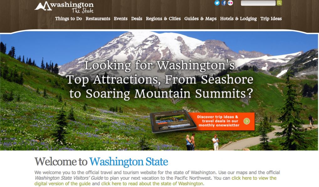
Although the state also includes several large cities, the site goes heavy on the visuals showcasing its natural beauty.
As a result, we can gather that their target audience is prospective travelers who want to spend their trip enjoying the outdoors.
And while this might seem to limit their ability to attract vacationers, choosing a specific audience is a wise choice.
That’s because marketing a destination isn’t all that different from marketing a product or service.
And as any experienced marketer will tell you, having a clear picture of your target audience is absolutely essential for creating effective campaigns and content.
When you try to cater to too many people, it’s difficult to really engage anyone. Instead, you’ll be more effective when you narrow in on a defined audience.
This way, you can keep that audience in mind as you develop each part of your marketing strategy. You can select images, create design elements, and write copy with the goal of connecting with a specific set of users.
By keeping their priorities and preferences in mind, you’ll be able to create an entire marketing strategy that matches what they’re looking for in a vacation.
On this site, for example, even the subtle, natural-toned color scheme is designed to match the scenic imagery.
And while this might not appeal to travelers looking to explore downtown Seattle, that’s okay — because the site’s primary goal is to engage visitors looking for an outdoor-focused adventure.
So if you’re struggling to figure out how to market your site or destination, it might be time to narrow your audience.
Determine exactly who you want to reach, and it will be much easier to figure out what kinds of content you should be producing to attract their attention.
17. Egyptian Tourism Authority
On the exact opposite end of the spectrum from the previous example, the Egyptian Tourism Authority’s website does an excellent job of highlighting different types of trips and experiences available to travelers.
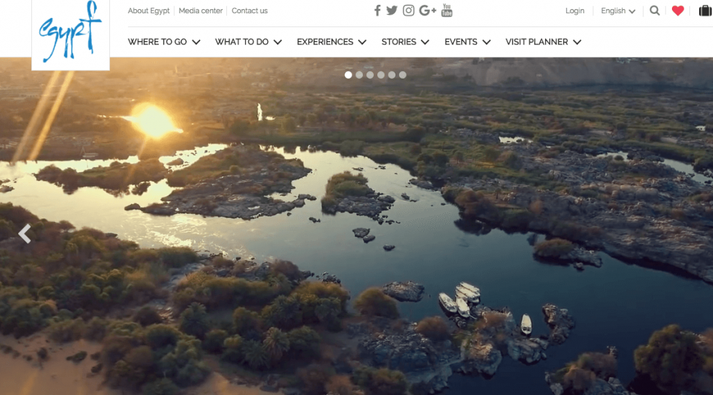
In this case, they opted not to niche down — and it works.
That’s in large part because the site is designed to highlight the country’s variety and cultural richness.
The first thing visitors see is a stunning landscape. From there, the photos on the page display Egypt’s diversity, showcasing everything from beaches to deserts to the iconic Giza Pyramids.
The idea they’re attempting to convey is that the country holds something for everyone.
While narrowing in on a specific attraction would’ve made it easier to write copy and tailor their content to a specific type of traveler, this approach lets the site show off several different attractions.
And while it might seem contradictory to place this example of a site that covers an entire country immediately following a site that focuses on a subset of attractions within a specific state, the takeaway is that there’s no “best” approach that will work for every site.
If you’re working to increase tourism in an entire region or country, you’ll need to design for a broad audience. But if you’re trying to reach travelers looking for a specific type of trip or tour experience, you might see better results by niching down.
Determine what you’re hoping to accomplish with your site, then work from there.
18. Costa Navarino
Costa Navarino is located on the Mediterranean coast of Greece, and their site focuses on highlighting the beauty and uniqueness of the destination.

Their site seems to have one main objective: to make visitors forget about everything but the beautiful island scenery in front of them.
Travel sites are particularly effective when they enable potential customers to envision themselves in luxurious destinations from the minute they arrive on the homepage.
That can be the primary motivation for a traveler to book tickets from their cold home in the winter — and Costa Navarino’s site reflects this.
To accomplish this goal, they feature stunning images of coastlines, beaches, pools, and luxury villas. The weather report in the top right corner is a nice touch, too.
Altogether, the site does a nice job of minimizing distractions. Site visitors are encouraged to focus solely on the destination in front of them — at least until they’re ready to start taking steps to plan their trip.
19. Experience Columbus
Experience Columbus is the state of Ohio’s site for attracting visitors to their capital city.

The first thing you’ll notice on this site, after the gorgeous shot of the city’s skyline, is that the site is fast and appealing.
Of course, the site looks nice. But arguably even more important than that it loads extremely quickly. And it doesn’t lag on mobile devices, either.
Since many people now use smartphones and tablets to access information online, this last detail is critical.
And beyond that, the site is designed to be extremely user-friendly on any device.
Regardless of a visitor’s browser or screen size, it’s easy for them to access information about sightseeing, restaurants, events, hotels, neighborhoods, and virtually anything else they might want to know about the city.
So as you design your travel site, make sure that user experience is a key consideration right from the start.
Utilize responsive design, so that travelers can easily navigate your content on whatever device they’re using. Then, ensure that your testing process includes a variety of operating systems.
When not coded correctly, elements like buttons and your navigation bar can appear distorted on devices other than desktop and laptop computers. This can easily make or break a user’s experience with your site.
You don’t want this to be the determining factor in whether a user decides to visit your city or sign up for your tour service — so invest the time it takes to create a user-friendly site.
20. Discover Chile
The last site on our list is Chile’s official tourism site, Discover Chile.

The first thing you’ll notice on their homepage is likely the stunning image of a whitewater kayaker flying over a waterfall.
But after that, you’ll see the goal logo at the top of the page, announcing that Chile is the “World’s Leading Adventure Tourism Destination.”
Chile has received numerous awards for tourism, and it displays the most prestigious of these awards prominently on its homepage. The slideshow features three hero images, each with a different award at the top.
This is essentially a form of social proof.
If you’re not familiar with the concept of social proof, it’s the practice of using third-party reviews and opinions to create positive associations with your brand or business.
After all, consumers know that companies are biased towards whatever it is that they’re promoting.
As a result, they’re typically more inclined to trust the opinions of other consumers and organizations that don’t have a clear incentive to speak highly of a particular product or service.
That’s why many of us seek out customer reviews and ratings before purchasing anything online.
Of course, reviews work a bit differently within the travel industry. Travelers might rate specific attractions they visit or tours they attend, but most won’t take the time to write and publish a review of a destination as a whole.
But in Chile’s case, the titles they received from World Travel Awards are just as compelling.
And if a visitor in search of an adventurous trip lands on this homepage, they’ll immediately know that the country offers what they’re looking for — and they don’t have to take a biased tourism site’s word for it.
If your city, attraction, or site has earned any awards or distinctions, be sure to feature them prominently.
Even if it’s just a small award from a local organization, having some sort of third-party verification can go a long way in building trust with your visitors.
Conclusion
There’s no guaranteed template to follow when designing a travel website.
The 20 sites in this post alone cover a variety of design styles and approaches — they each work for their own unique audiences and goals.
Regardless of your industry or niche, there are a few important points to keep in mind when working on your site:
- Make sure your navigation is simple. Graphics, smart category grouping, and smaller menus can all help with this.
- Images play a huge role with travel sites! Don’t be afraid to use big banner images. Just make sure that your file sizes don’t slow down your page load times.
- Try to set your site apart from the rest. Figure out what your competitors are doing, then aim to come up with a unique approach.