Want to start conversion testing on your website, but don’t know where to start?
Don’t worry, I’ve got you covered.
In this article, we’ll break down 6 of my favorite conversion rate optimization case studies. After each one, I’ll give you actionable advice you can take to improve your blog or website in a serious way.
I’ve personally learned a lot from these case studies, and I hope you do too. Also, because this post is on the longer side, you might want bookmark and come back to it later.
Here’s what I recommend if you to get the most out of these case studies:
- Find one that best reflects where you are with your website today.
- Look past the surface. Don’t ask “What” worked, but really think about “Why” it worked.
- Ask questions in the comments, I’m more than happy to help!
- If you know someone who this article would help, please share it with them. They’ll appreciate it (and I will too!)
1. How We Made $1 Million For Moz With One Landing Page & A Few Emails
I always find myself coming back to this case study for one simple reason: If you want to sell more stuff, you have to find out what’s working for your paying customers—and find out what’s holding your non-paying customers back.
In this study, Conversion Rate Experts started by interviewing Moz’s paying customers, free-trial customers, and former customers.
The Research
They asked paying members what they liked most & how they would describe Moz to a friend.
They asked free-trial members what it would take for them to sign up for the service, what they liked the most, and how they spent their time on SEO.
They asked members who canceled, “Why? And what would bring you back?”
They also found that Rand, Moz’s founder, could energetically sell the service face to face, but his enthusiasm and detail didn’t translate over to the website’s communication very well.
The Execution

Conversion Rate Experts infused their findings into several new wireframes for the page, and asked Moz’s Twitter followers to participate in usability tests.
After reaching statistical significance on low-cost wireframes, a new page was created and resulted in nearly 52% increase in sales to the Moz Pro solution.
After, they emailed free trial subscribers offering a full-featured membership for just $1.
When about 500 members asked “What’s the catch?”, they followed up with an email the next day assuring users there were no gimmicks.
For the users who took advantage of the $1 full-featured trial, they received a series auto-responder emails to help them get the most out of their new membership.
In the end, Moz added an additional $1 Million dollars to their yearly revenue.
Actionable Advice:
Assume nothing – Talk to customers, prospects, and former customers to get their perspective on what you’re doing and how you could do it better.
Test Everything – Moz only launched a live page after it was user tested.
Say everything that needs to be said – We tend to oversimplify our messaging, but that can lead to us leaving out vital details for key decision makers. Make it as easy as possible to become a customer.
Read The Full Case Study Here: http://www.conversion-rate-experts.com/seomoz-case-study/
2. Smiling People Increases Sign-Ups for High Rise by 102%
What I love about this case study is that it proves adding the human element can have a dramatic impact on subscriptions.
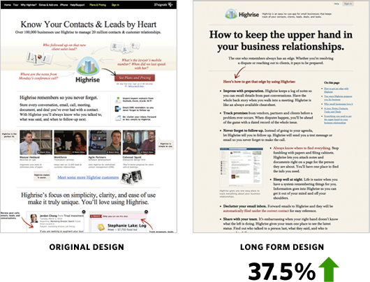
Highrise, a simple lead management platform from the team at 37 Signals, had just seen a 37% increase in sign ups by testing a new long form page against their original design.
While many would celebrate this lift, founder Jason Fried urged his team to “destroy all of their assumptions” about the page, and try something radically different.
The Research & Execution
You have to understand, 37signals are a bunch of media hackers.
“Research & Execution” are the same thing. The point is to get ideas out the door, measure the results, and build from there.
They understand the fluidity of the internet & human nature so well, they don’t see the point in crying over things not going their way.
So, in a radical redesign, they featured a beaming customer for a warm and inviting look at their product.
What happened next was astounding – 102.5% increase in paid subscriptions!

Never being content, they tested this new design against a similar design with long copy underneath, and found a negative impact from the longer page.

Then they took the basic premise of the new page, and tested different people.
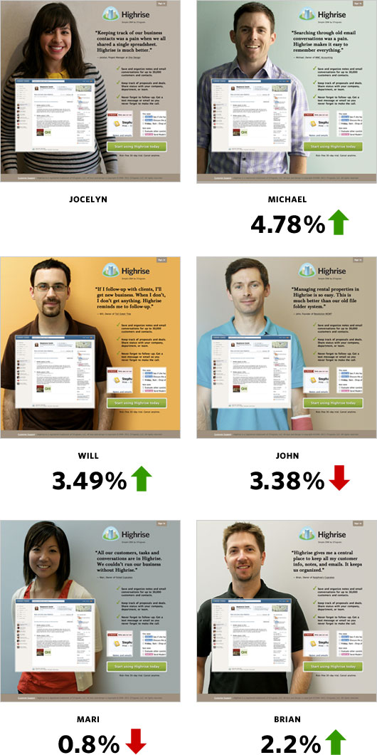
On the surface, what they found were big pictures of smiling people convert better, regardless of who it is.
But on a deeper level, this test is about validating the idea that it’s ok to be fearless about testing your assumptions.
We get stuck when we we tell ourselves “It has to maintain the same look and feeeeeeel.” or “I don’t want it to conflict with my core brand.”
What would have happened if High Rise did this?
They might have seen a 33% increase in sales, but then what? It’s only incremental changes from there.
Having a leader fearless enough to say, “Change everything if you need to,” allowed them to see more than 100% growth. How powerful would a 100% increase in business be for your business?
It’s time to stop holding yourself back.
Actionable Advice
Dedicate a portion of your time to test your wild ideas.
Use Google’s content experiments to slip a 10% of your traffic to an alternate homepage. Send a crazy offer to only 5% of your email list. Make offers at weird hours, on holidays, or the weekend.
As much as you try, you never really know who’s on the other side of the screen, so it’s always worth a shot to give them something they’ve never seen before.
Read The Full Case Study Here: http://37signals.com/svn/posts/2991-behind-the-scenes-ab-testing-part-3-final
3. Intuit Increases Conversions By 211% with Proactive Chat
Keep in mind with this next case study that it’s not about the tactic, but what the tactic represents: an increased level of access for the customer at points where they are the most unsure of what to do next.
The Research
Intuit, the maker of QuickBooks, found through customer service that customers were upgrading only after learning the product they originally bought didn’t quite match their needs.
Understanding that speaking with frustrated customers and getting them the proper tools was not the best use of customer service budget, Intuit decided to introduce the solution earlier in the product buying funnel.
They determined the “Review Your Order” and “Product Comparison Pages” were among the pages with the highest purchase intent, and that’s where they would attempt to connect with the customer.
The Execution
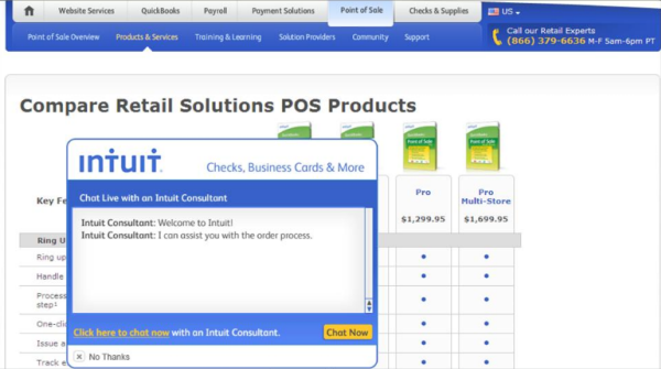
By partnering with Liveperson, Intuit implemented a live chat solution on the pages where customers might have the most questions about what’s best for their business.
Every page with this functionality saw an increase in conversions and revenue, but beyond that, the strategy minimized frustrated customer service calls, making the long-term impact far more successful.
Actionable Advice
If it’s not feasible for your business to include a live chat like this, that doesn’t mean you can’t offer an easier level of access for your potential customers.
- If you use forms to generate leads, give a phone number to make it easier to get in touch.
- If you write blog posts, do the occasional Live Q&A on Skype or Google+ Hangouts.
- If you do virtual events, make them known on key pages of your site.
The easier you make it for people to get what they want, the more reward there will be in the end.
Read The Full Case Study Here: http://www.proimpact7.com/ecommerce-blog/how-intuit-increased-conversion-rate-by-211-just-by-using-proactive-chat/
4. Voices.com Improves Conversions by 400%
I like this study because it’s about something that can be tricky to do: create a single site for multiple audiences.
Again, Conversion Rate Experts lead the charge, and prove that researching the visitors and the competition is the best way to create messaging and design that just “fits.”
The Research
The team at Conversion Rate Experts researched 4 major areas before designing their conversion experiments:
- Dove deep into analytics to find the pages with the most opportunities.
- Analyzed 510 visitor surveys to understand the “non-subscriber” mindset.
- Studied existing sales literature and interviewed the company’s CEO to find everything that would impress prospects.
- Deconstructed competitor websites to exploit weaknesses.
Armed with a wealth of knowledge, Conversion Rate Experts created 11 experiments that targeted at 5 different areas of the sales funnel.
The Execution
A common problem for both voice-over artists & companies, is that “middle-man” type sites only exist to collect advertising fees, but don’t deliver quality talent or jobs.
To combat this, one of the “quick wins” Conversion Rate Experts implemented was the use of trust symbols from the companies who used Voices.com in the past.

They also segmented traffic based on visitor type.

And created “explainer videos” for pages that normally caused confusion.

These were the key contributors to an incredible improvement, and for a huge reason: As you go deeper into the site, every question is answered at the top of the page, making you feel “safe” during every step of the process.
Actionable Advice
Go to your website’s homepage and ask yourself if the next thing you want your visitor to do is clear.
If you’re a consultant, is it obvious you’re available for consulting from key pages? Do the pages after that address concerns someone considering consultation might have?
Do you make it clear what you offer, and who it’s for?
At every point in the process, are you offering affirmation that your visitor is making the right decision?
There is no such thing as too much attention to detail when it comes to making people feel comfortable.
Read The Full Case Study Here: http://www.conversion-rate-experts.com/voices-case-study/
5. Shortening landing page improves signups by 13%
Wait, what? There’s actually a valid argument for shorter landing pages?
In this case study for DesignBoost (Disclaimer: writing client), Jen Gordon learned the shorter page was just what she needed to get visitors to sign up for her free offer.
The Research
DesignBoost’s conversion agency, Markitekt, had found through their previous research that short pages typically convert better for free offers. To test this theory, they installed CrazyEgg on the long version of the DesignBoost site and used the scroll map feature to see where visitors attention started to fade.
The Execution
Using what they learned from the scroll map, Markitekt created an short version of the page. They then A/B tested the long (6400+ pixels long) and short form pages (1,200 pixels) using Visual Website Optimizer.

The shorter page resulted in a 13% increase in email signups, and a 25% increase in click-throughs to course content, a huge improvement and a great start for the new website.
Actionable Advice
If the goal of a page is to get email signups or to get people off the home page, shorter pages can work better. – Peep Laja
Use whatever data you have available & create tests to cut the stuff that’s clearly not holding people’s attention.
Read The Full Case Study Here: http://visualwebsiteoptimizer.com/split-testing-blog/short-landing-pages/
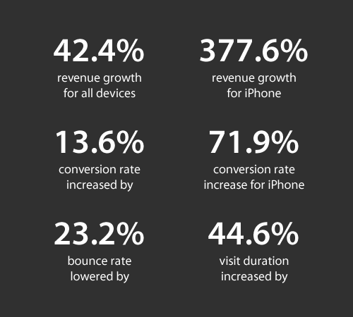
6. SkinnyTies.com Increases Mobile Revenue By 377.6%
I love this case study because it’s a beautiful demonstration of powerful meeting basic visitor expectations can be for an outdated website.
When SkinnyTies.com contacted Gravity Department for a site update, they allowed consultant Brandon Falkowski to take full control of the site’s look and feel—something that was very much stuck in early 2000’s web design aesthetics.

The Research
Brandon used his own heuristics in addition to taking aesthetic cues from other online retailers who target the same demographic. The idea was to create a familiar look and feel for new visitors, while also creating a unique identity for Skinnyties.com
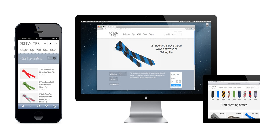
In addition to researching modern aesthetics, Brandon also payed close attention to how the best sites from similar verticals were structured, and how they broke down from desktop to tablet to smartphone.
The Execution

Central to SkinnyTies.com’s content strategy were boldly colored product photos with consistent composition for every shot.
I created comprehensive style guides for shooting and editing that defined standards for scale, orientation, angularity, white space, ambient brightness, and light hardness. The results are stunning, especially on HiDPI tablets. – Brandon Falkowski
Because mobile was critical to the design strategy, Gravity Department ensured the site was beautiful and was easy to navigate regardless of whether the visitor was on their smartphone, desktop, or any other internet enabled device.
The openness of the design creates a much more inviting look and feel. Perhaps more importantly, the design reflects the personality of the target customer.
All of which lead to some very impressive results:
Actionable Advice
There’s so much I took away from this case study because it does so many things right.
1) Create A Consistent Style Guideline For Your Website.
As a blogger, this was the biggest one for me. Too often I’m selecting images based on what’s free, and perhaps what loosely fits the keywords that I’m searching for. Looking around, I know I’m not alone.
But when I look at blogs like Buzzfeed or Medium.com, both of which have a very specific design aesthetic, my gut tells me that the consistent visual language plays a big role in their growth.
2) Optimizing for Mobile Leads To Impressive Results
I know the whole “design for mobile” conversation is done to death now, but with results like SkinnyTies, it’s hard to ignore.
We live in a mobile world, and with the variety of utilities—from mobile responsive design to click-to-call technology—there are few reasons we can’t make the mobile experience better for our visitors.
3) When The Website Knows The Visitor, Magic Things Happen.
When I see 44.6% increase in visit duration and a 23.2% decrease in bounce rate, along with higher revenues, it’s obvious visitors actually enjoy being on the site.
This isn’t just because the site was easier to look at. I don’t even think this because there is scientific proof that “simple” sites are better. I think it’s because this site knows it’s target audience so well.
Imagine someone wearing a skinny tie, and what do you see?
Maybe a half-bearded hipster? A tech nerd? Chris Hardwick of The Nerdist? (wait, aren’t those all the same thing?)

Ok, now let’s think real quick about the other products that are important to this guy.
For the sake of brevity, I’ll guess he’s a Mac user. I think you’ll like where I’m going with this.
Apple homepage:

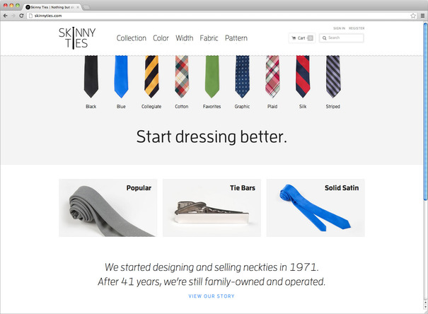
SkinnyTies.com Homepage
Even if Gravity didn’t directly borrow from Apple, it doesn’t really matter.
The new site understands its customer so well, it anchors itself in something familiar while still being its own thing. You can imagine, for the skinny tie customer, everything from the tie they wear to the tech they use is a statement about who they are.
Don’t take this as me tell you to copy Apple because your customer has an iPhone. Because that’s not it.
Instead, what I’m saying is to think of your customers as real people using a variety of different sites and services every single day.
Understanding their exposure & knowing what’s important to them can play a dramatic role in your website’s visual communications.
Read The Full Case Study Here: http://gravitydept.com/blog/skinny-ties-and-responsive-ecommerce/
Remember: You Just Have To Start Somewhere
After everything you’ve read, the only question left is: Where will you start?
If you’re still unsure, here’s what I want you to do:
- Find the case study in this article with a problem that’s most similar to where you are now.
- Leave a comment letting me know the study, and the challenge you’d like to overcome.
I will personally respond to your challenges in the comments, along with resources to help you push past it.
Together, we can build a better internet. The first step is always the hardest.
Will you take it?


