So what exactly is an accent color?
An accent color is a contrasting color used to draw attention to key pieces of a web page.
It’s a way of using color to ensure the most important links, buttons, or sections on a website don’t get overlooked.
Most importantly, accent colors are used to draw attention to key calls to action (CTAs). If there’s a CTA button such as “Click to learn more” or “Buy Now,” it’s critical to draw attention to those buttons.
Why?
Because that’s the most important action you want people to take. In order to keep customers moving forward through the sales funnel, you want to make it incredibly obvious which action you want them to take. You don’t want there to be any mistake about what the most important next step is.
Accent colors help to do this, and here are some examples that show how to use them:
Example #1: Basecamp by 37 Signals
Basecamp is a project management software and online collaboration tool produced by 37 Signals, and they do a great job using accent colors to elicit more actions.
The first way they use accent colors is to draw attention to the number one CTA on their homepage: “See Plans & Pricing.” That’s the most important action prospective customers can take, so they get visitors attention with a prominently placed large green button that stands out from the rest of the page.
The green accent color makes sure the button won’t be missed, and since it won’t be missed, it gets more clicks.
Another way Basecamp uses accent colors for their home page is in the main navigation menu. They accent “Plans & Pricing” and “Sign in” with the same green color as the main CTA button.
Basecamp views these as the two most important links, and they ensure that customers can find them by highlighting the links in green.
Example #2: MailChimp
MailChimp has one of the most beautiful websites on the internet, and they also effectively use accent colors.
Similar to Basecamp, they use an accented CTA button on their homepage to highlight their main call to action. It’s a red “Sign Up Free” button that is prominently placed near the center of the page. The red stands out from the blue palette used for the rest of the page and draws attention to the “Sign Up Free” button.
What action do you think they want customers to take? Based on the red CTA, which action action do you think customers will take?
For MailChimp, the most important next step customers can take is signing up for a free account. They make sure that action is easy to take by emphasizing and accenting the call to action on the homepage.
Example #3: Copyblogger
Copyblogger is rated the number one marketing blog in the world by Ad Age, and they do a lot of things right when it comes to internet marketing.
Since Copyblogger is more of a publication than a sales site, they don’t use homepage accent colors for the standard “Buy Now” or “Learn More” CTAs. Instead, they use accent color to get readers to take the steps they want them to take next– namely reading posts and subscribing by e-mail.
The first step they want people to take is to read the full post. If readers like a post, there’s a good chance they’ll subscribe.
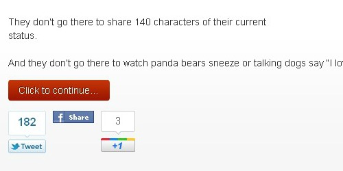
To get people to take this first step, Copyblogger includes a red “Click to Continue” button underneath each post. This button stands out from the white background and focuses the readers attention on this critical action.
It makes it obvious that Copyblogger wants you to click and read more. Readers can’t miss it. (They also highlight the headline in red which helps it to stand out as well. Both are effective at helping readers to take the action of reading more.)
Copyblogger also wants readers to subscribe. To help with this, they draw attention to their subscription opt-in with a black box that stands out on the white background and a red “Join Us” button.
What does Copyblogger want people to do? They want readers to join. They encourage this by accenting the “Join Us” button in red.
Example #4: Dropbox
A great example of a streamlined website that uses accent colors is Dropbox.
Their homepage is stripped of everything except a video to explain their product. There’s nothing to get in the way and distract visitors.
It’s pretty clear the number one action they want visitors to take is to watch the video. They make this obvious with “Watch a Video” as focal point of the homepage.
They also want visitors to download their product, and they make it super easy to take that action with a blue accented “Download Dropbox” button.
What is it they want people to do? First, watch the video; second, download the Dropbox software.
The streamlined website and accented CTA button makes these critical actions stand out to every visitor.
Example #5: CrazyEgg
Crazy Egg, the owner of this blog, sells an effective software for website optimization. It helps website owners to stop reading customers minds and start getting results by optimizing based on exactly where users click and look on a webpage.
The software is priceless.
They also use yellow accented “Show Me My Heatmap” buttons in multiple places on the home page. The use of mutliple CTAs gives customers the option of moving forward in the sales process at whatever point they’re ready.
If they’re ready to see their heatmap after reading half of the page, they can; If they want to wait until the bottom of the page, they can do that as well.
Without multiple CTAs, customers would need to make it to the bottom of the page before clicking to move forward.
Since showing the heatmap is the first action Crazy Egg wants customers to take, they provide seven opportunities to do so. This is much better than one CTA at the bottom of a long sales page where customers may never make it to the bottom. Multiple accented CTAs provides a great way to keep customers moving forward through the sales process.
Now here’s a question for you: how will you use accent colors to get more actions on your website?
Please leave a comment to let us know.


