There are seven main website formats: a brochure site, a local service site, an online store, an online service, a consultative site, a publication site, and a portfolio site.
Each has its own purpose, so the choice depends on what your business does.
To check if your website format is working, track metrics that align with your goals. For example, conversion rates or average order value (AOV). Use heatmaps and session recordings to get a more granular view of which format elements work and which don’t (and whether it’s the format and not other factors, like the price, that are costing you conversions).
In this article, I’ll cover all seven formats: who they suit, the order their sections should go in, and what they need to work, all illustrated with real-life examples. I also explain how to choose the right one for your business and how to analyze whether yours is working.
What Is a Website Format?
A website format is the page structure: which sections it has and how they’re ordered.
Formats are structural, not visual. Two sites can use identical colors and typography and still have different formats. And most sites follow the common format even though their designs vary massively.
All website formats include the same elements: a header, a hero section, a body, and a footer. What goes between the hero and the footer varies.
What’s the difference between a website format and a website layout?
Layout is the visual arrangement of elements on a page, for example, the grids, the split screens, the column counts, while format is which sections exist and what order they come in.
The two work at different levels. One format can use several layouts. For example, online stores often use the grid or the list layout for category pages. And some, like Currys, let you switch between them.
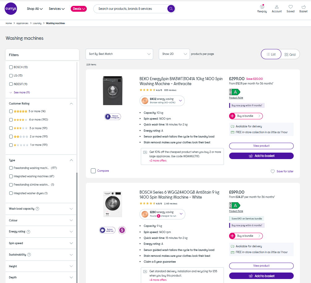
And the other way round: different site formats use the same layouts. For instance, both portfolio and online store sites commonly use the grid layout.
What’s the difference between a website format and a website template?
A template is a ready-made set of pages you install in your CMS and then fill in with copy, images, and branding, while the website format is one of its elements that defines the overall website structure.
A common mistake is choosing a website template based on its visual design without considering its format.
What’s the difference between a website format and website design?
Web design covers how a site looks and feels: the typography, color, imagery, white space, and the layout. Good design makes a page visually appealing and gives the eye a clear path, so visitors can easily scan it and find what they came for.
Format underpins the design. It decides which sections the page has and how they’re organized, and design decides how each one is presented.
Both shape the user experience, from different ends. Format sets the route a visitor takes through the page, and design affects how easy that route is to follow.
The 7 Best Website Formats and Who Each One Fits
Seven formats cover almost every online business. Each serves a different goal, which determines the key sections and their order.
| Format | Best for | Goal action | The section that carries it |
|---|---|---|---|
| Brochure | Businesses you visit in person | A visit | Location and hours |
| Local service | Trades, clinics, firms serving an area | A call or quote request | Hero CTA and reviews |
| Online store | Product sellers of any size | A purchase | Product entry points above the fold |
| Online service | SaaS and subscription products | A trial or signup | Hero offer and signup block |
| Consultative | Long-cycle and B2B businesses | A conversation | Client results |
| Publication | Blogs, newsletters, media | The next read | Latest content and navigation |
| Portfolio | Designers, studios, creatives | An inquiry | The work sample |
1. The brochure site
The brochure site is for businesses you visit in person. Its primary purpose is to get customers or clients to turn up — at a store, a beauty salon, or a fast food joint.
To do this, it needs a clear statement of what you do and contact details.
West New York Home Center, a hardware and housewares store in New Jersey, is a good example. The whole site is a single page with:
- A header carrying the logo and the phone number
- A carousel of photographs taken inside the shop
- Copy about the store’s history (forty years in the neighborhood) and what separates them from the big stores
- Information about the products it sells (kitchenware, hardware, and houseware)
- The address, the opening hours, the phone number, and a Get Directions button on a map
- A customer testimonial block
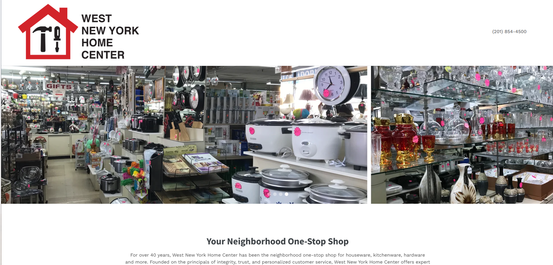
The site has an old-school feel, as many brochure sites do.
2. The local service site
The local service site is for businesses, like plumbers, dental practices, or law firms, serving a defined area, and its goal is to make clients contact them.
For this to happen, the local service website visitors need to know if the service covers their area, trust them, and, of course, have their contact details (phone number, email, a contact form).
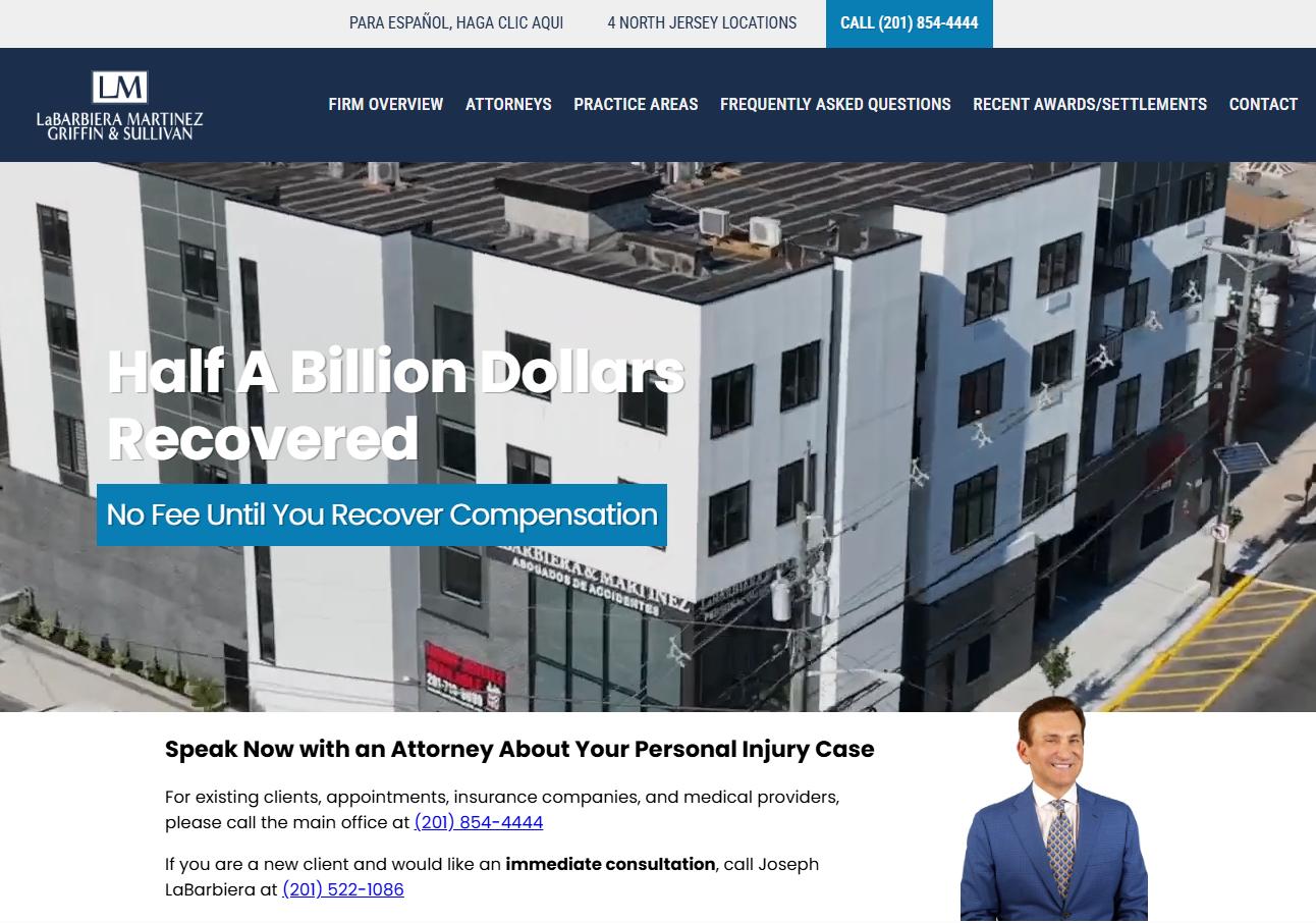
LaBarbiera, Martinez, Griffin & Sullivan, a personal injury firm in North Bergen, does all of that. Its homepage sections include:
- A hero leading with a result, “Half A Billion Dollars Recovered”, and a risk reversal, “No Fee Until You Recover Compensation”
- A call-now block with phone numbers
- Proof: four settlement figures, each with a one-line description of the case
- Why-choose-us copy and a free-consultation button
- A five-star client review (more proof)
- Service tiles linking to dedicated pages (SEO-friendly)
- Accreditation badges (even more proof)
- A contact form alongside every office address.
3. The online store
The online store is for anyone selling products, from small one-person operations through multinational retailers with huge catalogs, and its main objective is to drive sales.
To achieve this, a good online store site lets customers find the right product easily, provides all necessary information about product specs, shipping, and returns, and guides them through checkout without unnecessary friction.
Best Buy is a good example of the online store format. Its homepage features:
- A header with a search bar, a store finder, and a cart
- A hero promoting a single product, with a Shop now button
- Blocks routing visitors to product categories or specific products (new releases, seasonal sales, best-selling, top-rated, trending deals, top deals, most viewed in the past 24 hours, etc)
- Benefits section (More value for money, reliable support, fast delivery)
- A footer with support, delivery, and returns links.
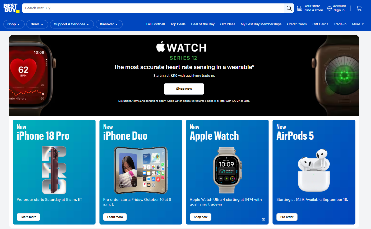
That’s just the homepage. Other online store pages follow different structures:
- A category page features a grid or a list of products and filters,
- A product page has a hero with the product name, price, and review rating, a benefit-focused description, spec list, shipping & returns policy, customer reviews, and related product recommendations.
- A checkout page has the order summary, payment options, shipping and billing address form, and security and social proof cues.
4. The online service
The online service page format is for SaaS and subscription services, like a meal delivery service. Its main objective is to convert visitors into trial signups, demo bookings, or paid subscribers.
To deliver on their goals, online service websites need copy that explains product benefits and persuades visitors to try it, social proof to build trust, and an easy sign-up flow.
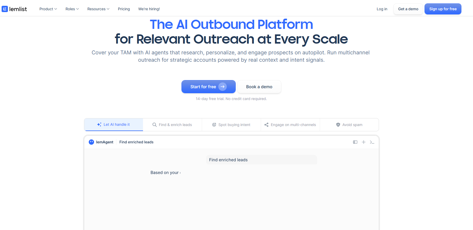
Lemlist, an outbound sales platform, runs this online service format at full length. Its homepage has:
- A header with the product menu, pricing, a demo request, and a sign-up button
- A hero explaining what the product does and its benefits with two CTAs side by side
- A tabbed product demo
- Social proof blocks (customer logos and a count of the teams using it, G2 reviews, customer stories)
- Capability sections, each with a product screenshot and its own learn-more link
- FAQs
- A closing block with call-to-action buttons
5. The consultative site
The consultative site is for businesses with long sales cycles, usually B2B, like consultancies, agencies, or enterprise software vendors. Its main purpose is to prepare the ground for the sales conversation, which is often months away.
To do this, it needs content that guides the reader through the funnel, for example, general guides that help them understand their problem or comparison articles showing how the solution stacks up against competitors.
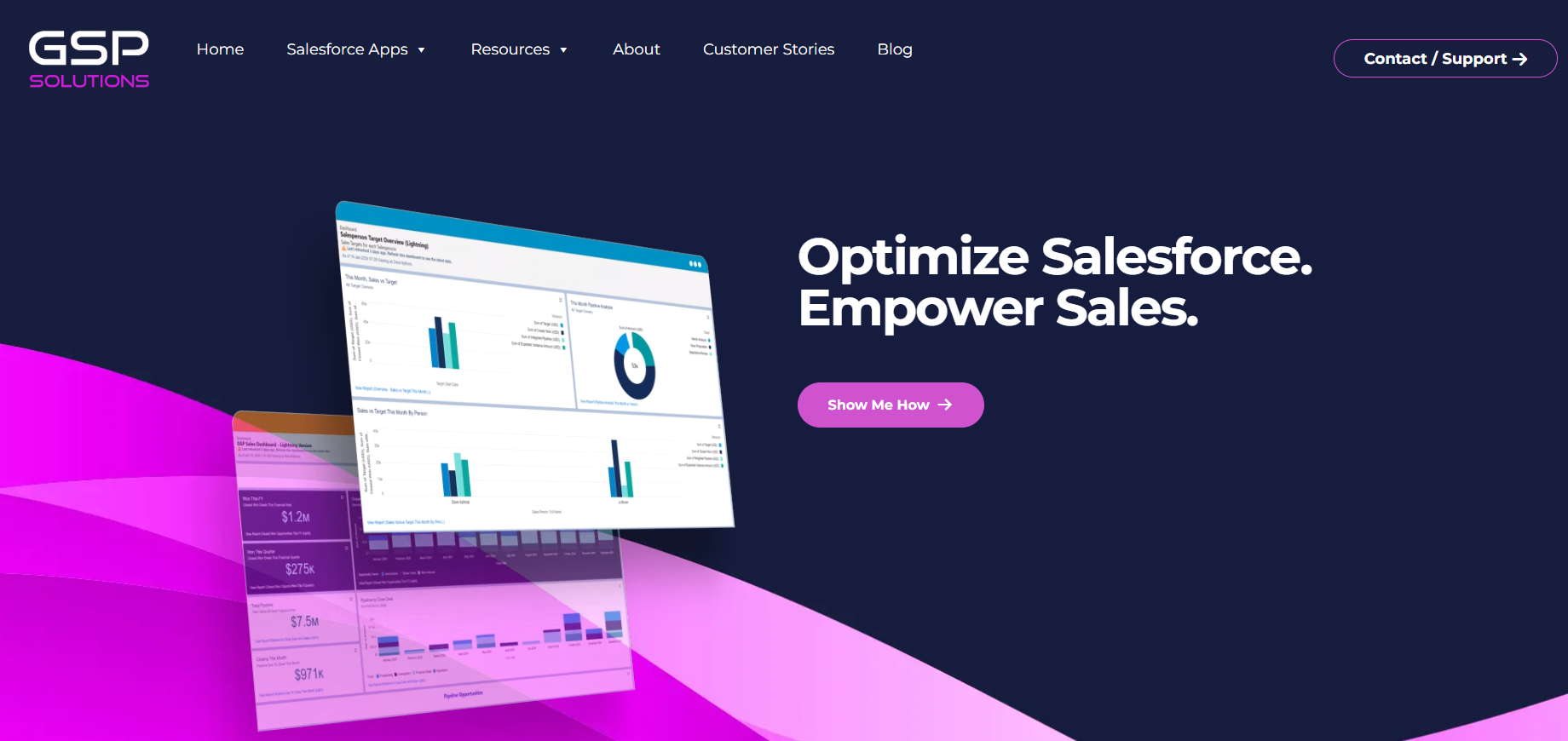
The consultative format works well for GSP Solutions, a consultancy that helps sales teams get more value out of Salesforce.
Its homepage features:
- A hero with product screenshots, a benefit-driven headline, and a CTA button
- App cards, each opening with the problem it solves
- A wall of customer logos
- How we work block
- Links to their free sales dashboard and eBook (CTA and email capture form)
- Customer testimonials and reviews from the Salesforce marketplace
There is no signup or pricing. The website either captures your email, so they can nurture you over time, or takes you straight to the call if you’re ready to move on.
6. The publication site
The publication site is the website format of choice for news sites, blogs, newsletters, or UGC platforms like Medium. So all businesses that make their money from keeping readers engaged with their long-form content. Its primary purpose is to make you read the next piece.
For this to happen, it needs navigation and search that make it easy to find relevant content, a subscription mechanism, and a route from every article to the next one worth reading.
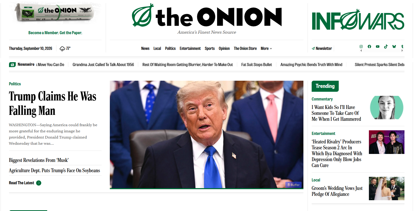
The Onion is one of my favorite examples of the publication format.
Its homepage features:
- A masthead carrying the date, the weather, and a prompt to subscribe
- A category menu: news, local, politics, entertainment, sports, opinion, store
- A newswire ticker of one-line headlines
- A lead story with a photograph, two secondary headlines beneath it, and a link to the latest
- Recent videos block
- A newsletter signup in a block you cannot miss
- Category sections, each with a lead story, two secondaries, and a more-from-this-category link
- A two-column feed of everything else
- A right-hand rail running in parallel the whole way down: trending, opinion, the latest, and repeated prompts to buy the paper.
A publication earns from attention, so the page keeps giving you something else to read or watch.
7. The portfolio site
The portfolio site is for people who need to showcase their work, like photographers, graphic designers, or writers. Its main goal is to demonstrate experience and expertise and drive client enquiries.
Portfolio sites do this by featuring high-quality work samples, removing distractions, and offering a way to get in touch.
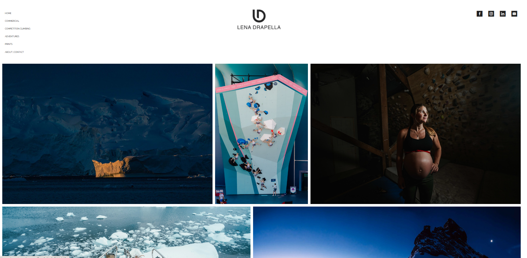
Lena Drapella, an outdoor and climbing photographer, strips the format back as far as it goes. Her homepage includes only two blocks:
- A simple, unobtrusive menu down the left side, her name and logo in the middle, and four social icons on the right
- A mosaic photo gallery. The pictures start immediately under the menu and carry on to the bottom.
That is the whole page.
How To Choose the Right Format For Your Business
When choosing your website format, decide the one action you want your visitors to take.
Visit a high street shop or nightclub? Go with the brochure format. Subscribe to the free trial of your SaaS tool? The online service is the one. Buy a product? An online store is the obvious choice.
What if your website must serve multiple goals?
Build your homepage around the primary one and create dedicated product or service pages for each additional one.
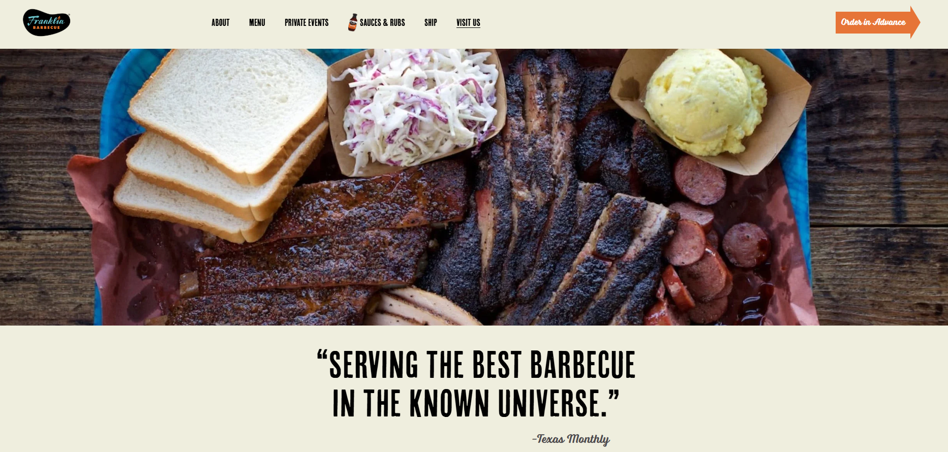
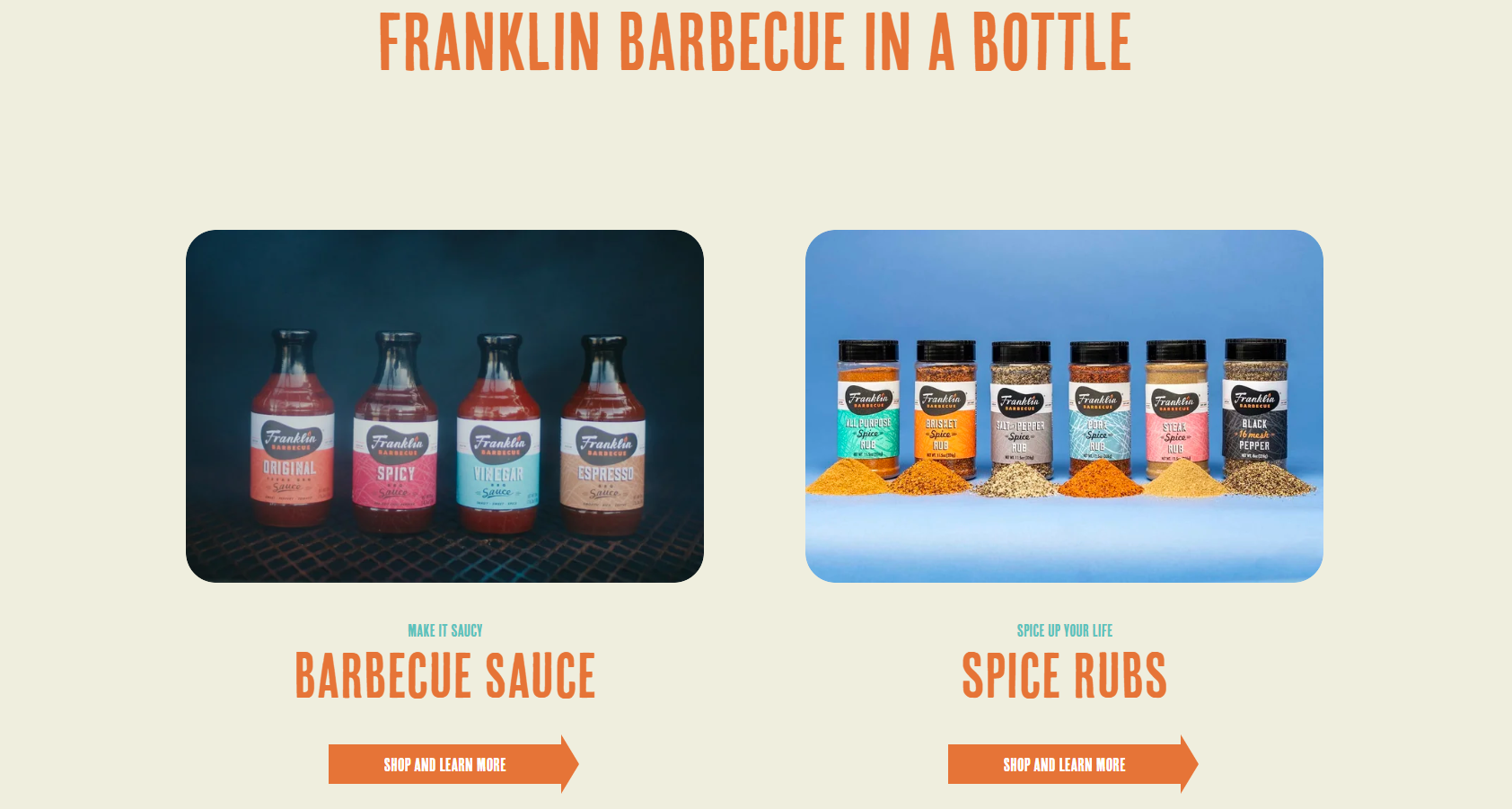
Franklin Barbecue is a good example. Its primary website format is brochure because its goal is to attract customers to the restaurant. But it also lets people book the venue for private events, book their food in advance, and purchase their sauces and gift cards.
Each of these has a dedicated web page formatted to maximize its impact.
How To Know Your Website Format Is Working
To understand if your website format is working, track how well it drives the desired action. Does it attract enough customers to your cafe? If you’re a plumber, do you get enough phone enquiries?
Tracking it online, for example, for your SaaS business or store, is easy with web and conversion analytics. They tell you how many people land on your site, how many bounce, how many drop off later on, and how many complete the desired action.
Conversions are a lagging indicator, though. They tell you if the website does its job but not always whether the format is suitable. In fact, the format may be suitable, but the website still fail to convert because of your product, its price, or perceived value.
For a better understanding, dig deeper with user behavior analytics:
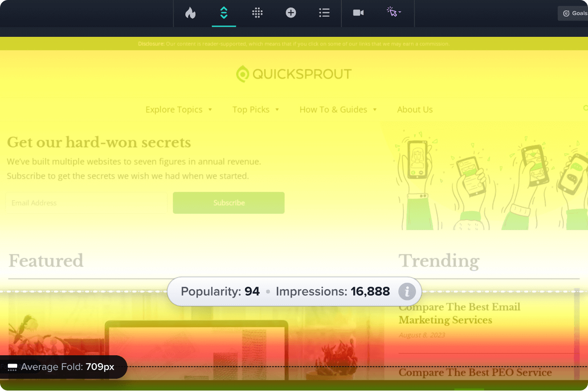
- Scroll maps: show how far visitors scroll, which sections they spend most time on, and whether they even see the section that drives conversions.
- Click maps: visualize which page elements they engage with.
- Session recordings: illustrate how individual visitors navigate the page (scroll, hovers), what causes frustration (dead and rage clicks), and what confuses them.
If you would like to learn how Crazy Egg can help you audit your website format, improve its usability and UX, and drive conversions, start your 30-day free trial today!