A good landing page converts your visitors into leads all while delighting them.
Today, I’m going to teach you my best landing page best practices so you can attract more prospects and convert more customers.
What Exactly Is Landing Page Optimization?
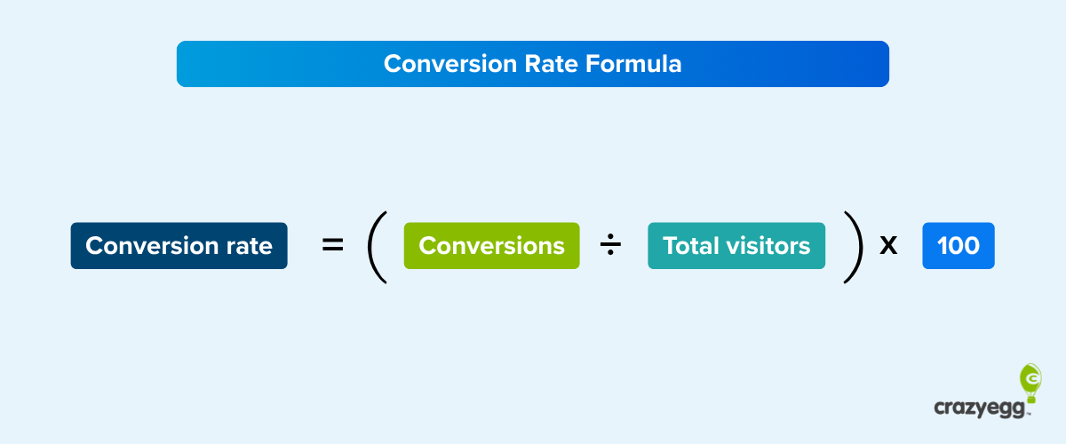
Landing page optimization refers to the process of enhancing or improving each element on your landing page to increase conversions. Instead of redesigning the entire page based solely on a hunch, you use data and anecdotal evidence.
The best part? You can collect information before your landing page ever goes live. Surveying your audience, for instance, will help you better understand what they expect and like.
However, you won’t create the perfect landing page from day one. Instead, you push the page live, then make tweaks as you analyze the data and observe your conversion rate.
Before Optimizing Landing Pages, Identify Potential Problems
Marketers I’ve worked with in the past have followed unhelpful landing page optimization strategies. They know something isn’t working, so they change everything.
It’s like that old saying about throwing noodles against a wall to see which ones stick and which fall to the floor.
That’s not how you approach landing page optimization. First, you identify specific problems that contribute to low conversion rates so you can change them.
A heat map can show you where people are clicking on your landing page. Do they ignore your call to action? Are they focused on a relatively unimportant element, such as a stock photo?

In the above image, you can see that the greatest activity occurs on the farthest right CTA. If this was your landing page, you’d put your most important element there to see if it gets more clicks.
Track your website visitor behavior to see what isn’t working
Heat maps aren’t the only visual data reports that can prove effective for landing page optimization. Scroll maps, confetti maps, overlay reports, and list reports all provide valuable information.
A scroll map shows where scrolling activity occurs on the page. If you see lots of white or blue on the map, people have either left the page or scrolled quickly past that section. Red, orange, and yellow areas indicate that people have stopped to read or look.

A confetti report shows you where individual clicks have occurred on the page, while overlay and list reports provide you with click percentages on various page elements and individual numerical data, respectively.
14 Landing Page Best Practices to Improve Your Conversions
If you want to improve your website conversion rates, approach landing page optimization using best practices and strong data. The process starts the minute you begin designing the page, but it lasts long after the page goes live.
Think of it as building a product. You don’t design the perfect prototype on day one. Instead, you might create 100 prototypes before you’ve perfected the product.
Landing pages work the same way. Just like products, landing pages must appeal to your target audience, compel them to act, and meet their expectations.
1. Make your offer clear
When you first start planning your optimization strategy, think about how you can make the customer experience positive emotions. You want them to feel smart, appreciated, inspired, and excited.
Start by thinking about your customer’s specific goal, and turn that goal into a headline. Elegant Themes does this well.

The word “empower” in this context makes the customer want to feel the same thing.
2. Simplify your landing page
A very simple landing page might seem counterintuitive, but it gets rid of the visual clutter. You want your website visitors to focus on the prize: your call to action.
Dropbox is consistently one of my favorite examples. The company creates awesome landing pages that communicate volumes without many words.
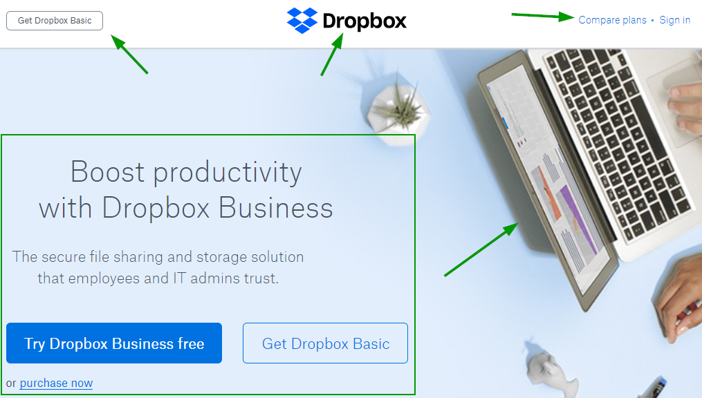
On this page, there are just five main elements above the fold, and three of them are small enough to fit in a navigation bar space. The fourth provides a pleasing but subtle visual, and the last focuses on the CTA.
3. Try contrasting colors
The best landing pages I’ve ever seen have made great use of contrast, but in color and clarity. In this example from Starbucks, you can’t ignore the CTA.

Even though the “Join Now” button reflects the star’s color in the left-side logo, it’s far more pronounced and clear. The textured black background makes the headline and CTA pop. Plus, there’s lots of negative space between the logo and the rest of the elements.
4. Keep the important part above the fold
The term “above the fold” traces back to the newspaper. The most enticing stories were placed on the first page above the traditional newspaper fold so customers would see the headlines and want to buy the paper.
You can do the same thing by keeping your landing page elements above the digital fold — the point at which the user must scroll to get more information.This is more difficult than ever now that more people are using smartphones and tablets.
The good news is you can use a scroll map to easily identify the location of the average fold on different devices and still keep your headline, a brief sentence or two of body copy, and a CTA front and center.
5. Use scarcity techniques
There’s a reason why “limited time” and “limited quantities” are among the most common marketing phrases. Scarcity compels your landing page visitors to act now because they know they might miss out if they wait.
Even big box stores use it. When buying a product from Target the other day, I knew I wanted to pick it up at my local store. Upon checking availability, I saw this:

The words “only 2 left” made me want to order an Uber right away and get to the store before anyone else could.
Do the same on your own website by activating a limited-time discount or offering a lead magnet, such as a live webinar, that won’t ever occur again.
A countdown timer can add a visual element to scarcity. It tells your visitors how long they have to act on an offer.
6. Keep your call-to-action buttons straightforward
A call-to-action button shouldn’t stress out or confuse the reader. Make your offer clear, concise, and obvious.
You’ll notice that, in the screenshots I’ve shared above, companies stay away from fancy language or complex offers. Phrases include:
- Join to Download
- Try Dropbox Business Free
- Join Now
- Pick Up Here
Simple, right? And very effective.
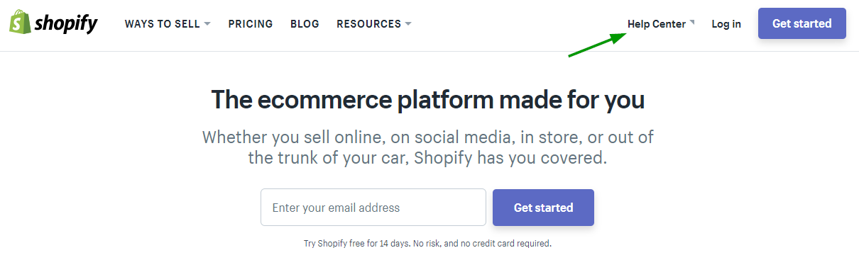
7. Add contact information
You can provide your website visitors with contact information in lots of different ways. You can put your phone number or email address on your landing page, or you can use a contact form. Other companies, such as Shopify, include links to their help centers.
Customers know by now that they can find contact information, answers to frequently asked questions, and tutorials in help centers.
8. Try different headlines and copy
Text still matters in an image- and video-focused world. People will read what you write, so make sure it resonates with your target audience.
Try A/B testing different headlines on your landing page. You can also change up the body copy and run A/B tests to see how those elements perform. If you feel stuck and are looking for new directions, try out an AI paragraph rewriter. It’s a great way to get copy test variants and brainstorm new directions.
9. Be consistent
While on-brand messaging matters now more than ever, visual consistency can also make a huge difference in conversion rates.
Let’s say you place a Facebook Ad that takes people to your landing page. You want the text, imagery, and other elements of your ad to be reflected in the landing page.
They should look similar visually and present the same offer. Otherwise, your potential customer will be confused or irritated.
10. Add testimonials to help convert undecided users
I’m a big fan of social proof. I want people to know that other businesses have used my products and services. Not only that, but I want to communicate that I’ve helped them achieve fantastic results.
Testimonials are among the best ways to do this. If you can convince your customers to create a video testimonial, you’ll have an edge on the competition. Quotes work well, too, as long as you use the customer’s full name — and ideally a headshot.
11. Try different form lengths
Some marketers believe that only incredibly short forms work well. They say, “Only ask for the email address. Anything more is too much.”
But that’s not always true.
If you want to qualify leads for an expensive product or service, a longer form can prove more effective. You might get fewer leads, but those leads will be more qualified.
For instance, asking about the potential customer’s budget for a web design business can save you tons of time. A customer looking for a $500 design probably won’t utilize your service if your minimum package starts at $20,000.
12. Optimize your landing page for SEO
People find landing pages via organic search all the time. Maybe one of your landing pages is your home page, for instance, which means that it should — at the very least — come up if someone searches for your company’s name.
You can also rank for industry-related keywords. If you search Google for “heat map tool,” for instance, Crazy Egg is the first organic result:

Use tools like Ubersuggest to find the best keywords for your landing page. Incorporate those keywords into headlines, body text, image alt text, and more.
13. Try an exit popup
An exit popup appears on your landing page screen if a visitor attempts to leave the page. It’s another opportunity to create a conversion.
They’re less intrusive than popups that appear as soon as a visitor arrives, or simply while he or she is looking around.
Use a combination of compelling visual imagery, a strong headline and CTA text to get users to click. Try incentivizing the exit popup with a special discount or other offer.
Using a tool like Hello Bar, you can not only create exit popups for individual pages on your site, but also A/B test variants. You’ll get lots of useful data as well as a way to snag visitors who decide to hang around because of your well-timed offer.
14. Keep A/B testing everything
The more A/B tests you run, the more accurate your data becomes. Each A/B test should include a single change to one variant, such as your CTA.
If you change multiple elements, you won’t know which one impacted the difference in conversions between the two variants.
After you’ve collected data and gotten to know your audience, you can apply what you learned to a redesign and verify that it improved your conversion rate via A/B testing.
What Landing Page Optimization Tools You Should Use
Crazy Egg offers extensive landing page optimization tools to help you better understand user behavior. A recording, for instance, lets you virtually look over someone’s shoulder as he or she navigates the page.
Watch mouse movements, clicks, and more to see what captures their interest, what turns them off, and even see them entering information in form fields.
Why Is My Landing Page Not Converting?
Landing pages fail to convert for many reasons, but the culprit often lies in a misunderstanding of what the prospect wants. If you can’t anticipate your website visitors’ desires, needs, or expectations, conversion rates will suffer.
Additional mistakes I’ve seen when working with other businesses include:
- Unintuitive design
- Poor headlines
- Disconnections between ad copy and landing page copy
- Unrecognizable calls to action (CTAs)
- Distractions from the landing page’s primary purpose
I’ll explore each of these — and more — in depth later on, but understand that you won’t know why your landing page doesn’t convert until you start collecting data. I’ll show you how in a minute.
What Is a Good Conversion Rate for Landing Pages?
The best landing pages convert at rates of up to 27.4 percent. However, the median ranges fall much lower, with most industries experiencing between 2 and 6 percent conversion rates.
When it comes to landing pages, the true measure of success is improvement. If your conversion rates stay the same month after month, you’re not collecting data and using it to improve your landing pages.
You should see a strong correlation between web traffic and conversion rates. If your web traffic grows, you should convert more visitors — but it doesn’t always happen that way.
Check out this video to learn why the quality of your traffic matters, not just the quantity.
But what if you’re getting high-quality traffic from Google search, but you’re still not seeing conversions?
A negative correlation between traffic and conversions means something’s wrong with your landing page, your offer, or your product.
- Landing page: The design, framework, imagery, or other qualities of your landing page turns off readers for some reason.
- Offer: The “hook” you’re using to get readers to convert doesn’t resonate with your audience.
- Product: The product you’re selling isn’t sufficiently desirable to convince people to buy.
Figuring out the problem will help with landing page optimization.
Conclusion
The 14 landing page best practices for boosting your conversion rates are:
- Plan your optimization strategy in advance
- Simplify your landing page design
- Use contrasting colors
- Keep the important elements above the fold
- Use scarcity techniques
- Make your call-to-action buttons clear and simple
- Add contact information
- Test different headlines and copy
- Be consistent
- Add testimonials
- Try different form lengths
- Optimize landing pages for SEO
- Try an exit popup
- Keep A/B testing everything
That blueprint will help you figure out what works for your prospects and leads so you can convert them on your offers.
Don’t forget that basing your website design changes on real user data can make conversion rates soar. Use visual data reports and recordings whenever possible to collect more information about your website visitors.
With those strategies in place, you’re well positioned to conquer your competition.