This conversion optimization rate (CRO) checklist is designed to help absolutely anyone audit their site and make the most out of their traffic.
I did not write this expecting every reader to be part of a dedicated CRO team.
If you are looking to drive revenue at your business by optimizing your website conversion rate, this post is for you.
This 19-item CRO checklist covers all of the dependable levers you can use to influence user decisions on your site. More signups, demos, sales, customers — those are the goals. If the low-hanging fruit is gone and you are searching for any lever to increase sales, you won’t be disappointed.
At the very least, you can use this list to check and make sure that your design and content aren’t working against your goals.
CRO Checklist Strategy and Tools
For CRO, pick one goal to optimize for. There’s no methodical way to optimize for multiple conversion rate goals at the same time.
CRO goals are focused on increasing the percentage of users who take a desired action, like:
- Make a purchase
- Sign up for a newsletter
- Share contact information
- Request a demo or quote
- Complete a survey
- Take a free trial
- Submit a form
As you make your way through the conversion optimization rate checklist, the goal you pick is your north star. Every tactical decision you make should be in service of increasing the target conversion rate.
That said, you should track all the metrics you care about to ensure that optimizing conversion rate for one thing hasn’t torpedoed another key metric on your website.
So before you start, make sure that goals and conversion tracking tools are set up correctly. This is absolutely vital for making data-backed decisions and sifting out all the noise that comes with website traffic.
Take Our Conversion Rate Optimization Checklist
Copy the complete CRO checklist. It’s yours. Paste it in a doc, spreadsheet, and then get to work on your site.
- Users can convert above the fold, on any device
- Headlines are compelling and aligned with your audience
- Social proof is placed strategically and validates claims
- Trust signals are prominently displayed
- Page load speed is two seconds or less
- Call to action (CTA) buttons are benefit-driven and noticeable
- Content is scannable with predictable formatting
- Key actions are easy to find and tap on any screen size
- Form fields are minimized to essential inputs only
- Navigation is intuitive, with a clear hierarchy and menu structure
- FAQs reduce purchase hesitation
- Images, GIFs and videos showcase the product or service
- Images are optimized and responsive
- Guest checkout is available and easy to find
- Multiple payment options are offered
- Internal linking has strategic and editorial value
- All external links open in a new tab
- Scarcity and urgency tactics are used persuasively
- About Us page reinforces your brand’s credibility
If you’re short on time, start with the most direct CRO changes. I listed these first. These are high-impact criteria that 99.99% of people want their site to satisfy.
Later checklist items cover conversion rate optimization strategies for ecommerce websites and specifically, along with broader CRO opportunities that can reinforce positive results.
This is an ongoing process, so the faster you can iterate, the faster you can find what really moves the needle. Consider A/B testing significant changes to get the best possible data about how your decisions are really impacting the conversion rate.
Using Our CRO Checklist: Guided Walkthrough
Each checklist item focuses on a particular page element and how to tell whether you have optimized it for converting users.
You’ll find explanations, tips, examples, and tactics to help you implement these changes on your own site.
1. Users can convert above the fold, on any device
Every single brand that cares about converting visitors puts one (if not more) calls to action “above the fold”, which refers to the portion of the site that’s visible as soon as people get there.
Technically, the above the fold section is around 600 pixels high, though what someone sees above the fold ultimately depends on the device they are using.
Make sure your offer(s) are safely within that territory. WordPress and other website builders allow you to preview pages on mobile. You can also always get a rough preview for different device sizes using the Chrome inspect tool or Responsive Design Mode in Safari.
This is straightforward. Users on a phone, tablet, or desktop should all see an offer having to scroll.
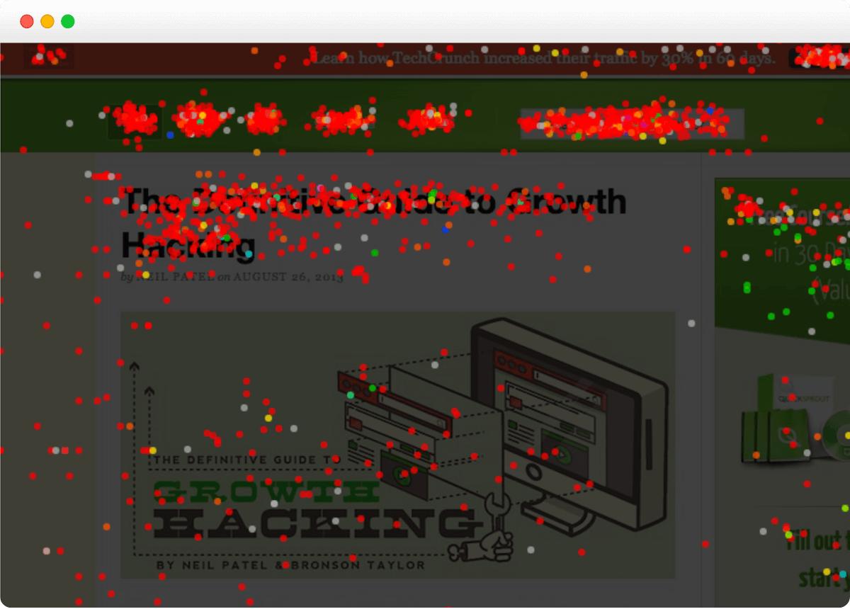
Why? Most users do not scroll down very far, if at all, which means they won’t even see the desired action you want them to complete. If you want to see how far users scroll down on your website, you can use website heatmaps to visualize data as a scroll map.
The Grammarly homepage is provides a conventional example of how to get three CTA’s above the fold in a fairly understated way:

The first two buttons are large, distinct from the other elements on the page, and placed below the headline and subhead, which is where we expect to find them.
The first is an attractively worded, low-stakes commitment offer, “Sign Up It’s Free →”, and the other is an even lower-stakes offer to sign up using your Google credentials.
The third button is located in the navigation bar, which is sticky, meaning that users will continue to see the offer “Get Grammarly It’s Free→” even as they scroll to other parts of the page.
If you are really trying to maximize conversion rate, I would follow what Grammarly (and millions of other websites) are doing, and put 2-3 conversion opportunities above the fold.
2. Headlines are compelling and aligned with your audience
Writing good headlines is hard, but as the first text that a person reads on your site, they could not be more important.
There is no secret to cranking out headlines, you have to understand your target audience — what they care about, what they hate, what they need, how they want to be seen — and angle your writing accordingly.
That said, headline writing is a well-trodden path. Here’s a quick five-point headline check you can use to make sure your headline is doing as much as it could be to drive conversion rate:
- Are you using power words or forgettable ones?
- Are you tapping into audience emotions?
- Is the value proposition clear?
- Does it create urgency?
- Does the rest of the post follow naturally from the headline?
I mention this last point because you may need to update the rest of the copy on the page if you make significant changes to the headline.
You’ll see what works over time, especially if you start headline testing and digging into the data. And if you need inspiration on headline writing, there are a handful of terrific copywriting books that have stood the test of time, and proven headline formulas that can be adapted to any scenario.
3. Social proof is placed strategically and validates claims
Foregrounding social proof at key moments on your website can increase conversions by making your brand seem safer, more desirable, or qualified. Some common examples:
- Customer reviews
- Testimonials from real customers
- Client logos
- Follower count
- User-Generated Content (UGC)
- Tagged posts on social media
- Star-ratings
- Media mentions
More people will convert if they think that your brand is credible, and they will believe that if they can see that other buyers have had a good experience with you.
From a CRO perspective, you are looking to maximize the positive impact these assets can have on signups and sales. Do this by including social proof all over your site. At a minimum, I would include social proof assets:
- Above the fold on any landing page
- Home page
- About Us page
- All checkout pages
- Near all CTAs
- Sprinkled throughout the page
Getting social proof is as simple as asking your customers for a review, a 20-word blurb, or a post with a hashtag on social media. If recognizable brands or respected figures use your product, get their permission to mention them or use their company logo.
You can run email or SMS campaigns specifically to fill your social proof arsenal by offering incentives for following up.
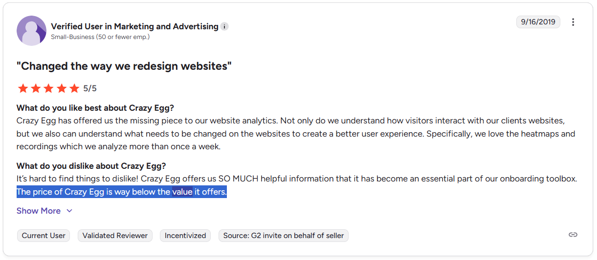
Be strategic about who you ask, and craft questions carefully, as you are going to want to present social proof as a polished asset. This customer testimonial from Ramp is a good target to shoot for:

Ramp is a relatively new corporate spend management platform. It’s going to be a headache for people to switch to a new platform, so hearing from a VP Controller at Boys and Girls Clubs of America that Ramp saves them and their colleagues time is a reassuring testimonial.
With both long-form content and a video, Ramp has optimized this asset to appeal to a broad range of customers within their specific audience of potential buyers.
4. Trust signals are prominently displayed
Trust signals are a way to show institutional credibility, as opposed to crowd-based credibility of social proof. They are endorsements by an organization that is viewed as reputable by your target audience.
Displaying these signals throughout your site reminds people that reputable third-parties have endorsed your brand in some way. Common trust signals include:
- Industry credentials, certifications, and badges
- Secure payment icons
- Third-party ratings
- Data privacy assurances
- Money-back guarantees
- Years of operation
- Reassuring business metrics
A giant statistics box that says “1,000+ happy customers” or “8 years in business” is going to make people feel better about taking the next step with you.
Be sure to place trust signals where they reinforce key actions. For example, put certifications and third-party ratings above the fold to establish credibility early. These trust signals have weight with people who don’t know your brand yet.
Later in the customer journey, trust signals can help reduce hesitation and ease last-minute concerns. This includes placing security badges and money-back guarantees near CTAs, or highlighting secure payment icons on checkout pages.
5. Page load speed is two seconds or less
The goal here is to make the experience of visiting a site and moving from page to page as fast as possible. Why? People hate slow sites, they are going to disengage, and you are going to lose conversions.
Do you have to make your site lightning fast? No, though faster is usually always better.
Anything under 2 seconds is probably fast enough. If you are below that threshold, your page speed is probably not hurting conversions, and there’s no guarantee that bringing page speed lower will increase them.
If you are in the 3-4 second load time range, this is worth working on, and there are lots of ways to speed up your website.
If your site is taking more than 4 seconds to load, then I would prioritize bringing that number down. Load times above this threshold are just asking users to bounce.
6. Call-to-action (CTA) buttons are benefit-driven and noticeable
Users should have no issue spotting CTA buttons. Everything in your page design should naturally guide the eye toward them. All of the copywriting should intensify a user’s desire to click the button.
Here is the extensively tested homepage of Crazy Egg, which is a great example of making a CTA noticeable without trying to grab attention.

The button is large and it’s a light blue color that appears nowhere else in the field of view. When your cursor hovers over the button, a subtle animation brightens the button color.
The signup field is white, set against a dark box, which is set against a light background. There’s no loud neon colors, blinking lights, or giant arrows, yet it’s impossible for your eye not to be drawn to the signup box.
You might also notice that the box contains powerful social proof (400k websites use Crazy Egg, and brands like Intuit and Dell trust them) and highlights the 30-day FREE trial, which people can cancel anytime.
All good website builders give you a lot of control over the button color, shape, size, and text. Experiment to figure out which colors and shapes perform best. In terms of button design, I think anything goes as long as it is prominently featured and visually distinct from every other element on the page.
The placement of CTAs is really important, but not far behind is button text. See if you can improve on the default button text like “Try Now” or “Read More”. I found a few creative call to action examples that go beyond the bland.
7. Content is scannable with predictable formatting
Look at the way content is laid out on any high-ranking website. Without exception, these pages are broken down into visually digestible sections that make it easy for people to pick and choose what they read.
Here are a few quick checks you can do to make sure that your content is scannable:
- Are section headings and subheadings clear?
- Is information organized logically?
- Are lists, tables, images, and white space used to break up large sections of text?
- Are CTAs visually distinct from other elements?
- Is the page format and styling consistent throughout?
The goal is to make it effortless for visitors to absorb information and take the next step.
Dense walls of text are rarely helpful. Neither are confusing page hierarchies. Addressing these issues is an easy way to optimize conversion rate, and you have thousands of high-performing websites to study.
8. Key actions are easy to find and tap on any screen size
This is a best practice of UX and web design — as it relates to CRO, what you are trying to do is ensure that you aren’t losing any potential customers due to clunky design on mobile.
Some of the tactics that you can use to meet this goal include:
- Sticky navigation
- Large, tappable buttons
- Limited CTA options
- Consistent CTA placement
- Short, clearly labeled forms
With sticky navigation, menus and cart buttons remain visible while people scroll. It’s a simple thing, but it works a lot of the time. Same with consistent CTA placement — there is no sense in confusing people. Make it as easy as possible for people to know where the buttons are.
Big brands hire expensive firms to make sure their customers can discover new products and decide to buy quickly, on any device.
You can investigate this yourself, manually testing buttons, going through menus, and filling out the forms you expect users to navigate easily. Or you can get a lot deeper into this question using UX testing methods and tools.
9. Form fields are minimized to essential inputs only
If you want to maximize the conversion rate, minimize the information people need to give you in order to fill out a form or complete a purchase.
To max out the conversion rate, aim for 3-5 form fields total. 6-7 fields is acceptable, not great. 8+ fields is going to hurt the conversion rate.
Look for the simple fixes first, such as combining “First Name” and “Last Name” into a single field labeled “Full Name”. Conditional logic can also help in places where it only makes sense to ask particular users to fill out a “Company Name” field.
There are other ways to reduce manual inputs, such as using drop down menus instead of open-ended questions. This lowers the burden on users and decreases errors. Win-win.
10. Navigation is intuitive, with a clear hierarchy and menu structure
People should feel like they know how to get around your site the first time they use it. That’s the goal.
As long as you follow basic principles of good website navigation, you will be 80% of the way (or more) to completing this CRO checklist item. This includes things like:
- Keep the design as simple as possible
- Use familiar website patterns
- Create a clear, intuitive site structure
- Use simple, logically-organized menus
- Create visual separation with whitespace
- Enable breadcrumbs if you have lots of products or content
- Use icons, arrows, or animations as visual cues
Ideally, you can make website navigation feel effortless, which keeps users engaged. When it’s easy for visitors to find what they need, they’re more likely to take action and convert. Consider the alternative where users struggle to find their way around.
11. FAQs reduce purchase hesitation
From a CRO perspective, you can use FAQ resources to do more than just answer common questions people have — ideally, writing speaks back to the concerns of potential buyers and reframes their doubts.
Like a salesperson countering objections, your FAQ page can raise and answer questions that help people feel safer, more confident, more informed, and more likely to convert.
Check out this example from Gusto, the uber-friendly, lightweight payroll service. You can see how both the spirit of the brand and its value proposition are on full display in their pricing page FAQs:

Anyone who has managed payroll knows that providers typically lock companies into long contracts and upcharge for everything. That’s one of the big audience fears. Look how Gusto has framed these questions to speak directly to this potential objection.
“Do I have to sign a long-term contract?”
“Nope, Gusto is month-to-month, cancel anytime”
It’s also on-brand, approachable language that differentiates Gusto from the stodgy, heavyweight payroll players. This is memorable, even for a potential buyer who has five pricing page tabs open.
From a customer service perspective, FAQs should help users help themselves. Definitely do that — but also look for potential CRO opportunities where you can ask/answer questions in a way that sways buyers and positively positions your brand.
12. Images, GIFs, and videos showcase the product or service
Whether it is a pair of shoes or a new SaaS subscription, potential customers are eager to see what they are buying.
You can decrease uncertainty and purchase hesitation with high-quality visuals, like:
- Before/After images
- 360-degree views of products
- Images showing the product in use
- Short videos showing the product in use
- Animations that explain the service
- Screen captures of software handling a real-world task
To select appropriate visuals and maximize their effectiveness, consider what will play best with your target audience. What seems to be working for your competitors, visually? Where are the gaps where you can provide a more engaging, persuasive visual asset?
When in doubt, show images of your target audience. Consider this landing page from eCapital, an asset-based finance lender. It’s not exactly a service category with rich opportunities for visuals, but this landing page is more appealing because it showcases their target audience and the text sells the dream, “Unlock the cash in your outstanding invoices.”

Think of every visual element as an opportunity to add layers of meaning to the copywriting that’s selling the website visitor. In the example above, the image evokes the emotion of someone waiting on payment (never a fun spot to be in), and people searching for “invoice factoring” can probably relate.
13. Images are optimized and responsive
This is an important best practice for keeping your site fast as bulky images that slow down page loads are frustrating for users and flagged by search-engines.
But it is also important for making your website look polished across all devices — this is an important part of building credibility with your audience.
Using the appropriate file format (SVG for logos, for example), sizing images correctly, compressing them to reduce size — all of these actions contribute to faster load times and a better user experience. If an image looks terrible on mobile, for example, half the traffic or more on your site will think your brand is sloppy.
Learning how to optimize images for websites is not hard at all, though it can get a little tedious. I highly recommend putting guidance together for whoever is creating images so images are always optimized ahead of publication.
14. Guest checkout is available and easy to find
One of the most well-known ways to increase conversion rate on ecommerce sites is to enable guest checkout. This allows people to make purchases without having to create an account.
For some businesses, this isn’t an option — a SaaS product requires an account and regulated industries cannot even entertain this idea — but where it is possible, this tactic is as close to a sure thing as conversion rate boosts go.
The reason this works is obvious: guest checkout lowers the barrier to making a purchase, saving people a few steps and having to share personal information.
You can start to see the drawbacks of this tactic — lost opportunity to build loyalty with a customer or learn anything about them. But if you are really trying to minimize friction in the buying process, guest checkout will work.
15. Multiple payment options are offered
This is a simple way to make it easier for a larger segment of people to shop on your site.
Someone really has to want what you have in order to sign up for a new payment platform in order to buy from you. That’s just a huge hurdle that is going to cost conversions.
I’d inform customers of which payment options you support early and often. At the start of the checkout process, for sure, but also on your site near buy buttons.
16. Internal linking has strategic and editorial value
Internal links to another page on your site should:
- Connect users with related resources on your site.
- Funnel traffic towards high-converting pages.
Every single internal link should accomplish both of these things. It should only offer relevant resources to users that have practical value. I hate useless links that are unrelated to what I’m reading, or misleading links that take me somewhere unexpected.
At the same time, you want to maximize the potential that someone who is clicking links through to other pages on your site will hit your high-value pages. On most websites, a handful of pages drive most of the conversions. Steering users to those pages via relevant links is part of every content marketing strategy that actually converts.
I’m not saying every link has to be to your signup page — no need to get sleazy. Look at any high-performing site, though. You will find plenty of elegant ways that content teams have sprinkled links to high-value pages across their site, often in callout boxes or the sidebar.
Brands looking to convert users almost always have an offer in view with an attractive link to click.
17. All external links open in a new tab
This is a very straightforward checklist item. Whenever someone clicks a link that takes them away from your site, you should set it to open in a new tab.
If you don’t, then any user who clicked the link is off of your site. In order to see a conversion now, you are counting on them to navigate back or (even more unlikely) remember your brand and re-search your site.
Enforce this criteria across your site and especially on pages where you really care about conversions. It’s an easy leak in your conversion funnel that takes two seconds to patch with almost no downside.
18. Scarcity and urgency tactics are used persuasively.
The conversation rate increases you can find using these tactics lean into people’s FOMO, fear of missing out. If a product is scarce, they might not get it. If the sale ends tonight, they might never see those savings again.
Urgency and scarcity are two of the most commonly used persuasion techniques because they work. You will see these tactics employed on ecommerce sites with countdown clocks ticking away the seconds until the sale ends, or bolded declarations like “ONLY 2 LEFT IN STOCK!”
On the lighter end, you’ve got understated stock counts showing a handful of items left, or static sale ends date that happens to be approaching fast.
If you are not an online store, consider incorporating more urgency in your headlines and copywriting. What is the threat of not buying? What are people missing out on if they don’t act now?
19. About Us page reinforces your brand’s credibility
I think of the About Us page as a giant trust signal. So does Google, their Search Raters, and many human users who want to know who is behind the curtain.
This is an easy way to build credibility with people who don’t know who you are. You do not need to go overboard here, simply let your audience know:
- Who is the team behind the brand?
- What do you do and offer?
- Where are you located?
- How long have you been in business
- What is the company mission?
- What makes the company different?
- How can people get in touch with you?
I would include images of the real people who work there. Headshots of the executive team, a group picture from a company outing — any photos are better than nothing.
There’s a lot more you can add (a whole company history, for example), but from a CRO perspective, you just need to make sure that the About Us page reinforces your credibility with your target audience. Need inspiration? Check out some of the absolute best About Us page examples.