What makes a website beautiful? No, wait. A better question. Why does it matter if it is?
Like dating, too many people are caught up on looks and not enough of us are worried about quality. And in the website world, by quality I mean function. Does the website do what it’s supposed to do and give visitors exactly what they’re looking for?
These are the websites that are designed to make money. Let me give you some examples.
TractorData.com

Tractordata.com is exactly what it says it is: a website dedicated to tractor data. They have data on over 17,000 farm, lawn, and industrial tractors, and the site’s been up for 20 years.
As soon as you get to the homepage, you realize they could care less about visual appeal. This isn’t to say things aren’t organized. The design is just old and basic like it was designed when the internet started.
It’s mostly words on every page and links to loads of data. And the images they do you use seem like they’re a little out of focus and really only used for thumbnails.
If you’re hoping for color, just go to another website. The gray, black, and white color scheme goes perfectly with the old and basic design.
Ultimately, if you’re hoping for something pretty to look at, you’re going to be severely underwhelmed. But if you’re looking for all things tractor data, you’re in the right place.
Why it’s superbly designed to make $:
You’re probably expecting me to say specialized content. Yes, that’s part of the reason why I think this site is designed well to make money. People know what they’re coming to this site for, clear, detailed tractor information, and they like it. The consistent traffic proves this.
I also think this site makes a lot of money because it doesn’t sell anything. Hear me out.
It would be pretty easy to make the transition to an eCommerce store. After getting information about a part they need, it would be convenient for people to buy it right on the site.
But they’ve chosen a specific revenue model, monetizing its traffic through display ads. And I think the ads not competing with an eCommerce store is a good thing. They’ve opted to keep what they provide simple, and it’s working in their favor.

Reddit is a hugely popular social media platform that’s essentially a collection of online forums organized by topic. Users get to share all kinds of content and vote other users’ content up or down, which pushes the most relevant content to the top of feeds.
I love Reddit for its mastery of bringing people from all walks of life together. But its design, not so much.
You log on and are met with an endless feed of random stuff. The posts, comments, discussions, usernames, and topics hit you in the face and it can be visually overwhelming. It lacks the visual polish of other social media platforms, like say Instagram or Facebook.
The color scheme isn’t necessarily ugly, it’s just very basic (black and white with small pops of that red/orange). Also, Reddit’s overall look hasn’t changed much since the platform launched.
Circling back to the “endless feed of random stuff,” the site’s navigation can be super confusing. You’ve got your main feed, but then there are subreddits, community threads, and you can click on individual profiles and see their threads. It’s a lot for newcomers or people who are accustomed to simple navigation structures.
For those who prefer cleaner and more organized layouts that embrace vibrant colors and graphic elements, Reddit isn’t going to fulfill those needs.
Why it’s superbly designed to make $:
Reddit gets millions of views from organic traffic every month. Why? It’s people-centric. It really feels like users run the site, “for the people, by the people.”
Also, as much as people say you should niche down, this site broke that mold. They found a way to cater to a lot of people by allowing them to lead the content aspect of it.
You can get so sucked into the content that you don’t mind the ads, and they’re making a ton of money from them. Nearly any business can advertise on the platform, further securing the money-making part of the site.
Craigslist

Craigslist is a site that allows people to post and browse classified ads, community information, job listings, rental listings, and other forums. The site is amazing from a functionality standpoint. However, the design doesn’t give much and has remained relatively unchanged since the site started.
It’s got such an old-fashioned look compared to modern websites. You’re not going to find images unless they’re in the listings. The site relies heavily on plain text. Its blue and purple color scheme is nearly famous.
There are no banners, no fancy logo, nothing. Compared to websites that are rich with multimedia content, Craigslist is visually plain with a minimal layout and listings presented in a simple, list-style format.
Also, the site looks even worse on a mobile device. It’s like a scaled-down desktop version of the site and almost impossible to navigate on a small screen. For such a big site, I’m always wondering why a responsive web design isn’t a priority.
Why it’s superbly designed to make $:
Craiglist’s categories are so intuitive and straightforward. They’ve organized their content to make sense for the user, despite there being so many different categories that don’t go together.
It only takes a few seconds to find what you want, and you don’t have to subscribe to the site or fill out a questionnaire to get it. The site just works without a whole bunch of unnecessary steps or attempts to sell you something.
The design can be as ugly as it wants to be, as long as I can get in and get out with what I need.
Disk Prices

Disk Prices might be the worst website to look at on this list. Its purpose is simple and practical: give people a list of hard drive deals.
Apparently, the owner of the site was working on building a Network Attached Storage (NAS) system and needed to find multiple affordable hard drives quickly, and decided to turn his efforts to find them into a website for others who might be doing the same.
There’s no homepage introducing anything. There aren’t any other pages. This is a black and white, one-page website that will confuse the heck out of you if you don’t know why you’re there. It’s all text and links, kind of like Craigslist.
When you first get on the site, you’ll probably blink a few times and shield your eyes because it just completely disregards graphic design and visual appeal. But it’s so niched down and fills a real need for the niche, hence why it’s getting thousands of visitors a month despite being an eye sore.
Why it’s superbly designed to make $:
People come to this site because they’re monitoring disk deals. Nothing more, nothing less. It’s laser-focused on meeting the user’s need in this small niche, and it does a really good job at it.
Aside from offering this constantly updated data, it gives you the link to purchase these different hard drives. And the owner did something incredibly smart, he made those links affiliate links. So, he’s raking in a whole lot of passive income without doing a whole lot of work.
The filtering functionality also makes this website superbly designed to make money. He’s put all the filters in plain view on the left hand side, and you can easily find exactly what you’re looking.
Berkshire Hathaway
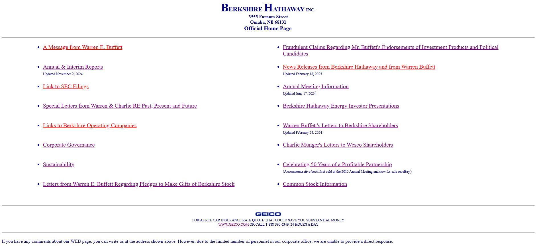
The Berkshire Hathaway site is solely for the company’s shareholders as it provides information and updates to them about the company. People only come to this site because they’re familiar with the company or are a part of it.
It has one of those designs that make you say, “That’s it?” It’s like a directory, all hyperlinks and no images, just an all-around poor look. Even the logo is plain text in Times New Roman font. And when you click on a link, get ready for nothing but more plain text.
It doesn’t feel like a proper web presence in today’s digital landscape. The frills and thrills don’t exist here.
Why it’s superbly designed to make $:
Clearly, this site isn’t a marketing site trying to gather leads. Still, it generates hundreds of thousands of visitors in organic traffic. And it doesn’t make any money directly from the website.
Most of Berkshire Hathaway’s money comes from manufacturing, insurance, and wholesale distribution. And this site does a good job of subtly pointing people in the direction of their sources of income.
For example, they’ve got a link for “A Message From Warren E. Buffet” where he talks about how he doesn’t share stock recommendations but will tell you how to save real money in your personal expenditures with the services of two subsidiaries of Berkshire: GEICO and Borsheim’s.
They also have a page dedicated to sharing links to all of Berkshire’s operating companies.
At the end of the day, Berkshire Hathaway’s site is designed to make money because it’s subtle about the money-making part and instead focuses on sharing the information they need to with stakeholders.
Ugly Websites? What About Ugly Domain Names?
As ugly as the websites above are, their domain names aren’t bad. You kind of know what you’re getting into (tractor data, some sort of list from Craig, something to do with cars with Ling, information about Berkshire Hathaway, Reddit maybe not so much but the brand is big and people usually know).
That said, ugly domain names do exist, and they definitely mess up the user experience as much as an ugly design.
Here are some of the worst domain names I’ve seen:
Read this one the wrong way and you’d think you’re looking for sexual predators in your area.
We’re talking art here, not breaking wind.
They sell pens people. Pens.
You could easily mistake this one for a burlesque show management company. But it really helps you find out who represents certain companies, celebrities, or representatives.
No sexually explicit content in this publication. It’s a newspaper for the community of Winters, California.
Six rules of thumb for a domain name:
- Be short (2-3 words)
- Indicate what they can find on your site. If not this, it needs to be memorable like crazyegg.com
- Avoid hyphens and numbers
- Make sure it’s to spell and type
- Use the .com extension. It’s what people recognize and trust most
- You should be able to read it fast and not get confused
What’s the #1 thing to avoid when designing a website?
A cluttered layout with too much information. It kills the user experience and makes it hard for visitors to find what they’re looking for.
What makes a website ugly?
Poor color and font choices, too much text and not enough images or media to balance things out, no white space, and clutter.
What makes a website pretty?
Visual appeal, like high-quality images, a balanced color scheme, readable font, good use of white space, no clutter, and a simple layout, makes a website pretty in the literal sense. But you should also prioritize ease of use, a responsive web design, and providing your target audience with content relevant to them.
Are single-page websites a good idea?
If you can organize them right and they fit the type of website you’re trying to create, yes. Diskprices.com is a good example. If you’re listing a bunch of products and data to be a sort of primary source of information for people, then a single page website could work.