You’re probably like most people when it comes to a thank you page: you say thank you for the purchase or contact details, confirm what the person is getting, and tell them to check their email for next steps.
There’s nothing really wrong with this. Except that you could be getting a sale with your thank you page. Even if that’s what someone has just done, you could get another one. You just need to know exactly what to put on your thank you page to get it. It comes down to four things:
- A note about what their action made possible
- A cross-sell
- A time-sensitive discount
- Video testimonials
A note about what their efforts have made possible
Confirming the purchase or action the person took, when they’re supposed to get what they signed up for or bought, and who to contact in case of an issue are a given on a thank you page.
But you’ll need to go a step further and make an emotional connection with them while confirming these details to get them in the mood and mindset of buying something.
When a person knows their action has done more than just put money in your pocket, they genuinely feel good. They’re contributing to something greater, and that feeling is a catalyst to another purchase or stronger relationship with your brand.
Here are a couple of examples:
- “Your purchase means a lot to us and to the kids we’re donating 10 pairs of shoes to because of your order.”
- “Thank you so much for signing up for our email list. We’re happy to have you as part of our community and standing with our mission to provide more resources for underserved communities.”
The example below from Charity: Water does a great job of highlighting their appreciation on their thank you page and coming up with a message about what donations do for the world, not just them.

A cross-sell
Cross-selling is a strategy that encourages customers to purchase additional, related products or services that go well with their initial purchase.
Putting a cross-sell on your thank you page to get another sale works because the customer has already spent their money. They’re over the hump of whether or not they should make a purchase and are more willing to keep spending money, should it be the right product at the right price.
In addition, there are a lot of buyers who make a purchase and want everything that compliments that purchase. Putting related products on your thank you page makes it an easy decision for these buyers and streamlines the purchasing process.
Look at the thank you page from Amazon below. They’re notorious for convincing people to make another purchase with their emphasis on related products.

This could even work for non-purchase thank-you pages if you’re creative enough.
For example, let’s say someone gives you their contact details in exchange for a free workbook you’re offering. You could show them a few upcoming workshops in their area that complement the workbook and recommend they purchase a ticket.
If you’re thinking about upselling vs. cross-selling on your thank you page, that could work too. However, here’s why I think cross-selling is better.
The goal of upselling is to convince people to purchase a more expensive or premium version of the product they’re already buying, while cross-selling encourages the purchase of related or complementary products.
I think adding additional items to a cart is easier for people to do than replacing their original item with a higher-priced one. Not to mention you may be able to get a few sales with cross-selling versus the one.
Don’t go overboard with how many related products you recommend. It’s easier for people to choose between 2-3 products than it is 5-10. And 2 or 3 products is perfect for how much space you have on a thank you page.
Video testimonials
People are more likely to listen to other people to help them decide if a purchase is worthwhile and/or necessary. When someone like you, who has the same problem you’re trying to solve, says a certain product did it for them, it starts persuading you to get it.
So, let your best customers do the talking for you, specifically through video testimonials. People are trusting written testimonials less and less because they’re being faked more and more. Plus, videos let you see a person, their enthusiasm, and their body language, helping you gauge how genuine their review is.
Use video testimonials that highlight the products or services you’re cross-selling so that you’re thank you page stays cohesive.
Put thumbnails to a couple of video testimonials on your page that link to the full video, as Cathedral Payments does below. If you can find a way to embed them on your thank you page without having to go to an external site, even better.

Time-sensitive discount
If people haven’t been fully convinced to make a purchase at this point, a time-sensitive discount could do the trick. It can’t be a general discount like, “Get 10% off your next purchase.” That isn’t enough to tap into FOMO (fear of missing out).
You need to be able to stand by the fact that this is the biggest discount they’ll ever see from you and it will disappear in a short time. That will make someone want to purchase something right now, even if they just bought something.
Take a look at this example for a little inspiration:

You could add a hefty discount like this to a popular cross-sell product or attach it to any purchase made within 24 hours to get a buyer to think “It’s now or never.” With a good product, better discount, and FOMO all working together, they’ll likely choose “it’s now,” and give you another sale.
How Should a Thank You Page Look?
You now know what to put on your thank you page to get a sale. But how should your thank you page look? The visual appeal of your thank you page is just as important as what you put on it and the messaging you use.
Ultimately, your thank you page design should be clean and simple. The elements above should be positioned logically. We suggest doing them in the order presented.
So, put the thank you note and highlight what their efforts have made possible at the top. Below that, put your cross-sell and a video testimonial from a happy customer next to it in the same row. Then, end it with the time-sensitive discount and accompanying CTA button.
You should also put your logo at the top of the page, where a person’s eyesight will fall first. Use your brand colors, font, and typography to reinforce that this thank you page is coming from your business. And use spacing and white space properly so that things don’t feel cluttered.
Take a look at this example from The Pen Tool:

They check off all of the boxes when it comes to thank you page design. It’s very simple but bold and obviously expressive of their visual brand elements. Their logo sits prominently at the top of the page.
They’re sure not to clutter the page, using just a simple thank note and purchase confirmation details, one link to a helpful piece of content, a survey question, and a couple of cross-sells. They also space everything out really well so it’s all digestible.
Use The Pen Tool’s thank you page as inspiration and always err on the side of simplicity.
Different Ways to Say Thank You
You know you need to say “thank you.” But maybe you want to say it better, and more meaningfully than that. A personalized thank you message can go a long way with customers and put them in the mood and mindset to make another purchase.
Here are examples of different ways to say thank you that come across as more genuine and personal:
- “Our sincere thanks for your meaningful contribution and support”
- “I can’t thank you enough for your support.”
- “From the bottom of my heart, thank you.”
- Your support is humbling and we are so grateful, thank you.”
- Thank you for making the world a better place by choosing us.”
- “Your thoughtfulness and generosity empower us. Thank you.”
Say a little more than just “thank you,” and you’ll get buyers closer to that next sale.
What Not to Put on a Thank You Page
It’s equally important to know what not to put on a thank you page to ensure you’re not confusing or overwhelming customers.
- Avoid overly long or complicated text. People are not going to read lengthy messages. They’re there for one reason, they want to know their purchase or contact details went through and when they’re going to receive what they’re owed. If you add anything after that, it’s got to be short and sweet for them to absorb it.
- Don’t include an excessive amount of sales pitches. There’s a thin line between trying to recommend products that would be helpful and just being greedy. 1-2 related products is more than enough.
- Putting irrelevant information on the thank you page is a big no-no. A lot of people make the mistake of cramming as much info as possible on the thank you page, hoping something sticks. But all it really does is confuse customers and make them exit the page faster.
- Avoid too many links to other content and too many CTAs. It’s going to overwhelm people and they’ll end up not clicking on anything. Stick to 2 links and one CTA to keep the page simple and easy to navigate.
- Don’t put any negative language on your thank you page. Using the wrong tone and language is a huge turn-off for people. So, stay away from anything that might be considered down talk or insincere, as well as anything that might make the person feel like you’re trying to say you’re doing them a favor.
What to Use to Create a Thank You Page
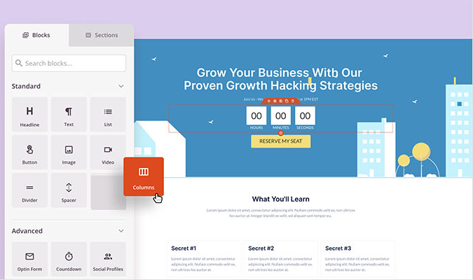
You can easily create your thank you page on a variety of platforms. Most people use their website builder, whether Wix, Squarespace, WordPress, or another website builder, to create their thank you pages.
They guide you through creating a thank you page, especially when you have an eCommerce site. For example, when you create the purchasing process for your store, it will take you to the step of the thank you page and allow you to customize it.
You could also use a website builder for a stand-alone thank-you page. Use their customizable templates to create it and link it to an already-made product or landing page. Many website builders will let you do this for free and give you a subdomain if you’re on a budget.


