Remember when one of the easiest ways to spot AI-generated imagery was to count the fingers?
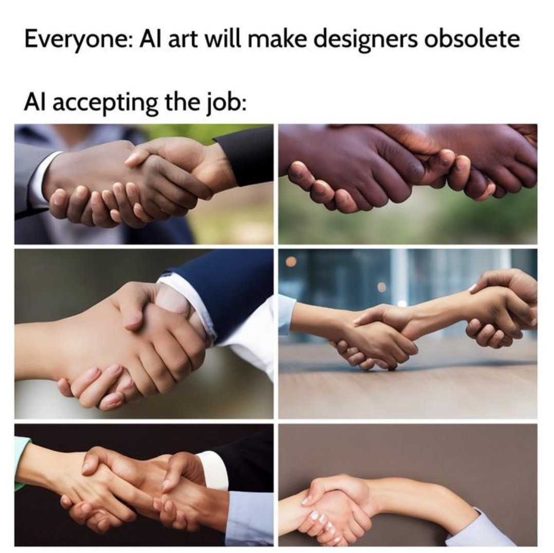
Things have come a long way since then.
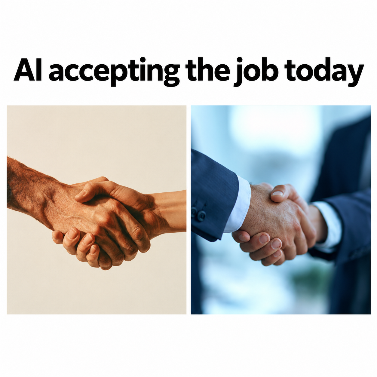
AI design tools today can produce remarkably polished logos, websites, ads, presentations, product mockups, and even full brand systems. But polished output can still hide some surprisingly basic problems.
We tested 146 AI design platforms across 32 common graphic and web design tasks to see what actually holds up in real work, and what still falls apart once you look beyond the first impression.
The Biggest Patterns We Saw Across Our Tests
AI has become surprisingly capable across a broad range of design tasks. But capability isn’t the same as reliability. The closer a task gets to exact copy, brand rules, typography, consistency, or pixel-perfect creative control, the more human supervision still matters.
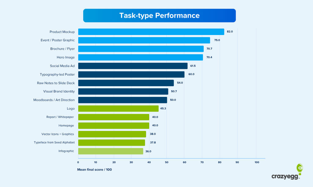
A few patterns stood out across our testing:
- AI is already dependable for a lot of design grunt work. Background removal, object cleanup, image expansion, resizing, reframing, upscaling, and straightforward variations tend to be more reliable because the creative direction already exists.
- AI can now handle much more complex design work than simple image generation. We saw credible websites, interfaces, presentations, mockups, and even multi-page brand systems from surprisingly little initial input.
- The best results rarely come from one-shot prompting or one platform. Stronger workflows usually mix tools with different strengths, then bring the output into a professional editing environment for refinement.
- AI doesn’t always save time, but often moves it. It can significantly reduce time to first draft, but some of that gain gets spent later on prompting, checking, fixing, regenerating, and stitching outputs together.
- Tasks with established structures tend to be more reliable. AI tended to perform better on tasks with established patterns like dashboard design than on highly expressive work requiring lots of interconnected creative decisions.
- Polished output can hide silent errors. The most worrying mistakes weren’t always obvious visual failures, but clean-looking outputs with wrong copy, prices, addresses, or brand values explicitly stated in the prompt.
- Capability and reliability are not the same thing. Producing one excellent result doesn’t mean a tool can repeat it consistently.
- “AI-powered” doesn’t always mean genuinely generative. Some products still behave more like template selectors than systems capable of executing a detailed custom brief.
We’re past the point of asking whether AI can design. Our testing suggests it can produce reasonable work across most common design tasks. The more useful question now is which tools and workflows are dependable enough to trust in real production.
How We Tested 146 AI Design Platforms
Rather than judging AI design tools by their demos, we gave them real design briefs and assessed what they actually produced.
For the study, we tested 146 platforms across 32 graphic and web design tasks, including:
- Branding: logos, visual identity systems, brand style guides
- Marketing design: social ads, posters, campaign assets, brochures, infographics
- Web design: landing pages, homepages, pricing pages, ecommerce pages
- Product and UI design: app screens, dashboards, user flows, component libraries
- Image generation and editing: hero images, product mockups, image series
- Documents and presentations: slide decks, whitepapers, reports
- Specialist design tasks: typography-led graphics and typeface development
We didn’t test every platform on every task. We matched tools to the design tasks they actually supported.
The briefs were deliberately specific. We used Claude to help draft standardized briefs, then applied the same brief consistently across tools being tested for each task. All brands mentioned in the test are fictional.
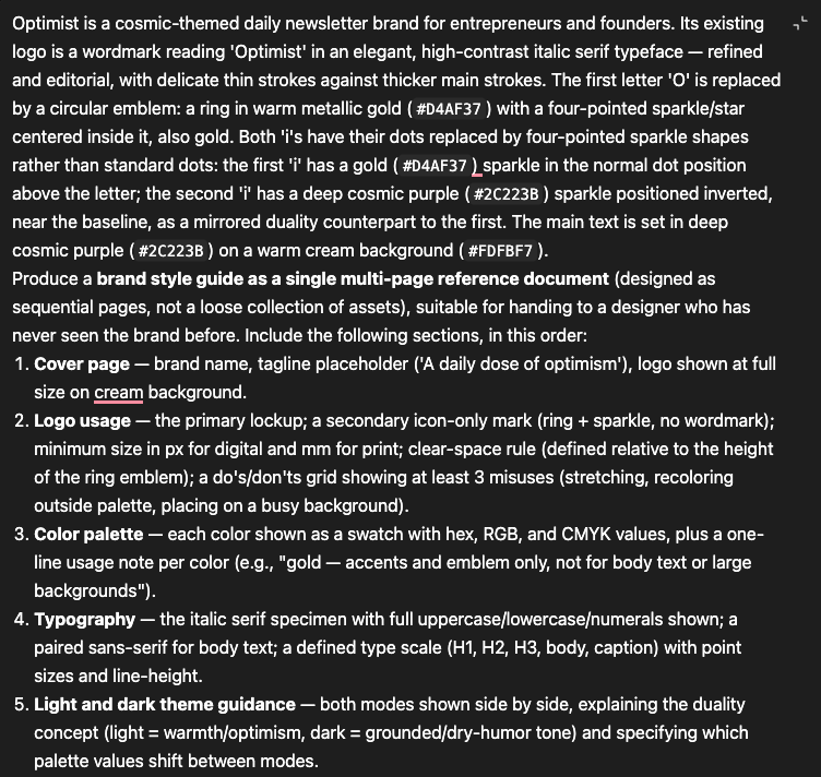
Our prompts included requirements such as exact copy, colors, typography, hierarchy, layout, brand motifs, dimensions, and intended use. That made it easier to tell the difference between a tool that genuinely followed the brief and one that simply produced something attractive in roughly the right category.
We scored outputs using the same five criteria throughout:
- Brief fidelity: Did it actually follow the instructions?
- Brand coherence: Did the visual choices work together and stay on-brand?
- Craft and technical execution: Was the output clean, accurate, and free from obvious artifacts?
- Functional fitness: Would the design work for its intended purpose?
- Aesthetic judgment: Did it look like something a professional designer might reasonably ship?
Each category contributed equally to a score out of 100. We also used critical-fail conditions for problems that made an output fundamentally unusable, such as garbled required text, a misspelled brand name, an ignored color palette, or a missing non-negotiable element.
Where useful (and within available credit limits), we regenerated the same prompt to see whether a strong result was repeatable rather than a lucky first attempt.
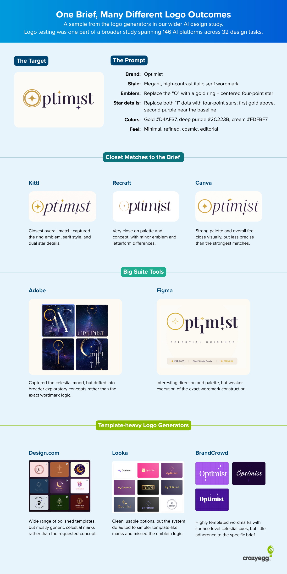
This wasn’t a statistically controlled model benchmark. It was a hands-on production test designed to show how these tools behave on the kinds of tasks designers and marketers actually need to complete.
AI Is Most Reliable When the Creative Decisions Are Already Made
Some of the most dependable AI design tools we tested weren’t the ones trying to be designers. They were the ones taking an existing creative decision and doing the tedious work around it.
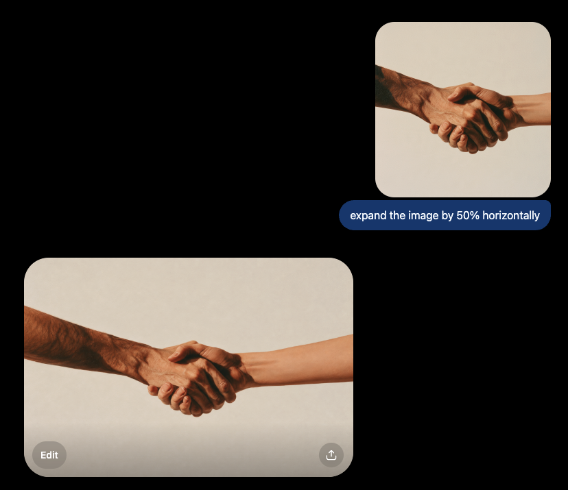
Think background removal, object cleanup, image expansion, reframing, upscaling, resizing, or adapting an established asset into another format.
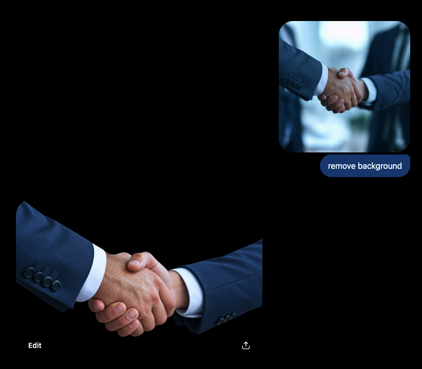
These are relatively bounded tasks: the subject, visual direction, and intended result are already known. AI has fewer decisions to make and less room to wander off-brief.
That makes this kind of “grunt work” one of the easiest places to put AI into a real production workflow.
It can remove a distracting object, extend a hero image to accommodate copy, or turn an existing campaign asset into another aspect ratio without asking it to invent the campaign itself.
This pattern extended beyond image editing. Some of the strongest and most consistent results in our tests came from structured design tasks with familiar conventions.
Pricing pages and dashboards, for example, produced no critical failures in the testing set. They give AI an established design framework to work with: cards, tables, headings, controls, navigation, hierarchy, and repeated UI patterns.
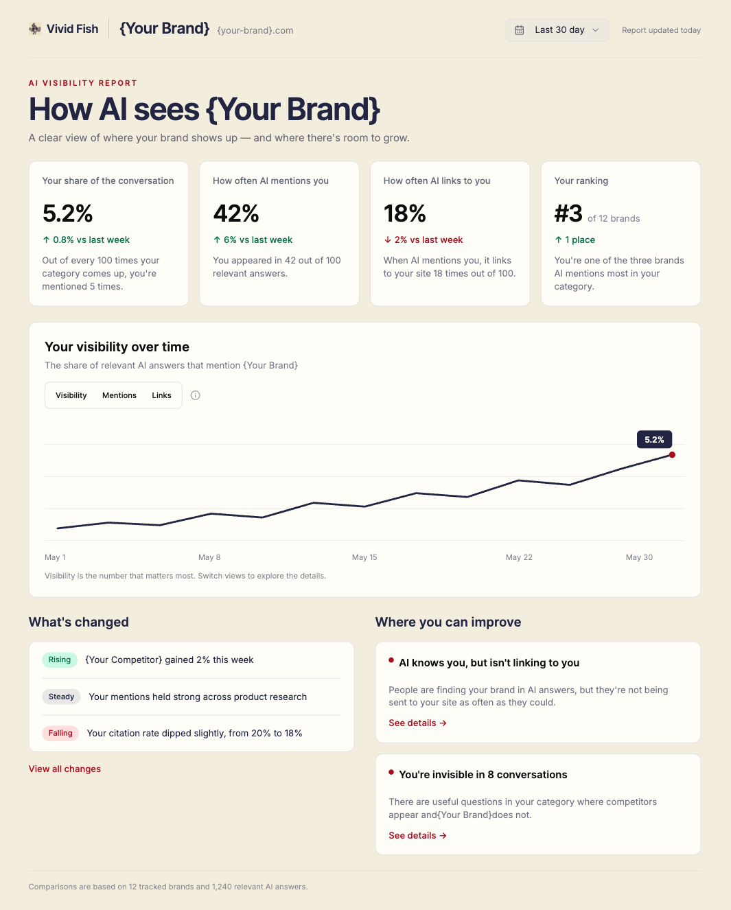
That doesn’t necessarily mean AI is better at web design than graphic design. It suggests something more useful. AI performs well when the problem has clear boundaries and recognizable patterns.
We saw the same thing in more ambitious work.
ChatGPT produced one of the strongest creative outputs in our test. In general, typography and typeface design are weak points for AI design tools.
That’s because typeface design demands unusually high consistency at the character level, such as stroke logic, proportions, spacing, and kerning. Repeated forms all have to work as a coherent system, not just look plausible in isolation.
For a couple of our tests, we asked AI tools to extend a small set of seed letterforms into the beginnings of a usable alphabet.
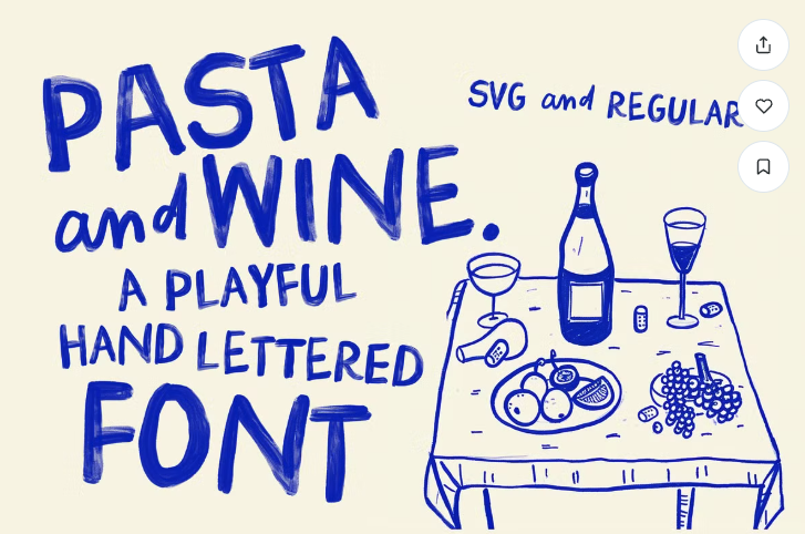
Our inspiration was a playful, handwritten watercolor font like Pasta and Wine by Nikki Laatz:
We started in Claude to generate the structure of a new typeface, though it was lacking the aesthetic we were aiming for:
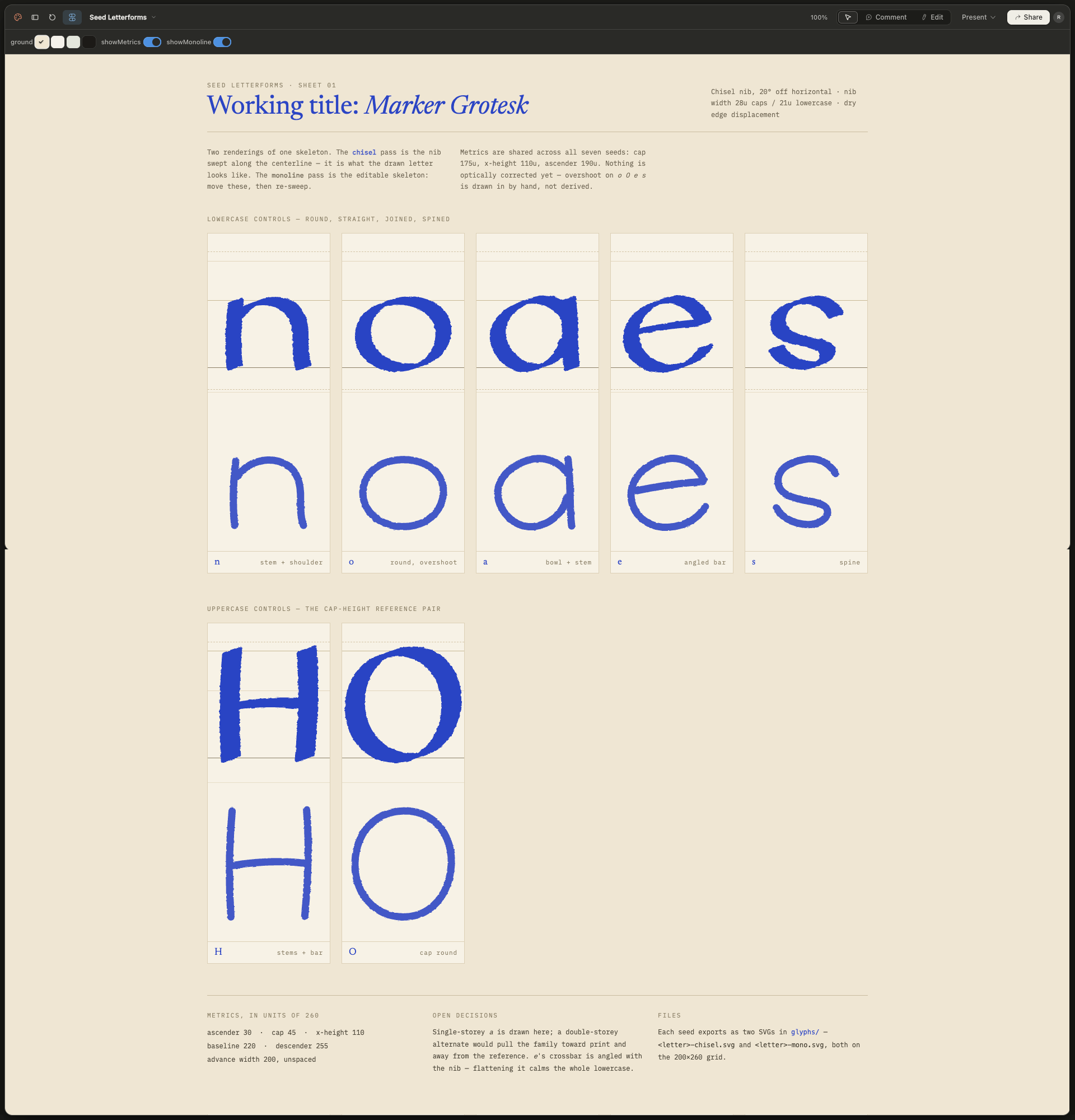
We used this output as a reference point for ChatGPT Design, which produced this result:
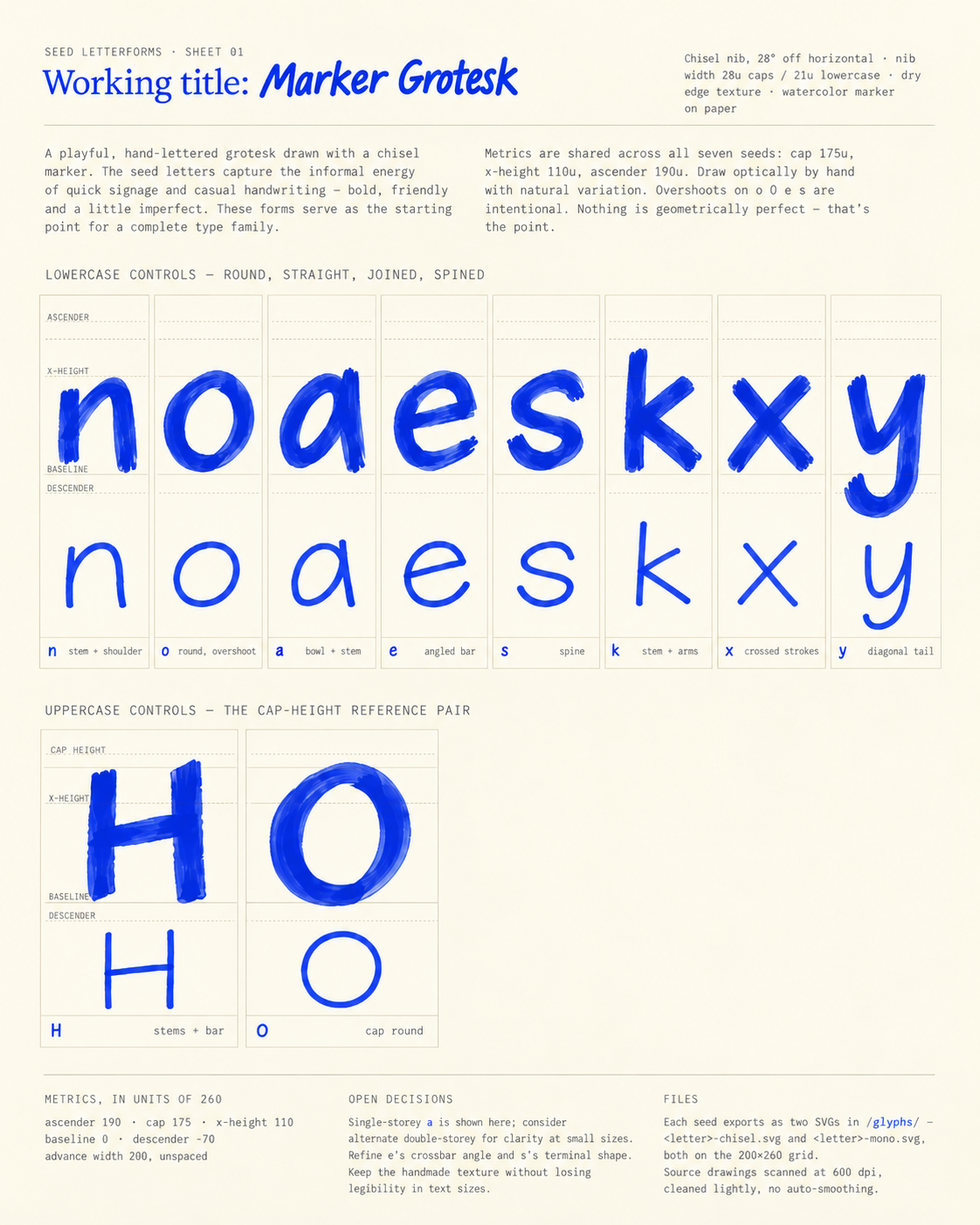
It preserved the visual aesthetic we were after, followed the existing stroke logic, and generated plausible new characters that felt like they belonged to the same type family.
From these seed letterforms, it was then able to generate a full typeface:
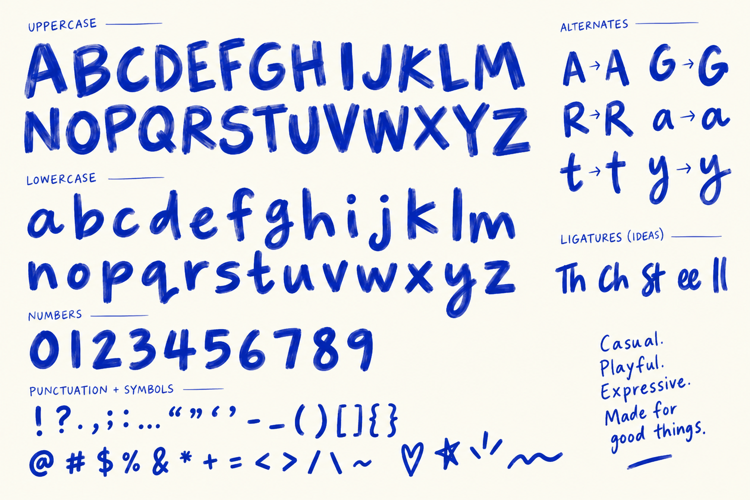
We weren’t trying to recreate Pasta and Wine exactly.
We used it as a visual reference for the qualities we wanted, including the loose watercolor texture, irregular handwritten forms, and playful character shapes, then asked the tools to develop a distinct typeface from there.
We were testing whether AI can understand and extend a visual language. Sometimes it can; other times, it can’t.
ChatGPT was the exception rather than the rule. Other tools struggled with the same kind of task.
For instance, we tested CalligrapherAI to generate a variety of handwritten-style fonts. More often than not, it degraded the font into broken, looping glyphs.


Meanwhile, Dreamina produced a plausible alphabet but garbled much of the supporting text around it, and upon closer inspection, it was missing a few letterforms like i, k, and x.
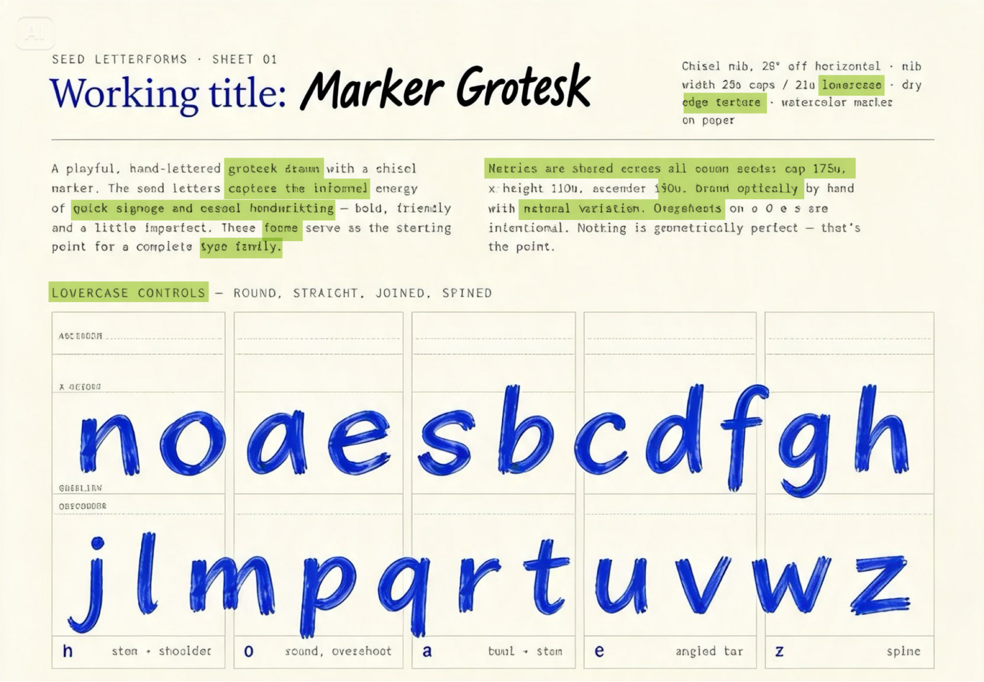
The biggest finding in our test is that a task can be complex without being creatively open-ended.
AI can handle complex tasks.
For example, a dashboard might contain dozens of elements, but there are well-established ways dashboards tend to work. A brand guide can span six or sixty pages, but a detailed brief can tell the system exactly what each page needs to contain.
Compare that with designing an original logo, where the most important decisions often aren’t explicitly contained in the brief. Art direction, visual taste, proportion, distinctiveness, and the relationship between individual elements all have to be judged rather than simply followed.
That’s why we didn’t judge AI design capability purely by how complicated the finished artifact looks. So far, creative constraint seems to help more than simplicity.
Polished AI Design Can Hide Surprisingly Basic Errors
Some AI design failures are obvious. A broken hand, garbled headline, or malformed letterform is easy to spot.
The more concerning mistakes in our testing were the ones that looked completely normal at first glance.
We repeatedly saw polished, professional-looking designs containing small but meaningful errors in copy, pricing, addresses, or brand information. Unlike obviously garbled text, these mistakes don’t announce themselves as AI failures. You have to actively look for them.
For example, Dreamina changed the CTA “Book your consultation” to “Cook your consultation.”

Sometimes the problem wasn’t broken text at all. The design looked completely coherent, but it was built around the wrong creative direction.
Glyph, an AI brand identity platform, generated an impressively complete set of brand guidelines for our fictional marketplace brand, Locals.
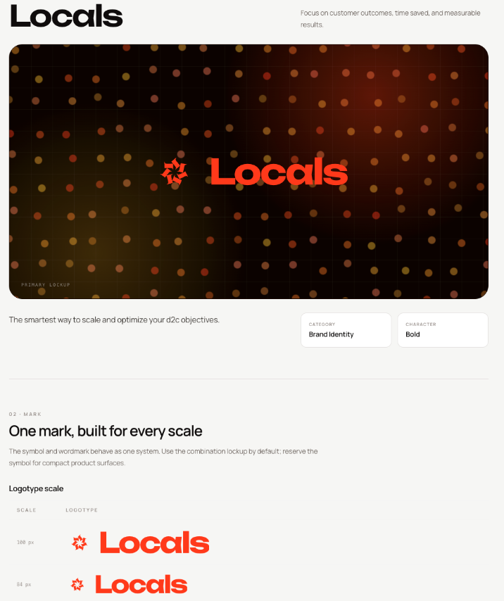
But the palette bore little resemblance to the brief. We specified a vibrant magenta-pink as the signature brand color, supported by softer pastel pinks, ivory, and warm clay tones. Similar to this moodboard generated by Magnific:
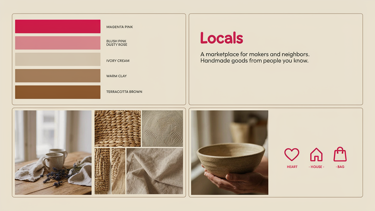
Glyph instead built much of the identity around bright orange, yellow, dark brown, and black. The output wasn’t aesthetically bad. It was simply solving a different design problem from the one we gave it.
This creates an awkward production problem.
AI can significantly shorten the journey to something that looks finished, while leaving behind errors that are easy to miss precisely because everything around them looks so polished.
For designers and marketers, that means the final QA pass matters more. Exact copy, prices, addresses, data, color values, accessibility details, and other non-negotiables still need to be checked against the original brief before anything ships.
Capability Isn’t the Same as Reliability
One of the easiest mistakes to make when evaluating AI design tools is judging them by their best result.
A platform might produce an excellent output once, but that doesn’t mean it can produce the same quality consistently.
We saw this clearly when regenerating identical prompts. In one typography-led poster test, only one of four generations produced a fully legible subheading. The other three contained garbled or doubled letterforms, despite using exactly the same prompt.
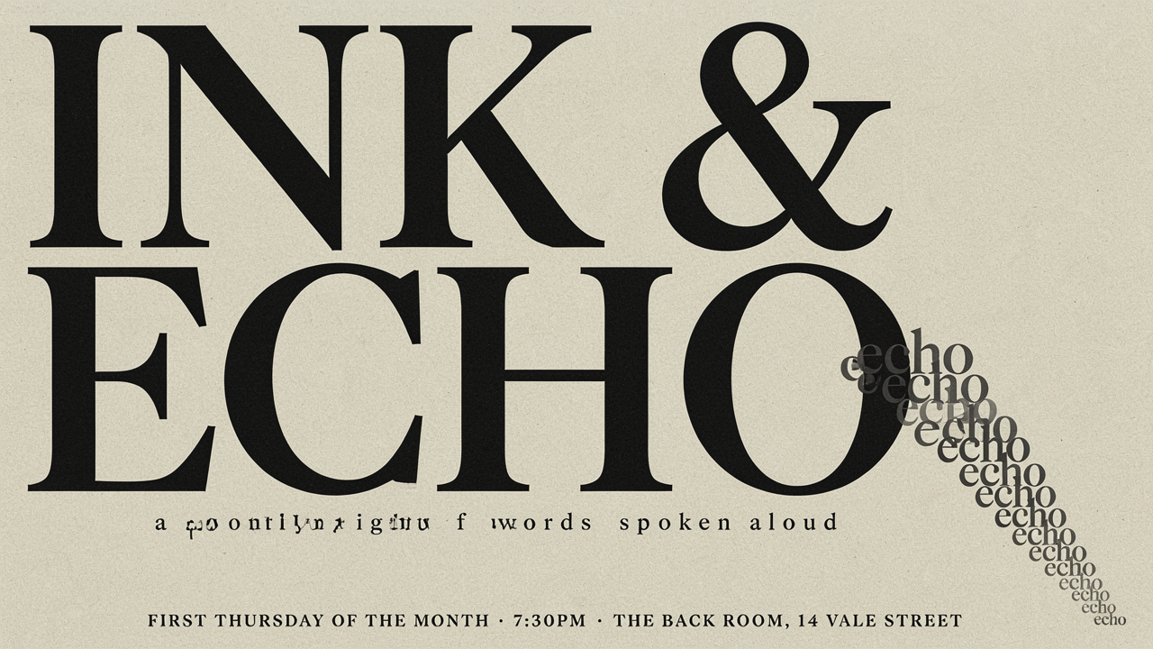
That creates an important distinction between capability and reliability.
A tool’s best result shows its capability ceiling. But in production, its reliability floor matters just as much.
If a platform can create a great design but requires three or four attempts to get there, you have to factor the time spent regenerating, comparing, and checking outputs into its usefulness.
Creating multiple variations to explore different visual directions isn’t necessarily a problem for exploratory work. Generating several directions and choosing the strongest may still be faster than creating them manually.
But for repeatable production work, consistency matters.
A tool that reliably produces an 8/10 result can sometimes be more useful than one that occasionally produces a 10/10 and just as often misses the brief.
Marketers and Designers Should Judge AI Design Tools Differently
A useful AI design tool for a marketer is not always a useful AI design tool for a designer.
The difference is not that marketers care less about quality. They often optimize for a different outcome.
A designer may care most about precise control, editability, originality, spacing, typography, component behavior, and consistency across a wider system.
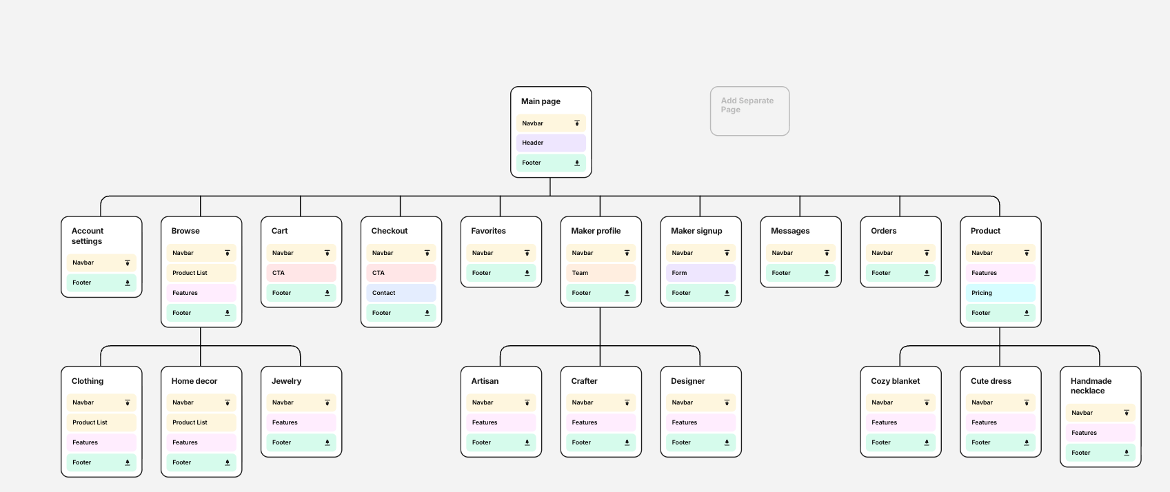
For instance, UX/UI designers will find value in AI-generated sitemaps from a tool like Flowmapp:
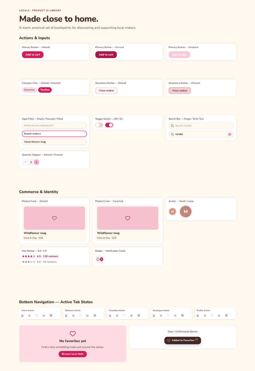
Or in designing UI component libraries quickly:
Or even multi-screen user flows:
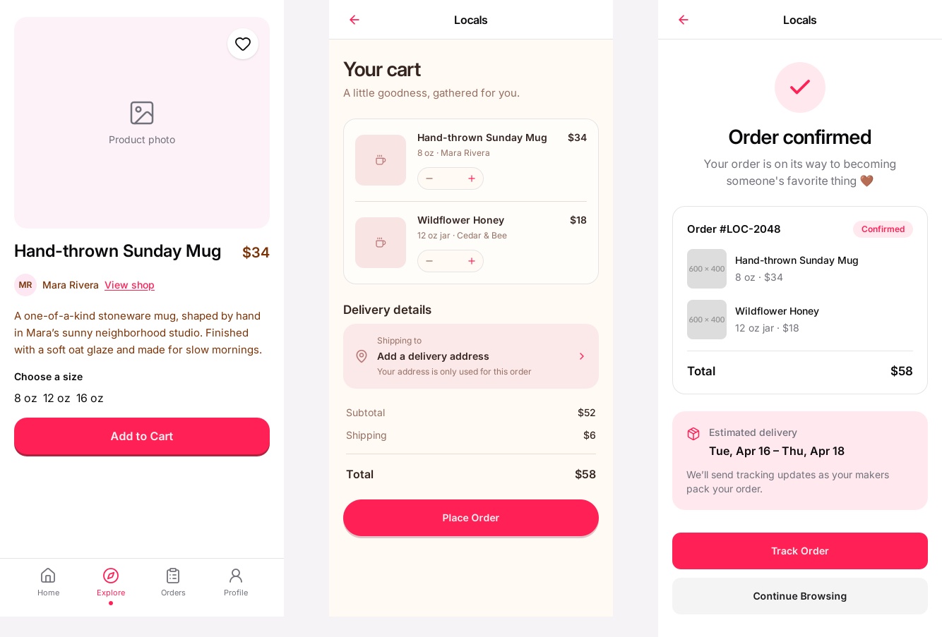
A marketer, however, typically cares more about how quickly they can produce a good campaign asset, resize it across channels, generate several variants, keep it roughly on-brand, and make small edits without waiting on a full design workflow.
They’ll accept a scrappier output if it means they can publish content on time. Design inconsistencies are often seen as minor, and “good enough” passes the bar for use cases like social ads:
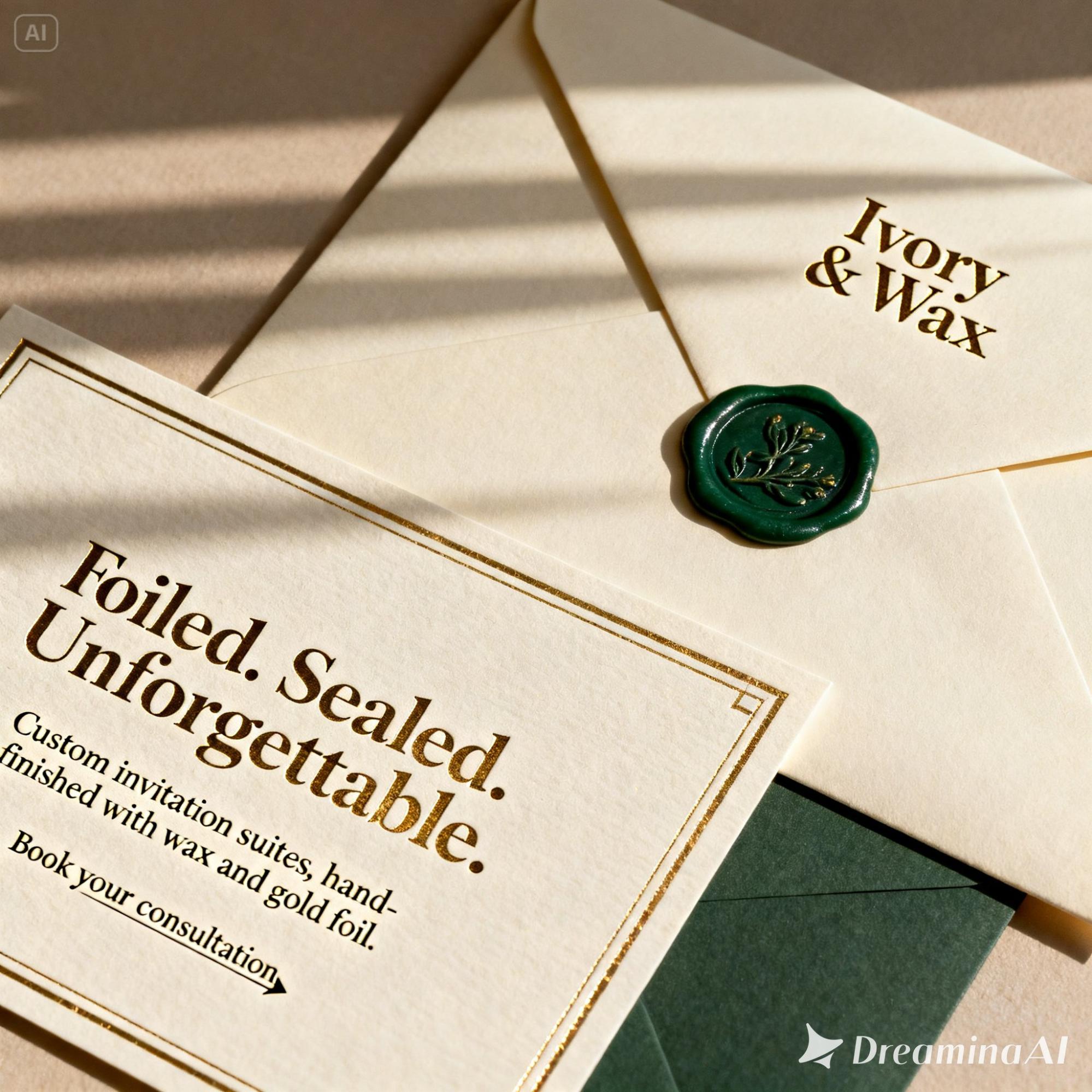
The differences in skill sets, use cases, and priorities change how the same tool should be judged.
A platform that feels frustrating to a designer because it offers limited control over individual elements might still be extremely useful for producing a set of social ads, adapting an existing campaign, or getting a landing page concept in front of stakeholders quickly.
Likewise, for marketers, the trade-off can run the other way. A powerful AI tool with lots of granular design controls may be overkill if you are not already comfortable working in environments like Figma or Adobe.
Someone who lives in Canva may get more value from a simpler, more guided workflow than from a tool designed around professional editing conventions.
In practice, there is often a real difference between Canva people, Figma people, and Adobe people.
The “best” AI design tool is partly the one that fits the design environment and level of control you already know.
The Future of AI Design Will Be Won on Workflow, Not Novelty
AI design tools are improving quickly, but raw generation quality is becoming less of a differentiator.
The bigger advantage will come from how well these tools fit into real creative workflows.
A platform that occasionally produces a spectacular result is useful. A platform that reliably plugs into an existing process, respects brand constraints, hands off cleanly to other tools, and reduces rework is much more valuable.
That is especially true as teams move beyond experimentation.
The strongest results in our testing rarely came from treating AI as a one-click replacement for design. They came from using it selectively, giving it clear constraints, combining tools with different strengths, and applying human judgment at the points where accuracy and consistency mattered most.
That suggests the next phase of AI design will be less about who can generate the most impressive demo and more about who can make AI dependable inside a repeatable design production process.