On an ecommerce site, conversions are critical.
You get that, I know. So what do you do when you know conversions could be better? Where do you focus your attention?
In this post, I share 5 essential areas for troubleshooting and optimizing your ecommerce website. If conversions are below expectations, more than likely, your problem lies in one of these 5 areas.
 Source: Placeit.net
1. SEO – Can People Find You?
An ecommerce site is still a website, so you still need to optimize it in the usual way. That means looking after off-page optimization such as friendly, transparent URLs (so people know what they are getting when they choose a link) and the right target keyword (no stuffing, please) to help your products show up when people search.
One of the important issues from an SEO viewpoint is avoiding duplicate content, which is sometimes difficult when you are listing the same types of products.
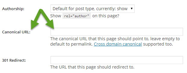
Search Engine Watch and others suggest fixing this by concentrating all the options for a particular product on one page and using canonical URLs to give the main product page the SEO juice.

In the image above, Amazon has all the color options for the headphones on the same page—buyers only need to click to see the right preview and product description. In addition, variations in the product itself are available from a tabbed box below the color options.
Ecommerce sites typically have a lot of duplicated information, say, for different products in the range. A canonical URL tells search engines which is the preferred one. You can do this with a “rel=canonical” tag on the page or by a number of other methods. If your site runs on WordPress, the WordPress SEO plugin makes it easy to identify a canonical URL by typing it into the correct box.
Don’t forget to use semantic markup for great looking search results and to help mobile users find your products. And optimize images, too.
A recent survey found that 74% of younger people prefer visual search. In the screenshot below, a search for chocolate chip cookies brings up results with rich descriptions and images, as well as a Knowledge Graph entry with nutrition information.

2. Trust and Conversions
The difference between choosing one site and another to purchase the same product isn’t just about price. Shoppers have to trust your business before they part with their cash.
Check your analytics and you’ll see that people are looking at your About page to see you you are, checking out your location and contact details (also useful for local search) and visiting your social media profiles. Make sure you have all this information, then back it up with trust signals for the products and services themselves.
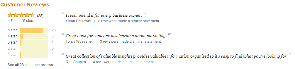
Research from Internet Retailer published by Shopify shows that customer testimonials and product reviews can boost conversion by between 14 and 76%. Amazon provides a good example of this:
And you can give ecommerce conversions another boost by including safe shopping trust marks on your site. A study found that these are important for 76% of web users, and a similar number have failed to purchase items when they didn’t recognize the logos.
Building trust may be as simple as including a message like this one on Wolferman.com’s order page:

3. Design and UX
Let’s think about the overall design and user experience (UX) on your ecommerce website. One of the most important aspects is page load speed.
A slow loading site equals lost revenue: it’s a simple equation. Syncshow believes that you just have two seconds to get people interested; for every second after that you will lose 10% of your visitors.
If my math is right, that means it takes just 7 seconds for half your visitors to disappear. It’s no wonder Google is looking for a sub-1-second page load! Check out our tips on speeding up your site to keep potential buyers happy.
Navigation is another key UX issue. If you’re shopping online, it can be pretty frustrating if products don’t appear in the logical place in the navigation. Smashing Magazine has some excellent tips on categorizing and listing your products to help shoppers find them more easily. As they point out: “If they can’t find it, they can’t buy it.”
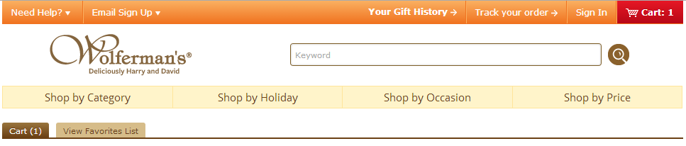
When planning your navigation, think in terms of how users look for your products. For example, Wolfermans understands that some customers know exactly what they want, while others are buying gifts and need suggestions. Their navigation makes it easy to find what you need, no matter which type of buyer you are:
4. Shopping Experience
While you can make lots of small tweaks to improve the shopping experience and conversions, three really stand out.
First, ensure that site search works well to improve branding, customer loyalty, conversions and sales. It’s not just about product information but about related products, delivery times, return policies and more.
Make this information easily findable and visible and they will stick around longer. Check out these tips from eConsultancy to troubleshoot site search issues.
Second, make product descriptions interesting. Avoid generic descriptions; instead, make sure the description identifies the problem the product solves for the reader. WarbyParker does a fantastic job of writing product descriptions that fit the style of their target audience:

You can even provide more in-depth content, such as buyers’ guides, which will also help with SEO since Google currently favors long-form and in-depth content. Use split testing to see which product copy provides the best conversions.
Third, use video. A UK promotional products company found that conversions from those watching videos doubled when they created product videos for 4000 products and overall conversions increased by 7.5%. Here in the US, Zappos has had great results by using employees for video product demonstrations.
A video is a great way to show people what they are getting and how to use it. And with the growing importance of video for mobile and social media users, there’s even more reason to make this a key target for optimization efforts for your ecommerce site. Read our recent article on video optimization to see how to get the most out of this area.
5. Checking Out the Cart

Image: Pixabay
Shopping cart abandonment is a major issue for ecommerce sites—that’s why remarketing has become so important.
People abandon shopping carts because they run out of time, because they don’t want to create an account or because the process is too complex. Sometimes they leave because they get a nasty surprise about shipping costs or they can’t pay with their preferred payment provider or method.
And then there’s the issue of load time. Recent stats from Radware indicate that:
- 70% of online carts are abandoned before checkout.
- A 2 second delay in load times can increase the abandonment rate to 87%.
People usually think they are waiting longer than they actually are, which is bad news for conversions.
There’s lots of advice on streamlining the shopping cart experience for better conversions, including:
- Showing people how far they are in the process so they know something is happening.
- Reducing the number of pages needed to complete a transaction.
- Ensuring that shoppers know up front whether a product is available or not.
- Keeping the checkout page simple so that there are no distractions.
- Remembering the cart so that shoppers who come back later can resume shopping immediately.
- Tweaking your calls to action.
Check out these infographics on Invesp and Monetate for tips on how to improve shopping cart conversions.
Bottom Line… It’s Your Bottom Line
No matter what you sell online, it’s your bottom-line profits that determine your success. For that, look after SEO, trust signals and usability while testing the shopping and checkout process. Just these 5 areas can put you well on the way to optimizing ecommerce conversions.
Check out our guide to ecommerce optimization for even more tips.
Read other Crazy Egg posts by Sharon Hurley Hall.