
Website menus seem easy.
I wish they were.
In a web usability report from KoMarketing, about half of their respondents reported using the navigation menu to acquaint themselves with a new website.
And 37% of respondents said a poor experience with site navigation was enough of an annoyance to make them want to leave the site completely.
The wrong site menu can actively push people away from your site.
Your menu should always be a reliable cornerstone of your website. Visitors need to know where it is at all times in order to orient themselves and find their way around your site.
A ton of testing has already been done website menus. Luckily, you get to benefit from all those hard won lessons without having to try everything yourself. We’ve broken down the biggest lessons below.
Menu Structure
Although we don’t have any data on what sort of usability issues the Portland Trail Blazers’ website was experiencing, we do know that something prompted them to hire Sq1 to assess their sales funnel and determine what may have potentially been the cause of lackluster sales.
The marketing agency set their sights on the navigation, which was clearly not optimized for the user experience. Here is what it looked like in 2013:

Portland Trail Blazers – Before
The design itself was difficult to read text from and the layout was confusing. After assessing what visitors’ goals were in using the site’s navigation, Sq1 decided to do a total revamp of the menu’s design and structure.
- They removed the transparent background.
- They realigned the drop-down options in a vertical layout, presenting pages in a more logical and easy-to-follow stream.
- They improved the mobile responsiveness of the menu.
As a result of this A/B test, Sq1 found that the new and improved structure resulted in a 62.9% increase in revenue. The Trail Blazers’ site’s navigation has since undergone a number of renovations, but has maintained the same opaque and vertical layout that proved to be the most effective with their audience from 2014. Here is what it looks like today:

Portland Trail Blazers – After
Menu Wording
When the designers of the Formstack website set out to tackle the navigation, they initially asked themselves many questions like:
- What sort of content should appear in the menu?
- How should we structure it?
- Which pages should be prioritized in the hierarchy of the menu?
The page they decided to lead their navigation menu with was titled “Why Use Us”. They had high hopes for it as a driver of traffic and conversions and so were consequently surprised when click-through rates failed to meet expectations.
Here is what the Formstack website and “Why Use Us”-led navigation looked like in January of 2013:

Formstack – Before
Disappointed with the effect their lead page had on visitors, they decided to test a name change to “How It Works”. It was a name they considered prior to launch, but ultimately scrapped for “Why Use Us”. As you can imagine, they were shocked when a simple change of wording in their menu resulted in 50% more page views and 8% more conversions across the website.
It didn’t take long before they ditched the flailing “Why Use Us” wording (which put most of the focus on Formstack) in favor of “How It Works” (which spoke more to an actionable solution). Here is how the site looked in March of that same year after they implemented the change:

Formstack – After
Menu Logic
Back in 2014, the people behind the Bizztravel Wintersport website began to notice how much work visitors had to do to get around the site to find the destination and vacation that made the most sense for them. With an average of five clicks required to navigate to the correct region (and not even the actual vacation page), they knew there was a serious missed opportunity here.
And so Bizztravel determined that the menu was the greatest source of pain on their site. Lacking in logic and simplicity, they needed to redesign not only the menu, but the header as well, in order to streamline the search process for visitors.
Upon creating an improved and more intuitive navigational system for their site, they launched an A/B test to confirm their hypothesis. What they found was that the redesigned navigation resulted in 21.34% more conversions than the previous navigational design.
This is a side-by-side comparison VWO captured of the old Bizztravel navigation against the new (which still stands today):

Bizztravel – Before and After
As you can see, the improved navigational system relied on clearer guides—like country flags and other recognizable symbols—to lead visitors down to a more intuitive and helpful interface.
Hidden Menus
When we talk about hidden versus visible menus, what we’re really talking about is whether or not a menu is hidden behind a symbol (like a hamburger menu). While hidden menus may make sense for sites viewed on mobile devices, the question of whether or not these minimal navigational cues can be used on a desktop is something UX experts are indeed curious about.
The Nielsen Norman Group conducted an experiment to try and uncover what exactly happens when you use hidden menus for both desktop and mobile websites. While we don’t have information on which website they tested this on, I don’t know if it’s necessary as the test itself is clear enough.
Can you guess where the hidden menu is on this site?

Impossible Bureau Hidden Nav
If you guessed the icon at the center of the page—which logically should only serve as a link back to the homepage—then you would’ve guessed correctly.
In testing visible menus against hidden menus, here is what the NNG researchers found:
Desktop
- Visitors utilized the hidden menu in 27% of the experiments.
- When a menu was visible, they used it in 48% of the tests.
- Hidden menus resulted in people taking a longer time to find their way around a website; specifically, they were 39% slower than those with a visible menu.
Mobile
- Visitors utilized the hidden menu in 57% of the experiments.
- When a menu was partially visible and partially hidden (since a fully visible menu isn’t practical on mobile), they used it in 86% of the tests.
- Hidden menus resulted in navigation being 15% slower than those with a visible menu.
In addition, the researchers also found that hidden menus delayed discoverability. In other words, without a clear guide at the top of the website, users had a more difficult time finding the information they were looking for. Hidden menus led to a 21% increase in difficulty and a 20% decrease in the ability to complete a task.
Here’s a good example of a simple, straightforward, and visible menu:

HostGator Visible Nav
Mobile Menus
As you can see from the example above, mobile users are definitely more acquainted with the hidden menu than desktop users. But when it comes to determining how to design a hidden menu for mobile, it’s not enough to rely on the hamburger icon and call it a day. These tests from Sites for Profit will show you why.
In the first test they conducted, they set out to test the efficacy of the design of the hamburger button. They created three versions of the hidden menu icon:
- The baseline design which was just the three horizontal lines.
- The hamburger icon with a thin border around it.
- The hamburger icon with the word “MENU” beneath it.
What they found was that the icon with the border resulted in a higher conversion rate. Their assumption was that because it more closely resembled a button that visitors’ eyes were drawn to it as something to click.
Caffeine Informer – Hamburger Icon
In the second test they conducted, they wanted to know if the word “MENU” could have a more profound effect when used in other capacities. They created four versions of the hidden menu icon:
- The baseline design which was just the winning design from the previous test (the hamburger icon with the border).
- The word “MENU” in place of any icon.
- The word hamburger icon and the word “MENU” wrapped together inside a thin border.
- The word “MENU” within a border.
They found that the hamburger/MENU with a border received the most clicks; however, it was the word “MENU” wrapped in a border that had the highest conversion rate.
Caffeine Informer – MENU Icon
Sites for Profit was sure that the word “MENU” was the clear winner over the hamburger icon since a well-known and descriptive word was likely to be more effective in drawing traffic than an icon that most, but not all, people were aware of. So they took the winners of their two tests and conducted one final experiment.
Unsurprisingly, the bordered “MENU” won over the icon.
Additional Tips for Menu Design
So, what have we learned about navigation menus from all these A/B tests? Well, if there’s something that doesn’t seem quite right about how visitors interact with your site, then the navigation is a likely culprit. For something that likely doesn’t take as much thought or planning as, say, your home page design or the wording of a conversion pop-up, it can have a seriously devastating effect on your conversion rate if not properly set up.
Here are some additional tips to keep in mind when designing your website’s menu:
Tip #1
Always link your logo to the home page. According to the KoMarketing report mentioned earlier, 36% of people use it to navigate back to the start.
Despite the multiple menus, search bar, and member links on the REI website, the logo stands out large and in charge so there’s never any question on how visitors can return to the home page.
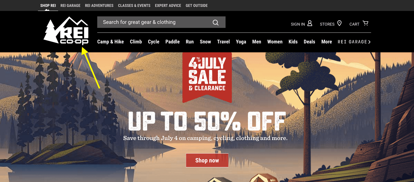
REI Home Logo
Tip #2
Keep it simple. The more pages you try to jam in a single space, the greater the chance you’re going to confuse someone. So either keep the number of menu options on the lower end of the spectrum (realistically between five and seven) or simplify the layout.
The La Moulade navigation is a great example of this.

La Moulade Simplified Nav
While they could’ve followed other agencies’ leads in breaking out their services into a variety of sub-pages that, frankly, their visitors wouldn’t really understand, they kept it nice and simple. Three pages in the navigation and a fun animated scrolling effect tells visitors everything they need to know about the quality of work they’ll get when working with La Moulade.
Tip #3
Organize your menu based on priority. The serial position effect says that pages that appear closer to the top or bottom will automatically take precedence in your visitors’ minds.

Comedy Central Priority
As you can see on the Comedy Central site, they’ve chosen not to list their shows in alphabetical order or in any seemingly logical order that would help visitors find what they’re looking for right away. It’s probably safe to assume then that The Daily Show is their highest rated show—or one they want to put in front of more viewers—and that’s why it was given the top slot here.
Tip #4
Use concise, but descriptive menu page titles. This is not the place to try and get creative with headlines.
Tip #5
Build your menus as wide as you can for each screen size. It’ll make the text easier to read and the buttons easier to click.
The Adwyse website does a great job of maximizing the space the menu takes up so that page titles are always large enough to read and click on. This applies both to the desktop navigation:

Adwyse Desktop
As well as the mobile navigation:

Adwyse Mobile
Tip #6
Use color or other hover effects to indicate “You Are Here” within the menu. The Netflix website makes good use of their brand red to let visitors know where they’re currently located within the navigation.

Netflix Colors
Tip #7
Make your navigation “stick” so visitors don’t worry about where it disappeared to. This applies to any style of navigation, too: mobile or desktop, visible or hidden, horizontal or vertical.
The Coloured Lines’ website does a good job of this with their super colorful, icon-driven, and ever-present vertical navigation:

Coloured Lines Sticky Nav
Tip #8
Mobile and desktop users want a menu that makes sense for them, so don’t try and design one menu to suit all. The Intuit website, surprisingly, serves as the perfect example of why you need to do this.
Here is it on desktop:

Intuit – Desktop
And here it is on mobile:

Intuit – Mobile
Either they don’t have any visitors from mobile or they don’t care that they need to pinch and zoom and scroll in order to make their way around the non-responsive website.
Tip #9
When designing a menu for mobile, remember to make it crystal clear that the menu is clickable. A border is a great way to call this out. Here’s how Politico does it:

Politico – Boxed Hamburger
Tip #10
Icons aren’t always universally understood, so try to avoid using them when possible—for mobile or desktop.
I’d suggest that the Brit & Co website actually does a good job of this since the icons they use are all instantly recognizable:
Brit and Co – Icons
Tip #11
It’s okay to have deep, multi-layer menus. However, never place them within hidden menus. Always use a mega menu design and think about adding breadcrumbs to simplify navigation even further.
The Verizon Wireless website abides by both these rules. First, they’re completely transparent about the information available in their navigation and have done a fantastic job at organizing their mega menu structure.

Verizon Mega Menu
Secondly, they include breadcrumbs as visitors dive deeper into their website, helping them backtrack if they need to (which comes in handy for product-heavy sites).

Verizon Breadcrumbs
Tip #12
If you want to use a creative navigation upon entering the site (think of ones that use scrolling or animation), feel free to do so. But that should be where the creativity ends. Place the main menu in the expected location for the rest of the on-site experience.
A lot of designers are playing with pop-up/slide-out functionality right now since that unexpected movement seems to do really well in capturing visitors’ attention. But pop-ups don’t need to be relegated to urgent messages about special offers, they’re now also being used for navigation, like in the case of Bolden’s menu.

Bolden Popup
Just remember that when you’re done flexing your creative muscles, that you place your menu (or hamburger icon) in an easy-to-find and expected location.
Summary
All that said, just because you follow the “rules” of what makes for a good navigation experience, and your instincts tell you that what you’ve done makes sense, that doesn’t always mean your visitors will agree. Anything that deviates from what they expect from your site or that causes undue confusion or frustration could potentially cost you conversions. This is why A/B testing is an absolute must for your navigation.
There are so many factors to consider when A/B testing your navigation. You can start by looking at what the experts have done above, but don’t forget to also think about the number of links, color choice, location, sizing, wording, and more.
Want more help? Check out Crazy Egg’s new guide, “Tools, Tips, and Getting Ready For A/B Testing.”

About the Author:
Nathan James Oulman writes around the web on conversions and Web Hosting. He is a real estate agent in Sandpoint, Idaho.


