Eye tracking used to be a high-cost tool reserved for labs and elite research teams. Today, it’s much more affordable, and an increasingly popular option for marketers and user experience (UX) teams who want to see how users actually interact with websites, products, and ads.
This post breaks down the major types of eye tracking systems, how they work, and what they cost. The goal is to understand this potentially game-changing tool, and assess whether it makes sense for you.
What Is Eye Tracking?
Eye tracking is a process for collecting data on a person’s eye movements and what they are looking at.
Every type of eye tracking system relies on two core components: a device to capture the data and software capable of interpreting that data and displaying it as measurable signals. Here are a few of the key metrics that eye tracking systems can capture:
- Eye position: Tracks where the eyes are directed. It reveals where people are looking at.
- Eye movement: Tracks the path the eyes take across a screen. It reveals how people navigate, what they focus on, and what they ignore.
- Fixation duration: Measures how long the user’s gaze lingers in one spot. Longer fixations often indicate interest or confusion.
- Pupil dilation: Changes in pupil size can signal emotional arousal, which may indicate excitement, stress, or attention.
- Blink rate: Detects patterns in frequency and duration of blinking, which may indicate confusion, low attention, or intense focus.
Along with the hardware and software system, eye tracking research requires specialists to interpret the data, which is often captured in a spreadsheet as XY coordinates, time durations, and so on. Here’s an idea of what the raw data looks like:
For trained scientific and academic researchers, this presentation is ideal for analysis, and they can transform the data into visualizations that convey their findings to a non-specialist audience.
Some of the newer software is more friendly for people without extensive training, automatically converting the raw data into visualizations. For example, GlassesViewer is an open source program designed for the Tobii Pro Glasses 2 eye tracker, which converts recorded data into a much more accessible format.
It’s not beginner-friendly, per se, but software like this helps lower the barrier to entry for researchers that want to analyze data from wearable eye trackers in fields like psychology, marketing, and UX research.
How Do Eye Trackers Capture Data?
Eye tracking systems capture data in a few different ways, but most commercial tools rely on just one. Here’s a quick breakdown of the main methods:
- Video-based infrared (IR): A small infrared light source illuminates the eye while a camera tracks two key features: the center of the pupil and the reflection on the cornea. By measuring the angle between these two points, the system can calculate where the person is looking.
- Electrooculography (EOG): This method uses electrodes placed around the eyes to measure the electrical potential caused by eye movement. When the eye moves, the difference in voltage between the front and back of the eye shifts, and this is captured by the electrodes.
- Scleral coil: This method involves placing a small coil in or around the eye, usually embedded in a contact lens. When the person moves their eyes within a magnetic field, the coil generates a measurable signal that indicates eye position.
Unless you’re working in a clinical setting, you’ll almost always be using a video-based IR eye tracking system.
It’s the standard in UX research and marketing because it’s accurate, scalable, non-invasive, and relatively easy to deploy. The other methods are valuable in niche applications, but they are prohibitively complex and expensive for most teams.
What Is Eye Tracking Used For?
Broadly speaking, people using eye tracking software are looking to understand:
- What people actually notice
- How people process visual information
- Where people get lost or confused
- What about the layout, design, or content influences people’s behavior
- Which elements cause emotional and physiological responses
- How people interact with complex environments in real time
As the cost and complexity of this technology has come down, more fields are putting it to work to better understand users, customers, and patients. What follows summarizes some of the places eye tracking is being put into use everyday — there are many more instances, but I hope this gives you a sense of the amazing range of applications.
In academic and scientific research, eye tracking is used to study reading, decision-making, learning, and attention. It’s common to see in fields like psychology, education, and cognitive science.
In clinical settings, eye tracking supports assessments of brain function, recovery from injury, and early detection of cognitive disorders.
In product testing and industrial design, it reveals how people interact with packaging, instructions, and physical interfaces. In the automotive and aerospace industries, it’s used to study how drivers or pilots pay attention under stress, leading to safer interface design.
For marketers and UX designers, eye tracking offers a window into attention and usability, but as you can see, its applications stretch far beyond websites and ads. I’ll have more to say about how to use eye tracking for marketing and improving UX, but first let’s take a closer look at the eye tracking systems available, how they work, and why they can get so expensive.
Cost Drivers of Eye Tracking Systems
Eye tracking systems range from a few hundred dollars to tens of thousands, depending on the level of precision, the hardware setup, and what you are using it for. The biggest driver of cost is the type of system (e.g. whether it’s screen-based or wearable), but several other factors shape price and performance.
As you look at different types of systems and evaluate your choices within each system, here are the big cost drivers to keep in mind:
- Sampling rate: Measured in Hertz (Hz). A higher Hz value increases precision but significantly raises costs. 60 Hz is considered the standard for low-cost systems — below that threshold you will miss important data. 250 Hz is typical for mid-tier systems and high-end systems will have sampling rates of 1,000 Hz to 2,000 Hz.
- Precision: Measured in degrees of visual angle (°). It reflects how consistent the gaze point is when the eyes are fixed on a target. The lower the value, the better the data. Basic systems may have precision around 0.5° to 1°, which is suitable for general UX or marketing use. Research-grade systems push toward 0.01° to 0.1°, which enables analysis of micro-movements, but it comes at a significantly higher cost.
- Monocular vs. binocular tracking: Refers to whether you are tracking one eye or both. Binocular systems double the data and increase the price. For basic UX research, monocular is fine, but other applications call for the richer data that comes with binocular tracking.
- Analytics software: Built-in tools for gaze mapping, fixation detection, and event tagging can add thousands to the all-in cost. Vendors often include a basic platform with the option to pay for upgraded features.
- Real-time vs. post-processing: Systems capable of real-time feedback are more expensive than those designed for offline analysis at a later time.
- Data storage: High-resolution, high-frequency data creates storage and bandwidth needs, especially for long sessions or multiple subjects. The greater the sampling rate, the greater the data storage requirements.
- Integrations: Compatibility with EEG (electroencephalogram), motion capture, VR/AR, or third-party platforms adds both technical complexity, licensing costs, and training requirements.
Having a good sense of these cost drivers can help you navigate the wide range of prices and capabilities across different eye tracking systems. With this context in mind, let’s walk through the main types of eye tracking systems. Each comes with its own tradeoffs in terms of cost, complexity, and data richness.
1. Remote or Screen-Based Eye Trackers
These are eye trackers that sit below or near a computer and track the user’s gaze as they look at on-screen content.
Pictured above: The EyeLink Portable Duo, from SR Research
How it works: The small, non-intrusive device uses infrared light and cameras to detect reflections from the user’s eye and estimate where they’re looking on the screen. It typically requires a one-time calibration.
What it’s good for: A wide range of applications. Remote eye trackers allow participants to sit normally and interact with content naturally, which strikes a good balance between realism and accurate data capture. Some common use cases include:
- Website usability testing
- Ad effectiveness studies
- Online learning studies
- General UX research
Drawbacks to consider: Although many remote trackers are portable, they require ample lighting and participants that can remain mostly still. The accuracy will drop if participants move too much, which can be an issue for studying children, and many models are truly screen-based, meaning they can’t track gaze on physical objects, just what’s on screen.
Setup: Easy to set up on a desk or in a lab, with software that visualizes gaze heatmaps or live views. Calibration usually takes under a minute per participant
Typical cost: $2,000–$10,000+. The biggest differentiators for cost are the sampling rate, precision, and whether you are tracking one eye or both (monocular vs. binocular). Beyond the device, the software contributes to the cost, and you may wind up paying for upgrades to access advanced analytics tools, integrations, and data storage. You should also factor in training and/or support, which is usually required even for the “simpler” trackers.
2. Wearable Eye Trackers
These are mobile eye trackers designed to be worn directly on the participant, such as smart glasses, headsets, or head-mounted rigs.
Pictured above: The Neon line of wearable eye trackers from Pupil Labs.
How it works: The wearable devices use outward-facing cameras to record the environment and inward-facing cameras that capture eye movements. Software maps the gaze point onto the real-world scene, frame by frame. Participants can walk, turn their heads, interact with objects, or perform tasks naturally while being recorded.
What it’s good for: Real-world environments where fixed setups won’t work. Researchers who care about natural gaze behavior in uncontrolled environments often rely on these tools for things like:
- Retail studies
- Training programs
- Sports performance
- Workplace ergonomics
Drawbacks to consider: Accuracy tends to be lower than lab-based systems, especially if the participant moves quickly or lighting conditions shift. Wearable cameras can miss fine details. Also, the gear itself can influence behavior if participants feel self-conscious or encumbered.
Setup: You’ll need to calibrate each participant individually, monitor for recording stability, and handle a larger volume of video-linked data during analysis. Some systems offer real-time streaming, but most require post-processing.
Typical cost: $5,000 and $20,000+. Wearables have a higher cost than remote systems due to the hardware complexity and the need for much more high-powered analysis tools. I was able to find glasses with eye tracking for as low as $800, but reading the reviews, it seemed like a glitchy solution, and it did not have the software or analytics necessary for eye tracking research.
3. Embedded Eye Trackers
Embedded (or integrated) eye trackers are built directly into devices like smartphones, VR headsets, AR glasses, automotive dashboards, flight simulators, and medical equipment. Users don’t wear anything extra or interact with a separate eye tracking device because the technology is integrated into the device they’re already using.
Pictured above: A user commands an iPad with their eyes using the embedded tracking system from Apple.
How it works: These systems rely on inward-facing cameras, usually placed near the screen or display area, to track eye movements during normal use. In VR/AR setups, this often means sensors inside the headset track where you’re looking in the virtual environment. On phones or tablets, the camera near the screen detects eye position and movement.
What it’s good for: Embedded systems are used when eye tracking is part of a broader experience or interface. In cars, for example, it monitors driver alertness. On mobile devices, it enables accessibility features or user engagement tracking. Because it’s invisible to the user, it’s ideal for studies that depend on natural behavior. These are often used for:
- In-car driver attention monitoring
- VR headset gaze interaction
- Hands-free communication
- Smartphone usability testing
Drawbacks to consider: These systems are often closed, so you can’t customize or calibrate them the way you would with dedicated research tools. Their accuracy and sampling rate are typically lower, designed for interaction or monitoring rather than detailed analysis. There may also be privacy concerns for researchers, as you may not have complete control of the data.
Setup: Minimal in some cases, as these systems are embedded/integrated with the device. In other cases, calibration, collection, and analysis may require significant backend setup.
Typical cost: $0 to $30,000+. Costs vary widely, as some embedded systems come with the devices people already have (like iPhones or Meta Quest headsets), while eye-tracking-enabled AR headsets or embedded automotive trackers can cost tens of thousands of dollars
4. Head-Stabilized Eye Trackers
These eye tracking systems require the participant’s head to be in a fixed place, typically by using a chin rest or bite bar. This setup minimizes movement and maximizes tracking accuracy, allowing researchers to detect even the subtlest eye movements.
Pictured above: A participant using a chin rest with an eye tracking system from SR Research
How it works: A specialized camera system, usually positioned in front of the participant, uses infrared illumination and high-speed image processing to track the exact position of the pupil and corneal reflection. Because the head doesn’t move, the system can isolate extremely fine movements. Most devices are capable of extremely high sampling rates (500 Hz to 2000+ Hz), capturing hundreds or thousands of data points per second.
What it’s good for: This category is the gold standard for studies where precision and control matter more than maintaining a realistic viewing experience for participants. It’s common in:
- Psychology experiments
- Neuroscience labs
- Vision science studies
- Clinical diagnostics
Drawbacks to consider: While the data quality is unmatched, these systems are the least naturalistic. Participants can’t move their heads, which can affect how they behave. You’re also limited to tasks that can be done in front of a screen. Setup and calibration are more time-intensive, and the environment must be tightly controlled.
Setup: They require a dedicated testing space, trained researchers, and often integration with other research tools. Setup includes mounting the device, adjusting the head support system, and conducting a detailed multi-point calibration for each participant.
Typical cost: $30,000 to $60,000+. The ultimate cost depends on the analytics features and sampling rate. Hardware costs typically start at $5,000 for the device and lab setup, and can climb as high as $40,000+ for devices with a high sampling rate and level of precision. Additional costs include lab space, high-performance computers, analytics software, and data storage (these setups collect a ton of data every second).
Eye Tracking for UX Testing
Eye tracking is widely used in user experience testing to understand how people interact with websites and apps.
By showing where users look (and what they miss), researchers can identify friction points, design flaws, and attention patterns in real time. Most UX studies use screen-based trackers, though wearables are also used for physical product testing.
Here are some of the major areas that UX researchers use eye tracking to study:
- Navigation clarity: Test if users notice key buttons, menus, or calls to action, and if they see them in the intended order.
- Content hierarchy: See whether headlines, images, typographical elements, or interactive features draw attention or get skipped.
- Form design: Identify which fields cause hesitation, confusion, or back-and-forth eye movement, which can indicate possible friction or confusion.
Eye Tracking for Marketing Research
Since eye tracking helps measure visual attention, it can help marketers assess how well ads, packaging, and signage capture a consumer’s gaze.
It’s often used along with surveys or behavioral tracking to uncover subconscious reactions and user motivations. Both screen-based and wearable systems are common, depending on whether the focus is digital or in-store.
Here are some of the common areas marketers use eye tracking to investigate:
- Ad effectiveness: Measure whether viewers actually see brand logos, taglines, or calls to action, and whether their gaze lingers.
- Package design: Test which designs grab attention on a crowded shelf, and which elements (color, shape, text) draw the eye first.
- Retail display layout: Evaluate in-store signage, end caps, or product placement to optimize visual flow and purchase intent.
Blindspots In Eye Tracking Data
Eye tracking tells you where users look, how long their gaze lingers, and where they look next. It provides some insight into what users are doing between clicks, so to speak.
But it stops short of explaining why they behave the way they do. Did they stare at a button because it was unclear? Did they skip a section because it looked like an ad? Eye tracking alone can’t answer these questions.
That’s why eye tracking is almost always paired with other testing methods that reveal user motivations and additional behavioral data. Together, these tools give a clearer picture of what users are trying to do, where the design is helping them, and where it might be getting in the way.
I would strongly recommend using these additional methods to pick up more user/customer data to supplement what you learn from eye tracking.
- Think-aloud protocols: Ask users to narrate their thoughts while interacting with a product, which provides real-time explanations for what they’re looking at and why.
- Heatmaps, clickmaps, and scrollmaps: Show aggregated mouse movement and click patterns, highlighting where users take action. These are helpful for comparing eye tracking results with other user interactions.
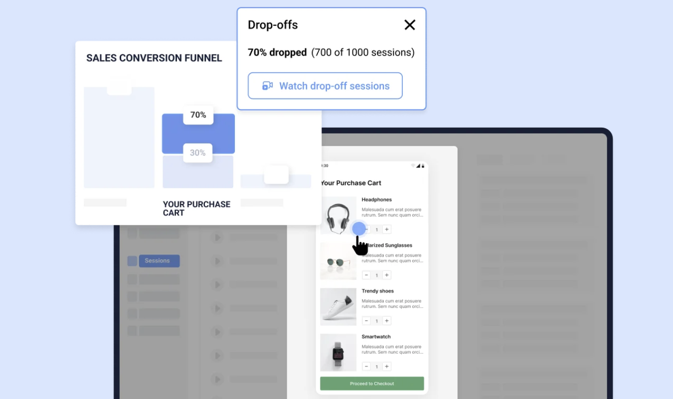
- Session recordings: Let you replay real user sessions (website visits) to see how gaze patterns translate into scrolls, hovers, and hesitations. Very useful for capturing buying trends, even if you don’t have a lot of users or website traffic.
- Surveys & polls: Capture self-reported reactions from users and customers. These can be helpful for understanding big picture motivations and issues that can provide context for understanding why users behave the way you observe.
- User interviews: Provide deeper qualitative insights into decision-making, expectations, and pain points that aren’t visible on-screen.These are instrumental at figuring out the “why” behind the eye tracking data.
- Task success metrics: Measure whether users complete tasks, how long it takes, and where they drop off. These data are critical for interpreting eye tracking data and analyzing trends among different outcomes.
In combination, these methods help move eye tracking from raw observations into actionable insights. They can help explain not just what users saw, but what it meant. Armed with this context, it will be much easier for you and your team to improve their experience.