Brick and mortar storefronts are still a great way for businesses to earn clientele—but to make it in retail in today’s market, the brick and mortar shop is an option; an online presence is a must.
Building an e-commerce storefront can be as involved or as simple as you like—but for it to take off, keep in mind that there are a few guiding principles that you should follow.
For starters, it must be both search engine and user friendly, intuitive, aesthetically pleasing, and functional. But there’s much more to it than that. You need to focus on ecommerce usability as well.
Start your e-commerce venture off on the right foot by following the below five fundamental guidelines for a successful e-commerce design.

Source: Placeit.net
1. Keep navigation simple and functional
This one’s an easy one. Think about your own user experience when you visit a website: Are you more likely to purchase if you can easily find what you’re looking for or if you have to click through 50 options?
Complexity hurts conversions. Excess clicks and menus or unrelenting categorization are annoying to shoppers. Make your menus and navigation options simple and intuitive.
To that end, do not over-simplify. You do need a menu. But try to limit it to somewhere between three and seven headers and three or fewer sub-tiers within the initial headers.
Beyond the quantity of navigation options, be sure to make your options clear. Use simple one- or two-word labels that are very direct and transparent about where they will lead. Trendy and fun wording can be appropriate, but only if it does not take away from the ease of use.
For example, if you are running an e-commerce site focused on apparel, it may seem like a fun idea to label your navigation categories with names like “Threads” and “Kicks.” But in doing so, you may lose some of your audience. Nine times out of 10, you’ll retain more potential clients by just being straightforward.

Additionally, people like familiarity. They know that a left arrow means they will go back and that a pointing finger means they can click on a link.
Stick to known symbols within your e-commerce site to make shopping with you more intuitive and user friendly. (Share this on Twitter.)
Last, but not least, make sure that your navigation options work. I can’t tell you how many times I have visited a website and navigated through their intricate tiered navigation sections, only to finally find what it is that I was looking for—but it not be accessible because they had a 404 or other inconvenient Web error.
I can’t say enough for thorough website testing: Just do it!

2. Use a linear checkout process
Have you ever purchased from one of those sites where you go to check out and then redirect to suggestions or your cart? Yeah, me neither. That’s because a checkout process should be simple: either go back or forward. That’s it. No redirects, no landing back in a cart or shopping page.
Simple and transparent does the trick.
3. Use clear error indications at check out
Make error notifications easy for users to understand. Nothing is more frustrating than not being able to make a purchase and not being able to figure out why. If this happens, your potential customer may give you a second shot and try again—but it’s unlikely they’ll try more than three times.
That said, make your error messages clear. Relay to your customer in clear, direct language what it is they need to do. Make those messages easy to see by using red, highlighted yellow, or even blinking text to increase the error text’s visibility.
Also, place the error message directly above or next to the specific item(s) that requires correction. There’s nothing worse than a blanket error message at the top of the page that leaves someone guessing.
4. Make sure your load time is fast

Did you know that 25 percent of Web users abandon a Web page if it takes more than four seconds to load? It’s true—talk about impatience!
Mobile users are slightly more patient (what does that say about mobile carrier performance?). But just barely: They will give a page up to 10 seconds to load. And there are no second chances: three of five people won’t return to a site they abandon due to slow load times.
Adding further insult to injury, an increase of just one second in your site’s page load time can cause a nearly seven percent decline in your conversion rates.
Time is money and consumers are not a patient breed. All it takes is mere seconds to lose a sale. So make sure you’re working with a good, reliable hosting company; your success depends on their performance.
5. Automate your search
Finally—and this one should go without saying—make sure to include a search feature on your site. Some people will come to you knowing exactly what that they want and, if they can’t find it within seconds, are likely to abandon your site.
Upgrade your search feature to have auto-complete functionality. This is the functionality Google uses, for example, to finish your sentence before you have typed it. Not only does it make it easier for visitors to find what they are looking for, but it also gives you horizontal sales potential by suggesting things within the arena in which they are already searching.
Bonus: A/B Testing
When it comes to making your e-commerce site a success, the best path forward is to never assume.
Don’t assume that high conversion rates are due to your stellar inventory alone. Or that your high bounce rates are because of your homepage design.
What works for one company may not work for another—and beyond that, what worked for you a year ago may no longer work today. Test everything.
One of the best and most proven ways to test is through something called A/B testing.
A/B testing is a way of testing two different concepts simultaneously with randomized testing samples. So two versions of a Web page (or other type of copy) are pitted against one another in order to determine which works best.
For example, if you are planning to send a marketing email promotion and are interested in evolving your strategy, you might send the same email with two different subject lines; in doing so, you can measure the success of the two different emails to determine what type of subject line secures more opens, click-throughs, and completes.
By paying attention to the differences in your approach, you can better tailor your future efforts.
But A/B testing goes far beyond marketing emails. You can use it for everything from testing an email subject line to testing your homepage or even entire website.
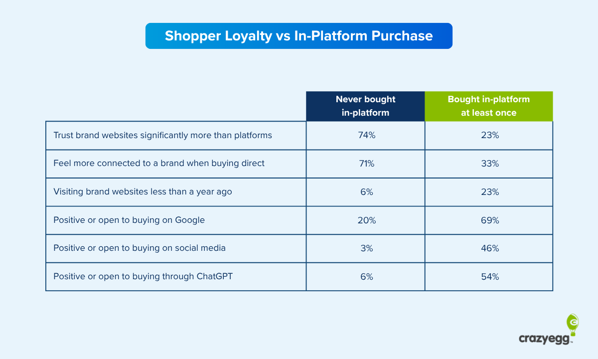
There are numerous solutions out there. Crazy Egg, for instance, is one the industry’s most notable and effective options. And in case, you were looking for more, here are another three tools to look into.
1 – Google Analytics Content Experiment
This solution allows you to test up to five versions of something simultaneously—all within the Google platform. This solution uses a random sample of your visitors, but allows you to define what percentage of your overall visitors are included in the testing.
This comes in particularly handy if you are worried about potential losses should there be a negative reaction to one of your test items. Instead of approaching your entire client base, minimize the exposure by releasing it to just a small segment.
Additionally, you can define which aspects of your site/pages you want to test and you will even get emails updating you about your results and performance.
Since it is part of the Google family, it interfaces right alongside your Analytics account—and best yet, it’s free.
2 – Unbounce
Unbounce is a great option for testing pages and sites without needing to involve your IT team. Even Google’s solution requires one segment of code—minimal by industry standards, but none the less.
Unbounce specializes in landing page testing, meaning that you can easily test from email campaigns, unique URL directs, and more, but that you will be testing single pages (not an entire site).
This tool offers a series of collaboration tools and also does interface with Google Analytics. It offers a convenient landing page builder, so you can create your page from directly within the platform and push it out live with the push of the button.
This option is extremely user friendly and a great way for beginners to get into A/B testing. It does, however, come with a price—though it is quite manageable. Pricing for entrepreneurs and new businesses starts at just $49 per month while pricing for marketing teams and agencies lands at $199/month. Features and functionality vary by cost.
3 – Optimizely
Upon entering the Optimizely site, you will have the opportunity to enter your own e-commerce site’s URL and receive a complimentary tour/example of what the platform can do for you (a nice perk, even if you don’t use their service in the end).
Optimizely is easy to use and requires minimal assistance from your programming team. In fact, it generates a single line of code which your tech team will need to enter into your site’s code (much the same way as they do to integrate Google Analytics).
The platform tracks numerous variants, including engagement, clicks, conversions, sign-ups, and any other metrics you define. You can schedule your testing so it takes an automated approach, freeing you up to wait for the results rather than manually manage every component, including kick-off and test wrap-up.
You can even target your testing to key visitor segments. Optimizely integrates with numerous analytics tools and also works with a graphic user interface so designing test pages is intuitive and doable for non-tech folks.
Again, pricing scales based on the quantity of monthly visitors and features, but it begins at $17 per month and reaches $359 per month for the “Gold” package (which includes 200,000 monthly visitors, unlimited user accounts, phone support, visitor segmentation, and a slew of other features).
All three are great options and which is right for you will depend on your level of tech prowess, need, and budget. Happy testing!
Read other Crazy Egg articles by Jerry Low.