This isn’t the definitive list of the worst websites I’ve ever seen. But if you’re a sensitive soul with design proclivities, I’d get a blanket and a cup of something soothing before you dig in. There are horrors ahead.
Apart from laughing at them, why should we ever look at terrible websites? Wouldn’t it make more sense to learn from the best, rather than the worst?
You can learn a lot about what not to do from failure. (If I were planning to go that route, I’d have started here, with the self-declared ‘world’s worst website.’)
But the sites in this list aren’t failures – they’re successful mutants. They’re each on the list for breaking most or all of the ‘best practice’ rules of design and still succeeding in at least one important way.
And if they don’t look like you expect a good website to look, well, aren’t you tired of looking at cool people drinking coffee anyway?
Make no mistake: Some of these are visual horror shows. There’s no way your website should look exactly like them. But each of them represents a lesson in making a website that actually works.
Let’s check them out.
1: Superior Web Solutions

Where to start? Your website could be nexted. Run now (just don’t run Flash).
Why does it make the list?
This is a dull, poorly written website. The copy’s barely literate, the design doesn’t so much scream as mumble y2k, and when I ran it through Screaming Frog my browser crashed and my phone rang. Most pages don’t have an h1.

But, as soon as you look at it, you know what they do. They make websites.
When you look at the sites that are held up as the epitome of design, it’s sometimes difficult to tell what it is they actually do. And the copy is even less help than the imagery. It may be grammatical and in English, but in many cases it’s such an afterthought to a million cool design gimmicks that it doesn’t come out above the fold and say, ‘we do X.’
Where thought has gone into it, it often kind of looks like this:

But when it comes to Superior Web Solutions, it’s crystal clear.
2: AintWet

What do they want me to do? I don’t get it…
Why does it make the list?
Aintwet is an example of a web design trend called brutalism. Brutalism isn’t meant to look ‘brutal’ – it comes from the French word ‘brut,’ which means ‘raw.’ Often, brutalist websites feature clashing neon colors, garish typography, and a whole bunch of classic design ‘errors.’ Like these.
So far, so abstract. And there are a lot of brutalist websites that look awful and are awful. Special mention to Yale School of Art’s unnavigable, incomprehensible monstrosity.

But the reason AintWet makes the list is that you’d have to have your monitor switched off to miss their CTAs. The whole homepage is a CTA. This is design at work – it’s ‘brut’ not because it’s big and square and kind of ugly in an arresting way, but because it passes every quick-and-dirty test of solid design.
Squint test? Check. Person is drunk test? Probably, don’t ask me.
And that points to some of the arguments Marc Schenker made last year for Webdesignerdepot. Schenker argues that brutalism’s ‘ultra-minimalist design choices actually can prove beneficial to raising conversion rates,’ mainly by making sites load faster and improving usability.
AintWet is a case in point: it loads fast, but mostly, this is a hard website to get lost in.
Click through and you get this:

This is their shop:

Every option a user has on this site is marked like a fire door. Aesthetically you’re going to love it or hate it, but you’re not going to have to hunt for the ‘cancel’ button.
3: LingsCars

For best results, leave the page open a minute or two to see a drag act perform the whole of the Shangri-Las’ ‘Leader of the Pack’ in the background. I’ll wait.
Why does it make the list?
Chinese-born, UK-based car rental businesswoman Ling Valentine has one of the most appalling websites I’ve ever seen, hands down. She regularly updates the design, each one more crass, garish and tasteless than the last. Check ‘em out:

Pretty bad. It gets worse.

Had enough?

Hoo boy.
But she must be doing something right, because she gets an amazing amount of traffic.

It’s all organic, and it’s worth a ton of money.
Not bad for a site that’s registered in Gateshead to Ling’s husband Jon, whom she met in Finland while failing an MsC in wood chemistry (yes, really: Finnish is ‘bloody hard to learn,’ apparently).

(I love that the registrant email is the site’s sales email.)
Ling’s website might be (might be? Definitely is) downright terrifying. But her customers seem to like it. Her business is booming because her website generates traffic.

Based on that Ling turned over $106,192,200 in 2015 (her figures).
And that’s what a website should do.
Does it take the Shangri-Las to do it? Heaven only knows…
4: Craigslist

It is some text. But quite a lot of it.
Why does it make the list?
Craigslist is the best of a slew of websites like the Drudge Report that are basically a page full of text links. Click them to go to another page of text. This is like Web 0.5. Even the name is as design-backwards as you could get: it’s called Craigslist because it’s Craig’s list. Craig Newmark started the site in 1995 and then basically didn’t change it.
He didn’t really need to. Craigslist is monumentally successful. Ahrefs estimates the value of its organic traffic at $206 million.

It turned over $690 million dollars in 2016, a 75% bump on the previous year ‘without spending a penny on advertising or marketing — the largest expense at most major classified companies,’ in the words of Peter M. Zollman, executive editor of Classified Intelligence Report.
Most of that is profit. There are around 50 people working at the company and its main expenses are server costs and legal fees.
Yet, Forbes values Craigslist ‘conservatively’ at $3 billion.
Again, this is a site that works. And it does do without continual redesigns, garish tricks or even images, and without a lick of advertising or marketing.
Why?
Turns out, the secret of Craigslist’s success might be pretty similar to Ling’s.
‘Twenty years ago, I had in mind fancy user interface stuff,’ Newmark told Alyssa Bereznak at The Ringer. ‘Talked to people, they said, “Don’t do that, keep it simple and fast and get to the point.”’
That sounds like good advice, for design, copywriting or anything else that’s about communication and helping people find or do what they want to do.
Equally important, though, is that there’s genuinely a vision behind the site’s layout and user experience.
‘I’m afraid my own personal attitudes reflect that,’ Newmark continues. ‘Especially when I’m listening to people speak, I want folks to get to the point fast and then stop.’
5: Google

Wait, what?
Why it makes the list
Every other site on the list, I’ve had to justify why I think it’s great. The reasons it’s awful are looking you in the face. Google’s not like that. This time, I have to answer: what on earth makes you say Google’s a terrible website?
Well, for starters, like Craigslist, Google hasn’t changed much since the 90s. Here’s Google’s homepage in 1998:

That’s different, for sure. But compared with how different the web looks now to then, it’s hardly any change at all.
For comparison purposes, here’s Yahoo’s homepage in 1998:
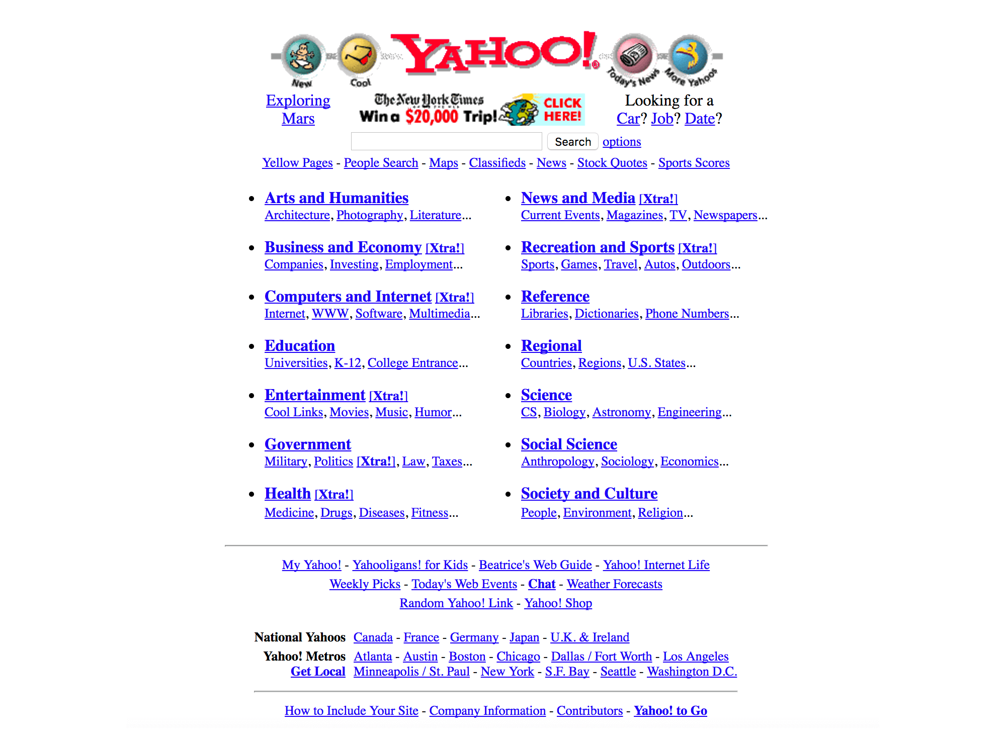
Different. Yahoo and most other search engines focused on throwing the whole internet at you as soon as you opened them. Google stuck with a search box and a couple of links. Google’s homepage is super clean and light, characterized by vast expanses of white space. It was anomalous when it emerged, but it’s now the undisputed king of search:

It’s also conditioned what we expect from a search engine.
But there’s almost nothing there. Just the one thing they want you to do. Is it too stripped down, too basic, too spare? No. Because everyone knows the one thing they’re meant to do on that page. And it’s not like Google started out busy and toned it down over time: they emerged right out of the gate with a super-spare homepage, and their success was rapid. It’s always been a simple, intuitive interface.
Maybe your site shouldn’t be quite that spare. But in all too many cases websites are full of stuff that stands between the user, and the one thing the designer wants them to do. Google neatly avoids that trap.
Conclusion
Some of these sites are conspicuously unpleasant to the eye. Others are barely there, or weirdly super-simple. But what they all have in common is confidence, real creative or business vision, and a sense of putting the user in the driving seat. They’re built to be used, and that’s why they work.
The takeaway is to look afresh at other sites, including your own, and think about what you could stand to move or lose, to de-clutter the user’s route to the thing you want them to do. Probably leave the Shangri-Las alone for now though.


