The ultimate end goal for every single visitor to your website is to turn them into a customer or a recurring visitor.
The problem is that turning visitors into regulars can be tricky.
Really tricky.
There is, however, an easier way to convert visitors without wasting your time or theirs—and it comes in an unexpected form.
Pop-up form, to be exact.
Simply by using well placed popup forms, you can boost your email subscription rate by 317% or more.
With this in mind, we’re going to take a look at our top seven pop-up recommendations and discover how they’ll help you boost your conversion rates.
But first, let’s look at some of the qualities that make a great popup form.
What Makes a Great Popup Form?
-
Marketing Copy
The very first aspect of any successful pop-up form is marketing copy. When you place a pop-up on your website, it’s absolutely essential that the visitor understands exactly what to do and why.
Marketing copy essentially lets all the visitors coming to your page know how they can benefit from filling out the information that you are asking for in the form.
In other words—it provides incentive.
Without this first aspect of the form, there will be no incentive to fill out the form and it will simply be ignored.
-
Branding
When visitors come to your site, many of them will not know exactly what they are coming to.
When the first thing visitors run into on your site is a pop-up, it’s important that they also see your brand and get a taste of what you’re about.
Branding goes beyond the simple act of putting your name on the pop-up form—it also includes making it attractive and giving it a sense of purpose.
Your pop-up should deliver a message about your product and how it will fit into the life of the customer.
Remember, this is the very first taste they are getting of your business—make it good.
-
Imagery
Along the same lines of the branding, including attractive imagery in your pop-ups is another aspect of increasing conversions.
Put yourself back in the shoes of the visitor coming to your site. You see a pop-up, but all it has is simple text with no type of image or design.
Are you going to put your e-mail into the form?
I sure wouldn’t. That’s why including some type of imagery or design in your forms is another integral part of making return customers out of one-time visitors.
Imagery doesn’t necessarily mean pictures. If your website is going for a minimalist look, a simple design is fine. The only thing you’re trying to avoid here is keeping your visitor from clicking the “exit” button before they even see what you have to offer.
-
Call to Action
Finally, make sure you have some type of call to action. Otherwise, your pop-up is not going to drive a conversion for you.
A call to action doesn’t need to be a paragraph-long explanation of your brand, company story, or how you can help them if they’ll just type their email in.
Think simple. What is the fewest number of words you can use to make your form seem irresistible?
A call to action should be just that. One sentence with five words that says you’re giving away an e-book, a webinar, a gift card, or whatever your incentive is.
A simple call to action with a clear expected response is perfect. An example of a clear response is an input bar for an email address and a submit button.
The simpler and easier your call to action is, the more likely your visitors are to respond.
That’s it! Those are the components of a successful pop-up form that is very likely to produce conversions and boost your brand.
The Top 7 Popup Forms to Skyrocket Your Conversions
With these aspects in mind, let’s look at our top seven pop-up forms and how you can use them as inspiration to boost your website conversion rates.
-
Ecommerce: Fab.com

This first pop-up from Fab.com hits all the main points that we just talked about that help turn visitors into customers. Let’s break it down piece by piece.
First, the fun phrasing and statement about the offer are an immediate incentive to respond. The visitor automatically has a reason to fill out the form because the value proposition (“Enjoy 10% off your first order”) is spelled out in capital letters.
Visitors are much more likely to respond to clever, fun wording and marketing copy, which means you’re much more likely to make another conversion.
Second, the form is very attractive and well-designed, which makes the visitor want to put their e-mail into the input box.
The form also makes sense given the content of the website.
If the content on your website is centered around simplicity, design, creativity, or anything else, it is a very good idea to reflect that content in your pop-up forms.
Finally, the input requested here is very simple and easy. The simpler you make the input, the more likely the customer is to actually fill it out. Here, the e-mail is the only thing that is required and the blue “SUBMIT” CTA button stands out from the rest of the form with a nice pop of contrast. .
2. B2B: Web Ascender

This form from Web Ascender is another example of a simple, well designed pop-up that is sure to generate a response and boost conversions.
There are several reasons for this:
- The marketing copy on the form is attractive and enticing. By appealing to customers’ desire to learn and gain experience from the website, the copy offers a strong incentive to respond.To use this same technique on your own website, try to consider what your brand offers and make an appeal to it in the form.
- By adding a small, attractive logo to the form, the website is able to maintain a strong connection between the brand and the benefits being received. A clearly branded form is much more effective, so putting your brand on your pop-ups is a must.
- The imagery is subtle, but it still makes the form much more interesting and appealing. On a simple blue background, this form would be boring. However, the faded image keeps the visitor’s attention.
- Finally, the call to action is a simple e-mail input and the offer of monthly updates with valuable information.
3. B2C: Foreignpolicy.com

This is the pop-up for foreignpolicy.com, an online magazine. They take advantage of several key factors and some of the things that distinguish them as a brand to make the form as attractive as possible.
The dollar makes the simplistic design easy to look at and intriguing enough to read the whole pop-up. The bold color contrast and minimalist approach is maintained throughout the rest of the website as well, so there is continuity between the website and the form.
In addition to being well-designed, the marketing copy and branding both contribute to the success of the pop-up because the reader is not left with any questions about the brand, the purpose, or the value.
When creating your own pop-ups, make sure to include some of these valuable aspects so that website visitors immediately understand the value that you have to offer them.
Finally, the incentive and call to action are simple and easy to execute. The reader is hooked by the offer of a 99 cent subscription and only has to click one button before they are redirected to the form to be filled out.
4. Ecommerce: La Mer

This form from La Mer is very creative and attractive and shows a different side of pop-up design.
The artistic simplicity of this pop-up form fits very well with the design of the rest of the website and also incorporates branding into the photo, giving users the chance to develop the desire for the product.
As with some of the other pop-ups we’ve looked at, the marketing copy here is creative and maintains the customer’s interest.
The incentive is “inside offers” and “an exclusive introduction” to a special product, which is specific enough to be interesting but vague enough to be enticing.
If you decide to go with a design like this, just make sure that it fits in with the rest of your website, because a disconnect between the styles of your website and your pop-ups will feel odd and reduce conversions.
5. Ecommerce: Startup Vitamins

Even though most of the forms we’ve looked at up till this point are heavily focused on design, it is not at all a requirement.
The coloring on this simple “Subscribe to our newsletter” pop-up is very minimalist and simply designed, but it’s still interesting enough to drive conversions.
First of all, the website is focused on encouraging purchases, so the pop-up form’s incentive is highly relevant to anyone who is visiting the site.
This brings up an important point—the more relevant and immediately helpful the incentive is, the more likely it is that it will increase conversions. The $5 off coupon being offered here is helpful to anyone buying from the site, so it is likely to have a high conversion rate.
Second, the simplicity of the form can actually be a very attractive way of presenting the incentive. Rather than masking a simple coupon with photos, complex designs, or other marketing techniques, the creator of the pop-up gives the reader the simple chance to opt in to the newsletter and receive a discount.
If you decide on a straightforward design like this, just make sure that you do something to it to make it more interesting than simple black text on a white background.
Here, the color and the small logo keep the visitor’s attention long enough to read the offer and type in their e-mail address.
6. Ecommerce: Kate Spade Saturday

While we’re looking at simple designs, this is a very attractive circular pop-up from Kate Spade Saturday that has no pictures or logos, but it is playful, fun, and has great marketing copy.
One of the most interesting things about this type of pop-up is how much text is on it. Even though having too much text is dangerous and you can run the risk of losing visitors’ interest, keeping it playful like this form can be inviting.
Having fun with the text, shape, and color of your pop-up—especially if your website is geared toward quirky customers—can be an interesting way to differentiate your pop-ups from those that web surfers undoubtedly encounter when they are on your competitors’ websites.
7. Ecommerce: Cigar Cutters By Jim
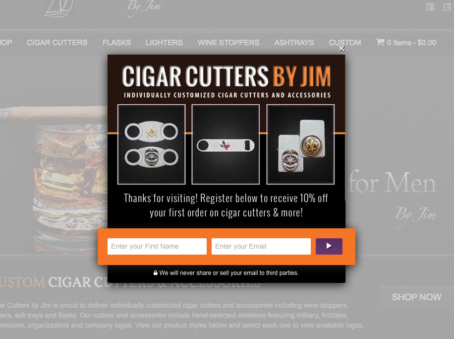
This final pop-up form is one of the most distinct that we’ve looked at, which is one of the reasons why I like it so much.
It’s a great roundup of all the different techniques we’ve talked about, but it also displays different products and allows the reader to really imagine themselves enjoying the benefits that will come from being on the website.
The incentive of 10% off placed next to the photos of real products combine to make a powerful incentive for customers to input their name and email. Additionally, the rugged design fits well with the overall theme of the website.
By combining different pop-up techniques in a way that fits your taste and website style, you can create enticing forms that will convert more visitors than ever before.
Conclusion
Popup forms are an effective tool for turning one-time visitors into customers, but there is definitely an art to creating a pop-up that is going to convert effectively.
By utilizing good marketing copy, images, branding, and a call to action in ways that support your brand and fit in with the rest of the website, you can create lead-generating forms.
Now that you know how to create powerful pop-ups, it’s time to put that knowledge to work!
Start using Crazy Egg tools to optimize your pop-up forms
Author Bio

Yassir Sahnoun is a founder, content strategist, and consultant at YassirSahnoun.com, and a co-founder at WriteWorldwide. He helps companies attract sales using content strategy, copywriting, blogging, email marketing, & more. If you want to skyrocket your sales and up your content marketing game, you can schedule a free discovery call with Yassir by clicking here.