Everyone wants the Pinterest look.
The visual bookmarking turned social networking website is currently having the same effect on web design that a certain hairstyle from Friends had on the hair industry and Apple’s revolutionary engineering had on product design.
For those who are still somehow unaware of what Pinterest is, it’s an online pinboard that lets its users view, collect, organize and share images that they like from all across the web. Think Del.icio.us but entirely images-based (it also lets you pin videos). Pinterest’s pleasing aesthetic would have not gained much attention if it wasn’t for the role its distinctive look played in the website’s staggering achievements: Pinterest recently became the fastest website to hit 10 million visitors in a month, and it now generates more traffic to the websites its users link its content from than Google+, YouTube and LinkedIn combined.
Pinterest’s meteoric rise to social media ubiquity is powered by its blend of great visual design and highly intuitive user interface. Because of the hugely positive response Pinterest has received, it has inadvertently spearheaded the latest web design trend and we can’t get enough of it.

Here are 6 ways you can incorporate some of the Pinterest design magic into your web site and improve your conversion rate:
1. Simple Blocks Are All You Need
Pinterest is built mainly around sticky-note sized blocks that serve as mini web pages complete with their own ‘like’ and ‘repin’ buttons, and comments space.
Most of the space in each block is taken up by an image and the buttons only appear when you hover your mouse over it. The blocks are organized together through a grid that uses a vertical layout to better fit the images- a development strategy that can be traced back to the jquery masonry plugin even if Pinterest firmly brought it into the mainstream. The masonry layout eliminates visual gaps between images of different sizes and proportions, and thus effectively utilizes available space.

The visual grid forms the backbone of Pinterest’s overall user interface. Because the website has vivid eye candy on full display, the supporting design elements have been purposely kept simple so that the spotlight remains on the user content. The objective is for the design to facilitate and enrich user created content- not overpower it.
The Pinterest type masonry layout works best for displaying an image gallery or publishing news stories (or a combination of both). By using separate blocks to house your content you can achieve better organization and superior user interaction.
Facebook’s recent revamp resembles the Pinterest design ideology. In a new two-column setup, the newsfeed gets its own block and the rest of user content is grouped together in separate blocks.

2. Photo-centric design is easier to digest
Pinterest presents its content (which is basically images) in a scrolling collage that clearly deemphasizes text. While you can add captions to the images and click to access a long list of comments, the focus remains on creating a community of people that are joined together by shared visuals- not conversations.
Pinterest draws from and builds on a social development that has been gaining traction for quite some time now: Internet users (and the masses in general) are becoming increasingly intolerant of text and written communication. The success of Tumblr, Instagram and Pinterest, and the potent viral potential of infographics, memes and gifs signal a clearly visually oriented modern society. The publishing industry is by far the worst hit by this reluctance for reading but there are certain implications for web designers and businesses as well.
With Pinterest well on its way to form the social media trifecta (alongside Facebook and Twitter), the visual has become the most powerful means of communication. Images capture attention faster and generate more powerful emotional responses. The success of Pinterest reinforces the adage that a picture says a thousand words.
Essentially, the biggest effect Pinterest is having on web design strategies is that designers are being asked to create ‘pinnable’ content. If your web page is devoid of images that can be pinned and shared on Pinterest, you will be nonexistent on the third biggest social network. In the old days, an image heavy website was seen as clunky and impractical but now, the images on your website will decide whether you fly on Pinterest or get shut out. By ensuring that your website contains ‘pinnable’ images and design elements, you can be a part of the visual conversation on Pinterest.
The good news is that Pinterest offers a great solution to businesses that sell products that can be photographed. You can use your pinboard as an online store- complete with gorgeously organized product images and price tags. You can also easily recreate the look for your online store. Use a featured product as the cover for an album of similar products, create separate ‘pinboards’ for your different product types, add prices and ‘buy’ buttons and let your entire product showcase scroll infinitely!
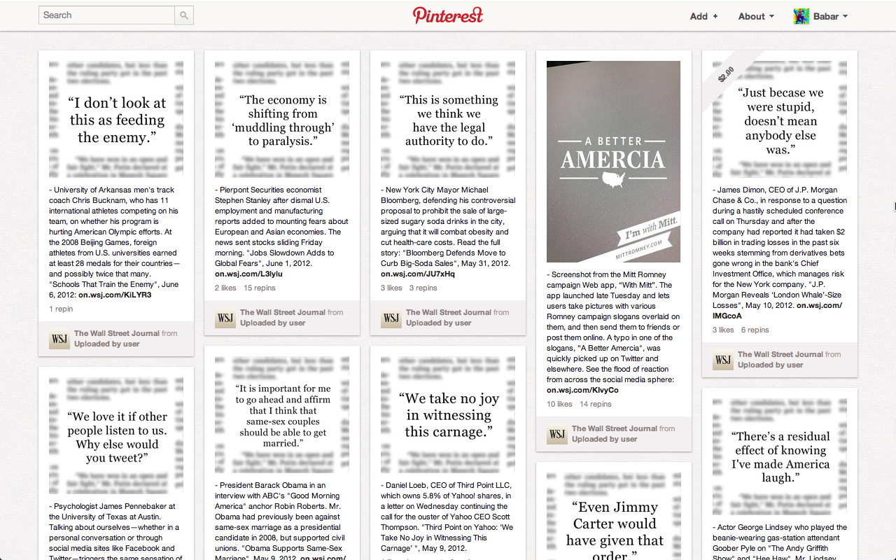
The visual medium has become so strong these days that even the Wall Street Journal is now turning its pull quotes into images and pinning them to their Pinterest boards in an effort to drive users to the full articles.
Lady Gaga uses a Pinterest type visual display for her social network.

3. Deliver Content in Flow
‘Content that flows’ is key to improving conversions, and Pinterest is a prime example. It’s like a window shopping experience that never ends—you keep moving from one beautiful display to the next.
Similar to the revamp of Google Images, Pinterest utilizes ‘infinite scrolling’ to display additional content as the user scrolls down. Because of this rolling effect, a user is far more likely to spend more time viewing and engaging with the content than if they had to click to view the ‘next page’ and wait for it to load. It also makes finding an image you previously liked easier- you don’t have to backtrack through page after page to get to it. Pinterest’s infinite scrolling is complemented by a simple ‘scroll to top’ button on the lower right corner that takes user back to where they started no matter how far they have wandered into Pinterest’s sprawling visual display.
The web design lesson here is that you should not wait for your visitors to make a concerted effort to get more information and content from you.
Make it easier. Make it flow.
Infinite scrolling is one of the best things to happen to web design. Its predecessor, pagination, had always been tiresome for the end user. Web designers mostly spread content across multiple pages to raise advertising revenue as users click from one page to the next but the practice did not allow for a great user experience. A possible solution could be to deliver more ads through infinite scrolling as well!
The Facebook news feed used to be the best example of infinite scrolling that is both practical and addictive. But thanks to its gorgeous visual content, Pinterest is able to combine the engaging masonry layout with infinite scrolling for a spell binding visual experience that gets visitors to spend more time on the site than they had planned to.

4. Break Free of Reverse Chronology
Sure, we all want to know what’s happening right now and are only ever concerned with the very recent, but Pinterest has shown that reverse chronology is not the only possible way to organize content online. Unlike Twitter and Facebook that are all about the ‘latest status updates’, Pinterest organizes its content by interests and pinboards that users can move around and arrange however they like.
Pinterest is not as concerned with ‘what’s new’ than it is with ‘what’s interesting and relevant’ to you. The strategy is apparent in the way you see pins from other users as well as your own pinboard. This way, you get to display your pins the way you like instead of being represented by pins that only get face time because they were newly posted. It, consequently, gives the content a longer shelf life.
You can use this organization strategy in your web design by tailoring content for your users according to their signaled interests. Don’t just tell them what’s new. Tell them what they would like no matter when it was posted.
5. Make it REALLY social.
Pinterest lets new users sign in with their existing Facebook and Twitter accounts. It lets them tweet their pins and post to their newsfeeds with its Facebook app. It goes one step further with the ‘Pin It’ social bookmarklet button which allows you to capture and pin any image from all over the web. And a plethora of Facebook apps let pinners bring over all their pinboards to their Facebook pages.
Instead of trying to build its own unique userbase, Pinterest wisely tapped into the millions of Facebook’s legitimate accounts to ensure that the content on Pinterest comes from real people who will feel responsible for the content they pin. This helped create a community based on the genuine interests of real people. Consequently, Pinterest managed to curate high quality content and avoid the pitfalls of similar initiatives that are chockfull of low quality content and spambots.

6. Execution is as important as the idea
The idea of visual bookmarking isn’t new- there are lots of websites that offered similar capability to their users before Pinterest. However, while a lot of Internet startups based on ‘brilliant and original ideas’ fail because of poor execution, Pinterest managed to become a triumph by excellent execution of a generic idea. Pinterest is a relatively new entry in a crowded niche that already had a number of strong players (remember weheartit?). However, it was able to become the leader thanks to smart design strategy. While sharing similarities, none of the other visual bookmarking websites used masonry layouts, infinite scrolling and existing social accounts in a well-designed conjunction like Pinterest did.
Ultimately, what Pinterest teaches us about web design is this: With the right design execution, you can turn any user experience into an engaging, rewarding and profitable venture. After all, it’s not just what you say. It’s how you say it.
Want to share this post on Pinterest? Use this image.


