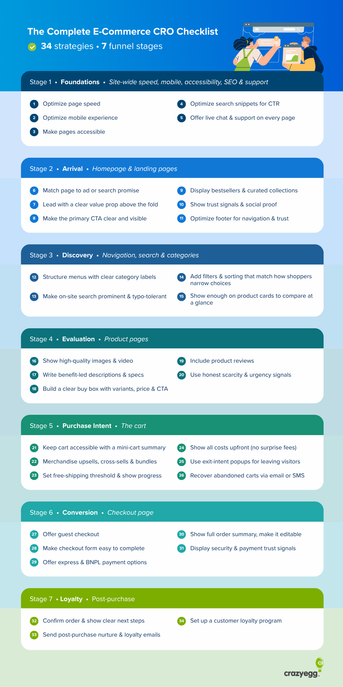
Our e-commerce CRO checklist gives you a list of 30+ evidence-backed conversion strategies that deliver quick wins and help you plug the biggest holes in your conversion funnel, from site-wide optimizations to post-purchase customer nurturing.
The checklist is also a good springboard for further experimentation to dial in your store-specific optimizations.
Your E-Commerce CRO Checklist
I’ve divided our e-commerce conversion rate optimization checklist into 7 sections mapped to different stages of the customer journey:
- Foundations (site-wide speed, mobile, accessibility, SEO, and customer support)
- Arrival (homepage & landing pages)
- Discovery (navigation, search, and category pages)
- Evaluation (product pages)
- Purchase intent (the cart)
- Conversion (checkout page)
- Loyalty (post-purchase)
Foundations: site-wide speed, mobile, accessibility, SEO, and customer support
Site-wide items that affect every page on your store. Fix these first.
- Optimize page speed
- Optimize the mobile experience
- Make your pages accessible
- Make your search snippets attract the click
- Offer live chat and customer support on every page
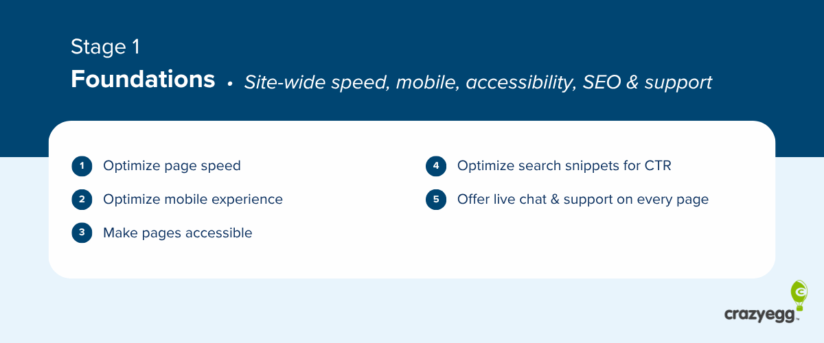
1. Optimize page speed
Cut the website load time to under 2.5-3 seconds by:
- Resizing images and serving them in WebP or AVIF,
- Preloading the largest hero image,
- Reducing server response time with caching and a CDN,
- Defering non-critical JavaScript,
- Breaking up long tasks,
- Removing heavy third-party scripts (chat widgets, analytics tags, ad pixels).
2. Optimize the mobile experience
Mobile is your highest-traffic surface, so optimize your e-commerce store for a superb mobile user experience:
- Size every tap target (buttons, links, form fields) to at least 48 × 48 pixels.
- Set form-input font-size to 16px or larger.
- Use one-column forms (no side-by-side fields).
- Place primary CTAs in the thumb-reach zone (the bottom half of the screen).
- Add a sticky add-to-cart on product pages and a persistent cart icon in the header.
- Offer mobile-native payment wallets (Apple Pay, Google Pay).
3. Make your pages accessible
A share of your shoppers rely on accessibility features, and if they don’t work, it costs your conversions.
Your e-commerce platform or site theme normally covers these, but it’s worth checking:
- Color contrast of at least 4.5:1 for normal text and 3:1 for large text or icons.
- Visible focus states on every interactive element.
- Keyboard navigability in category browsing, add-to-cart, and checkout.
- Form labels, not placeholder-only labels that disappear on focus.
- Icons or text markers to supplement color.
Also, add a descriptive alt text on every product image.
4. Make your search snippets attract the click
To increase the odds that the shopper clicks on your store in search results, write clear, accurate page titles for every product, category, and landing page, and add schema.org structured data to trigger rich snippets (product schema with price, availability, aggregate rating; organization schema for the homepage).
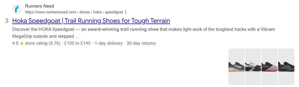
Meta descriptions matter less because Google rewrites most, but ChatGPT uses them to understand page content, so I still write them.
5. Offer live chat and customer support on every page
Provide customer support via:
- A live chat/chatbot widget on every page, with handoff to a human during business hours and an AI or FAQ bot outside them.
- A”Have a question?” link near the buy box and the cart.
- WhatsApp or SMS support
This prevents potential customers from dropping off when they can’t find the information they need.
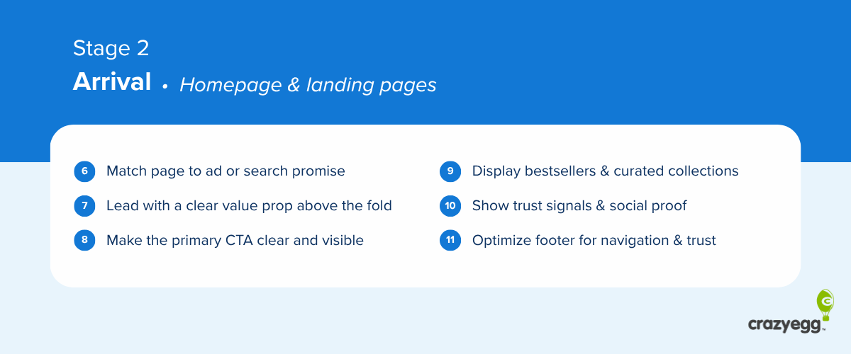
Arrival: homepage & landing pages
Use these to reduce bounce rates.
- Match the page to the ad or search promise
- Lead with a clear value proposition above the fold
- Make the primary CTA clear and easy to see
- Display bestsellers and curated collections
- Show trust signals and social proof
- Optimize the footer for navigation and trust
6. Match the page to the ad or search promise
Whatever you promised in the ad or the SERP snippet, deliver it on the landing page.
If the ad refers to a specific product or promotion, and they land on a generic page, it makes the visitor wonder if they’re in the right place. And makes it harder to find what they need, which increases drop-off risk.
7. Lead with a clear value proposition above the fold
A good value proposition tells the visitor what you sell (product or category), who it’s for (audience or use case), and why it’s worth their time (the differentiator). Avoid generic language that could belong to any store.
Put it in the hero section, above the fold, where the visitor sees it before scrolling.
8. Make the primary CTA clear and easy to see
Give the page one dominant call to action (CTA), so visitors can’t miss the next step.
Label the button with what happens on click (“Shop the New Drop,” “Build Your Box,” “See Pricing”), and don’t dilute it with a same-styled secondary action next to it.
9. Display bestsellers and curated collections
Showcasing bestsellers, new arrivals, and a small set of collections on the homepage gives first-time visitors a place to start and a fast way to see what’s new for returning ones.
Curate the collections by how your shoppers browse (occasion, problem, season).
10. Show trust signals and social proof
Display brand-level credibility signals, including aggregate review counts (“4.8 stars from 12,000+ reviews”), policy guarantees (“Free returns for 30 days”), category-relevant certifications (organic, Fair Trade, B Corp), and earned press mentions.
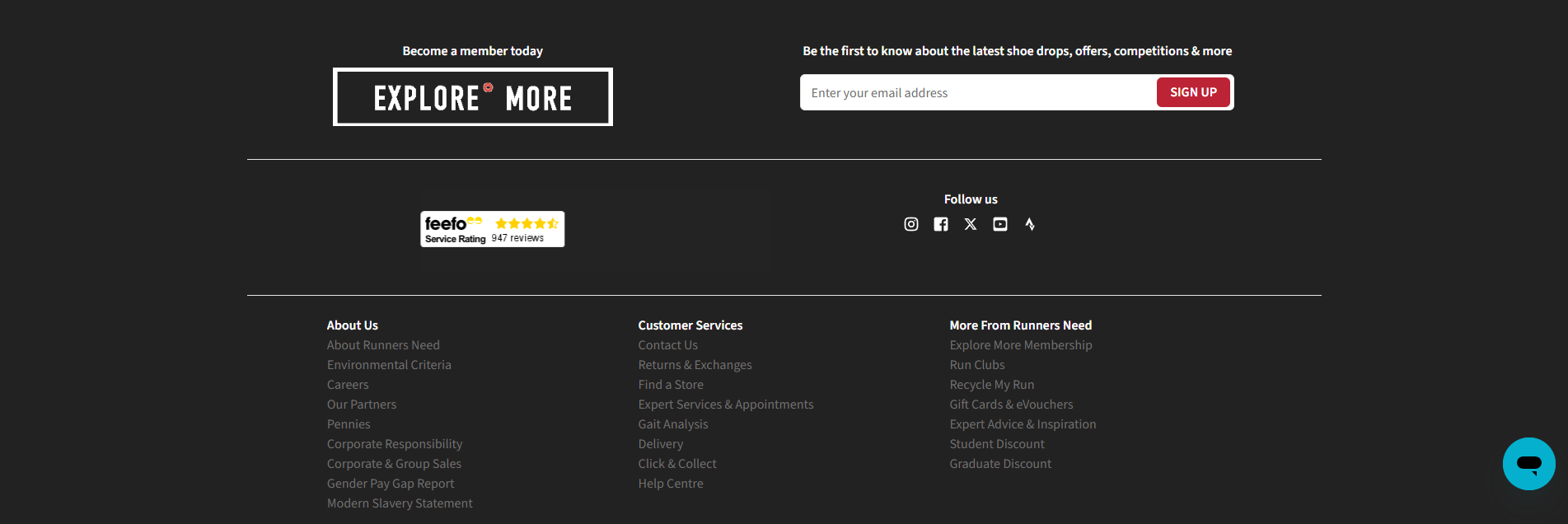
11. Optimize the footer for navigation and trust
The footer boosts conversions by improving navigation and addressing customer concerns.
Add to your footer:
- Quick links to main product categories (a condensed top nav).
- Customer-service links: contact, FAQs, shipping policy, returns, terms.
- Payment method logos and security badges.
- Newsletter signup with a clear value offer (“Get 10% off your first order”).
- Social icons (if you’re active) and contact details (email, phone).
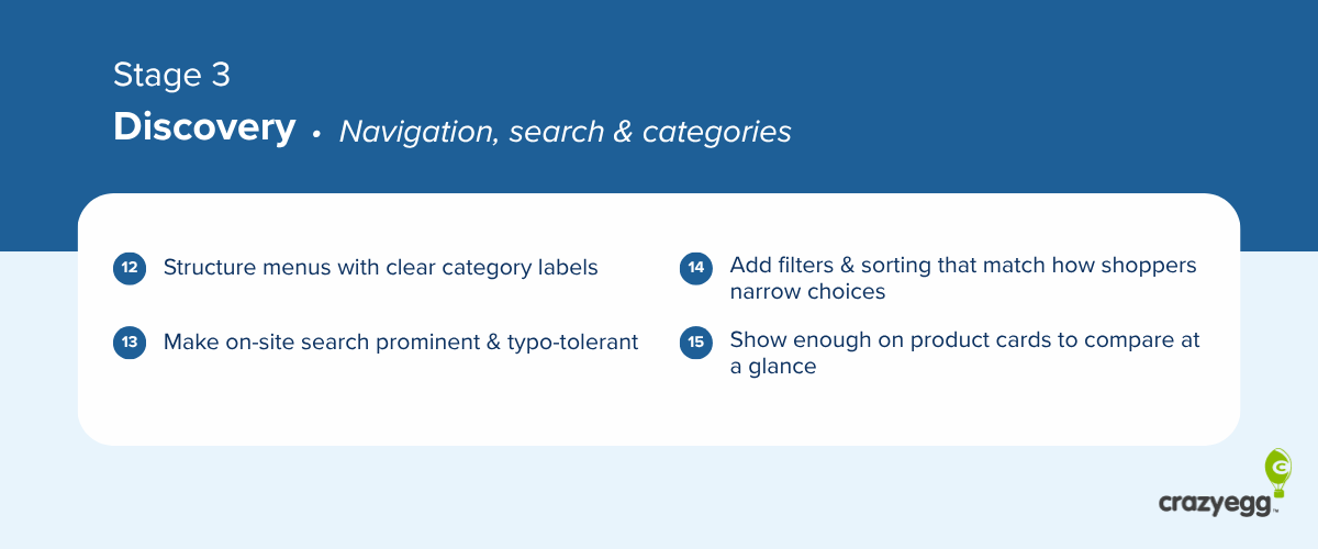
Discovery: navigation, search, and category pages
Implement these navigation, search, and category page optimizations to help customers find what they need fast.
- Structure menus with clear category labels
- Make on-site search prominent, typo-tolerant, and accurate
- Add filters and sorting that match how shoppers narrow products
- Show enough on product cards that shoppers can compare at a glance
12. Structure menus with clear category labels
Name your menu categories the way customers describe what they want (“winter coats,” not “outerwear AW25”) and organize categories around how people actually shop (what they’ll use the product for, who’s going to use it, or season).
Keep the main menu to seven main items to reduce mental fatigue and speed up search.
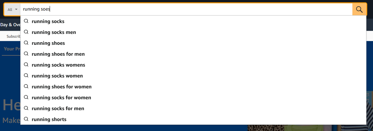
13. Make on-site search prominent, typo-tolerant, and accurate
Use a tool like Doofinder, Klevu, or Argolia so your search:
- Returns relevant results when the shopper misspells the query
- Recognizes synonyms
- Matches partial product names and attributes
- Personalizes search results based on user behavior
Constructor’s 2024 study found searchers were 24% of visitors but drove 44% of revenue and converted at 2.5 times the rate of non-searchers.
14. Add filters and sorting that match how shoppers narrow products
Cover the five essential filters: price, ratings, color, size, and brand, then add category-specific filters (e.g., age plus skill level for toys). Show counts next to each filter so shoppers know what’s available.
Sort by relevance first, with bestsellers, price, and ratings as alternates.
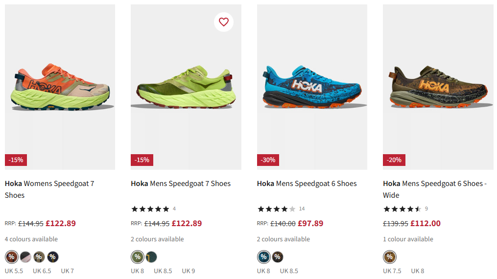
15. Show enough on product cards that shoppers can compare at a glance
The product card must carry enough information for shoppers to compare options without clicking into each product page.
A useful product card shows:
- The main product photo, with a second view that appears on hover or swipe.
- Color swatches for available variants.
- The price (discounted and original).
- A star rating with review count.
- Available sizes
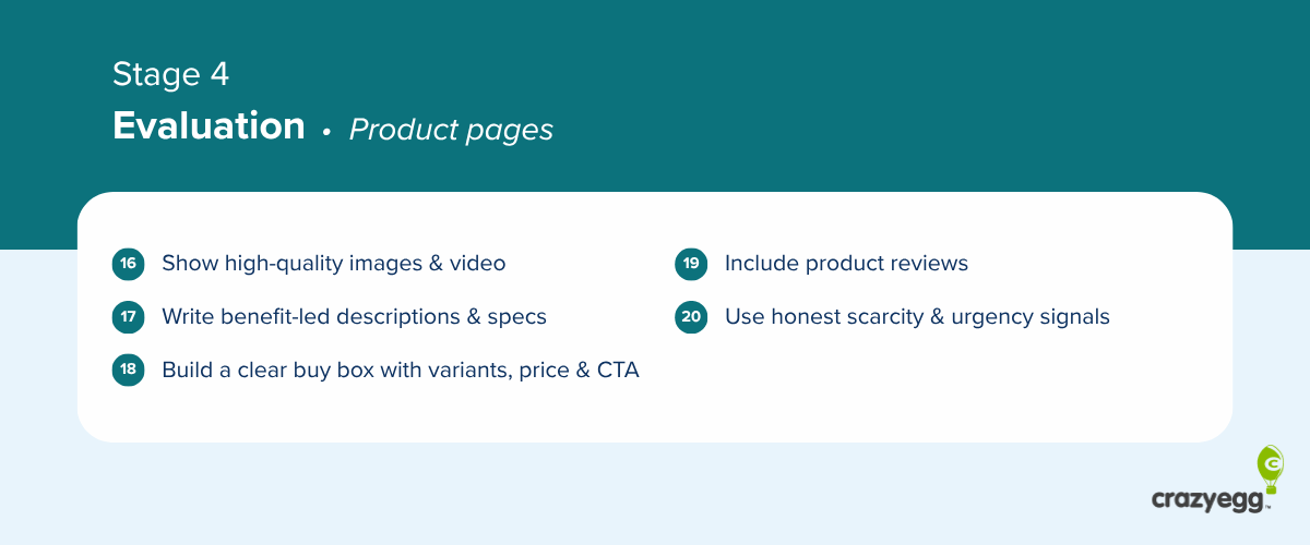
Evaluation: product pages
Design product pages that help the buyer choose the right product.
- Show high-quality images and video
- Write benefit-led product descriptions and specs
- Build a clear buy box with variants, price, and dominant CTA
- Include product reviews
- Use honest scarcity and urgency signals
16. Show high-quality images and video
Show the product in scale next to a recognizable object or person to help them judge the size, cover multiple angles, and include lifestyle imagery of the product in its actual use environment. If available, add a video of the product in use.
Visuals are a proxy for hands-on inspection.

17. Write benefit-led product descriptions and specs
A product page has to give shoppers everything they need to decide whether to buy:
- What it is and what it does, written benefit-first
- Materials and care instructions
- Size, dimensions, or fit information (with a sizing chart where it applies).
- Shipping cost and expected delivery date
- Return window and policy
- Warranty or guarantee terms.
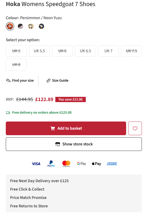
18. Build a clear buy box with variants, price, and dominant CTA
The product page buy box must:
- Show every size and color as a visible button or color swatch.
- Mark out-of-stock options clearly, so shoppers see what’s available before they click.
- Show the price in large, bold text. If discounted, show the original price, too.
- Include a prominent “Add to Cart” button.
19. Include product reviews
Your shopper must easily see star rating and review count, 1-5 star breakdown, and detailed reviews with filter and sort options.
Each review should include:
- The reviewer’s name and a “verified buyer” badge.
- The variant they bought (size, color).
- Buyer-submitted photos and videos of the product in use.
Reviews help shoppers decide whether the product is worth buying, increase confidence, and build trust.
20. Use honest scarcity and urgency signals
Trigger the sense of urgency and scarcity with:
- Low-stock messages tied to live inventory.
- Shipping cut-offs based on your real fulfillment deadline (“Order in 2 hours for delivery on Friday”).
- Sale end dates that are firm, not perpetually renewed.
- Recent activity notices pulled from real orders (“12 ordered in the last hour”).
- Limited edition badges.
People are more likely to buy if something is in short supply or available for a limited time, but scarcity and urgency work only when they’re genuine.
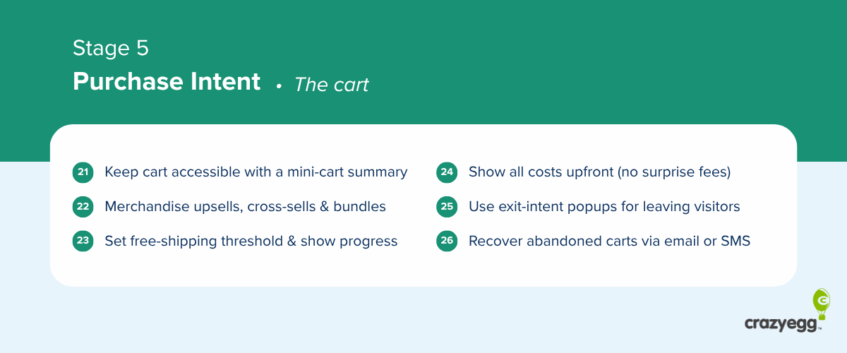
Purchase intent: the cart
Implement these best practices to build a cart that makes shoppers commit.
- Keep the cart accessible with a mini-cart summary
- Merchandise upsells, cross-sells, and bundles
- Set a free-shipping threshold and show progress toward it
- Show all costs upfront (no surprise fees)
- Use exit-intent popups to recover leaving visitors
- Recover abandoned carts with email or SMS
21. Keep the cart accessible with a mini-cart summary
Keep the cart visible and editable so shoppers don’t have to leave what they’re doing to review or change it.
Enable a persistent cart icon with item count in the header on every page, a hover or slide-out mini-cart that shows what’s inside on demand, and quantity edits and item removal directly in the mini-cart.
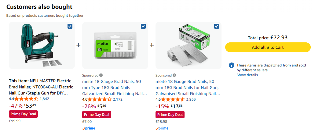
22. Merchandise upsells, cross-sells, and bundles
Show relevant cross-sells, upsells, and bundles in the cart.
Match each suggestion to what the shopper needs with this purchase, for example, a charging cable for the camera or nuts for bolts.
Bundles outperform individual product recommendations.
23. Set a free-shipping threshold and show progress toward it
Set a free-shipping threshold just above your current average order value and show a “you’re $X away from free shipping” progress bar in the cart and mini-cart that updates on every change.
Pair it with a recommendation rail of items that would close the gap.
24. Show all costs upfront (no surprise fees)
Extra costs at checkout are the #1 abandonment reason. To prevent, show the full product cost before the shopper reaches the payment step, including:
- Estimated taxes, duties, or fees and shipping costs on the product page
- Final shipping total in the cart before they click “checkout.”
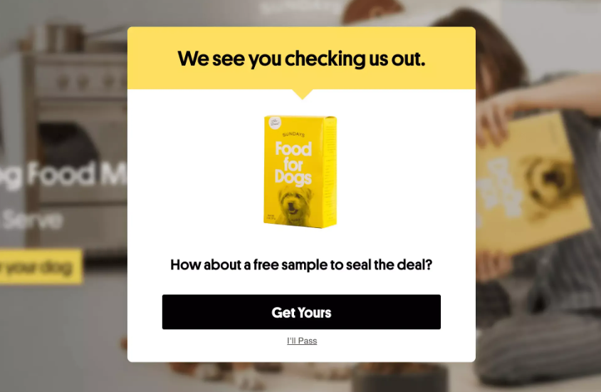
25. Use exit-intent popups to recover leaving visitors
Trigger a popup when a visitor signals they’re about to leave the site to keep them on the page and nudge them to complete the purchase. For example, by offering a discount or free shipping.
26. Recover abandoned carts with email or SMS
Send a recovery email showing the cart contents within an hour of cart abandonment. Follow up 24 hours later and address common objections, like shipping cost or return policy. Send a final message at 72 hours with a stronger incentive, like a discount.
Layer SMS on top of email for the carts you care about most.
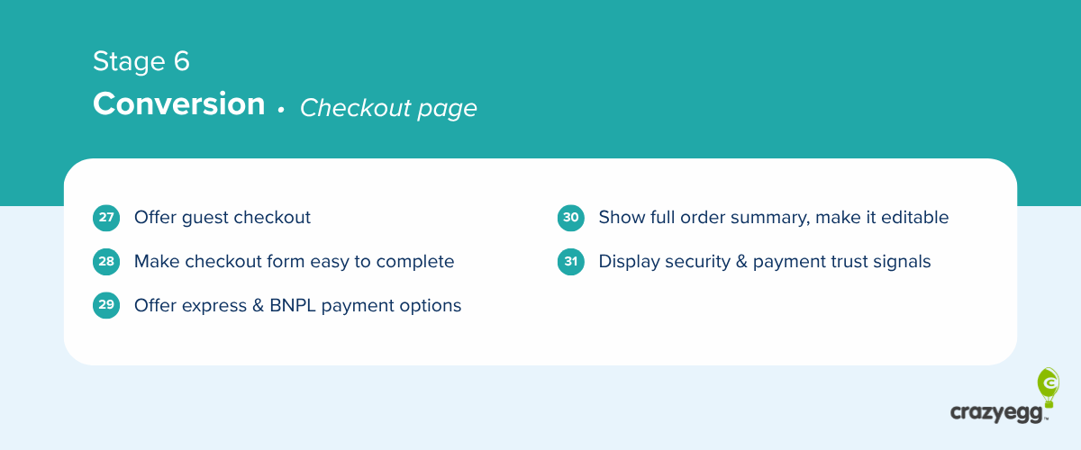
Conversion: checkout page
Implementing these checkout page optimizations reduces cart abandonments.
- Offer guest checkout
- Make the checkout form easy to complete
- Offer express and buy-now-pay-later payment options
- Make the payment step show the full order and make it editable
- Display security and payment trust signals
27. Offer guest checkout
Make guest checkout the default, visually dominant choice, and save the account creation for the confirmation page.
Baymard’s 2025 research found that 18% of US shoppers abandoned a cart because they were forced to create an account.
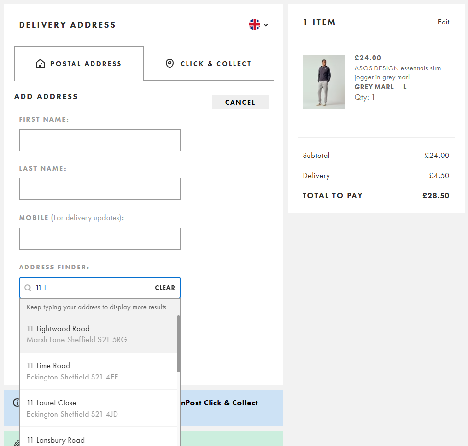
28. Make the checkout form easy to complete
Keep the checkout form to 7-8 fields. Combine first and last name, default billing to shipping, and hide the second address line and coupon field where possible.
Make the remaining fields easy to fill:
- Use the right input type: dropdowns, date pickers, toggles, and input types that trigger the right mobile keyboard.
- Enable browser autofill so saved data fills in with one tap.
- Add address autocomplete
- Validate inline as the shopper completes each field.
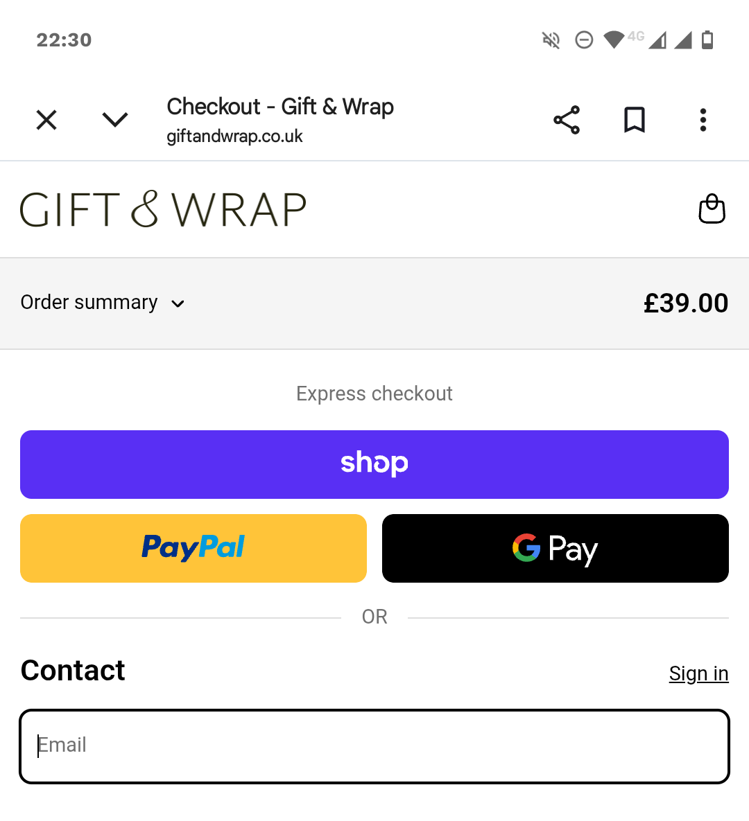
29. Offer express and buy-now-pay-later payment options
Offer the express wallets your audience uses, and put them above the form.
Stripe (2025) found that adding one additional relevant payment method increased conversions by 7.4% and revenue by 12%. Buy-now-pay-later (BNPL) option increased revenue by up to 14%.
30. Make the payment step show the full order and make it editable
At the payment stage, show every product with a thumbnail and quantity, the subtotal, shipping, tax, discounts, and the final total. Put it on the same screen as the payment form.
Let shoppers edit quantities or remove items directly on this screen so a small change doesn’t force them back to the cart.
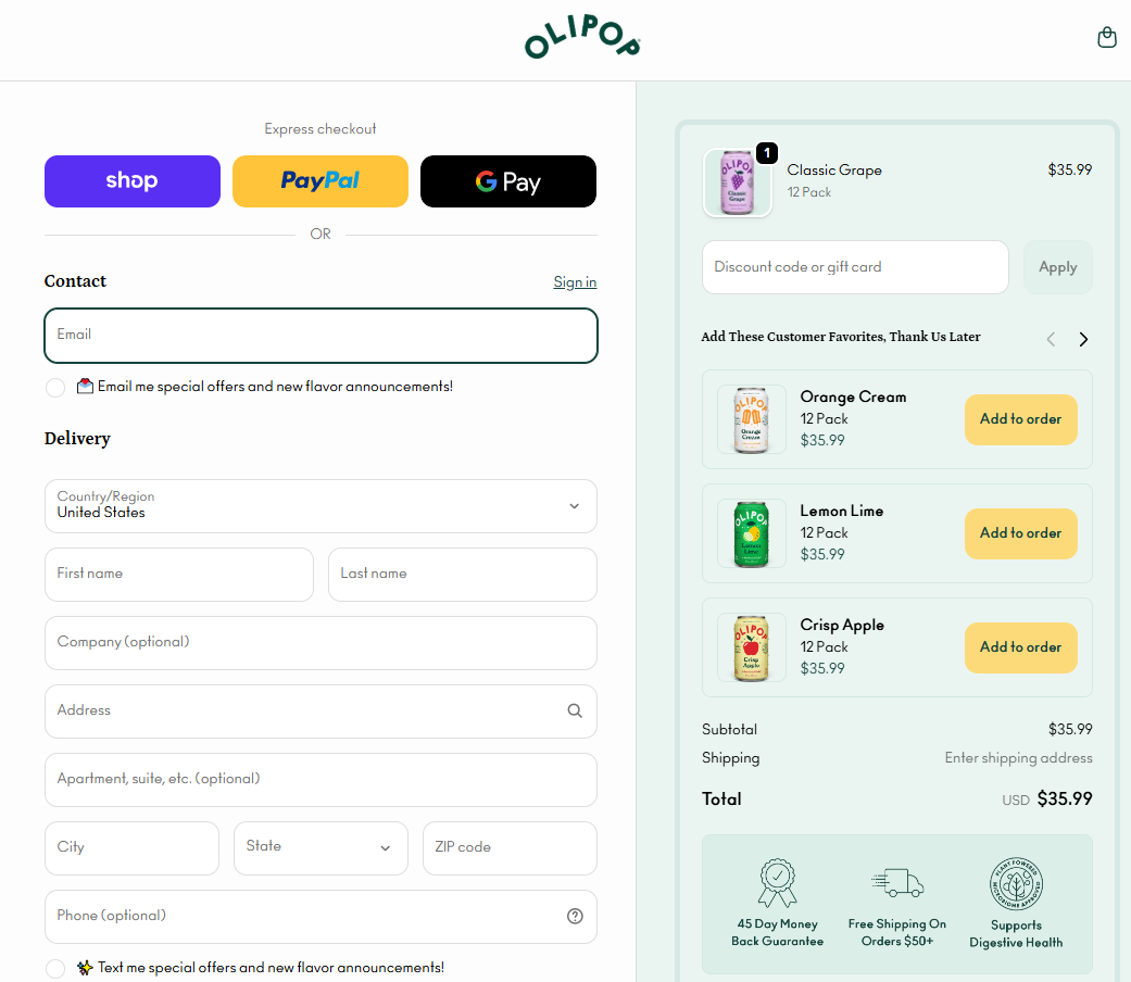
On mobile, keep the running total visible at the top or bottom of the screen so it doesn’t disappear behind a collapsed accordion.
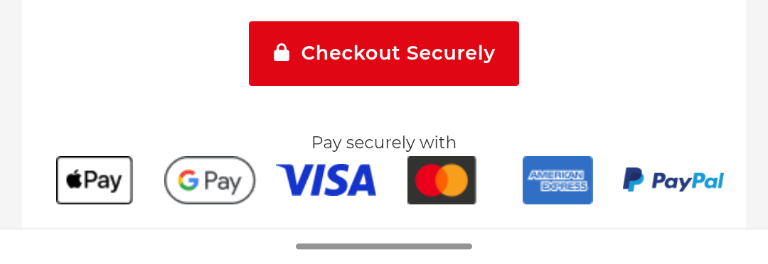
31. Display security and payment trust signals
19% of cart abandoners cite distrust of card-data handling, so place trust cues next to the card form.
Use a small lock icon on the card row, the accepted-card logos next to the inputs, and a note about secure processing under the CVV.
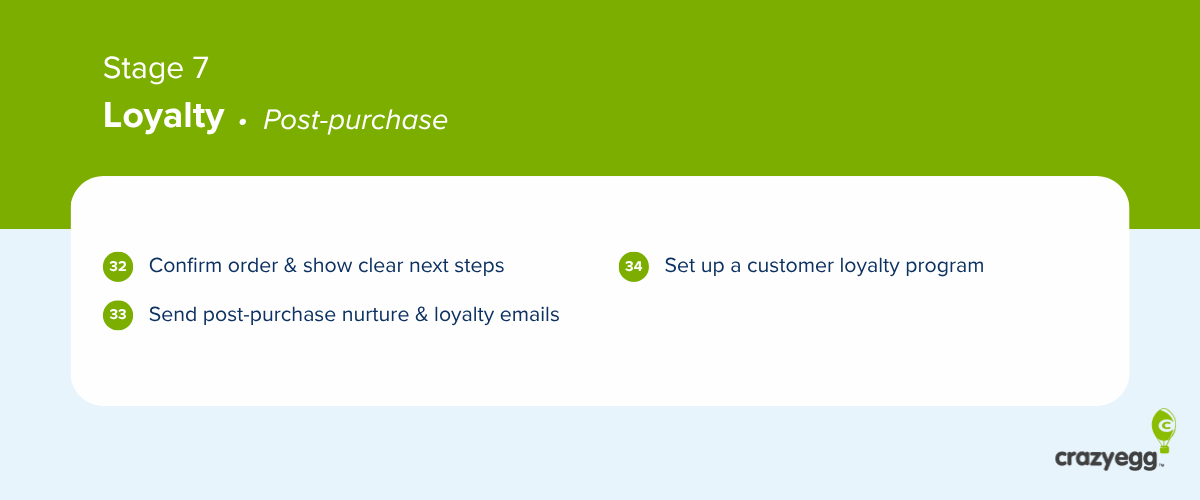
Loyalty: post-purchase
Acquisition gets the attention; retention pays the bills.
- Confirm the order and show clear next steps
- Keep customers engaged and nurture loyalty with post-purchase emails
- Set up a customer loyalty program
32. Confirm the order and show clear next steps
On the confirmation page, show the order summary, an expected arrival date, a clear note that confirmation was emailed, and an account-create CTA.
Follow with the “next steps” links: track the order, contact support, or return to shopping.
33. Keep customers engaged and nurture loyalty with post-purchase emails
Lead post-purchase emails with information the buyer needs (shipping confirmation with tracking link, how-to-use or setup guides), and follow with related product recommendations and replenishment nudges for consumables.
Send review requests and loyalty or referral offers later, when the customer has had a chance to try out the product.
34. Set up a customer loyalty program
A well-designed loyalty program increases the repeat-purchase rate.
Try these rewards and incentives:
- Points per dollar spent, redeemable for discounts or free products.
- Bonus points for non-purchase actions (reviews, referrals, social shares).
- Tier-based perks like free shipping for members or early access to launches.
Show the points balance on the order confirmation, in post-purchase emails, and in the customer account.
How to Use This Checklist
Before you reach for the checklist, walk your own store. Use the menu and search bar to find products, place an order, and go through the checkout, and try every payment method. Fix every friction point you find.
Next, work the CRO checklist in this order:
- Implement the site-wide optimizations before stage-specific ones.
- Prioritize by funnel stage. Use your analytics to find the biggest drop-off, for example, low add-to-cart on product pages or high checkout abandonment.
- Implement the relevant stage optimizations.
- Measure the impact. Re-check the conversion or drop-off rates at the stage you fixed after 2-4 weeks of traffic.
- Dig into the details with behavioral data. To achieve further improvements, use heatmaps, session recordings, and on-site surveys to understand why drop-off is happening.
- A/B test the changes.
Turn the Checklist Into a CRO Program
Working through 30+ tried-and-tested CRO strategies in the checklist is the quickest way to move your numbers.
When the optimizations don’t move the needle anymore, use user behavior analytics and A/B testing to identify improvements specific to your store.
Start your 30-day free Crazy Egg trial and run your store through the diagnostic after you’ve ticked off the checklist.
FAQ
What is CRO in e-commerce?
E-commerce CRO is a discipline that focuses on increasing customer conversions when they visit an online store. Conversion optimization strategies remove friction from the shopping experience and offer incentives for users to complete the purchase.
Why invest in CRO instead of more ad spend?
CRO is a better investment because acquiring new customers is expensive. If these customers don’t convert, spending more on acquisition is a waste of resources. Increasing the conversion rate from 2.2% to 2.3% gives you a 4.3% revenue lift (assuming the AOV remains the same).
What counts as a “good” ecommerce conversion rate?
What is a “good” conversion rate in e-commerce varies by industry, device, traffic source, and AOV. Dynamic Yield’s vertical benchmarks (May 2026) put store-wide ecommerce conversion at roughly 0.7% in Luxury and Jewelry and up to 7.15% in Veterinary and Pet care.