Color can affect us in unexpected ways. It can:
If it can do all that, can it change purchase habits?
Yep.
The emotional effects of different colors are well documented.
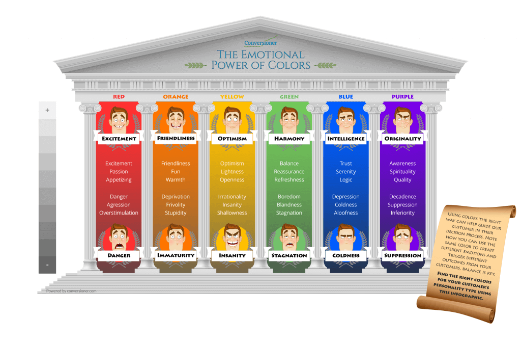
Obviously, each of these colors is a two-edged sword – it’s easy for blue to come off as cold, or red to scare folks off.
But done right, color can be leveraged to affect conversions.
The effect can be stark.
For instance, 85% of shoppers say that color is their primary reason for buying a product. And 66% of people won’t buy a product unless it comes in their preferred color.
Speaking of which, what exactly are people’s preferred colors? Can they be predicted?
Yes, but only vaguely. People choose colors based on how they feel at the time, though there are some constant trends.

If certain moods can make us think of certain colors, the opposite is also true. Colors can trigger changes in mood:

Which means we can use website design elements to trigger emotional changes in our visitors, increasing conversions.
Additionally, colors can strongly affect how a business is seen by visitors and customers. Colors contribute best to conversions when they reinforce brand personality.
It’s a tightrope.
The right color will increase your conversions. And the wrong color will turn people away.
How do we make sure we’re using the right colors?
Here are 6 with a solid track record.
1: Red
Scientists at the University of Durham published research in 2005 that showed that athletes who wore red were more likely to beat their opponents: ‘We find that wearing red is consistently associated with higher probability of winning,’ wrote Russell Hill and Robert Barton.
Red’s associated with urgency, danger and power. That sounds like a potent combination that you might want to step lightly around, and you’d be right. You should use red sparingly. But you should absolutely use it!
What does red do for sales?
Red triggers action. If you’ve already primed someone to buy with great design (that isn’t all bright red), and solid copy, then your red ‘buy now’ buttons can work great.
Where can you see it in action?
Every bricks-and-mortar sale ever: all sales signs are red, and it’s not just a convention. By the time Black Friday rolls around, people are already geared up to go find something at 99% off and buy the heck out of it. The trigger they need is to buy from this store rather than that one, so sales signs are bright, urgent, act-now red.
Where should you use it?
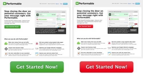
Red is more effective for impulse purchases, so it’s a common buy button choice on ecommerce websites. But it’s more effective for B2B software vendors too. When HubSpot A/B tested CTA button color for Performable, red out-converted green by 21%.
Red seems to perform best across the board.

2: Blue
Blue boosts sales indirectly. It’s associated with calm, tranquility and stability, which means it’s a popular color for financial institutions.
It’s also a popular color whenever you want to make people think of security and serenity. So big-ticket items that have a lot riding on them often use blue.
What does blue do for sales?
Blue can boost sales indirectly, by dealing with anxiety before it arises. With red, we’re trying to trigger nervous system arousal – we want people to sit up, take notice, and realize that now is the time to buy. With blue, it’s the opposite – instead of exciting purchase intent, we’re quelling anxiety.
That makes blue a good choice for background and conversion elements on websites that deal with intrinsically scary things like finances, medicine or insurance.
Where can you see it in action?

Most financial and insurance sites will use blue. Lighter blues give a sense of freedom and security, while darker blues are associated with tradition, seriousness and intelligence. Paypal makes hay with both, while other financial services sites go with royal and navy blues for their association with sober security.
![]()
Note the use of a contrasting color – with the opposite emotional associations – for headings.
Check out Versions, too. Offering to open up SVN to designers and developers who aren’t familiar with it (or want an easier interface), Versions uses both blue and green buttons – one for download, the other for buy.

Where should you use it?
Use blue where your sales depend on projecting an image of reliability and seriousness. It makes good conversion elements against a white background, and blue and yellow text together are regarded as the most readable. So despite being calming colors, they may be the most visible – and the majority of colorblind people are red-green colorblind and can see blue and yellow.
3: Green
Green’s associations are with the environment – ‘green’ is a one-word reference for the whole spread of natural, organic, environmentally friendly. So it gets used by businesses that want to appeal to similar audiences or that align with similar interests, even if there’s no direct connection.

Is this yoga studio particularly environmentally friendly? Maybe. Probably it just appeals to people who regard that as a positive.
This instinctive association does have some evidence to back it up: studies suggest that being exposed to green, as opposed to other colors, can make people more creative.
As well as its outdoorsy and environmental connotations, green is the ‘go’ signal on stoplights. Green conversion elements make sense for purchases that feel less like urgency, and more like permission – like buying high-end consumer tech.
What does green do for sales?
Green makes a solid CTA and buy button choice.

Way back in 2010, RIPT Apparel decided to try their first A/B test, replacing a black buy button with a green one.

The result was a 6.3% conversion jump.
Where can you see it in action?
Computing giant Dell seems to be reading this article. On their product pages, they use blue for reliability and intelligence – and a red offer banner to make me feel like it’s urgent that I click it now.

Scroll down, though, and you can see that all their conversion elements are green.

Where should you use it?
White space and contrasting colors, or in places where it can dominate the visual hierarchy and command attention without screaming. If you think your buyers are more likely to need a green light than a fire sale, green buy buttons are worth testing too.
Green seems to work best on sites that sell consumer electronics, where it slightly out-performs red.

4: Purple
Purple is associated with royalty, wealth and power – once, there were laws forbidding ordinary people to wear the color. In modern times, it’s a bold color that isn’t freighted with the ‘do it now!’ urgency of red, or the ‘we’ll help you with your taxes’ seriousness of blue. It also comes with connotations of spirituality and creativity.
It’s worth taking a look at who likes purple:
It’s in the top three for women:

… and the bottom three for men.

Source
So we can think of it as a kind of ‘pink for grown-ups’ – don’t brand with purple if your audience is mainstream adult males, and don’t expect those people to be anxious to click on buy buttons in purple either.
What does purple do for sales?
Purple is a bright color, and it’s complementary with yellow-green and analogous with pinks and blues. (Don’t make your site green and purple unless you have designs on Gotham City.) So it often gets used on sites with lots of white and black as a stand-out splash for branding, menu items or conversion elements.
Where can you see it in action?
Roku, the TV streaming company, uses purple for its branding. It’s also used for menu elements on the site.

Where should you use it?
On a practical note, purple gives a great standout color for branding and conversion elements in sites that use a muted blue – cream – brown color scheme intended to convey seriousness and competence. That’s a common choice for financial businesses, but educational organizations like Pearsons use it to the same effect.

Bear in mind that the shade or tint will strongly affect how your purple elements come across. If you don’t want them to read feminine, go for high saturation and deep shades, and pair them with blues. If you do, take it the other direction into strong, light hues and pair them with pinks and reds.
One thing about purple? It stands out. Make it bold for the right reasons, and you have a solid alternative to the BOB.
5: Black
You wouldn’t think that black would play much of a part in most websites’ color schemes. And you’d be right: most sites opt for white space, and a couple of strong colors. But black can be powerful.
The brands that use black to good effect are luxury or high-end brands, retailing to a mainly male audience. Rolls-Royce. Lamborghini. Rutgers University.
Notice the trend?
What does black do for sales?
Black doesn’t make great conversion elements because it’s tough to see except as an outline. But a black and white color scheme automatically gives you contrast. Squarespace uses a white button on their black backgrounds:

On their lighter colored backgrounds, the button is black with white text:

That decision frees them to use a range of colors and hues in their imagery, knowing their black/white branding will stand out among all of it.
Where can you see it in action?
Check out any high-end luxury brand with a male-oriented clientele and you’re likely to see a lot of black. For instance, Rolls Royce:

Rum brand Don Q gets some mileage out of black too, pairing it with gold and a line of copy aimed at young men who want to be sophisticated.

Where should you use it?
If you’re not selling luxury cars, use black sparingly. But it can be an effective color as an element, even on a light colored website.
6: Orange
Orange is a bright, bold color that doesn’t have red’s heart-palpitation urgency. It also doesn’t suffer as much as red does from being toned and tinted – pale reds aren’t easy on the eye, and dark reds are difficult to see text against, but orange will support a far greater tonal range.
That’s the technical side. Orange features heavily in many websites, where it’s used for calls to action and buy buttons. It stands out clearly against a lot of different backgrounds, and some of its success may be down to the fact that it’s a comparatively rare brand color so an orange button is often the only orange thing on the page.
What does orange do for sales?
Orange is a common choice for conversion elements in clean, simple-looking websites. It stands out clearly from the majority of color schemes and it’s a color that people feel positively about – even though it’s in both men’s and women’s bottom three colors.
Where can you see it in action?
Penguin has orange branding, orange subscribe buttons…

And orange buy buttons.

Basically, everything clickable on the page is orange.
And check out how Blogger uses orange.
It’s a classic, simple signup page.

But it’s also a background slider. As the slider turns, we see two more background colors.

Teal gives way to blue…

But the signup button stays orange, because it looks bright, legible and coherent against all those different backgrounds.
How should you use it?
Check out how Harley Davidson use orange:

Against a dark background, bold orange stands out. The color is picked up in menu items, and even echoed in the red of the featured bike’s back springs. Most importantly, the whole site is in the colors of the logo: black, orange and white.
Conclusion
Some colors are effective because they stimulate urgency, others because they soothe anxiety. Some work by calling up feelings of safety. Others bring to mind excitement and danger.
So which should you use?
It’s vital to align the colors you use with your brand identity. If your brand is about excitement, power and freedom, then colors like Harley Davidson’s might work great for you. Victoria’s Secret uses a very different color scheme, because their brand is about something very different.
Never go against branding when you’re making a color choice.
Beyond that, though, color advice is only indicative. Some of these colors have hard facts to show that they improved conversions – for somebody else. HubSpot said it best: ‘The most we can say is that they hold for the conditions in which they occurred: in this page design, on this site, with the audience that viewed it.’
Whether they’ll improve conversions on your site is a different question.
The only way to figure out how your sales will be affected by changing the color of your buy buttons and CTAs is to run your own tests.