Web designers are always discussing the best colors for websites, as color is critical to the level of a site’s success.
When creating a website that’s designed to appease your target audience, you need simple navigation, an uncluttered layout, and enough important information to keep your traffic engaged and returning enough times to successfully convert.
Yet, there’s one aspect of web design that matters greatly and yet it’s so easy to get wrong.
We’re speaking of website colors, of course, and only the proper ones will do for your discerning audience.
“What Color Should I Choose for My Website?”
When asking yourself this question, consider Your brand’s logo and maybe the color of your products for inspiration.
If your company makes tractors, for instance, those vehicles might be a flashy red color.
Your next job will be to find other colors that will complement the red.
Whatever you do, spend a lot of time on this issue. This isn’t a topic you want to tackle and then move on from. The choice of color matters in web design, perhaps a little more than you might suspect.
How Your Choice of Website Colors Can Impact Your Conversions & Sales
The average person takes around 90 seconds to form either a positive or negative interaction with your website. According to a study conducted by the University of Winnipeg in Canada, up to 90% of a person’s assessment about your site is based on colors alone.
Furthermore, if yours is an ecommerce site, you find it fascinating that nearly 90% of shoppers cite color as their basis for most product purchase decisions. Color also helps people recognize your brand. In fact, research shows that color helps with brand recognition by 80%.
How to Choose Color Combinations for Your Website
The first thing you should do is search around the web for companies similar to yours. Study their websites and try to determine why the organizations selected the colors they did.
Notice the graphic created by Material UI, which showcases all the colors used by top sites from around the world.
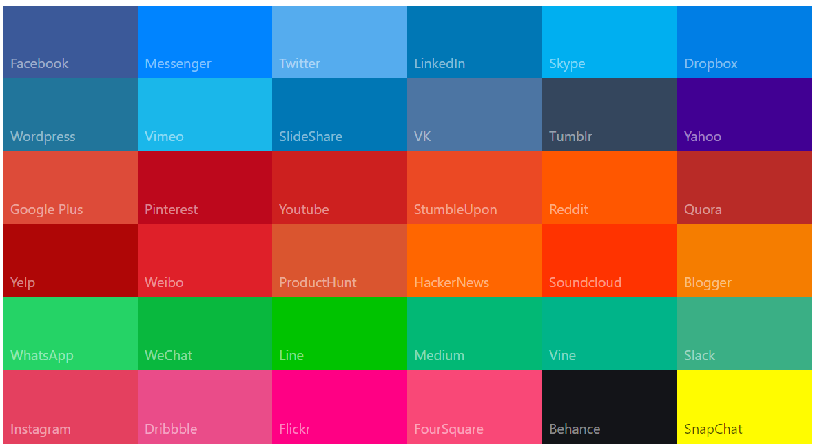
You can take a lot of inspiration from these very sites but knowing why the companies chose their respective colors helps.
Before we get to the reasons some web designers use certain colors over others, it helps to understand the ways colors work together for more harmony and greater eye-appealing design.
Use Primary Colors to Stand Out
Primary colors stand alone in the world of colors. That is, these stark blues, yellows, and reds are not created by mixing any other colors together.
Secondary colors are created by mixing two primary colors together. For example, combining blue and yellow make green just like red and yellow come together to make orange.
Tertiary colors are made by mixing primary and secondary colors. For instance, this is where you get your blue-green combinations or red-orange.
Now that you know the differences between color types, focus on primary colors if you hope to incite action, particularly for strategic sections of your site, such as your calls-to-action.
Notice how Exxon uses the primary color blue for its call-to-action button to entice visitors to Join for Free.

Use Color Combinations to Bring Shades Together
To understand the concept of color combinations, you’re encouraged to turn to the color wheel.
This festive looking wheel helps you understand colors’ relationships with one another and can help you create eye-popping websites designed for conversions.

Here are some ways the color wheel can be used to select your website colors for the best results.
Complimentary Colors
Matching your primary color to its complementary color can make your website more pleasing to the eye. Once you have a color picked out, simply draw a straight line across the color wheel to the other side. Examples include blue and orange and green and red.
Analogous Colors
This color scheme involves selecting a color on the wheel that is directly beside the color you’ve selected. For example, if your primary color is blue, selecting blue violet and blue-green can help to give your site a nuanced effect.
Triad Colors
With this scheme, you draw an equilateral triangle from your prime color to two others for added aesthetic effect. Keep three colors between your selections at all time. For example, if your main color is blue, then your other colors might be yellow and red.
Color is All About Audience Psychology
Most people have a favorite color and some people prefer certain colors over others. Choice of color can actually vary greatly, depending on a person’s age, gender, and where they’re from.
Therefore, you must consider your audience when selecting your color schemes. Men tend to prefer brighter colors while women like website colors that are softer.
This is just one example of how your buyer persona can affect the choice of colors you use if you hope to enhance your site’s success.
However, no matter which gender you’re targeting, or even if you happen to be targeting both, when it comes to men, 27% said that brown was their least favorite color compared to 20% of women. Take these types of statics into account to avoid turning off your buyer persona.

The 10 Best Colors for Websites That Want a High Conversion Rate
With all that knowledge in mind, let’s get down to brass tacks.
Here are the various colors you might want to select for your website, and why, for more traffic, engagement, and sales.
White
White is critical for displaying text at just the right contrast so as to make your site’s words, sentences and paragraphs more legible and easier to read.
Without white space, you might overwhelm your audience and cause them to bounce.
The truth is, white can come off as pure and clean, but too much can give your site a snooty, almost unfriendly feel, which is hardly what you want when audience engagement, repeat visits, and conversions represent your ultimate goals.
Skype makes liberal use of white space to draw attention to its headline, imagery, and primary color blue calls-to-action.

Word-Form makes use of white to showcase their professional photography, and the design works well. It’s simple and easy on the eyes.

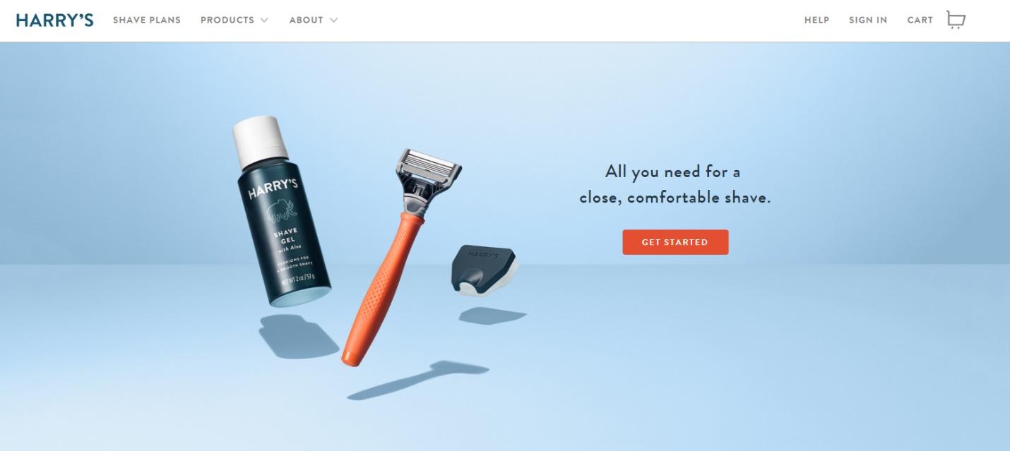
Some people might find the overuse of white excessively boring. If that’s the case for your audience, consider using the technique used by razor company Harry’s.
The website uses white very conservatively in the header to act as an uncluttered space for the simple navigation menu. The site then contrasts the white with a nice, soothing blue, which is both interesting and, well, it kind of makes you want to stick around, browse, and just maybe buy.
Blue
The color blue is used by quite a few websites in various shades, namely Facebook, Twitter, LinkedIn, Skype, Dropbox, WordPress, and lots more.
There’s a great reason for that. Blue is seen as the color of communication, intelligence, and calm reflection.
It’s typically found in corporate business because of its ability to evoke feelings of security, safety, comfort, and trust.

The color is relaxing and, most of all, it makes visitors to your website want to remain, because like looking up at the sky, the color blue simply makes them feel so darned good.
Black
You might think that Black would be associated with darkness and coldness, and you’d be correct in a sense.
But black used in web design can also represent sophistication, glamor, security, and efficiency.
You will notice black used heavily on power and luxury brands like Mercedes-Benz, Under Armour, Loreal, Rolls Royce, and plenty of others.
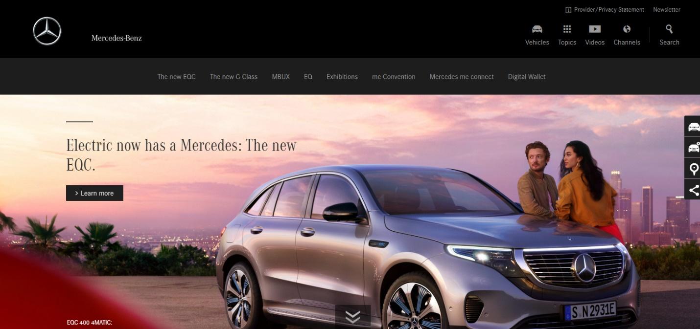
Notice how Mercedes also uses lots of gray, which is analogous to black on the color wheel.
Gray
A color that represents strength, power and authority, gray makes for excellent shade that will go with most colors. You will notice that gray is used a ton in web design today. Take Maytag for instance.

The color makes use of blue and white, but the gray lends the website a sophisticated appearance, which bodes well when people are looking for high-end and trustworthy products to buy.
Red
The color red evokes strength and stimulation, it’s exciting and gets people to act. It’s heavily used by companies that rely on impulsive shoppers.
It’s also used to evoke urgency and can be terrific for clearance sales.
Many websites, like Toyota and Avis use red, because it’s warm and energizing. It’s the color of movement. While too much red can be glaring and unpleasant, red does make for an excellent accent color to keep your website looking alive and active.
Notice how Toyota uses red in its logo, as text, topic icons, and to showcase one of its latest car models. The rest is comprised of simple white and sophisticated gray.

Yellow
The color of the sun also evokes optimism and confidence, transparency, and creativity. It’s exciting and electric, but too much can be distracting.
The color Yellow, instead, should be used for accents.
Notice how Best Buy uses yellow very sparingly, but the effect works well for showcasing the savings visitors can hope to collect by clicking-through to buy.

Pennzoil also makes good and conservative use of Yellow. Like Toyota, the motor oil brand uses yellow in the form of an automobile to accent the opulent black and gray for a stand-out effect.

Orange
Orange fills website visitors with comfort and warmth, and the color is just downright friendly and fun. It also gets people to act, and therefore is excellent for calls-to-action that direct visitors to Subscribe or Buy.
Nickelodeon and Hooters are two examples that make good use of orange to create excitement and entice action.


Brown
Not many sites make heavy use of brown. As we’ve already discussed, both genders tend to dislike it greatly. UPS isn’t afraid of that statistic, however.
The brand has become synonymous with its brown trucks and similarly decked-out delivery drivers.
Therefore, the brand makes heavy use of the color in its website’s design. Only proper testing will determine if this color scheme is one to emulate for your organization.

Purple
This color is often used to promote anti-aging products due to its soothing and calming effects. It’s connected with royalty, wealth, and success.
Many brands use purple, like Yahoo, though only a few will make heavy use of it like startup networking service Big Top.

IBM Watson uses purple, but it’s more of an accent, giving way to black, white and blue.

Green
This color helps people feel harmonious and balanced.
Green is the color of equilibrium, peace, and environmental awareness. If your company deals with agriculture, green might be the color to use. Take a look at John Deere’s website as a great example.

Big Oil firm BP wants to convey an environmentally-conscientious image, and therefore makes great use of Green as a contrast to its white background.

The Secret to Discovering Which Colors Attract and Convert the Most
To help you create the very best color scheme for your website, use a handy tool like the Color Calculator provided by Sessions College for Professional Design.

The tool makes it easy to determine the right primary, complementary, analogous, triad, and other color combinations.
Find the ones that seem to work well, then try them with your audience. Dipping your website into the flow of online traffic is really the only and best way to see how your audience responds.
See How Your Users Interact
When presenting a newly designed website to your audience, go with simple. Take a page out of Apple’s book.
The site is plain as can be. Black background, white text with some blue and gray to round it all out. Yet the website pops and comes off as fancy. When it comes to colors and design, less is usually more.

Sun Trust is another great example of a simple site that uses both blue and orange to entice action but keeps it all simple with lots of white space.

A/B Test Various Colors & Combinations
It’s said that the colors that stand out are the ones that get clicked. While this may be true in theory, only your website visitors truly know which colors they prefer.
For that reason, you are encouraged to test primary colors, color complements, accents, and all other color choices in between to find the ones your audience respond to most.
Conclusion
Deciding on just the best colors of your website can be time-consuming, as well it should be.
Website color choices are not a decision to be taken lightly by any means.
On the other hand, selecting just the right color combos when designing your website can be fun.
Use a color creation tool and play around with various schemes until you find one that makes your website truly stand out.
Your audience will be sure to notice.
However, continue to test your website for best effect. Soon, you’ll know just the right colors for your website to make your audience stay, engage, and convert for greater sales and revenue.