There are many elements to an online business. There is the website and a regularly updated blog. There’s a sales funnel, marketing, social media, advertising.
You name it.
But all of this is in vain if you’re not getting enough people to buy from you.
So you gather your team on Skype and start strategizing. You all conclude it’s time to boost your sales by 30%.
The question is how do you do it? Do you invest in advertising? Or do you spend more time in strengthening your relationship with your audience through social media?
Ironically, you can probably get a significant boost without any of these.
When it comes to optimizing your website for conversions, visual elements on your page play a huge role. By visual, I mean color, images, cues and their placement on your landing or checkout pages.
Here’s how to send your conversion rates through the roof with simple visual tweaks.
1. Call-to-Action Button
Call-to-action buttons are one of the simplest things you can split-test. In fact, you can read about 6 variables to test on your buttons here. One of the most important is the color of your button.
We recently launched a new landing page for Visme, an app to create interactive presentations and infographics.

In this case, you’ll notice the CTA button stands out from the rest of the page. If you’re unsure about whether a CTA button stands out well, just squint.
Seriously. If you let things get blurry, your CTA should still stand out. Let’s look at the image above, blurred. As you can see, it passes the squint test easily.

Another thing you could try is to increase the size of your button.
Typically, viewers have an “F-shaped” eye-pattern that you want to cater to. In the case of Visme’s page above, a viewer will look at the logo first (left corner), the login button next (far right corner) and come back to the CTA button.
Which is good for more sign-ups.

So my point? Place and design your CTAs in a favorable manner that makes your visitors take action.
2. Hero Image or Mascot
If you’ve been in online business for a while, you already know MailChimp.
You cannot just ignore their mascot, the chimp. They use soothing colors and a memorable mascot to makes an impact, making the brand “memorable.”

Another great example is Social Media Examiner’s hunter/scout. You can’t just ignore him.

Mascots can be a great way to make a visual impact on your customers.
But even if you don’t have a mascot, that’s OK. You can always use an effective hero image to drive action.
Your hero image is a primary creative element of your page that works to strengthen your headline and values proposition.
It ties in closely with your benefits and drives people to click that button or enter their email.
Let’s look at an example of Zipongo.

The hero image on the top is fresh as a health food market. It immediately grabs my attention.
On the other hand, can you be 100% clear what this page does? What does “We make it easy to eat well” mean?
Do they mean they are a health tracking app? I am not sure.
Here’s a snapshot of another slider image.

This one makes it a bit clearer and the hero image is still fresh and enticing. Go Foods will tell you which foods are good for you to buy.
Next, I go to their About page, and now I understand this is a personalized meal planner app that provides grocery discounts.
The lesson? Your hero image can only do so much on its own. It has to work with other elements, such as your headline and values proposition. So don’t ignore these.
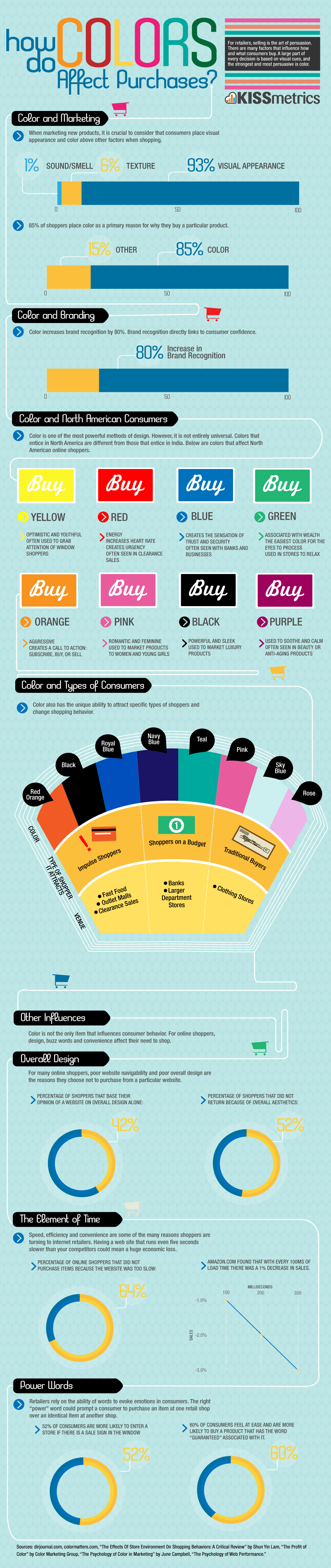
3. Color Psychology
You’ve probably heard about it—orange is for confidence, blue/green is for dependability, and blah, blah, blah.
Colors don’t always work that way. When studying color psychology, don’t forget to take the context into consideration.
Make sure you get the right “feel” for the colors on your page. A color that converts better for your competitor won’t necessarily do the same for you.
You have to take into consideration the background and foreground colors, as well as other key elements on your page, such as your copy.
Colors are hugely dependent on personal choice of a visitor, culture, upbringing and the context they are used in.
This makes it important that you do A/B testing every time you’re trying a new CTA button color or a new background color theme for your page.
So, in short, bright yellow doesn’t have to mean “happy.” Yes, if it’s combined with a smiley face, it denotes happiness. But if it’s used as a background of your website, well, it means you need some basic user interface classes.
People are always buying a specific desired feeling, not just a product. If you are a Harley Davidson enthusiast, you’re essentially buying the feeling of ruggedness, devil-may-care attitude and freedom.
If they started making pink bikes tomorrow, would you still buy? Not really, because what they would be selling wouldn’t “match” the brand personality. Your perceived value about them will completely change.
What’s more, a study shows we prefer some colors over others simply based on the names. Mocha, for example, will win over brown, although both are pretty much the same in the color spectrum.
Bottom line? Do a lot of testing before settling in for “the” right color for your brand.
Check out this Crazy Egg infographic for more research on brand colors. The following infographic from KISSmetrics will also help:
4. Contrast
I’ve touched this point before, but it bears repeating. Your most important elements, such as a CTA button or a signup form, must stand out as a sore thumb on your page.
You can easily find out whether you pass this test by blurring your landing page and then checking if your main element still stands out.
Why? It’s all about incorporating contrast into your design.
On Visme’s landing page, we saw the color green stood out like an oasis in a desert. That’s what you want.
This is based on the psychological principle known as “Isolation Effect.” Essentially, an item that stands out more than others will be more recognized and remembered.
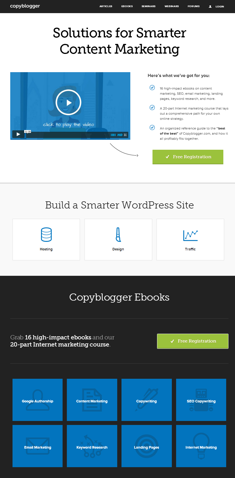
Here’s an example of how Copyblogger uses this principle.

The “Create Account” button is in contrast with the rest of the page, thus driving a visitor’s attention to it.
5. White Space
The last thing you want is for a visitor to be ready to click “Buy Now” but not be able to find that button!
To avoid such problems, make sure you use the right amount of white space around your elements.
Remember, whitespace does not have to be white or solid in color. It’s just the space between your items—and it’s an effective way to emphasize your CTA and headlines.
Continuing with Copyblogger’s example, check out their minimalist design. That doesn’t hurt the user experience. It only makes it better. They are not afraid to use lots of whitespace on their website.
6. Stock Photos
There are still many marketers using hideous stock photos. Stock photos were a rage perhaps a decade ago, but slowly, they have come to a gradual death.
Here’s an example I found this in a quick Web search.

Bad stock photos with men in suits and ties and women in corporate wear, with white and blue color themes will always shout “fake.”
Don’t get me wrong—not all stock photography is as bad. You can still buy good stock photos. Get real human emotions in the picture to make it more engaging.
This one’s much better than men shaking hands.

7. Directional Cues
A study done on Sunsilk shampoo showed that eye tracking is too important to ignore.
Consider the below images for example:


When the first image was tested using a heat map, only a few people looked at the product. They looked straight ahead on the headline.
But when the woman’s gaze was changed, results were shocking. She was now looking at the product—providing a directional cue to users—which made most of the visitors follow her gaze.
In short, they looked at the product now.
Directional cues can be explicit too. Think arrows and pointers.
Salesforce does it very subtly on their page next to the copy on the CTA. Do you see small arrows next to Free trial, View demo and Small business solutions?

Your Turn!
A good landing page converts—simple as that. You don’t need flashy bells and whistles. Just keep the above pointers in mind when designing your page.
Humans are wired visually, and we love a visual treat. Organize the elements on your page well and you’ll notice the difference.
What are your thoughts? Did I miss anything? Tell me in the comments below.


