Both user journey and user flow are important experiences for UX designers to consider.
But they aren’t the same thing.
A user journey is a person’s overall experience with a single brand. It covers the user’s experience from the first time they become aware of a brand to their first purchase and beyond.
A user flow zooms in on a single aspect of the user journey, like signing up for a newsletter or adding a product to the cart.
While they sound similar and often get confused, the two concepts have a number of differences:
| User Journey | User Flow | |
|---|---|---|
| Definition | A person’s overall experience with a brand, from initial awareness to post-purchase interactions. | A detailed visualization of the specific steps a user takes to complete a particular task within a product or service. |
| Scope | Broad, encompassing multiple touchpoints and stages in the user’s relationship with the brand. | Narrow, focusing on a specific process or task within the user experience. |
| Focus | Emphasizes emotions, motivations, and pain points throughout the entire user experience. | Concentrates on the sequence of actions, decisions, and screens involved in completing a specific task. |
| Visualization | Often represented as a timeline or map layered with stages, goals, and emotional context. | Typically diagrammed as a flowchart showing actions and decision points. |
| Use Cases | Ideal for improving user satisfaction across all touchpoints. | Best for optimizing a specific process. |
| Example | A customer discovering a brand, researching products, making a purchase, and seeking post-purchase support. | A user navigating through the steps to sign up for a newsletter or complete a checkout process. |
User journeys and user flows are part of broader experience frameworks, like the buyer journey and customer journey.
User Journey Examples
Let’s take a closer look at examples of the user journey.
While most companies don’t share their user journey maps publicly, you can find mock examples and templates all over the web.
Take this mock user journey chart from Nielsen Norman Group, for instance. Okay, technically it’s a customer journey map—a user journey would include everything that comes after the sale.
But it gives us a good idea of what a user journey map should look like.
In this journey, a phone customer is deciding to switch mobile phone plans. The pretend customer, Jumping Jamie, is in the process of becoming aware of a better provider and switching over.

The map above offers every step in Jumping Jamie’s road to finding a new phone company. I’m going to offer her a little bit of dignity and remove “jumping” from Jamie’s name from here on out:
- Identifying a need: Jamie feels a desire for a new plan that saves her money without forcing her to have less usage.
- Building awareness: She sees various ads for other mobile phone companies and starts researching and comparing plans.
- Contacting potential providers: Jamie calls her list of potential providers to find out if there are any new deals. As the map notes, she’s frustrated at how much work it is to do this.
- Deciding on a provider: After calling around, reading reviews, and comparing plans, she decides on a new mobile plan carrier. Once she’s done switching everything over, she feels a sense of relief.
To fully complete the user journey, I’d add a few post-purchase destinations to this map:
- Onboarding and Setup: After switching, Jamie gets a welcome email and instructions on how to set up her account, SIM card, and billing preferences. A smooth onboarding experience reinforces her decision and pushes any buyer’s remorse out the window.
- First Use and Validation: As she uses the new plan for the first time, our customer evaluates whether the service meets her expectations. Positive early experiences help validate her choice and build trust.
- Customer Support Interaction (if needed): If Jamie bumps up against any issues with billing or coverage, she’ll experience the brand’s customer support service. A helpful, quick resolution boosts her satisfaction with the mobile service provider.
- Loyalty and Retention: Over time, the provider offers their newer customer loyalty programs, usage insights, or offers for upgraded plans, cementing her positive emotions toward the brand.
- Feedback: If she’s satisfied with the service, Jamie may leave a review or refer her friends. If she isn’t satisfied and leaves negative feedback, this critique becomes a valuable asset to the brand. (If they pay attention to it, that is!)
These touchpoints help capture the ongoing relationship between the customer and the brand after a purchase is made.
When it comes to the user journey, these post-purchase steps are key to building trust and encouraging brand loyalty.
When to Use User Journeys
A user journey is a great tool to use when you want to visualize how users experience your product or brand over time. They help your team understand what users do and why they do it.
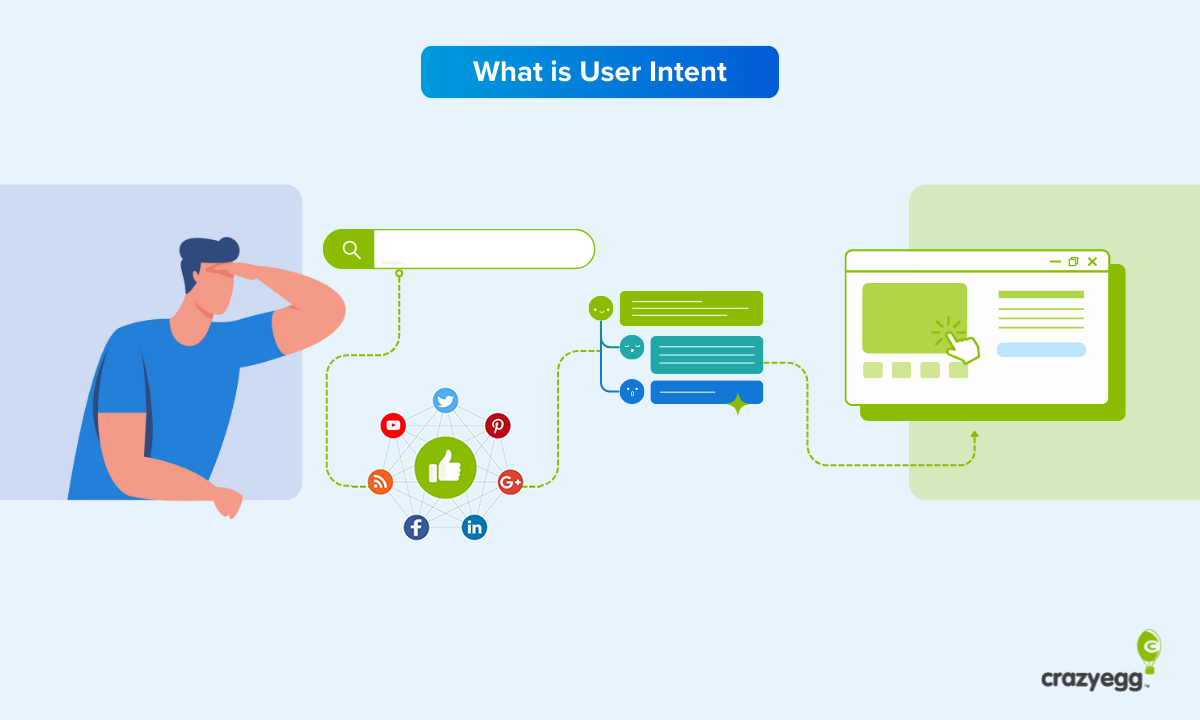
This can help you anticipate needs, spot problem areas to improve, and just keep a close eye on how well your product is meeting user intent.
Map out user journeys when you need to:
- Understand your user’s experiences across various channels. User journeys can map out how users move between your website, app, emails, support, and even offline touchpoints.
- Improve product or service UX. Designers and product managers can use user journeys to spot friction points, unmet needs, and gaps for user experience testing. A user journey map shows the full context of how users interact with the product, emotions and motivations included.
- Align your team around the user. One of the best things you can do is bring different teams—product, support, sales, and marketing, for example—together to map out the user journey. This gives everyone in the company a vision of how their work impacts the user.
Taking a step back and considering the user journey helps your entire organization understand users on a deep level.
This helps everyone, leadership included, make decisions that benefit users.
Take the mobile phone provider example provided by Nielsen Norman Group with our good friend, Jumping Jamie.
Let’s say that while they’re mapping out Jumping Jamie’s journey, the provider notices how frustrating comparing plans and pricing is for prospective users.
Instead of passively accepting this as an unfortunate step in the user journey, the brand could do something about it.
Like creating a price and plan comparison tool (or chart) that gives an honest and accurate portrayal of all of its competitors’ plans and pricing.
Or a calculator that lets the potential new user pop in the usage and pricing for several different plans to calculate which one offers the most value.
Or both.
These tools would help reduce friction in a key part of the user journey. And if the creator of the tool (our mock mobile provider) actually does offer the best value, the user is likely to choose it.
All while feeling grateful to the brand for a smoother user experience.
User Flow Examples
User flow zooms in on one key step or process in the user journey.
For a user flow example, let’s go back to our mock mobile provider. We’ll say the team has decided to create a plan comparison tool to:
- Address the pain point—that comparing mobile plans is frustrating, tedious, and confusing.
- Reduce decision fatigue, as the tool will help users make the decision by showing them all their options in one easy-to-digest format.
- Transition the user from research mode to conversion, all in a streamlined flow.
Here’s an example user flow for our mock mobile plan comparison tool.
Remember: the goal is to help a prospective customer quickly compare plans and choose the one with the best value.
- Homepage or Marketing Landing Page: User sees the CTA, “Compare Plans and Save,” and clicks to open the comparison tool.
- Comparison Tool Interface: User views a table showing the provider’s plan vs. major competitors. Can easily filter each column in the table by criteria like data limits, monthly cost, and contract length.
- Interactive Calculator: User enters current data usage and monthly budget. Tool recommends the best-value plan based on input. Tooltip or sidebar explains why that plan is the best one. Use sidebar to highlight your plan’s strengths (like reliability or features) so users feel informed—but not pushed—toward your plan.
- Call to Action (Decision Point): A “Switch Now” or “Customize This Plan” button appears. User clicks to begin signup or save their results.
- Sign-Up Page: User enters basic information to begin switching providers.
When they’re put into a flowchart, user flows can get pretty complex, like this example below from Matomo.

But many UX designers find them incredibly satisfying to make.
According to the r/UXDesign subreddit, anyway.

This speaks to the job description that uses user flows the most: UX designers and directors.
But they’re not the only ones who benefit from these detailed charts.
When to Use User Flows
User flows are incredibly useful tools for UX designers to map out specific tasks within a digital product or interface.
Of course, just because they’re the ones who usually create user flows doesn’t mean UX and UI designers are the only ones who need them.
Anyone involved in UX/UI design, product development, conversion optimization, and marketing can benefit from mapping out user flows.
Use them when you’re:
- Designing (or redesigning) a new feature or process like signing up for a free trial, checking out, or onboarding
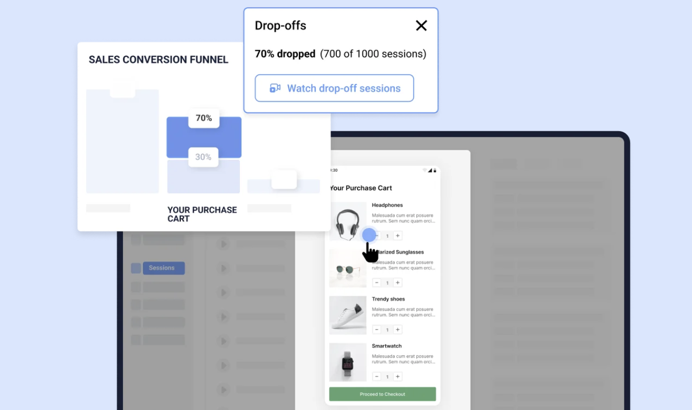
- Trying to understand why some folks don’t complete important tasks, like buying a product or using a free tool
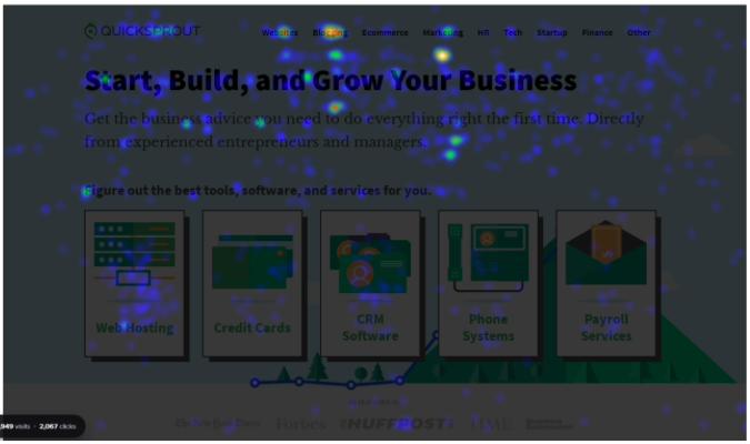
- Making sure navigation is logical and intuitive throughout a SaaS product or webpage
- Collaborating with developers on what steps a user takes and in what order
- Testing variations in user behavior based on where they enter your site—ads vs. homepages vs. referral links, for instance
In short, user flows help teams zoom in on the moments that matter most. That way, users don’t get stuck, lost, or frustrated as they complete an action on your product or site.
User flows help your team understand both micro-level actions a user takes in their interactions with your product. User journeys give you the birdseye, macro-level overview.
Together, these two tools create a complete picture of the user experience—and work to continually improve it.