We live in exciting times.
Over the last few years we have focused on building mobile websites that are text-heavy versions of the main site.
While these sites are faster for users on a mobile device, they often remove the design characteristics that make the site uniquely branded for the company and remove necessary call-to-actions and advertising.
To make things more complicated, most laptop & desktop screens are now wider than 1024 pixels. But most designers still build sites at 960 pixels wide because netbook & tablet monitors are small and developers don’t want to make people scroll horizontally.
Responsive Web Design is a way of building a website that responds to the size of the browser. Rather than building a unique mobile version developers build a flexible design that changes dynamically to the actual width of the browser.
Here are five key elements to consider when creating a responsive web design.
Element 1: Navigation
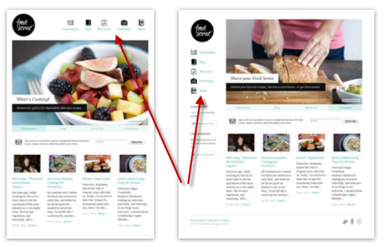
As shown in this example of foodsense.is, the site navigation is laid out in different locations depending on the width of the browser. For mobile users the navigation is top and centered (for easy access) for other widths it is either top right corner or below the logo. Responsive design shouldn’t scale the navigation to huge proportions on a large screen device.
Element 2: Columns
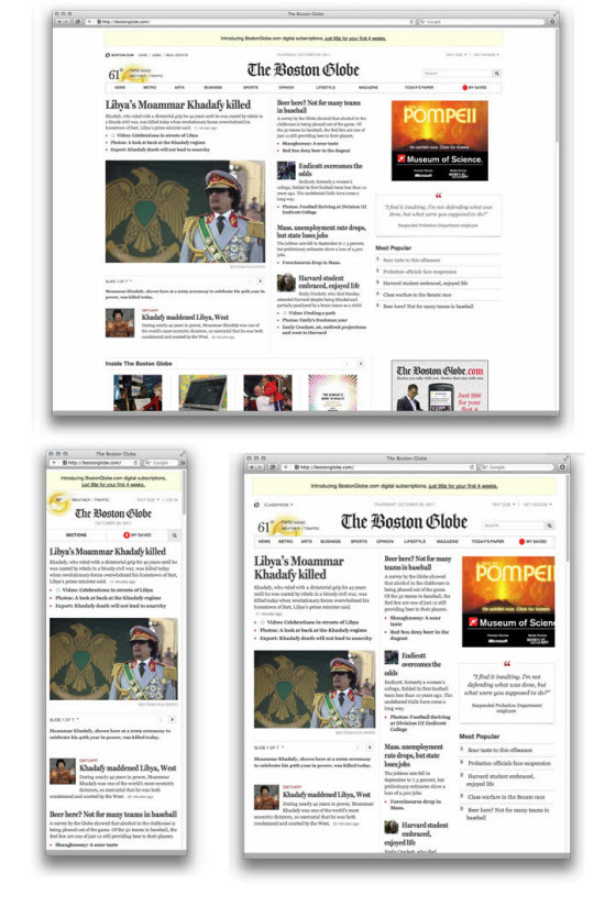
One important point to understand is that responsive web design doesn’t just scale a site when it’s first served to a user, but also scales if someone makes their browser larger or smaller. A good example of this can be found on a recently celebrated responsive design – The Boston Globe.
As a major newspaper, the Boston Globe made responsive architecture and design a part of their launch as a pay-wall based site. The site works and looks great regardless of the device you are viewing it from.
The Boston Globe responsive web design is a textbook example of a design that preserves its integrity regardless of the browser size.
The Boston Globe site can display one column of content or three, depending on the browser width.
A responsive website will scale headlines, images, text and ads in the right proportions while maintaining the integrity of the design, both when the website is first served, and when the browser is re-sized.
Element 3: Calls to action
Good responsive design considers the critical calls to action that should be displayed prominently regardless of the screen or browser size.
Mogo Tix clearly displays the “Get Started For Free” call-to-action on their responsive design.
Element 4: Branding
Simply scaling or moving elements around on a flexible grid, doesn’t address the issue of sites losing their unique branding when building a mobile version. Building a responsive design requires designing for three or four widths. A designer’s eye is important to make sure that the design reflects the brand at all sizes.
Notice how London & Partners keeps many of the branding elements of the site visible no matter what the screen size.
Element 5: Padding and White Space
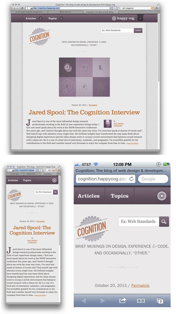
Cognition, Happy Cog’s Blog does a nice job of preserving padding and white space on various screen sizes. This ensures the items on the page have the appropriate information hierarchy. Nothing feels too crowded or misaligned.
Responsive web design presents the information from the site in the best visual manner regardless of screen size. Unlike print design, web design has always been presented on canvases of varying sizes.Responsive Web Design is the latest & most flexible solution to design that addresses these differences.
What are other elements that should be considered in your responsive design?
Image courtesy of practicalowl


