Google Analytics (GA) is capable of generating incredibly detailed and comprehensive data. It provides the insights needed to fine-tune your site, reduce UX friction and ultimately maximize conversions.
But there’s a catch. It’s only effective if you actually know how to interpret the data.
Unfortunately, not all users fully understand the core metrics, and there’s uncertainty as to how to decipher them.
Here, we’ll take a look at six of the most misunderstood metrics in GA to find out what the data means and how to apply it in order to optimize your site.
1. Direct Traffic
At first glance, direct traffic seems pretty straightforward.
There’s usually one of two scenarios. It’s either the result of a user manually entering your domain name directly or using a bookmark to access your site.
This wraps direct traffic up into a neat and tidy little package.
But there’s a lot more to it than that.
When you get right down to it, Google attributes direct sessions any time it can’t name another referrer.
Or as Search Engine Land puts it, “Often traffic considered ‘Direct’ really means, ‘we have no clue where it came from, maybe they typed the URL in or hit a bookmark.”
It’s basically a last resort.
And as Megalytic points out, there can be a variety of scenarios:

Technically, any users who are unknown or undefined get lumped into direct traffic, which can make the data very misleading.
It’s important to keep this in mind and understand that direct traffic can go way beyond users manually entering your domain or accessing your site through a bookmark.
What Are the Implications?
It’s easy to see why GA users can be a little confused about direct traffic. The data can be inherently deceptive.
So what does direct traffic really mean?
When you boil it all down, having a high volume of direct traffic tends to correlate into brand awareness. If a sizable percentage of visitors are reaching your site directly, it means that they’re already aware of your brand.
There’s no need for these visitors to find you via search, a referring site, social media, etc. because they already know about your brand.
Now, of course, there’s always the “we have no clue where they came from” factor on GA’s end where it simply can’t identify a referrer.
But generally speaking, a spike in direct traffic typically means that your brand awareness is growing.
A Quick Comparison
Let’s take a look at the traffic breakdown of two random brands.
Here’s brand A:

A grand total of 34.98 percent of their traffic is direct, which exceeds referral traffic, search traffic, social and so on.
This is an indicator of solid brand awareness since the majority of visitors are accessing their site directly.
Here’s brand B:

With 26.89 percent of their traffic being direct, it’s solid but probably doesn’t have the level of brand awareness that brand A has.
Accessing Your Direct Traffic
For a quick breakdown, click on “Acquisition” from your GA dashboard.

Then click on “Overview.”

Now you can see how your direct traffic stacks up against your other sources in a pie graph…

as well the specific session numbers.

This should provide intel on where your brand awareness is currently at.
A high volume of direct traffic indicates that your brand searches are doing well, and a significant percent of your visitors already know about your brand.
This is important because it means one thing – you’re not overly reliant on Google for traffic. In turn, your traffic is less likely to be adversely affected the next time Google inevitably releases a new algorithm update.
There’s an inherent level of stability to your traffic, leads and ultimately conversions.
2. Behavior Flow
First viewing the behavior flow chart can leave GA users scratching their heads.

What does it all mean?
Here’s the formal definition that Google provides:

In other words, behavior flow marks the path visitors take and shows which pages they’re looking after arriving on the initial landing page.
It offers insight into how visitors are exploring your site and if any particular pages are resulting in site abandonment. This, of course, is crucial for understanding the overarching UX and what the average person’s journey is like.
By analyzing behavior flow, you’ll be able to determine which content/pages are receiving the most engagement and any potential content issues you may need to address.
To access this feature, click on “Behavior” from your GA dashboard.

Then click on “Behavior Flow.”

You’ll see something that looks like this:
It begins by first looking at “Starting pages.” This is where visitors are first landing on your site.

You can follow their journey by looking at “1st interaction,” which is the next page they click on.

Pay attention to the connecting lines to see precisely which pages visitors are clicking on from the starting pages.

You can then tell where visitors are heading to after that by looking at “2nd interaction.”
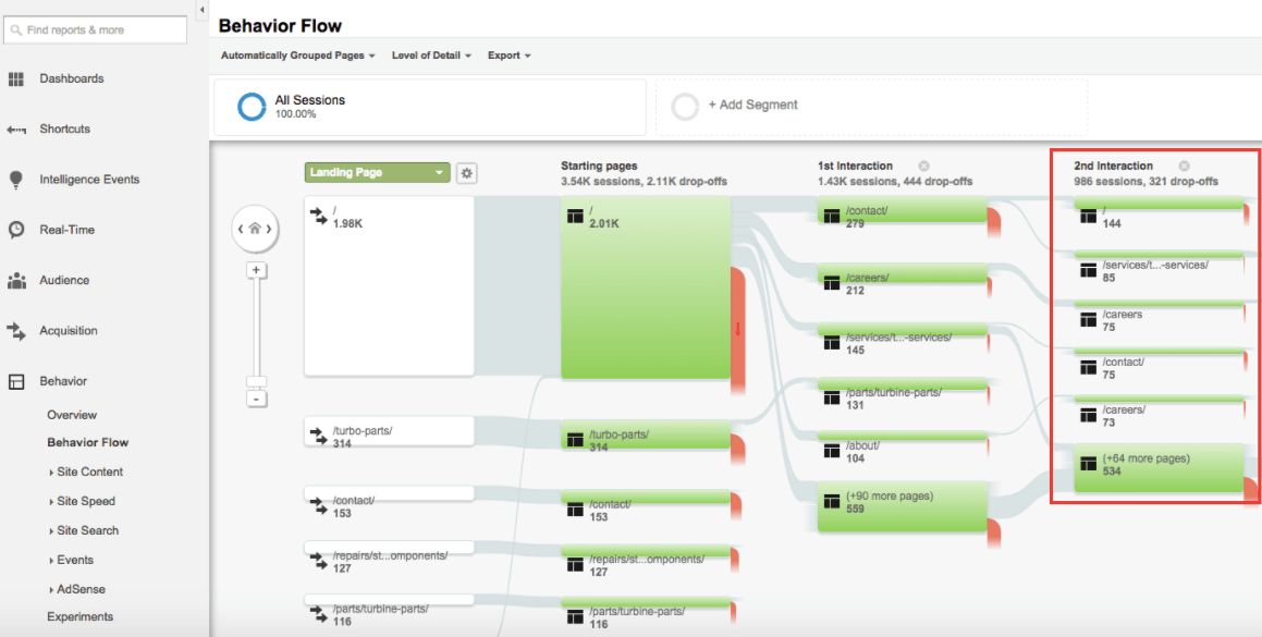
This will give you a clear idea of the path visitors are taking.
You’ll also want to pay attention to the number of drop-offs that are occurring on each page, which can be done by hovering over the red area on the right-hand side of each page.

The red areas indicate the percentage of people that are “dropping-off” (leaving your site) in this step of the funnel. The thicker the red section is, the more people are dropping off.
If you notice that there’s a higher drop off on a particular page, then it likely has issues you’ll need to address. These are the areas that can use improvement, and most deserve your attention.
What you’ll want to do is examine the pages with high drop-off and determine what potential obstacles are getting in the way and preventing them from completing the desired action (e.g., making a purchase).
Maybe you need to place a link or CTA in a more conspicuous location. Or maybe there’s excessive content to the point that it’s distracting visitors from clicking on the link or CTA.
You may even want to consider removing pages that have a high drop-off rate and aren’t directly contributing to your goals. The friction they create may simply mean that they’re more trouble than they’re worth.
It may take a little bit of detective work, but behavior flow should help you figure out what’s preventing visitors from moving fluidly through your sales funnel. From there, you can make the necessary adjustments.
3. Active Users
This metric is somewhat misleading. When hearing the term “active users,” many people assume that this refers to visitors that are on your site right now.
But this simply isn’t the case. Visitors that are on your site right now are referred to as “real-time users” and that’s a different metric entirely.
Before we dive into the details, here’s how to access this metric.
First click on “Audience.”

Then click “Active Users.”

You’ll see something that looks like this:

Right away, you’ll notice that active users are broken down into 1 day, 7 day, 14 day and 30 day active users.

But what exactly does this mean?
By examining the various timeframes, you can determine how many users visited your site during that particular period.
“1 Day Active Users” are the users who visited your site during the last day, “7 Day Active Users” are the users who visited your site during the last seven days, etc.
So from this report, we could tell that 1,924 people visited the site over the course of one day, 14,810 visited the site over the course of seven days and so on. This is valuable information to have because you can make comparisons based on different time periods.
Here’s a simple example of how you could use this metric. Let’s say that wrote a guest post in hopes of bringing in a high volume of referral traffic, gaining exposure and strengthening your brand.
You could examine the data from active users to determine how much traffic you generated in the subsequent period of time after the post was published.
All you have to do is click on “7 Day Active Users,” “14 Day Active Users” and so on to plot them on the chart. Then compare the data with “1 Day Active Users” with a longer range of time.
If you notice that 7 Day, 14 Day and 30 Day active users have increased substantially, then the guest post was successful. If there was no noticeable increase, then it only had a minimal impact.
This makes active users a great feature for determining how effective a particular promotion was, how much attention a guest post brought your brand, etc.
4. Benchmarking
The chart GA displays can be overwhelming in and of itself. Users see a hodgepodge of green and red boxes along with a myriad of numbers.

What the?
At its simplest, benchmarking provides you with data to determine how your business stacks up against similar competitors.
To access this metric, click on “Audience.”

Then “Benchmarking.”

GA will then display a rough overview of your data.
Making sense of the data requires you to examine the individual data points to see how your site compares against similar competitors.
Or as Google puts it:

From there, it’s a matter of examining the data. Luckily, Google makes it pretty simple.
Green shows where you’re outperforming competitors and red shows where you’re underperforming. Looking at the individual boxes will provide more detail on the specifics.
You can tell how your performance compares by channel, location and device.
Just click one of these three options under “Benchmarking.”

Also note that you can specify your industry vertical, country/region and class size (the number of daily sessions you receive).

If you’re wondering how your site fares, benchmarking can provide some real clarity. It will also bring any potential issues to your attention so you’ll know where to put your attention moving forward.
Here’s an example using this particular report:
By looking at this report, we can quickly deduce that email and direct traffic are outperforming similar competitors. Email, in particular, is crushing it.

So that’s good. Keep it up.
Unfortunately, the rest of the traffic channels are underperforming when compared to similar competitors.

This report lets us know that organic search, display, paid search, etc. are all lagging behind and could use some improvement. Therefore, you would want to prioritize which traffic sources are most important and focus on the appropriate marketing channels.
For instance, if organic search traffic were a top priority, you would want to focus on improving SEO and give that the bulk of your attention.
By analyzing the data from benchmarking reports, you should inevitably have a better, more well-rounded marketing campaign where no critical areas are lacking.
5. Bounce Rate
Finding your bounce rate is easy. Just click on “Audience.”
Then on “Overview.”

Bounce rate will be displayed along with other data like sessions, users, pageviews, etc.

Most of us know what bounce rate means, but if you need some refreshing, Google defines it as:

In other words, it’s the percentage of visitors who land on a single page but fail to explore any additional content on your site. They enter and they exit. That’s all.
There’s no real engagement happening. The higher the bounce rate, the fewer people are exploring your site.
So in most cases, this is considered as a bad thing. It means visitors aren’t checking out additional content, signing up for your newsletter, learning about your brand, etc.
But it’s not always bad.
The exception is when a single page session is expected. For instance, when your goal is to get visitors to a single page, extract the necessary information and leave. In that case, a high bounce rate would be fine.
So it’s important to slash through the misconception that a bounce rate is always bad.
However, in the majority of cases, it’s not desirable.
And this begs the question. What’s a reasonable bounce rate?
To answer this question, it’s helpful to look at some data provided by Rocket Fuel.

According to them:
- A bounce rate in the range of 26 to 40 percent is excellent
- 41 to 55 percent is roughly average
- 56 to 70 percent is higher than average, but may not be cause for alarm depending on the website
- Anything over 70 percent is disappointing for everything outside of blogs, news, events, etc.
If your bounce rate is higher than it should be, it usually means that visitors perceive your page as being low quality, or it’s irrelevant to what your audience is looking for. This means that you would need to improve the quality and/or relevancy to lower your bounce rate.
Here are some potential ideas:
- Make sure on-page content matches a user’s query
- Make content easily digestible through short paragraphs, sub-headers, bullet points, etc.
- Ensure your site is loading quickly through the Pingdom Website Speed Test (a slow load time is often a catalyst for a high bounce rate)
- Reduce or eliminate ads
- Use A/B testing to improve your CTAs
This may require a bit of trial and error. But with enough effort, you should be able to lower your bounce rate and encourage visitors to explore your site.
6. Attribution Modeling
A lot of people think about attribution modeling in terms of different channels or third-party traffic sources. We use it moreso to attribute which of our digital channels affect the final sale.
For example, say we’re running a campaign that incorporates AdWords campaigns, organic traffic generation, email marketing, Facebook Ads and retargeting.
What we want to know is how all of those channels and touch points work together towards a final sale. GA’s attribution models can help us understand the impact of all our multiple channels.
Some touch points – customer reviews, for example – we have no control over. However, if we know the people that come to our site organically are best convinced by AdWords (since they first saw us on Google), that’s actionable info we can use.
Currently, GA offers seven different types of attribution modeling, including:
- Last Interaction
- Last Non-Direct Click
- Last AdWords Click
- First Interaction
- Linear
- Time Decay
- Position Based
Some of these are self-explanatory. “Last Interaction” gives full credit to the final touchpoint in the sales funnel, while “First Interaction” attributes the full value of the conversion to the initial web exchange.
Others in GA’s arsenal are multi-touch attribution models.
- A Linear attribution model gives equal credit to all channels involved in the conversion.
- A Time Decay attribution model weights credit to the channels involved closest to the conversion.
- A Position Based attribution model gives greater weight to the first and final interactions, splitting the remaining credit across interim interactions.
A full description of the seven attribution models in GA can be found here.
To access attribution modeling reports, you’ll use the Model Comparison Tool, found under “Conversions,” then “Attribution.”

As a note, you won’t have access to the ROI Analysis or Model Explorer reports unless you’re a Google Attribution 360 user.
Once you’ve opened the Model Comparison Tool, you’ll be able to compare the impact of different attribution models on your conversion data.

Select different models to compare against each other or create your own custom attribution model.
Ultimately, GA’s attribution modeling is just a really good way to figure out how valuable each channel is in driving the end goal.
Use these comparisons to inform how you allocate your marketing and advertising resources in the future, as well as to identify potential weak points in your sales funnel.
Conclusion
Google Analytics is the premier platform for measuring website traffic and is used by over half (54.1 percent) of all websites and accounts for 83.5 percent of the traffic analysis tool market.
This makes it the customary platform for most marketers.
The basic features are fairly simple to understand. But things can get a little nebulous once you dive in deeper.
The metrics listed here are some of the most frequently misunderstood and can create confusion for marketers.
Breaking them down-step-by-step and understanding the underlying methodologies and purpose should shed light so that the data not only becomes comprehensible but actionable.
Are there any other metrics besides these that you find especially confusing?
Attribution modeling images: OptimizeSmart / OptimizeSmart
About the Author: Mo Harake brings over 12 years of ecommerce and digital marketing experience leading brands like FIJI Water, 7Diamonds, Kill Cliff and venture-backed startups to his work as Managing Director of Stray Digital. For more on his approach to ecommerce, content marketing and growth hacking, visit him on LinkedIn or at the Stray Digital blog.