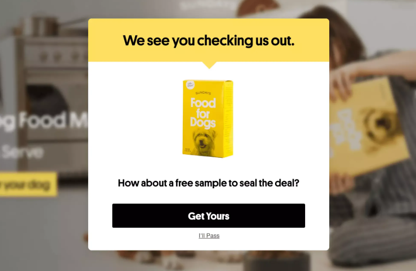
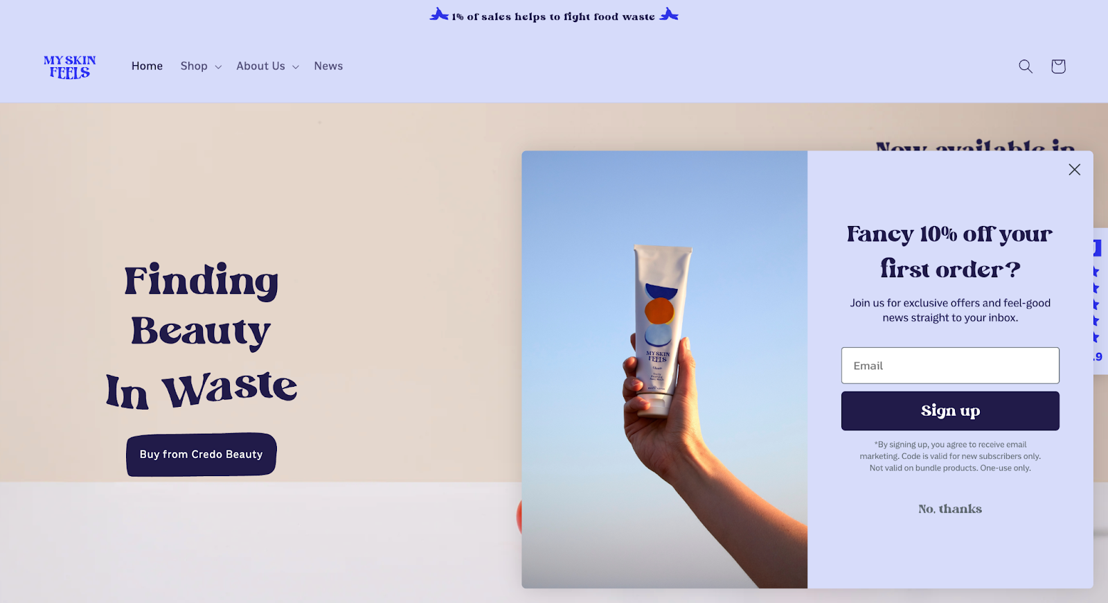
An exit-intent popup appears when a website visitor is leaving to keep them on the page and nudge them to complete a purchase, sign up for a newsletter, or download a lead magnet.
To convert, the popup must be well-timed and the offer compelling.
Otherwise, it hurts the user experience and puts off visitors from coming back.
This article explains how to avoid it. You will learn how exit-intent popups work, if and when they convert, when they backfire, and the best practices for using them.
What Is An Exit-Intent Popup & How Does It Work?
An exit-intent popup is a type of modal that fires when a visitor is about to leave the page. Its aim? Give them a reason to stay and complete their task or a way to reconnect later.
For example, a shopper abandoning their cart might see a popup with a discount code or a free sample.
How does the popup “know” when to show?
On desktop, the exit-intent technology tracks mouse movement toward the browser close button, address bar, and back arrow. On mobile devices, there’s no cursor, so detection relies on scroll-up velocity, idle time, back-button taps, or a combination.
Exit-intent is one of many popup triggers. Others include time delay, scroll depth, or page entry (loads with the page).
Do Exit-Intent Popups Actually Work?
Exit-intent popups convert on average 2.81% of visitors, according to figures Wisepops published in September 2025. The top 10% performing campaigns converted considerably more — 19.63%.
The conversion rate depends on the page and popup type.
For email-capture popups, exit-intent conversion sits in a modest range. Omnisend’s 2026 analysis put exit-triggered popups at 1.8%.
In contrast, cart abandonment popups perform considerably better. In 2025, OptiMonk reported its cart-abandonment exit popups converting at 17.12%.
When Do Exit-Intent Popups Convert?
Exit-intent popups convert when they “earn the interruption” and catch a visitor at a moment of active decision.
Imagine you’re in a car dealership. You like a car but can’t afford it. When you’re leaving, the car dealer blocks the door and offers you a 2% discount. Or a free mat upgrade.
That isn’t going to change your mind, is it? If anything, it’s going to be irritating — insulting, even.
But an interest-free finance plan? That might actually work.
Only if you’re genuinely looking for a new car, though.
So, exit popups convert best on the pages where visitors are actively deciding:
- Cart abandonments. A visitor who added items but left has shown purchase intent without committing — and often simply isn’t ready to decide.
- Checkout exits. A shopper who started checkout is more committed than a browser with items in a cart.
- Pricing-page exits. Someone leaving a pricing page is often actively evaluating options.
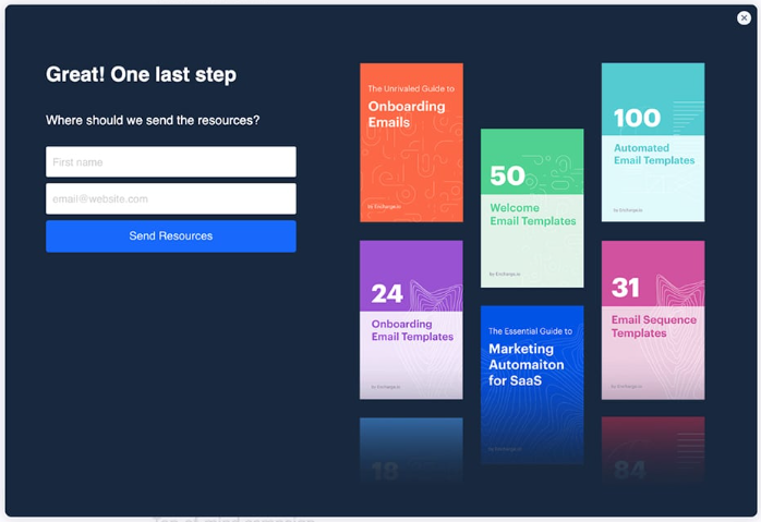
- Abandoned-form exits. A visitor who started a quote or demo form and didn’t finish is a recoverable lead.
- Content page exits. A reader who finished a guide on your blog is engaged, so may want to sign up for a newsletter.
In each of these instances, the offer needs to be good enough for the popup not to feel like an inconvenience.
When Do Exit-Intent Popups Backfire?
Two things cause the exit popup to misfire: the trigger is a false positive, or the offer isn’t suitable.
False positives happen when the visitor wasn’t actually leaving.
Tab-switching is the classic case — visitors open new tabs for later reading, check a notification, or look something up, and the exit-intent system reads it as an exit.
On mobile, the signals are noisier: a scroll-up to re-read a section, an idle pause mid-form, or a back-tap to check something may all look like exit behavior to the detection system and trigger a popup.
Offer mismatch means the trigger is right, but the offer is wrong for that visitor.
The offer can be wrong in two ways: it doesn’t fit the person, or — as in the car dealer example above — it isn’t compelling enough. Either way, they leave having been interrupted for nothing.
The impact of misfired exit popups goes beyond missed conversions. People don’t like popups at the best of times, and an irrelevant or poorly timed popup will discourage them from returning to the site.
11 Exit-Intent Popup Best Practices
Let’s finish with 11 high-impact exit-intent popup best practices that will let you improve conversions without ruining the user experience on your website.
1. Prioritize high-intent pages
You can’t fire an exit-intent popup on every page because it creates fatigue, so prioritize based on conversion value.
Start with the most commercially valuable pages: product, cart, checkout steps, and pricing.
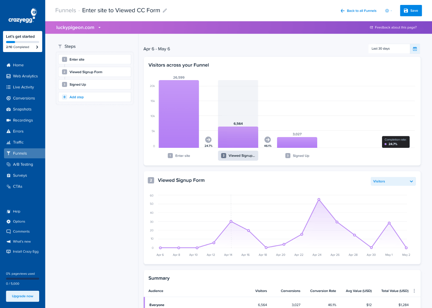
Use pageviews and exit rates as auxiliary metrics. Look for pages with lots of traffic and high exit rates. Or use funnel analytics to identify steps in the customer journey with the highest drop-off rates.
2. Resolve UX issues before adding exit intent popups
Before you deploy your exit-intent popups, fix all user experience and design issues hampering conversions and driving visitors away.
Think extra costs that appear only at the final step, CTAs buried below the fold, or forms that clear all fields after a validation error, forcing visitors to start over.

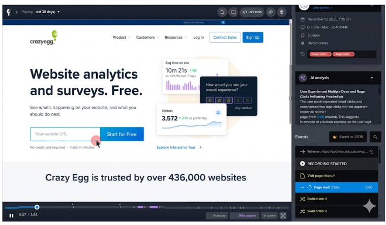
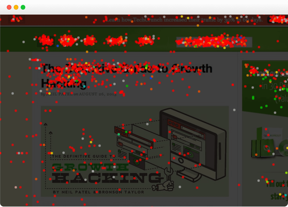
Check error reports for JS errors that break the payment buttons, review scroll maps to see whether visitors see the relevant details, analyze heatmaps for dead and rage clicks, and watch session recordings for signs of confusion or hesitation.
3. Match the offer to the page’s intent
The offer has to match the reason why the visitor came to the page and why they’re leaving.
A discount code works on a cart page because the visitor has already shown purchase intent. The same discount on a blog post interrupts a reader who was never shopping.
Here are examples of how you can match the offer to the reason behind the exit:
- They’re hesitating on cost. Free shipping, a money-back guarantee, or a price-match promise incentivizes the visitor without discounting the product itself.
- They’re not ready to decide. Let them save their cart or save their progress so they can pick up later instead of starting over.
- They have an unanswered question. On pricing pages for complex products, a live-chat prompt, a demo booking, or a comparison guide complements the page.
- They were reading, not buying. On blog pages, a content upgrade specific to the post — a checklist, template, or guide that extends what they just finished — converts better than a generic PDF.
- They’re a returning visitor. Point them to what’s changed since their last visit: new stock, a new feature, fresh content.
If you don’t know why visitors leave a particular page, use the popup to find out.
A one-question exit survey — “What stopped you from buying today?” or “What were you looking for?” — tells you which offer to test next.
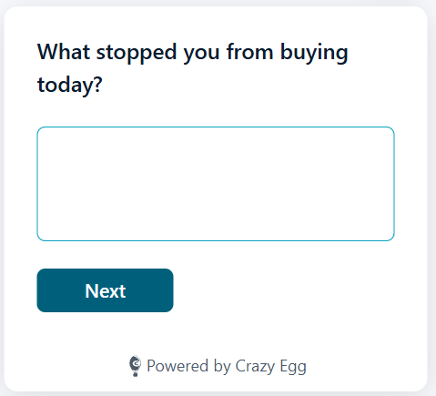
A low-key question tends to land better than a dramatic “wait, don’t leave,” because it reads as genuine interest rather than a last-ditch pitch. Keep it to a single question and make answering optional.
4. Tailor the offer for different user segments
Match the offer not only to the page intent but also to the user segment.
A few segmentation cuts worth considering:
- Traffic source. Someone who clicked a paid ad for a free trial, then sees a generic newsletter signup, gets an offer disconnected from why they came — match it to the ad or channel that brought them in.
- New vs returning. A first-purchase discount shown to a loyal customer signals you don’t know them; returning visitors and first-timers are at different stages and need different offers.
- Already converted or subscribed. Exclude them. An exit discount shown to someone who just paid full price tells them they overpaid; a signup popup shown to an existing subscriber looks careless.
5. Design for an instant decision
An exit-intent popup appears when the visitor is already halfway out the door, so every design choice has to land immediately.
Lead with the headline, make the offer clear, and give the CTA enough visual weight that the visitor knows exactly where to click.
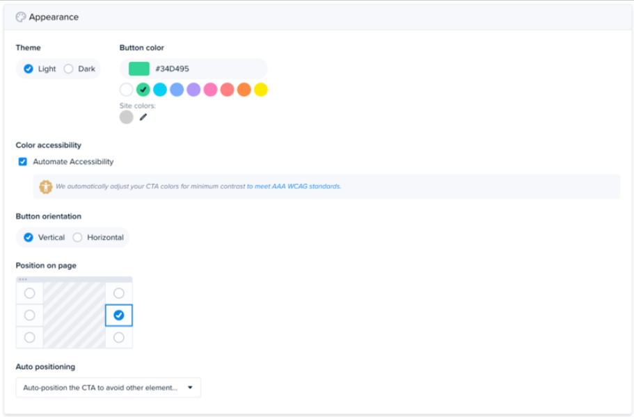
Keep the popup visually consistent with the rest of the site. If the fonts, colors, or imagery don’t match, the popup feels like a third-party ad rather than part of the experience.
A slide-in from the corner or a simple fade works for the entry animation — anything that flashes or zooms is more likely to annoy than convert.
Finally, keep the form fields to a minimum. In Omnisend’s 2026 popup study, one to three fields converted at roughly 2.1%. At four fields, conversion dropped to 1.5%. At five or more, to 1.4%.
6. Write copy with a specific goal and no manipulation
Your exit-intent popup needs only one headline, one offer, and one CTA. If the visitor has to scroll or choose between two actions, the popup is doing too much.
Headlines should tell the visitor exactly what they’re getting. So “Get 10% off your first order” beats “Don’t miss out!”. Same with CTA copy — “Save my cart for 7 days” is clearer than “Save”.

Finally, don’t use any copy that guilt-trips or shames the visitor, like “No thanks, I’d rather pay full price.” Neutral alternatives like “Not right now” or “Maybe later” let the visitor close the popup without feeling manipulated.
7. Make it accessible and mobile-friendly
The popup needs to be accessible to all visitors — on desktop, tablet, and mobile.
How do you make your popups accessible?
- Trap keyboard focus inside the modal when it opens, return focus when it closes on ESC.
- Adjust color contrast to meet WCAG standards.
- Don’t bury the close option. Making it hard to find or delaying its appearance can lift conversions in the short term, but undermines trust. Give the decline button the same visual weight as the accept button.
On mobile, keep the modal to a portion of the viewport rather than the full screen.
Tap targets should be at least 44×44 pixels, and the close button needs to be easy to reach with one thumb.
8. Tune the mobile trigger deliberately
Because mobile detection leans on noisier signals than a desktop mouse-out, the trigger needs more care. You can’t eliminate false positives, but a few things keep them down:
- Find the page’s average scroll depth first. A scroll map shows how far a typical visitor gets. Use that line as your baseline — there’s no point watching for exit behavior before a visitor has engaged with the page at all.
- Combine signals. Fire only after a visitor passes the average scroll depth and then goes idle for a few seconds. Two signals are a more reliable read on genuine exit intent.
Most popup tools handle this for you, and you don’t always have control over the trigger settings. If that’s the case, and you’re still getting tons of false positives, consider disabling popups for mobile altogether. Or switch to a different tool.
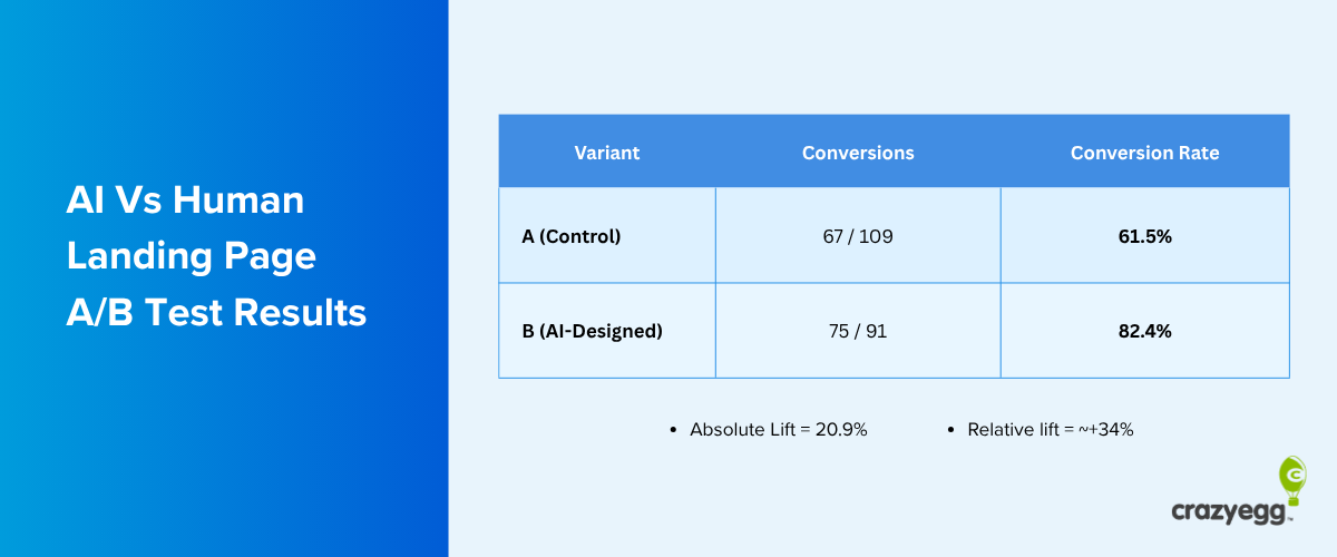
9. A/B test versions and track performance
A/B testing your exit-intent popups helps you choose the best-converting option. Even small changes to the offer, headline, or CTA can lift conversions meaningfully.
Start with the offer — the biggest lever. Once you’ve found an offer that works, test the headline, then CTA copy, form-field count, and visual layout.
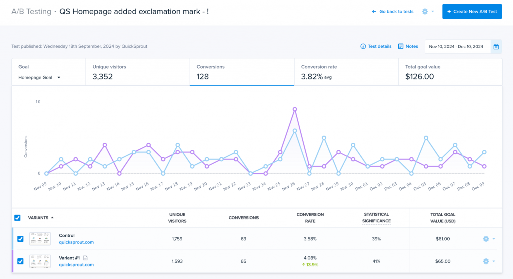
Don’t stop with the test results: Analyze heatmaps and session recordings for each variant and look for engagement patterns. Use them to inform future iterations.
Treat this as ongoing, not a one-off. Even when tweaks feel marginal today, popup performance decays over time — so keep iterating.
Apart from the microcopy and design, experiment with different frequency caps and suppression windows. Start with one exit popup per session and a suppression time that matches your buying cycle. Adjust based on what you see.
Finally, check that the popup library isn’t slowing down your page load times.
10. Combine exit popups with other recovery tools
An exit-intent popup catches a visitor in the moment — the last few seconds before they leave. It isn’t the only way to recover a disengaged visitor, and it works best as one layer among several:
- Abandoned-cart email reaches the visitor after they’ve gone, but only if you captured their address, for example, through a “save my cart” exit popup.
- Retargeting ads bring visitors back after they left the page.
- Live chat suits high-consideration pages, like pricing or demos, where the hesitation stems from a question a popup can’t fully answer on its own.
11. Use other standard popup tactics
Other popup tactics that increase conversions regardless of the trigger include:
- Two-step opt-ins. Ask a yes/no question first, and the form only once the visitor says yes; the initial commitment lifts the odds they finish.
- Pre-populated fields. Auto-fill any details you already have, so the visitor has less to type, and the form feels like less work.
- Progress bars. On a multi-step form, show visitors how close they are to finishing and tap the natural pull to complete what they already started.
- Countdown timers and scarcity messaging. Add urgency that pushes a hesitating visitor to act — as long as the deadline or low-stock claim is genuinely true.
- Social proof. Subscriber counts, customer testimonials, or review scores reassure a wavering visitor that other people have already taken the same step.
- Gamification (e.g., spin-to-win wheels). Lift signup rates by turning the offer into a small game if the format suits your brand.
Final Thoughts
Whether your exit-intent popup converts or hurts the UX comes down to three things — who sees it, where, and how strong the offer is.
Fire it where visitors are genuinely deciding, match the offer to page intent, and make it compelling enough so they don’t mind you interrupting them.
Get it right, and the popup earns its place. Get it wrong, and you lose the conversion — and a customer’s goodwill.
Crazy Egg’s heatmaps, session recordings, analytics, and surveys help you design and target your exit popups. When you’re ready to build and test an exit popup, you can do both with Popup CTAs and A/B testing. Start your free trial today!