The average ecommerce cart abandonment rate sat at 70.22% in 2025. Many of the abandonders never intend to buy (about 43%). They are browsing, comparing prices, or window-shopping for gifts.
But a well-designed checkout page can help you save those who want to buy but leave mid-flow.
In the article, I’ll walk you through 11 ways to improve your checkout page design and reduce cart abandonment rates. Backed by primary research and illustrated with live checkout page examples.
11 Ways to Reduce Cart Abandonment on Your Checkout Page
A good checkout page design removes friction from the checkout process, reinforces customers’ desire to buy, and eliminates anything that could make them navigate away from the page.
1. Show the total cost and delivery date up front
Surprise costs and slow delivery at the final step are the two largest causes of abandonment, accounting for 39% and 21% of drop-offs, respectively.
Shoppers add a product expecting the tag price. When checkout adds shipping, tax, or a longer delivery wait, they leave — to compare elsewhere or because the deal no longer feels worth it.
So display the full cost and estimated delivery time on the product page (technically not a checkout page element, but it has a direct link to abandonment).
Wayfair, the household goods retailer, ticks all the boxes: it shows the price, shipping, and estimated delivery date next to the product details.
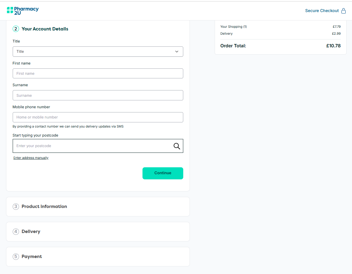
2. Offer guest checkout and single sign-on (SSO)
Forcing customers to create an account causes 19% of cart abandonments — and hits hardest with first-time buyers whose trust you have yet to earn.
Another common mistake? Making guest checkout secondary to “create account” with different styling or lighter button weight, or burying it behind a small link.
Mindful of that, Etsy offers guest checkout prominently on the first page, at the sign-in step.
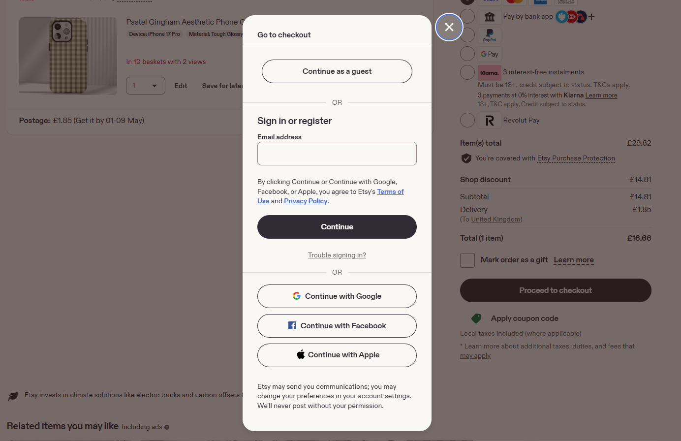
It also offers single sign-on (SSO), so customers can log in with Google, Facebook, or Apple.
SSO speeds up registration, increases trust, gives you accurate customer data, and can increase conversions by 20–50% (according to some estimates).
Pro tip: If you need the customer to create an account, for example, for recurring billing, delay it until the confirmation step.
3. Cut your checkout to 6-8 form fields
18% of 2025 shoppers surveyed abandoned a purchase because the checkout was too long or complicated.
Baymard’s 2024 research, however, found the issue isn’t the number of steps but the effort, and more fields mean more effort.
A B2C checkout doesn’t need more than 6-8 field forms.
For instance, ASOS gets its checkout form down to 7 fields, credit card included! This is possible thanks to an address finder that autofills as you type.
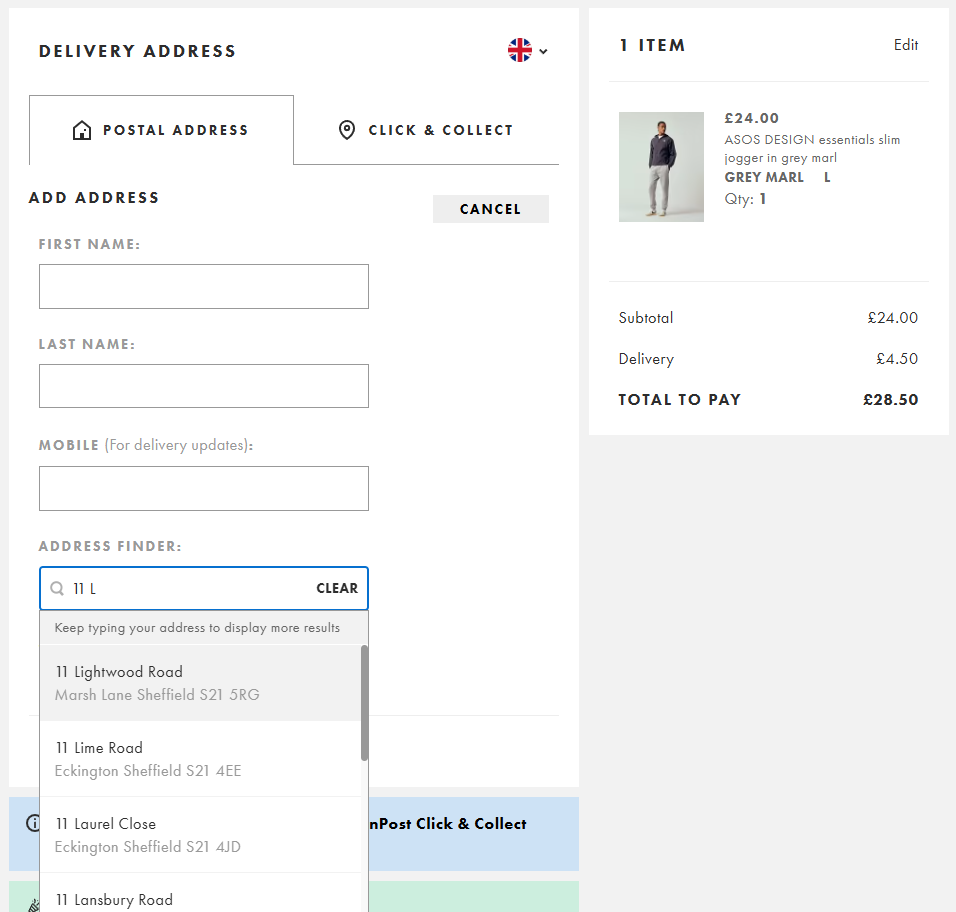
How else can you cut unnecessary form fields?
- Combine first and last name into one field (if your shipping carrier accepts it)
- Hide Address Line 2 — most customers don’t need it
- Default billing address to shipping
- Hide the coupon field (or auto-fill it for sitewide discounts)
Of course, B2B purchases, prescriptions, age-gated products, and purchases that require tax IDs genuinely need more fields.
4. Strip unnecessary page elements to limit distractions
The sole purpose of the checkout page is to enable the transaction, so remove anything that doesn’t serve that goal, distracts, or gives shoppers an exit route.
What should you strip?
- Site navigation — it gives the shopper a way out
- Promotional banners, sale countdowns, and pop-ups unrelated to the order
- Social media icons and newsletter sign-ups
- Auto-popping chat widgets that block form fields (chat available is fine; chat interrupting isn’t)
- A heavy footer with link directories — keep only logo, copyright, and security/policy links
- Any internal link that takes the shopper off the page
A good checkout page has:
- Order summary with product images, quantities, and the running total
- Primary CTA (“Place Order” or “Continue to Payment”)
- Trust signals (badges, secure-payment label, payment logos)
- Customer support contact — phone, live chat link, or both
- A minimal branded header: logo only, no nav
- Inline validation and clear error messages
Patagonia is a good example.
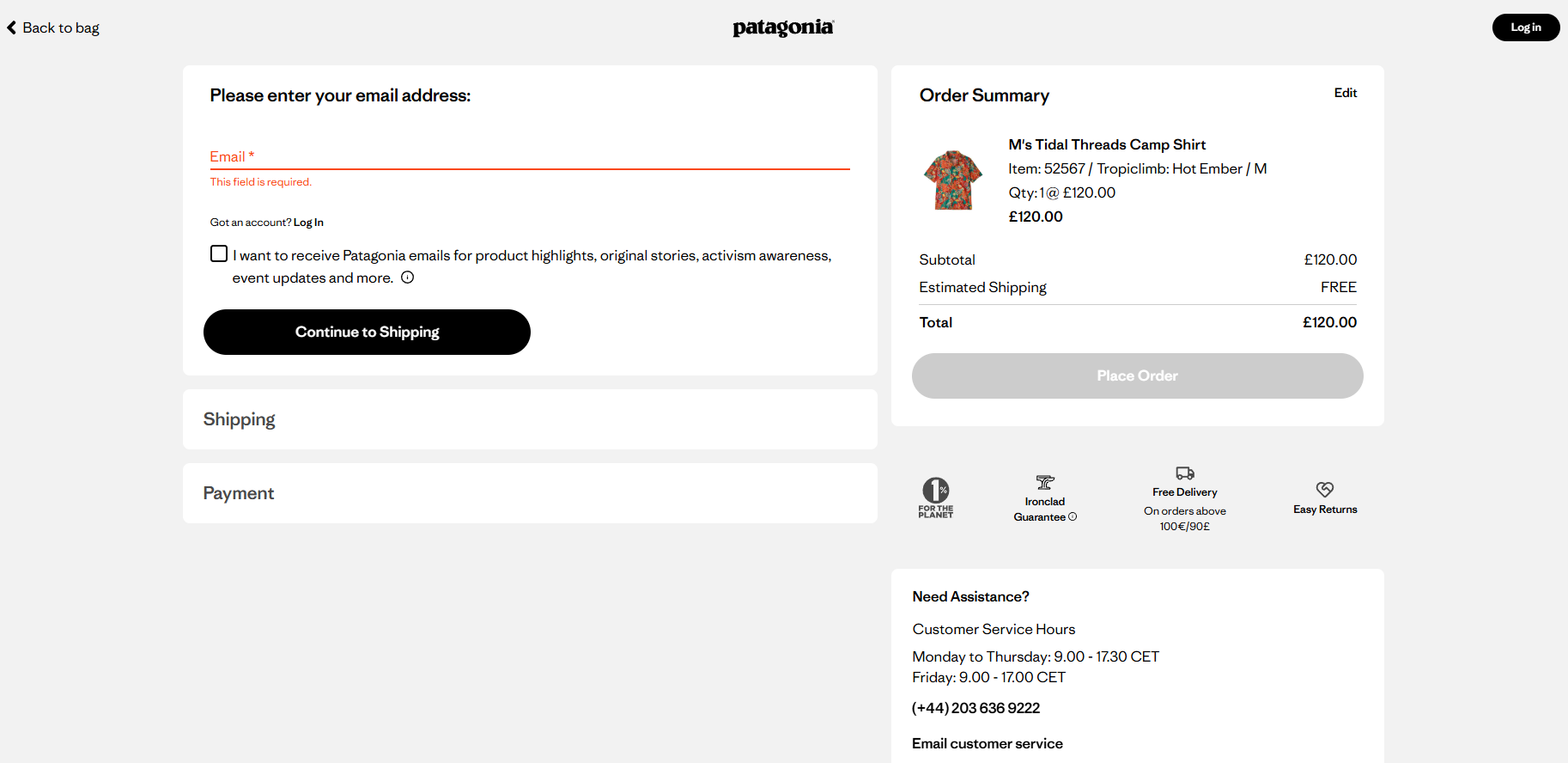
Its header carries only what the checkout needs: logo, “Back to bag” for cart edits, “Log in” for returning customers. No nav, no search, no account dropdown, no promo banner.
The order summary sits on the right with product image, quantity, running total, and “Place Order” pinned at the top.
Everything else earns its place: four small trust badges (1% For The Planet, Ironclad Guarantee, free delivery threshold, easy returns), customer service hours with phone and email, and a collapsed FAQ that pre-empts the four most likely questions — delivery, returns, cancellation, and fit.
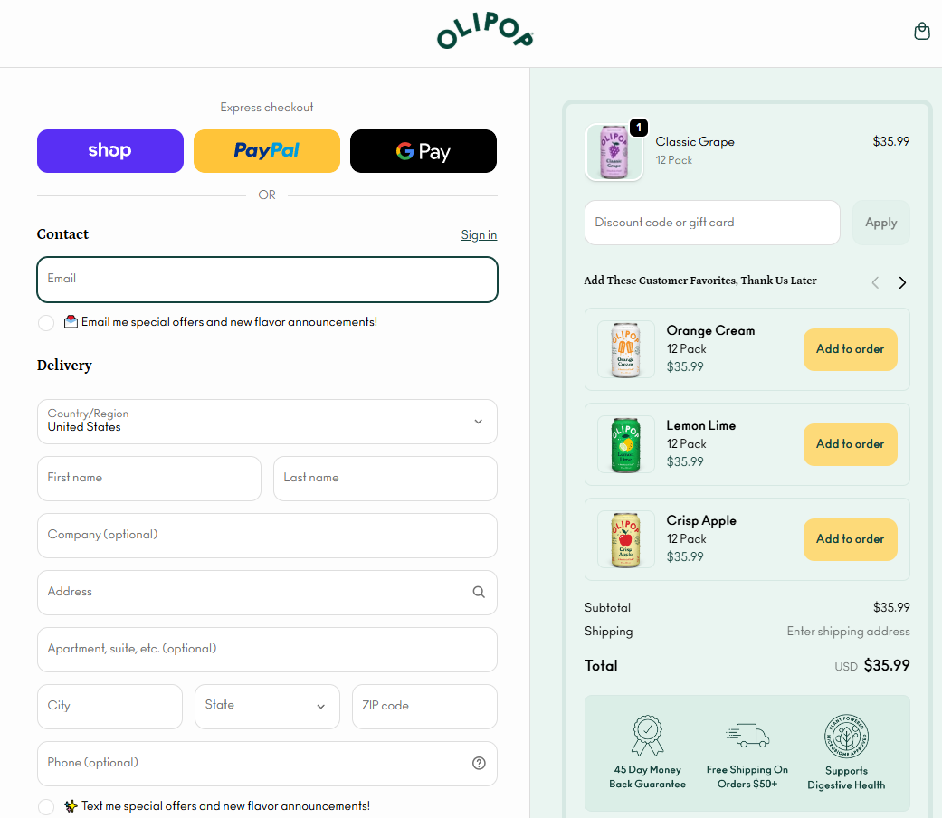
5. Choose a single-page or multi-page checkout design intentionally
The choice between single- and multi-page checkouts depends on what you’re selling and how complex the order is.
One-page checkouts, promoted by Shopify, work for simple, low-cost purchases — like Olipop soda or Magic Spoon cereal. Fewer pages mean fewer interruptions, fewer chances for buyers to change their minds, lose patience, or hit a page error.
Multi-step checkouts break the process into logical steps and feel less visually overwhelming. They work better on mobile, where there’s less scrolling.
Multi-page checkout flows also leverage the sunk-cost fallacy: with every completed stage, the buyer’s commitment grows, because quitting means wasting the effort already invested. So they’re more likely to complete their order.
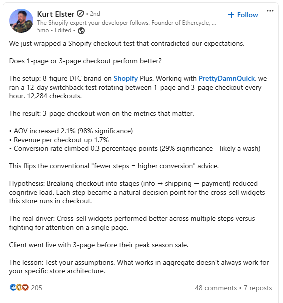
Finally, they give you more opportunities to insert trust signals and upsells (warranty add-ons, product bundles), increasing average order value (AOV) and revenue per checkout — as Kurt Elster’s LinkedIn case study demonstrates.
Adding a progress bar to a multi-page checkout reduces the risk of drop-offs. It shows customers how much effort the process takes and taps the goal-gradient effect: the closer people feel to the finish, the harder they push to get there.
If you want just one page but need to collect more information, use an accordion-style checkout design. So, later sections stay hidden until the current one is complete.
6. Add trust signals to the checkout page
As many as 19% of customers abandoned their carts last year because they didn’t trust the site.
You can alleviate their concerns through:
- “Secure Checkout” button label
- Payment processor name (e.g., “Secured by Stripe” or “Powered by Shop Pay”)
- Recognized payment-method logos at the payment step (e.g., Visa / Mastercard / Amex / Apple Pay / Google Pay)
- A visible security note at the payment field (e.g., “Your card data is encrypted with 256-bit SSL” or “PCI DSS Level 1 compliant”)
- Order overview
- Design consistent with the rest of the website (branding, colors, etc.)
- Risk-reversal copy (e.g., “Free returns within 30 days” or “Money-back guarantee”)
- Customer reviews and start ratings
- Press or award badges
- A trusted seal (especially Norton or Google)
Match the stack to your product — a $20 t-shirt buyer doesn’t need what a $3,000 PC buyer does.
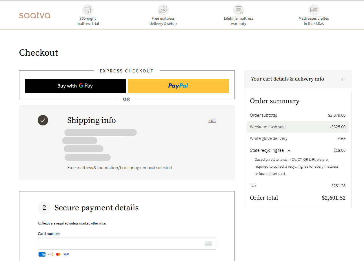
Saatva is a good example. The luxury mattress retailer lines up four trust badges across the top of its checkout — 365-night trial, free delivery and setup, lifetime warranty, made in the USA — each resolving a specific concern a high-AOV buyer raises.
The payment section is labeled “Secure payment details,” with Visa, Mastercard, Amex, and Discover logos at the card field, plus Google Pay and PayPal as express options.
7. Offer the payment methods your customers use
Adding payment methods beyond cards — Apple Pay, PayPal, Google Pay — increases conversion and revenue, especially on mobile.
A Stripe holdback experiment last year (April, 2025) found that adding other payment methods drove +7.4% conversion and +12% revenue. Apple Pay alone delivered a 22.3% conversion and a 22.5% revenue boost.
The key is relevance.
The same experiment showed conversion lifts of 39% from iDEAL in the Netherlands, 91% from Alipay in China, and 46% from BLIK in Poland.
Buy Now, Pay Later (BNPL) options like Affirm, Afterpay, or Klarna increase conversions by up to 14%, according to another Stripe study (June 2024).
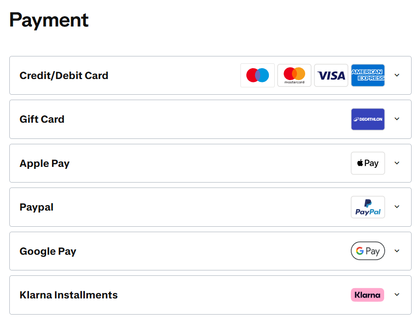
If you want a good example, have a look at the Decathlon checkout.
The sporting goods retailer offers UK customers all major credit cards (including Amex), Apple Pay, Google Pay, PayPal, Klarna, and gift cards.
Unlike some retailers, it displays them all on the main checkout page — no “other payment methods” dropdown.
8. Design mobile-first
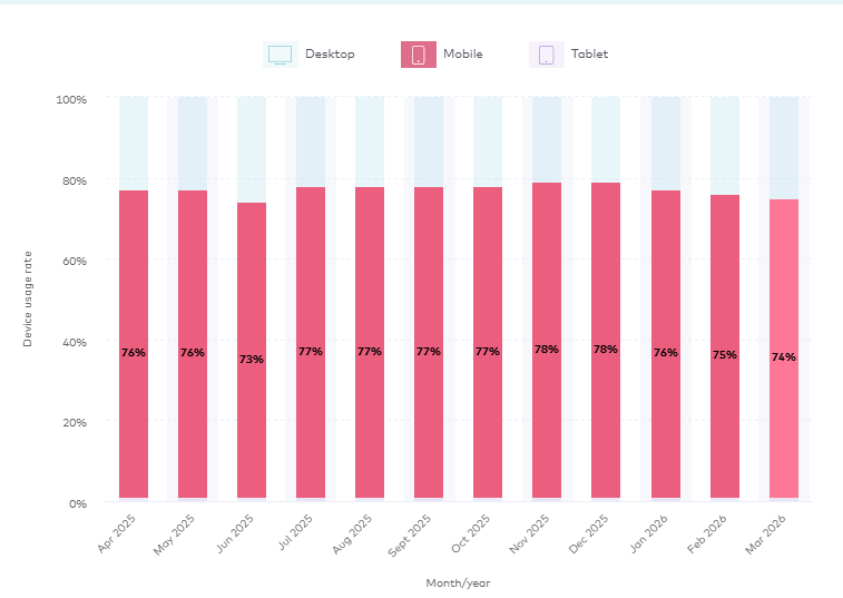
In March 2026, 74% of e-commerce traffic came from mobile devices, and in some categories, like Beauty & Personal Care, it hit 93%.
Mobile is also the highest-abandoning device — 80.94% in March, almost 11 points higher than desktop.
Some of that gap is browsing intent (mobile users window-shop more), but ignoring mobile design still leaves real buyers underserved. To do mobile-first well:
- Put Apple Pay, Google Pay, and Shop Pay at the top of the page. Express wallets skip form entry entirely — the biggest single mobile win.
- Enable address autocomplete via Google Places, Loqate, or SmartyStreets. Removes the worst typing burden on a phone keyboard.
- Trigger the right keyboard for each field. inputmode=”numeric” for zip, phone, card number, and CVV; inputmode=”email” for email.
- Use a single-column layout with generous spacing — no side-by-side fields on mobile.
- Embed camera-based card scanning and biometric autofill to kill the 16-digit-typing problem.
- Keep page load under 2 seconds. Compress images, lazy-load non-critical elements, defer third-party scripts. Abandonment climbs sharply past 3 seconds.
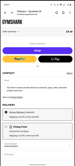
Gymshark checkout is a good mobile-native example.
Express checkout options (Shop Pay, PayPal, Google Pay, Apple Pay) sit at the top as the primary payment route. For card, Klarna, or Clearpay, autofill plus Face ID or Touch ID gets a buyer through in under a minute.
9. Make the CTA button unmissable
“Place Order” buttons that are hard to see or hidden below the fold reduce conversions — but not for the reason you might think.
Baymard’s 2019 tests found users mistook the Order Review step for the Confirmation step and left convinced they’d already paid. The damage: up to 11% abandonment.
To avoid this:
- Put the Place Order button above the fold at Order Review.
- Use unambiguous, descriptive copy — “Place Order” or “Complete Purchase,” not generic verbs like “Submit” or “Next” that don’t tell users what’s about to happen.
- Make the button visually dominant. Higher contrast, more weight than secondary buttons; “Place Order” and “Return to Cart” shouldn’t look equally important.
- Name the destination at intermediate steps. “Continue to Payment” is clearer than “Next.”
- Keep the CTA persistently visible on mobile with a sticky footer that follows the scroll.
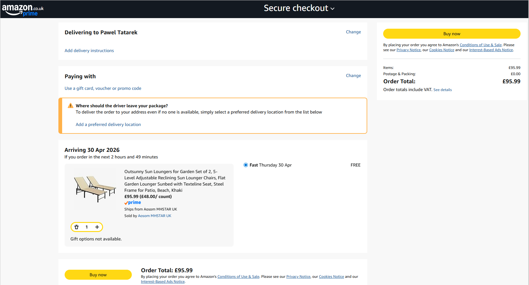
Amazon guides buyers through with a sequence of clear, hard-to-miss CTAs. The basket CTA sits in the side panel, labelled “Proceed to checkout.”
The checkout page itself has two “Buy now” buttons — one at the bottom and one in a sticky side panel that stays visible as the customer scrolls.
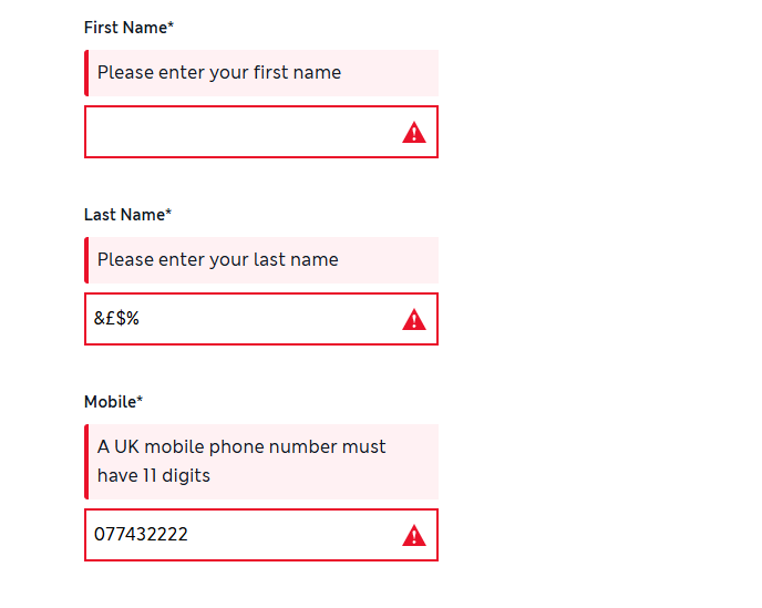
10. Validate form fields inline
Inline validation catches errors as users type, so they can fix them before submitting. It prevents end-of-form error dumps that force shoppers to scan the whole form for the broken field — and make some give up.
When implementing inline validation:
- Don’t validate prematurely — robert@ shouldn’t trigger an “invalid email” error while the user is still typing.
- Clear the error on keystroke. The moment they start fixing it, the message goes away. Red copy that stays visible after the fix makes the form feel hostile.
- Show positive validation. A green check tells users they can move forward without re-reviewing. On submission, anchor any remaining errors to the specific field — not a generic “please correct the errors below” banner.
Marks & Spencer’s checkout gets most of this right — error messages appear only when the customer leaves a field empty or enters wrong details.
This is particularly helpful at the payment step (if not using the Express Checkout).
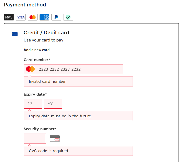
The one miss: errors don’t clear when you start correcting them. One to fix, M&S.
11. Design the checkout page for accessibility
Designing for accessibility means customers with disabilities and special needs can complete their purchase.
Most online stores fail this bar.
The WebAIM Million February 2026 audit found 95.9% of top home pages have detectable WCAG failures, with shopping the worst-performing category. The data is for home pages, but if a homepage fails, the checkout almost certainly does too.
Accessible design is also a legal requirement is some jurisdictions. For example, the 2025 European Accessibility Act mandates WCAG-compliant design for anyone selling to EU consumers.
To make your checkout accessible, use:
- Descriptive labels for every form field — not placeholder-only patterns which disappear the moment the user clicks in.
- High-contrast text and CTAs (WCAG AA: minimum 4.5:1 for body text, 3:1 for large text and UI components).
- Full keyboard navigation through every checkout step, including payment.
- Error states that don’t rely on color alone — pair red with an icon and clear text.
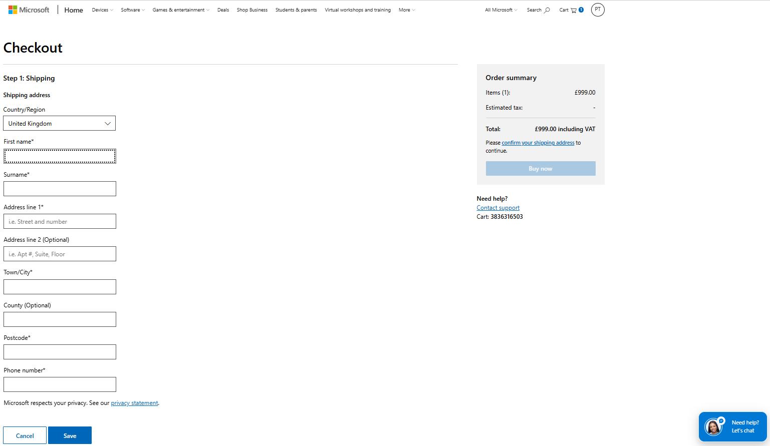
The Microsoft Store checkout follows accessibility best practices.
Text and CTAs use high-contrast color, controls are keyboard-focusable with a visible indicator, tab order follows left-to-right and top-to-bottom reading, and inline validation pairs color with error messages.
How Crazy Egg helps you improve your checkout page design
Optimizing checkout page design without knowing where or why it’s losing people is groping in the dark.
Crazy Egg tools like conversion funnels, session recordings, heatmaps, error tracking, and exit surveys give you the necessary insights. Once you know, you can A/B test various designs to pick the winning ones.
Want to try? Start your Crazy Egg free trial today.
FAQ
What is checkout page design?
Checkout page design is the process of laying out, labeling, and sequencing the fields, buttons, progress markers, and payment options on the checkout page.
The checkout sits between the product page and the order confirmation — a choke point in the customer journey. A shopper who reaches it wants the product, so anything that makes them hesitate or second-guess, like extra costs, lack of trust, or unnecessary steps, hits your revenue.
Why do people abandon checkouts?
About 43% of people who start a checkout never intend to buy. Among those who genuinely want to buy and still leave, the five main reasons are: surprise costs at the final step (39%), slow delivery (21%), no trust in the site (19%), forced account creation (19%), and a checkout that feels too long or complicated (18%).
What’s the difference between a cart page and a checkout page?
The cart is where shoppers review what they’ve added — adjust quantities, remove items, apply codes, and decide whether to keep shopping. The checkout is where they pay: it collects shipping and billing details, payment, and a final order review.
The cart is editable and exploratory; the checkout is transactional and linear.