The consumer buying process used to be predictable. A buyer saw an ad, ran a search, clicked a website, and made a decision. But that tidy funnel has fractured.
Today, the journey is messier and often invisible to brands.
Consumers are no longer the sole decision-makers. Increasingly, they’re outsourcing parts of the process to AI-powered agents, recommendation engines, and conversational search tools.
If your content, products, or brand can’t be understood (or surfaced) by these digital intermediaries, you’re already losing ground.
This article explores how the consumer buying process is evolving, what brands must do to keep up, and why the battle for attention is shifting from people to the platforms they trust to act on their behalf.
What Is the Consumer Buying Process?
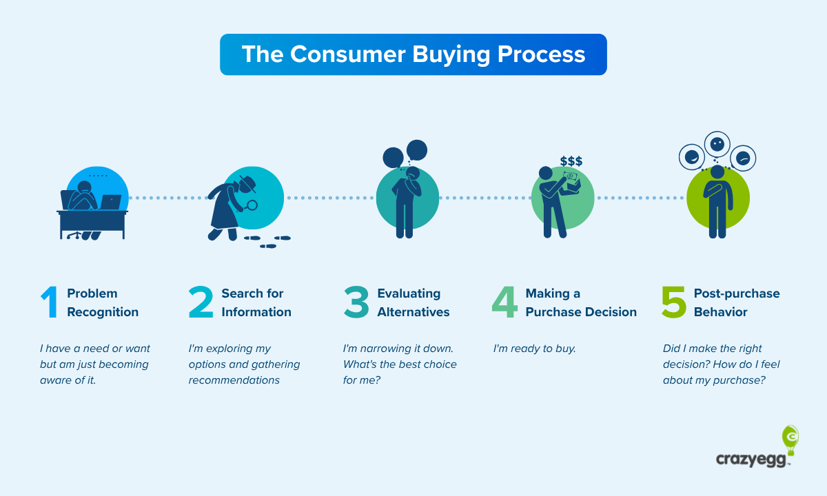
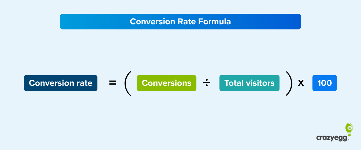
The consumer buying process refers to the mental and behavioral journey a person takes from the moment they realize they need something to the point of making a purchase.
It’s typically described in five classic stages:
- Problem recognition: The consumer identifies a need or want.
- Information search: They begin researching solutions.
- Evaluation of alternatives: They compare products, brands, or services.
- Purchase decision: They make a final choice and complete the transaction.
- Post-purchase behavior: They experience the product, form opinions, and may become loyal (or not).
This model has served marketers well for decades because it highlights how influence works: different messages, platforms, and content types are needed at different points in the journey.
But that journey is changing.
Today, consumers no longer move through these stages in isolation. They’re aided (and often led) by digital agents, personalized algorithms, and voice-based assistants. The process is still valid, but it’s being filtered, accelerated, and sometimes entirely handled by AI.
Understanding the structure is still important, but so is rethinking who is in control of each stage.
Why the Consumer Buying Process Still Matters for Brands
At first glance, it might seem like the consumer buying process is becoming obsolete. After all, AI agents and algorithms are starting to make decisions for people.
But that’s exactly why it matters more than ever.
Understanding this process gives brands a framework for influence. Even if the consumer isn’t consciously stepping through each stage, someone (or something) is. Whether it’s a person browsing search results or an AI summarizing the top product options, the same fundamental journey is happening behind the scenes.
For brands, the challenge has shifted: it’s no longer just about persuading a human buyer. It’s also about being visible, credible, and useful to the digital systems assisting that buyer.
If you don’t understand how people make decisions (and how technology is accelerating or rerouting that journey) you risk disappearing entirely from the consideration set.
But if you do, you can design messaging, product experiences, and search-friendly content that surfaces at the right moment, whether the audience is a human, a chatbot, or both.
How the Stages of the Consumer Buying Process Are Changing
The traditional five-stage model of understanding the consumer buying process still offers a useful blueprint. But in practice, most stages now plays out differently thanks to AI, conversational search, automation, and new digital platforms.
Let’s take a closer look at what’s shifting.
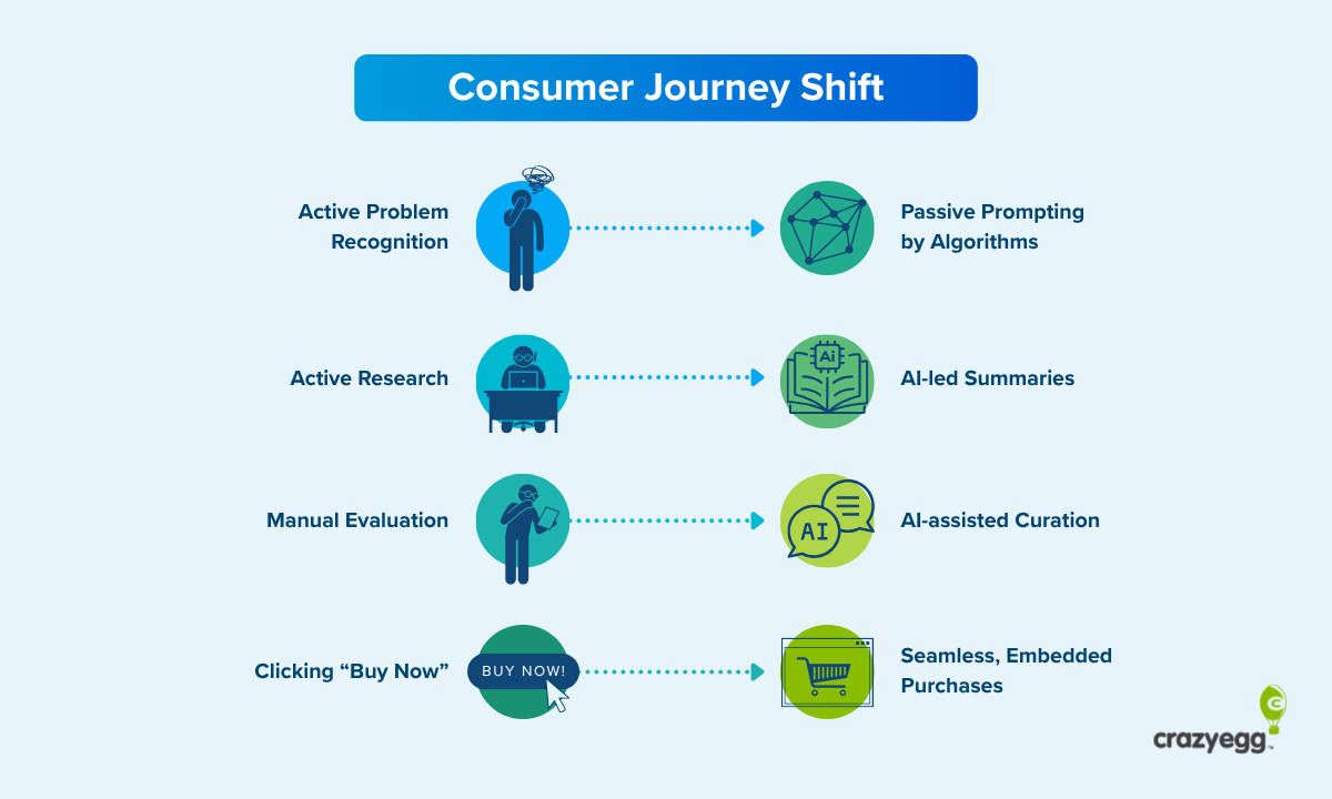
1. From active problem recognition to passive prompting by algorithms
Instead of realizing a need on their own, consumers are increasingly triggered by personalized prompts.
Personalized prompts are pieces of content (often algorithmically generated or selected) that surface based on a user’s behavior, preferences, or contextual data.
Unlike traditional advertising, they don’t respond to a user’s active search or intent. Instead, they anticipate needs and subtly nudge the user toward passive discovery.
Examples include:
- A TikTok video showing skincare tips for dry weather, shown to users in a region with a cold forecast.
- A YouTube Shorts product review served after you watch three videos on morning routines.
- An Amazon homepage suggestion based on browsing history, even if you didn’t explicitly search for the product.
In each case, the algorithm acts like a personal assistant, using signals like:
- Behavioral data (what you watched, clicked, or lingered on)
- Demographics or location
- Previous purchases or interactions
These prompts create a problem to solve or a desire to fulfill, initiating the buying journey without a conscious starting point from the consumer.
2. From active research to AI-led brand and product summaries
In the past, consumers actively searched for solutions by typing keywords into Google, scanning multiple pages, and comparing options manually.
Today, that behavior is shifting for two reasons:
- Search platforms natively integrate AI summaries into their results
- Searchers are turning to AI platforms instead of traditional search engines
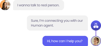
People are increasingly outsourcing the research process to AI agents. Tools like ChatGPT, Gemini, and Amazon Rufus don’t just surface links, they generate summarized recommendations, compare features, and provide conversational answers.
Instead of asking “what’s the best mattress for back pain?” and reading five blog posts, a consumer can now ask a chatbot and get a tailored shortlist instantly.
Even when humans still conduct their own research, AI is often embedded in the experience.
Google’s AI Overviews now appear above traditional search results, reshaping what gets seen and trusted. Shoppers may still browse, but they’re being guided by AI-generated summaries, product comparisons, and in some cases, entire buying guides.
For brands, this means traditional SEO isn’t enough. If your content isn’t structured in a way AI systems can parse, summarize, and recommend, you risk being filtered out before the buyer ever sees you.
3. From manual evaluation of product alternatives to AI-assisted curation
In the past, when consumers had a shortlist of options, they evaluated them manually. This could often be a lengthy process that included:
- Visiting product pages
- Reading reviews
- Watching YouTube comparisons
- Doing price comparisons on marketplaces
Today, that hands-on research is increasingly offloaded to AI systems that do the vetting for them.
Whether it’s a chatbot summarizing pros and cons, a Google AI Overview comparing brands, or a shopping assistant listing top-rated products by feature, the process of evaluation has been compressed into a curated output.
Instead of spending 20 minutes jumping between tabs, the consumer receives a two-minute AI-generated answer.
This shifts the brand’s role from “one of many pages the buyer might explore” to “one of few options the agent might recommend.”
If your product data isn’t machine-readable, well-reviewed, and easy to contextualize, it may be excluded from that shortlist altogether.
4. From Clicking “Buy Now” to Frictionless, Embedded, and Invisible Purchases
In traditional shopping experiences, once a consumer makes their decision, they’d head to a site, fill out forms, and complete checkout.
Today, that friction has been all but erased in many shopping experiences.
Now, purchase flows are often embedded into the same environment where the decision was made. For instance, search, evaluation, and purchase now happen on the same platform:
- TikTok Shop: Users discover products through influencer videos and can purchase directly without leaving the app.
- Instagram Checkout: Shoppable posts and reels let users evaluate and buy in a few taps, no website visit needed.
- Amazon’s Rufus: This AI assistant answers product questions and links directly to purchase options in the same thread.
- Google Shopping: Search results can now include comparison tables, reviews, and buy buttons in one view along with AI-assisted options to virtually try a product before you buy.
- Pinterest: Visual discovery platform turned storefront. Users can go from pin to product to purchase in seconds.
- Shopify + Chat/Voice Integrations: Brands using Shopify can embed purchase flows directly into Messenger, WhatsApp, or voice assistants.
In many cases, users complete the entire journey (from discovery to decision to transaction) without leaving the app or search environment.
The biggest shift? The buyer often doesn’t need to visit your website at all.
With AI handling discovery, comparison, and even transaction support, the importance of owning the end-to-end experience is shrinking, unless you integrate your product into the spaces where those experiences now happen.
What Influences Buying Decisions Today (and How Brands Can Shape Them)
While AI is changing how consumers move through the buying process, the core drivers of decision-making haven’t disappeared, they’ve just evolved.
People still care about price, trust, convenience, and social proof. But the way those factors show up (and the speed at which they’re evaluated) has dramatically accelerated.
Here’s what’s influencing consumers now, and how marketers can respond:
- Relevance: AI tools surface products that match intent, behavior, and context. Brands that structure their data well (through metadata, schema, and clean product feeds) are more likely to be recommended.
- Speed: In an AI-powered world, people expect answers and options fast. Brands need content and experiences that load quickly, summarize well, and answer common questions upfront.
- Trust: With AI agents acting as filters, consumers rely more on signals of credibility like verified reviews, recognizable branding, expert endorsements, and transparent policies.
- Personalization: People expect experiences that reflect their needs without feeling invasive. AI enables tailored product listings, offers, and recommendations, but only if brands feed the system accurate, diverse inputs.
- Framing: The way your product is described (by you and by others) matters more than ever. AI agents pick up on descriptive language, FAQs, and consistent messaging when generating summaries.
Even if marketers no longer control their customer’s journey, they still have the power to shape how their products are interpreted and presented within AI-driven environments.
By feeding these systems with clear, consistent, and well-structured content, brands can influence how AI tools summarize, recommend, and prioritize their offerings, often before a consumer ever reaches the website.
How Brands Can Stay Visible in the AI Era
The rise of AI agents doesn’t mean marketers are obsolete; it just means the rules have changed.
Influence still matters. Trust still matters.
But to compete in a world where machines increasingly make consumer purchase decisions on behalf of people, you need to rethink how and where you show up.
Here’s a focused checklist to help product marketers stay relevant and discoverable in this new landscape:
- Structure your content for AI visibility: Use clean metadata, schema markup, and clear product descriptions that AI agents can easily interpret and summarize.
- Write for conversations, not just keywords: Anticipate natural-language questions and answer them clearly in your content. Think FAQ-style copy, product comparisons, and explainer sections.
- Feed the systems that feed the agents: Ensure your product data is accurate, up-to-date, and present in the platforms AI tools rely on, like Google Shopping, Amazon, or Shopify.
- Strengthen your trust signals: Encourage credible reviews, highlight real expertise, and reinforce brand authority, because AI systems prioritize what’s reliable.
- Experiment where the journey now happens: Test how your product appears in AI overviews, voice search, chat interfaces, and embedded commerce tools. You may not own the full journey anymore, but you can own the moment of selection.
The consumer buying process hasn’t disappeared; it’s just moved beneath the surface. AI agents, conversational platforms, and embedded commerce are quietly reshaping how decisions are made and who gets considered.
For marketers, the goal has shifted from attracting attention to being understood, trusted, and chosen by both humans and the systems that guide them.
The brands that win in this new landscape won’t just follow the funnel. They’ll adapt to the algorithm, speak the language of AI, and meet buyers exactly where decisions are being made even if that’s not on a channel they own.