In this tutorial we are going to look at 15 different effects you can create using CSS transitions.
CSS3 allows you to add transitions to different CSS properties on any HTML element. Using CSS transition effects allows you to add different types of animation to your web pages.
If you look at the social media icons on Paulund.co.uk (my site) you will see how it uses CSS transitions to change the opacity on the images to fade in the social media icons.
CSS Transition Property
Currently transitions are supported on all modern browsers and will come into place for Internet Explorer in IE 10.
To use transition you need to add the browser prefix to the start of the property.
div{ transition: width 2s; -moz-transition: width 2s; /* Firefox 4 */ -webkit-transition: width 2s; /* Safari and Chrome */ -o-transition: width 2s; /* Opera */ } With transitions you can change a certain CSS property or all the properties on an element.
In the below examples of transitions we are setting it to all so we can make multiple changes to the element.
View the demo to see these in action.
The Box
All of the following examples use the same HTML element, a box, so we can demo the different CSS transition effects, here is where we setup the transition settings.
<div class="box"> </div> .box{
background-color:#ccc;
width:400px;
height:250px;
margin:10px auto;
cursor:pointer;
position:relative;
transition: all 0.7s linear;
-webkit-transition: all 0.7s linear;
-moz-transition: all 0.7s linear;
-o-transition: all 0.7s linear;
-ms-transition: all 0.7s linear;
}
Now we have add the transition property to the box class we just have to setup the hover events on the boxes to see the transition effect.
Move Down
Move the box down.
<div class="box move_down"> </div> .move_down:hover{ top:30px; } Move Up
Move the box up.
<div class="box move_up"> </div> .move_up:hover{ top:-30px; } Move Left
Move the box to the left.
<div class="box move_left"> </div> .move_left:hover{ left:-30px; } Move Right
Move the box to the right.
<div class="box move_right"> </div> .move_right:hover{ left:30px; } Smaller
Change the scale to make the box smaller.
<div class="box smaller"> </div> .smaller:hover{ -webkit-transform: scale(0.7); } Larger
Change the scale to make the box larger.
<div class="box larger"> </div> .larger:hover{ -webkit-transform: scale(1.3); } Tilt
Change the angle of the box.
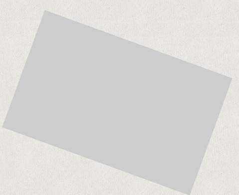
<div class="box tilt"> </div> .tilt:hover{ -webkit-transform: rotate(20deg); } Rotate
Completely rotate the box.

<div class="box rotate"> </div> .rotate:hover{ -webkit-transform: rotate(360deg); } Adding Shadows
Add box shadow to the box.
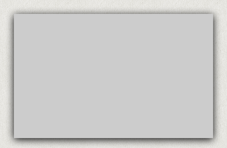
<div class="box shadows"> </div> .shadows:hover{ box-shadow: 0 3px 25px #000; } Changing Background Colour
Change the background colour of the box.

<div class="box bg_colour"> </div> .bg_colour:hover{ background-color:#000; } Changing Width
Change the width of the box.
.width_more:hover{ width:800px; } Changing Height
Change the height of the box.

<div class="box height_more"> </div> .height_more:hover{ height:600px; } Fade In
Fade the box into sight on hover.

<div class="box fade_in"> </div> .fade_in { opacity:0.3; } .fade_in:hover{ opacity:1; } Fade Out
Fade the box out of sight on hover.
<div class="box fade_out"> </div> .fade_out:hover{ opacity:0.3; } Border Radius
Change the border radius of the box.
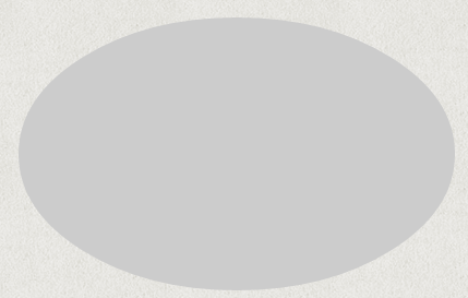
<div class="box border_radius"> </div> .border_radius:hover{ border-radius:50%; } View the demo to see these in action.


