Source: Pat Anzanello
Ralph Waldo Emerson once wisely observed that nature always wears the colors of the spirit. Your website should do the same.
That’s especially true when it comes to your checkout process or landing page. When a visitor lands there, you’re just a few clicks (give or take) away from conversion.
At that point, you want to do everything you can to lead the visitor further down the sales funnel. Your aesthetics should include a color scheme that contributes to a healthy conversion rate.
So what colors work best for conversion? What palette is optimal for maximizing clicks? The answer may surprise you.
It depends.
In this article, we’ll discuss why color makes a difference, the meaning behind various colors, the results of some color tests that have been conducted, and how to select colors that maximize conversions.
Which colors will choose for your site?
Color Does Make A Difference
If you think that color is trivial as a contributing factor in your conversion rate, think again. Evidence indicates that color is more important than many people realize.
According to Kissmetrics, “it is crucial to consider that consumers place visual appearance and color above other factors when shopping.” In fact, a whopping 85 percent of consumers identify color as the primary reason for why they buy a product.
Further, 42 percent base their opinion of a website on overall design alone and more than half (52 percent) didn’t return to a website because of poor aesthetics.
Kissmetrics also offers guidelines about color selection, depending on the nature of your business. Red, orange, black, and royal blue should be used to target impulse shoppers; navy blue and teal should be used to reach shoppers on a budget; and softer colors like pink, sky blue, and rose should be used to target traditional buyers, especially for clothing brands.
Those guidelines, however, are just a starting point. There is much more to the story.
Culture And Colors
As with everything else in marketing, the process of selecting the best color design begins by understanding your target market. That’s especially true if you’re market includes people from different cultures.
Specific colors have different meanings in different countries. While people in the West might view white as a symbol of purity, it’s the color of mourning and death to people in China. To people in Brazil, though, purple is the color of death.
Those are just two examples. To make sure that your checkout process or landing page yields an optimal conversion rate, you’re going to need to familiarize yourself with the culture of the people who are most frequently visiting your site and design accordingly. You might even have to make an investment in offering different color schemes to people from different countries.
The Theme Of Your Site
Next, you’re going to want colors that align with the theme of your site. When you use a color pattern that reinforces your niche, you’re leveraging the familiarity principle when it comes to web design.
Simply put, the familiarity principle states that people are attracted to what’s familiar to them. That’s why your color scheme should reflect the overall “personality” of your products or services. According to Color Wheel Pro, “Blue is the color of the sky and sea. It is often associated with depth and stability. It symbolizes trust, loyalty, wisdom, confidence, intelligence, faith, truth, and heaven. Blue is considered beneficial to the mind and body. It slows human metabolism and produces a calming effect.”
Orange represents enthusiasm, fascination, happiness, creativity, determination, attraction, success, encouragement, and stimulation.” Thus many of our calls to action are orange, both on our site, and on the Internet in general.
Example Amazon orange calls to action
As another example, if you’re selling saltwater fishing tackle online, then you probably wouldn’t want to offer your visitors a brown and green motif. Instead, you’d probably prefer something like cobalt blue and white. Those are colors that are familiar to saltwater fishermen.
Finally, if you are site who is focused on making entrepreneurs money, like Quick Sprout, green is an excellent choice.
Shopping carts and landing pages are no exception. They should extend the color palette that the visitor has seen throughout the website. That way, those pages will look familiar to people who visit them.
However, there is still more to the story.
Colors In North America
Colors make statements. Some colors convey a good mood. Others throw off shade. Colors can have attitude or they can be humble. Some colors inspire while others depress.
Here in North America (and in much of Western Civilization), we’ve grown accustomed to associating specific colors with feelings, moods, and/or thoughts. Savvy web designers know about the psychology of colors and craft websites accordingly.
Here’s a brief rundown of how we view colors in North America.
Red
There are several applications for red in the West. It can mean stop, love, or Christmas. It’s often used create a sense of urgency or convey the idea of energy.
Red also inspires hunger. Think about all of the fast food restaurant chains that use red in their logo: McDonald’s, KFC, Chili’s, Applebee’s, and In-N-Out. The website for Edible Arrangements not only features red in its logo, but also uses the color prominently throughout the site (pay particular attention to the popup you’ll likely see when you click that link).
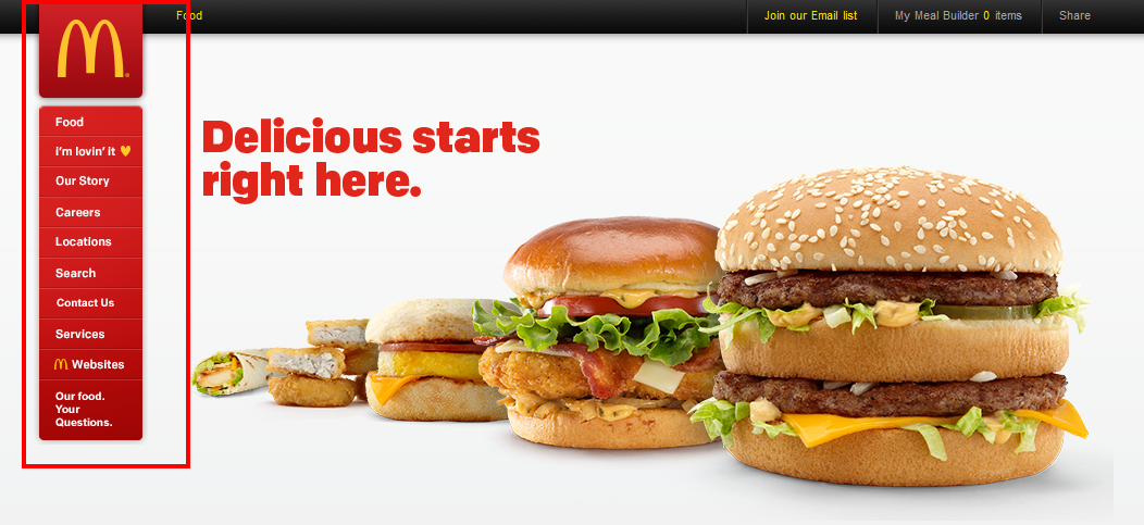
McDonalds using red to entice hunger
The color red has been tested repeatedly and successfully as the “go to” color for buttons on websites. That’s led many marketers to think it’s the best color for conversions. More on that later.
Yellow
Yellow is an eye-catcher because it doesn’t occur that often in nature. It conveys a sense of happiness and optimism. It’s also thought to inspire creativity.
If you’re looking to make people feel better about their situation, about themselves, or about their purchase, consider using yellow. It will offer your shoppers a soothing effect.
As with so many other things in life, though, too much of a good thing can be a bad thing. If you hit your visitors with an overabundance of yellow, your site might come across as “loud” and have an effect completely different than what you had intended. It’s best to use yellow for borders, logos, and buttons rather than using it as a background.

Too much yellow can be overwhelming
Also, yellow is an excellent contrast color. If your overall color scheme works well with yellow, consider using it to draw attention to certain, important parts of your pages.
Green
North American drivers everywhere think of one thing when they see green: Go!
Beyond that, green brings to mind the concept of nature. It’s a good color selection for sites that focus on outdoor activities, like camping and hiking. It’s also an excellent choice for sites that promote environmentalism.
Let’s not forget also that green is often associated with wealth, thanks to the color of paper money in North America. If you’re promoting a sales course or marketing tactic that people can use to boost their own net worth, consider using green to reinforce the idea of earnings.
Outside of the mention of Quick Sprout above, the website VitaCost also does a good job at using green as a contrast color for its buttons.

VitaCost green button examples
When it comes to selecting a color for a call to action button, many marketers who don’t opt for red/orange often choose green or blue.
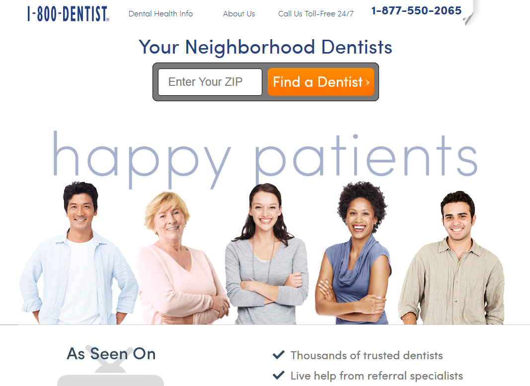
Blue
Blue is the universal “corporate” color when it comes to web design. It certainly figures prominently in many WordPress business themes.
There’s a reason for that. As mentioned, blue conveys a sense of trust, integrity, and security. Businesses that opt for a blue design are telling people in their target market: “You can trust us.”
Of course, blue can also be used to represent a cold or oceanic location. If your product or service is meant for those types of environments, consider selecting blue as a primary color.
One good thing about the color blue is that you can often use a lot of it without overpowering the eyes of your visitors. That’s especially true if you’re opting for a lighter shade of blue.
The website Dr. Dental does an excellent job of using various shades of blue on its home page.

Example of Dr. Dental using blue
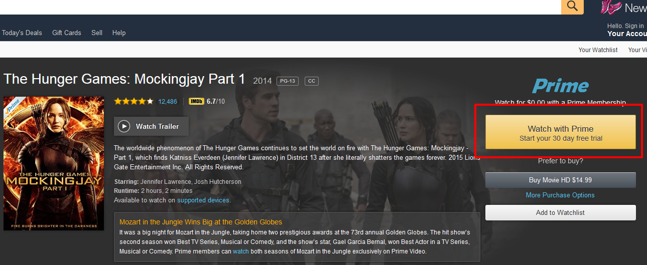
Orange
Orange can convey any number of messages, depending on the psychologist you’re listening to. Some say it conveys warmth and optimism. Others say it indicates caution (think roadside signs). Still others say it’s aggressive.
One thing is for sure. The undisputed king of e-commerce uses orange for its call to action button. That might be all you really need to know about the color.
Also, a long time ago, Unbounce declared the BOB (Big Orange Button) to be an excellent choice for maximizing conversions.
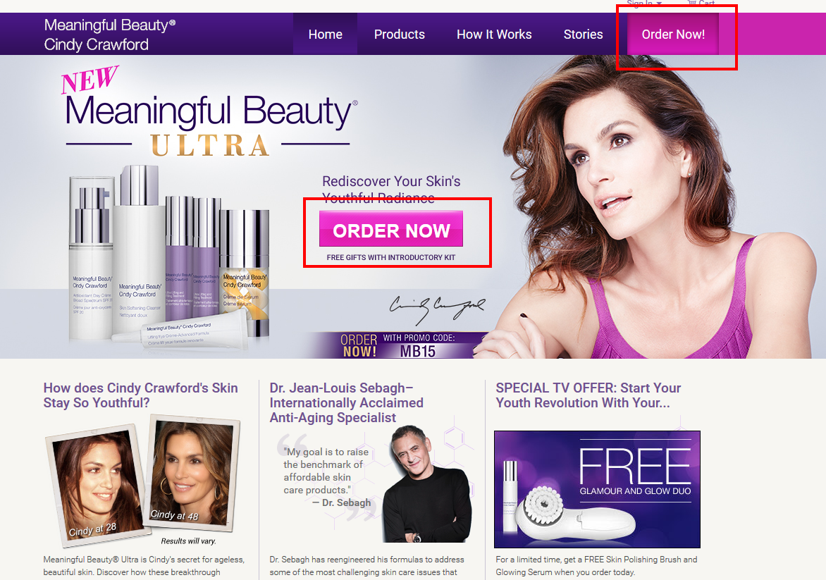
Purple
Purple has historically signified royalty. In marketing, it’s used to soothe or calm people. However, as with yellow, too much purple can become an eyesore.
The color purple is often selected to market anti-aging products. Check out the Meaningful Beauty website for an example of that. Note how various shades of purple are used throughout the website in menus and borders and that the call to action button is a combination of purple and pink that not only matches the model’s outfit, but also the overall design of the site.
Example of Meaningful Beauty
Pink
Pink is the favorite color of many young ladies. For that reason, it’s often considered a feminine color.
If your website caters to a young, female audience, consider using the color pink. The girls’ clothing section of The Children’s Place uses pink very effectively.

Example Children’s place using pink
It should be noted, though, that darker shades of pink can appeal to a male audience because they exude romance and love.
Also, a study published in the Journal of Orthomolecular Medicine showed that the color pink induces a calming effect. Some people have theorized that anti-indigestion medication Pepto-Bismol is pink for that very reason.
White
In Western culture, white symbolizes purity, wholesomeness, and clarity. That’s why it’s a good match for blue (“integrity”) in a corporate theme.
White is almost always the best background color for any website. As a result, it’s not often the case that you’ll want your call to action buttons to be white.
Example white background
Black
Black is the combination of every color. It’s considered the appropriate wardrobe color for people who are evil but it also conveys a sense of power.
Black is often used to market luxury products. Have a look at the JustLuxe website for an example of that. It is also used on tech and men’s fitness sites.

Example JustLuxe website
The Red/Orange vs. Green Studies
Now that we’ve covered the basics about various colors, let’s look at how a couple of colors have been used historically with some level of effectiveness. Specifically, we’ll look at the color for the all-important call to action button.
There are a few studies that compared the effectiveness of a red or orange call to action button against a green one. Spoilers: they all reached the same conclusion.
In the Dmix study, 600 subjects were tested with red and green buttons. When the red button was presented, the study found that conversion rates increased 34%.
Score a win for the red button.
The second study comes to us from none other than HubSpot. That study compared traffic spanning a few days and more than 2,000 visitors. The result: the red button won again with a 21% increase in conversion rate.
Score two wins for the red button.
In the Visual Website Optimizer test, three different types of buttons were compared: a white button with green text, a green button with white text, and a red/orange button with white text. That time, there was only a modest improvement for the red/orange button: a 5% increase in conversion.
That’s a total of three wins for a red or orange button in three studies.
So the verdict is in: a red or orange button is best for maximizing conversions, right?
Not necessarily.
Orange vs. Blue
What happens when orange is compared against integrity-bearing blue? Fortunately, Monetate conducted that experiment.
In a classic A/B test, the company found that the blue button actually outperformed its orange counterpart. The increase was a modest 9%, though.
So, in that case, the orange button wasn’t the winner.
So What’s The Right Answer?
There is no right answer. That’s not what you want to hear, but that’s the truth.
Why? Because the optimal button color for your page depends on context.
For example, the Hubspot test referenced above shows red outperforming green. However, the green button in that study blended in with the color scheme of the web page at the time. In other words, the button color was the same shade of green as the logo. Ergo, there was little contrast. The red button, on the other hand, offered significant contrast against the overall green design. Do you think that might have had something to do with why the red button yielded a better conversion rate?
Probably. That’s why HubSpot was quick to point out that you “cannot generalize these results to all situations. The most we can say is that they hold for the conditions in which they occurred: in this page design, on this site, with the audience that viewed it.”
Other tests revealed similar flaws. In one case, a green button was tested against a button that could barely be seen. Unsurprisingly, the green button in that study showed a superior conversion rate.
That’s why, even with studies, there’s no one-size-fits-all answer to the question. It’s all about what works best for each individual website.
Here’s a guideline, though: find a button color that stands as a contrast to the website. That way, it’s easy to detect and your customers aren’t looking all over the place trying to find the “Order” button. In the checkout process you want buttons to be big, clean and simple. You want the background to be plain and free of distraction.
However, the contrasting color should still complement the overall color scheme. If your color scheme is light blue and white, maybe you’ll find that a dark blue button works well. While a bright red button would stand out, it might actually be viewed as a nuisance because it clashes with your design.
Split Testing
As with so many other aspects of digital marketing, rely on split testing to give you the optimal solution when it comes to button color selection in your checkout process. Since there are more than two colors that you can use, though, you might need to rely on several iterations of split testing to find the one that converts the best.

Always be testing
Start by narrowing the field of potential call to action button colors down to a few options that are in line with your theme or present a significant contrast. Be careful not to choose a color that might have a negative connotation to people in your target market, if they’re from a different culture. From that point, conduct a variety of split tests that look like an NCAA bracket tournament. Pick the winner from the first two tests to go head-to-head against the winner from the second set of tests, and so on. Crown one color the champion and use that for your call to action button color.
All Other Rules Still Apply
Color itself isn’t going to save you. If you don’t have a compelling copy that quickly informs the visitor about the benefits of your product or service, then it won’t matter what color scheme you select. You’re still going to have a limited conversion rate.
Your color design is only one part of your marketing responsibilities. Be sure to give the other parts the attention they deserve.
Wrapping It Up
The colors you choose for your checkout process or landing page will make a difference in your conversion rate. However, the exact colors that work best for your site depend on its theme and the culture of the people in your target market. With some split testing and a little research on the meaning of colors, you can create a design that’s sure to turn curious onlookers into paying customers. My main points would be to:
- Match the color scheme to the rest of your site
- Have a background free of distraction
- Do not use colors that have a negative connotation in the culture
- Make sure you calls to action are large and above the fold
- Keep easy to reach tap targets for mobile
- Reduce distraction and apply simplicity as much as possible
As a final though, think of the Amazon checkout process. Simple, orange buttons that you cannot miss. Oh, and what is the brightest option on the app? “Buy Now with One Click.”
About The Author
John Lincoln is CEO of Ignite Visibility and a digital marketing teacher at the University of California San Diego. Lincoln has worked with over 400 online businesses and has generated millions in revenue for clients. He is a noted author on Search Engine Land, Marketing Land, Search Engine Journal and Entrepreneur Magazine and has been featured on Forbes, CIO Magazine, Good Morning San Diego, the Union Tribune and more.