I’ll be upfront: I wasn’t sure this would work.
The idea was simple. Take Crazy Egg’s existing Web Analytics landing page (written and designed by an experienced human team) and build a competing version using AI. Then A/B test them against each other and see which converts better.
The AI landing page had a 44.83% conversion lift. At 99% confidence.
For conversion rate optimization, a 5-10% lift is considered a good test result. A 44% lift at that confidence level is the kind of number that makes you stop and rethink how you’ve been building pages.
Here’s everything I did, what the data showed, and why I think the AI version won.
Key Insights From the A/B Test
- The AI-generated page converted at 80.65% vs the human page’s 55.68%
- That’s a 44.83% relative lift, at 99% statistical confidence
- The AI page led with visitor outcomes instead of product features
- It included a competitive comparison table that the human page didn’t have
- The workflow took a fraction of the time a traditional redesign would
What We Were Testing and Why
Crazy Egg’s Web Analytics page was already live and performing. It wasn’t broken. That’s actually what made it an interesting candidate for a test. Our goal wasn’t to fix a failing page. Instead, we wanted to see whether AI-assisted design could beat a competently built one.
The conversion event we measured was signups. Visitors were split fairly evenly across both variants (just under 55,000 people per variant), and we tracked who landed on the web analytics page and who signed up from that group.
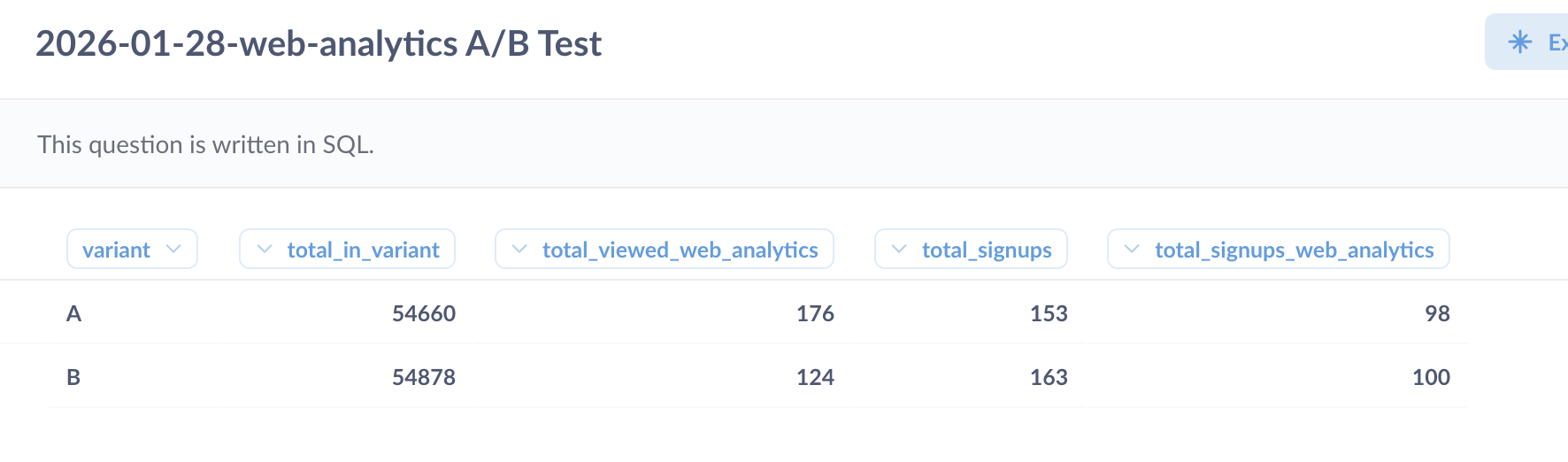
Variant A was the existing human-designed page. Variant B was the AI version. We ran the test for about three weeks in total.
How I Built the AI Version
This is the part most “AI vs human” posts skip over. So let me be specific.
The workflow had four stages and used only two AI tools, Claude and Base44.
Stage 1: AI-generated page structure and copy
From a previous experiment on the best and worst UX prompts, I learned that one of the best ways to prompt AI website builders is to use another AI tool to generate a well-structured, detailed prompt.
So I did exactly that. I asked Claude to generate a detailed prompt outlining the page structure, section by section, along with the copy for each section.
Claude asked some clarifying questions and then got to work. It generated over 1,000 words of content for the landing page before creating the prompt.
The prompt itself was structured, specific, and long. It was quite similar to a product requirements brief rather than a basic prompt and ended up being over 2,300 words.
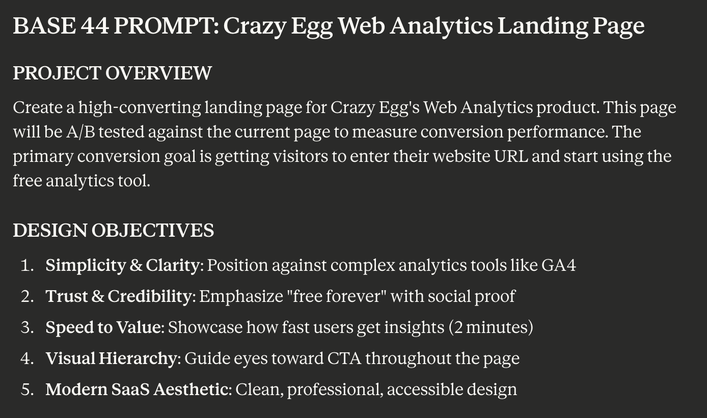
I did not edit the content or the prompt. In fact, I didn’t even read either before prompting Base44.
I wanted to keep my involvement in this process as minimal as possible while also giving Claude enough information about the brand so it didn’t completely go off the rails.
Stage 2: Base44 builds the design
I pasted the exact prompt Claude generated into Base44, a vibe-coding platform, which generated the full-page design.
If you’ve read our earlier piece on AI website builders, you’ll know Base44 was the top performer in our UX test.
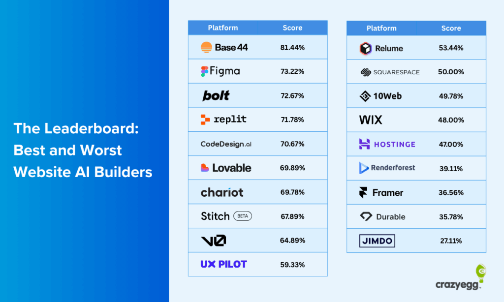
Given the results of this experiment, it continues to prove its quality and value for AI website design.
The Crazy Egg team made a few minor stylistic changes (e.g., using a custom font) and adapted the design for desktop, mobile, and tablet views. 99% of the design was kept true to Base44’s version.
Stage 3: AI critique and second iteration
I took a full-page screenshot of Base44’s first design and asked Claude whether it had any follow-up edits to request.
I also requested two things to ensure branding consistency and accurate information: images of the actual product dashboard and factually correct information for social proof sections.
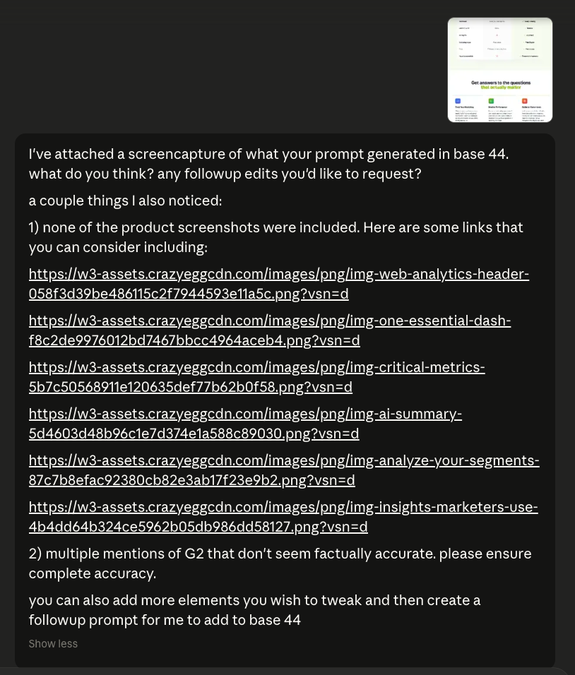
Claude took care of the rest, flagging several areas for improvement and implementing the changes I requested for brand accuracy.
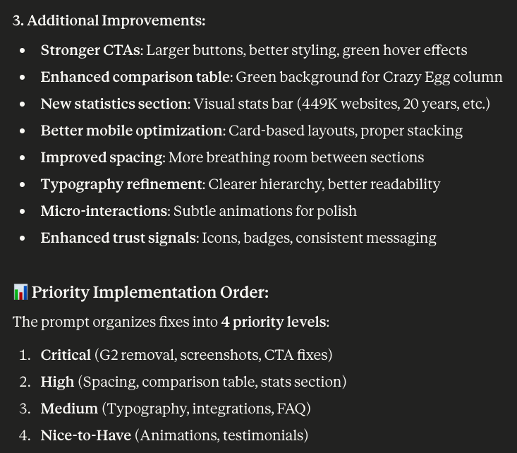
Then it used its own feedback to generate a second prompt, which I entered into Base44 to get the final landing page we used in the A/B test.
Stage 4: Brand-safety review by Crazy Egg
The Crazy Egg team reviewed the final design and its content for accuracy and brand compliance. They made minor adjustments (like swapping in correct customer logos or fixing a couple of product details), but nothing that would affect conversion behavior.
The page structure, copy, and layout were left intact.
From first prompt to final page, the whole process took a fraction of the time a traditional landing page redesign would require.
Possible Reasons Why the AI Page Won
Looking at both pages side by side, the performance gap isn’t hard to explain.
The AI version made several structural and copy choices that align closely with established conversion principles, choices the human-designed page had either skipped or handled more loosely. Here’s what stood out.
1. Above the Fold: The AI Version Does a Lot More Work Before the First Scroll
Above the fold is prime real estate. It’s what every visitor sees before they decide whether to keep reading or leave. The two pages use it very differently.
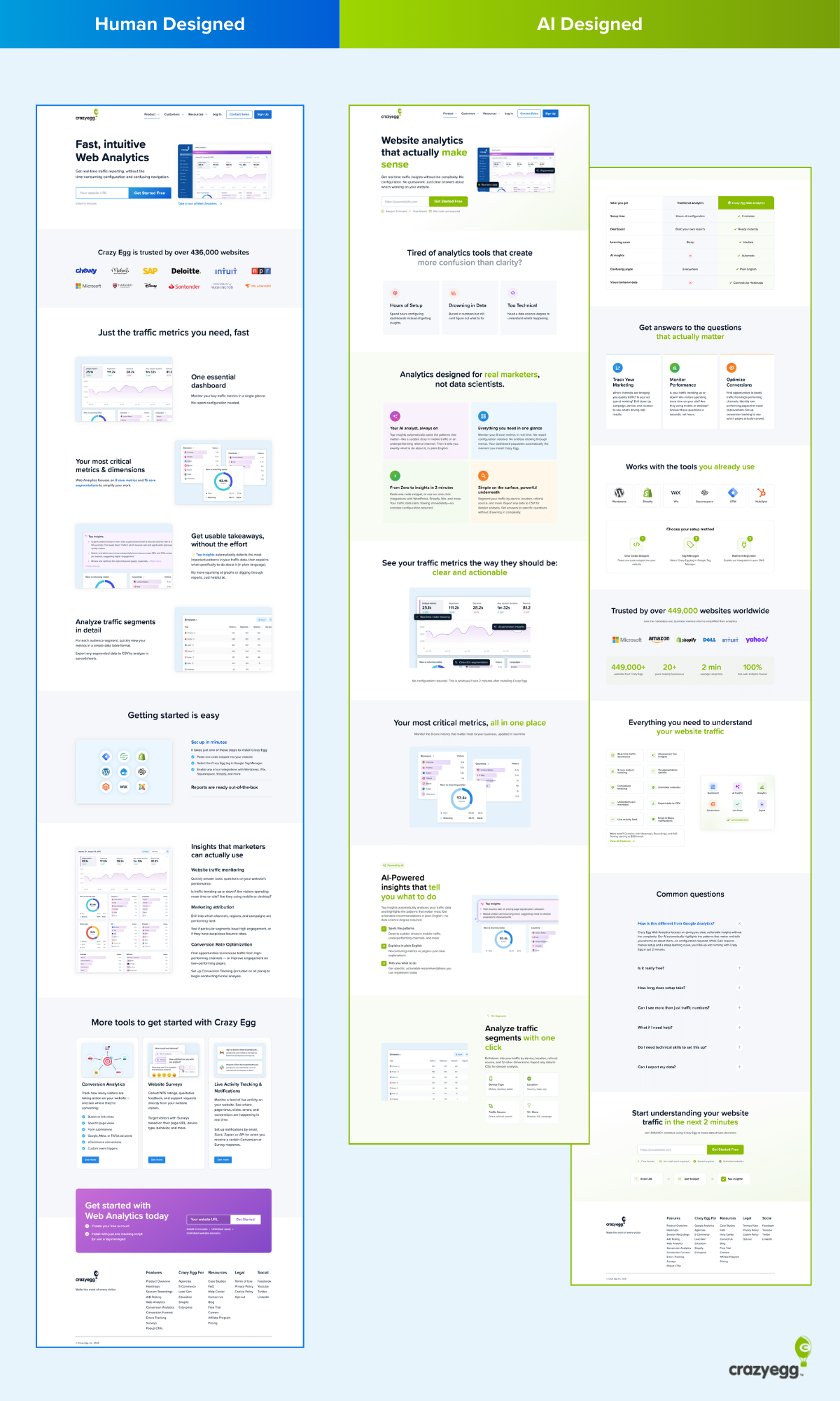
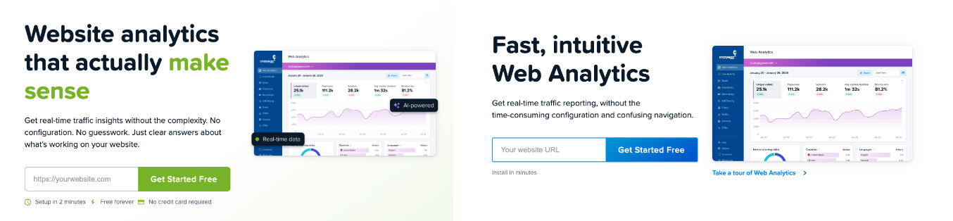
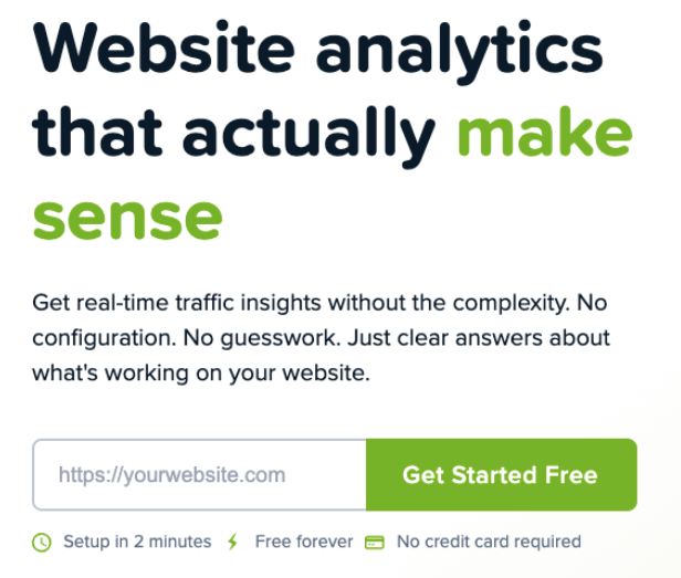
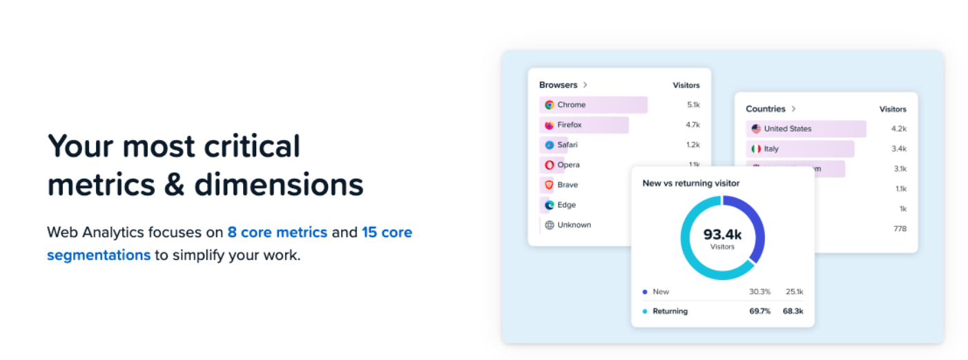
The human page opens with a headline, a short descriptor line, a URL input field, and a dashboard screenshot.
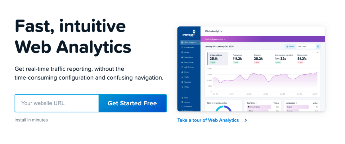
It’s clean, but it’s doing relatively little conversion work. The messaging is product-focused, and there’s minimal effort to connect with the visitor’s situation before asking them to act.
The AI page opens on a completely different footing.
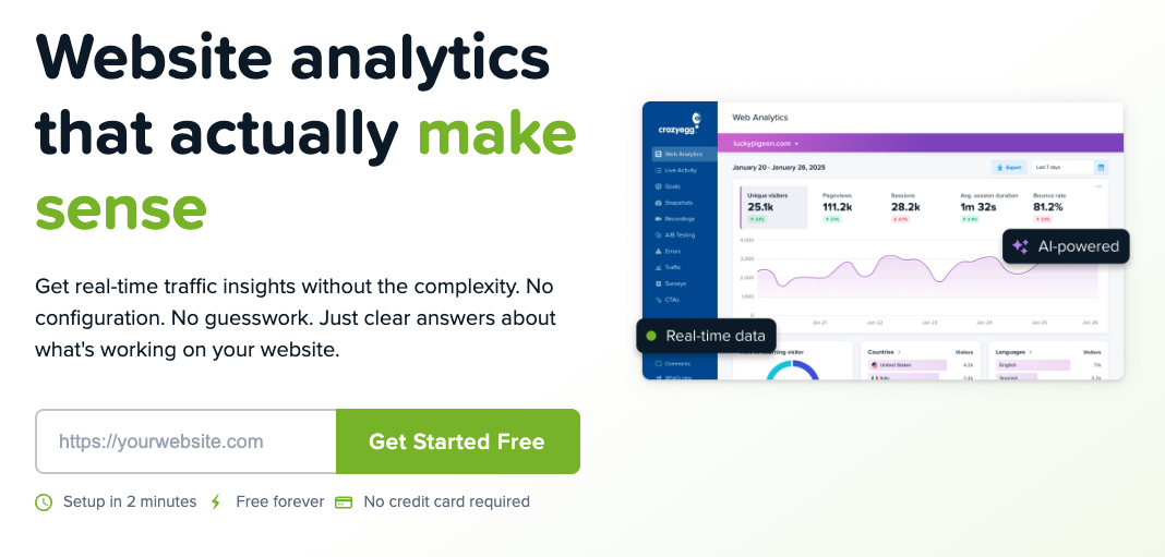
The header “Website analytics that actually make sense” immediately signals that this page understands a frustration the visitor likely already has.
The tone shifts from product-focused to prioritizing the reader and their analytics needs. The visitor is being spoken to about their experience before the product is even mentioned.
Beyond the messaging, the AI hero section also packs in a product UI screenshot, core benefits, and a clear call-to-action in a more eye-catching color than the original page. The human page gets to some of this, too, but the density of conversion signals is noticeably lower, and none of them are doing the work of connecting with the visitor’s pain point the way the AI version does.
2. The Messaging Shifted From “What It Is” to “Why You’d Care”
The human-designed page heavily prioritizes product descriptions and features included.
In this case, the Web Analytics page was already converting to a level Crazy Egg’s team was satisfied with. So this approach isn’t necessarily bad in and of itself. However, the messaging shift was a significant contrast with the AI version and a likely contributor to the big lift in conversions.
This shift started with the headline and ran through the entire page.
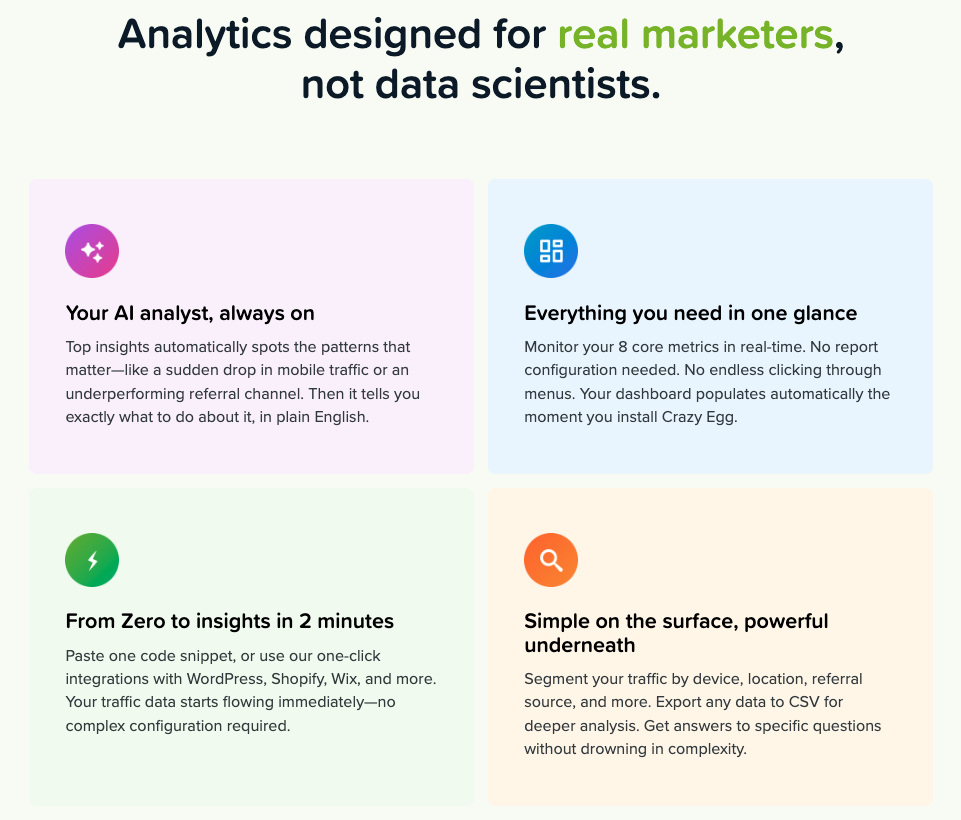
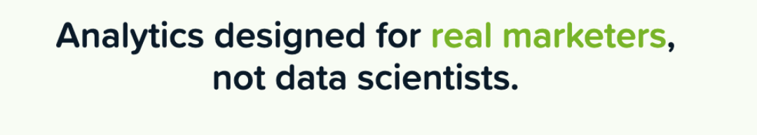
For example, sections like “Analytics designed for real marketers, not data scientists” do something the human page never attempts: they define exactly who the product is for and, just as importantly, who it isn’t for.
That kind of audience-specific positioning builds immediate relevance. A marketer reading that line feels seen. A data scientist self-selects out. Both outcomes are good for conversion.
The body copy throughout the AI page sustains this voice. Section headers like “See your traffic metrics the way they should be: clear and actionable” and “Get answers to the questions that actually matter” keep framing everything around the reader’s needs rather than the product’s capabilities.
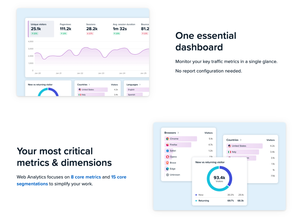
The human page’s equivalent headers (“One essential dashboard,” “Your most critical metrics and dimensions”) focus on the data and the product.
For many readers, especially marketers new to analytics or unfamiliar with its jargon, it can be difficult to understand the benefits they’ll receive from this product compared to others.
3. The AI Page Used a Recognised Copywriting Framework
This is the detail that makes the result harder to dismiss as luck.
The AI page follows a clear version of the PAS framework (Problem, Agitation, Solution), one of the most widely used structures in direct response copywriting.
- Problem: It opens with “Tired of analytics tools that create more confusion than clarity?”
- Agitation: This follows in the next section with three named pain points: Hours of Setup, Drowning in Data, and Too Technical.
- Solution: Then leads into “Analytics designed for real marketers, not data scientists.”
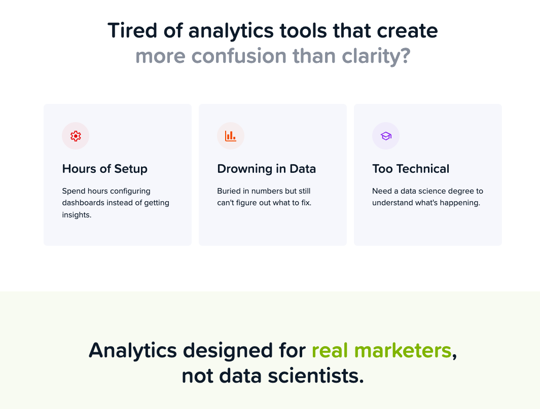
The problem is a direct, specific statement that a significant portion of the target audience will recognise immediately, especially if they use more complex but prevailing tools like GA4.
The agitation section names a specific frustration rather than a vague dissatisfaction. The visitor isn’t just nodding along. They’re being reminded, in concrete terms, of exactly what has annoyed them about other tools.
And then, when the visitor reaches the solution, the product is introduced as the direct answer to the problem just established.
This is a textbook PAS execution. The human page has no equivalent structure. It opens directly on product features with no problem framing, no agitation, and no earned introduction of the solution. It assumes the visitor already knows they need a web analytics tool and just needs to evaluate this one. The AI page doesn’t make that assumption and, as a result, casts a wider net.
4. The AI Page Takes the Visitor on a Journey Towards Conversion
Beyond the PAS opening, the AI page walks visitors through a deliberate sequence:
- Hook with the problem: open on a pain point the visitor already feels, before the product is mentioned at all
- Introduce the solution: once the problem is established, present the product as the answer to it
- Show, don’t just tell: demonstrate what the product looks like in use with UI screenshots and plain-language feature explanations, so visitors can picture themselves using it
- Handle the setup objection: an integrations section showing compatibility with WordPress, Wix, Shopify, and others, answering implicit questions the visitor may have, like “will this actually work with my website?”
- Prove it with numbers: social proof, specific stats, and recognisable brand logos build credibility at the point where a visitor is starting to seriously consider signing up
- Answer the stragglers: a FAQ section catches the visitors who are almost convinced but have one more question standing in the way
- Ask for the conversion: the CTA reappears at the natural end of the journey, once every major objection has been addressed
Each section earns the next. The visitor is never asked to convert before they’ve been given a reason to.
Even in the hero section, many of the elements above are neatly rolled into a single segment, including a product screenshot and benefits that address common objections that block initial conversions.
The human-designed page doesn’t follow this logic as clearly. It focuses on the product and therefore moves through features and use cases rather than the order a hesitant visitor needs to receive information.
It isn’t a bad page, but it was written by people who already understand why Crazy Egg is valuable, and that familiarity shows in what gets assumed rather than explained.
5. Calls-to-action: Consistent, Repeated, and Impossible to Miss
The two pages handle calls to action differently in placement, design, and frequency.
The human-designed page leads with a URL input field as its primary CTA mechanic. The text of the call to action is identical on both pages, but the design varies:
The AI page uses a single, consistent CTA button throughout: “Get Started Free” in green, a contrast color that matches Crazy Egg’s logo, and stands out on the page.
The human-designed page has more understated call-to-action buttons that vary in colour to match the blue/purple theme central to most of Crazy Egg’s landing pages.
For instance, a navy blue color is used in the hero’s CTA button, while a purple CTA section is used at the end:
Green is used consistently for conversion-related elements on the AI page. By the time a visitor reaches any CTA button, their eye has already associated green with key benefits and things they care about.
From the hero section’s focus on “make sense” and the icons supporting the benefits-focused micro-copy:
To the heading confirming the platform is for “real marketers”:
If you only read the green elements on the page, you get a pretty clear idea of what this page is selling and how it guides the visitor through a journey past objections and toward conversion:
- For “real marketers”
- “Clear and actionable”
- “All in one place”
- Insights that “tell you what to do”
- Analyze traffic “with one click”
- Questions “that actually matter”
- Tools “you actually use”
- “Your website traffic”
All of these elements are in the same color as the call-to-action buttons, priming visitors to pay attention.
The human-designed page sporadically uses the same navy blue color as the call-to-action in the hero to highlight specific features like “8 core metrics”, “15 core segmentations”, and “set up in minutes”.
However, the color is not contrasting enough to draw the visitor’s eye in quite the same way. Not to mention that these highlighted elements are exclusively product-focused and contain jargon that some website visitors may not immediately understand.
What the Data of This A/B Test Reveals
The test ran across roughly 54,000 visitors per variant, but the numbers that matter most are smaller than that.
Not everyone who entered the test visited the web analytics page specifically, and not everyone who visited went on to sign up. So we narrowed the data down to the visitors who actually landed on each version of the web analytics page, and tracked how many of those signed up from there.
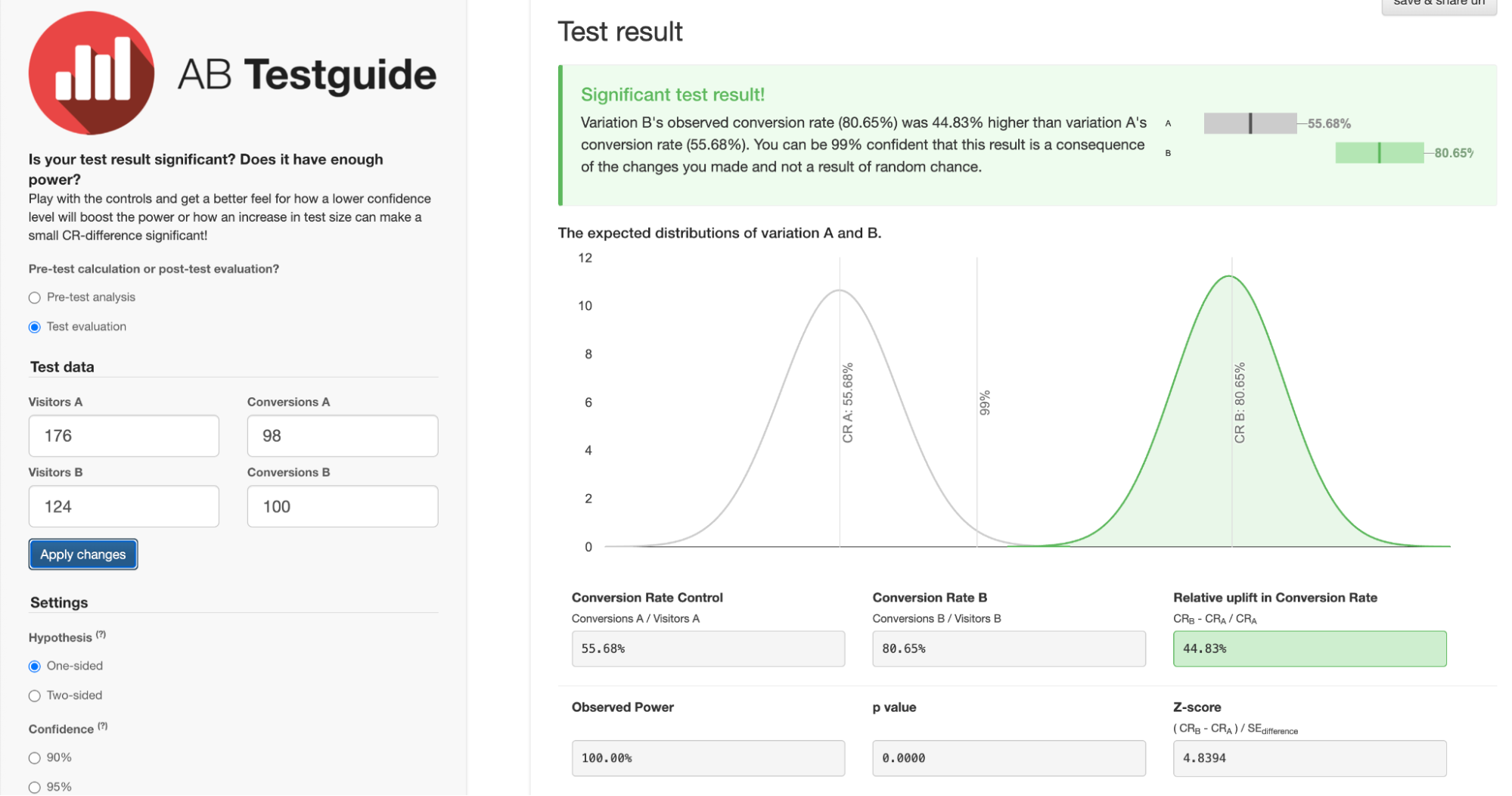
176 visitors saw the human-designed Variant A, and 124 saw the AI-built Variant B.
Here’s what the conversion data means and why, despite a small sample size, the confidence in the results is so strong:
- Variant A conversion rate (human page) = 55.68%. Of the 176 visitors who landed on the human version of the web analytics page, 98 went on to sign up. This is the baseline we’re measuring against.
- Variant B conversion rate (AI page) = 80.65%. Of the 124 visitors who landed on the AI version, 100 signed up. More conversions from fewer visitors.
- Relative lift = 44.83%. This is how much better the AI page performed compared to the human page, expressed as a percentage of the original rate. To put that in context: most A/B tests that produce a 5-10% lift are considered a strong result. A lift of 44.83% is exceptional by any measure (the kind of result most CRO practitioners dream about).
- Confidence level = 99%. This means we can be 99% certain the result reflects a genuine difference between the two pages, not a statistical accident. The standard threshold most teams use to call a test result valid is 95%. This test cleared that bar comfortably.
In plain English, AI smashed it right out of the park! We were all genuinely shocked and surprised to see such a significant conversion lift with such minimal human intervention. Crazy Egg’s web team has now made the AI version the default landing page.
What We’re Testing Next
One test doesn’t definitively prove AI-designed landing pages are better than human-designed ones. It could be a fluke, a quirk of this particular audience, or something specific to this page.
So we’re running it again.
The Crazy Egg team is already interested in repeating the experiment on another product page. We’ll use the same workflow, track the same metrics, and see whether the result holds or whether the human team takes back the win.
While it was fun to test a different take on human vs AI, the more interesting question is whether this kind of AI-assisted workflow can consistently produce pages that outperform the status quo. One data point is intriguing. A pattern would be something worth building a process around and integrating into your website, too.