If you run a SaaS company, your pricing page is the most important page on your site.
Visitors use it to understand your features, complete various forms of qualification, and decide whether or not to sign up. Optimization is a necessity. But there’s a lot of misinformation and questionable advice.
I spoke to three top experts to cut through the fluff and find out what really goes into a high-converting SaaS pricing page.
3 reasons why pricing pages matter more than ever
Pricing pages have a large traffic share, unusually strong engagement, and are central to late-stage buyer qualification and purchase.
If that isn’t enough, they’re also typically the most-cited page by LLMs when ranked against a website’s other pages. As buyer journeys move into chatbot interfaces, pricing pages are providing users with key information during vendor research and evaluation.
Pricing pages combine high traffic share and engagement
Hockeystack conducted one of the largest studies to date looking at B2B SaaS pricing pages. It found that they account for 16.5% of all website visits and have a bounce rate of 39% (versus the 59% sitewide average).
This combination of volume and engagement puts pricing pages among the top money pages for SaaS sites. An increase in high-quality conversions will have an immediate impact on revenue.
Pricing pages are key for later-stage qualification
A buyer may visit a feature page to learn about your advanced analytics.
They may check out your enterprise solution page.
But it’s a near certainty they will look at your pricing page as part of the qualification process, whether directly or through an AI platform.
The data is clear that pricing is a core shortlist consideration, either because of budget or a desire for “value for price,” with the latter factoring into 66% of decisions (TrustRadius).
However, the relevance of pricing pages extends beyond pricing alone. They often act as a stand-in for visitors that don’t want to navigate a dozen or more overlong feature pages.
UX research by Baymard found that the plan matrix (or feature comparison table) displayed on the pricing pages of digital subscription and SaaS products was central to learning about new features along with checking the makeup of different packages. Interestingly, these tables often acted as a jumping-off point to dedicated feature pages.
Pricing pages are cited by LLMs more than any other individual page on a website
Trying to gauge which page types “perform best” in AI engines is tricky. This is largely because sheer volume isn’t always the best measure.
Otterly, for example, found that informational pages like product listicles are cited most often when taken as a percentage of all pages across a prompt set. However, when looked at in the context of a single site’s content “footprint,” pricing pages are disproportionately represented. This is especially true when you test with prompts with commercial intent.
In a B2B-focused study, Writesonic had this to say about pricing pages: “They’re 8.8% of GPT-5.5’s citations despite being a tiny fraction of any brand’s content footprint. They still pull more AI visibility per page than anything else on your site.”
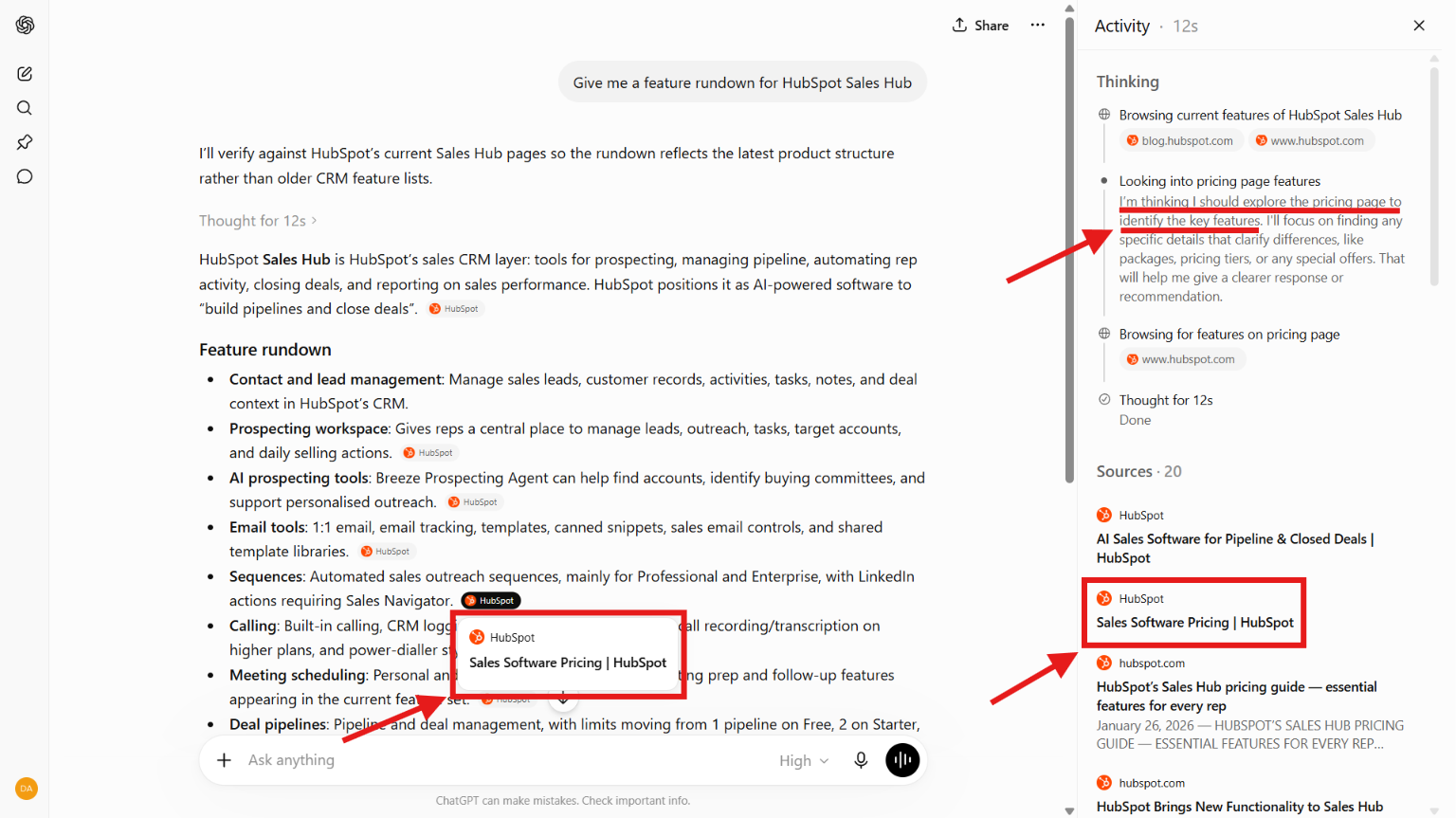
As a rudimentary example of this, when I ran the prompt “Give me a feature rundown for HubSpot Sales Hub” in ChatGPT, the pricing page was frequently cited. This was a prompt about features, not pricing, and nearly every bullet had the pricing page listed as a source.
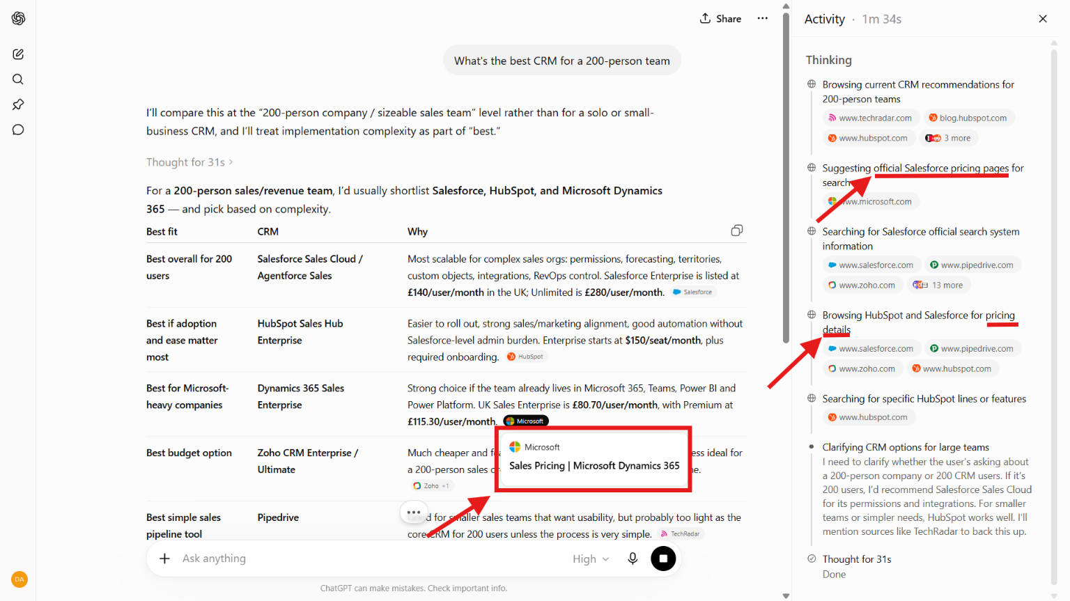
The same happened when I ran a more general prompt with lower-level commercial intent: “What’s the best CRM for a 200-person team?” Pricing pages were among the top-cited sources.
What actually works for pricing page optimization? A 5-step framework with expert input
It would be easy to give a five-thousand-point optimization checklist covering everything from headline font size to CTA color. That tends to be how most optimization guides work nowadays.
This framework presents the following alternative approach:
- Start from the standard design, with a focus on pricing transparency.
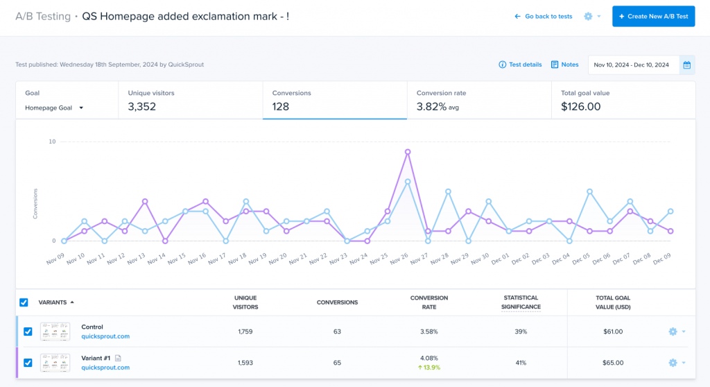
- Carefully A/B test design elements to optimize sign-ups, but don’t change your pricing model.
- Ensure that your pricing is clear, consistent across your site, and readable by LLMs.
| Expert Contributors | |
|---|---|
 | Serge Herkül: Founder of three startups and former CEO of Toggl. He now runs Potio, a boutique pricing consultancy that helps SaaS and AI companies optimize their pricing. |
 | Casey Hill: CMO of DoWhatWorks, an innovative platform that uses a patented system to track A/B tests across the web. He was previously a strategic advisor to McKinsey and Co., where one of his specializations was SaaS pricing trends. |
 | Krzysztof Szyszkiewicz: Partner at Pricing Engineer, a value and monetization consultancy, and a former senior analyst at McKinsey and Co. (working primarily in dynamic pricing and branding). |
1. Limit innovation and build from a standard design
Here’s an interesting data point: Serge Herkül, who has worked on hundreds of pricing pages, told a client to change a navbar link from “Go Pro” to “Pricing” and move it to the right. Visits doubled overnight.
Reinventing the wheel is not the way to go with pricing pages, at least initially. The pricing layout that’s common today on desktop and mobile is the result of an evolution over at least two decades, and buyers expect it.
That doesn’t mean that whatever HubSpot or Microsoft decides to do is the automatic gold standard. But it’s the best starting template and a good foundation for innovation.
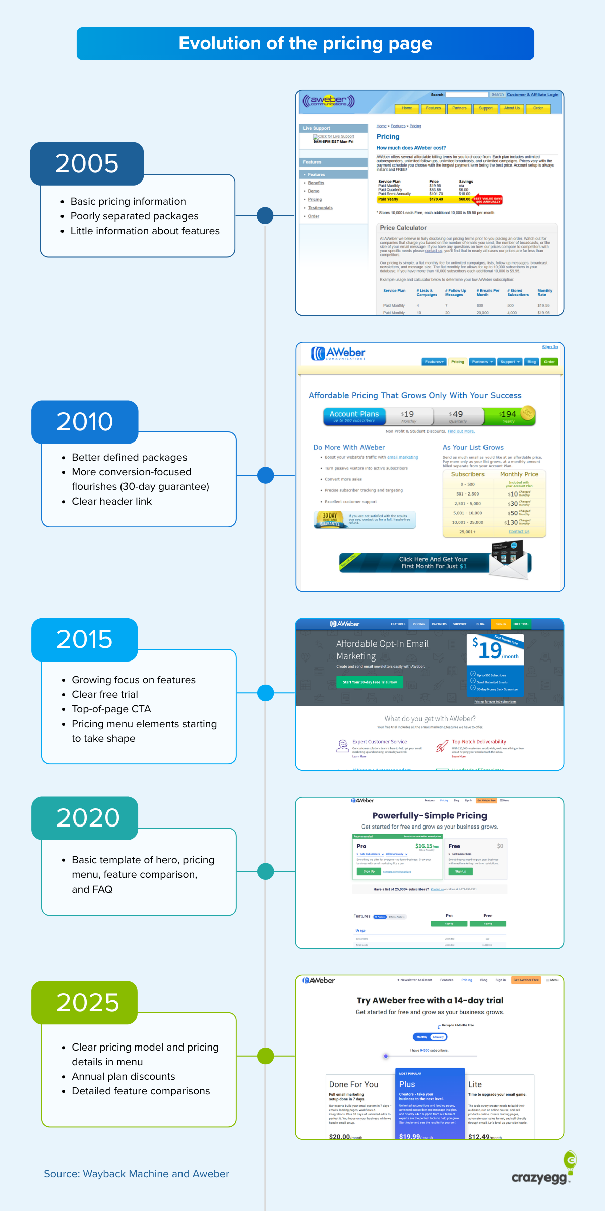
“Follow the ‘standard’ 80% of the time,” Serge told me, “and innovate 20% of the time. You’re not trying to outperform the best in the industry. You’re trying to avoid underperforming. People have seen hundreds of pricing pages and expect yours to work a certain way. Use that. Innovate too much and the page will read as unfamiliar. That will cost you.”
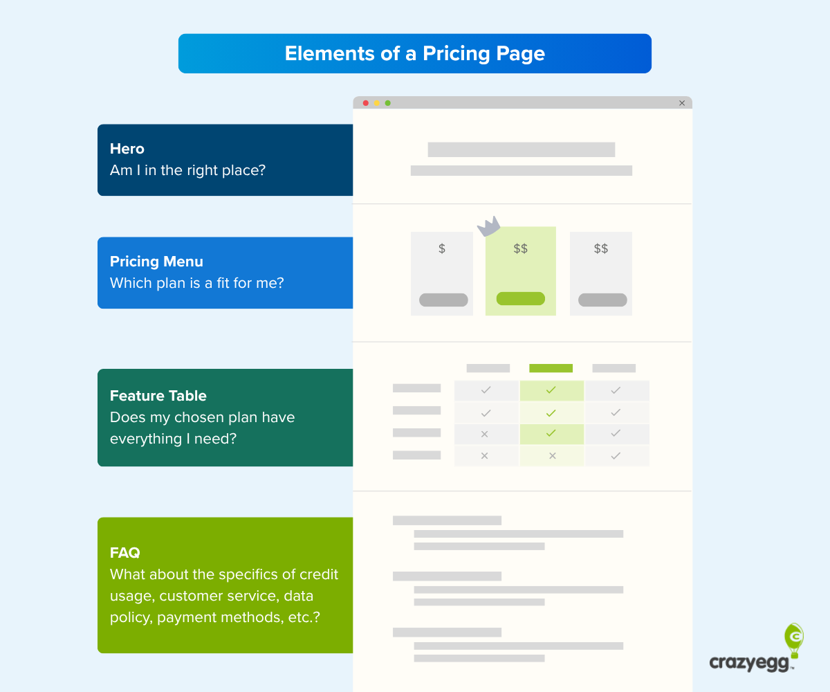
Pricing pages should be built on a four-part structure made up of the following components:
- Hero section: This reassures visitors they’re in the right place.
- Pricing menu: As the core component of the page, this should quickly tell potential buyers which plan is right for them.
- Feature table: This provides an opportunity for a confirmatory deep dive.
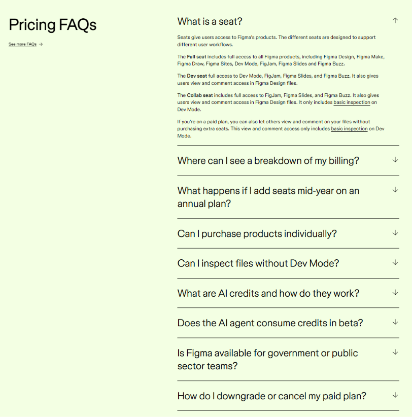
- FAQs: The primary function of the FAQs is to handle objections.
Hero section
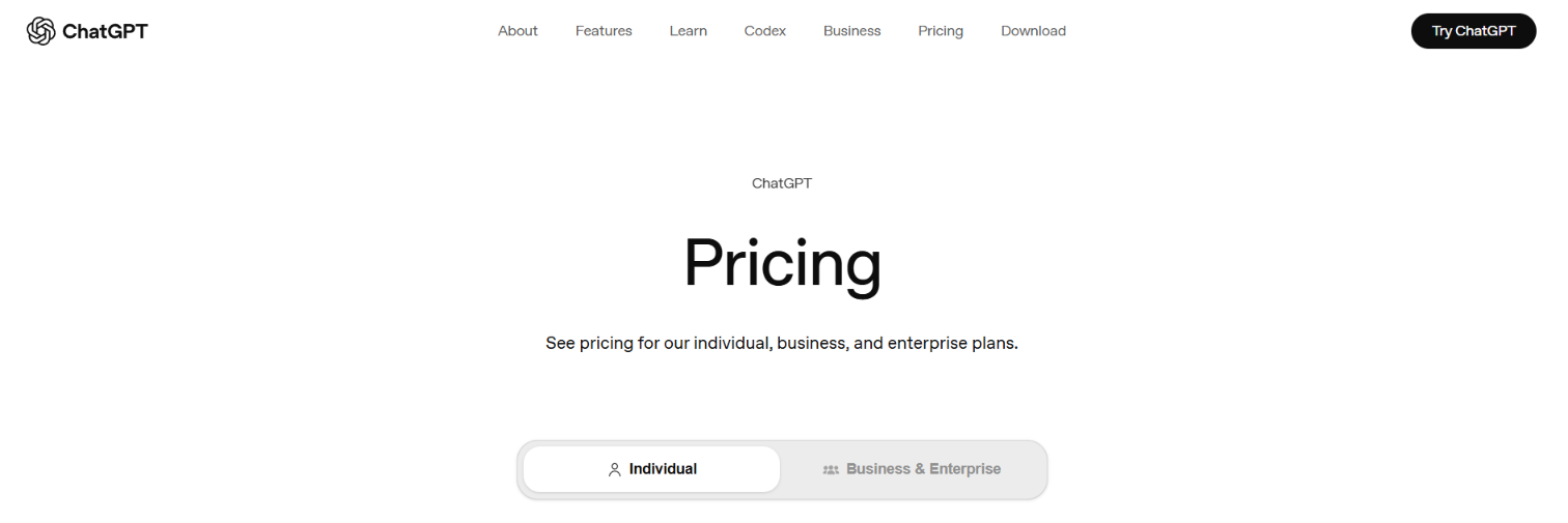
This is the part of the page with the headline and the subheading. The biggest mistake that SaaS companies make, according to Serge, is using elaborate copy. “The hero often describes the product, and this is a mistake,” he said. “An H1 that just says ‘Pricing’ is completely fine and usually better.”
ChatGPT, for example, opts for a simple “Pricing” header and uses the subheading to confirm that visitors are in the right place for individual, business, or enterprise plans. Also note how the navbar link is to the right, where visitors expect it.
Also keep in mind that visitors are arriving on your site with context. “Anyone on your pricing page has already been around your site; they know what you do,” says Serge.
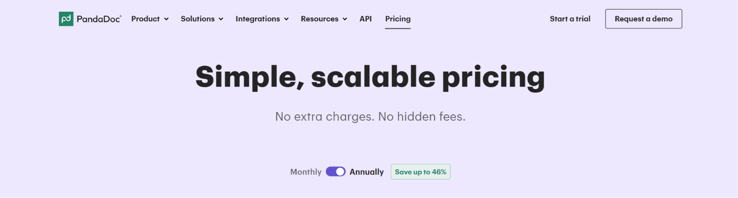
PandaDoc uses an equally simple heading. While there is a benefit contained in the headline and subheading copy, it isn’t about the product. It’s about the pricing itself and assumes that visitors already know what the platform does.
Pricing Menu
The pricing menu is about providing clarity. Visitors should be able to see which plan is right for them shortly after arriving on the page.
For Serge, the pricing menu has one overarching aim: to give the buyer an understanding of the pricing model (how you charge) and the price point (how much).
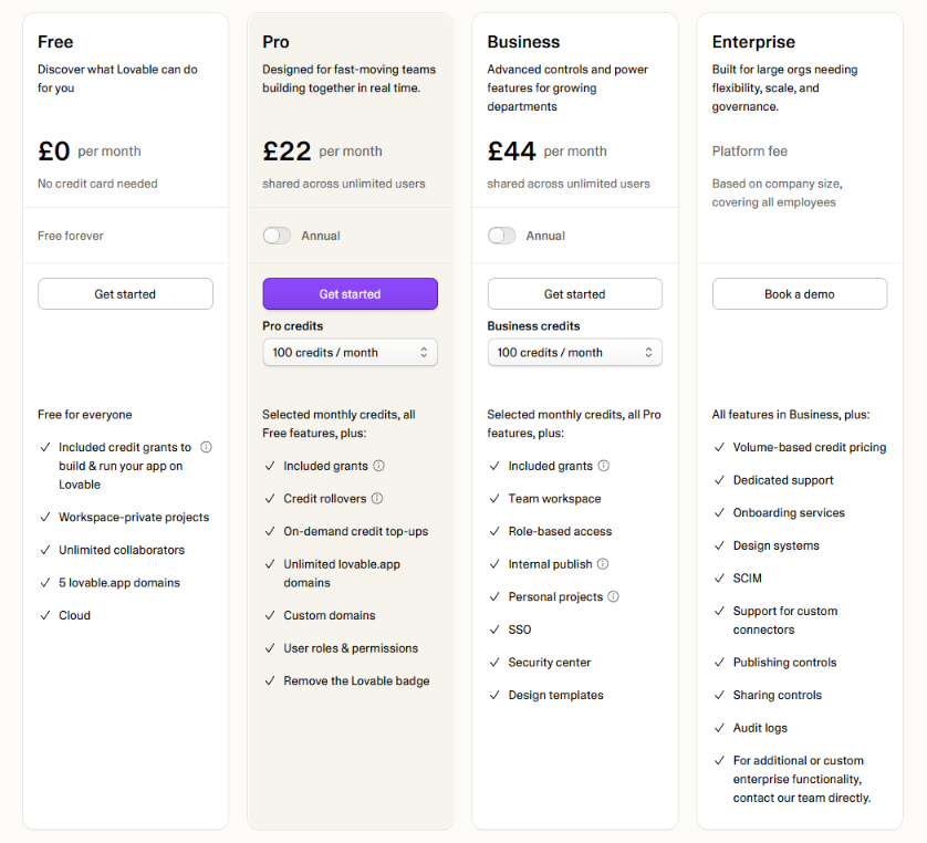
“You get there with a clear hero, descriptive tier names, and an intro line or subtitle for each tier,” Serge told me. “That last one gets forgotten constantly, and it’s one of the most powerful things on the page because it tells a buyer who the tier is for.”
Lovable uses tier names and subtitles to full effect in its pricing menu. The names for packages are commonly used for SaaS, providing well-recognized reference points for visitors, and subtitles describe exactly who the packages are for.
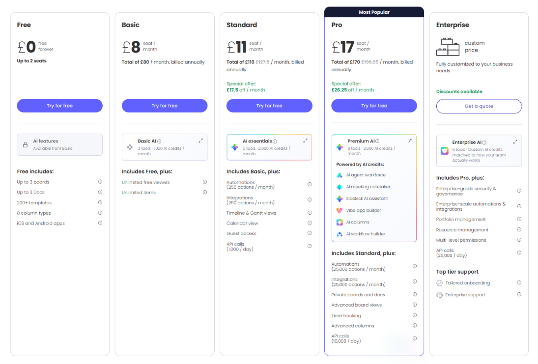
Another big mistake companies make is over-describing features in the menu. “I often see companies cramming everything into their pricing tables. Show the levers that matter and push the rest into a comparison table,” Serge says.
Monday is a good example of a feature-rich product that doesn’t overload its menu. It makes good use of the “Includes [previous plan], plus:” format to communicate its value ladder and avoid crowded feature descriptions. The pricing model (/seat/month) and price points are also clear.
Feature table (feature matrix)
The feature table serves two functions:
- It should act as a detailed overview of package differences.
- It should provide information to readers that are using it to gather general feature information.
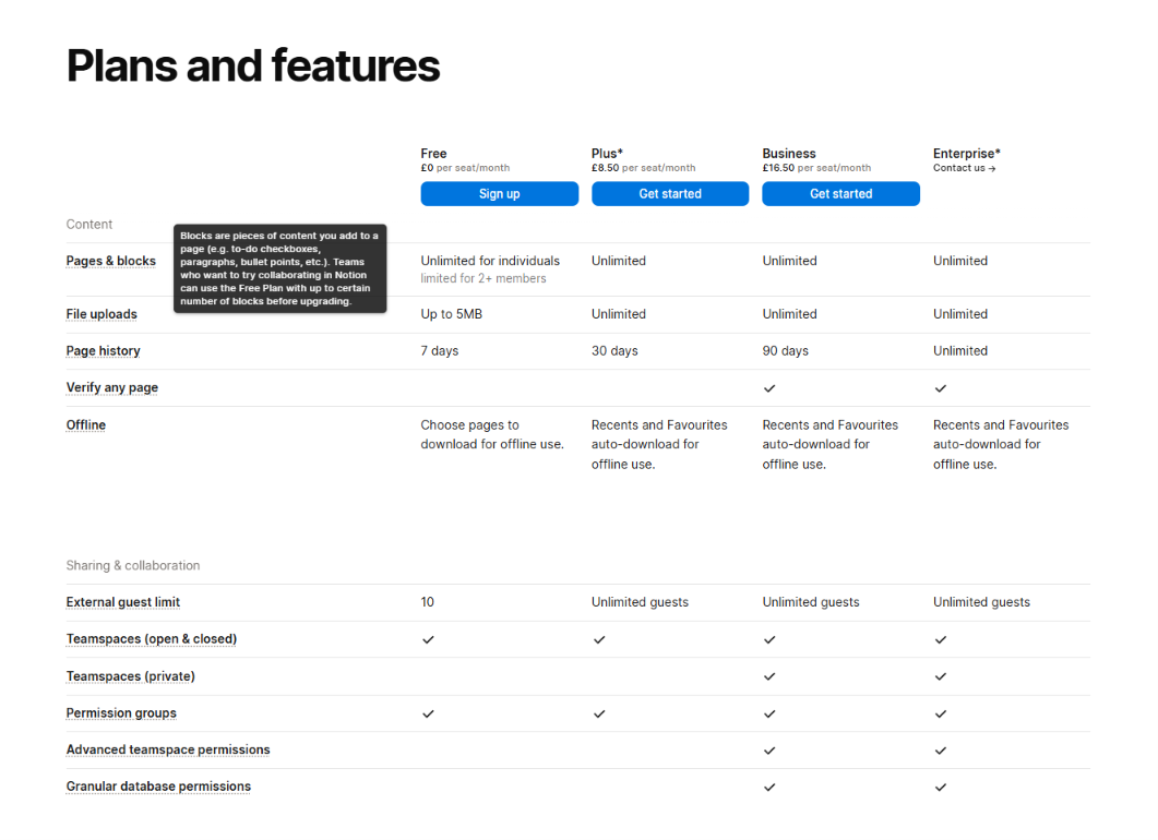
There are three design elements that work simultaneously to meet these aims: categories, checkboxes, and tooltips.
Notion does a good job of combining these elements despite a very heavy feature catalog and lots of nuanced differences between plans. Categories are organized into a hierarchy that reflects feature importance (it is primarily a knowledge management platform); checkboxes and descriptive entries distinguish packages; and extensive context is given via tooltips.
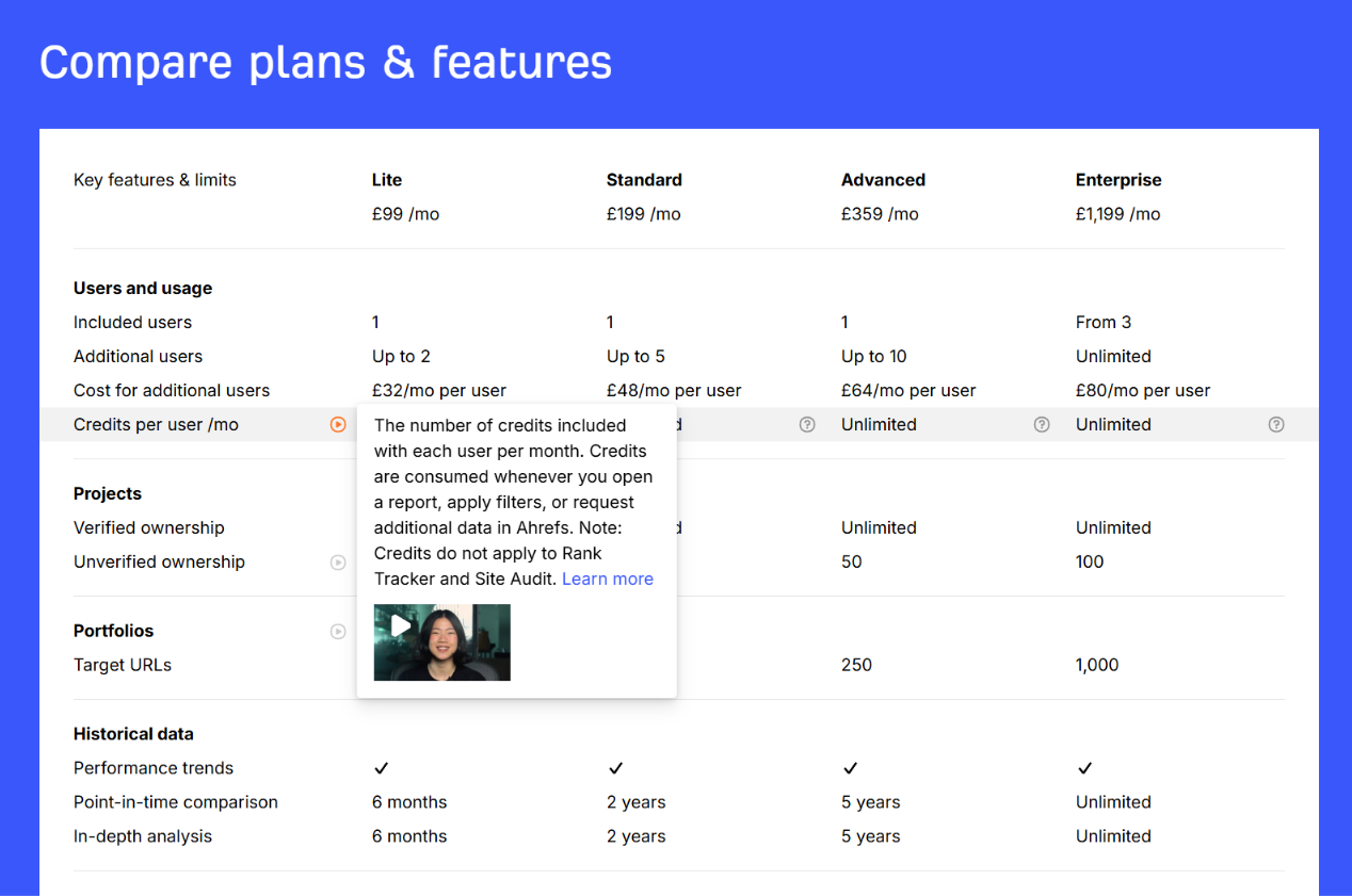
Ahrefs takes tooltips a step further and includes video breakdowns for some features alongside text explanations. Even specific feature entries, as in the case of “Unlimited” for “Credits per user/mo,” have extra context where appropriate.
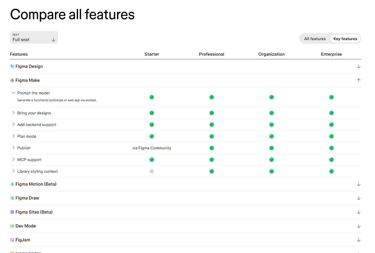
For SaaS products with large product portfolios, drop-down sections are a good option. Figma, which offers nine separate tools along with its platform-wide features, makes use of dropdowns and includes an option to filter by seat size.
FAQs
For Serge, the FAQs are “where you handle pricing objections and take work off your sales and support teams.”
Because they’re simple structures on the surface, it’s easy to overlook FAQs. And I know from first-hand experience working at SaaS companies that it’s not uncommon for copywriters to ask AI to generate a list of fifteen or so generic questions and answers.
A fair amount of UX research has gone into what makes FAQs useful. The short version is that they should answer real questions. An accordion format is also preferable for easy scannability.
The following sources can provide useful data, especially with the help of AI:
- Social media and review site mining: Social media listening tools can be especially useful for finding unfiltered objections about pricing.
- Google search queries: Keyword research tools allow you to find branded queries and rank them by volume for inclusion in your FAQs.
- Conversation mining: Conversation intelligence and customer support platforms typically offer native features for analyzing sales calls and customer support tickets.
FAQs related to the nuances of your pricing model, particularly as regards credit usage, caps, free trials and refunds, and payment methods, should take precedence. Common non-pricing objections can also be included (Shopify includes an FAQ about preexisting domain use in its FAQs, for example).
Figma does a good job of addressing specific pricing issues and provides a link to a more comprehensive FAQ page (along with links to support pages in the FAQs) for those that need them.
2. Aim for the 20-second rule
The 20-second rule stipulates that a buyer should know which plan is right for them within 20 seconds of landing on a pricing page. “If it takes longer, the page is doing too much,” argues Serge.
The good thing about the 20-second rule is that it’s relatively straightforward to test. You can gather good qualitative feedback using a platform like UserTesting or via your own focus group. Show your pricing page to a cross-section of individuals that match your ideal customer profile (ICP) and track how long it takes them to find the package that’s right for them (noting any areas of confusion) and self-report that they would be happy to progress to a trial.
There is a caveat here, however. Pricing clarity doesn’t necessarily mean pricing simplicity. Transparency and ease of understanding should exist alongside complexity, and one shouldn’t be sacrificed for the other.
Serge argues that this is particularly true for mature companies: “Once a company matures, it ends up with all sorts of buyers looking at all sorts of packages, add-ons, and rungs. At that point, the page’s job is to take a genuinely complex pricing structure and make it easy to understand for each buyer.”
He cites Slack as an example of a company with a huge feature portfolio that does this exceptionally well. It uses a Jobs-to-be-Done (JBTD) framework that simplifies the various components of its complex add-on model.
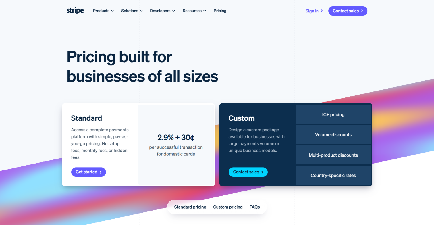
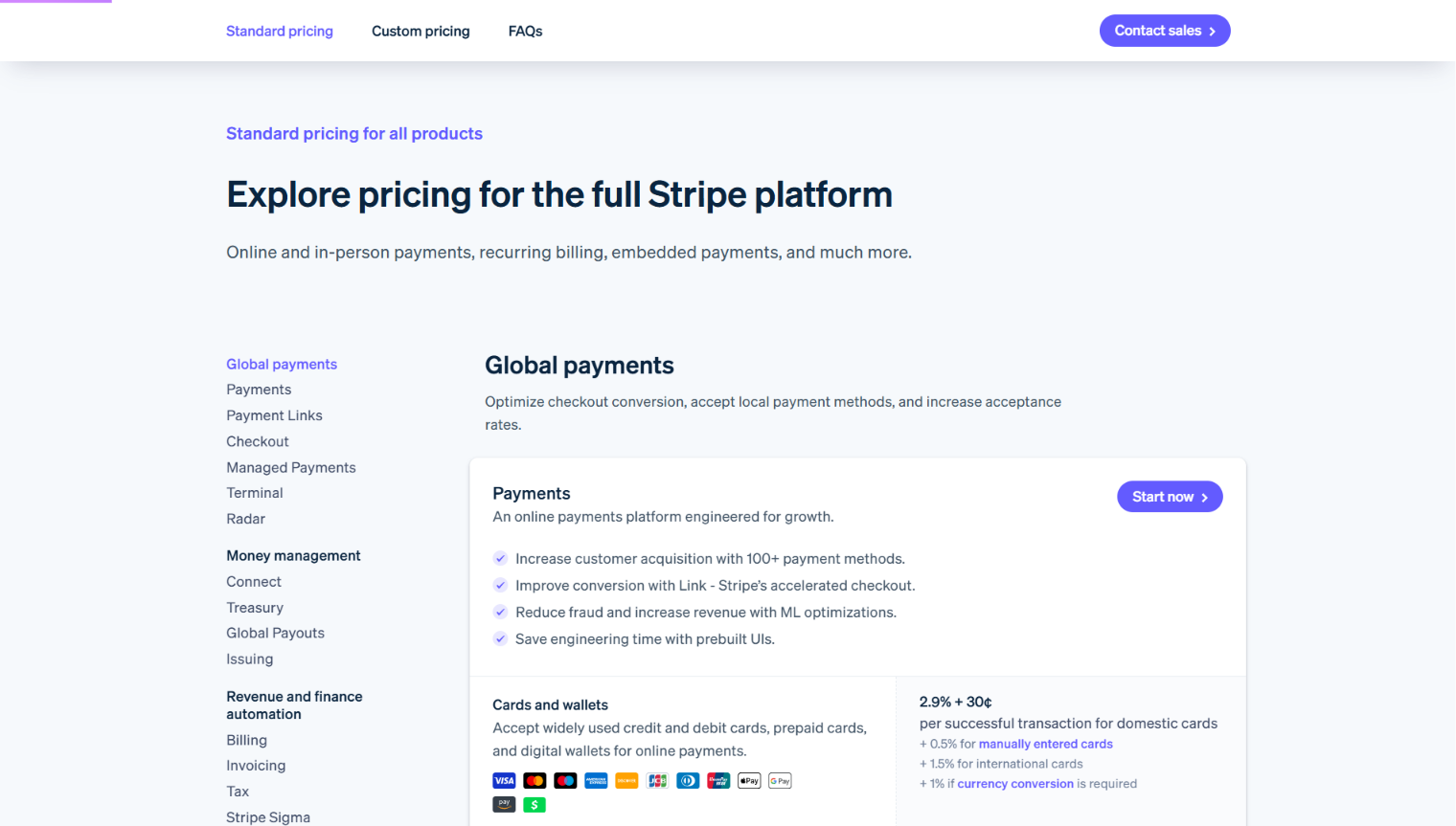
It offers a standard core plan, clearly shown in the hero section, which can then be supplemented with a myriad of additional services, subscriptions, and hardware. All of these are outlined clearly, with a minimum of extraneous information.
3. Be wary of intuitively appealing optimizations
One ever-present temptation when working with a well-defined template is to add small flourishes. These are page elements for which there seems to be little or no downslide.
You might want to include a G2 badge showcasing your perfect five-star score, for example.
Or an ROI calculator above the pricing table.
Or a testimonial from a well-known client.
Casey Hall is the CMO at DoWhatWorks, which could well be the largest database of test results currently available on the web. It uses a patented system to track A/B and multivariate tests around the web.
When I spoke to him, he made two points: many of the conversion gains he had seen on pricing pages were the result of removing elements, and many were counterintuitive.
“At DoWhatWorks,” he told me, “we have tracked over 14,000 tests related to pricing pages. There are a few major trends in pricing page optimization, and most involve subtraction.”
Here was his advice based on the tests that most stood out to him:
- Don’t have anything above your pricing plans other than a header. No videos. No explainers. No ROI calculators. Let people get to the core plans as fast as possible.
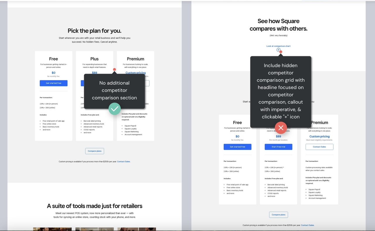
- Don’t use strike-through pricing. It loses the vast majority of the time in A/B testing for B2B products.
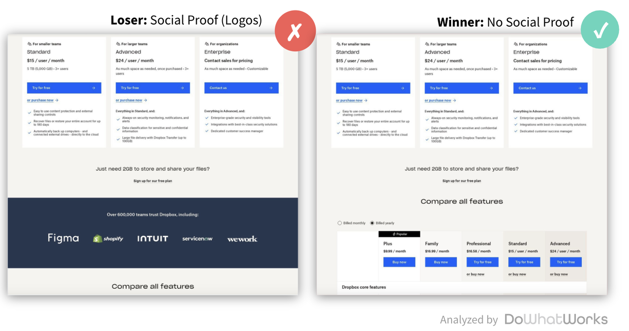
- Logos and social proof tend to perform poorly. The reason is a bit nuanced. If someone is on your pricing page and then scrolls down past your plans, they are typically looking for a specific answer or clarification. Logos or testimonials rarely answer that question.
- Annual plans (even with large discounts) are becoming less popular. In a world where AI is changing the landscape on a daily basis (Claude stands out here), buyers are reluctant to commit to longer deals, especially to multi-year deals.
While these might seem like disparate data points, they do point to the fact that apparently obvious modifications don’t always lead to the expected results.
4. Split-Test to Improve Sign-Ups, Not Your Pricing Model
There are lots of complex variables that can affect pricing model tests in nuanced ways. Very few experts can run these types of tests effectively, and many have advanced degrees with a strong data science component.
A cheaper plan may increase conversions but reduce lifetime value, for example. Or an initial revenue boost might be nullified by higher late-stage churn. Then there’s the host of ethical issues that can come from A/B testing different models and having customers on the same plans with different subscriptions.
In short, you shouldn’t test against revenue. Focus exclusively on increasing total sign-ups without making any changes to the pricing itself.
Your pricing page is best understood as a presentation layer, and, as such, any A/B or multivariate testing should focus exclusively on design elements (buttons, headlines, images, colors, etc.).
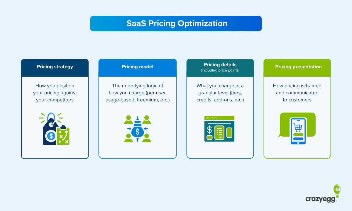
A pricing page that follows established standards is an excellent canvas for small changes. While you should err towards the prevailing framework 80% of the time as Serge Herkül advises, the 20% you devote to innovation is where your additional conversion gains will come from over time.
This was a point that Krzysztof Szyszkiewicz, a former McKinsey analyst who is now a partner at Vasluships, also raised when I spoke to him. “Don’t be too creative,” he said. “I think most of the standards have already been established. That doesn’t mean you can’t be creative at all, but sometimes people just try too much.”
How you develop your hypotheses is everything. And existing data is the most useful basis for coming up with new ideas about which page elements to modify.
Use the following sources to generate ideas:
- Competitive analysis: Following top SaaS players, especially those that have similar pricing models to yours, can provide hypothesis-worthy ideas. This is in part the idea that DoWhatWorks is based on. You can set up ongoing monitoring of a competitor list relatively easily with tools like Claude Code and have changes populate in a connected knowledge base like Notion.
- Internal data: Qualitative customer feedback, surveys with members of your target market, usability tests, focus group sessions, and one-on-one interviews can all be good sources of data that can feed into strong hypotheses. They will typically alert you to any areas of confusion around plan structures or costs.
- Good research studies: With LLMs increasingly being used to augment hypothesis ideation, it’s now easier than ever to draw from a large body of industry reports and academic studies, even if you don’t have formal academic training. You can configure prompts to draw from a specific set of sources, and many academic AI tools, like the platform Scite (which draws on research papers), now offer MCPs.
Ideally, hypotheses should come out of mutual consideration of all these points. If a hypothesis looks promising based on patterns from internal data, competitive analysis, and LLM-aggregated research together, you’ve potentially got a strong test.
5. Make your pricing page agent-friendly
Buyers are increasingly conducting product research without leaving the interface of their chosen AI chatbot. Large swathes of the buyer journey are now being handled by AI. This has been confirmed in numerous studies, most recently by Forrester, who found that nearly all buyers (94%) use AI at some point in the evaluation process.
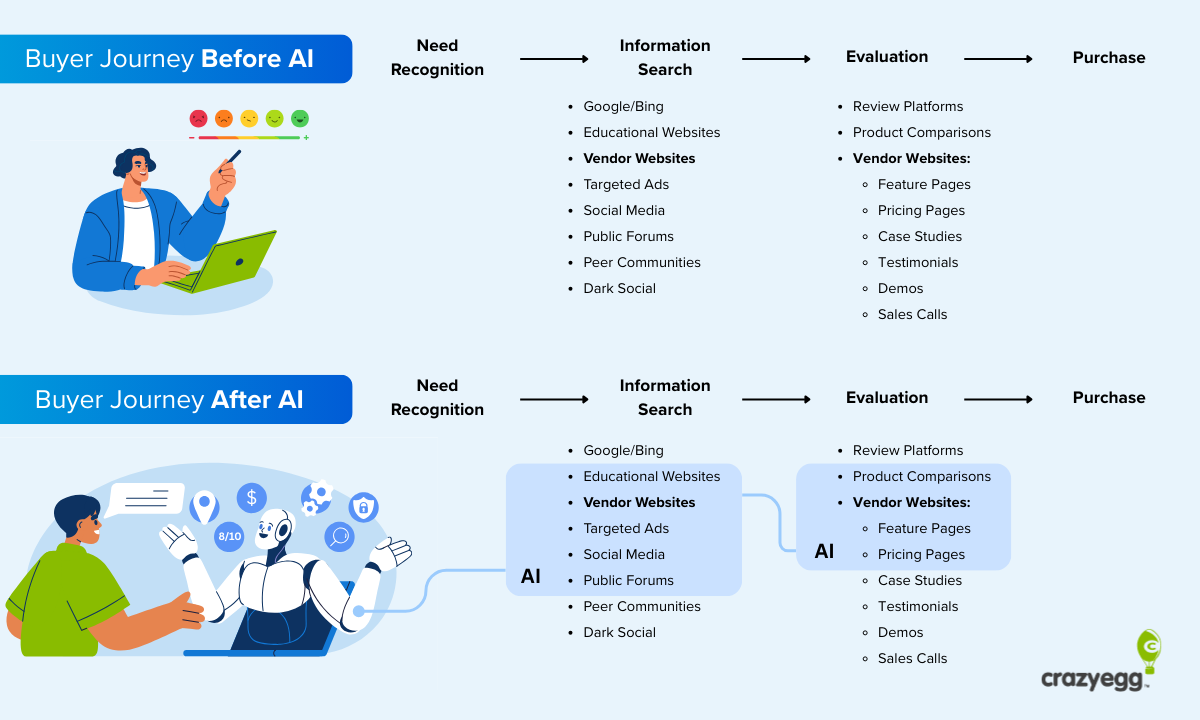
When I spoke to Casey, he was also keen to emphasize the need for pricing pages to be optimized for AI: “Your website has a new type of visitor. Some human users are pivoting from manual navigation to delegating goal-oriented journeys to AI agents. Those autonomous systems can interpret input, plan, and execute actions on behalf of a user.”
Generally speaking, agents are very good at understanding website pages as long as they’re not a total mess. If you’re already aiming for clarity, you’re 90% of the way there.
As for the technical dimension of building agent-friendly sites, Google has provided detailed advice on web.dev:
- Audit the page’s accessibility tree (and if necessary the DOM), because clean roles, names, and states give agents a more reliable map of the page.
- Make all interactive elements clearly visible in the interface so agents can identify what to do next in line with the goal they’ve been given.
- Keep layouts stable, because shifting buttons, forms, images, or text can confuse screenshot-based interpretation.
- Avoid transparent overlays, as agents may ignore or misread elements that aren’t visually distinct.
- Use semantic HTML such as <button> and <a> instead of <div> or <span> for interactive elements as agents more readily recognize these.
- Use cursor: pointer for clickable elements, because it gives agents another signal that an element is interactive.
- Use the for attribute with labels so agents can understand what each input is for.
- Make interactive elements larger than 8 square pixels so visual analysis does not filter them out.
Also keep an eye on WebMCP, a proposed protocol for agent-ready websites that’s available for early preview.
Finally, ensure consistency and clarity across your on-site pricing “narrative.” If you don’t, there’s every chance you might confuse LLMs or force them to resort to information from third-party sources.
Krzysztof Szyszkiewicz has spent a great deal of time emphasizing the need for brands to monitor their pricing across LLMs. “Right now, you need to follow best pricing page practices and control the narrative,“ he told me. “The buying journey has changed. Remember the last time you took an important business decision without consulting an LLM? Yeah… your buyers do the same. That’s why it is so important to have LLM-readable pricing. Otherwise, you are handing over the battleground to your competition. The most important thing is to have a good value-for-money perception in the LLM and clear pricing thresholds.”
Follow 80% of the time and lead 20% of the time
Pricing page optimization is about three things: following the current standard well, innovating cautiously, and prioritizing fast understanding on the part of your visitors.
Here’s a summary of how you do that:
- The basic pricing page design that pervades so much of the web is the evolution of many years of incremental optimization by SaaS companies on their top money pages. It’s the best baseline template available to you.
- This basic design is made up of a hero section that confirms to leads they’re in the right place, a menu that displays the different pricing tiers and key features, a detailed feature table, and an FAQ section that covers common objections and questions about plan specifics.
- Extensive testing shows that many “obvious” additions, like testimonials and pricing calculators, don’t drive expected conversions and even have a negative effect. Be wary of them.
- Don’t test your model and price points via your pricing page. That’s a separate task and one that requires specialist expertise. Instead, focus exclusively on increasing sign-ups by testing design elements. Use a mix of your in-house data, competitor monitoring, and good third-party sources to generate testing hypotheses.
- Follow basic technical best practices to ensure LLMs can read your pricing page and ensure that messaging, or “narrative,” is clear and consistent across your site.
Here’s an interesting data point from Krzysztof to round off with: “Valueship’s latest research shows that 50% of companies do not have a pricing page. That’s a lost opportunity for product companies.”
Don’t waste the opportunity your pricing page presents. If you haven’t updated it in a while or, even worse, you don’t have one, now’s the time to start building.